Search the Community
Showing results for 'ROMM RGB'.
-
 I noticed that the blending effect can vary a lot when exporting to CMYK and that graduality of the fill opacity set in Blend Options can come back: fillopacities.mp4 The document used above is RGB/8 and all color definitions are RGB based. The effect shown in the clip when exporting to CMYK would happen only when exporting to PDF, but not when exporting to CMYK JPG or TIFF. It is pretty much impossible to predict in what way the blend option fill opacity will differ from fill opacity set in the two alternative ways, so this is really just something experimental. But as the difference of effect is stated in documentation, the feature probably works "as designed".
 -
Change font color via Data Merge
lacerto replied to TheZBillDyl's topic in Affinity on Desktop Questions (macOS and Windows)
Here is a setup where specific Segou UI Emoji glyphs with different background colors are clipped into (heavily zoomed in into) Arial (and also table cells) and where text gets coloring definition from an Excel sheet, so it is not necessary to use a custom font (self-created). I just created one to make it possible to precisely define a color in source by mixing 10 RGB components.
-
 Hallo, kann mir jemand sagen, ob man in Affinity Photo den Modus von RGB auf "indiziert" (wie in Photoshop) umstellen kann? Danke 😀
 -

SVG export blurry
v_kyr replied to BioWeb's topic in Affinity on Desktop Questions (macOS and Windows)
Yes. - Though not really supporting the alternative usages of SVG embedded/inline CSS or several SVG filters, is here more a shortcoming of the Affinity SVG parser/generator implementation. For example check the following samples in a webbrowser versus ADe. <?xml version="1.0" encoding="UTF-8" standalone="no"?> <!DOCTYPE svg PUBLIC "-//W3C//DTD SVG 1.1//EN" "http://www.w3.org/Graphics/SVG/1.1/DTD/svg11.dtd"> <svg width="100%" height="100%" viewBox="0 0 380 277" version="1.1" xmlns="http://www.w3.org/2000/svg" xmlns:xlink="http://www.w3.org/1999/xlink"> <style> rect { mix-blend-mode: screen; } </style> <rect x="0" y="0" width="191.836" height="157.5" style="fill:rgb(230,0,255);"/> <rect x="80.724" y="59.282" width="191.836" height="157.5" style="fill:rgb(0,18,255);"/> <rect x="187.485" y="118.564" width="191.836" height="157.5" style="fill:rgb(0,224,255);"/> </svg> <?xml version="1.0" encoding="UTF-8" standalone="no"?> <!DOCTYPE svg PUBLIC "-//W3C//DTD SVG 1.1//EN" "http://www.w3.org/Graphics/SVG/1.1/DTD/svg11.dtd"> <svg width="100%" height="100%" viewBox="0 0 380 277" version="1.1" xmlns="http://www.w3.org/2000/svg" xmlns:xlink="http://www.w3.org/1999/xlink"> <defs> <filter id="Blend"> <feOffset dx="-100" dy="-100" in="SourceGraphic" result="rRect"/> <feBlend mode="screen" in="SourceGraphic" in2="rRect" /> </filter> </defs> <g transform="translate(120,20)"> <rect x="0" y="0" width="191.836" height="157.5" style="fill:rgb(230,0,255);"/> <rect x="80.724" y="59.282" width="191.836" height="157.5" style="fill:rgb(0,18,255); filter:url(#Blend);"/> </g> </svg> See also related ... feBlend (MDN) feBlend mode attr (MDN) <blend-mode> CSS data type (MDN) ... -
Sorry! I got it messed up with other user that indeed has a CAD channel in Youtube. (I was checking several works in the art gallery) Yep, the conversions CMYK- RGB or sRGB <-> Adobe RGB can degrade color pretty badly... It happened to me in the past with a commercial project, it was painful (but it was a mistake made at the print company, they made a bad conversion). And I only was able to realize when I received the product, months later.... :/. Luckily, most people did not notice.
-
Nice work. About the uploading issue (color quality loss?), to both Pinterest and here... Maybe I am saying something super obvious that you already considered, but just in case: When I work with wide gamut, like in Adobe RGB color space, as many browsers are still limited to sRGB (color space which often doesn't have certain intense colors for certain neon lights, etc), they display the uploaded image poorly. What I do is I carefully convert the "flattened" image to sRGB (leaving an intact (Affinity file) master in Adobe RGB, of course), as this typically does its best to preserve a bit of the color richness (there's loss, of course, but better handled), or a "not too bad solution". I mean, it ends better than if leaving it to a browser or external app to compensate or convert/assign. Surely you already did this, though. PNG does not carry color profile info, but with the previous (to export) conversion, the color range is anyway limited, so I guess it is fine if you convert first to sRGB in the Affinity app, and then export as PNG. Surely also if setting the sRGB profile at export time...but I like to control it, sometimes even edit it a bit once as sRGB, to fix a bit some areas. Solely for a web export, of course. In a similar way than I do sometimes for work that in the final export has to be CMYK, when it is not typical graphic design for corporate image or etc. I mean, doing the conversion at the end, and so ensuring how it will look in the target screens or whatever media. Again, apologies if the problem is another, or much more complex than just this. Ehm... disregard the advice... I saw in your youtube channel that you are or have been a CAD freelancing professional. The issue must be a different one. :).
-

Photo V2 Newest version. Locks when choosing swatch.
Hangman replied to Sukavi's topic in V2 Bugs found on macOS
Okay, so I've now managed to replicate the issue... Initially, it seems to relate to the 'Colours' Swatches, i.e., the default 'Colours' Swatches palette in the Affinity Apps. Despite having the Colour Swatches panel set to be the default palette for RGB/8 files every time I opened your file it defaulted to a different swatches panel which appeared above it alphabetically in my swatches list. I've just deleted the other palette so the Colour Swatches palette is now the first in the list. Now when I open your file I see exactly the same issue in both Photo and Designer, an instant hang when selecting a swatch from the Colour Swatches panel. Edit: It's not the 'Colours' palette, I can now replicate this every time I open the file so something else is going on here which will require some additional testing... -
Hallo @Currycat, Nur um das Feedback von @stokerg's oben zu ergänzen... Könnten Sie bestätigen, ob die vom CNC-Fräser verwendete Datei CMYK sein muss, d. h. die Schnittlinien müssen (Magenta) M:100 sein, oder werden RGB-Dateien akzeptiert? Können Sie bestätigen, ob PDF das einzige Dateiformat ist, das der CNC-Fräser akzeptiert, oder ob er auch DXF- und SVG-Dateien akzeptiert? Ich habe ein Beispiel von beiden aus derselben Quelldatei angehängt, die ich in meinen Tests verwendet habe. Wenn Sie in der Lage sind, ohne tatsächliche Kosten zu testen (vorausgesetzt, die Dateiformate sind eine Option), wäre es interessant zu wissen, ob sie das gleiche Problem aufweisen wie die PDF-Datei ... Wenn ich mir beide Dateien ansehe, gehe ich (zu Recht oder zu Unrecht) davon aus, dass die SVG-Datei wahrscheinlich das gleiche Problem aufweist, möglicherweise sogar schlimmer als die PDF-Datei, und dass die DXF-Datei funktionieren wird, vorausgesetzt, dass der CNC-Fräser RGB-Dateien akzeptieren kann, aber das wäre tatsächlich der Fall Es ist hilfreich, das Ergebnis zu kennen, wenn das eine Option ist ... ___________________________________ Just to add to @stokerg's feedback above... Could you confirm whether the file used by the CNC Router has to be CMYK, i.e., the cut lines must be (Magenta) M:100 or will it accept RGB files? Could you confirm if PDF is the only file format the CNC Router will accept or will it also accept DXF and SVG files? I've attached a sample of both from the same source file used in my testing. If you are able to test without actually incurring any expense (assuming the file formats are an option) it would be interesting to know whether they exhibit the same issue as the PDF file... Looking at both files, my assumption (rightly or wrongly) is that the SVG file will likely exhibit the same problem, maybe even worse than the PDF and the DXF file will work, assuming the CNC Router can accept RGB files but it would be really helpful to know the outcome if that is an option... Sample Files Rectangles with 5mm Corner.dxf Rectangles with 5mm Corner.svg
-
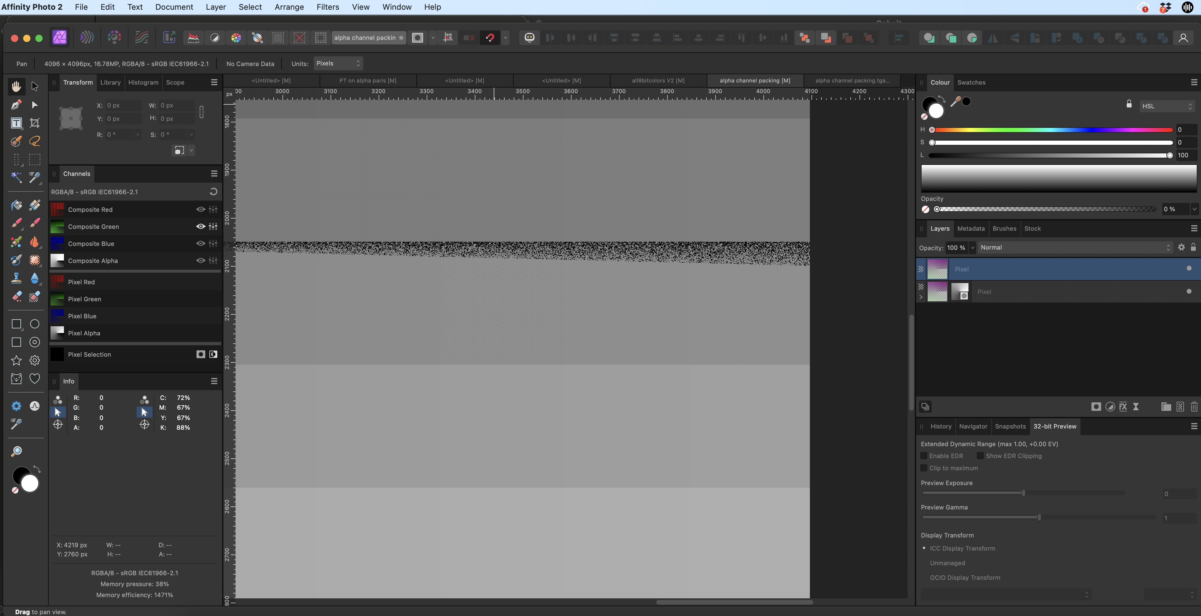
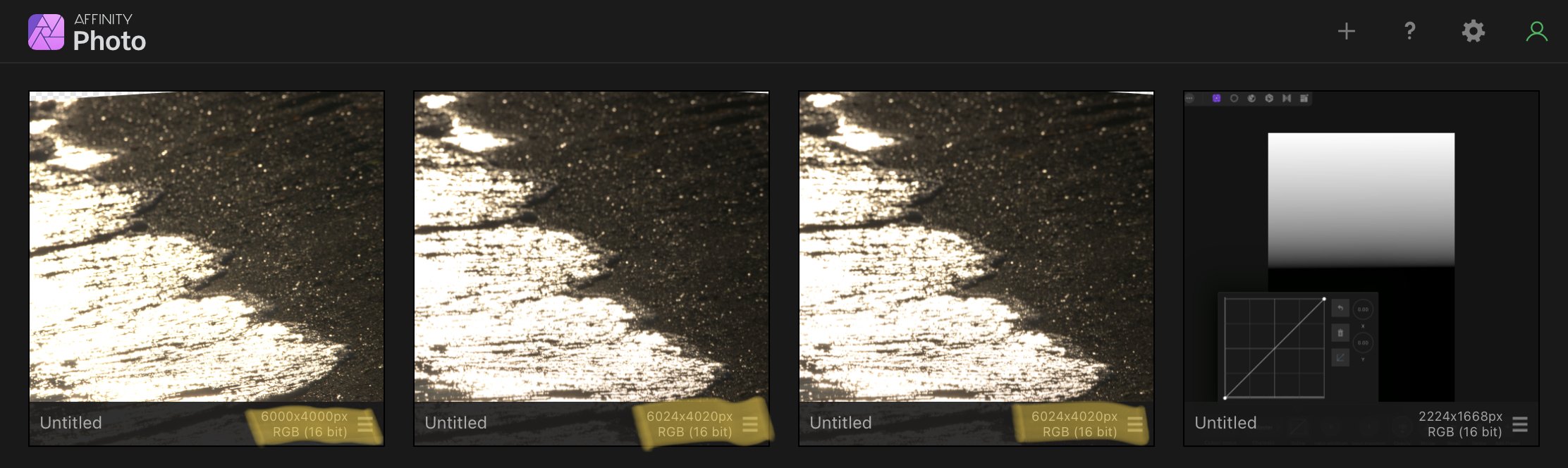
Hi, when I try to convert the document from RGB/16 to RGB/8, black spots will be created in the right-middle area. Best observable when using Chanels panel and choosing only one color channel. The images show green channel. Image 1: RGB/16 (looks ok) Image 2: RGB/8 (black pixels are wrong) Image 3: Conversion alpha channel packing.afphoto
-
This is a Color Test (for my own illumination) and I'm sure others will have some wisdom to share. In the past, the safe route was to work in a wider gamut color space to preserve color and avoid premature clipping (ProPhoto RGB, Adobe RGB, P3, etc), then convert my small JPG files to sRGB for emailing and web posts to be sure other saw essentially what I saw (limited to sRGB, of course). That was a good approach for images heading to an inkjet or to a press too because sRGB whacked a lot of colors that can be printed using CMYK inks (not to mention additional ink colors and spot colors). I have a good friend who is an experienced, color management professional and it's his opinion that converting to sRGB is no longer necessary (with a few limited exceptions here and there). Most browsers and email clients are color managed these days. I respect his judgement, but it's always nice to test and get some confirmation and feedback, which is what this post is all about. I created a composite image in AP v2.4.0 and used Apple's Display-P3 profile in this file. I purposely chose an image that has skin tones, some subtle shades, some bright colorful portions, then added some grayscale and fully saturated color patches for evaluation. I wanted any differences to be visible if they existed. ( I haven't viewed the results on this forum yet, as I am still creating the original post.) I'll attach the original AP file, along with 3 different exported JPG versions, all 2000px on the long side, at 85% JPG quality. 1. First, I exported the Display P3 original from AP and embedded the Display P3 profile in my first export. On my Retina display, that is the brightest JPG of the three, since my display IS a P3 display. So, the color patches retain their original saturation and brightness. 2. Next, I exported the Display P3 file from AP, but on export, I converted the file to sRGB 1966 and embedded that profile in the export. As expected, the saturated color patches are less saturated because they are now clipped to the smaller sRGB gamut. The rest of the image looks pretty much identical on my Retina display and also on an old Viewsonic sRGB gamut LCD display (about 15 years old). That is what I was expecting and hoping for. 3. The third JPG image export I did differently. First, I converted my original AP file from Display P3 to sRGB. Then, I exported to sRGB. The color patches look the same as in No. 2 above, which I expected. My daughter also looks the same overall. However, I was a bit surprised to see that the foliage in the background showed a tonal shift (slightly darker) compared the the sRGB exported from a Display P3 working space. This was the same result on my Retina and Viewsonic monitors. As mentioned, I haven't seen the result as posted on the forum yet, but I will after clicking the "Submit" button. By the way, I chose Apple's "Display-P3" profile for this test. Why? It uses a tone curve that looks identical (or at least very similar) to the tone curve in sRGB. This should minimize any tonal changes between sRGB and Display P3 (which is why I was a bit surprised to see the foliage in No.3 above different from No. 2 above). DCI-P3 (at least the version I have) is an ICC v2 profile and was supposedly designed with cinemas and theaters in mind, so they use a very low white luminance and a gamma of 2.6. For the work I do, I felt Display P3 made more sense. BTW, the Apple Display-P3 profile I have is an ICC v4 profile. So, there it is. I suspect some people will have some interesting feedback, so bring it on!! I'm about to click Submit, so I'll get a look at the post at the same time you do. Thanks. P3-sRGB Test.afphoto
-
Hi @SamMN, It's difficult to comment without having seen both files in the flesh but out of interest if you create a new single-page RGB document using the same page size, dpi and image placement policy and then use Document > Add Pages from File... select your First Document and choose All Pages and Replace Page 1 to add all the pages from the First Document to a New Document then Save and export using the same Digital (High Quality) PDF Preset, is the exported PDF file still 709 MB?
-

Gradient map does not affect color
NathanC replied to Bartek's topic in Affinity on Desktop Questions (macOS and Windows)
Hi @Bartek, To me this looks like a bug, particularly as setting the left node K100 only and the other to 4C black does show a colour gradient on the gradient map dialog, and there is a somewhat similar issue logged with the CMYK sliders failing to convert to RGB correctly. I'll log this with the developers for further investigation and confirmation. -
 When working with wide gamut color profiles it is important to use RGB/16 instead of RGB/8. otherwise you have a high risk of banding effects in areas with smooth gradients. So a agree to the advise, export to RGB/8 and a smaller gamut as last step. Keep all edits in RGB/16 and any suitable wide color format. Also note AdobeRGB and other wide gamut formats do not contain (fully overlap) each other. Depending which colors are actually used in the document, and the intended output (print, lcd display) you may need switch earlier to AdobeRGB (still RGB/16). After exporting, check the exported files for issues like clipped tones or banding.
 -
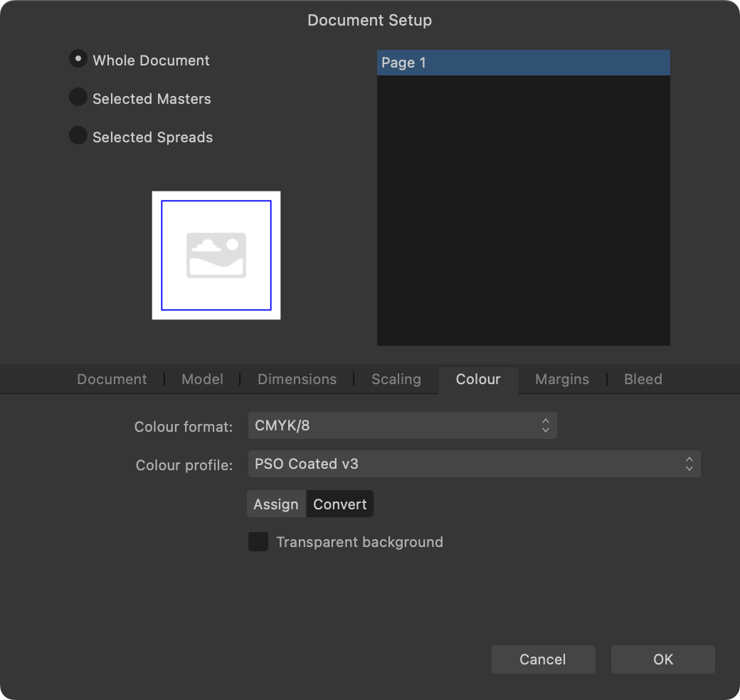
 🇬🇧 Hi, the interface of the three software programs in the Affinity suite seems very well done and quite productive. But everyone also has their own specificities in their workflow and the addition of a utility like Keyboard Maestro can fill certain gaps or innovate with advanced functions. In addition, KM knows how to perfectly replace many other utilities for macOS… 😉 As I am working on a document alternating between RGB mode and CMYK mode, I was wondering about the opportunity to be able to visually know, and without action on my part, the current color mode and the possibility of quickly changing it. to change. Unfortunately, AD does not indicate the current color mode and the procedure to switch from one mode to another requires a lot of clicks on the part of the user (from memory, on other graphics software [?], there is a simple and direct submenu within a menu, associated with keyboard shortcuts…). I haven't found a keyboard command for this function in AD!… The Keyboard Maestro utility has solid arguments for performing macros. This software is a marvel of efficiency and provides very valuable services, whatever the software used or the context. Below is a screencast of the KM interface in AD. Sorry if the action is rapid, but that is also the goal, to make it as transparent as possible. macros live.mp4 Attached is a set of two macros KM for AD. Affinity Designer Format de couleur RVB CMYK Macros.kmmacros.zip In detail, this set includes a first macro for the conversion to RGB and a second macro for the conversion to CMYK. The macros simulate the call to display the “Document Setup” dialog box (Command + Shift + P), a first click on the “Color” Tab, a second click on the “Color Format” Menu and a third click in this Menu on the desired profile. And a final press of the “Escape” key to close the dialog box. The initial position of the mouse is maintained during the macro. The two macros are displayed in a palette, in the form of a button, alternately, one replacing the other with the help of a simple toggle. When opening AD and a document, the last state of the button is displayed, the toggle being managed by KM (with a system variable). It is therefore up to the user to make their choice by clicking on the mode they want. In KM, everything is almost configurable. So, pallets have several options. Their positions are defined by the user, using the mouse while pressing the Command key. For the two icons which symbolize here the RGB mode and the CMYK mode are simple copy and paste of two small illustrations created with AD, inserted in the KM interface, on each of the two macros. There you go, I hope this post will give you ideas to perhaps further improve your workflow… NB: we can also add a function (clicks) to the macro to modify the profile of the “Color” Palette at the same time. Finally, porting this set of macros for AP and for AP is possible, you just need to modify the call up of the dialog box because the menus are different... 🇫🇷 Bonjour, l'interface des trois logiciels de la suite Affinity me semble très bien faite et assez productive. Mais, chacun a aussi ses propres spécificités dans son flux de travail et l'apport d'un utilitaire comme Keyboard Maestro peut combler certains manques ou innover avec des fonctions évoluées. De plus, KM sait parfaitement remplacer bon nombre d'autres utilitaires pour macOS… 😉 Étant en train de travailler sur un document en alternance entre le mode RVB et le mode CMYK, je m'interrogeais sur l'opportunité de pouvoir visuellement connaître, et sans action de ma part, le mode de couleur courant et la possibilité de rapidement le changer. Malheureusement, AD n'indique pas le mode de couleur en cours et la procédure pour passer d'un mode à l'autre demande beaucoup de clicks de la part de l'utilisateur (de mémoire, sur d'autres logiciels graphiques (?), il y a un simple et direct sous-menu dans un menu, associé à un raccourcis clavier…). Je n'ai d'ailleurs pas trouvé de commande clavier pour cette fonction dans AD !… L'utilitaire Keyboard Maestro possède de solides arguments pour effectuer des macros. Ce logiciel est une merveille d'efficacité et rend de très précieux services, quelque soit le logiciel utilisé ou le contexte. Plus haut, un screencast de l'interface de KM dans AD. Désolé si l'action est rapide, mais c'est aussi le but, qu'elle soit la plus transparente possible? Joint aussi le set de deux macros KM pour AD. En détail, ce set inclus une première macro pour la conversion en RVB et une seconde macro pour la conversion en CMYK. Les macros simulent l'appel de l'affichage de la boîte de dialogue “Configuration du document” (Commande + Majuscule + P), un premier click sur l'Onglet “Couleur”, un deuxième click sur le Menu “Format de couleur” et un troisième click dans ce Menu sur le profil souhaité. Et un dernier appel de la touche “Escape” pour fermer la boîte de dialogue. La position initiale de la souris est maintenue durant la macro. Les deux macros sont affichées dans une palette, sous forme de bouton, en alternance, l'un remplaçant l'autre avec l'aide d'une simple bascule. À l'ouverture d'AD et d'un document, c'est le dernier état du bouton qui est affiché, la bascule étant gérée par KM (avec une variable système). C'est donc à l'utilisateur de faire son choix en cliquant sur le mode qu'il désire. Dans KM, tout est presque paramètrable. Ainsi, les palettes disposent de plusieurs options. Leurs positions est définies par l'utilisateur, à la souris tout en appuyant sur la touche Commande. Pour les deux icônes qui symbolisent ici le mode RVB et le mode CMYK sont de simples copier-coller de deux petites illustration réalisées avec AD, insérées dans l'interface de KM, sur chacune des deux macros. Voilà, j'espère que ce post vous donnera des idées afin de peut-être améliorer encore votre flux de travail… NB : on peut aussi ajouté une fonction (des clicks) à la macro pour modifier en même temps le profil de la Palette “Couleur”. Enfin, le portage de ce set de macros pour AP et pour AP est possible, il faut juste modifier l'appel de la boîte de dialogue car les menus sont différents…
- 4 replies
-
- 1
-

-
- affinity designer
- macros
- (and 2 more)
-
Color conversion varies with the same settings
Hangman replied to PeterB.'s topic in V2 Bugs found on macOS
Hi @PeterB., Of course... These are my default settings for both Publisher and Photo... These are the Publisher Colour Settings used when converting the document to CMYK... These are the colour profiles used for your RGB and CMYK JPEG files... RGB CMYK Let me know if I'm doing something differently to you in this process and if so I'll ee if I can replicate it...
-
Color conversion varies with the same settings
Hangman replied to PeterB.'s topic in V2 Bugs found on macOS
Hi @PeterB., I have to say I'm not seeing the same issue... Initial Document Settings Your Publisher document starts out using an sRGB Profile Your RGB JPEG uses a Display P3 profile Your CMYK JPEG File uses a PSO Coated P3 Profile Change the Publisher Document from RGB to CMYK Using the same PSO Coated P3 Profile Place the JPEG files converted in Photo to CMYK into the CMYK Publisher document This is the result I see... Am I doing anything differently to you here...
-
 Layer modes seems use rgb values way background value+layer value but subtract reduces always i feel smaller value form bigger if i want subtract way where bigger cna reduced smaller doing simply black for such areas how i archive it.
 -
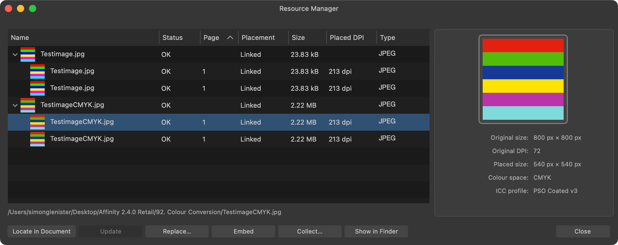
Hi @Dan C, That is correct since a pdf file doesn't have a resolution but it will use the resolution of any embedded raster files when reopened in Affinity apps, so an embedded 300 dpi raster file in an RGB pdf will be reopened at 300 dpi, likewise, an embedded 192 dpi raster file in an RGB pdf will be reopened at 192 dpi... I'm checking this with our development team as I can replicate this behaviour - it's not clear if 'Estimate' when importing a CMYK document would consider that a CMYK PDF is typically used for printing and therefore 300DPI is a sensible estimate, or if this should be imported using the same DPI value as the RGB PDF file. It certainly appears to be the case that Estimate is using 300 dpi for CMYK files, though perhaps one question mark would be, is that correct, i.e., if I create a 1,920 px x 1,080 px Publisher document at 192 dpi and export to pdf, this will reopen in Publisher as a 3,000 px x 1687.5 px, 300 dpi file, so it's not honouring the source dpi the file was exported at and is perhaps not what you would want if you're using a specific dpi for a specific purpose?
-
Set the Colour Format (File > Document Setup, Color tab) to RGB/8 (or 16) and it should export correctly. Currently is set to RGB/32 (HDR).
-
Hi @kasmith479, This appears to be working correctly... See whether you see the same issue with the attached exported PNG file and let us know... I believe the issue you're seeing is because your Designer document is set at RGB/32... If you set it to RGB/8 and export to PNG all should be good... 2024 Orca Swimcaps (red background).png.zip
-
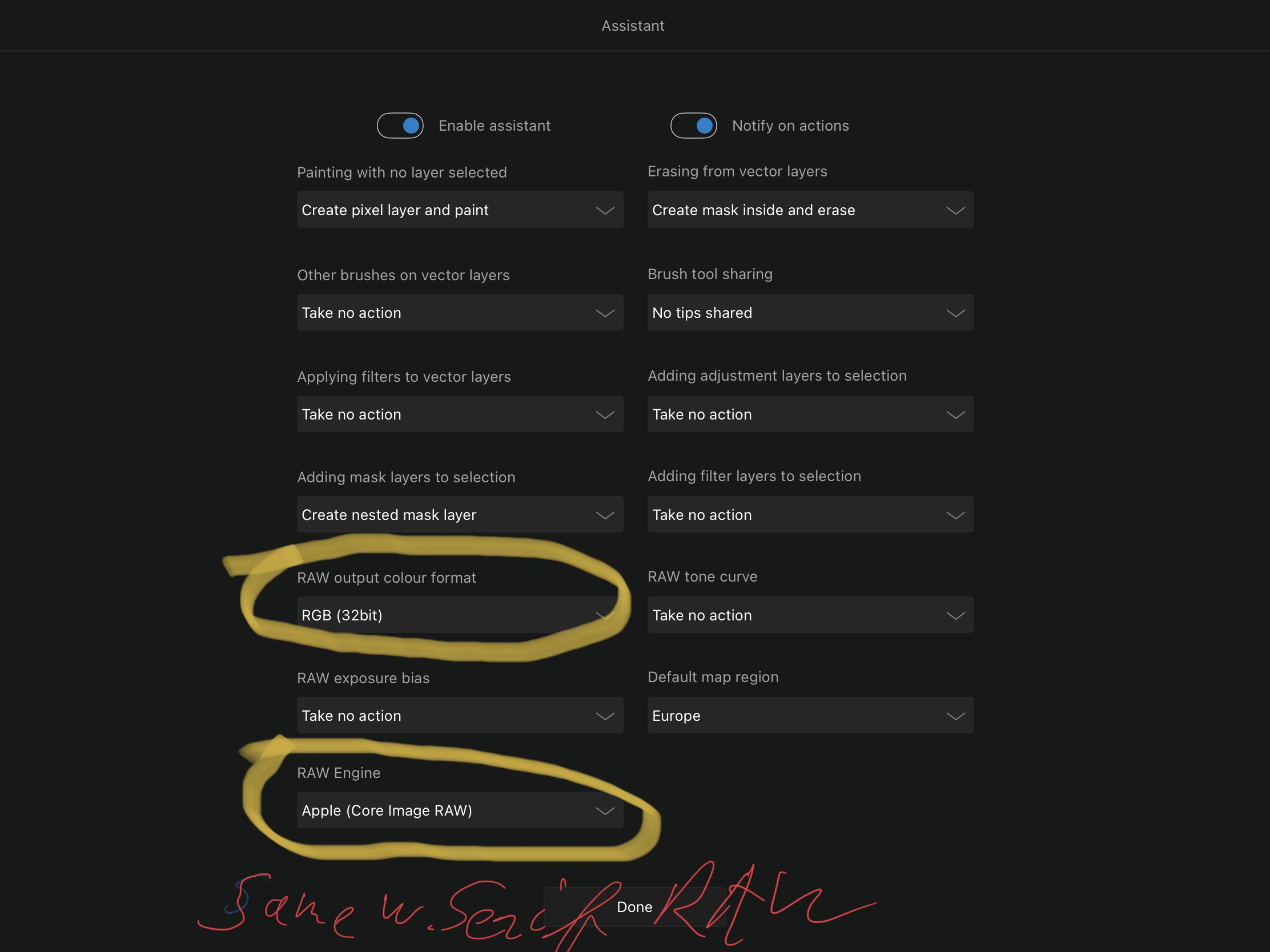
Hi, today i tried to open a CR2 Raw image and develop to RGB/32, after setting the Develop Assistant to do so. Photo always creates RGB/16 images. Tested on 2 iPads, with both Apple and Serif RAW Engine. Photo 1.10.5 IPad pro 2018 iPad 2017
-
PDF for print export problem
lacerto replied to CT15's topic in Affinity on Desktop Questions (macOS and Windows)
Hello @CT15, and welcome to the forums. Can you post a Designer file for inspection? It is not clear whether the document was in RGB or CMYK and colors defined in RGB or CMYK but note that using the Invert adjustment will rasterize the design when you export so it may play part in the problem. -
 You could create a pixels selection using color or tonal ranges: https://affinity.help/photo2/en-US.lproj/index.html?page=pages/Selections/selections_range.html&title=Range pixel selections https://affinity.help/photo2/en-US.lproj/pages/Selections/selections_sampled.html Or perhaps you could use some dynamic masks? https://affinity.help/photo2/en-US.lproj/pages/LiveMasks/mask_liveBandPass.html https://affinity.help/photo2/en-US.lproj/pages/LiveMasks/mask_liveLuminosityRange.html And to see which are the RGB pixels without a CMYK equivalent, you can use the Gamut check in the Soft Proof adjustment: https://affinity.help/photo2/en-US.lproj/pages/Adjustments/adjustment_softProof.html
 -
Hi @Seneca, I don't really have anything specific to say other than the team is still smashing out APIs! We've also had to go back and do some of the less interesting "that can wait" tasks, such as dealing with shut down properly e.g. you start running a script and then decide to shut down the app halfway through its execution - we need to make sure things like asynchronous ops are properly aborted / synchronous waits end gracefully. We've also been re-evaluating the high level JS layers to make sure they were intuitive and usable. We went hell for leather to get bits of the app exposed, but didn't do them in a particularly good way e.g. this kind of sucks: let clrData = new RGBA8(0, 0, 255); let clr = new Colour(clrData); and should be something much more concise like: let clr = RGB(0, 0, 255);
- 655 replies
-
- 5
-
-

-
- automation
- scripting
- (and 3 more)
-
Hi @Dan C, That makes perfect sense... In your original reply when you said "if you change your 'Slider' RGB Hex setting to 16 bit, it's expected for you to see different HEX values when selecting the same colour, using the 'Wheel' vs the 'Sliders." I'd misinterpreted that to mean you'd see a completely different Hex value, i.e., in the same way as you see completely different Hex values when switching from the wheel to the sliders when in Percentage mode on macOS, but if it's #RRRRGGGGBBBB then that makes sense and sounds to be consistent between Windows and Mac... Thanks for clarifying though I'm surprised as this is a simple Base-10 to Hexadecimal conversion and it appears as though this is already being converted correctly on Mac, is there any logical reason why this shouldn't be the accepted conversion? It's no big deal, just curious... The Colour Chooser in v2.4.0 shows 16-bit slider values for both CMYK and RGB in 8-bit mode on Mac which appears to be a regression from v1 where the Colour Palette reflects 8-bit mode with the Colour Chooser also showing the values in 8-bit, but in 16-bit mode we see the reverse of v2.4.0 in as much as the Colour Palette displays 16-bit CMYK values but the Colour Chooser displays 8-bit slider values though based on your description above even this appears to be incorrect since the Sliders above the waterfall in the Colour Chooser aren't displayed using your Colour Studio settings even there in 16-bit mode... V1 CMYK Sliders in 8-bit Mode V1 CMYK Sliders in 16-bit Mode Anyway, now that this is all logged, hopefully, we'll see these issues rectified in a future release... Many thanks for taking the time to compare, clarify and explain what we should and shouldn't be expecting to see... very much appreciated as always...