Search the Community
Showing results for 'ROMM RGB'.
-
I suspect from that screenshot that image in the release version is 32 bit linear so its a different sub-set of profiles based on that image type. I understand that ROMM RGB is similar
-
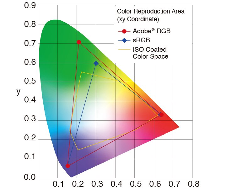
 You can setup and use it as an default on your Nikon Z6 for JPGs. Since the Adobe RGB color space has a wider gammut (color space) than sRGB ... ... it can showup more colors for JPGs here, as far as it has been generated/developed in cam in the Adobe RGB developed color space and it's icc profile is embedded in those final out of cam JPGs. Note however, that RAW images don't contain any color space at all. RAW files offer, so to say, initially just a mathematically color free space, or with other easier words said, the full spectrum of possible colors the hardware (the cam) can physically offer. - A color space in any RAW converter (Affinity here too) is usually assigned after the RAW develop process, meaning the developed RAW file are mapped afterwards color wise to a color space. The huger the color space (gammut) the more possible colors can it transport and show (...as far as the display output devices, like LCD monitors, tablets, iPhones etc. do supports to show up that much colors at all). Well sRGB is the lowest common denominator here, since pretty much all displays can at least show it up in terms of colors. So if you capture JPGs with/in an assigned sRGB color space, you obviously use sRGB in AP too! - Using Adobe RGB instead makes sense for working image manipulation wise in that color space, since it offers more color possibilities. Though in the end you will mostly let the result be mapped to sRGB again, since that is the common display standard in term of colors all devices can show up. - If you have some better pro display monitor, which can showup nearly the whole AdobeRGB color space, then using the Adobe RGB color space and icc profiles is of an advantage during image workings. - However note again, that only better screen devices can make use of the more/extra colors here, if you assign the Adobe RGB icc profile to your JPG images! The AP RAW develop persona shows you your to be developed images in a very wide gammut (one of the widest available color spaces), usually something like ProPhoto/ROMM RGB here. Since you are there in a RAW development state then and there all possible colors must be presented (even your display monitor wouldn't technical be able to show up all of those colors at all). Now after you developed the image and take it over from the Develop Persona into the Photo Persona for further image manipulations, comes the interesting part of what color space to use an image here then. Here again, the higher/wider the color space the more you can tweak and work with colors overall here, as far as you have a good pro calibrated monitor/display. So you can continue your working here in a higer color space than sRGB, let's say ProPhoto or Adobe RGB etc. But when you finally save/export your image as an JPG/PNG etc. you would then let it be generated and color mapped for sRGB, since as I said before, this is the lowest common denominator here, which all display devices can show up nearly equally. So if you give away or share your final developed and worked out images, you should store then for the sRGB color space with an embedded sRGB color profile! Well there are many (too many) photo sides which deal with all this materia, thus I will name only one common quite good one here: https://www.cambridgeincolour.com/
-

RAW Output
CharlesG replied to CharlesG's topic in Pre-V2 Archive of Affinity on Desktop Questions (macOS and Windows)
I am editing for printing and plan to have the colour profile as sRGB for the printers, should I edit in Adobe RGB or ROMM RGB and then export in sRGB? What about soft proofing? -

RAW Output
RichardMH replied to CharlesG's topic in Pre-V2 Archive of Affinity on Desktop Questions (macOS and Windows)
You have sRGB in Photo Persona. It is a smaller colour space. Suggest you change Colour Profile to Adobe RGB or ROMM RGB in preferences. (Edit->Preferences->Colour)
-
 I think it is able to do by virtue of being able to use ROMM-RGB as an RGB profile when device-specific profiles are not available (I have no clue why this profile can be used but e.g. sRGB or Adobe RGB cannot). All other RGB profiles that I can use (checked this on three devices, including macOS) are device RGB profiles.
 -
 Hello! I watched the Affinity-Tutorial "ProPhoto cs sRGB" some days ago and started to try this for my workflows. The first obstacle to overcome was, that on my mac there was no prophoto icc-profile. In this forum i found a post about that, where is was shown, that the ROMM RGB Profile should be the same. This profile is on my mac, so I gave it a try! But one thing about the ROMM-Profile I didn´t understand. In the forum-post was a link to the ICC-website to download the ROMM.icc file. I also downloaded the profile (unless the romm was on my mac) just to compare the one on my mac with the one downloaded from ICC. The one on my mac is dated with 2015 or so and the one freshly downloaded was dated with about 2006!? The settings shown via the color-sync app on my mac are also not the same... so is the ROMM on my mac still the same profile than the one from ICC? And are those really the same like the prophoto?? After my try on one of my actual projects - I tryed the same workflows than in the tutorial videos - I got stuck with some troubles... - converting my sRGB Image to the ROMM was as expected. And in some details the result of my project changes quite positively. I could really see that the bigger gammut gave some adjustment- and filter-layers more room to work. - then i tryed to export the project - like on the tutorial - via the export dialog as an jpg with an sRGB profile again. But the result was not the same, then. The color shift wasn´t the problem! The sharpness of my foto got lost? What I couldnt understand. Exporting a jpg directly from my original project file (in sRGB, not converted to ROMM) looked much better, sharper, like it should look like! So the jpeg out of the "sRGB-aphinityfile" and the jpg out of the "ROMM-aphinityfile" look enormous different, but not like the nice differences I could watch via the profile-conversion. The third and last issue on that is about the soft proof. Because my actual projects will be printed on fine art paper I use the soft proof from the producer to check the gammut. after the romm-conversion it is much more difficult to get rid of the "black" surfaces the gammut check shows. What is expected, because the romm have a much greater gammut. But maybe you can give me some tipps to handle this better, because even in my sRGB projects it is quite difficult to reach the gammut of the producer (the fine art paper) - can it be, that the gammut of this fine art paper is rather small compared with sRGB (and smaller compared with romm)? I watched the tutorials about soft proofing, but on my projects it seems much harder to reach the soft proofed gammut. Thanks for help! the icc profile for my soft proof is attached, as well as the two romm profiles, the one from my mac and the one from ICC. (Wasn´t allowed to upload the icc files) Thanks!! Andreas
 -
 Walt, thank you for you quick response. You make an excellent point. When it comes to colorspace and profiles, I am out of my depth. I'm not sure linear profiles are limited to 32 bit. At least that doesn't seem to be the case for darktable's raw processing. Nonetheless, the only built-in Prophoto profile in darktable is linear. It would appear that AP isn't recognizing this profile. I am not able to locate the linear prophoto profile in the darktable installation files in order to provide it to AP. As a work around, I have taken the ROMM RGB profile from AP and loaded it into darktable as a new output colorspace. This seems to have done the trick. This seems to give the same result as converting the file to ROMM RGB within AP. I am also able to convert from linear prophoto to ROMM in ACDsee and Krita. However, Krita seem to be able to recognize a correctly display the linear prophoto profile. In the end, I am unlikel to work in ROMM very often, but wanted to be able to in there was a need. Thanks again and Happy New Year.
 -
Color Space
v_kyr replied to CharlesG's topic in Pre-V2 Archive of Affinity on Desktop Questions (macOS and Windows)
Read the following article about color management, which deals with the different color spaces their pros/cons etc., it gives a good common overview here! - Note that ROMM RGB = ProPhoto RGB here! Fine Art printing, part 2 Color Management (Google translated to english) Drucken, Fine Art Printing, Teil 2 Farbmanagement (German original article) -

Lab channels (split)
PhotoHobby replied to PhotoHobby's topic in Affinity on Desktop Questions (macOS and Windows)
While going directly to converting the raw document to LAB/16 in AP1 allowed me to get to the background properties assigned to the channel subcolors described above it didn't in AP2 to my knowledge. But when I followed James Reston's method to first assign the ROMM RGB color profile and then convert the document to LAB/16 the background: lightness, AOpponent and BOpponent methods are still available in AP2. What's more the color profile is strikingly better when the correct steps are taken. -
Hi Chris, Found the problem ....... Dodge and Burn not working in 32bit ROMM RGB ..... I changed to 16bit ROMM RGB and the tools work ... also in 8bit ROMM RGB they are working. Is this a bug !!!! cheers Colin
-
 Well, you don't have to have an answer to this questions, but I'm hoping that someone from Serif has an answer. As long as everyone is designing in the sRGB color space for electronic displays, no one need worry about color gamuts. But if one is alternately designing for sRGB devices, then wider color gamut ROMM RGB display devices, and then much smaller color gamut CMYK print output, one needs to be concerned about specifying "in-gamut" colors. How does Serif expect one to manage these color space gamut issues? How does the Affinity software prevent someone from (or warn someone against) using the Lab color model sliders to spec an out-of-gamut color for their CMYK document?
 -
 This sentence alone can be misinterpreted... I meant only with32 bits, color grading has no sense, because 32 bits is meant for tones. However when you combine ROMM RGB with 32 bits, then yes. First because the colourspace is large enough, so colour grading have space to find the right chroma, and adding the 32 bits depth, it also has room for the right intensity, without being stuck between 2 values (0 and 1). That's why I added ROMM RGB or Rec.2020 for colour than tones. A good combination is a large colour pace and a large bit depth. That's why I'm trying to try to find a process with Affinity keep this combination as long as possible before exporting. As for my background history, I was using Lightroom as my developing software, and wanted to move away. Last year I started looking around and tried Darktable. This is were I learned most of colourspace, linear etc... (and started a youtube channel of my journey of learning). I'm far from knowing everything. That's why I'm asking questions here.
 -
 Perhaps it is helpful to keep in mind that colour spaces (format) and colour profiles are two different things. Spaces are RGB and CMYK. Profiles are AdobeRGB, sRGB, U.S. Web Coated (SWOP) v2, PSO uncoated V3, ... RGB SPACE is for Monitors/Displays adding light to mix colours. => Adding Red + Green + Blue = white on your display. Within the RGB space, RGB PROFILES are for example sRGB, AdobeRGB, ROMM RGB etc... CMYK SPACE is for printing ink on paper to mix colours. => Adding Cyan + Magenta + Yellow = Black (or close to black) + K (black) to make things even darker. Within the CMYK space, CMYK PROFILES are for example PSO uncoated V3 FOGRA 52 ... U.S. Web Coated (SWOP) v2 ... So, switching from one space to the other, you will always have to change the profile as well, or not? Correct me if I'm wrong here... At least in Photo I can't select a RGB profile when I'm in CMYK and vice versa.
-
 It would be easier if you can say what color profiles your display is supporting. E.g. my LG monitor supports sRGB, AdobeRGB, DCI-P3, and the last has the widest gamut. If i would edit a document with ROMM RGB, some colors cannot be displayed correctly and would be clipped / transformed to similar colors within the visible range of DCI-P3. I would not be able to see the actual colors, unless i switch to a ROMM RGB capable display. The other way, editing sRGB is no problem, as DCI-P3 can render all possible sRGB colors (without clipping).
 -
.thumb.jpeg.6f143e8223547aba974205ef53397036.jpeg) Hopefully this can clarify the issue and also clear up the concerns that Photo is discarding or throwing away anything outside of sRGB: RAW files opened in Develop go through an image processing pipeline, during which the colour information is extracted and processed—the colour space used for these operations is ROMM RGB because it provides a suitably large resolution and enables colour values to be saturated and manipulated without clipping to white. This choice of colour space was introduced in version 1.5 where there was a marked improvement in RAW files with intense colour values (e.g. artificial lighting). However, the actual document profile is in sRGB—this means the final colour values sent to the screen are restricted to sRGB. Is this deficient? Yes, and there have been discussions about how to tackle it without risking further complication for people who don't use wide colour profiles. There is a silver lining though. RAW files are developed in an unbounded (float) colour space, which means all the values that fall outside of sRGB are not clipped or discarded. If you were to then set your output profile to a larger colour space like ROMM RGB, these out of bound values can be accommodated by the larger resolution of that colour space. Essentially, you can avoid clipping values outside of sRGB when clicking Develop, and you can get them back once you're in the Photo Persona: the issue is that you can't see these values within the Develop Persona. I've experimented with one of my photographs of some intense lighting to back this up, and have attached it to this post for people to experiment with. I've also compared the results versus Photoshop CC 2019 (where you can set the colour space and it will actually affect the view transform) and, minor processing differences aside such as sharpness and lens distortion, have been able to match the intensity of colours. For Photoshop I also used ROMM RGB and increased saturation directly in the Camera Raw module. Here's the RAW file for you to try out: _1190462.RW2 Steps for this experiment: Enable Shadows/Highlights and drag the Highlights slider to -100%. Avoid any colour or saturation adjustments, add other adjustments to taste (e.g. noise reduction). Enable the Profiles option and set the output profile to ROMM RGB. Click Develop. Once in the Photo Persona, add an HSL adjustment and increase Saturation all the way. You'll be able to dramatically saturate the image without losing resolution. If you close and re-open the RAW file and try to increase the saturation within Develop, you'll notice that the colour values are restricted to sRGB—however, even with values at the limit of sRGB, you can still set the output profile to ROMM RGB and then increase them further once in the Photo Persona. And below are two images, one still in ROMM RGB, the other converted to sRGB. I'm not sure how they will display on the forum (and whether the forum software will process and convert the colour profile—hopefully not!) but feel free to download both and view them in a colour-managed application or image viewer. If your display is capable of reproducing wide colour gamuts, you should see a noticeable difference between the two. [Edit] OK, that didn't work, the forum software converts to sRGB and ruins the comparison. Here's a Dropbox link to the JPEGs and RAW file where you can download the original files: https://www.dropbox.com/sh/aof74w94f6lm3d2/AABXE2OJMfk__kjA_jb6vwmia?dl=0 Hope that helps! James
Hopefully this can clarify the issue and also clear up the concerns that Photo is discarding or throwing away anything outside of sRGB: RAW files opened in Develop go through an image processing pipeline, during which the colour information is extracted and processed—the colour space used for these operations is ROMM RGB because it provides a suitably large resolution and enables colour values to be saturated and manipulated without clipping to white. This choice of colour space was introduced in version 1.5 where there was a marked improvement in RAW files with intense colour values (e.g. artificial lighting). However, the actual document profile is in sRGB—this means the final colour values sent to the screen are restricted to sRGB. Is this deficient? Yes, and there have been discussions about how to tackle it without risking further complication for people who don't use wide colour profiles. There is a silver lining though. RAW files are developed in an unbounded (float) colour space, which means all the values that fall outside of sRGB are not clipped or discarded. If you were to then set your output profile to a larger colour space like ROMM RGB, these out of bound values can be accommodated by the larger resolution of that colour space. Essentially, you can avoid clipping values outside of sRGB when clicking Develop, and you can get them back once you're in the Photo Persona: the issue is that you can't see these values within the Develop Persona. I've experimented with one of my photographs of some intense lighting to back this up, and have attached it to this post for people to experiment with. I've also compared the results versus Photoshop CC 2019 (where you can set the colour space and it will actually affect the view transform) and, minor processing differences aside such as sharpness and lens distortion, have been able to match the intensity of colours. For Photoshop I also used ROMM RGB and increased saturation directly in the Camera Raw module. Here's the RAW file for you to try out: _1190462.RW2 Steps for this experiment: Enable Shadows/Highlights and drag the Highlights slider to -100%. Avoid any colour or saturation adjustments, add other adjustments to taste (e.g. noise reduction). Enable the Profiles option and set the output profile to ROMM RGB. Click Develop. Once in the Photo Persona, add an HSL adjustment and increase Saturation all the way. You'll be able to dramatically saturate the image without losing resolution. If you close and re-open the RAW file and try to increase the saturation within Develop, you'll notice that the colour values are restricted to sRGB—however, even with values at the limit of sRGB, you can still set the output profile to ROMM RGB and then increase them further once in the Photo Persona. And below are two images, one still in ROMM RGB, the other converted to sRGB. I'm not sure how they will display on the forum (and whether the forum software will process and convert the colour profile—hopefully not!) but feel free to download both and view them in a colour-managed application or image viewer. If your display is capable of reproducing wide colour gamuts, you should see a noticeable difference between the two. [Edit] OK, that didn't work, the forum software converts to sRGB and ruins the comparison. Here's a Dropbox link to the JPEGs and RAW file where you can download the original files: https://www.dropbox.com/sh/aof74w94f6lm3d2/AABXE2OJMfk__kjA_jb6vwmia?dl=0 Hope that helps! James
-
 Your original artwork is in ROMM (ProPhoto) RGB in 8bit. This is a large gamut color space and is not really amenable to saving or manipulating in 8bit color precision - however, that is not such a big deal here, as there are only 2 colors and no gradients, etc When you print, you need to specify the RENDERING INTENT of the conversion that is done from the working/source color space of the file into the output color space of the printer. There are four rendering intents: Perceptual Relative Colorimetric Saturation Absolute Rendering intents are different ways to instruct a conversion of a large gamut color space into a smaller space - they differ in how the colors that are out of gamut in the larger space get translated into the smaller space. For graphical artwork such as your logo, saturation rendering intent is probably best, as it will tend to preserve the blue in the logo. I am not sure how the PDF artwork was generated, but for printing the rendering intent can make a huge difference with colored graphics, versus a photographic image, for example. You do not want to convert into or assign the printer ICC profile to the artwork in Affinity Photo - just print from the source color space (ROMM RGB), specify the printer-paper ICC profile in the print dialog and tell the printer what rendering intent you want to use - the print driver software will do the appropriate conversion. You can use the printer's ICC profile to soft-proof the image in Affinity Photo - add a soft proof adjustment layer to the document and then specify the printer's ICC profile as the device you want to simulate and see if you can reproduce the problem on screen. You can also try converting the image's color space to a smaller working color space like AdobeRGB or sRGB to reduce the gamut prior to printing. Without more detail regarding your workflow, it is difficult to tell exactly why the blues in your logo are turning black. Somewhere along the way, color management decisions are being made without your full control or knowledge and the color numbers are being interpreted differently than you want/expect them to be. Kirk
 -
@anon2 Thanks for your reply. Based on that I tried the following: no convert the final panorama but convert the individual images and then make the pano from them. first I re-enabled the "Convert opened files to working space" - Option then I opened all images individually, (they are auto-converted from sRGB to ROMM RGB) and saved them again (ROMM RGB). after that I used the panorama-tool again with those converted images and the result was fine. To me, this is evidence that you are right ("..just assigns the ROMM profile without converting the pixel values..") and makes me more secure that no color-information is lost during the panorama-stitching since the ROMM-RGB gamut is wider/bigger than sRGB. Thanks. Fritz
-
Color Space
CharlesG replied to CharlesG's topic in Pre-V2 Archive of Affinity on Desktop Questions (macOS and Windows)
Ok, so do you stay with the default color space throughout editing and then convert once you have a finished image? For me, when I open a RAW file in the develop persona the color space is sRGB. Should I keep this colour space throughout editing and into the photo persona? Should my default color space be something other than sRGB when opening a RAW file? I'm sure you saw above that RichardMH recommended switching to ROMM RGB, as it is the largest color space. -

ROMM RGB soft image
T.Zed replied to T.Zed's topic in Pre-V2 Archive of Affinity on Desktop Questions (macOS and Windows)
Hi Lee, Thank you for replying back, but I’ve sorted out the problem since I posted that message. It isn’t a ROMM RGB vs sRGB thing causing the softness that I first thought. It appears that when you go from, Open to Browser to select your RAW image, then to the Develop Persona, then eventually to the Photo Persona as per normal editing, the image softens. And it’s soft because I wasn’t sharpening the image in Develop first; I’ve only ever done that in Photo not knowing any better. I only noticed this recently, because it was the first time I decided to edit an image from start-to-finish using the latest Affinity version ( and trying out ROMM RGB as well for potential printing down the track ) and not going through Nikon View then to Affinity to finish off the image like I have in the past. It sure is a learning curve. Anyway, many thanks again for your time and interest. Cheers! Tony -
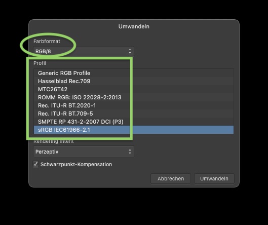
 First, a RAW image does not have a color profile. It is simply the raw sensor data; what the camera saw. Any clipping would occur during the Develop process, when Photo creates a developed image from the RAW image. At that time, the settings in the Develop Assistant determine whether Photo produces a 16-bit RGB image or a 32-bit RGB image. In Preferences/Color you can specify the color profile to use with 8- or 16-bit RGB images, and you can specify the color profile to use with 32-bit RGB images. When you press Develop, Photo produces an image as specified in the Develop Assistant (16-bit RGB or 32-bit RGB). Before you press Develop, while operating in the Develop Persona, Photo will display and (I think) operate on the image using the color profile specified in Preferences/Color for the kind of image that will be produced when you press Develop. So, for example, if I have told the Develop Assistant to produce a 16-bit RGB image, and I have told Preferences/Color that my preferred color profile for 16-bit images is sRGB IEC61966-2.1, then the Develop Persona will be operating with that profile applied to my RAW image. At least, that's my current understanding, and if I open a RAW image with those settings, and look in the Develop Persona's Info Panel, it says that sRGB IEC61966-2.1 is being used. On the other hand, if I have told the Develop Assistant to produce a 32-bit RGB image, and I have told Preferences/Color that my preferred color profile for 32-bit images is "ROMM RGB: ISO22028-2:2013 (Linear)" then the Develop Persona will operate with that profile applied to my RAW image. If I open a RAW image with those settings, the Info Panel will say that the image profile is "ROMM RGB: ISO22028-2:2013 (Linear)". As ROMM-RGB is a much wider gamut profile than sRGB, less clipping will occur when I press Develop. Of course, even in case 2, at some point I will have to display or print the image. At that point, the characteristics of the output device come into play, and further clipping may occur.
 -

.780 : Color-issue with OpenCL
Chris B replied to Fritz_H's topic in [ARCHIVE] Photo beta on Windows threads
I can reproduce this if I'm using ROMM RGB. But that's true of the retail version wich doesn't have OpenCL. OpenCL seems to give me the correct render when using ROMM RGB as if I use the retail and set ROMM RGB I get the green cast. The first part of the video shows what I'd expect to see when OpenCL is on. The second part of the video, when you turn it off shows the green cast and looks wrong to me. -
In the Designer file you have the underlying RGB color values defined in ROMM:RGB: ISO 22028-2;2013, and in the Publisher file you have them defined in sRGB. If you assign the former to latter, or latter to former, you get identical colors in view whether your document color mode is CMYK or RGB. In the video, I reverse the underlying RGB color modes without changing a single color value and end up having the Publisher document showing as your Designer document showed, and vice versa: underlyingrgb.mp4 So the apps and palettes work as they are designed. Affinity Publisher and Designer have dual color modes but that is not so obvious because the underlying "other" working space is not explicitly shown.
-
I noticed the same behavior in 2021 with version 1.10.4.1198. Like you I had set my color profiles to "ROMM RGB" for both RGB and "32bit RGB". A noticeable color cast was introduced in the exact same step as you described. I switched the "RGB Color Profile" back to "sRBG" and the issue is gone. Color profiles can always be good for surprises... This old discussion was a great help for locating the solution in the settings. 👍
-
I exported from darktable a 16Bit tif in linear prophoto rgb colorspace. I opened this document in AP (first attachment as screenshot). AP seems to be crushing the blacks with a purple cast in the shadows. I've opened the same file in several other programs (Capture One, Capture NXd) and the file seems to be rendered much closer to what it does in darktable. Then I convert the file to ROMM RGB and it seems to lighted the shadows and remove the color cast (second attachment as screenshot. Is it possible that AP is not recognizing the tif file color space properly, i.e., it doesn't recognize linear prophoto rgb as ROMM RGB? I've also attached the 2 tif files. DSC_2409_Prophoto.tiff DSC_2409_ROMM.tiff
-
 @R C-R: Yes, I was sure. Furthermore, how many bits (16 or 32) which color format (8-, 16- or 32-bit RGB, etc.) and which ICC profile (sRGB, Adobe RGB, ROMM RGB) are used during the processing, especially in the Photo persona, seem to be three independently configurable aspects of the processing, an impression that one doesn't automatically get when one learns that the Develop persona works in 32-bit float and uses the ROMM RGB profile. Indeed, I had assumed up until now, that ROMM RGB implied 32-bit processing and 32-bit RGB color format, and that the advantages of both developing and editing using 32-bit floating point calculations in ROMM RGB would outweigh the slowness of floating point calculations. I think I, at least, really need to understand what @James Ritson was warning against when he wrote, "Honestly, I wouldn't recommend touching 32-bit unless ... ." Did he mean color format 32-bit RGB or 32-bit floating point processing, or are these equivalent for him. Specifically, too, I would like to know some of the pitfalls of "32-bit" to which he alludes.


.png.29bf0787ffb254d55523da176f114b94.png)
.png.9e9d4d945277f3ac987bcff4afa96281.png)