kirkt
-
Posts
440 -
Joined
-
Last visited
2 Followers

Recent Profile Visitors
3,255 profile views


-
 aslusers reacted to a post in a topic:
Masking does not work
aslusers reacted to a post in a topic:
Masking does not work
-
 AlexRonda reacted to a post in a topic:
Editing a mask?
AlexRonda reacted to a post in a topic:
Editing a mask?
-
DeJeanB reacted to a post in a topic:
Window Pulls in real estate photography
-
SuffolkCindy2 reacted to a post in a topic:
New camera canon EOS R not downloading to Affinity in good quality.
-
ThatMikeGuy reacted to a post in a topic:
Node-based UI for AP. Please?
-
 ambersand reacted to a post in a topic:
Pasting Images Into Alpha Channel
ambersand reacted to a post in a topic:
Pasting Images Into Alpha Channel
-
Something you can also add in a macro. Nice tip. Kirk
-
kirkt reacted to a post in a topic:
Pasting Images Into Alpha Channel
-
@Tatom You might consider using "Apply Image" which is macro-able and will pack channels with equations, bringing in each external texture file and placing it in the channel of your choosing in your working document - you do not even need to open the texture files to copy and paste them (you don't need to do this in PS either, because you can also use Apply Image in PS). If you have a disciplined workflow, where each texture is named according to a consistent naming convention and you place them in a directory where the macro is made to look, then the whole process is a matter of clicking the "Play" button on the macro. One problem with packing the alpha channel is that it is premultiplied into the composite, which burns it into the R, G and B channels. Not good for channel packing. Kirk
-
Nita Reed reacted to a post in a topic:
Affinity Photo - Resolution
-
Affinity Photo - Resolution
kirkt replied to Nita Reed's topic in Pre-V2 Archive of Desktop Questions (macOS and Windows)
You are welcome! kirk -
kirkt reacted to a post in a topic:
Affinity Photo - Resolution
-
@SuffolkCindy2 You may want to elaborate - rubbish as in, what? Is your version of Affinity (Photo, I am assuming) up to date - meaning, does it support the relatively new .CR3 raw file format correctly? I downloaded an EOS R raw file (.CR3 file) from imaging-resource.com here: https://www.imaging-resource.com/PRODS/canon-eos-r/Y-JG-458A0719.CR3.HTM and opened it in AP v1.10.1 on Mac OS 11.6 (Big Sur) with no problems. There is nothing particularly glaring about the image that would cause me to think there is something wrong with the conversion. Upload the raw file to a post in this thread and readers can take a look at it and see if they can reproduce your problem, once you describe the problem. Also, Canon DPP software uses screen drawing that always looks a lot sharper than other applications - at least it traditionally has, I have not used it for a while now. All raw converters will render the raw data somewhat differently. Take a screenshot of an offending raw file opened in the Develop persona and post the screenshot here so we can see what you are talking about. If the conversion looks like it has been tinted pink or purplish across the entire image, then you need to update your version of AP - that is a telltale sign of a raw converter working with a file that it does not support. kirk
- 1 reply
-
- 1
-
-
Affinity Photo - Resolution
kirkt replied to Nita Reed's topic in Pre-V2 Archive of Desktop Questions (macOS and Windows)
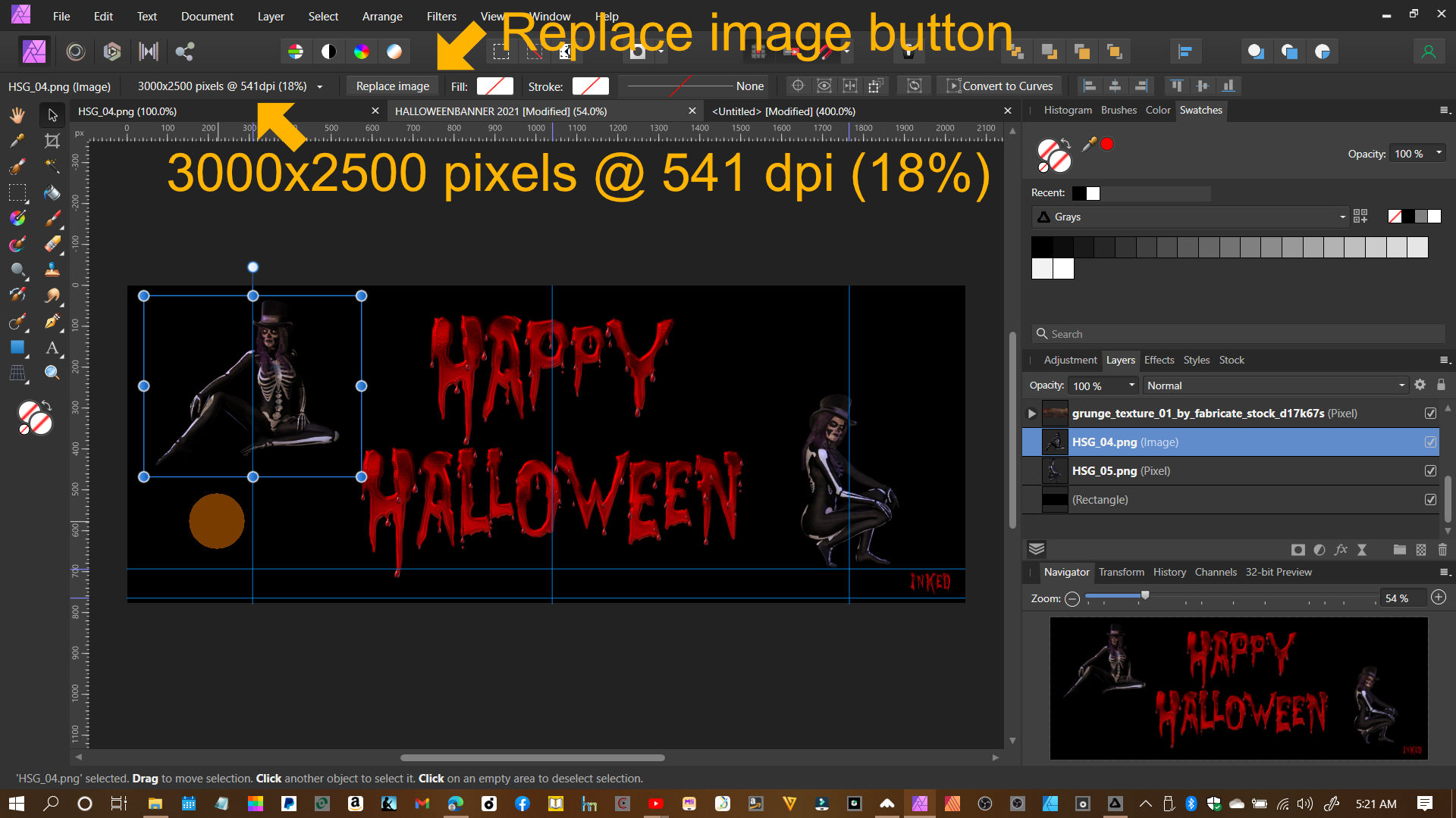
Here are the data and Replace image button in your screenshot, for reference. Note that the data/button are displayed when you have the Move tool active. kirk
-
Affinity Photo - Resolution
kirkt replied to Nita Reed's topic in Pre-V2 Archive of Desktop Questions (macOS and Windows)
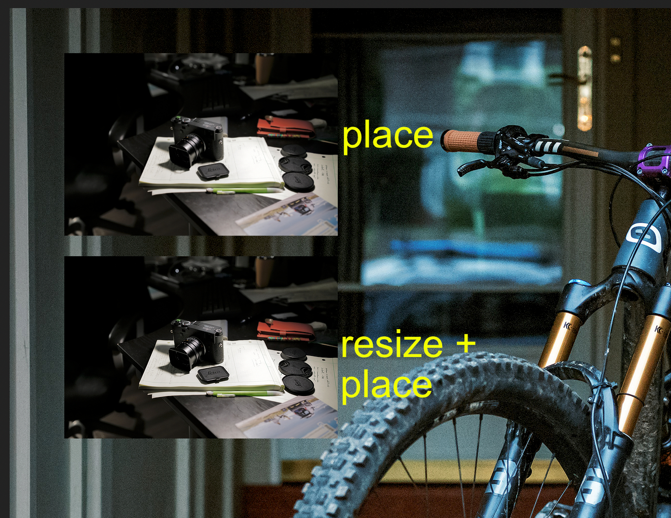
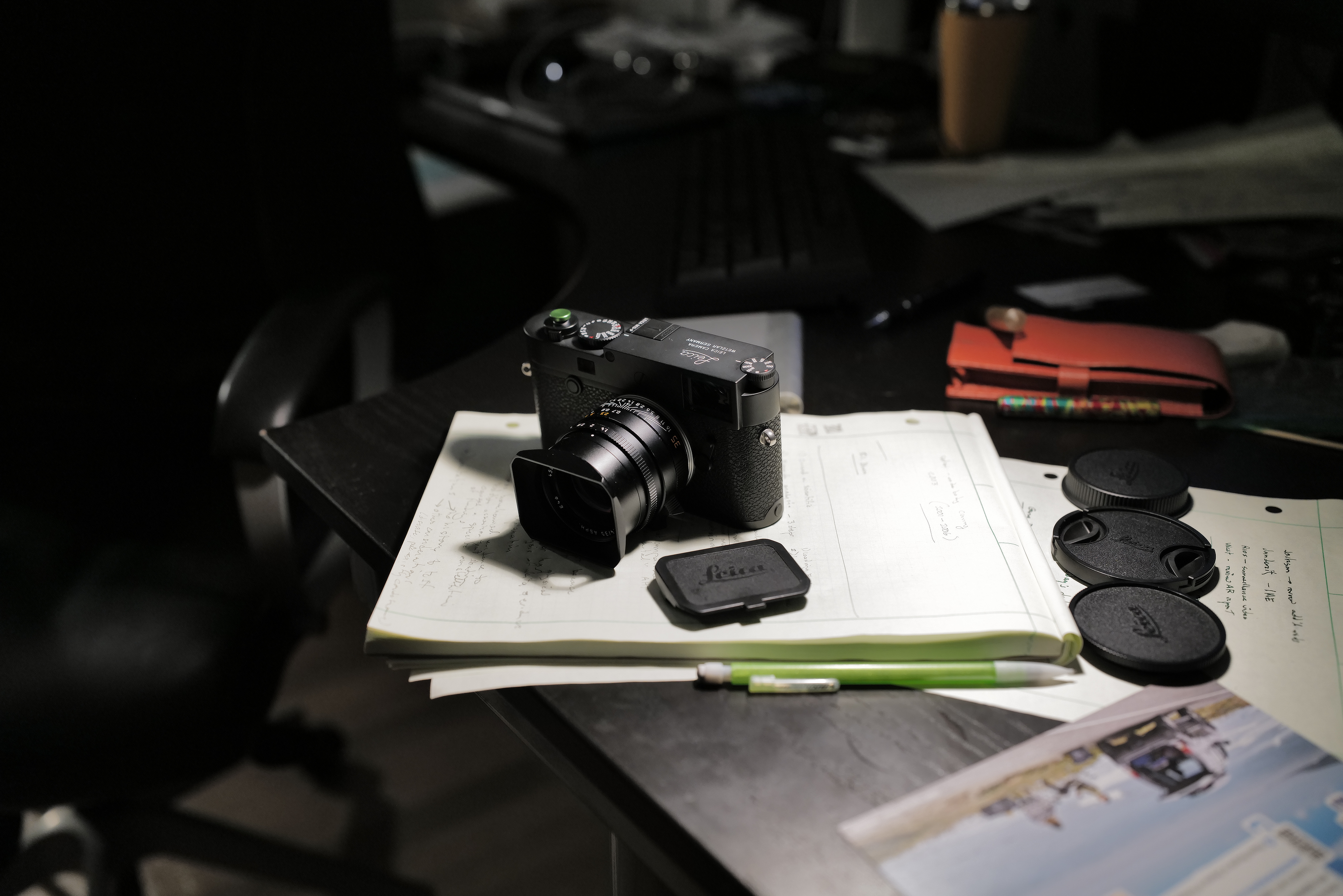
@Nita Reed Try this - perhaps it will improve the end result. 1) Use "Place" as you have been to bring your external image (the Source image at the source resolution) into your banner layout (the Destination image at the destination resolution) and set its position and size within the banner's composition. 2) Once that is set, note the percentage reduction (i.e., the percentage of the original, full-sized image) that the context toolbar is displaying for your placed image. In your screenshot, this data reads "3000x2500 pixels @ 541 dpi (18%)" - so note that the working image size that you ultimately want from your full-res image is 18% of the original. This data will be displayed when you select the Placed image layer with the MOVE TOOL active. 3) Open the original artwork and resize the document to 18% of the original size. AP makes this easy - you can enter "18%" into the width or height field in the Resize Document dialog box. ALSO - choose a more accurate resampling algorithm, like Lanczos 3, or a smoother algorithm, like bicubic. Experiment to see what works best for your images. Now export this resized image as a PNG or whatever - name it something useful like <imagename>_18.PNG or whatever. 4) Back in the banner document, WITH THE MOVE TOOL ACTIVE click on the low-quality image you placed there originally and click on the "Replace image" button in the context toolbar. Navigate to the newly resized image you created in Step 3 and select it. If the MOVE tool is not active when you do this, the Placed image data and the accompanying Replace image button will not appear in the context tool bar. Note the increase in image quality compared to the image you placed in Step 1. *** A couple of things are happening here, but the major culprit is that the Place operation appears to use Bilinear interpolation to resample the source artwork to its new size and resolution within the destination document. This may be sufficient to work with a large Placed source document for proxy purposes, but it is not acceptable for the final render. In Step 3 of the above process, you resized the source image using a better interpolation algorithm and got better quality results when inserting the resized image into the destination document, using the Replace image button. Also, because your artwork is CG, the edges are somewhat inartfully anti-aliased (versus a more subtle digital photograph, for example) and this gets amplified by the bilinear interpolation. So, try resampling your 3000x2500 pixel 3D render of the person in the skeleton costume to 18% of its original size by opening it within AP and choosing Document > Resize Document - enter "18%" into the width field and choose "Lanczos 3 (non-separable)" or "Bicubic" for example - export this as a PNG. Then go to your banner document, click on the low-quality artwork of the character and hit the "Replace image" button and swap in the new, resized image. Using the Replace image command is a convenience because you can swap in the high-quality resized/resampled artwork without disturbing the layout (in the layer stack, for example) and positioning of the proxy artwork in your composition. Attached is a screenshot I contrived to demonstrate the results of the above process. The Destination document (analogous to your banner doc) is a 2048 x 2048 pixel image at 72 dpi (a photograph of a bicycle). The two inset images of the camera on the desk are from a 47Mpx camera that makes a JPEG image over 8000 pixels wide. To make things similar to your image data, I resampled the 8000 pixel wide image of the camera down to 3000 pixels wide @ 300 dpi as a starting point. Then I placed that 3000 px wide image as the Source Image into my 72 dpi Destination document of the bicycle image and dragged the corner of the Placed image frame to scale it to 18% of its original size, as displayed in the context toolbar. Then I went back to the 3000 pixel wide original and resized it to 18% using Lanczos 3 (non-separable) resampling and exported that image as a PNG. I then Placed that Source image into the Destination document at 100%. I then took a screenshot of the part of the document that contains the two placed images, viewing the document at 100% zoom. The difference in quality is obvious (make sure to view it at full size). I have attached the AP file with the comparison placed images in it, as well as the original 3000 pixel wide image of the camera on the desk so you can follow along and do the experiment yourself. TL/DR version - AP should implement a choice of resizing algorithms for the Place operation. Or a "rasterize" option for the Place operation that permits the choice of resampling algorithm. Hope this helps - LOL. Kirk PlaceTest.afphoto
-
Depth Map???
kirkt replied to NicholasG's topic in Pre-V2 Archive of Desktop Questions (macOS and Windows)
Looks like your depth map is corrupted or not being read/parsed properly. Here is the what content of a HEIC portrait mode image looks like when it is opened in AP - I moved the depth map layer to stack the two layers so they would both be visible. When you open the HEIC, the depth map is the top layer, the image is the bottom layer. AP v 1.10.1, Mac OSX 11.4 (Big Sur). What platform and AP version are you using? kirk
-
user_0815 reacted to a post in a topic:
Soft Proofing does not work in the manner it would be helpful (Affinity Photo)
-
kirkt reacted to a post in a topic:
How do I extend a background in Affinity Photo?
-
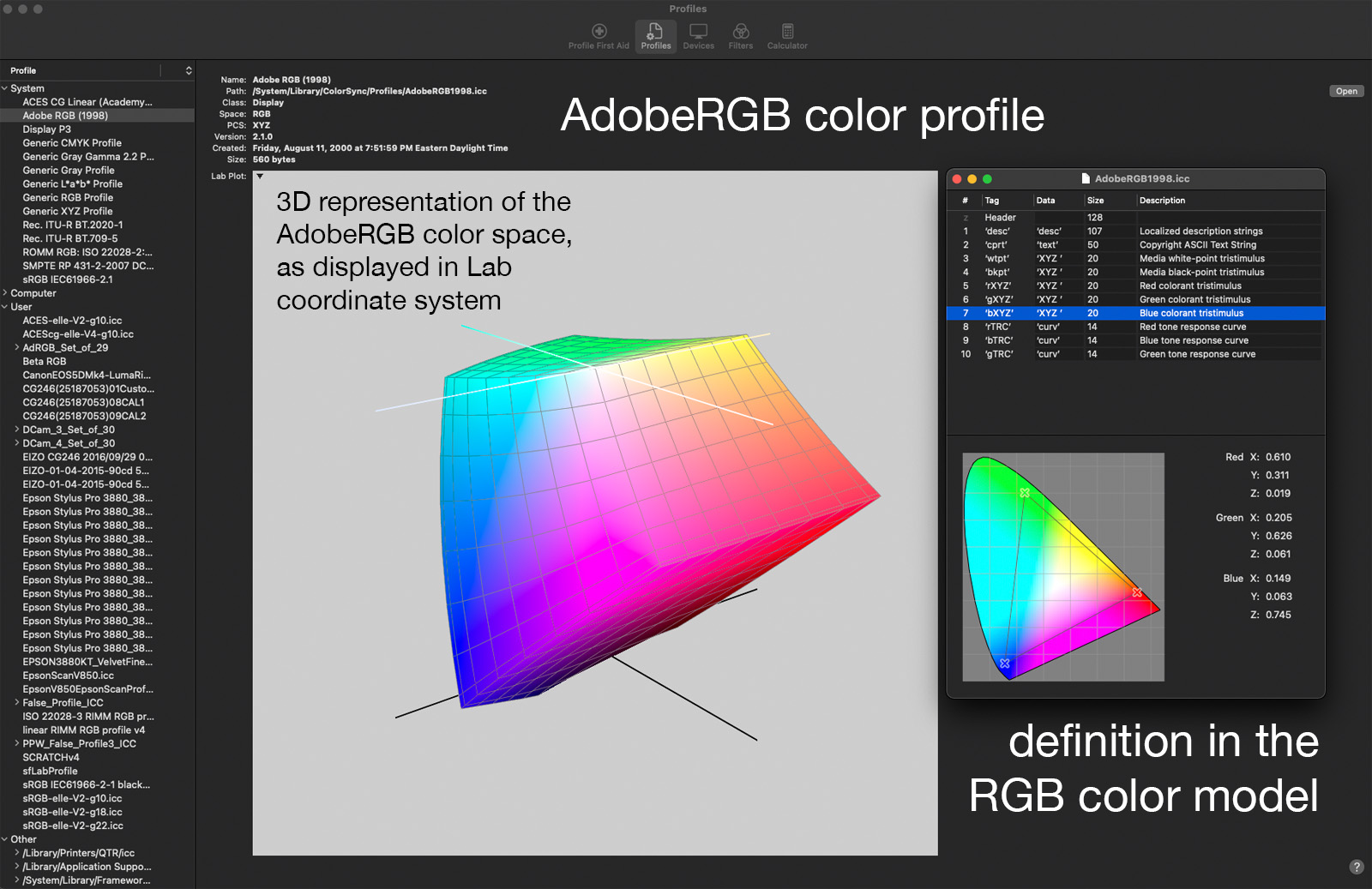
RGB and CMYK are "color models" - how color is represented. sRGB, AdobeRGB, ISO, SWOP etc. are color spaces within their respective color models - think gamut volume as the space in which a color in a particular model (RGB) can live for that particular space (sRGB). A color profile is a file on a computer that defines the color space (its "tristimulus values" for R, G and B) and its white/black point, among other characteristics. On a Mac, you can use the ColorSync utility to view the contents of your color profiles (screenshot). kirk
- 18 replies
-
- 1
-
-
- affinity photo
- soft proof
- (and 4 more)
-
NotMyFault reacted to a post in a topic:
Soft Proofing does not work in the manner it would be helpful (Affinity Photo)
-
kirkt reacted to a post in a topic:
Soft Proofing does not work in the manner it would be helpful (Affinity Photo)
-
kirkt reacted to a post in a topic:
Soft Proofing does not work in the manner it would be helpful (Affinity Photo)
-
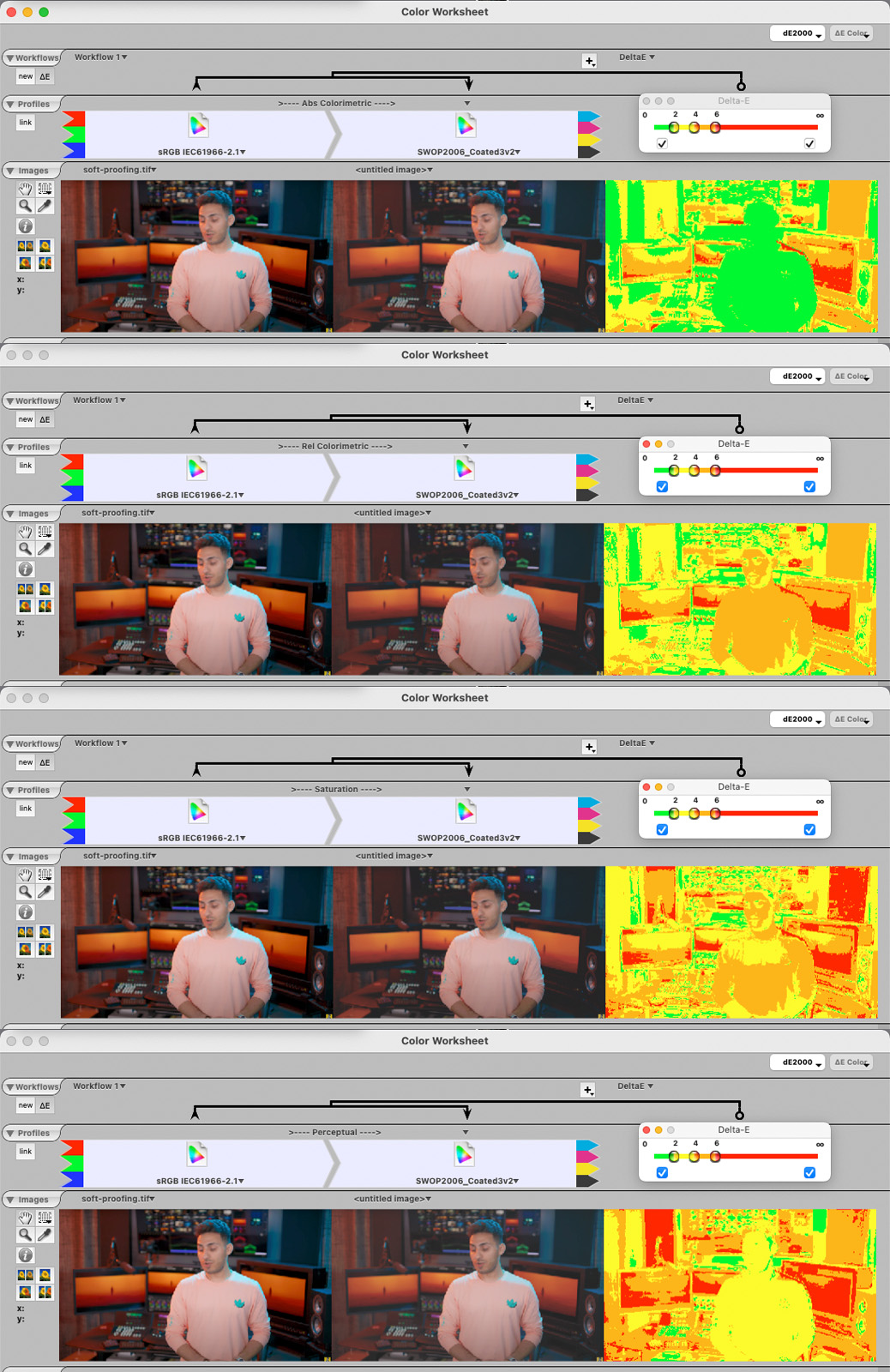
Color Think will provide an accurate color preview on the display for the various rendering intents and will provide the corresponding change in the ∆E false color map (see screenshots for differences based on specified rendering intent), as well as permitting the user to sample from the image to see the specific ∆E value for that pixel. As far as quick or easy, one still has to verify that the soft-proof is useful by comparing it to a print under specified lighting. Trying to control gamut between the source and destination color spaces does not require a print, by verifying that any adjustment one makes to the file to produce the desired printed appearance will require an accurate soft proof, otherwise one would inspect the print and make changes based on it. I do not come from a CMYK workflow, so please take my comments with whatever grain of salt might apply specifically to a CMYK production workflow. I suppose that differences between a conversion into the CMYK profile and a soft-proof of that profile may be related to some soft-proof simulation parameter (like simulating paper white, or whatever) that is not exposed to the user. kirk
- 18 replies
-
- 1
-
-
- affinity photo
- soft proof
- (and 4 more)
-
NotMyFault reacted to a post in a topic:
Soft Proofing does not work in the manner it would be helpful (Affinity Photo)
-
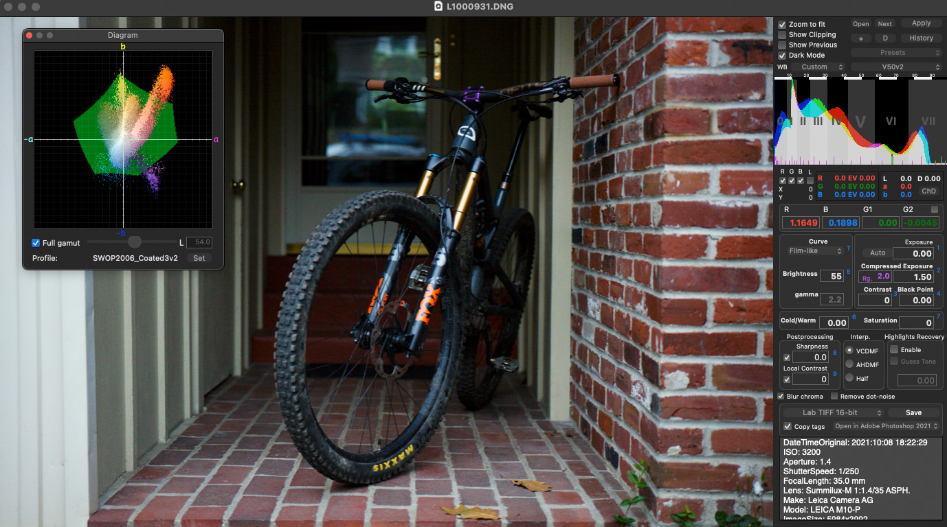
Here is a screenshot of a raw converter (Raw Photo Processor, for Mac) that includes a gamut diagram for inspection during raw conversion, so you can adjust your raw conversion while you take into account the ultimate destination color space if you choose. Not as detailed as the Color Think application, but useful still. kirk
-
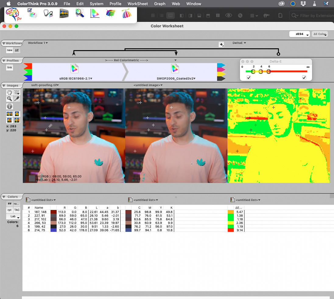
Here is a visualization of your above image with sRGB as the source and SWOP2006 CMYK as the destination, with the ∆E values plotted in a false color image and some of those RGB patches sampled for their ∆E (in the list). Changing the rendering intent will change the ∆E across the image, so you need to investigate how rendering intent affects your final printed output compared to the soft-proof. As you can see, the deep purples in the image are particularly out of gamut and may present a problem with printing, especially with a relative colorimetric rendering intent (where OOG gamut colors get clipped to the destination gamut boundary) - you may need to adjust those colors locally or come up with a way to preserve them as well as possible prior to printing if they are important to the final image. You can do this local adjustment with soft-proofing turned ON so that you can see the simulated result while you make adjustments. A tool like this is more helpful than just a gray overlay because it gives you an idea of how far OOG a color is in the destination space so that you can devise a specific strategy to target the worst offenders and leave the less intrusive problems alone, within acceptable error. kirk
- 18 replies
-
- 1
-
-
- affinity photo
- soft proof
- (and 4 more)
-
In general, what you are describing sounds like soft-proofing is working as intended. Soft-proofing is intended to use your RGB display to simulate an output device that is characterized by its ICC profile (eg, a printer) - simulate is the key descriptor here. When your sRGB file is soft-proofed with the CMYK profile, the visual appearance of the displayed image changes according to the device profile you have chosen and the rendering intent that you have specified; however, your display is trying to give you a general idea of what a printed image is going to look like - clearly a transmissive display and a reflective paper print are not visually going to be identical, so soft-proofing is a visual approximation (an accurate soft proof requires a calibrated and profiled display that can simulate the output device you are specifying). Also, the gamut check (the gray overlay) indicates to you which colors in the source color space (here, sRGB) are outside of the destination color space (here, CMYK). That does not mean that those colors will not print on the destination device, it just means that the colors in the source space will have to be mapped to the gamut of the destination space to print and may not appear identical to the image in the source color space. The way these transformations are handled is partially a function of the **rendering intent** that you select. In terms of a shift in brightness or perceived appearance, this may be a function of the rendering intent you select and how the white/black points of the source and destination spaces might change - you need to investigate this by examining how the choice of rendering intent affects the visual simulation of your image on your display under soft-proofing, compared with viewing that image as an actual print under controlled lighting conditions. This way you can choose which soft-proof rendering intent best simulates the appearance of the final print under the specified viewing conditions, and use that intent for soft-proofing. Kirk
-
Your original artwork is in ROMM (ProPhoto) RGB in 8bit. This is a large gamut color space and is not really amenable to saving or manipulating in 8bit color precision - however, that is not such a big deal here, as there are only 2 colors and no gradients, etc When you print, you need to specify the RENDERING INTENT of the conversion that is done from the working/source color space of the file into the output color space of the printer. There are four rendering intents: Perceptual Relative Colorimetric Saturation Absolute Rendering intents are different ways to instruct a conversion of a large gamut color space into a smaller space - they differ in how the colors that are out of gamut in the larger space get translated into the smaller space. For graphical artwork such as your logo, saturation rendering intent is probably best, as it will tend to preserve the blue in the logo. I am not sure how the PDF artwork was generated, but for printing the rendering intent can make a huge difference with colored graphics, versus a photographic image, for example. You do not want to convert into or assign the printer ICC profile to the artwork in Affinity Photo - just print from the source color space (ROMM RGB), specify the printer-paper ICC profile in the print dialog and tell the printer what rendering intent you want to use - the print driver software will do the appropriate conversion. You can use the printer's ICC profile to soft-proof the image in Affinity Photo - add a soft proof adjustment layer to the document and then specify the printer's ICC profile as the device you want to simulate and see if you can reproduce the problem on screen. You can also try converting the image's color space to a smaller working color space like AdobeRGB or sRGB to reduce the gamut prior to printing. Without more detail regarding your workflow, it is difficult to tell exactly why the blues in your logo are turning black. Somewhere along the way, color management decisions are being made without your full control or knowledge and the color numbers are being interpreted differently than you want/expect them to be. Kirk
-
kirkt reacted to a post in a topic:
Olympus ORF RAW files cropped?
-
Olympus ORF RAW files cropped?
kirkt replied to Domus's topic in Pre-V2 Archive of Desktop Questions (macOS and Windows)
In the Develop Assistant there is a lens correction default drop-down option - set it to none, instead of auto. Kirk -
kirkt reacted to a post in a topic:
Adjusting the saturation of shadows and highlights independently
-
Urban abstract effect
kirkt replied to Digbydo 2's topic in Pre-V2 Archive of Desktop Questions (macOS and Windows)
It looks similar to an oil painting/pastel filter or Topaz Labs "Radiance" filter applied to the image and blended with the original. kirk