Search the Community
Showing results for '"variable fonts"'.
-
 You installed the variable font - Affinity apps do not support variable fonts. Per the OpenType specs, when an application does not support variable fonts the default master is shown. The Rubik variable font has two masters - Light and Black - and the Light is set as the default (by the font designer). So that is what you see - Light. The fix is to un-install the variable font(s) and install the static fonts (from the same ZIP you downloaded). Note: most of the time variable fonts include a Regular master so that is the more common master chosen as default. So instead of them all saying "Light" they will all say "Regular."
 -

Disappearing Font
MikeTO replied to Woodpig's topic in Affinity on Desktop Questions (macOS and Windows)
If Athelas is not showing up in Font Book then it is not installed and you'll need to reinstall it. But it sounds like you've tried to install it only for macOS to tell you that it's a duplicate so it should show up in Font Book. Is it possible that you've installed a variable font and not a static font? Affinity is not compatible with variable fonts. To fix this, you'd have to find the font in Font Book and uninstall it and then install the static version, but you can't find it so I'm unsure what do advise. This isn't an Affinity issue since the font isn't showing up in Font Book for you but more of a Mac issue. I think Apple just gave up and sent you to Serif for help. Sorry. -
Photoshop, Illustrator, InDesign, CoreDRAW, Sketch. They all have support of variable fonts. While XD and Figma (and Affinity) still lacking support for it. More and more type foundries are releasing their typefaces in variable format now in addition to usual family sets these days. From the web development point of view, utilizing the only one font file in css and tweaking its axes could be more convenient than handling a bunch of different weights. Also, less resources to request from server. However, variable font files a bit more heavy than usual single weight as they contain more data. So, there are things to consider. From pure organizational point of view, it might be more comfortable for someone to have just one font file installed locally, which actually covers the whole family. For type foundries, sometimes it could also be more convenient to just have one main master curve set in a working file, rather than tweaking and applying changes to individual weights across multiple working files. Unification, standardization, linearization and simplification of the process. But the truth is, that almost every type foundry will raise the prices significantly when they all will decide to provide variable fonts only. So customers will no longer have control over how many individual weights they want to purchase. Either you pay full price or you wouldn't get it at all. Most of the times you don't need the whole family of 20+ styles but 2 or 4 styles only. So, of course, it would be great to see variable fonts support in Affinity suite. But I'm totally fine without it for now, as long as I can still purchase individual weights from type foundries.
-

Publisher V2.10 does not show font correctly
Return replied to Chills's topic in V2 Bugs found on Windows
Found it> https://forum.affinity.serif.com/index.php?/search/&q=variable fonts&quick=1 -
Just for the record, I am very interested in variable fonts, and as they are really starting to gain momentum, I look forward to being able to finally use them for layout work. I have been meaning to post a couple of thoughts of how they can improve the work we do, so now seems like my chance: 1. Back in the days well before my time, when fonts were sold as chunks of metal type, they would necessarily be fixed sizes, and you would purchase particular sizes according to need. No question about the disadvantages of the way it was in those days, but there was an advantage to that method if it came from a quality foundry: the different sizes in a single family would have subtle variations on weight and other features (ink traps, for example) so that the optical characteristics of the font would be tuned to its own specific size. Although our fonts today are vastly more convenient, we have lost a little something in quality with a one-size-fits-all approach to scalable fonts (consider the difference between true versus “faked” small caps for a rough comparison of the idea I am talking about). Here is a quote from an old but good article over on CreativePro.com (link). The main article is about adjusting tracking for different point sizes, but this part also describes the issue I am talking about. Variable fonts gives us a way to apply fine-tuned adjustments for weight to suite different sizes. 2. Different print mediums have different characteristics. About five years ago at my little publishing operation, we got a new production machine, and one of its features was how accurate the fine details were as compared to older models. I printed a test page to compare against the same layout as printed on the previous machine. My boss looked briefly at the two specimens, then said simply, “I don’t like it.” The new machine was technically more accurate, but the type looked a good deal thinner, especially fine typefaces like Baskerville. (Perhaps the older fonts in use were also designed with machines of the era in mind.) In order to adjust, we either had to change fonts or use the workaround of applying a very fine character outline (something like .04 pt) to be able to continue using the same fonts as before. On our machine, that workaround does the job for printed results, but I have to be careful with the settings lest the outline can have a disconnected ghosting appearance, and the PDF version where every character has an outline is much bigger, performs poorly, and basically looks bad onscreen. Here too, variable fonts could be a good solution. If it prints a little too faint on our machine, we would just adjust the weight by fine amounts in the text styles and print again. Summary: I can be patient with Serif, as there is room to grow the suite in multiple directions, and they can’t do it all at once. Maybe they should focus on other things first while variable fonts spend a little more time maturing. But if ignored indefinitely, it would really start to seem a great loss.
- 42 replies
-
- 1
-

-
- variable fonts
- variable
- (and 3 more)
-
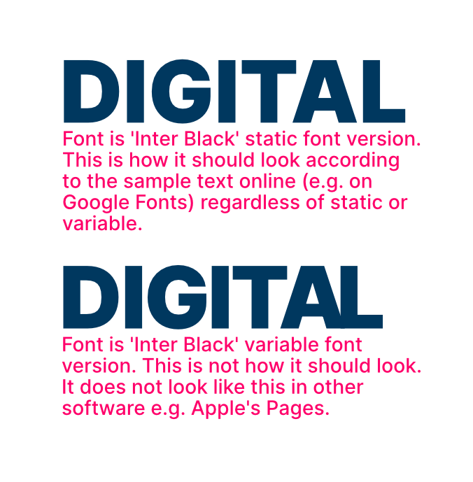
 Having a really odd issue with variable fonts. I downloaded 'Inter' font in the variable version, typed out the word 'Digital' for a logo I'm making in Affinity Designer, and it didn't look right. The A and the L being too close together is what initially caught my eye. I went back to Google Fonts and it wasn't displaying how it does when I typed sample text on there. So I downloaded the static font too, and that shows exactly as expected. Initially I tried reinstalling the fonts etc but nothing worked. So then it occurred to me it might be an issue specifically with Affinity, and it turns out it is! If I do this comparison in other software (e.g. Apple Pages) both the variable and the static font look identical. I've attached a screenshot from Affinity Designer to show the problem. Can anyone help?
-
 For a guess: the fonts you have installed are Variable fonts. As the Affinity applications only support Static fonts, you just see the basic version of the font when the Variable fonts are used.
 -
Welcome to the Serif Affinity forums. You have a Variable version of the font installed on your system. Unfortunately, the Affinity applications do not support Variable fonts. You'll need to install a Static version of the font.
-
Ahhh ... that's the problem. You have the variable font installed (JosefinSans-VariableFonts-wght.ttf). Affinity apps do not yet support variable fonts. The Mac font manager fools you by displaying the variable instances as if they will work, but there is no variable font support yet. So what you actually get is the default master in the variable font - which is Thin. Un-install the variable font(s), and install the static fonts. Then it should work.
-
If you mean any of the GF variable fonts, yes, they will not work in Affinity apps. The GF static fonts work just fine. Note, the GF variable fonts are designed to have the same instance names as the static fonts. This is so if the user has either installed locally they will be used (saving the font download). Because of this it is not a good idea the have both the statics and variables installed. This will definitely cause conflicts in Affinity apps, and perhaps other applications too. This name conflict is why font designers generally use a different name on the variable version. GF does this on purpose as their goal is speed and to save the bandwidth.
-
@garrettm30 All of what you have described is really related to optical size. Bad faked small caps look bad because of the lack of optical size adjustments, and the lack of good kerning. Bad faked superscripts/subscripts look bad because of the lack of optical size adjustments, proper placement, and bad kerning. Same with faked or poorly created numerator/denominator figures. Some newer fonts have been built "more sturdy" to address the subtle reduction in visual weight in newer systems (e.g. STIX Two). But this sturdiness is really an overall optical adjustment, not an just increase in width or height or spacing. Which is what your current work-around of the thin outline attempts to address, but with some obvious drawbacks. So my point is that the most common variable axes of Weight [wght] and Width [wdth] will not actually solve this. Just make it a bit easier for you to do the work-around. But the end result will still not be a well designed optical size - which would look perfect. Out of the relatively small number of variable fonts out there, there even fewer which have the Optical Size [opsz] axis. In FOSS fonts - Source Serif 4, Franuces, Merriweather, and RobotoFlex are a few which come to mind. RobotoFlex even has the multiple axes which are the individual components of optical size. Variable fonts like these will actually address the issues you raised. So the solution being available and widespread is still a ways off ... but it is coming. In the mean time, if you find a variable font you like, you can export your own custom instance using some free tools. Less problems with embedding a static font. One of the issues not being discussed much is the somewhat spotty support for embedding variable fonts for output. Finally, if you have a variable font you want to use now, I can easily export a custom static instance for you. Only takes a few minutes and is really quite easy.
-

Variable fonts support
R.Keller replied to Athanasius Pernath's topic in Feedback for the Affinity V2 Suite of Products
+1 I was also hoping/expecting variable font support in v2. As a typeface designer, my main use of this software is to make specimens and test my variable fonts. It's frustrating how low of a priority this still is for Serif (ironic that with the name 'Serif' they don't care more about the fonts 😂). -
 Mike, thanks so much for your answer! Interesting, didn't know it was because of the variable nature. I still wonder: Keynote properly calculates the different character spacing correctly, but I would definitely say I does NOT support variable fonts. What gives in that case?
 -
Tracking/kerning displaying incorrectly in Affinity Designer V1
MikeTO replied to jesi-rgb's topic in V1 Bugs found on macOS
Hi Jesi and welcome to the forum. Mona Sans is a variable font and isn't available as a fixed font. Unfortunately, Affinity doesn't support variable fonts at this time so you won't be able to use this font with it. Cheers -

Variable fonts support
DamienG replied to Athanasius Pernath's topic in Feedback for the Affinity V2 Suite of Products
Glad I found this thread before I pulled the trigger - it's bad enough having to pay for .webp support but not having variable fonts is a deal breaker for me. I don't want to be waiting multiple years and paying again for v3 to get that. (Yes, I get there's a ton of new features and that v1 was supported and enhanced for years as well but when you don't use any of those features at all and just wanted .webp and variable fonts it's incredibly frustrating) -
Are you using 10.xx version of MacOS? Those are the overlaps used in variable masters (the source files) and required in the variable fonts for them to interpolate properly. When static fonts are created from a variable source, the overlaps may or may not be removed (it is not required). So some static fonts may still have overlaps. MacOS 10.xx does not handle the overlaps correctly. So the GF position is Apple needs to fix it (which they did in 11+). I am assuming you got the single static font from Cufon which is v1.001 and has no overlaps. Note: AFAIK .otf vs. .ttf does not matter in the case. But I do know for sure - it may be possible that MacOS can properly figure-out the PS curves. Dunno. We can test .otf PS fonts if you want. If you are not using MacOS, please provide more info.
-
Thank you for confirming. I knew v1 didn't support them, but I'm surprised that v2 doesn't given the ready availability of variable fonts these days. Variable fonts have apparently been about since 2016 (Bahnschritt was released in 2017), so they're not that new of a thing to support. I'll keep my fingers crossed for v3.
-
How about SVG, which last time I checked was an output format that the Affinity apps supported? AFAIK (and from my limited experimentation) text elements in SVG documents can utilize variable fonts via CSS if the browser supports it. Lastly, having to constantly toggle variable/static fonts on and off when moving between applications that support variable fonts and those that do not gets old really quickly.
-

Variable Fonts
jamessouttar replied to LLB's topic in Feedback for the Affinity V2 Suite of Products
Currently, if you export a PDF with variable fonts from InDesign, the software creates static instances of the variable font according to they choices you made. PDF doesn‘t currently offer native support for variable fonts — meaning that the whole font is embedded and remains editable. Adobe don‘t forsee that happening for some time. But as long as the conversion from variable font to font instances works, this is not really an issue. In any case, because of its lack of accessibility, PDF is increasingly being seen as a legacy format. It’s fine as an interchange format for printed documents, but it‘s far from ideal for digital publishing. Given the nature of the PostScript language, which is the very opposite of semantic coding, it‘s hard to see how Adobe could address this (but they still have Framemaker, and perhaps XML and DITA will ultimately become a replacement for PDF). -

Exporting to PDF: wrong font style (font type is OK)
A_B_C replied to RobLonely's topic in V1 Bugs found on macOS
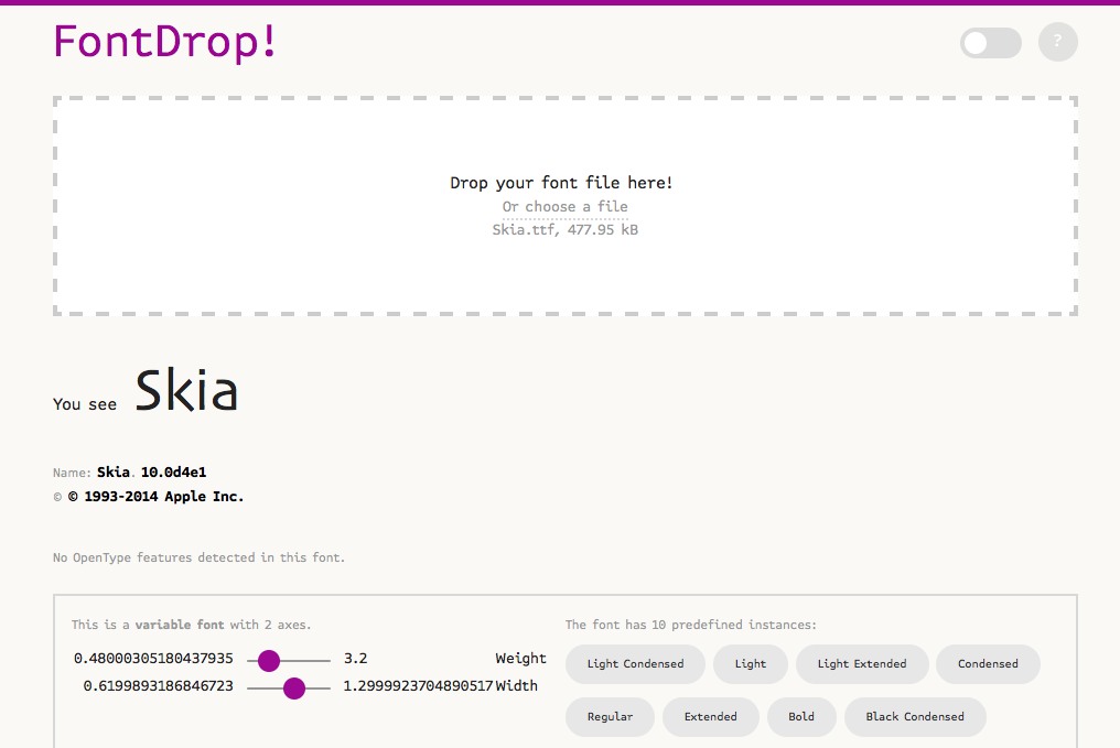
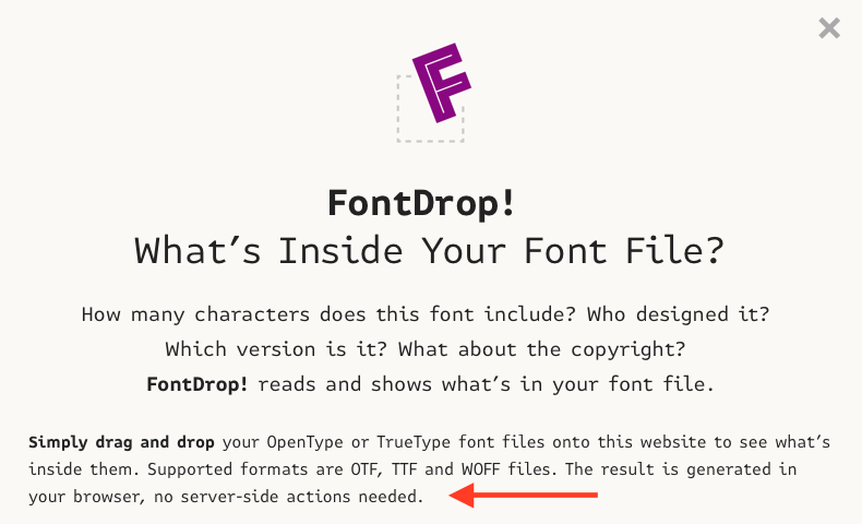
Variable fonts are field of font technology that is still under development. So you will have to know which applications support variable fonts to what extent, in particular with respect to output formats. As was pointed out earlier in this thread, the applications belonging to the Affinity Suite are not fully capable of handling variable fonts at the moment, so I think you should try to avoid using them with these applications. Regarding the question how to identify variable fonts, you will have to bear in mind that the variable font formats are extensions of the existing OpenType formats. Basically, an OpenType font becomes a variable font through the addition of certain tables to the table structure of the font file. John Hudson wrote an excellent introduction to variable fonts technology. And the relevant specification can be found at Microsoft Typography. So the definitive way to check whether a font is a variable font would be the inspection of its table structure, using a tool like DTL OpenType Master or an open-source tool like ttx. But these tools are somewhat technical. A slightly more accessible way is the online tool https://fontdrop.info, that allows you to check tables present in a font file. It will tell you whether a font is a variable font. According to the site disclosure, fonts are not uploaded to a server when using Fontdrop. Hope that helps … 😀 Alex
-
Variable Fonts
walt.farrell replied to LLB's topic in Feedback for the Affinity V2 Suite of Products
I don't think so. The issue, as I see it, is that PDF doesn't support variable fonts. So, in order to have them available in a PDF, either 1. The user or application needs to convert them to curves. Or 2. The application needs to generate a static subset of the variable font and embed it into the PDF. Approach 2 is certainly possible, but it's a complexity that many users who want variable fonts may not consider. -
Creative Cloud fonts are supported and should appear within Affinity when installed - unless they are variable fonts as mentioned
-
Variable Weight Fonts
walt.farrell replied to Charlespick's topic in Affinity on Desktop Questions (macOS and Windows)
The Affinity applications do not support Variable fonts, so what you're seeing is expected on Windows. (It will look different on macOS, but that kind of font is still not supported by the applications.) -
Yes, that is the issue. You installed the Variable fonts rather than the Static fonts.
-
Some fonts not supported?
MikeTO replied to MartinSva's topic in Affinity on Desktop Questions (macOS and Windows)
Hi Martin and welcome to the forum. Is it a variable font? Affinity doesn't support variable fonts at this time.