
smadell
-
Posts
1,151 -
Joined
-
Last visited
Reputation Activity
-

 smadell got a reaction from Geetardude in Manual Frequency Seperation Photoshop style
Hi, Geetardude.
I watched the video, and I'm not terribly fond of the technique. However, it is quite possible to perform exactly the same technique in Affinity Photo. I also did a macro for you (you're welcome!) that automates this. In the end, you should end up with a merge vislble layer that has been inverted and high passed, with a Gaussian Blur live filter and an inverted mask. You can (i) paint on the mask with White to reveal the skin smoothing; (ii) adjust the amount of smoothing with the Gaussian Blur layer (lower radius = more smoothing); and (iii) adjust the Opacity of the merge visible layer to lower the overall effect.
Unmesh Style Skin Smoothing.afmacros
-
 smadell got a reaction from Dan C in Manual Frequency Seperation Photoshop style
Thanks for figuring rhis out, @Dan C. I thought I had checked all the variations I could, but never looked at bit depth.
-

 smadell reacted to Dan C in Manual Frequency Seperation Photoshop style
Hi @smadell / @Geetardude - sorry to see you're having trouble!
The difference causing the artifacting you're seeing is due to the document being in RGB/16 bit.
I can confirm that using the above macro on an 8bit document works correctly, if you convert this document to 16bit then you see the artefacts appear.
I'm not currently sure if this is by design or not, as this could be happening due to how blending is achieved in higher bit-depth images - therefore I'll log this with our development team now for further investigation to ensure we are calculating this specific workflow correctly!
In the meantime, Geetardude, you can use Document > Convert Format / ICC Profile to change the document from 16bit to 8bit. Alternatively you could adjust your Lightroom settings to provide Affinity with an 8bit image to begin with -
I hope this helps
-
 smadell got a reaction from scb in Delete Background
Masks may well have been the hardest concept for me to wrap my head around. But, they are probably the most important concept to master when you’re editing. Take a deep breath, and leap...
-
smadell got a reaction from scb in Delete Background
Do you have the layer with the dog selected in the Layers panel? In other words, if you have (i) no layer chosen in the Layers panel; or (ii) some other layer chosen, such as an Adjustment layer – when you try to delete the dog or the background, it's likely that nothing will seem to happen.
As an aside, once you figure out how to delete the background you should explore using a Mask instead of hitting the Delete key. Masks are non-destructive, so you're never locked into a mistake.
-
 smadell got a reaction from Wayne Burrows in Paint by Numbers
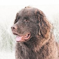
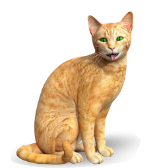
I am attaching an Affinity Photo macro that turns a photo into a “Paint by Numbers” image. The attached file is a macros category, and should be imported through the “hamburger” menu at the top right of the Library panel. The category can also be imported into the iPad version of Affinity Photo, although there is one important limitation (more on this later).
When you use the macro, it creates a Group called “Paint by Numbers Effect.” All of the changes are inside of this group, so you can turn it on and off simply. Once you look inside the group, you will see multiple layers. From bottom to top, these are:
1) Original Image - Merge Visible
This is a “merge visible” version of your photo. It includes all of the editing you may have done up until that point.
2) Posterization Adjustment
This is a Posterize adjustment layer, and is meant to reduce the number of colors/tones used in the effect.
3) Outlines
This is a separate layer, created (in part) by using a Detect Edges filter. It provides outlines for the areas of color. This mimics the outlines that were present on the Paint by Numbers boards we used as kids.
4) Normalize Colors
This is a copy of the original Merge Visible image, and has its blend mode set to Color. This is used to reset the posterized colors to more natural ones.
5) Adjust Brightness & Contrast
This is a finishing adjustment, and can provide a better final effect.
* * * * * * * * * * * * * * * * * * * *
Once you click the macro, you will be presented with a default version of the effect. A dialog box allows you to set a number of parameters. As you change each of these parameters, the Paint by Numbers effect is updated. You are asked:
Posterize - How Many Colors?
The default value is 4, but values between 3 and 6 generally give good results. If your image is a portrait, judging the final result by looking at what the different values do to the subject’s face is a good idea.
Outlines - Adjust the Opacity
The default is 50%. Adjust this upward to make the outlines more prominent; adjust it downward to make the outlines less obvious. Set to 0 to make them go away entirely.
Finish - Adjust the Brightness
Finish - Adjust the Contrast
The default is 10% brightness, and 20% contrast. Adjust these up or down to give you final effect the desired finish.
When you click Apply, the effect is finalized. Obviously, you can manually change any of the settings after the fact. However, you should know that while the number of posterization levels for the image is non-destructive, the originally chosen number is also used to create the outlines, and this is a destructive change. Although you can change the posterization level after the fact, it is not advisable to do this. The outlines might no longer line up with the individual areas of color.
Also, for some reason, the iPad version of Affinity Photo handles the macro pretty well but will not allow you to change the number of posterization levels before finalizing the effect. It is baked in at 4 levels. You can change this after the fact, but (as above) the number of levels in your posterized image may not match your outlines very well.
Here is the macro in action. The original image is top left; the parameters dialog is shown in its default state, and then changed during the course of the macro; the final effect is shown top right
As always, I am one person with one computer and have not tested this in every possible scenario. Try it and, if you like it, keep it and enjoy it. This forum has provided me with so many good ideas and answers to questions; this macro is my attempt to “pay it forward.”
[Note: Credit where credit is due. I am indebted to Dave Straker, whose recent YouTube video gave me some excellent ideas for this macro. Dave’s channel is called “InAffinity,” and is a steady source of helpful information. Thanks, Dave!]
Paint by Numbers.afmacros
-
 smadell got a reaction from PaulEC in Is there a preferred way to dodge and burn?
Ask 5 people how to dodge and burn, and you'll probably get 7 different answers. The answer to the question about a preferred way to dodge and burn is that it's the method you prefer.
That having been said, and despite all the possible complications that can be added, I almost always dodge and burn using a single 50% grey layer set to Overlay blend mode. I brush in black and/or white with a low flow soft brush (usually 100% opacity, 1-2% flow, 0% hardness) and build up the effect slowly.
I never use the Dodge and Burn tools because they are, at heart, destructive tools. Sure, you can use them on a duplicate layer. But you still can't go back to fix a mistake (at least, not easily) without undoing lots of work in between. I prefer to do things non-destructively whenever possible, and that's what doing dodge and burn on a separate layer accomplishes.
It's also been stated that the 50% grey fill in the Dodge and Burn layer is superfluous. You could just add an empty pixel layer and do the black and white brush strokes there. That's true, but I find that when it comes time to actually look at the dodge and burn layer, having the 50% grey background lets me see what I've done much more easily.
-
 smadell got a reaction from Carlo58 in Paint by Numbers
Paul...
Do NOT try to change the file extension - it will not work. You can import the macros (as a macro "category") into the Library panel. There are 2 different kinds of macro files - (i) a single macro, exported from the Macro panel; and (ii) a macro category (which can include 1 or multiple macros) exported from the Library panel. The former has a file extension of .afmacro and the latter has an extension of .afmacros . Yes, it is a subtle difference and it confuses a lot of folks; perhaps Serif should have chosen extensions that were more dissimilar.
The bottom line. The Paint by Numbers.afmacros file can be imported from the Library panel.
-
 smadell got a reaction from kirkt in How do I get rid of this space on my Affinity Photo window?
Instead of that, go to View > Studio > Hide Left Studio (or wording to that effect...)
-
 smadell got a reaction from JDM in How do I get rid of this space on my Affinity Photo window?
Instead of that, go to View > Studio > Hide Left Studio (or wording to that effect...)
-
 smadell got a reaction from Frozen Death Knight in Paint by Numbers
I am attaching an Affinity Photo macro that turns a photo into a “Paint by Numbers” image. The attached file is a macros category, and should be imported through the “hamburger” menu at the top right of the Library panel. The category can also be imported into the iPad version of Affinity Photo, although there is one important limitation (more on this later).
When you use the macro, it creates a Group called “Paint by Numbers Effect.” All of the changes are inside of this group, so you can turn it on and off simply. Once you look inside the group, you will see multiple layers. From bottom to top, these are:
1) Original Image - Merge Visible
This is a “merge visible” version of your photo. It includes all of the editing you may have done up until that point.
2) Posterization Adjustment
This is a Posterize adjustment layer, and is meant to reduce the number of colors/tones used in the effect.
3) Outlines
This is a separate layer, created (in part) by using a Detect Edges filter. It provides outlines for the areas of color. This mimics the outlines that were present on the Paint by Numbers boards we used as kids.
4) Normalize Colors
This is a copy of the original Merge Visible image, and has its blend mode set to Color. This is used to reset the posterized colors to more natural ones.
5) Adjust Brightness & Contrast
This is a finishing adjustment, and can provide a better final effect.
* * * * * * * * * * * * * * * * * * * *
Once you click the macro, you will be presented with a default version of the effect. A dialog box allows you to set a number of parameters. As you change each of these parameters, the Paint by Numbers effect is updated. You are asked:
Posterize - How Many Colors?
The default value is 4, but values between 3 and 6 generally give good results. If your image is a portrait, judging the final result by looking at what the different values do to the subject’s face is a good idea.
Outlines - Adjust the Opacity
The default is 50%. Adjust this upward to make the outlines more prominent; adjust it downward to make the outlines less obvious. Set to 0 to make them go away entirely.
Finish - Adjust the Brightness
Finish - Adjust the Contrast
The default is 10% brightness, and 20% contrast. Adjust these up or down to give you final effect the desired finish.
When you click Apply, the effect is finalized. Obviously, you can manually change any of the settings after the fact. However, you should know that while the number of posterization levels for the image is non-destructive, the originally chosen number is also used to create the outlines, and this is a destructive change. Although you can change the posterization level after the fact, it is not advisable to do this. The outlines might no longer line up with the individual areas of color.
Also, for some reason, the iPad version of Affinity Photo handles the macro pretty well but will not allow you to change the number of posterization levels before finalizing the effect. It is baked in at 4 levels. You can change this after the fact, but (as above) the number of levels in your posterized image may not match your outlines very well.
Here is the macro in action. The original image is top left; the parameters dialog is shown in its default state, and then changed during the course of the macro; the final effect is shown top right
As always, I am one person with one computer and have not tested this in every possible scenario. Try it and, if you like it, keep it and enjoy it. This forum has provided me with so many good ideas and answers to questions; this macro is my attempt to “pay it forward.”
[Note: Credit where credit is due. I am indebted to Dave Straker, whose recent YouTube video gave me some excellent ideas for this macro. Dave’s channel is called “InAffinity,” and is a steady source of helpful information. Thanks, Dave!]
Paint by Numbers.afmacros
-
 smadell got a reaction from rhett7660 in Graphic Novel Effect
Based on a recent thread started by user Steps, I have finalized and am attaching a macro called "Graphic Novel Effect." It is similar to the "Paint by Numbers" macro I created a while back, but offers better control of the black outlines that are needed in a cartoon or a graphic novel illustration.
The attached file is a macros category (not a single macro) and can be imported through the Affinity Photo Library panel. Once inside Affinity Photo, the category contains a single macro which can be moved into a different category (by dragging it) if desired. Since it is provided as a category, it can also be imported into the iPad version of AP.
When you use the macro, it creates a number of layers inside a group (which can be turned on and off to show or hide the effect entirely). The user is presented with 5 options in a dialog:
1) Posterize - How Many Colors?
The macro is preset to 5 color levels, but anywhere between 4 and 6 generally gives a decent result.
2) Outlines - Adjust Black [line thickness]
This option is preset to 50%, but changing the value will make the black outlines more or less prominent.
3) Outlines - Adjust White [fill smoothness]
This option is preset to 90%. Changing the value will affect the fill (inside the outlines). Keep the value above the value set in option #2 (line thickness).
4) Finish - Adjust the Brightness
5) Finish - Adjust the Contrast
These are preset to Brightness = -15% and Contrast = +30%. Changes made here will have the obvious results, and should be considered a finishing touch.
* * * * * * * * * * * * * * * * * * * *
As always, I am one person with one computer and have not tested this in every possible scenario. Try it and, if you like it, keep it and enjoy it. This forum has provided me with so many good ideas and answers to questions; this macro is another attempt to “pay it forward.”
Graphic Novel Effect.afmacros
-
 smadell got a reaction from Chris26 in Surely..Please..this has to be the most silliest of pop-up questions
I'm going to bet that the original photo (the piece of titanium) from which the non-titanium elements were cut out was a JPG image. Once the titanium is cut out, the surrounding pixels were erased, and that leaves empty space (note the checkerboard which surrounds the titanium). Choosing "Save" asks Affinity Photo to save the image, but the JPG format does not support transparency. Saving back to a JPG will mean inserting white pixels where transparency had been, and the dialog seems like a way to ask "is that really what you want"?
I suggest this because opening a PNG image, erasing a portion of the pixels, and then choosing Save will accomplish the save operation without the intervening dialog. This (I believe) is because PNG supports transparency.
-
 smadell got a reaction from firstdefence in Surely..Please..this has to be the most silliest of pop-up questions
I'm going to bet that the original photo (the piece of titanium) from which the non-titanium elements were cut out was a JPG image. Once the titanium is cut out, the surrounding pixels were erased, and that leaves empty space (note the checkerboard which surrounds the titanium). Choosing "Save" asks Affinity Photo to save the image, but the JPG format does not support transparency. Saving back to a JPG will mean inserting white pixels where transparency had been, and the dialog seems like a way to ask "is that really what you want"?
I suggest this because opening a PNG image, erasing a portion of the pixels, and then choosing Save will accomplish the save operation without the intervening dialog. This (I believe) is because PNG supports transparency.
-
 smadell got a reaction from T V in Pastel Watercolor Effect
It’s a gift, MxHeppa.
There are only two things I ask. First, remember to give back to the community. As you become more talented and knowledgeable, share your knowledge with others. That is why I call this “pay it forward” software. Second, if you create something wherein these macros played an integral part, attribution would be the ethical thing to do, right?
The answer to your un-asked question is that I don’t expect to send a team of high-priced attorneys knocking on your door if you use the macro to create work from which you then profit.
-
smadell got a reaction from Frozen Death Knight in Add Film Grain (free macros)
Adding grain to a photo is a nice way to emulate vintage images, especially older black and white photos. It has always bothered me a bit that Affinity Photo does not include a mechanism to introduce grain, other than to use the “Add Noise” filter. While adding noise is nice, it adds such a fine amount of variation that it is often quite literally unnoticeable.
I have admired the Film Grain effect that is available in other software, such as Nik’s Silver Efex. These filters can often vary grain size and intensity; sometimes grain can be added to shadows, midtones, and highlights in differing amounts.
What I’ve attached is an .afmacros file called Film Grain. This is a macros Category and should be imported into the Library panel. It includes two macros. The first is called Add Film Grain - simple. It allows the user to add grain with 2 parameters – intensity and size.
Grain - Intensity
The grain intensity defaults to 100%, but can be set to any value between 0 and 100. At 0% intensity, the grain effectively disappears. To understand intensity, think “contrast.”
Grain - Size
The size slider accepts values between 0 and 1, with the default being 0.2. The appropriate value will differ based on the image being treated, and the same perceived size might need higher values when the overall dimensions of the image are larger. Also note that values above 0.8 are rounded down to 0.8 (and this forms an effective upper limit to the slider). This is done primarily because the math breaks down at higher values.
The second macro is called Add Film Grain - by tonal range. It includes the same intensity and size parameters, but also lets the user set opacity levels for highlights, midtones, and shadows separately.
Grain Opacity - Highlights, Midtones, and Shadows
There are three separate sliders for highlights, midtones, and shadows respectively. Each defaults to 100%, but can be set to values between 0 and 100. While the “simple” macro creates a single Film Grain layer, the “tonal range” version creates a group containing 3 layers, one each for the three tonal ranges. The Grain Opacity sliders simply vary the opacity of the corresponding layers within that group.
Finishing Touches
When each of the macros finishes, the Blend Range for the result (the Film Grain layer in the case of the “simple” macro, and the Group in the case of the “tonal range” macro) is set to diminish the effect of the grain on the highlights slightly. This is an aesthetic choice on my part, and I think you will agree. However, you can set the Blend Range to anything you might like, as desired.
* * * * * * * * * * * * * * * * * * * * * * * *
For most users, the “simple” macro will be enough. It lets the editor vary the Intensity of the grain and also the Size. I have always liked adding grain that was a bit larger, because it becomes more noticeable.
For other users, the “tonal range” macro will allow you to add some additional nuance to the grain, by letting you emphasize grain in the shadows, midtones and highlights. Do this by first setting a global Intensity and Size, and then adjusting the opacity of the 3 tone ranges as desired.
* * * * * * * * * * * * * * * * * * * * * * * *
Here are samples of the two macros, along with the settings as applied. The differences between the two results is quite subtle, but might be worth the effort in some cases.
* * * * * * * * * * * * * * * * * * * * * * * *
As with all the macros I have posted, I have tested these on one computer under a limited number of conditions. I cannot guarantee anything, but I have no reason to think they will not work for you just as they have for me. The macros are free, with the suggestion to “pay it forward.” As you become more proficient, be sure to share your experience and your work with others.
By the way, happy holidays to everyone. Here’s hoping that 2021 is a more positive, uplifting year than 2020. And maybe, just maybe, we’ll be able to ring in 2022 in a crowd without any masks!
Film Grain.afmacros
-
 smadell got a reaction from Martin Ferenec in Preset selection in "Adjustments"
Two thumbs up for including relevant presets in their associated panels. I suggested this quite a while back, but it never gained any significant traction. The way to answer Walt’s concern, obviously (to me, at least), is to include the previews in the list of presets - not just as a drop-down menu. I included a mock-up, which I have also shown below.
-
 smadell got a reaction from walt.farrell in Preset selection in "Adjustments"
Two thumbs up for including relevant presets in their associated panels. I suggested this quite a while back, but it never gained any significant traction. The way to answer Walt’s concern, obviously (to me, at least), is to include the previews in the list of presets - not just as a drop-down menu. I included a mock-up, which I have also shown below.
-
 smadell got a reaction from Cealcrest in Add Film Grain (free macros)
Adding grain to a photo is a nice way to emulate vintage images, especially older black and white photos. It has always bothered me a bit that Affinity Photo does not include a mechanism to introduce grain, other than to use the “Add Noise” filter. While adding noise is nice, it adds such a fine amount of variation that it is often quite literally unnoticeable.
I have admired the Film Grain effect that is available in other software, such as Nik’s Silver Efex. These filters can often vary grain size and intensity; sometimes grain can be added to shadows, midtones, and highlights in differing amounts.
What I’ve attached is an .afmacros file called Film Grain. This is a macros Category and should be imported into the Library panel. It includes two macros. The first is called Add Film Grain - simple. It allows the user to add grain with 2 parameters – intensity and size.
Grain - Intensity
The grain intensity defaults to 100%, but can be set to any value between 0 and 100. At 0% intensity, the grain effectively disappears. To understand intensity, think “contrast.”
Grain - Size
The size slider accepts values between 0 and 1, with the default being 0.2. The appropriate value will differ based on the image being treated, and the same perceived size might need higher values when the overall dimensions of the image are larger. Also note that values above 0.8 are rounded down to 0.8 (and this forms an effective upper limit to the slider). This is done primarily because the math breaks down at higher values.
The second macro is called Add Film Grain - by tonal range. It includes the same intensity and size parameters, but also lets the user set opacity levels for highlights, midtones, and shadows separately.
Grain Opacity - Highlights, Midtones, and Shadows
There are three separate sliders for highlights, midtones, and shadows respectively. Each defaults to 100%, but can be set to values between 0 and 100. While the “simple” macro creates a single Film Grain layer, the “tonal range” version creates a group containing 3 layers, one each for the three tonal ranges. The Grain Opacity sliders simply vary the opacity of the corresponding layers within that group.
Finishing Touches
When each of the macros finishes, the Blend Range for the result (the Film Grain layer in the case of the “simple” macro, and the Group in the case of the “tonal range” macro) is set to diminish the effect of the grain on the highlights slightly. This is an aesthetic choice on my part, and I think you will agree. However, you can set the Blend Range to anything you might like, as desired.
* * * * * * * * * * * * * * * * * * * * * * * *
For most users, the “simple” macro will be enough. It lets the editor vary the Intensity of the grain and also the Size. I have always liked adding grain that was a bit larger, because it becomes more noticeable.
For other users, the “tonal range” macro will allow you to add some additional nuance to the grain, by letting you emphasize grain in the shadows, midtones and highlights. Do this by first setting a global Intensity and Size, and then adjusting the opacity of the 3 tone ranges as desired.
* * * * * * * * * * * * * * * * * * * * * * * *
Here are samples of the two macros, along with the settings as applied. The differences between the two results is quite subtle, but might be worth the effort in some cases.
* * * * * * * * * * * * * * * * * * * * * * * *
As with all the macros I have posted, I have tested these on one computer under a limited number of conditions. I cannot guarantee anything, but I have no reason to think they will not work for you just as they have for me. The macros are free, with the suggestion to “pay it forward.” As you become more proficient, be sure to share your experience and your work with others.
By the way, happy holidays to everyone. Here’s hoping that 2021 is a more positive, uplifting year than 2020. And maybe, just maybe, we’ll be able to ring in 2022 in a crowd without any masks!
Film Grain.afmacros
-
 smadell got a reaction from manfred9 in Pastel Watercolor Effect
I recently watched one of @dmstraker Dave Straker’s InAffinity tutorials about “Pastel Colour Grading…” and it gave me some ideas. So, thanks to you for the inspiration, Dave!
I’ve attached another macro for creating a specific Artistic Look – this one called a Pastel Watercolor Effect. The attached file is a macro category (even though it only contains a single macro); you can import it into the Library Panel in the Desktop version of Affinity Photo, and it is compatible with the iPad version as well. (In my own preliminary testing, the macro works fairly well on an iPad, although there are some issues with missing items in the dialog box that appears for setting parameters.)
When you click the macro, it creates a number of layers inside of a group. The group is called “Pastel Watercolor Effect” and it can be turned on and off by simply showing or hiding the entire group. When you invoke the macro, you will be presented with a number of options in a dialog:
1-6] Lighten Color - Cyan, Magenta, Yellow, Red, Green, Blue
All of these color ranges are initially set to a value of -200%. As you move each of the sliders to the right, that particular color range will be selectively lightened. If you set any of the sliders all the way to 100% then that color range will go to white.
7] Set Amount of Pastel Blurring
This slider defaults to a value of 25 px. Setting it higher or lower will adjust the amount of “smudging” that the pastel layer displays.
8] Set Intensity of Outlines
This slider defaults to a value of 0.7. You can set it to values between 0 and 2, with higher values giving you darker and more intense outlines. If you set the Intensity slider to 0, the black outlines will effectively disappear.
9] Adjust Brightness
Brightness defaults to a value of 20%. You might want to increase it if (i) you have increased the outline intensity significantly, or (ii) to compensate for changes (particularly decreases) you might make to the Contrast.
10] Adjust Contrast
Contrast defaults to 0%. Adjust this to taste.
I’ve attached 2 photos (below) to show Before and After versions using this effect. Included in the photos are the settings that were used (which are a bit different from the default values).
* * * * * * * * * * * * * * * * * * * * * * * * * * * *
As with all of the macros I have submitted, please note that I am only one person and have tested this on a limited number of images on a single computer. There is no way to have foreseen every possible scenario. I am hopeful (but obviously won’t guarantee) that you’ll like the results.
If you do like the macro, please keep it and enjoy it. This is “pay it forward software,” the happy result of an abundance of learning gleaned from the members of this forum who are so generous with their time and expertise!
Pastel Watercolor Effect.afmacros
-
 smadell got a reaction from paolo.limoncelli in Add Film Grain (free macros)
Adding grain to a photo is a nice way to emulate vintage images, especially older black and white photos. It has always bothered me a bit that Affinity Photo does not include a mechanism to introduce grain, other than to use the “Add Noise” filter. While adding noise is nice, it adds such a fine amount of variation that it is often quite literally unnoticeable.
I have admired the Film Grain effect that is available in other software, such as Nik’s Silver Efex. These filters can often vary grain size and intensity; sometimes grain can be added to shadows, midtones, and highlights in differing amounts.
What I’ve attached is an .afmacros file called Film Grain. This is a macros Category and should be imported into the Library panel. It includes two macros. The first is called Add Film Grain - simple. It allows the user to add grain with 2 parameters – intensity and size.
Grain - Intensity
The grain intensity defaults to 100%, but can be set to any value between 0 and 100. At 0% intensity, the grain effectively disappears. To understand intensity, think “contrast.”
Grain - Size
The size slider accepts values between 0 and 1, with the default being 0.2. The appropriate value will differ based on the image being treated, and the same perceived size might need higher values when the overall dimensions of the image are larger. Also note that values above 0.8 are rounded down to 0.8 (and this forms an effective upper limit to the slider). This is done primarily because the math breaks down at higher values.
The second macro is called Add Film Grain - by tonal range. It includes the same intensity and size parameters, but also lets the user set opacity levels for highlights, midtones, and shadows separately.
Grain Opacity - Highlights, Midtones, and Shadows
There are three separate sliders for highlights, midtones, and shadows respectively. Each defaults to 100%, but can be set to values between 0 and 100. While the “simple” macro creates a single Film Grain layer, the “tonal range” version creates a group containing 3 layers, one each for the three tonal ranges. The Grain Opacity sliders simply vary the opacity of the corresponding layers within that group.
Finishing Touches
When each of the macros finishes, the Blend Range for the result (the Film Grain layer in the case of the “simple” macro, and the Group in the case of the “tonal range” macro) is set to diminish the effect of the grain on the highlights slightly. This is an aesthetic choice on my part, and I think you will agree. However, you can set the Blend Range to anything you might like, as desired.
* * * * * * * * * * * * * * * * * * * * * * * *
For most users, the “simple” macro will be enough. It lets the editor vary the Intensity of the grain and also the Size. I have always liked adding grain that was a bit larger, because it becomes more noticeable.
For other users, the “tonal range” macro will allow you to add some additional nuance to the grain, by letting you emphasize grain in the shadows, midtones and highlights. Do this by first setting a global Intensity and Size, and then adjusting the opacity of the 3 tone ranges as desired.
* * * * * * * * * * * * * * * * * * * * * * * *
Here are samples of the two macros, along with the settings as applied. The differences between the two results is quite subtle, but might be worth the effort in some cases.
* * * * * * * * * * * * * * * * * * * * * * * *
As with all the macros I have posted, I have tested these on one computer under a limited number of conditions. I cannot guarantee anything, but I have no reason to think they will not work for you just as they have for me. The macros are free, with the suggestion to “pay it forward.” As you become more proficient, be sure to share your experience and your work with others.
By the way, happy holidays to everyone. Here’s hoping that 2021 is a more positive, uplifting year than 2020. And maybe, just maybe, we’ll be able to ring in 2022 in a crowd without any masks!
Film Grain.afmacros
-
 smadell got a reaction from Hilltop in Saturation Masks - a simple method
I have been reading Dave Straker’s post about Saturation Masks, and the variety of methods he and others have used to construct them. In looking into this further, I stumbled across a web page written by Tony Kuyper, and he describes a really simple way of creating a Saturation Mask using a Selective Color adjustment layer. A link to his web page is included below:
http://goodlight.us/writing/saturationmasks/satmask-1.html
I have attached a Macros Category (import this from the “hamburger” menu on the Library panel) that includes 6 different macros.
Important Note - Because of a bug in the Selective Color adjustment layer, these macros will not work in version 1.6 of Affinity Photo. However, the apparent bug has been squashed in version 1.7, and the macros give the proper results. At this point, use the macros ONLY in the version 1.7 beta and, presumably, in any version which follows it.
Saturation Mask - Greyscale
This macro creates a greyscale version of a saturation mask, based on a “merge visible” pixel layer that takes all of the visible layers into account.
Vibrance Mask - Greyscale
This macro creates a greyscale version of a Vibrance Mask. A vibrance mask is the inverse of a saturation mask, and favors areas of relatively low saturation. Vibrance Masks can be used to apply adjustments, etc. to poorly saturated pixels, while masking that adjustment from highly saturated pixels.
Saturation Mask - Create Mask
This macro creates a Mask layer out of the greyscale version of the mask. The mask is placed at the top of the layer stack, and can be used as needed.
Vibrance Mask - Create Mask
Similar to the above, this macro creates a Mask layer out of the Vibrance Mask greyscale layer.
Fix OVER-Saturated Image
This macro puts a 50% grey fill layer at the top of the layer stack, and sets the Blend Mode to Saturation. Without anything further, this would have the effect of desaturating all of the colors in an image. However, the macro attaches a Saturation Mask to the fill layer, which desaturates the colors relative to their existing saturation level. (More highly saturated pixels are affected more strongly.) Finally, the macro asks the user “How much desaturation?” should be applied. This sets the opacity of the fill layer, and can change the amount of DE-saturation applied.
Fix UNDER-Saturated Image
This macro puts an HSL adjustment layer at the top of the layer stack, and attaches a Vibrance Mask to the adjustment. The macro asks the user “How much saturation?” and this affects the Saturation slider inside the HSL adjustment. The vibrance mask causes the HSL adjustment to be applied more strongly to pixels with low saturation, and minimizes its effect on highly saturated pixels.
Saturation Masks.afmacros.zip
-
 smadell got a reaction from nsnen in Add Film Grain (free macros)
Adding grain to a photo is a nice way to emulate vintage images, especially older black and white photos. It has always bothered me a bit that Affinity Photo does not include a mechanism to introduce grain, other than to use the “Add Noise” filter. While adding noise is nice, it adds such a fine amount of variation that it is often quite literally unnoticeable.
I have admired the Film Grain effect that is available in other software, such as Nik’s Silver Efex. These filters can often vary grain size and intensity; sometimes grain can be added to shadows, midtones, and highlights in differing amounts.
What I’ve attached is an .afmacros file called Film Grain. This is a macros Category and should be imported into the Library panel. It includes two macros. The first is called Add Film Grain - simple. It allows the user to add grain with 2 parameters – intensity and size.
Grain - Intensity
The grain intensity defaults to 100%, but can be set to any value between 0 and 100. At 0% intensity, the grain effectively disappears. To understand intensity, think “contrast.”
Grain - Size
The size slider accepts values between 0 and 1, with the default being 0.2. The appropriate value will differ based on the image being treated, and the same perceived size might need higher values when the overall dimensions of the image are larger. Also note that values above 0.8 are rounded down to 0.8 (and this forms an effective upper limit to the slider). This is done primarily because the math breaks down at higher values.
The second macro is called Add Film Grain - by tonal range. It includes the same intensity and size parameters, but also lets the user set opacity levels for highlights, midtones, and shadows separately.
Grain Opacity - Highlights, Midtones, and Shadows
There are three separate sliders for highlights, midtones, and shadows respectively. Each defaults to 100%, but can be set to values between 0 and 100. While the “simple” macro creates a single Film Grain layer, the “tonal range” version creates a group containing 3 layers, one each for the three tonal ranges. The Grain Opacity sliders simply vary the opacity of the corresponding layers within that group.
Finishing Touches
When each of the macros finishes, the Blend Range for the result (the Film Grain layer in the case of the “simple” macro, and the Group in the case of the “tonal range” macro) is set to diminish the effect of the grain on the highlights slightly. This is an aesthetic choice on my part, and I think you will agree. However, you can set the Blend Range to anything you might like, as desired.
* * * * * * * * * * * * * * * * * * * * * * * *
For most users, the “simple” macro will be enough. It lets the editor vary the Intensity of the grain and also the Size. I have always liked adding grain that was a bit larger, because it becomes more noticeable.
For other users, the “tonal range” macro will allow you to add some additional nuance to the grain, by letting you emphasize grain in the shadows, midtones and highlights. Do this by first setting a global Intensity and Size, and then adjusting the opacity of the 3 tone ranges as desired.
* * * * * * * * * * * * * * * * * * * * * * * *
Here are samples of the two macros, along with the settings as applied. The differences between the two results is quite subtle, but might be worth the effort in some cases.
* * * * * * * * * * * * * * * * * * * * * * * *
As with all the macros I have posted, I have tested these on one computer under a limited number of conditions. I cannot guarantee anything, but I have no reason to think they will not work for you just as they have for me. The macros are free, with the suggestion to “pay it forward.” As you become more proficient, be sure to share your experience and your work with others.
By the way, happy holidays to everyone. Here’s hoping that 2021 is a more positive, uplifting year than 2020. And maybe, just maybe, we’ll be able to ring in 2022 in a crowd without any masks!
Film Grain.afmacros
-
.thumb.jpg.a7bd41dd8ac27799b84e485407994d31.jpg) smadell got a reaction from Ricardo Sandoval in Saturation Masks - a simple method
smadell got a reaction from Ricardo Sandoval in Saturation Masks - a simple method
I have been reading Dave Straker’s post about Saturation Masks, and the variety of methods he and others have used to construct them. In looking into this further, I stumbled across a web page written by Tony Kuyper, and he describes a really simple way of creating a Saturation Mask using a Selective Color adjustment layer. A link to his web page is included below:
http://goodlight.us/writing/saturationmasks/satmask-1.html
I have attached a Macros Category (import this from the “hamburger” menu on the Library panel) that includes 6 different macros.
Important Note - Because of a bug in the Selective Color adjustment layer, these macros will not work in version 1.6 of Affinity Photo. However, the apparent bug has been squashed in version 1.7, and the macros give the proper results. At this point, use the macros ONLY in the version 1.7 beta and, presumably, in any version which follows it.
Saturation Mask - Greyscale
This macro creates a greyscale version of a saturation mask, based on a “merge visible” pixel layer that takes all of the visible layers into account.
Vibrance Mask - Greyscale
This macro creates a greyscale version of a Vibrance Mask. A vibrance mask is the inverse of a saturation mask, and favors areas of relatively low saturation. Vibrance Masks can be used to apply adjustments, etc. to poorly saturated pixels, while masking that adjustment from highly saturated pixels.
Saturation Mask - Create Mask
This macro creates a Mask layer out of the greyscale version of the mask. The mask is placed at the top of the layer stack, and can be used as needed.
Vibrance Mask - Create Mask
Similar to the above, this macro creates a Mask layer out of the Vibrance Mask greyscale layer.
Fix OVER-Saturated Image
This macro puts a 50% grey fill layer at the top of the layer stack, and sets the Blend Mode to Saturation. Without anything further, this would have the effect of desaturating all of the colors in an image. However, the macro attaches a Saturation Mask to the fill layer, which desaturates the colors relative to their existing saturation level. (More highly saturated pixels are affected more strongly.) Finally, the macro asks the user “How much desaturation?” should be applied. This sets the opacity of the fill layer, and can change the amount of DE-saturation applied.
Fix UNDER-Saturated Image
This macro puts an HSL adjustment layer at the top of the layer stack, and attaches a Vibrance Mask to the adjustment. The macro asks the user “How much saturation?” and this affects the Saturation slider inside the HSL adjustment. The vibrance mask causes the HSL adjustment to be applied more strongly to pixels with low saturation, and minimizes its effect on highly saturated pixels.
Saturation Masks.afmacros.zip
-
 smadell got a reaction from mrs68tm in Add Film Grain (free macros)
Adding grain to a photo is a nice way to emulate vintage images, especially older black and white photos. It has always bothered me a bit that Affinity Photo does not include a mechanism to introduce grain, other than to use the “Add Noise” filter. While adding noise is nice, it adds such a fine amount of variation that it is often quite literally unnoticeable.
I have admired the Film Grain effect that is available in other software, such as Nik’s Silver Efex. These filters can often vary grain size and intensity; sometimes grain can be added to shadows, midtones, and highlights in differing amounts.
What I’ve attached is an .afmacros file called Film Grain. This is a macros Category and should be imported into the Library panel. It includes two macros. The first is called Add Film Grain - simple. It allows the user to add grain with 2 parameters – intensity and size.
Grain - Intensity
The grain intensity defaults to 100%, but can be set to any value between 0 and 100. At 0% intensity, the grain effectively disappears. To understand intensity, think “contrast.”
Grain - Size
The size slider accepts values between 0 and 1, with the default being 0.2. The appropriate value will differ based on the image being treated, and the same perceived size might need higher values when the overall dimensions of the image are larger. Also note that values above 0.8 are rounded down to 0.8 (and this forms an effective upper limit to the slider). This is done primarily because the math breaks down at higher values.
The second macro is called Add Film Grain - by tonal range. It includes the same intensity and size parameters, but also lets the user set opacity levels for highlights, midtones, and shadows separately.
Grain Opacity - Highlights, Midtones, and Shadows
There are three separate sliders for highlights, midtones, and shadows respectively. Each defaults to 100%, but can be set to values between 0 and 100. While the “simple” macro creates a single Film Grain layer, the “tonal range” version creates a group containing 3 layers, one each for the three tonal ranges. The Grain Opacity sliders simply vary the opacity of the corresponding layers within that group.
Finishing Touches
When each of the macros finishes, the Blend Range for the result (the Film Grain layer in the case of the “simple” macro, and the Group in the case of the “tonal range” macro) is set to diminish the effect of the grain on the highlights slightly. This is an aesthetic choice on my part, and I think you will agree. However, you can set the Blend Range to anything you might like, as desired.
* * * * * * * * * * * * * * * * * * * * * * * *
For most users, the “simple” macro will be enough. It lets the editor vary the Intensity of the grain and also the Size. I have always liked adding grain that was a bit larger, because it becomes more noticeable.
For other users, the “tonal range” macro will allow you to add some additional nuance to the grain, by letting you emphasize grain in the shadows, midtones and highlights. Do this by first setting a global Intensity and Size, and then adjusting the opacity of the 3 tone ranges as desired.
* * * * * * * * * * * * * * * * * * * * * * * *
Here are samples of the two macros, along with the settings as applied. The differences between the two results is quite subtle, but might be worth the effort in some cases.
* * * * * * * * * * * * * * * * * * * * * * * *
As with all the macros I have posted, I have tested these on one computer under a limited number of conditions. I cannot guarantee anything, but I have no reason to think they will not work for you just as they have for me. The macros are free, with the suggestion to “pay it forward.” As you become more proficient, be sure to share your experience and your work with others.
By the way, happy holidays to everyone. Here’s hoping that 2021 is a more positive, uplifting year than 2020. And maybe, just maybe, we’ll be able to ring in 2022 in a crowd without any masks!
Film Grain.afmacros