smadell
-
Posts
1,282 -
Joined
-
Last visited


Recent Profile Visitors
13,335 profile views


-
 NotMyFault reacted to a post in a topic:
What happens when you open a DXO Pure Raw dng file in Affinity Photo Develop Persona?
NotMyFault reacted to a post in a topic:
What happens when you open a DXO Pure Raw dng file in Affinity Photo Develop Persona?
-
alecspra reacted to a post in a topic:
What happens when you open a DXO Pure Raw dng file in Affinity Photo Develop Persona?
-
 I agree with your conclusions, @alecspra. As to the increased brightness in the PureRaw-processed version, I suspect this is a result of PureRaw trying to correct lens vignetting in the raw file. As to whether Serif can comment on the question, I’d certainly be in favor of hearing something official. However, they certainly have a lot of fish to fry and if a statement like this takes a back seat to quashing bugs and so forth, it wouldn’t bother me too much.
 -
alecspra reacted to a post in a topic:
What happens when you open a DXO Pure Raw dng file in Affinity Photo Develop Persona?
-
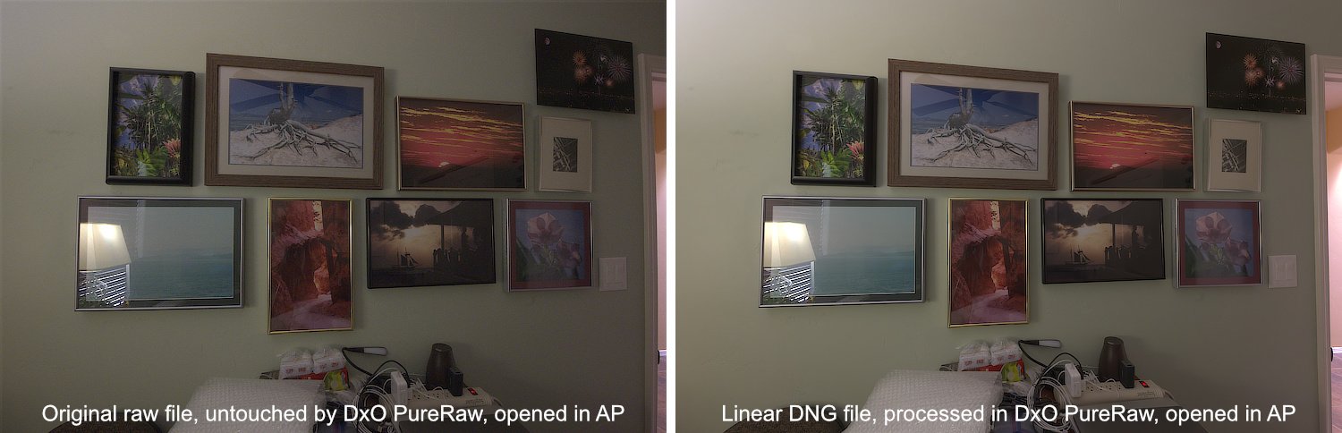
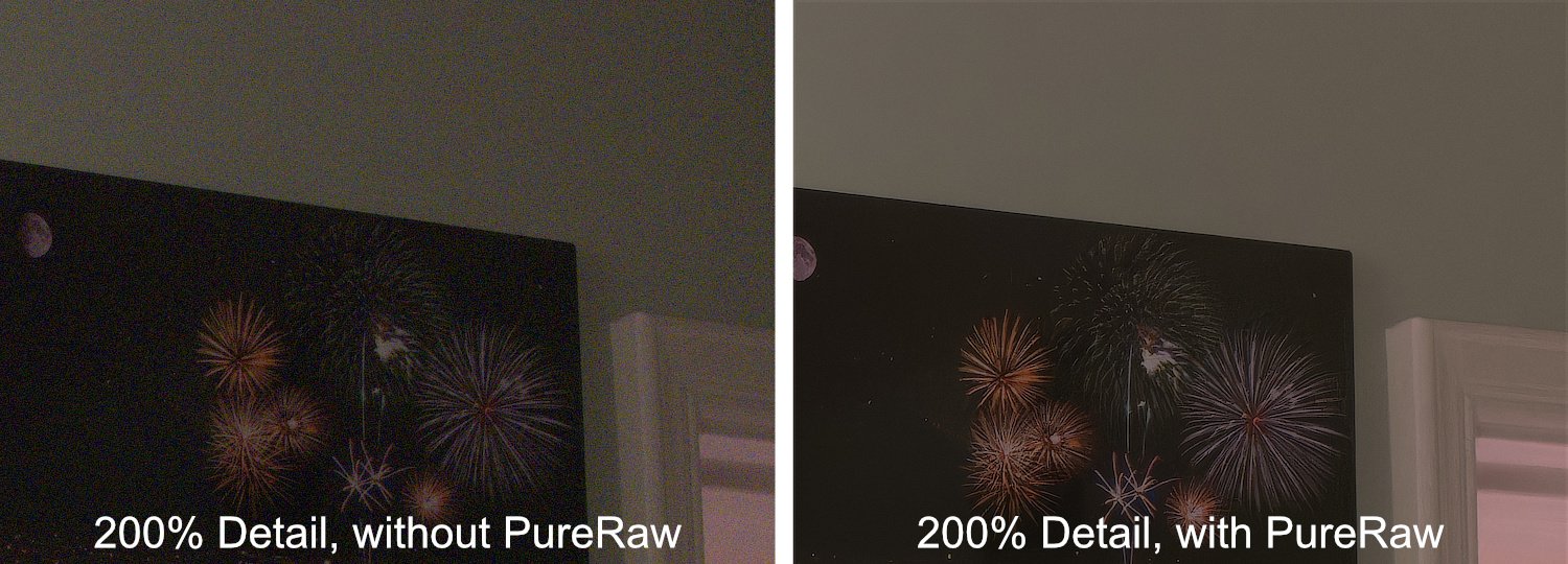
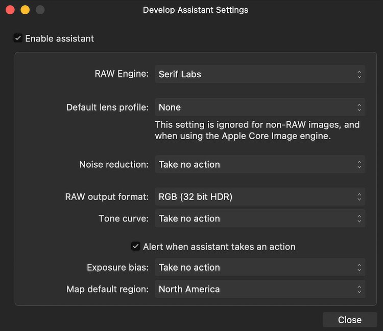
@alecspra - after my initial post, I decided to test whether the advice I was giving you was correct. I took a photo in my back room. I purposely chose a dark room, used a wide lens (14mm), and set my aperture to f16 (which gave an ISO of 12,800 and lots of noise). I took the raw file that resulted into Affinity Photo, both before and after processing with PureRaw. I set my Develop Persona assistant to avoid any additional lens correction, noise reduction, or added tone curve. My result? The DxO PureRaw processing is most definitely preserved. Here are the Develop Assistant settings I used: Here are both photos, one processed with PureRaw and the other not. And here is a 200% magnification of the upper right corner, in which the noise and lens distortion is clearly seen in the non-PureRaw photo, but is obviously absent in the photo processed in PureRaw beforehand.

-
alecspra reacted to a post in a topic:
What happens when you open a DXO Pure Raw dng file in Affinity Photo Develop Persona?
-
To get back to the original question posed by @alecspra, my understanding of what DxO PureRaw does is to create a new raw file (a linear DNG) and it does not simply add an .xmp file or other “directions” to the original raw file. The DNG file that PureRaw kicks out incorporates sharpening, noise reduction, lens correction, and demosaicing. It does not incorporate any changes to exposure, white balance, etc. As such, this new DNG file acts as any raw file does, except that the demosaicing has already been done. As such, if you process in PureRaw and then do additional raw processing in Affinity Photo’s Develop Persona, you should probably ask AP to avoid any step that would add additional noise reduction, sharpening, or lens correction. My best guess is that simply asking the Develop Persona to not apply a default tone curve will accomplish this. You can then do color and exposure correction to your heart’s content inside of AP before exiting into the Photo Persona. As a disclaimer, I use Capture One as my raw developer and so have much less experience with AP’s Develop Persona. I do use PureRaw, however, and have never had any (known) issues with using Capture One with a linear DNG file created by PureRaw. For additional reference, there is a nice article about Linear DNG’s on the DxO site. https://www.dxo.com/news/linear-dng/
-
Or… Mask the White Rectangles.mp4
-
pruus reacted to a post in a topic:
Create your own Avatar - a FREE Macro
-
VectorWhiz reacted to a post in a topic:
Machine Learning: Object Selection Tool
-
 Alfred reacted to a post in a topic:
Create your own Avatar - a FREE Macro
Alfred reacted to a post in a topic:
Create your own Avatar - a FREE Macro
-
PaulEC reacted to a post in a topic:
Create your own Avatar - a FREE Macro
-
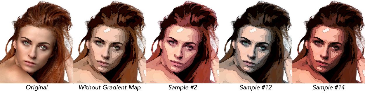
In my seemingly endless quest to create the perfect “cartoon” effect, I am posting a macro called Create an Avatar. This macro sets up a somewhat complex set of layers that can turn a photo into an avatar - the sort of image you might want to use on a forum or on social media. It is completely non-destructive, and allows for a large range of variation. The macro creates a number of adjustments and filters, all enclosed in a Group. Because of this, the effect can be turned on and off by simply toggling the visibility of the group itself. Additionally, the effect is completely non-destructive. It can be edited at any time, and even turned off or deleted without having affected the original photo in any way. The macro is supplied as a Macro Category and should be imported into the Library panel. It contains a single macro (called Create an Avatar). Once imported, the macro can be dragged into a different category, if desired. The macro was created using Affinity Photo 2 (v2.6.0) which means that it will not be compatible with version 1. However, since it is supplied as a category, it can be imported into the iPad version of Affinity Photo 2. The macro works well on portraits, and especially those with simple backgrounds. I have found that doing a selection of the background and filling with White creates a good starting point. There is nothing that should keep you from trying this macro on images other than portraits; I will include a sample of one such image below. * * * * * * * * * * * * * * * * * * * * * * * * * * * * * * * * * When you click on the macro, the layer structure is created and the user is faced with a lot of choices in the dialog box that opens. Here is what you can change in that dialog: 1) Set Brightness Part of a Brightness and Contrast adjustment, the default is 40%. Experiment with this, but I have found that keeping the number a bit high makes for better end results. 2) Set Contrast The second part of that Brightness and Contrast adjustment, the default is 25%. If the colors are too punchy, you can mute them by bringing the contrast down, even into the negative numbers. 3) Posterize to How Many Levels? A Posterize adjustment, this will limit the number of colors in the result. The default value is 5. The higher the number, the more bands of color you will get. You can move the number of levels up and down in the dialog, and see what kind of result you get. 4) Smooth Edges of Colored Areas This refers to a Median Blur filter, and is used to smooth out the edges of the posterized colors. The default value is 6, but sometimes a higher value is needed. The higher the value, the smoother the posterized areas will be. Don’t go so high that you lose all detail in your result. 5) Adjust Edge Darkness (higher = darker) The macro applies a sketch-like set of edges that outline the areas of posterization. This value will darken the edges. The default value is 85%. Values can be entered from 0-100%, but understand that a value of 100 will result in a complete blackout of the image. The best results are usually going to be between 80 and 95%. 6) Adjust Edge Width (higher = wider) This value changes the width of the individual edges. It does not affect the darkness of those edges, although a wider edge is certainly going to be more visually prominent. The default value is 1.5 px. You probably don’t want to enter values higher than about 3 or 4. * * * * * * * * * * * * * * * * * * * * * * * * * * * * * * * * * Here are two examples of the macro results. The first is a portrait, and the second is a landscape (the circular clipping was done afterward!) And here is a screen recording of the macro in action, so that you can appreciate the non-destructive nature of what’s being done by each of the sliders. Please take note that the resulting image remains non-destructive after the macro completes. Also, be aware that the Edges are all contained within a Group called “Sketch Edges” and its Opacity is set to 50%. You can make that opacity value anything from 0 to 100, which will eliminate or intensify (respectively) the edges. Create an Avatar (example).mp4 * * * * * * * * * * * * * * * * * * * * * * * * * * * * * * * * * Just before posting all of this, I decided to add an optional Gradient Map adjustment to remap the posterized colors. You will find this inside the “Photo Adjustments” group. It has a Blend Mode of “Soft Light” and is turned off by default. To use the gradient map layer, turn it on and open the adjustment panel. You can edit the default gradient map, and I have included a number of sample gradient maps that you can use. You may want to lower the Opacity of the layer in order to soften the result a bit. Download the ZIP file called “Optional Gradient Map Samples” for some presets you can use. (There are instructions!) * * * * * * * * * * * * * * * * * * * * * * * * * * * * * * * * * As with all of the macros that I have submitted please remember that I am one person working with one computer. I have tested the macro in a fairly limited fashion, and it works well for me. I believe that the macro functions as stated, but of course I cannot make any guarantees. On the other hand, if you like the macro you should keep it and enjoy it. It is free to use for personal and/or commercial work, and you do not need to credit me in any way. My only requests are these: (i) please post a response in this Forum topic to let me know that you are using the macro and (hopefully) enjoying it; and (ii) please remember to “pay it forward” by contributing to the forum in any way you can. It is by sharing your experience and your expertise that we all improve our skills and our enjoyment. Create an Avatar.afmacros Optional Gradient Map Samples.zip
-
- 3
-
-
-
smadell reacted to a post in a topic:
Add Film Grain (free macros)
-
P_Nog reacted to a post in a topic:
Color Grading in Affinity Photo
-
Color Grading in Affinity Photo
smadell replied to P_Nog's topic in Tutorials (Staff and Customer Created Tutorials)
My pleasure!- 5 replies
-
- 1
-
-
- color grading
- color wheels
- (and 3 more)
-
P_Nog reacted to a post in a topic:
Color Grading in Affinity Photo
-
Color Grading in Affinity Photo
smadell replied to P_Nog's topic in Tutorials (Staff and Customer Created Tutorials)
In the Develop persona, there is Split Toning (although that will only adjust Highlights and Shadows). In the Photo persona, try using adjustments like (i) Split Toning; (ii) Color Balance (which allows for Shadows, Highlights, and Midtones); or (iii) Gradient Map. Using a Gradient Map (with an appropriate Blend Mode, such as Soft Light) gives you the most options, but it is a bit harder to get real-time feedback as you move colors around.- 5 replies
-
- 1
-
-
- color grading
- color wheels
- (and 3 more)
-
Choose “Customize Tools…” from (I think) the View menu. Drag the Object Selection icon (looks like an owl) into the Tools palette.
-
smadell reacted to a post in a topic:
Paint Brush Flow
-
Paint Brush Flow
smadell replied to Old Bob's topic in Affinity on Desktop Questions (macOS and Windows)
One more thought, @Old Bob. Check the Blend Mode of the Paint Brush itself (in the Context Toolbar). If it is anything other than Normal, your brush strokes will look different than what you expect. Check the Help topic under Tools>Paint Tools>Paint Brush Tool. -
smadell reacted to a post in a topic:
Signature and copyright brushes
-
Signature and copyright brushes
smadell replied to tonyt's topic in Affinity on Desktop Questions (macOS and Windows)
Try this… Create a Signature Brush.mp4 -
Duplicate the layer (or just the seal) and set the blend mode to Linear Light.
-
Good morning, @Rachelle E. I found your post a few days ago and thought about it quite a bit. (In a "prior lifetime" I had an Occupational Medicine practice and, while it didn't require much in the way of aesthetics, I was drawn to your question.) Also, I've always found the Liquify Persona to be difficult to manage, and only helpful (to me, at least) for very subtle changes. I stumbled across what I think is a better (and easier) answer. That is the "Deform Tool." This is a destructive filter that can move points in a photo around, relative to an anchor point. I have attached a side view of a pre-rhinoplasty patient (from the web) as an example. To use the tool, I duplicated the background layer. This gives me a "Before" and "After" layer, and I will only be using the Deform tool on the "After" layer. First, place an Anchor point by clicking on the photo (with the layer selected). In my example, I have colored this point red. Now, place multiple other points in various positions on the layer. I've indicated these additional points by accentuating them with a white outline. You can use the Move tool to move them around, and they will transform the image by moving image pixels relative to the anchor point. In my example, I've moved most of the points along the periphery of the nose to new positions, and have indicated those moved points in green. I've left two points on the top (along the forehead) and the bottom (below the nose) so as to limit the deformation of those areas. This might be a reasonable way to simulate the anticipated changes in a patient's post-op results.
-
Selecting Neutrals
smadell replied to SaraL_Berlin's topic in Affinity on Desktop Questions (macOS and Windows)
For this particular photo, the suggestion by @NotMyFault is by far the easiest. For a more generic solution (also, by the way, encouraged by a post from @NotMyFault) try this method with associated macro. -
An additional point. You might not want to refer to that button as the “quick mask button”, since the phrase Quick Mask has a specific (and different) meaning in Affinity Photo. Refer to the Help section - https://affinity.help/photo2/en-US.lproj/index.html - but quick masking is a way to create and/or modify selections using pixel tools.
-
smadell reacted to a post in a topic:
Add Film Grain (free macros)
-
@jmwellborn - Happy New Year, Jennifer. This is so lovely, and so very serene. Thank you for posting this; it makes me feel relaxed, if only for a moment. Best to you and yours. As an aside, where is the quote from?