smadell
-
Posts
1,309 -
Joined
-
Last visited
Everything posted by smadell
-

Live Band Pass Mask has me Absolutely Confused!
smadell replied to smadell's topic in Desktop Questions (macOS and Windows)
Hello @Ron P. and @Komatös. I watched the James Ritson video (as well as some others) and it still leaves me with questions. I've got to say, however, I re-watched it just now and it does seem to answer one question. That is, once you've got the frequency range identified, the Intensity Map affects the "opaque pixels" (which I assume to be the white areas of the mask). I'm still a bit in the dark about the range defined by the Low Band and High Band sliders; do I define that range simply by random movement of the sliders or is there some logic that I'm missing? As I said in my first post, I can make it work (whether for sharpening, noise reduction, or simply creating outlines) but I still don't entirely grasp the logic of the thing. I do appreciate your inputs, though! -
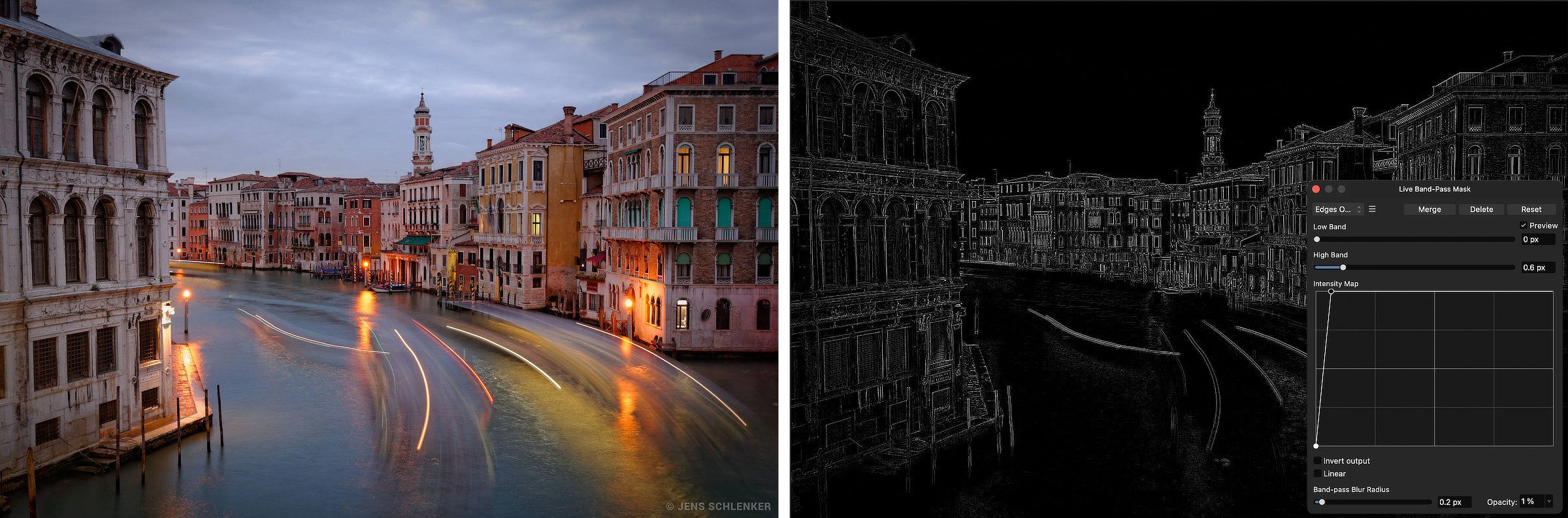
Can someone explain the Live Band Pass Mask for me? I understand that I can use it to isolate edges (e.g., for sharpening filters) or to isolate non-edge areas (e.g., for noise reduction). But just what the hell do the settings do? I've watched a bunch of videos that mostly show me examples of people using the band pass mask on a particular photo, but none have dug into the "why" of setting the sliders and graph the way they do, except in the most obscure terms. As a for-instance, I've managed to get some settings (see the attached image) that isolate the edges, and I can attach that to mask a sharpening filter. But I managed to do this by haphazardly moving sliders and graph points around. I don't really understand what I did, and I'd really like to. Someone (anyone!) tell me what the Low Band and High Band sliders actually do in practical terms. For instance, my settings (below) define a range of 0 (for the Low Band slider) to 0.6 (for the High Band slider). What does this range mean in terms of what my mask affects (reveal vs conceal)? And please tell me what the Intensity Map graph is all about. I seem to have made everything above 5-10% on the graph 100% (of what?) and everything lower than that falling off to 0%. So, the values are percentages of what? And how do I figure this graph out for next time except by random choice? Most of Affinity Photo 2 seems to have a logical explanation, and if I spend enough time I can figure out why things work the way they do. But this one has me completely confused. Can someone explain?

-
Can you import gradient maps?
smadell replied to kat's topic in Desktop Questions (macOS and Windows)
Good morning, @kat. Regarding the import of gradient maps, I simply don’t think there’s any way to do this. For some reason, Serif decided that gradients and gradient maps are so completely different that can’t share a file type. I have always maintained that there should be a centralized repository for gradients (in a manner similar to Photoshop's) which can be accessed to form linear, radial, and other types of gradients, but can also be used as the basis for creating gradient maps (even if the user edits the position, opacity, etc of the various color stops). Alas, this is not (yet?) the case. Since there is no file type extension for an Affinity Photo gradient map, they cannot be easily exported and/or imported. The only way I know of to share them is to create a document using multiple gradient map adjustment levels and share that document. Then, the recipient can open the document, turn on each individual gradient map adjustment, and save it as a preset. Clunky, to be sure. A gradient map’s settings can also be stored in a macro, but that’s even more difficult if the primary purpose is simply to share settings. I’ve attached an .afphoto document for you with all of the “cool gradient maps” you asked about earlier. If you want to keep all or some of them, open the adjustment layer and click “Save as Preset” in the panel. I’ve also included a link to a macro I posted a while back for enhancing skin tones, which you might want to try out. Gradient Map Transfer.afphoto -
Can you import gradient maps?
smadell replied to kat's topic in Desktop Questions (macOS and Windows)
Hi @kat. To answer your questions… 1) I put the mask on because I was in a hurry. Also, if there’s more than one area to shade/color, I’m not sure if the shading might spill out into the other shapes without a mask. Hadn’t really thought that one through entirely. 2) The “cool” gradient maps all started with a manually created gradient map that I made by hand and then saved as a Preset. I don’t remember for sure, but I may have based the gradient maps on some downloaded gradient swatches. 3) As to switching back and forth between two (or more) open .afphoto documents, I don’t know that there’s an easier way than just clicking in their respective tabs. -
Can you import gradient maps?
smadell replied to kat's topic in Desktop Questions (macOS and Windows)
@kat - You got me hooked. Never one to shy away from a challenge (or so I claim…) I watched the video. Obviously, Clip Studio Paint is wholly different from Affinity Photo, but I think that what I came up with is essentially the same process. I've attached a video, but basically I (i) masked out the area I wanted to paint; (ii) added a Pixel layer in which I added shading in black and white; and (iii) added a Gradient Map above that shading layer. Since the Gradient Map will apply different colors depending on the luminosity of the underlying layer, I can change the color by lightening or darkening the Shading layer. Effectively, it's dodging and burning with the goal of changing the luminosity so that the gradient map applies different colors. A picture is worth a thousand words, so a video is probably even better. Try this: Gradient Map Painting.mp4 -
Can you import gradient maps?
smadell replied to kat's topic in Desktop Questions (macOS and Windows)
@kat - If that’s what you’re after, then have I got a solution for you! Seriously, I saw the same YouTube video a while back, and posted a macro to create the same effect. You can download it (along with an explanatory PDF) here: -
Can you import gradient maps?
smadell replied to kat's topic in Desktop Questions (macOS and Windows)
1) Download and save the .grd file 2) Open in your browser: https://mikestimpson.com/GrdToAfpalette/ 3) Find the .grd file and convert it to an .afpalette file. Save this file to disk. 4) Import the .afpalette file into the Swatches panel Technically you’ve created a palette full of gradients, not gradient maps. But you could create gradient maps from these, using the various gradient stops for your gradient map. Personally, I would love to see Serif revamp the way it handles gradients entirely, including the glaring omission of the ability to create a gradient map from an existing gradient. But, for now, this is the only way I know of. -
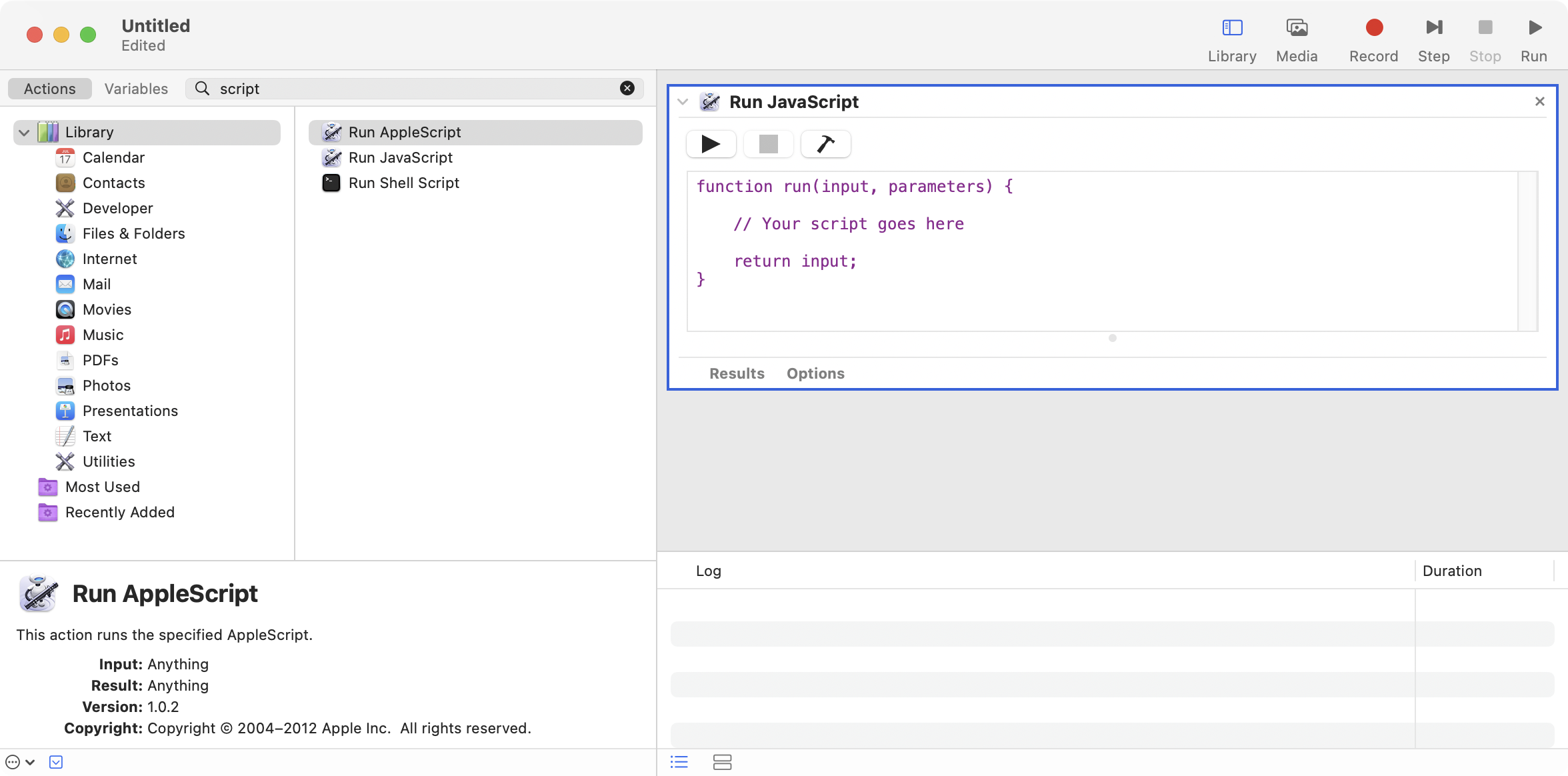
I've watched this thread (with great anticipation) but haven't posted, since I don't see myself actively "scripting." However, I am an avid user of macros in Affinity Photo. I would love to ask (confirm?) that the Macro recording feature will be upgraded to allow a script to be added as a step in a macro. I can only offer a comparison to Apple's Automator app, which allows the user to insert AppleScript, JavaScript, or a shell script as a step within an Automator workflow. This would allow a programming simpleton (like myself) to add a few simple script-like steps (e.g., looping, if/then statements, conditional steps, etc) without having to write full-blown end-to-end scripts. It might also allow me (and others, certainly) to create macros that incorporate third-party scripts, either purchased or posted on this forum! Is such a Macros enhancement planned?
-
Frequency Separation
smadell replied to Cameraman1649's topic in Desktop Questions (macOS and Windows)
To use Frequency Separation, you must have a pixel layer selected in the Layers panel. In practical terms, I usually choose “Merge Visible” to create a new pixel layer that encapsulates all the editing I’ve done up to that point. Then, with the “merge visible” layer selected, I choose Frequency Separation… from the Filters menu. Once you set the proper radius in the dialog that opens, you will have a High Frequency and a Low Frequency layer. The High Frequency layer is already set to Linear Light blend mode. And, your “merge visible” layer is no longer there - it has been replaced by the Freq Sep layers. -
Trouble with using a mask
smadell replied to steve ben's topic in Desktop Questions (macOS and Windows)
Are you using a Pixel layer as a mask? In other words, did you drag a “New Layer” into the masking position? If so, that would explain what’s happening. Using a pixel layer is fine, but the rules change a bit. Instead of “white reveals, black conceals,” the rule for pixel layers is that “painting reveals, erasing conceals.” Put plainly, anywhere there’s a pixel painted your image will be shown. Conversely, erasing those pixels will hide the image in that area. -
Software roadmaps are tenuous things. Features, improvements, new applications - all these can be promised with the best of intentions, only to fall prey to the ill winds of fate and circumstances out of everyone’s control. That having been said, Affinity issued the most important roadmap of all back in March 2024: 1) Perpetual licenses will always be offered… 2) Affinity is here to stay. Honestly, guys, everything else is icing on the cake.
-
Well, I’m glad that someone seemed to like it!
-
Go forth and vanquish your foes! To the victor go the spoils!
-
One other thing, @twosheds - if you find yourself “inside” a Group while recording a macro and want to select a layer that is outside of the Group, you cannot select the outer layer directly. You must first select the Group itself (you’ll be asked if you want to select the Parent, to which you should say Yes). Then, you can select the second layer. In essence, once inside a Group (or a layer that is a child of another layer) you must first “escape” the group before doing anything further outside of that group.
-
I do not hate Affinity Photo (quite the contrary!) But I don't use the Develop persona. I don't use it primarily because it is terrible at dealing with shadows and highlights. It makes them a muddy mess. I am not a professional by any means, and I am not an Affinity basher. For the most part, I love this software. But I use Capture One for my raw development, and the video below will show you why. A few caveats. (1) Since I don't use the Develop persona, I have never gotten very good at it. My attempts are probably not as good as they would be if I used that persona more often. (2) While there are numerous ways to tinker with shadows and highlights, my feeling is that if I shoot raw I should be able to recover shadows and highlights in the raw file, where they are most appropriately dealt with. (3) Workarounds aside, recovering shadows and highlights in AP is needlessly clunky. As shown below, what I could barely accomplish in Affinity Photo I was able to do in Capture One in a matter of seconds. If Serif needs to think about where to allocate time, effort, and money, this would be a good place to start. Raw Comparison.mp4
-
My vote is for the original (infrared) version. Isn’t the rule ‘black and white if the color adds nothing or is distracting’? I think the original’s color (which is actually fairly minimal) adds to the interest! PS: nice photo, by the way!
- 7 replies
-
- 1
-

-
- affinity photo
- infrared
- (and 1 more)
-
Modify Saturation for a specific colour
smadell replied to bvf's topic in Feedback for the Affinity V2 Suite of Products
The HSL adjustment has existed since version 1 was in beta. Watch this: -
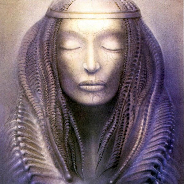
Talk about Giger-inspired! I looked for "Scorn Concept Art" images, and found the image below (left). Compare that to the inside of the alien spaceship from Alien, which was designed by Giger. Kind of similar…
-
I'm a big fan of Giger's art, and I like your interpretation quite a lot. My only wish is that the human face in your image were less photorealistic and more Giger-esque. But, a great homage to his work! As to the face, I would offer the inside album artwork from Emerson Lake & Palmer's "Brain Salad Surgery" as a possible goal.
-
I like your use of filling the Alpha channel, @NotMyFault. I tend to forget that as a choice!
-
If you’ve created an adjustment layer with an active selection, the mask will be created as per the selection. That’s unavoidable. If you’d rather have an attached layer mask (rather than a mask intrinsic to the adjustment) you can avoid the Spare Channel thing by: 1) If the selection is still active, immediately create a layer mask. If the selection is not active, hold down Command (or Control) key and click on the adjustment layer, which will reinstate the selection. Then create the layer mask. 2) Click on the adjustment layer and choose Fill… from the Edit menu. Fill the adjustment with White (which will effectively get rid of the mask). If your Foreground color is White already, you can alternatively choose Fill with Primary Color, also from the Edit menu.
-
Color Space - Profile
smadell replied to OldHickory30's topic in Desktop Questions (macOS and Windows)
@OldHickory30 - I wish I could comment intelligently about EDR vs SDR monitors, or about the DxO Wide Gamut color space. But I think my advice would be the same. It’s one thing to work in a really wide color space while editing, or even to export in a wide color space if you are going to use that image only on your own wide-gamut monitor. But, in other situations (such as sending images to others who will not have comparable monitors, posting images online which must of necessity be viewed through browsers that will assume an sRGB space, etc.), it’s most likely best practice to export in sRGB. As to editing, using Adobe RGB as your AP document’s color space is reasonable, given that your monitor can probably handle all, or nearly all, of that space. Printing is another concern, as there is most likely no printer out there that can handle ProPhoto, and may choke on whatever the DxO Wide Gamut entails. A post-edit color space conversion would be wise in that situation. -
Color Space - Profile
smadell replied to OldHickory30's topic in Desktop Questions (macOS and Windows)
First of all, @OldHickory30, I'm pretty sure that the RGB Color Profile (as well as the 32-bit RGB Color Profile) you specify in Settings… is only applied to a newly opened image if (i) you are creating a new image from scratch; (ii) you are opening an existing image for which there is no color profile stated in that image's metadata; or (iii) you have checked the box in AP that says "Convert open files to working space". If you are opening a document (for instance, a document you just created by exporting a photo from DxO) the Affinity Photo document should maintain the color profile that exists within that document. In short, if you export a TIFF file from DxO for which you specified Adobe RGB, opening that document in Affinity Photo should keep that Adobe RGB setting in place. As to which one to use, I normally use Adobe RGB rather than sRGB simply because it is a wider color space that allows me to work in "more" colors. I used to specify ProPhoto RGB (using that same logic) until it was pointed out to me, by a YouTube video I think, that most monitors cannot display ProPhoto and most printers cannot display ProPhoto, so I am shooting myself in the foot by trying to use that color profile as my working space. However (and this is the important take-home message) you should never, ever open your document using the same profile you specified for your monitor. That profile is only for use by your monitor, and its purpose is to correct colors when they are translated from your actual document to your monitor (for display). In truth, no matter what profile your AP document uses, your monitor profile will be used in order to display that file on screen. However, when you choose a "working" color profile, you are much better off using sRGB or Adobe RGB (and, as stated, I always choose the latter). Similarly, when you export from Affinity Photo, do not export an image using the monitor profile. Since that profile is specific to your monitor, it will make no sense for it to be used in an image sent somewhere else (or even used on your own system). If you have to specify, when you Export a file you should choose the color profile it uses based on where the image is going. If it is solely for your own use, and if your monitor can handle it, you can export a document in Adobe RGB. Otherwise, you are safest exporting a document in the sRGB color space. Simply choose that color profile in the appropriate pull-down menu when you are setting the parameters for file export. -
Well, I didn't call you weird, Lou - just your art. On the other hand, who knows???
-
This is very weird, Lou. But I like it! (Also, a nice job with the warp!)
- 8 replies
-
- 1
-
-
- affinity designer
- procedural texture
- (and 2 more)