Search the Community
Showing results for tags 'vector'.
-
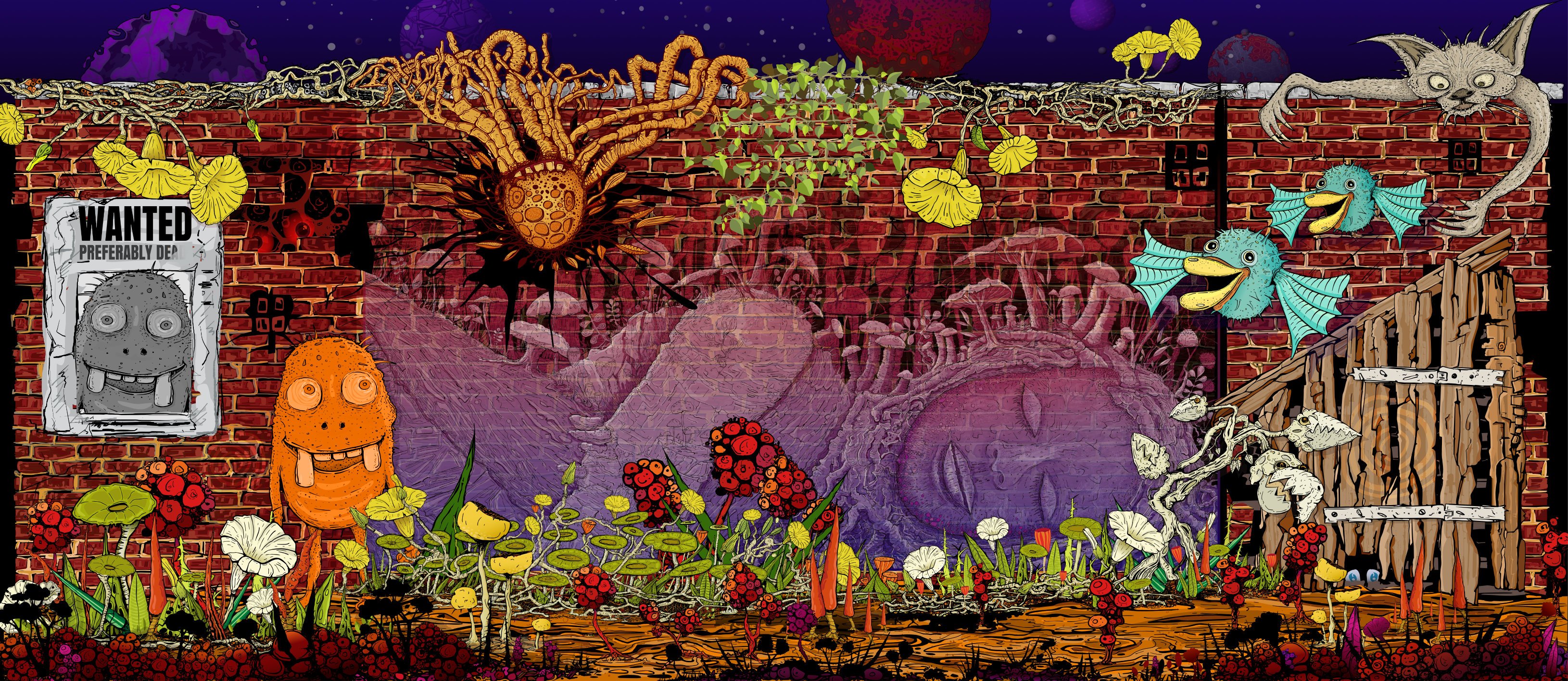
The Wall Affinity Designer | 1840 x 800mm 300dpi | Mixed raster and vector but mostly vector! Used Untamed: 'Planetary Toolkit' of for the Sky

-
 Introduction I'm "kicking the tires" of the Affinity Publisher, Designer, Photo V2.40 suite this week and wondered if anyone else has also been thinking of or are using it as a Swiss Army Knife program suite for all document related work like notes, letters, reports, papers, books, websites rather than just traditional "desktop publishing", to replace Microsoft OneNote, Word, Adobe Indesign, Illustrator, and Photoshop totally. I've been wanting such a suite for 34 years and after just 4 days of experimenting, I'm already dreaming of a world where the Affinity Publisher, Designer, Photo suite is dominant in all these areas. We are only allowed one main question, so what additions to the Affinity Publisher, Designer, Photo suite would be required for my vision of the future? Version 2.40 now has almost all the things that critics claimed were missing in version 1.0 as a desktop publishing program. The present plague I got my first "real"computer 34 years ago in 1990 and within 1 year I was already trying to import AutoCAD drawings into Microsoft Word for a steel pole manufacturing company user manual. Most of you know that Microsoft Word has never displayed vector illustrations properly and likely never will. I asked the secretary of the company to print out a few pages I had made with filler text and the drawings I had imported, to check the quality of the lines which looked horrible on the monitor. The secretary was horrified at the filler text thinking this was the final draft and notified all the head people in the company and soon I was confronted by an angry mob in the lobby where the head accountant put me in a choke hold and tried to strangle me to death. After this I experimented with Ventura Publisher which only displayed thumbnails in the image boxes, then Page Maker, Frame Maker, and finally Indesign, Illustrator, Photoshop where I discovered how huge those Adobe files are and so would only be suitable for the largest of projects. The file size problem Smallest Microsoft Word version 2016 docx files are 12 K, Adobe Indesign version 2.0 indd files are 144 K, but Affinity Publisher V2.40 files are only 10 K. So Adobe Indesign documents are not typically going to be used in any corporate or home office for small items. Below are minimum file sizes for different documents. Affinity Publisher 10 K, no thumbnail on save Affinity Designer 9 K, no thumbnail on save Affinity Photo 8 K, no thumbnail on save, 22x20 mm stamp size image Adobe Indesign 144 K, compression, no ICC, no pdf editing Adobe Illustrator 273 K, compression, no ICC, no pdf editing Adobe Photoshop 685 K, 22x20 mm image, CMYK, 8 bit Writing everything directly in the desktop publishing program Most people think that writing should be done in a word processor and later inserted by a professional into a desktop publishing program if required. We all know how many times documents are edited, so in the end the "finished" document spends more time being edited than the original write, and it only makes sense for the author to do the editing in the desktop publishing program. So everyone in a company should be using the Affinity Publisher, Designer, Photo suite. The desktop publishing experts would be used to set up the documents and help people with the editing, illustrations, and photos? Program suites Visual documents filled with illustrations and photos are much more compelling but also are often required. A long document text, vector, raster suite of programs developed by the same company is required for this to work seamlessly. There are only 2 companies now in the world selling reasonably popular, reliable, and easy to use suites that do this, Adobe with Creative Suite and Serif with Affinity Suite. Alludo (Corel) decided to drop Ventura Publisher, and Microsoft decided to focus on text and ignore complex graphics. File sizes of Adobe documents are too big and the subscription fees too high for wide use. This leaves only Serif to fill that void for the mass markets. And just like QuarkXPress lost their domination, Adobe Creative Suite could lose it's title of being most popular by missing on the mass market end if my vision of the future becomes reality. Even note taking could be done by Affinity Publisher There are likely over 100 different note taking programs available. Everyone of them has the same problem, not being able to draw or edit quality (Bezier) vector illustrations or add vector text to raster images. The original Zettelkasten note system was using 3x5 inch stiff paper cards, were widely used by academics for text, charts, diagrams, but present computer note programs focus on text only. But what is also required is a proper note making program. I work in the field of science and engineering and we make a lot of research and design notes. So instead of copying something from the Internet, we have to make our own drawings, tables, and formulas. And these are often quite formal with quality drawings and illustrations, as orderliness, precision, and attention to detail results in better conclusions. None of the present note taking programs will do this, they are more for fleeting notes. So am considering using Affinity Publisher to generate these permanent note and invention files. The actress Joan Rivers was reported to have one million cards in her Zettelkasten system. This is why small file size is so important. Because digital documents can be text searched, I am proposing to use longer notes than what was used in the original Zettelkasten system, might be up to 20 pages if there is one main idea, with individual digital files for notes instead of a single huge file like in present programs. This allows addition of different file types like document, database, spreadsheet, presentation, drawing, and image. A descriptive file name is typically used in computer filing systems and complex coding could be used, but also tags would be required for searching. Presently l can't find any tags that can be added in Affinity Publisher that can be found with the advanced search in Windows Explorer?
 -
 I really like the freehand vector pencil tool in Designer, but there are some thing that are a bit annoying and could improved imo. 1. Auto close was added in 2.0, but I find that in most cases it is not very useful. I would rather have the ability to close a path when the starting and end point are at a specified distance from eachother, say 10 points. This would allow me to use sculpt mode AND create closed paths, which is not possible right now. 2. Set smoothing factor: I would like the ability to set the accuracy of the stroke I draw, from very raw input with a lot of accuracy to a more smoothed out line. 3. Related to the previous point is the problem I have with zooming and pencil accuracy. The more zoomed out you are, the less accurate/more smoothed out the path becomes. I wish for a general smoothness regardless of zoom level. 4. I would love the integration of a Path eraser, that would be able to cut lines up to an intersection. This is possible using the Shapebuilder tool right now, so the code is there, but having it integrated in the Pencil tool and available with a shortcut would make it much more intitive and fast. This would probably require an option to keep all drawn paths selected.
- 11 replies
-
- 6
-

-

-
- affinity designer
- pencil
- (and 1 more)
-
-
Attached are two files, each of which contains a vector-based Sine Wave, Parabola and Hyperbola. This allows for fast, easy creation of these three curves, which can then be scaled and/or edited as desired. Nothing fancy. One is an Asset file (Curves.afassets) and the other is the Affinity Designer v2.4.1 file from which the assets were originally generated (Curves.afdesign). The strokes are black, and I included a white rectangle in the background so they are clearly visible in the Assets Panel. To install Assets, open the Assets Panel and choose Import Assets from the hamburger menu. Lou Dina Curves.afassets Curves.afdesign
-
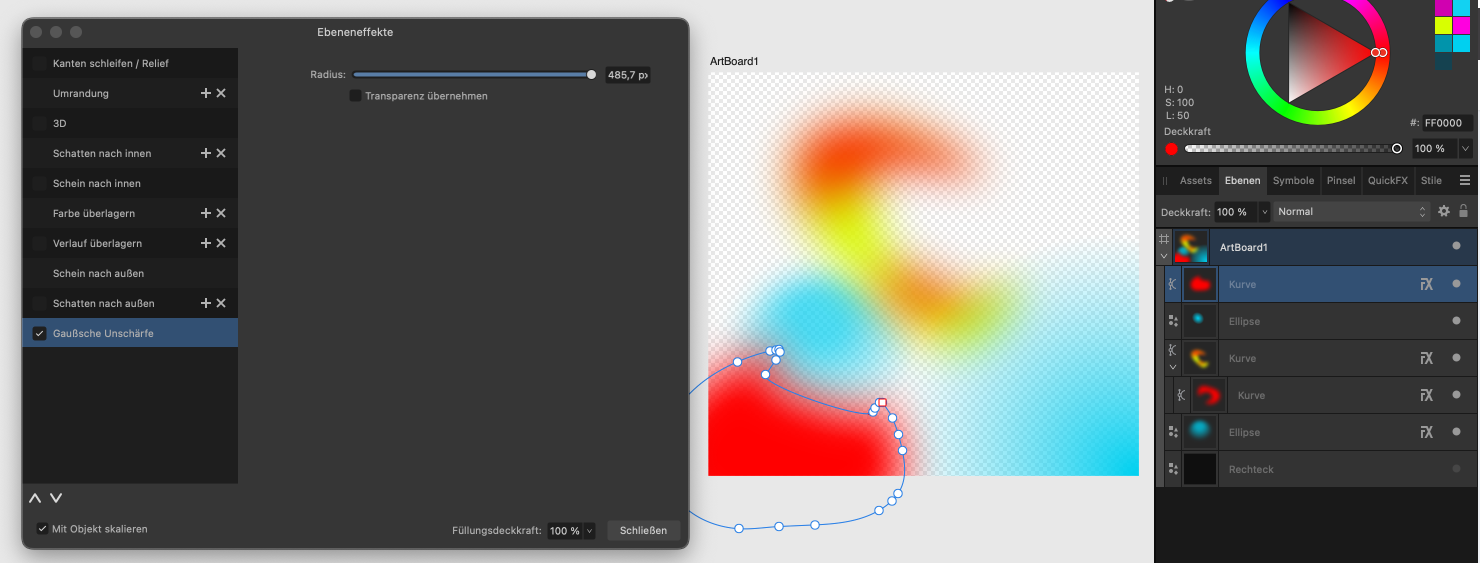
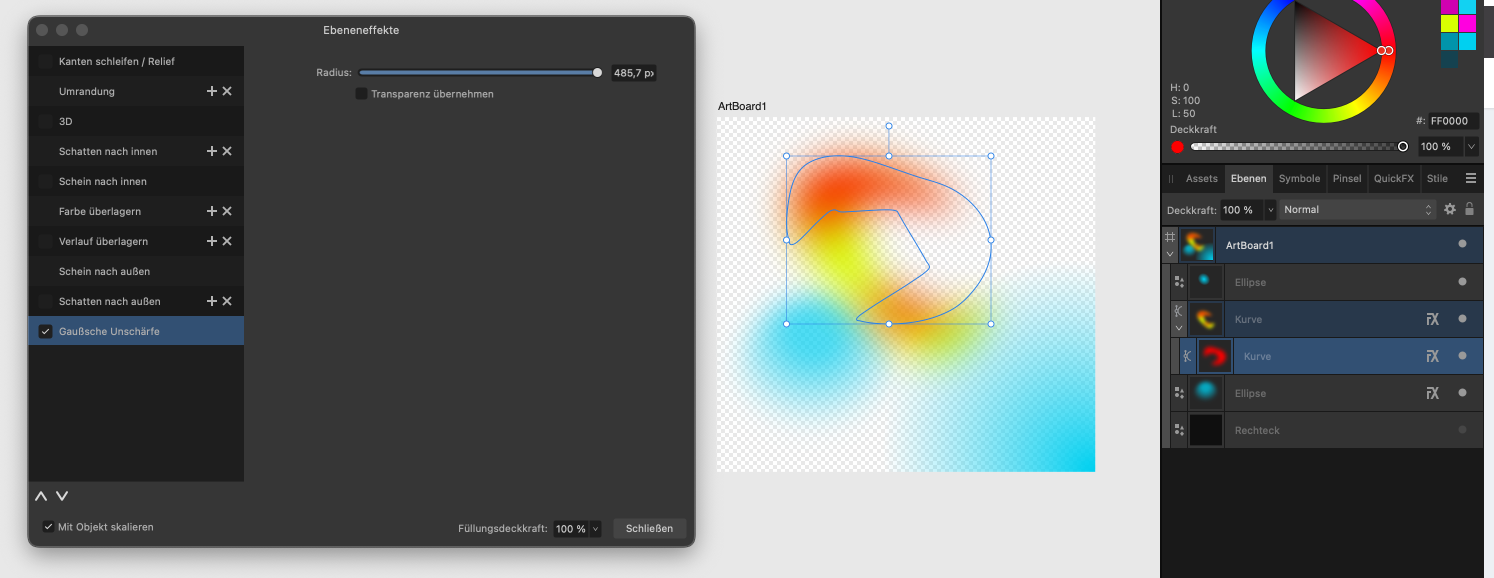
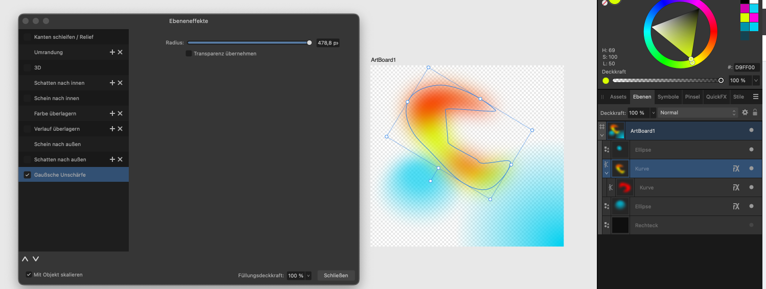
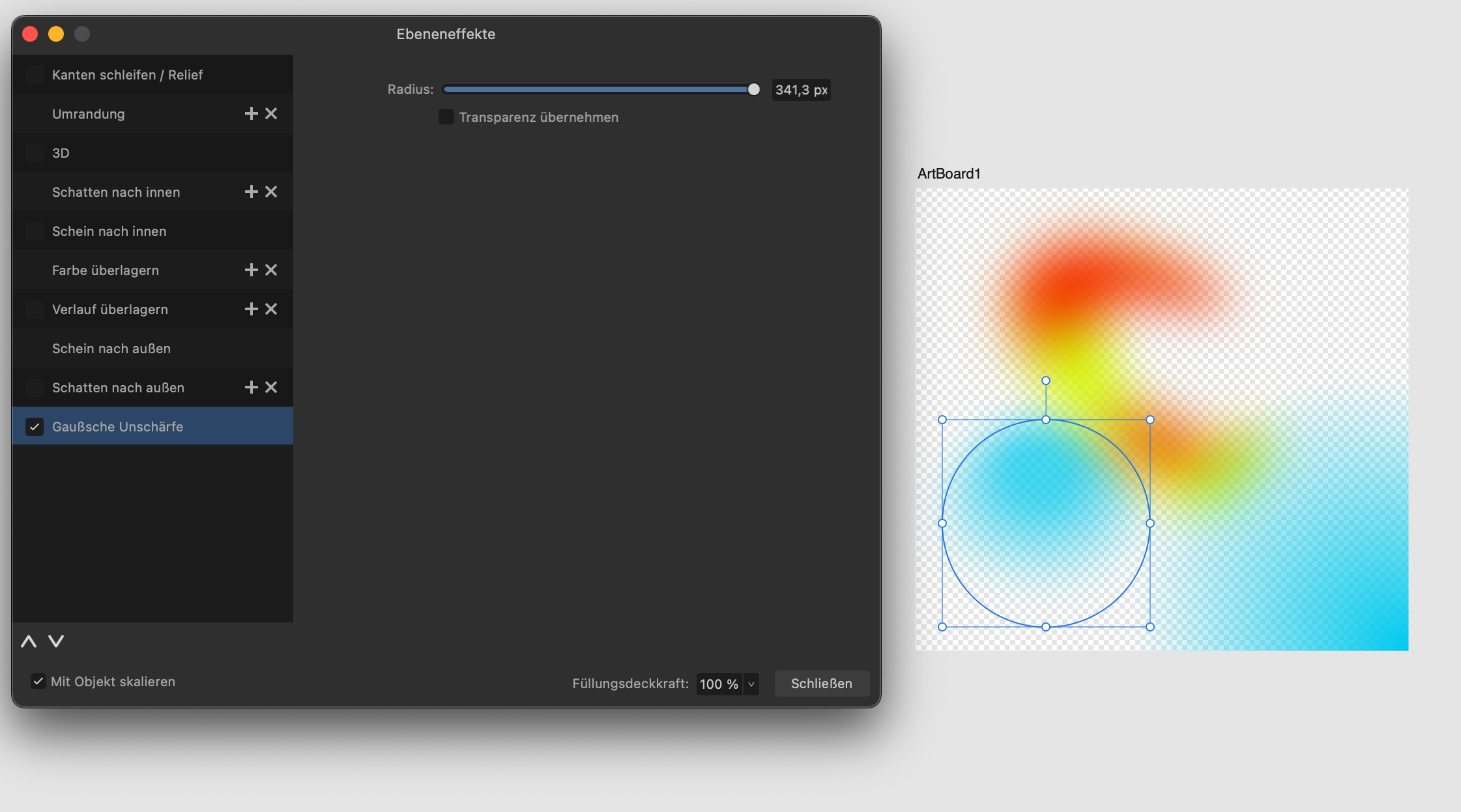
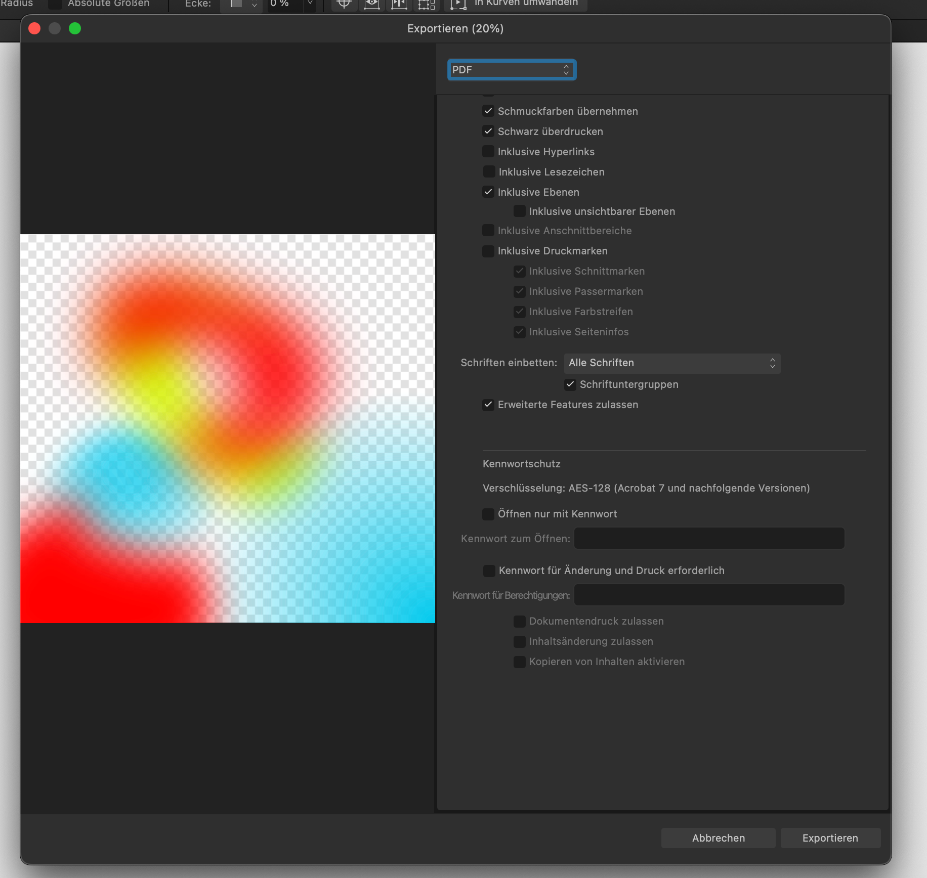
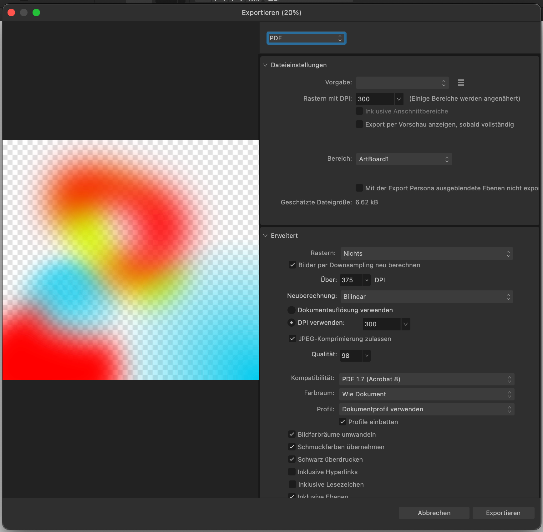
 I want to create with Affinity Designer a gradient mesh. In order to be able to define a brand specific texture, I am experimenting. The texture shall be used in Powerpoint slides but also on large prints like banners. So I must work in a way that it does not raster the image, because I want to scale it infinitly. Unfortunatelly you see in the Texture.pdf that the gaussian blur applied on the shape does not exist any more. Only the color gradients work in the PDF. If I export to SVG, then the gaussian blur exits. Also if I bring the SVG to Powerpoint and Export the Powerpoint as PDF, then the shape is blured correctly. So I assume this must be an export error in the Affinity Designer 2.4. Can you please help? I have posted the export menu screen shots so you may see whether any adjustment should be made, to get it to work. Thank you. Texture.pdf Texture.afdesign Texture.svg
-
 🇬🇧 The current version (v2.4) of AD does not allow you to rename a selection of several layers: if you run the command, it is ONLY the first (at the top of the list in the Layers palette) which is renamed (?!). Too bad, it seems so obvious, this impossibility is very frustrating... but perhaps the extended function will be implemented in the future... In the case where you ONLY have curves to rename and you accept that after this manipulation they become only simple curves, select them all, launch the “Merge curves” command, rename the object of this merger , then run the “Separate curves” command. Each curve resulting from this last command will have the name given above. @GarryP: This is a workaround to rename multiple curve layers with the same properties under the same name. Disclaimer: This won't work with everything. 🇫🇷 La version actuelle (v2.4) d'AD ne permet pas de renommer une sélection de plusieurs calques : si l'on lance la commande, ce n'est QUE le premier (en haut de la liste dans la palette Calques) qui est renommé (?!). Dommage, cela paraît tellement évident, cette impossibilité est très frustrante… mais peut-être que la fonction étendue sera implémentée par la suite… Dans le cas où vous n'avez QUE des courbes à renommer et que vous acceptiez qu'elles deviennent après cette manip que de simples courbes, sélectionner-les toutes, lancer la commande “Fusionner les courbes”, renommez l'objet de cette fusion, puis lancer la commande “Séparer les courbes”. Chaque courbes résultant de cette dernière commande portera le nom donné plus haut. @GarryP : ceci est une Solution de contournement pour renommer plusieurs calques de courbes avec les mêmes propriétés sous le même nom ». Clause de non-responsabilité : cela ne fonctionnera pas avec tout.
 -
I made this for a french festival using mix of vector & pixels with few time to do it. (Using affinity suite since V1, I will never come back to Adobe suite. Evreything is quicker, easier and fits my needs perfectly : focusing on creativity and not struggling and wasting time to make things work as it should.)
-
 Hi, Say I stroke a closed shape with a Vector Brush (in Designer). There is always a gap at the terminal point. Say you don't want the gap. No matter how you edit the brush's Properties – including Head or Tail Offset, Overlap, Pull, etc., – there's always a gap at the closing node. Is there a trick I don't know? (Besides opening the curve and tugging the end nodes for visual stroke overlap.) Wouldn't visual vector-brush stroke closure be a desirable feature for some/many purposes? ¿Could this option be designed into Brush Properties, in a later A.D. update? thanks in advance, – pbass
 -
 Could you add a flatten transparency command like Adobe Illustrator's? The way it works is that it converts the vector object with transparancy to a non-transparent vector with a colour that matches the one it had when opacity was applied. For more info see this thread: https://forum.affinity.serif.com/index.php?/topic/175099-flatten-transparency-set-opacity-to-100-and-use-the-colour-closest-to-the-transparant-colour/
- 14 replies
-
- 4
-
-
- flatten transparency
- opacity
- (and 2 more)
-
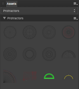
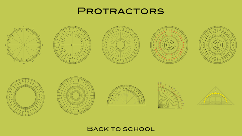
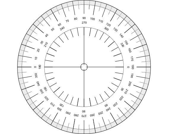
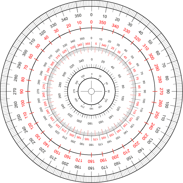
Let's go back to school, with some of those common and well known school protractors for measuring in degrees. ... etc. The protractor assets shared here ... ... are all vector based and do have printed on degree scales. You have to adapt/size the default assets protractor sizes to your document needs and thus scale them up/down so they nearly match your doc measurements. Note that all protractors are just a bunch of grouped/layered together vector parts (curves and text) thus they can be modified in colorings and the like. Also you should always move & size etc. a whole reused protractor group/layer when needed! Here is the associated assets file: protractors.afassets Have a nice school day!
- 3 replies
-
- 10
-
-
-
- vector
- protractors
- (and 4 more)
-
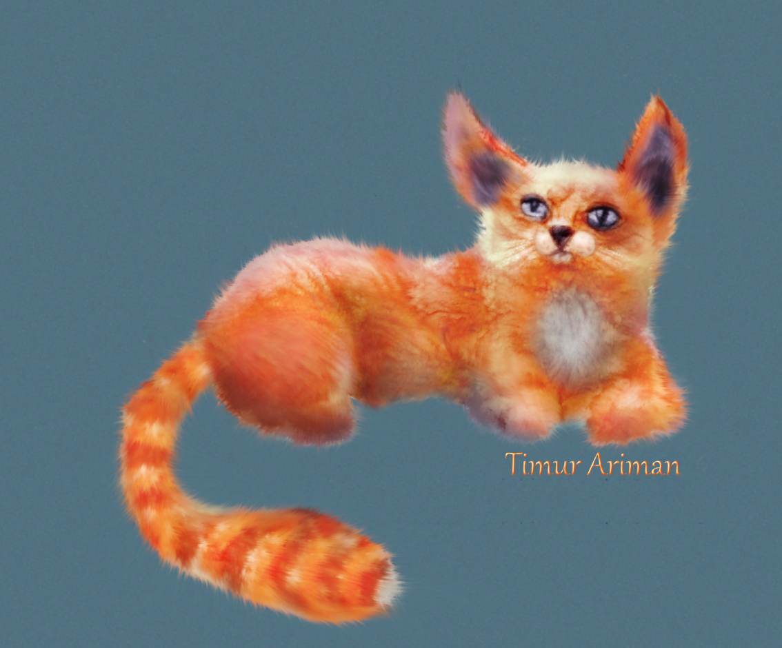
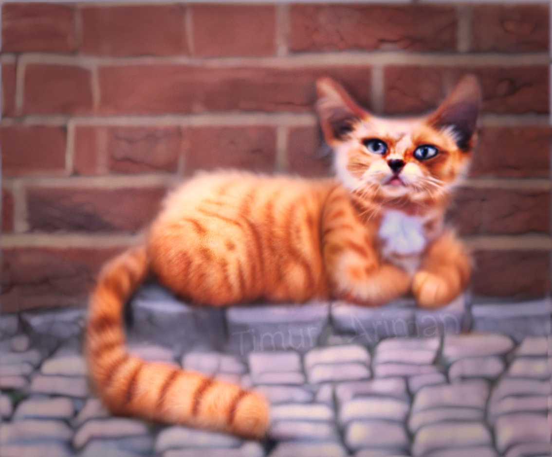
This started off life as a quick colour study for an oil painting I’ve been planning and wasn’t meant to be anything more, but - as usual - I started getting obsessed with adding the detail, and so here we are. I’ll still work on the painting, but I’m really happy with the vector version so thought I’d share. Hope you like her!
-
 Hello, I would like to suggest adding a vectorization feature to your software, similar to Illustrator's functionality. This request is quite common, and many users are frustrated by the fact that this feature is practically non-existent! It's quite unfortunate. I sincerely hope that you will consider integrating this feature in an upcoming update. It would be greatly appreciated by the graphic design community and would be a significant advancement for Affinity. Please kindly consider this request and implement it if possible. Thank you for your attention.
-
- 1
-
-
- vectorization
- vector
- (and 2 more)
-
I could have called this Many hands (and feet) make light work. We're all getting browned off with Artificial Intelligence stealing copyright works. I thought it was time I made a stand and made my own AI image. In this case, it probably means Astonishing Inaccuracies.
- 16 replies
-
- 18
-
-

-
-
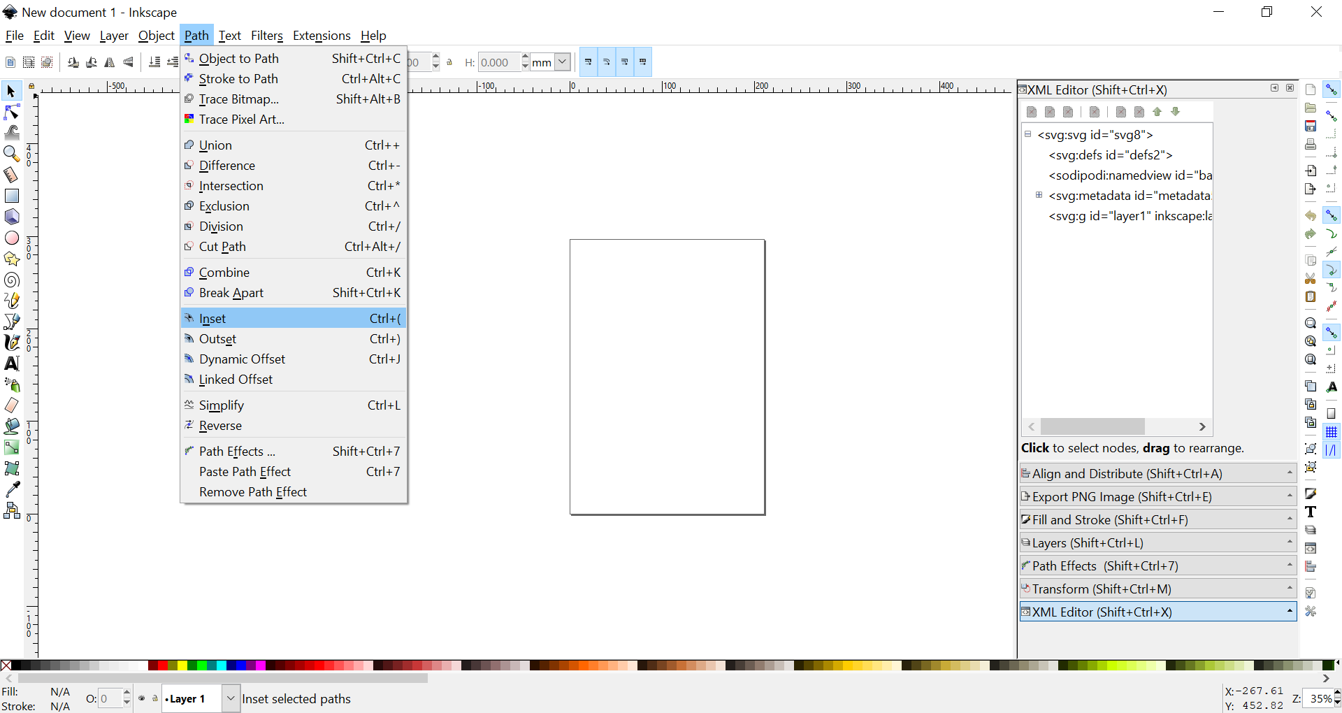
 Hello, I am looking for the equivalent of inset and outset in Inkscape. Can't find anything related in AD. There's something like that right?
-
 I am making some pattern that will be cut with a laser. This means that I have to plan the paths for the cuts by using vectors. I need to cut the whole edge of a piece (curvy) on a zig zag so the curves keep some stability once cut, but I can't finde a way to turn my smooth lines into zig zag ones.
 -
Just reposting this v1 feature request in the v2 feedback forum. Would be good to know if implementing this feature is even possible, I assume the inner software architecture doesn't allow it (only bitmaps) and it might only be possible with a hacky and unstable implementation, but if you can confirm it at least we can close the question with a definite answer. Here's the v1 thread:
-
 why are Recent picked colors are not listed when using VECTOR FLOOD FILL? bug???
-
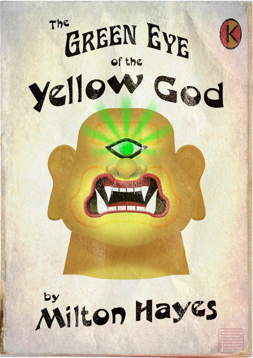
The Green Eye of the Yellow God, aka The Green Eye of the Little Yellow God, is a dramatic monologue written in 1910 by J Milton Hayes. Despite one or two comic parodies, it's still a Ripping Yarn if delivered straight; you can look up the words, or a recitation on YouTube. Meanwhile, I thought it would make a good subject for a 1960s-style pulp paperback cover (though it would be a very short book, as it will fit on a single page). Made in Designer, with a couple of pixel texture layers.
-
Hi everyone! This marks the start of my sketchbook. EDIT; here is the optimized version with shadows, thanks for the tip!@MBWanderer
- 8 replies
-
- 8
-
-
- affinity photo
- drawing
- (and 5 more)
-
New in Version 1.2: Tracks Function – Create many types of rotational designs. Routes Selector – You have a choice of the order in which most designs are drawn. Colour Schemes – Seven new schemes. New Shapes – Spikeys, Flowers, Rectelipses (Squircles), Quaternates, and path versions of other shapes. Code Viewer – Improved viewing options. Fields – You can now determine if the shape positions are automatically recalculated. I recently published an update to Canny Vectors which is an application that allows Windows 10 users to create various vector designs that can be used in the Affinity applications – as native Affinity layers – or saved as SVG files to be used anywhere you use SVGs. I had the Affinity applications in mind when I was developing the software but you can probably use the output anywhere that can use an SVG. It is not meant to be the greatest vector application ever, or anything like that; it’s just a small collection of simple tools which might come in useful every now and again and save you a little bit of time here and there. And it's completely free with no ads. At the moment it has five functions: Grids – regular orthogonal grids of shapes; Fields – a collection of randomly placed shapes; Panes – an area covered with randomly altered lines or shapes. Centrics – Create ‘concentric’ shapes, and more. Tracks - Create rotational designs. Each function has various options with which you can vary what the software creates, so there’s lots to experiment with. The application comes with a user guide – written using the Affinity applications – which I have attached to this post: I’ve attached some example images and a video of each function showing just some of what you can do. Please do not make bug reports or make feature requests for this software in these forums; I’m sure the Serif staff don’t want that extra hassle. Use the in-app functionality instead, or you can rate/review the software in the App Store. If you want to make a feature request, please read the notes in Part 8 of the user guide before making the request (some requests/suggestions may be ignored). (You might be able to PM me via the forums as long as the discussion doesn't go on for too long.) If you do use the software, and find some good uses for it, then it might be nice if you could show some examples here for other people to see. You can find and install the software via this link: https://www.microsoft.com/store/apps/9P3H0SH7XK02 Or you can get it via the Microsoft Store here: ms-windows-store://pdp/?productid=9P3H0SH7XK02 Why not give it a try and see what you can create? 2022-02-27 12-25-52.mp4 2022-02-27 12-30-24.mp4 2022-02-27 12-41-04.mp4 2022-02-27 12-43-22.mp4 2022-02-27 12-47-38.mp4
- 40 replies
-
- 21
-
-
-
A little Monster
-
Some of this year's reduced tree motives which I use on xmas cards ... If you need some last minute xmas tree resources take a look under the forum resources at ... Xmas Trees Assets Xmas Trees Xmas Silhouettes ... generally take then a look at the xmas stuff under ... Retrospective of resources contributions Have a contemplative and peaceful Christmas time!
-
Hi all, I'm considering buying Designer but one thing that I can't find is if there is a way to fill an object using vector or patterns. I only find gradients and bitmap. I know we can duplicate an object to create hand made pattern but I can't then edit the repetitions like if is a bitmap fill. Cheers, Juan
- 317 replies
-
- 29
-
-
Decided to do this without blurs again whilst trying to keep it realistic. It made some things trickier but saved the time in not having to set a million blurs. Used AD v2 for the warped text.