Search the Community
Showing results for tags 'ui'.
-
 Greetings, I am re-suggesting this to encompass all the Affinity products, especially Affinity Designer and Affinity Publisher. For the most part, Affinity cursor and tool icon shapes are very clear to understand and the cursors match well with their tool icons, except for the Move Tool. When switching between the Move Tool and the Node Tool with keyboard shortcuts, the two cursors are so similar they are quite visual ambiguous. I suggest changing them so they are consistent and clear for the user. My suggestion below is not the only solution— you may have a better one. I really hope you can reduce the user interface ambiguity and increase the consistency.
-
 Looking for a little guidance here using Affinity Designer on Windows 10. My issue is the highlight color used to indicate the active layer when the interface is in dark mode. That blue gets lost in the rest of the UI for me. It's just too close for my eye at least. I checked the other forum topics, and I found other similar complaints from Mac users, but not from Windows 10 users. It appears that I don't have a way to change that highlight color, either through the program or through the OS. Or do I? Am I missing something? Thanks for any help you can give me.
-

hide Left/Right studio pane
Clavote posted a topic in Feedback for the V1 Affinity Suite of Products
Hi It would be very useful to improve the UI of all Affinity Apps by giving us: open/close left studio panel and open/close right studio panel as a keyboard shortcut C -
Hey everyone! It would be great if there was a way to rearrange the UI (tools and icons like layers or symbols). Also, including tools like gaussian blur, that can be added as optional tools on desktop, would be great. Best wishes, Shu
-
Hey everyone! It would be very helpful if, when using tools, all of the UI, except for the icon on the top right that lets users enable the UI again, could be automatically hidden. There could be a timer, which shows the UI again after a period of time. The amount could be set in settings. Procreate has this automatic full screen mode and it's very useful. Best wishes, Shu
-
Hey everyone! It would be useful to be able to hide the menu on the lower part of the screen (especially in full screen mode). I know it hides when I move there, but most of the time I don't know if I need to move there since it's blocking the view. Best wishes, Shu
-
 Hey, please make the Resource Manager available to the Studio palettes for better integration in the UI. I need it right by my side all the time like the Layers and Pages panels. Please also add more options to pieces of information like Color Space, Transparency, Rotation, Dimensions, File Path etc already in the list. Cheers Benny
-
 Since I've already expanded a lot on the subject on my last post, I'll keep it short and to the point: Affinity apps almost completely disregard the macOS system-wide option “Full Keyboard Access: In windows and dialogues, press Tab to move keyboard focus between: All controls”, in the Keyboard prefpane. In fact, they don't even honour the alternative and default “Text boxes and lists only” on all places, which would include the very useful input fields on many different palettes. There are issues on important dialog boxes such as “New Document”, and the only palettes where fields are properly addressable via tabbing are, AFAIK, the Transform palette, and only partially so. Some allow for tabbing between one or two items, and all of them, regardless of the number of fields, drop the user into the “Tab to hide the Studio” behaviour, instead of cycling back to the first field like in Adobe CC. This behaviour is, for lack of a nicer term, undesirable and unintuitive, and I could also reproduce it in the Windows beta of Publisher; seeing how I can also reproduce it in the MAS versions of Photo and Designer, I'm willing to bet that it's also reproducible in the release-quality Windows versions of those as well. I also noticed input field and UI control ordering inconsistencies between the Mac and the Windows versions of Publisher. I am aware that fixing this would require an overhaul (or at least an internal review process) of six different codebases across two different OSes (though the fact that some palettes and dialogues are rather similar across apps, so there should at least be some economies of scale at work there), and introduce further overhead in your development process from now on (because it does indeed require a change in philosophy, as tabbing has up until now been added just as an afterthought and only in the places where we specifically asked for it, instead of everywhere, organically and by default, following a predictable scheme and behaviour), but this is yet another thing which I believe you also must do in order to be taken seriously by design professionals who actually use your apps for UI and UX work; you must lead by example, because many of your users will know a lot about that very subject. For the same reason, Adobe was the butt of all jokes for the better part of a decade on account of their lack of polish and consistency (there's even a Tumblr page called “Adobe Gripes” [formerly “Adobe UI Gripes”] dedicated to their misgivings: https://adobegripes.tumblr.com ), but even they got their act somewhat together as of late (there are still inconsistencies between different apps of their suite, but at least most of these nitty-gritty UX issues are pretty much solved by now). Seeing how you're still in the beginning of your expansion in the market, and only have 3 apps in two platforms to contend with, please take the opportunity to polish all of them before the arguably momentous 1.7 release, which will mark the completeness of the originally announced Affinity 1.x suite. All eyes will be, then and once more, on you, and some reviewers will possibly go through all those details (maybe even making brand-new reviews of the original first two apps), and call them all unpolished or unfinished. I know I would, because that's the way they feel, at least on this major point in particular.
 -
 Hi! Maybe someone asked this before, but wasn't able to find a specific discussion. So please delete this if needed. I'd like to have an option to enlarge Layer's preview/thumbnail, I'm getting old... Is this in your thoughts? Cheers, Paolo
 -
 Hi, used "Separated Mode" for a bit, but I found it difficult to get gridlines on a design so I switched it back off. However, "Merge all windows" doesn't appear to do anything when I'm in "Separated Mode" - what is it supposed to do? Using Affinity Designer 1.6.1 on Mojave 10.14.1
 -
I haven't this been suggested before. I think it would be pretty useful to have pie menus for quick tool switching. I haven't seen this in image editors, but I think it's pretty common for 3d modeling: In this app, for example, you can customize them to have multiple levels, you can have quick color selections, etc. I think it allows for very a very quick access to common options.
-
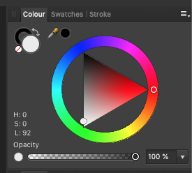
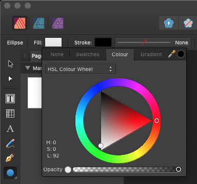
 (*Also see this issue in Designer Beta.) Looks ragged in both Color Studio and context pop-overs as shown. Changes under Preferences > Performance > Display have no affect. 2013 iMac -- non-retina, Mojave 10.14.1
-
 As someone who likes to have a full, always floating UI on desktop in Designer and Illustrator without having to hunt for everything, will there be any option for supporting this on iPad? I spend so much time tapping around it frustrates me a little. I have a 12.9” Pro so screen real estate isn’t really an issue for me. For example, I’d love to have layers, colour, and typography always open adjacent to each other instead of one or the other in the Vector persona.
 -
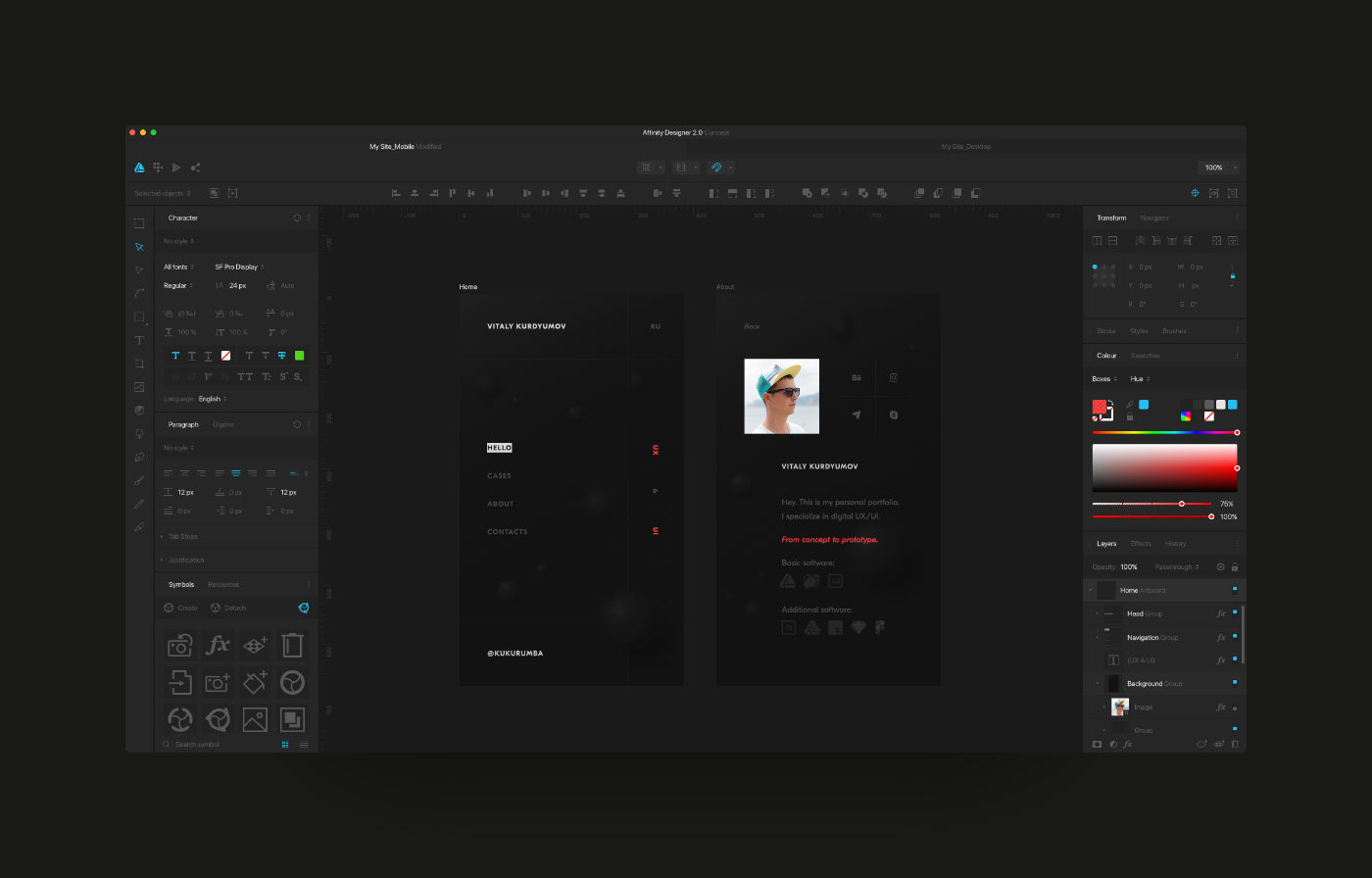
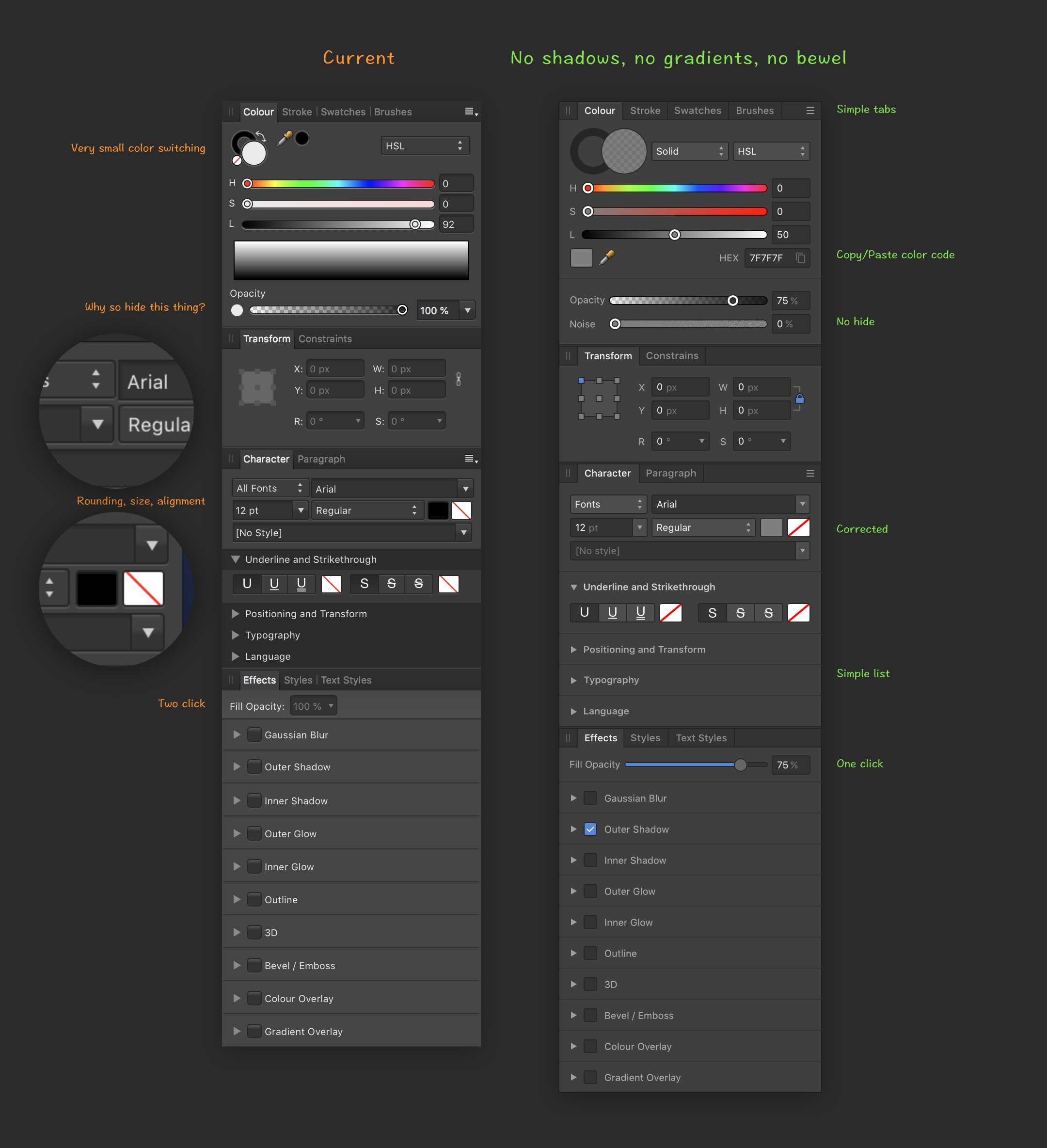
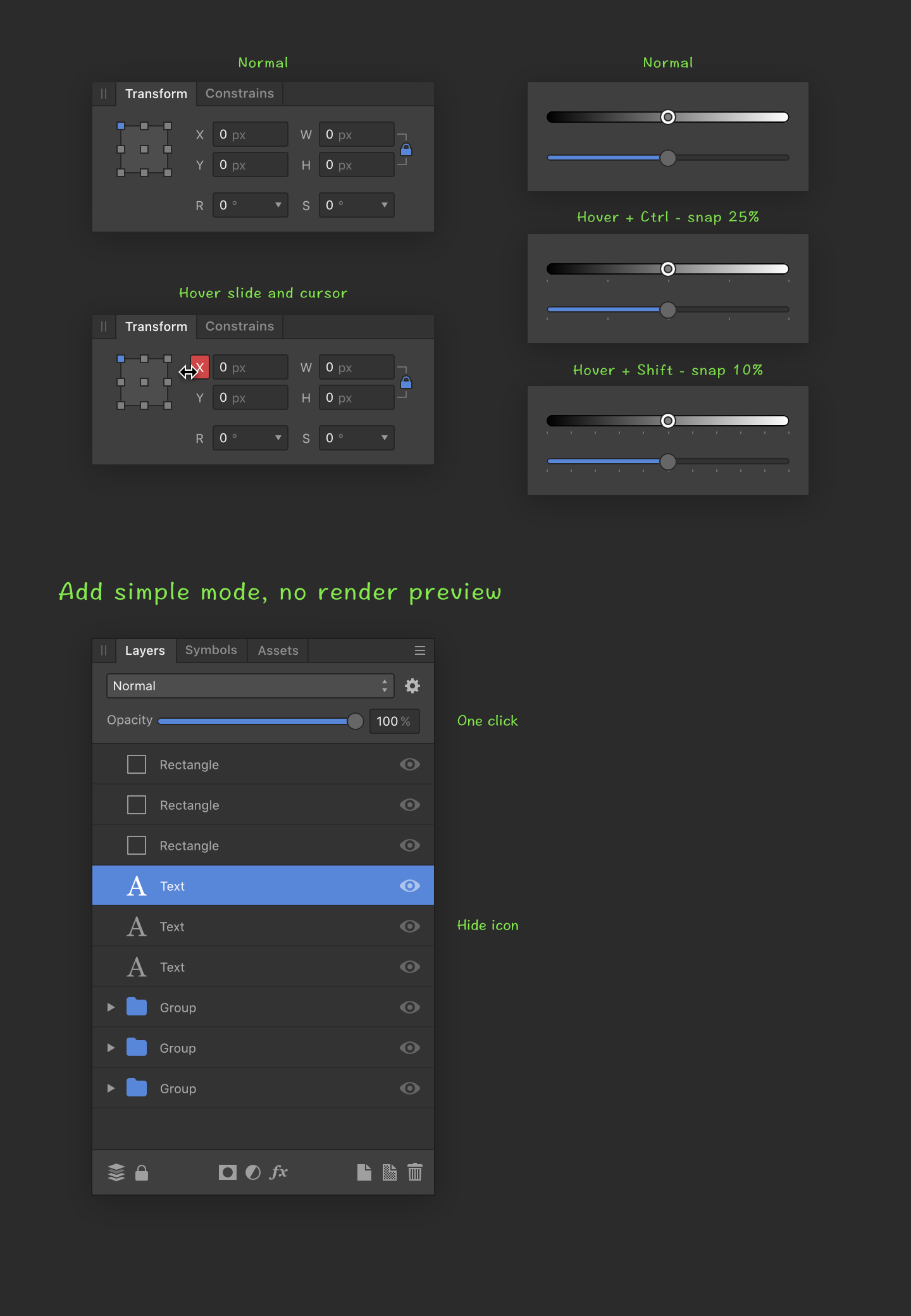
Hello. My name is Vitaly, I am UX/UI designer from Russia. In my free time I decided to redesign my beloved Affinity Designer. What I did can be viewed at the link below. What do you say, colleagues? View on Behance
-
I noticed a bug in the appearance of the navigator palette. I'm viewing this on a non-retina-display. the zoom-percentage (186%) is slightly blurred, while for the swatches pallette, the opacity percentage (100%) is sharp(er) Although I know, text has to be a little bit antialiased, but this seams to be a bug.
-
 Bonjour, J'ai 60 ans et je dois avouer que la taille de la police de caractères de l'interface utilisateur est particulièrement petite. N'y aurait-il pas la possibilité de proposer 3 tailles différentes (petite, moyenne, grande) ou de paramétrer soi-même la taille désirée. Ma remarque est également valable pour Aff Designer et Aff Photo.
 -
Hello. I don't speak English very well, so I will try to show everything with examples. P.S. I love this application.
-
So to use dynamic zoom you have to hit spacebar then ctrl. Is there a way to swap this or allow it to do both? I'm so used to hitting ctrl + spacebar. With my mindset being: start from the outside of the keyboard and working my way inward while hitting hotkeys. Thanks!
- 3 replies
-
- 2
-

-
- hotkey
- dynamic zoom
- (and 2 more)
-
 I have the bug in publisher where I have two tool windows next to eachother, the character panel docking to the left, then for instance the glyph browser next to it. However, this causes problems when picking fonts, as the fonts dropdown menu goes behind the glyph browser window. see screenshot.
-
I am really liking publisher so far, and can imagine working with it professionally in the future. I am using indesign cs5.5 at the moment and one thing I would like to see in publisher which is in this program is collapsible panels. I like to have some panels open all the time, like character, paragraph, pages and color. This already fills my workspace pretty much, but I would like other options quickly available too, but not take up space all the time, f.i. the text frame option, the text styles and stroke options. Having some way to group a couple and minimize them would be very helpful.
-
Hi, I'm often using Affinity to draw with a pen on my windows laptop and the most frustrating part is undoing strokes. When using the laptop as a tablet, the keyboard is folded away and I can't press Ctrl+Z. While I've read that there's no touch based interface planned, I would love to be able to add shortcuts to some basic actions like undo/redo to the toolbar like this for example: Actions I would use in the toolbar would be: Undo/Redo Changing selection mode (add to selection, remove from selection, new selection) for objects on the canvas and for layers Grouping selected Layers
-
I noticed two minor things today: 1) When detatching a symbol, the corresponding objects in the layers palette still have the orange bar that denotes a symbol 2) Highlighting two characters (asterisk and closing bracket) and clicking on the Superscript button didn't do anything to the characters. They just stayed as they were.
-
 Hello again, I have few other questions: • Is it possible to choose another color for highlights? There is already quite much blue and I'de rather had them in a warmer easier way to see the highlghts immediately. • How can one fix a hard space (to avoid having a ":" at a sentence beginning)? • When searching a glyphs (":" in my case), they appear all in a list, but won't be highlighted all at once. • When clicking on a found element in the list, the highlight happens only if I select the "A" icon in the UI. It turns back to "A-frame" each time I click on the next searching line. With few dozen of the identical glyphe to be checked, it soon gets heavy. RECTIFICATION: In the meanwhile, Publisher quitted, and something changes when reopened. I went on with correcting the none hard spaced ":" and notice that, with "A-frame" icon on, a grey highlight appears now with search line selected.
 -
 It would be awesome for all UI designers that we could import Sketch App file format into Affinity Designer, would not it? Is there any chance to see this feature request landing in the foreseeable future, what do you think about it?
 -
 The bleed options in Document Setup are given as… Inner, Outer, Right, and Bottom Surely Right should be Top?! UPDATE… Bug is worse than just the labels. The fields are misassigned. Outer is actually the Top. Right is the Outer. Inner doesn't seem to do anything?! Bottom is Bottom <- Hooray!