Search the Community
Showing results for tags 'ui'.
-
 The black and nearly black backgrounds of Affinity Photo windows, toolbars and palettes entirely distract me and I'm sure Serif knows that reading white type reversed out of black background is a strain. How do I change the UI preferences to display white or light backgrounds?
 -
 Hi I hope I'll explain my problem well. I am trying to use Affinity Designer as my new UX tool for wireframes and mockups, and so far so good. But there is a little something that is irritating. Every time I want to center some text inside like a circle or a square, it is never truely centered. My snapping tools are on. but still even if I put my text on the red and green line, the text is always a little off. I saw that every text got a little space between his bottom and the bottom of the selection box. So I think it is because of that, I am looking in the transform text dialogue box to see if I can do something... but no good conclusion. What should I do? Thank You
 -
 Don't know if this is a bug but I searched the forums and only relevant topics were about the ui looking too small. I am facing a reverse situation where the UI is looking too big (compared to the screenshots). I'm working on a 15-inch laptop with a 1920x 1080 resolution. I have similar issues with adobe applications and chrome but a few of them have workarounds using environmental variables and command line switches. Is anyone else facing the same issue? Do we have any workaround for this case?
-
 Hi guys, I'm trying to use Affinity for digital painting. When painting in Affinity I keep accidentally switching between the pixel tool, the color replacement brush tool and the desired paint brush tool (because all of them under pressing "B" on the keyboard). Is there a way to change it? Maybe edit the tools panel so I can leave only the paint brush tool (I don't use the other brushes) or maybe pressing Shift+B to switch between the other tools? Many thanks! -Ziv
 -

Little UI suggestions (AP)
Andreas - ImagoSTUDIO posted a topic in Older Feedback & Suggestion Posts
Hello! I have just a few UI suggestions for you (AP): - the windows, wich open when adding a adjustment layer or filter layer are always positioned at the right bottom of the canvas. I cannot count the klick-drags I did in the last days to put them up. Would be nice if the user could define a "pop-up location" as everybody likes it. - the app should remember the full-screen mode when restarted. i like to work in full screen because of flipping desctops with osx four finger gesture. Therefore it would be perfect to have the app menu omnipresent, not be hided as usual in full screen. but because at working in AP everybody uses the menu quite often... - the media view is a little helper i like, because i can resize the thumbs. the mediaview doesnt remember its window size and the thumbs size i adjusted. Great App! Move on like this! Andreas -
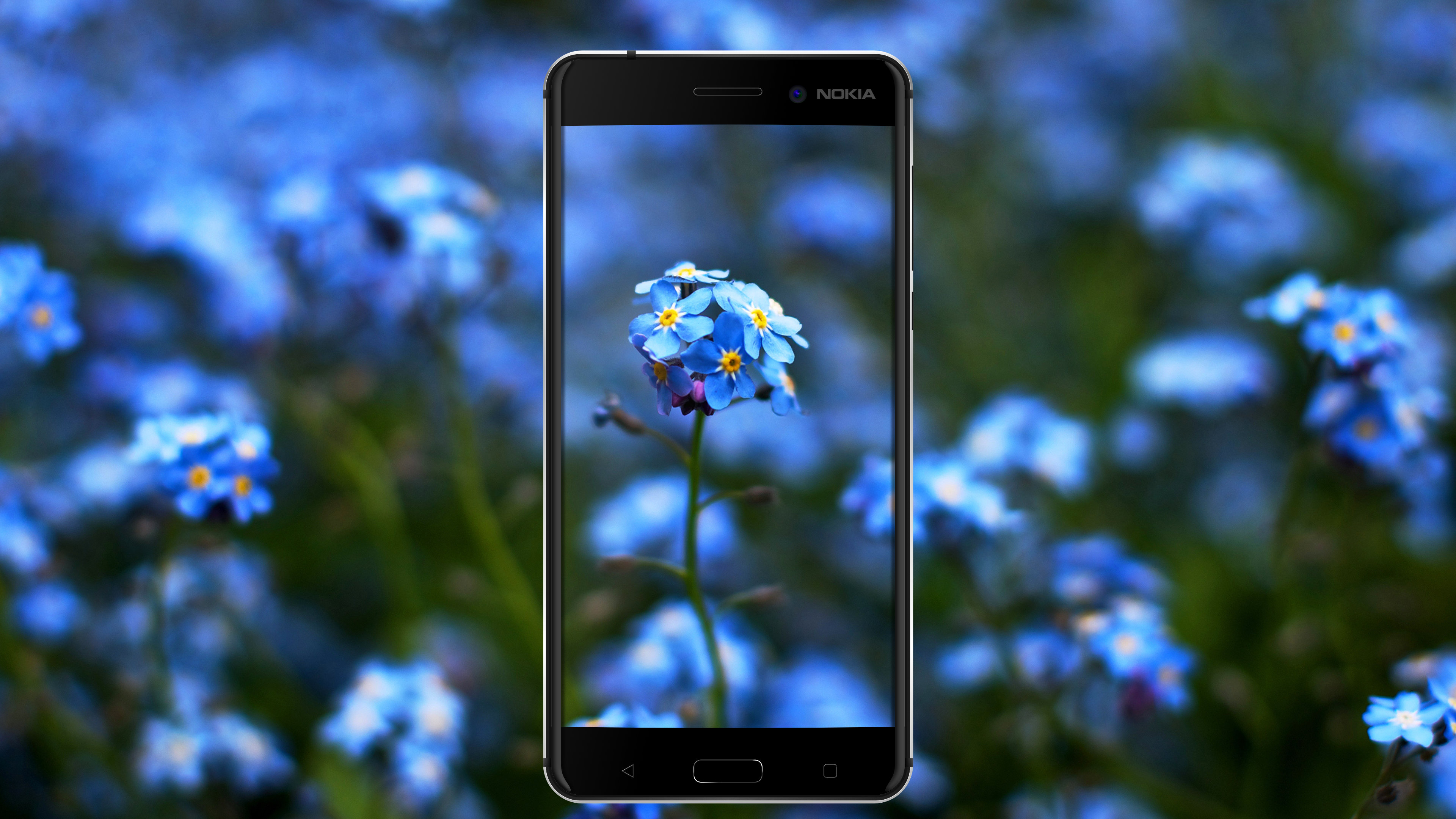
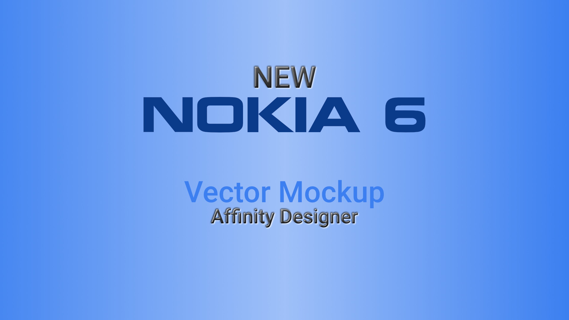
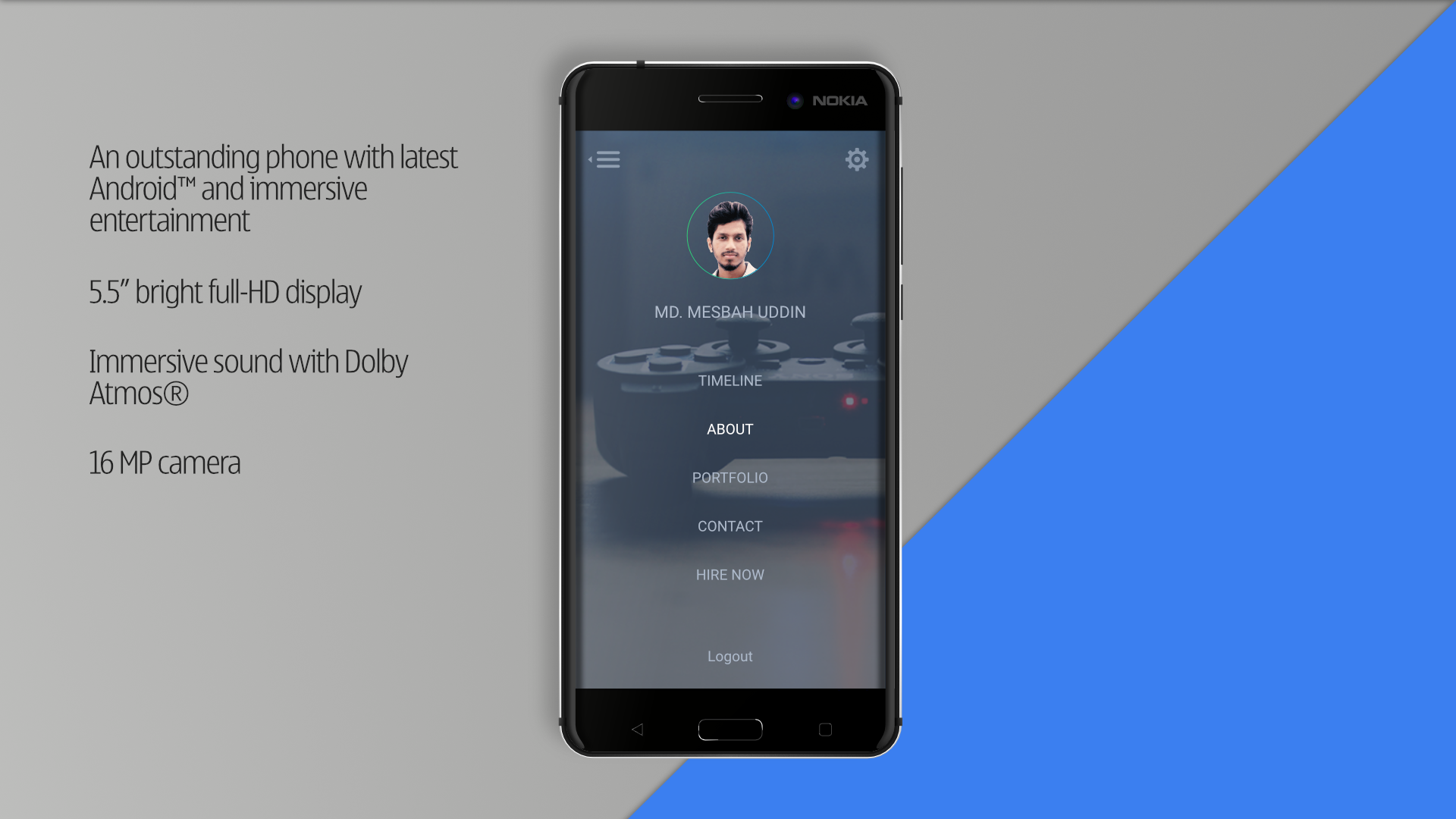
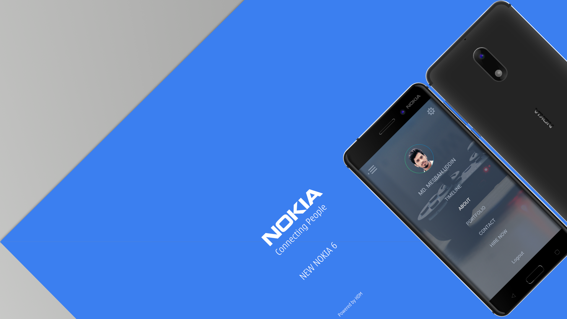
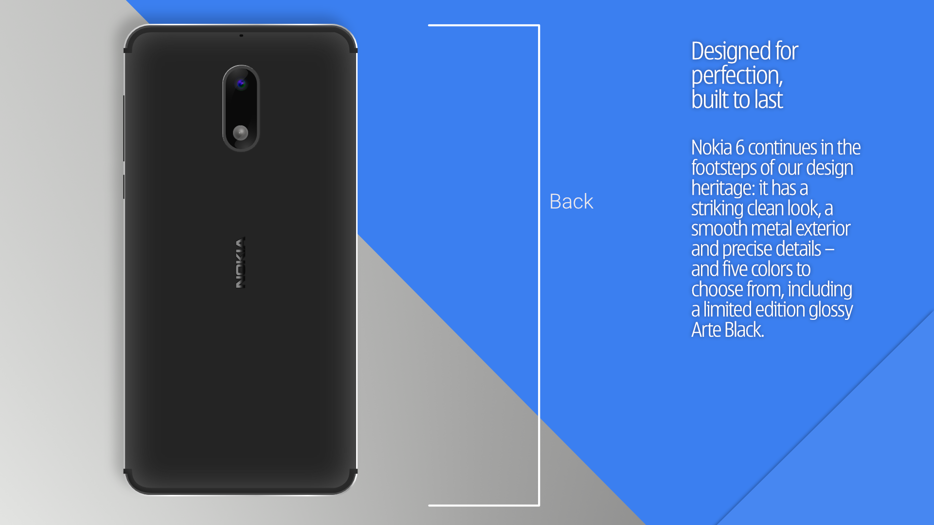
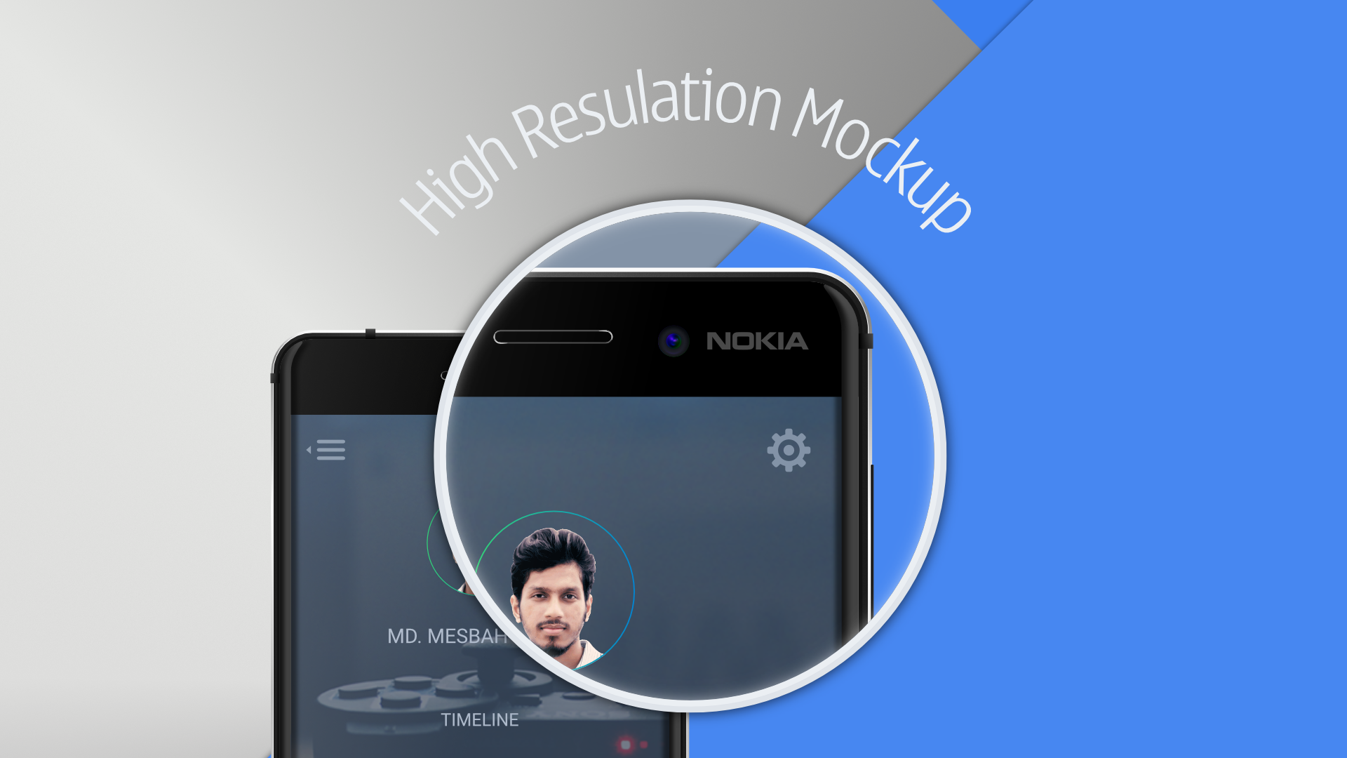
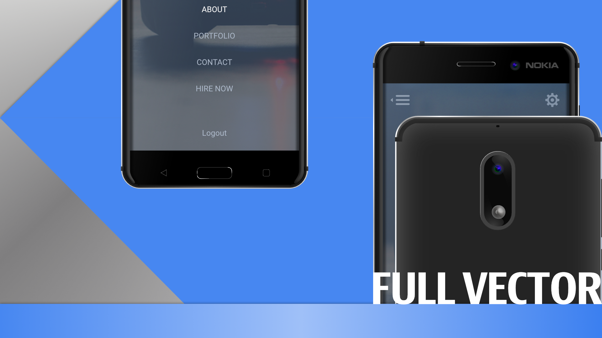
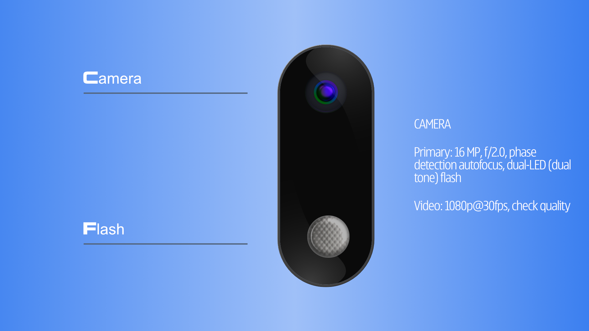
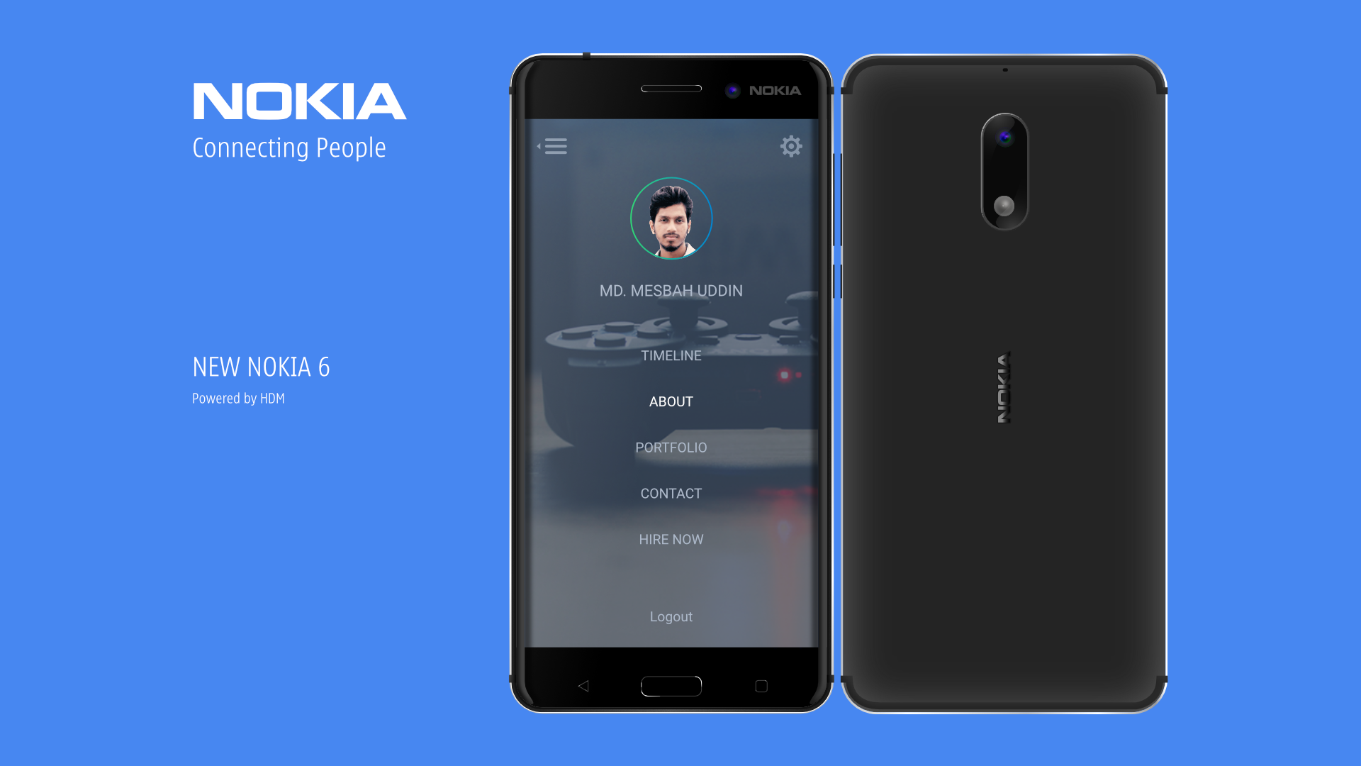
 New Nokia 6 Mockup vector Illustration . AffinityDesigner https://goo.gl/0YlLFt Visit the Behance link to view full design . Dont forget to click appreciate button https://goo.gl/0YlLFt
-
- 2
-

-
- android mockup
- illustration
- (and 4 more)
-
 I love Affinity Designer and I'm really pleased that both Designer and Photo are starting to provide stiff competition to Adobe. In my many years I've used a range of tools .. from xfig (!) .. through to CorelDraw! ... Inkscape .. Google Drawing ... Adobe Illustrator ... Gimp .. Lightzone ... Photoshop ... etc etc I think Designer's UI works well. Some bits need a new way of working and thinking but once you've invested in the effort to overcome them .. you can see the reason why it is a better way. BUT I don't have the same feelings with Affinity Photo .. the UX is overcomplicated .. too much of the screen is taken by the pre-set tools which also seem to behave in counter-intuitive ways .. They also hang around with the last used settings (which may have been regretted experiments) .. and it isn't clear how to undo them or re-layer them in the stack of applied filters ... Inconsistencies also around where to locate filters .. some are in the fliers menu .. others in the 'apply layer' .. Has user research and testing been done with the Photo UI? I would love the next Affinity Photo (2.x?) to have a redesigned UI ... I would pay again for that .. Am I the only one who dislikes the Photo UI and UX .. despite putting some effort in?
 -
Hi! I am slowly going from Adobe and Sketch over to Affinity, but have some "hiccups" in features. Some of the features I wish for. 1. RGBa 2. Material design assets 3. padding functions on buttons, so that buttons change size based on the text. 4. A function to add "Symbols" in the Assets panel so that if I change one symbol, they all change. 5. Google Material design color swatches. Someone made this 6. Make assets connect to the Affinity account, so when I use a different computer, all my assets will be there. 7. add new Page presets in the "new document" settings. 8. Flowchart 9. Plugin support 10. export to CSS 11. export to XML 12. copy SVG code 13. Pages 14. Shadow options like they have in the sketch app. BTW! I am now only working on AD and AP! love how my workflow has changed and how much more I get done.
-
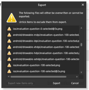
In AD, when exporting through the Export persona, the replace dialogue is quite small and often causes horizontal scroll. Since the checkboxes are all on the right side (which I find strange since on the Preferences and generally, on the web and other apps, they are on the left) it's hard to be sure if you're activating and deactivating the right files, as some part of the path might be hidden outside the scroll. If this window could be resized and keep the resized size between exports and between documents this would be great.
-
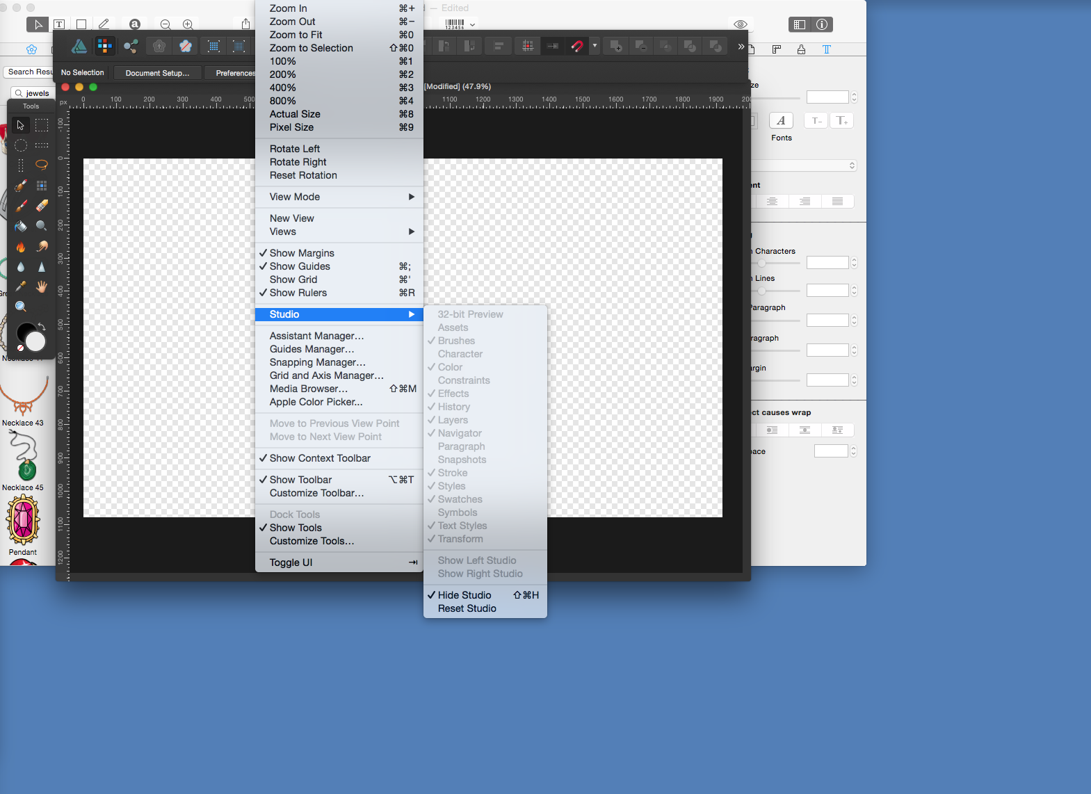
 Greetings... Loving my Affinity Designer, for me, so much more intuitive than PSD. However, suddenly, my UI changed, and everything is gone, or floating. No side panels, no toolbars, nada. I found under the view menu a way to turn on floating tool bars, but this is not the usual default screen I have become accustom to. More weird, the Studio is mostly greyed out (see attached). What did I do? And how do I get my screen back? Thanks for any advice. :)
-
 Hi, I am using affinity photo on windows and occasionally use pen input. I would appreciate the option to only draw with the pen, not by accidentally touching the screen with a single finger (or by palm rejection not working at that particular moment, or by simply forgetting what happens when you use a finger while drawing with a pen). If that option is enabled (maybe only when a brush is actually the current tool), a little button next to the pressure sensitivity button could enable/disable that behavior. And then, maybe finger input could automatically be something else, like moving and selecting objects. Best
 -
 Hello, I have downloaded the iOS UI assets file that comes with AD which is a great showcase of restraints and a great resource, but at my company we design all UI at 1x and the iOS assets are in Retina scale. Scaling doesn't work properly on these assets so I thought I'd make my own collection of UI elements for iOS and Android. How should I save/export the file so that I can import it in the assets panel and use them in any projects? (BTW here's a nice article about the benefits of designing UI at 1x - https://medium.com/shyp-design/design-at-1x-its-a-fact-249c5b896536#.bhxum5ugk) Thanks, Fernando
 -
What is really missing in Affinity Photo for a Pro user is the ability to create customized workspace. Especially now that many retouchers work on the set, this is very important. We go back and forth from our normal place with our usual monitor layout to many other places with many different monitor layouts. It's very annoying to rearrange every time all the panels to have our desired workspace. So, having the ability to save and recall custom workspaces would be a great feature. Professionals love to be fast and productive in the shortest time possible, so I think this is important for all the pros. Thanks again for your attention! Alex
-
Hello everyone! I'd like to request a feature: When selecting View -> Toggle UI, all of the UI will be hidden, which can be really great. The only problem that I am running into sometimes: I don't know which tool I have currently selected. Could you please include an option to let the user show the tools window even when "Toogle UI" hides all the other UI? Or maybe even better: Just show the one icon of the tool that is currently selected. The confusion especially happens when you have to cycle through tools. For example, for the "Pixel tool", you have to press B twice for "Colour Replacement Brush Tool" three times and for "Smudge Brush Tool" four times. Personally, I run into this especially when I don't know which tool is currently selected. For example, the eraser (E) is selected, but I think the brush (B) is selected. Then, I press E to select the eraser. Then it doesn't select the eraser, but rather the background eraser. Best wishes, Shu
-
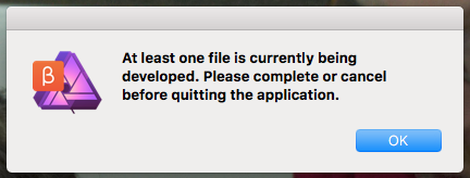
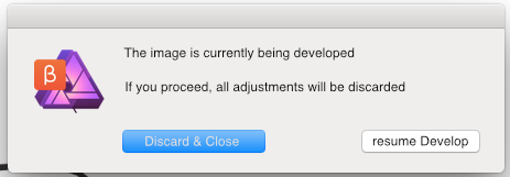
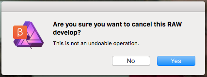
 I'd like to raise awareness to an issue that's bothering me (and apparently a few others) for over a month now. At first I hoped that my muscle-memory would get used to it; but a few hundred raw photos later, it's still as annoying as the first day. I'm referring to the way one can exit/quit/cancel development: it's very counter-intuitive. - It's totally understandable that one cannot proceed editing the image, if it hasn't been developed first. - It's also understandable that the adjustments in the develop persona, cannot be retained, unless the image gets developed. here are the quirks and some workarounds: - If develop persona were implemented as a modal, the Esc key should allow one to... escape. - If develop persona is not a modal and is a window/tab then Cmd+W and Cmd+Q should both allow you to close the document just like pressing the Cancel or X button (of the tab). The current message box when pressing Cmd+Q/W, is not meaningful: it's merely stating that you have to click elsewhere to cancel/close/quit. Why all the hoops and loops? This is particularly inconvenient when having dozens of develop personas open and you decide it's time to quit the application (or close them all). What could had been done with Cmd+Q is now mouse gymnastics! You have to close every develop persona individually, with the mouse, before you can quit the application. - The cancel button, and the X button, shouldn't act differently: As it is, the X button never asks for confirmation, whereas Cancel always does! - when you haven't made any adjustment in the develop persona, canceling should not ask for confirmation. It should be performed silently. - The confirmation should be rephrased. The yes no buttons are not very helpful. Yes, I want to cancel? Yes I understand? Yes I want the file saved? Yes I want it developed? If it were a rare occuring dialog, it would be okay to have and read all the text to know the meaning of Yes/No, but I see this dialog more often than I am asked to save a file, and I guess others too; so the buttons have to be as self-explanatory as possible; or the text as short as possible. eg. "Discard Changes?" Yes/No An example (not the most thought out apparently) follows - it shows two self-explanatory options: "Cancel & Discard" and "resume developing". It could had been "Discard Changes" and "do not discard" or it could even had been 3 buttons such as "Discard Changes", "resume"/"return" and "develop and Save as...", but you get my drift: it needs rephrasing. - Pressing the Esc key while the confirmation is displayed, should work (currently it does nothing). Hope this helps :) -Fotis Now that I got it out of the system,I have to say that I've started to really appreciating the Serif raw engine (and its speed) compared to other raw develop options!!!!
-
Hello, guys! The following questions are aimed just to pleasure my own curiosity, but you can as well see them as requests. 1. Are you guys planning on bringing some kind of UX prototyping directly in AD? Be it with AD's own tools or opening the program for plugins? I've had AD for a while now and I'm really happy with what it gives me and that raises the question "what next?". I've seen the roadmap on this forum, but I'm really wondering if some UI/UX prototyping is planned at all? Maybe a different persona, maybe a different app? 2. This maybe is something even bigger than UI/UX, but will there be any sort of cloud sync? By any means I know it can't be like CC, but something that syncs our assets like brushes, fonts, etc? As I said, I saw the roadmap and I know that these things aren't there, but the main question is are they considered for future additions? Bottom line - I'm really, really happy with AD. For the past few days I'm doing all of my work inside it and I'm not having any problems at all. Well, I still can't afford the luxury to delete Ps and Ai, mainly because of some work collaborations with people that use them, but if you keep up the good work and if AD continues to improve compatibility with Adobe apps, I can surely see myself buying Photo too and ditching all of the Adobe apps. I hope someone from the devs will give at least some partial info on this :) Have a great day, guys!
-
In AF i'd like to change colors used for checkerboard pattern. When working on UI elements document for my game, I use white for icons and color them in game engine. All I see in AF is parts that are on light gray. Checkerboard pattern needs to be close to 50% brightness.
- 5 replies
-
- 1
-
-
- transparency
- ui
- (and 2 more)
-
I decided to create visual journal to keep things organized. Due to work, i won't be able to post regularly. But i will try to keep things organized here. You can check out my Dribbble account to see my work. I haven't started posting work on Dribbble using AD yet as i got the software for 2 days only. But i would soon. You can also checkout out my DeviantArt account where i upload the source file of the design if you are interested in downloading the files and examining.
-
 How can I preview the APP UI on mobile phone? I use windows ,and I have iPhone and an android phone.
 -
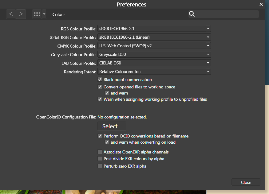
 For some reason, the AFD interface is scaling to beige where it should be scaling to white. This doesn't affect any final renders, but while it substitutes white for beige in the interface, I can't make any accurate design judgements involving colour. So this is happening on my new computer. I booted up my old computer with Designer and it doesn't have the same issue. Whites are white. I open up the same files on my new computer and whites are now beige (see attachment). Note in the toolbar where fill and stroke should be a red line in a white box, its a red line in a beige box. I tried changing the renderer from my GPU (nvidia) to WARP but this has had no effect. I am running Windows 7 on both computers and I have attached my Nvidia information file for more details. I have not noticed this problem in any other applications running on my system. It is not a monitor calibration issue. I have no idea what colour profiles I should be selecting in preferences. I have attached a screenshot of my colour settings. NVIDIA System Information 01-05-2017 09-51-49.txt
-
Hello You guys doing awesome. My suggestion is, add a basic animation timeline/some video editing option . So that UX UI designer use it for their portfolio and also for other purpose . You can start with some basic . I dont know is there any 3d text effect already or not . But only 3d text is very basic . And a 3d model support with live paint and texture will be awesome . Thanks
- 8 replies
-
- 1
-
-
- animation
- video editing
- (and 6 more)
-
The dark UI has one huge flaw where it's hard to tell at times whether something is active or not, such as the snapping tool. Sometimes I've had to click it a few times to see which is darker. Why not have it be something that's NOT gray or black? What about a subtle color to highlight or some other effect to show something is on or off? I should be able to glance at the magnet to know what the state is rather than stare at it or click it twice to check. Saw this suggested by others. The Light UI is nice but that doesn't solve the issue in the current theme.
-
- 2
-
-
- affinity designer
- affinity photo
- (and 3 more)
-
Hi, i hear that you want to make some prototyping tool (link). It's great move and if it's will be as great as i hope, i will be jumping meter high with pure joy. I love your Designer and it's very helpful to me. But thinks like prototyping and wireframes is make my life much more easier. Unfortunately now i must thinking out how to make prototypes with only .png or .jpeg files, and it's not very nice think. And i'm not talking about that i can't install any third-party plugins for Designer like Quant-UX or Craft. These programs make my life much more satisfying. I'm very supporting you in this idea, and when this will be done, the Affinity designer will be unstoppable :) I have only few tips for you: 1) please make it more like Quant-UX, it's a great program for prototyping it has logic elements, build-in wireframe widgets, great screen grid with lines connections. (Only bad think is that i can't import my screens from Designer, only as .png) 2) layer animation, please make it, the Principle will be useless than. 3) Fixed header, fixed footer, very useful think 4) Own css, android or ios animations. Lot's of prototyping tools has only standard easing and when you want make some own animation or make material animations it is impossible to make it and than you are stuck because nobody want to see linear animations anymore. 5) Browser testing or live preview. This is indispensable. I want always see prototype in action and if i can't test on demand device it it's useful. The perfect solutions for this was on Pixate, only problem was, that they don't have browser testing, but they have developer tools like Chrome has. I don't want telling you what to do, you are professionals, but maybe will be these tips useful :) I'm really exited about this :D Thank you for your great work!
-
 So then, first off; When I look at the purchase type (IE Business or Educational), I'm not too sure which one I fall under, as a casual artist. Second, how different is Affinity compared to Adobe's Photoshop, in terms of UI? Third, does the program operate with draw pads? This is from someone looking for a Christmas gift, by the way. Cheers!
 -
 How do you change the User Interface font size in Affinity Photo (1.5.0.45) on Windows? According to the help file, the option should be in Edit > Preferences > User Interface > Font UI Size, but it appears to be missing?