Search the Community
Showing results for tags 'German'.
-
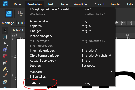
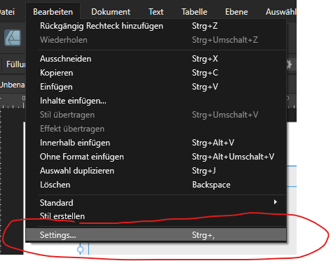
 I use a ANSI (qwerty) keyboard, but type in multiple languages, most of which are european, so I use the EURkey keyboard layout by Steffen Brüntjen to type the language specific letters occasionally needed. As an example to type the german Umlauts (ä,ü,ö) you would use the keybind "CTRL+ALT+A/U/O" or "AltGr + A/U/O". In Affinity Publisher 2, when typing in a Text Frame or Artistic Text Frame, the same keybinds with "CTRL+ALT" do not produce the desired characters, instead no input is read by the program. Using "AltGr" does produce the desired characters in the Text Frames. Interestingly if I go to Edit -> Preferences -> Auto-Correct and type in the "Replace" or "With" input fields, the program behaves as expected with both input methods, meaning that it can read the inputs normally. The problem can repeatedly be reproduced on new files. Technical details: Windows 10 Home 64 bit, Version 21H1 OS build 19043.1526 Ryzen 5 5600X processor 16 GB RAM Radeon RX 6800 XT Graphics card Issue persists with and without hardware acceleration enabled No relevant background software that may intercept the keystrokes other than the OS Recipe: Have ANSI (qwerty) Keyboard (Issue supposedly appears on other keyboards too) Have EURkey keyboard layout installed and selected Open Affinity Publisher 2 Create new Project Create a text or artistitc text frame Type in it Try to insert special characters with the CTRL+ALT+Character binding Unverified personal assumtions regarding the issue: The only other program where I have seen similar behavior in the past was in Joplin, a notetaking software. In there the issue existed because the keybindings were already preoccupied by the program, and had to be unbound in the settings. After unbinding it worked as intended. Since in Affinity Publisher 2 only one of the relevant keybindings seems to be preoccupied with another keybind ( CTRL+ALT+SHIFT+S for export), this solution does not work here. However my assumption is that the program somehow blocks the keybind because it reads some of the input. Since using AltGr keybinds works, my assumption is that the issue is the using of the CTRL key on the keyboard to switch into the mode in which you can see the distances of text fields to their surroundings (for lack of a more specific term). A "fix" could consist of either making it so that the keybinds work on EURKey again (evaluating how realistic that is is beyond my technical skills), or giving us the option to bind this control mode in the settings to some other key, which might also work. I'm of course willing to elaborate should further information help on my part. I know this is a bit of a nieche issue, but it seems like unwanted behavior and as such it should qualify as a bug. I asked about possible ways to fix it in the Support & Questions part of the forums and was advised to specify it as a bugreport. Thank you for your time.
 -
 Hi I am using Affinity Photo in German mainly just because I also have a German keyboard, what I can't find anywhere are a list/overview of all the shortcuts for a German keyboard AND for the Windows version! Can any one help me out?
 -
 Hi, i found these items not translated. Designer: Publisher: Photo:
-
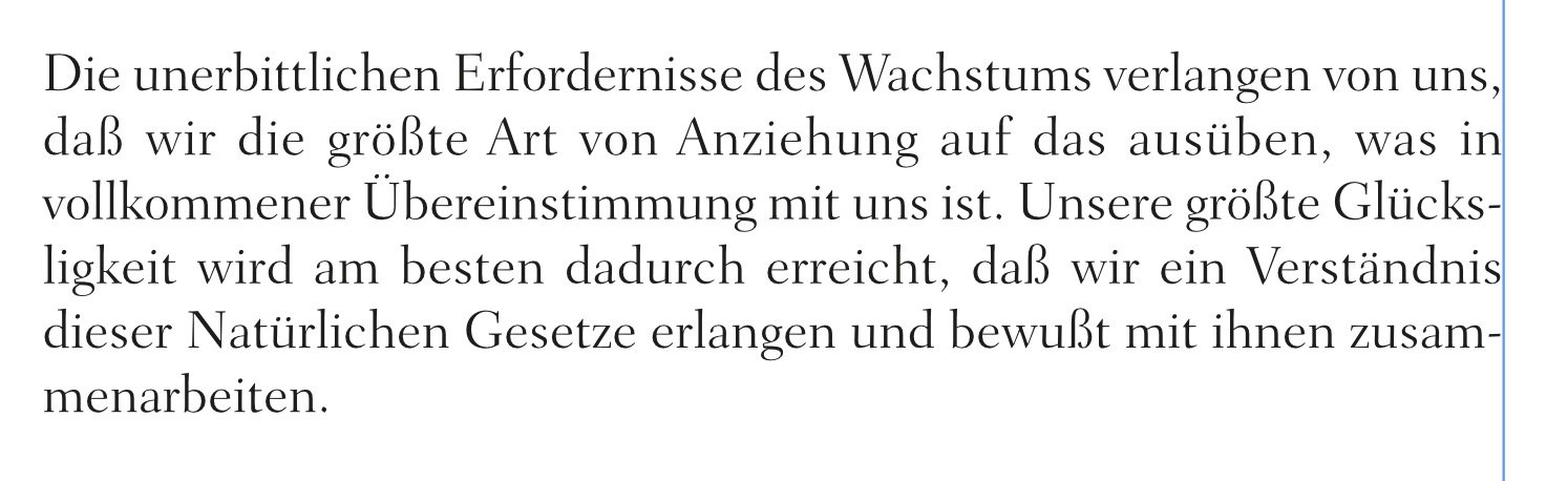
 The German word "Glückseligkeit" gets hyphenated incorrectly - see screenshots. Nothing more to add. Different settings didn't accomplish anything. Happy fixing. 🙂 Helmar PS: for those versed in German, the content of the paragraph is of paramount importance. English natives may refer to chapter 15, point 5 of the Master Key System by Charles F. Haanel.
-
 Hello / Hallo, I am currently looking for a way to insert the eighth part of a squad into text. I found options for a full or half squad and others, but not for the eighth part, which surprises me as I learned this as an important part of micro-typography. Can someone help me out, e.g., is this space hidden with another name or can be defined/inserted manually? (And sorry in case the English terms don't fully match; English is not my first language). ---- Ich suche derzeit nach einer Möglichkeit, ein Achtelgeviert in den Text einzufügen. Ich habe Optionen für ein halbes oder ganzes Geviert und auch andere Geviert-Teile gefunden, aber keine Option für ein Achtelgeviert. Was mich wundert, weil ich dieses Abstandsmaß als wichtigen Bestandteil in der Mikro-Typografie gelernt habe. Kann mir hier jemand weiterhelfen; versteckt sich dieser Abstand bspw. hinter einem anderen Namen oder kann manuell definiert/eingegeben werden? Thanks in advance / Danke im Vorraus, M.K.
 -
 I know this thread is very old now, but I was also looking for the German keyboard shortcuts and I found them here for Mac: https://affinity.help/photo/de.lproj/index.html?page=pages/Workspace/shortcuts.html?title=Tastaturkürzel# I think they are all still the same however my German keyboard does not have the [] brackets as main keys (on mine it is Alt/Option 5 and 6), so I am not sure how to shortcut the use of the paintbrush without them. The German shortcuts also have the same brackets listed as the shortcut, so I admit I am confused.
 -
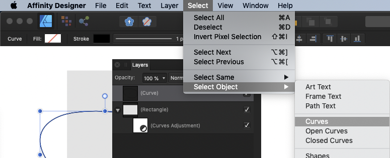
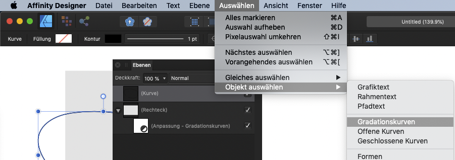
In the German version of Designer the new feature Select > Select Object > Curves is translated with Gradationskurven (gradation curve) Instead of Gradationskurven it should say Kurven (curves)
-
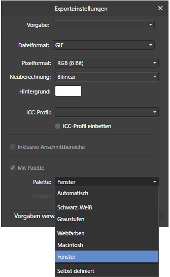
Fenster should be Windows
- 1 reply
-
- 1
-

-
- translation
- german
- (and 1 more)
-
 Hallo zusammen, mal schauen, ob es hier auch eine deutsche Community gibt Ich hatte mich so drauf gefreut, nach InDesign mein erstes Projekt mit dem Publisher umzusetzen. Doch zwei Dinge haben mir die Freude daran ein wenig verhagelt: 1.) Publisher friert ein: Ich hatte ab und zu auf Win10 eine erhöhte Prozessorauslastung, deutlich höher als vorher, und Publisher rührte sich kaum mehr. Zuletzt musste ich das Programm über den Taskmanager abstürzen lassen. Glücklicherweise funktionierte die Wiederherstellung und ich konnte normal weiter arbeiten. Keine Ahnung woran das liegt. Vielleicht hat ja auch darauf jemand eine Antwort...? 2.) Mein Hauptproblem: PDF/X-Ausgabe. Ob nun als X-1a, X-3 oder X-4, solange man beim Rastern "Nicht unterstützte Eigenschaften" angewählt hat, rastert Publisher ALLES. Ich erhalte also quasi eine große Bilddatei. Warum? Schwarze Texte sind darin nicht überdruckt, obwohl angewählt. Auch ein neu auf 4c-angelegtes Schwarz (0/0/0/100), welches extra auf Überducken gestellt wurde, wird nicht überdruckt. Also habe ich das Raster mal auf "Nichts" gestellt und siehe da, Publisher kann sehr wohl Vektor-Daten ausgeben und Schriften einbetten. Die Schriften sind dann bei X-1a und X-3 auch richtig überdruckt, aber nicht bei X-4?!?! Ebenfalls "interessant": Bei der Einstellung wo nichts gerastert wird, kann der Publisher bei Ausgabe von X-1a sowie X-3 nicht mit Transparenzen aus dem eigenen Hause, nämlich Affinity Photo-Dateien, umgehen. Die transparenten Schatten waren einfach ausgegraut! In allen PDF/X-Varianten werden zudem die eigenen Publisher-Schatten und auch 3D-Effekte einfach weggelassen. Wenn ich rastern angebe, sind die natürlich da, aber eigentlich wollte ich nicht eine mehrseitige Broschüre zu einem riesigen Megabyte-Ungetüm aufblähen, mit zudem deutlichen Qualitätseinbußen beim Druck. Hat jemand ähnliche Erfahrungen. Klappt bei euch die PDF-Ausgabe etwa problemlos? Gibts irgendwelche Tipps? Oder muss ich im Moment damit leben, bis der Publisher dahingehend irgendwann mal verbessert wird? Freue mich über eure Rückemeldungen! Gruß Leo
 -
 Hi! I'm not really sure if it's a bug, but I adjusted my Publisher some minutes ago to replace the english quotation marks by the german ones, and I really suffered by doing it for a long time, because at first it didn't seem to work. As I finally found out, it only didn't work, because I used fill text to test it. As I tested it with german text it suddenly worked verry well. So, for me the problem is solved. Not a big issue. I only post this here, because I'm not sure if it is meant to be this way, and I imagine, that possibly other users may stuck with the same problem.
 -
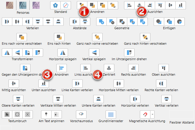
All Affinity programs use descriptive icon texts for the tool bar that at one point are misleading. See the attached screenshot: For the (z-)reordering of layers, the word Anordnen is used (1). That's good. For aligning objects, the word Ausrichten is used (2). That's fine. (3) also aligns objects, but unfortunately is translated as Anordnen, which means something else. To prevent misunderstandings, (3) should also be called Ausrichten. [nitpicking warning] (4) shows up as Zentriert, which is perfectly understandable and clear, but doesn't have the same wording as the other two horizontal alignment texts next to it. For textual consistency, I would prefer the text Zentriert ausrichten or, if a shorter text is desired, Zentrieren. Andreas Weidner
-
 Very glad to see that the new tutorials have subtitles for the languages which the Affinity site supports. This will save me time when I explain to my colleagues in photo club of the Volkshochschule Rheinfelden how I develop and edit my photos in Affinity Photo. With regard to the tutorial HDR from one exposure (https://affinity.serif.com/de/tutorials/photo/desktop/video/341759551) I have found some mistake that will wreak much confusion: 00:44 Wir belassen das dabei 00:47 denn wir wir die Ausgangs-Farbkurve anwenden -> denn wenn wir die Ausgangs-Farbkurve anwenden 00:51 werden unsere Werte außerhalb der Grenzen liegen. -> werden die außerhalb der Grenzen liegenden Werte abgeschnitten. One could consider using the subjunctive here, i. e., denn wendeten wir die Ausgangs-Farbkurve an, würden die außerhalb der Grenzen liegenden Werte abgeschnitten. At any rate, as it stands, the text makes no mention of the fate of out-of-bounds values, namely, that they will be clipped. Regarding the translation of to clip as clippen, I have the feeling that one says in German, that highlight details clippen, but not that they geclippt werden (are clipped), i. e., that clippen is intransitive and has no passive voice, even though the past participle, geclippt, can be used adjectivally, e. g. when speaking of geclippte Highlight-Details. That is why I used abgeschnitten, not geclippt. 02:12 und wir können sie kolorieren. I am puzzled about the use of kolorieren. I have not encountered kolorieren as a translation of to tone map. Linguee.de seems to imply that tone mapping is usually translated with das Tone Mapping, and gives many examples where the verb to tone map is rendered as to do or to perform a tone mapping. Actually, though, developing to a 32-bit space means, more generally, that out-of-bounds values are retained and remain available for all the things that one can do to the output of the Develop persona, including but not limited to tone mapping. I suggest, und bleiben für die Verarbeitung nach der Entwicklung der Roh-Datei erhalten -> and remain available for processing after developing the RAW file. This, of course, means that tone mapping, or whatever it is being called in German in Affinity Photo, is one such "thing."
 -
 When using export persona in AffinityPhoto version 1.7.1.404 (german language setting) using variables for slicename to save have no effect. See example in Screenshot. Only "Slice1.jpg" is used in exported image.
-
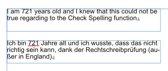
 Numbers seem to be all wrong when Check Spelling is enabled in German. See image. Top: Language and spelling in English, bottom: Language and spelling in German.
-
 Beside the actual series of Workshops for Affinity Photo on iPad I have published 46 videos about the desktop version. Hope you enjoy and find it useful. Markus
 -
Hi, I have a series of tutorials about Affinity Photo iPad in german on Youtube:
-
 Liebe Community, ich versuche über Affinity Photo die Struktur an einem Kleiderschrank zu ändern. Wenn der Schrank beispielweise aus Eiche besteht und ich ihn in Buche ändern will, dann habe ich leider Probleme, dies umzusetzen. Oder ein noch einfacheres Beispiel: Der Schrank ist weiß und ich möchte, dass er in Buche zu sehen ist. Ich habe dazu leider kein passendes Tutorialvideo gefunden. Was ist der beste Weg, um solch eine Bearbeitung zu schaffen? Vielen Dank vorab.
 -
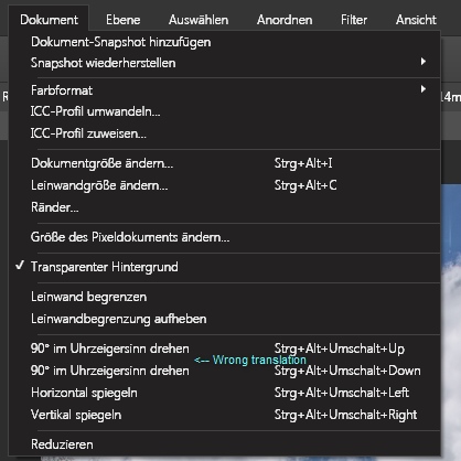
 Hi there, 1st option is correct 2nd should be: 90° gegen Uhrzeigersinn drehen regards norbert.r
-
Hey guys, If you are fit in german or german based user, you can follow my channel on youtube, where I made tutorials for affinity now. The first video was about how to start with APhoto https://youtu.be/JdHa29RCfCk The second tutorial about RAW developing is online since few minutes. https://www.youtube.com/watch?v=_d76jl6S8Gs Have fun and feel free to share your comments,likes and thoughts about it with me. cheers, seb :)
-
Unfortunately the Help in menu "Help" is only linked to the English version. But there is already a German help. In Win 7 you can find it here: C:\Program Files\Serif\Affinity Designer Public Beta\DesignerHelp\Contents\Resources\de.lproj\index.html German: Die Hilfe im Menü "Hilfe" ist leider nur mit der englischen Variante verknüpft. Aber es gibt bereits eine Deutsche Hilfe. Man findet sie unter Win 7 hier: C:\Program Files\Serif\Affinity Designer Public Beta\DesignerHelp\Contents\Resources\de.lproj\index.html
-
 Hello Affinity Team sadly there is a high number of shortcuts which are not internationally compatible with the UK keyboard. It would be good if,for ease of learning, the shortcuts where chosen to be internationally compatible. UK-Keyboard German keyboard this is an ongoing keylist of incompatibilities with the german keyboard; Size bigger Ctrl+> <- only works with ctrl+shift+> Size Smaller Ctrl+< <- doesn´t work at all Size Precice Bigger <-only works with ctrl+alt+shift+> Size Precise Smaller <-doesnt work at all Spacing tighten More Ctrl+Alt+Left <- seems to move to the beginning of text Spacing Loosen More Ctrl+Alt+right <- seems to move to the end of text Alignment Align Left Ctrl+{ <-doesn´t work Alignment Align Centre Alt+|<- doesnt work Alignment Align Right Ctrl+} <- doesn´t work Alignment Justify Left ctrl+alt+| <-doesn´t work
 -
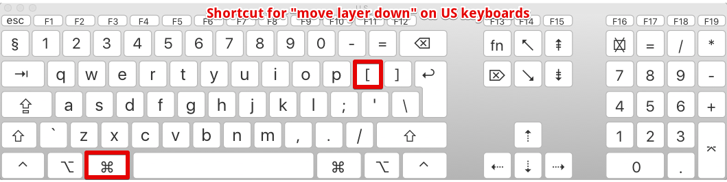
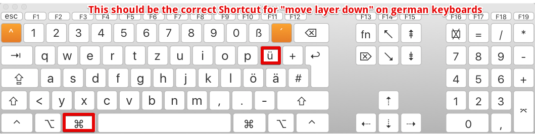
Please localize the keyboard shortcuts of your Apps properly. Cmd+[ (move layer down) is easy to access on english keyboard layouts, but with german layout you have to press Cmd+Alt+5. Using the same key position would be nice, like Cmd+Ü in this example. Current shortcut for German layout: Current shortcut for US layout: Preferred shortcut for German layout:
-
 Hi, are there any instruction PDFs for german keyboard layout on Designer and Photo? I have experimented especially for resizing brushes in Photo, but I didn't got it work with alt+5 or alt+6. With this or with different combinations mostly I am only changing the opacity.
 -
 Dear Sirs and Madams, (sorry for my bad english) first: aphoto and adesigner are both very very cool and useful programs. :D it was a very short time to converse my habituation from indesign to adesigner. (meanwhile i rather use adesigner) your video-tutorials was very helpful but in aphoto i must learn still some things, so i am sorry when following suggestions or questions are unnecessarily: 1. shortcuts in non-english keybord-layouts thats a big problem for german users because the user operability suffers some time. especially the „[" and „]“ keys are not reachable in german keyboard layouts. is there an (usable) way or for german users without changing the whole keyboard layout? (that would be in conflicts with shortcuts in other programs) 2. if using quickmask, the brush color must be set to „white“ to remove desired areas in the red „invertmask". but if i set the brush color to „black“ his functionality is opposite - like an eraser. thats very cool - so i dont need to set the eraser size seperately - only switch from white to black. but it is a bug or a feature? (i have not seen that in the tutorials) 3. is there a shortcut in quickmask (like „alt“) to switch from „mask“ to „demask“ function? 4. there a many different brushes in aphoto but most as an „circle“. sometimes i wish there would be some brushes with „sharper“ forms to better paint ore refine masks. maybe like an „triangle“ that can be rotated and changed like desired to work better in sharp edges. 5. i wish the cropping tool would be have a "preview“ function for blend out the unselected (cropped) areas. maybe switchable in the colors black, white or (selectable) gray. so it would be better to estimate the cropping result bevor pressing the „apply“ button. (wysiwyg style) 6. a more consistently way to crop "lossless" - without loosing the cropped areas after pressing "apply". the crop tool could maybe be ask on pressing "apply" what to to: "crop finally - and loosing the cropped pixels" or "crop with mask - without losing the cropped pixels". 7. a better indication which tools will act "reversible" or in "finally". (parallel or serial processing) at the moment this distinction is "from where" the tool is selected - from the "layers" or the "filters" menu. and - to find a needed filter the user must be click around in different menus. i think ALL filter should be storaged in ONE place (one menu) with a special sign (or a submenu) if the filter is availble for act in parallel and/or serial processing. best regards, yummiweb
 -
 The enlargment of the brush with a shortcut is not possible in german because there is no button for ][-brackets. Could you please change it to . and , or + and - or + and #. I think this is easy to do but really important for the german keyboard.


.jpg.bc16c25ede1ebc2df9b068ad33e18477.jpg)

-Klein.thumb.png.284eb0fdd852bc10f13f537a0370249b.png)