Search the Community
Showing results for 'variable fonts'.
-
 Affinity Experts, I'm using Franklin Gothic Book and Copperplate Gothic Light fonts and cannot format these fonts in bold nor can I define a style in bold as this isn't listed as a "trait" for these fonts. Can anyone tell me why? I can bold the lettering of these fonts in other applications like Word, PowerPoint, etc. Secondly, is there a way to format text frame outlines to make them less visible? Right now the default is a rather thick blue line. I would prefer something thin, semi-transparent, or maybe a light dashed line to minimize the visual clutter. I've watched several tutorials on text frames but none address this problem. Thanks in advance.
 -
 Hello, Serif team I am a recent member of the Affinity family, but I feel like it's just that. There's a lot of negativity surrounding this new deal, and I wanted to make sure you also get encouragement. I think the pledges are great. If you stay true to them, keep Affinity standalone and professional, and integrate it with Canva in the future in order to allow professional designers create templates in Affinity for marketers to use in Canva, this will be a groundbreaking workflow for the world of design. There isn't a single piece of software out there that solves the problem of professionals who enjoy non-destructive, complex softwares such as Affinity collaborating with marketers who enjoy the simplicity of something like Canva templates. I hope the entire team is as excited as I am for the future of Affinity. Keep Affinity professional, Canva for the beginners or non-designers, and you'll have yourselves the best design suite on the market. This is a web agency owner's (extremely passionate about Studio Link and your design suite) wishlist of features to come from the new Canva resources: Blend tool functionality Real vector brushes, not rasters on vector paths Real vector patterns, not rasters repeating on vector shapes Variable font support Smart object import functionality in Affinity Publisher Canva, please pay for additional developers to handle bug fixing, there are some persistent bug threads here that haven't been solved in 3-4 years Better transfer of Adobe format documents (I know, I know, it's closed-source format and the idea is to bring people over FROM Adobe, but sadly we still live in a world dominated by .ai .psd and .indd) for example the constant non 0 font tracking makes importing large document a real pain Export persona for all Affinity apps (I shouldn't have to open designer to export a batch of 10-20 logos I've been working on in Publisher) Generally way more Studio Link integration. Having a suite is great, but what you've developed in Studio Link is something special. Maybe Develop, Liquify, Export should become Modules rather than standalone personas in other apps. So that people would be able to add modules to their unified app (currently Publisher) just as we would add panels right now. Even if it requires a restart of the app, people would be able to make their one design app as slim or all-encompassing as they want. Some sort of image tracing capability Point-based gradients/Gradient meshes Some sort of vector filters suite (roughen, smoothen curve, distort, background distort, etc.) This is a list I'd been keeping for the past months, working on small business and big corporate website and design projects alike, using exclusively your suite for professional designs. Let's make this thread a place for positivity and genuine recommendations for the future of our favourite design suite. The serif team seem to be very excited and eager to bring the best design tools out there into existence for us. So let's make it happen together. Tudor.
- 9 replies
-
- 16
-

-

-
 Hello, I'm wondering if Designer has any kind of "master colour" feature that I'm just not finding? What I mean is, let's say that I have a complex object made up of many shapes. For ease of explanation, let's imagine a drawing of a car. It's made up of a bunch of shapes, including 4 wheels. Is there any way for me to define a "wheel colour", and then when I colour my wheels, I can click the newly defined "wheel colour" swatch. Then, later if I decide I want to change the colour of the wheels, i can simply alter the colour of the "wheel colour" swatch, rather than going through my layers, finding all my wheels, clicking them and recolouring them? I guess like a "master page" in publisher.. but with colour swatches. Does designer have anything like that? Maybe it's just the programmer in me but I feel like a sort of "variable swatch" would be helpful. Thanks! M
-

Include Variable Fonts
kemie replied to Friksel's topic in Feedback for Affinity Designer V1 on Desktop
One year later still waiting for this: Variable fonts allow users fine control over typographic properties such as weight and width, beyond what regular fonts can do. I hope Affinity can finally support them. -
 🇬🇧 Hi, the interface of the three software programs in the Affinity suite seems very well done and quite productive. But everyone also has their own specificities in their workflow and the addition of a utility like Keyboard Maestro can fill certain gaps or innovate with advanced functions. In addition, KM knows how to perfectly replace many other utilities for macOS… 😉 As I am working on a document alternating between RGB mode and CMYK mode, I was wondering about the opportunity to be able to visually know, and without action on my part, the current color mode and the possibility of quickly changing it. to change. Unfortunately, AD does not indicate the current color mode and the procedure to switch from one mode to another requires a lot of clicks on the part of the user (from memory, on other graphics software [?], there is a simple and direct submenu within a menu, associated with keyboard shortcuts…). I haven't found a keyboard command for this function in AD!… The Keyboard Maestro utility has solid arguments for performing macros. This software is a marvel of efficiency and provides very valuable services, whatever the software used or the context. Below is a screencast of the KM interface in AD. Sorry if the action is rapid, but that is also the goal, to make it as transparent as possible. macros live.mp4 Attached is a set of two macros KM for AD. Affinity Designer Format de couleur RVB CMYK Macros.kmmacros.zip In detail, this set includes a first macro for the conversion to RGB and a second macro for the conversion to CMYK. The macros simulate the call to display the “Document Setup” dialog box (Command + Shift + P), a first click on the “Color” Tab, a second click on the “Color Format” Menu and a third click in this Menu on the desired profile. And a final press of the “Escape” key to close the dialog box. The initial position of the mouse is maintained during the macro. The two macros are displayed in a palette, in the form of a button, alternately, one replacing the other with the help of a simple toggle. When opening AD and a document, the last state of the button is displayed, the toggle being managed by KM (with a system variable). It is therefore up to the user to make their choice by clicking on the mode they want. In KM, everything is almost configurable. So, pallets have several options. Their positions are defined by the user, using the mouse while pressing the Command key. For the two icons which symbolize here the RGB mode and the CMYK mode are simple copy and paste of two small illustrations created with AD, inserted in the KM interface, on each of the two macros. There you go, I hope this post will give you ideas to perhaps further improve your workflow… NB: we can also add a function (clicks) to the macro to modify the profile of the “Color” Palette at the same time. Finally, porting this set of macros for AP and for AP is possible, you just need to modify the call up of the dialog box because the menus are different... 🇫🇷 Bonjour, l'interface des trois logiciels de la suite Affinity me semble très bien faite et assez productive. Mais, chacun a aussi ses propres spécificités dans son flux de travail et l'apport d'un utilitaire comme Keyboard Maestro peut combler certains manques ou innover avec des fonctions évoluées. De plus, KM sait parfaitement remplacer bon nombre d'autres utilitaires pour macOS… 😉 Étant en train de travailler sur un document en alternance entre le mode RVB et le mode CMYK, je m'interrogeais sur l'opportunité de pouvoir visuellement connaître, et sans action de ma part, le mode de couleur courant et la possibilité de rapidement le changer. Malheureusement, AD n'indique pas le mode de couleur en cours et la procédure pour passer d'un mode à l'autre demande beaucoup de clicks de la part de l'utilisateur (de mémoire, sur d'autres logiciels graphiques (?), il y a un simple et direct sous-menu dans un menu, associé à un raccourcis clavier…). Je n'ai d'ailleurs pas trouvé de commande clavier pour cette fonction dans AD !… L'utilitaire Keyboard Maestro possède de solides arguments pour effectuer des macros. Ce logiciel est une merveille d'efficacité et rend de très précieux services, quelque soit le logiciel utilisé ou le contexte. Plus haut, un screencast de l'interface de KM dans AD. Désolé si l'action est rapide, mais c'est aussi le but, qu'elle soit la plus transparente possible? Joint aussi le set de deux macros KM pour AD. En détail, ce set inclus une première macro pour la conversion en RVB et une seconde macro pour la conversion en CMYK. Les macros simulent l'appel de l'affichage de la boîte de dialogue “Configuration du document” (Commande + Majuscule + P), un premier click sur l'Onglet “Couleur”, un deuxième click sur le Menu “Format de couleur” et un troisième click dans ce Menu sur le profil souhaité. Et un dernier appel de la touche “Escape” pour fermer la boîte de dialogue. La position initiale de la souris est maintenue durant la macro. Les deux macros sont affichées dans une palette, sous forme de bouton, en alternance, l'un remplaçant l'autre avec l'aide d'une simple bascule. À l'ouverture d'AD et d'un document, c'est le dernier état du bouton qui est affiché, la bascule étant gérée par KM (avec une variable système). C'est donc à l'utilisateur de faire son choix en cliquant sur le mode qu'il désire. Dans KM, tout est presque paramètrable. Ainsi, les palettes disposent de plusieurs options. Leurs positions est définies par l'utilisateur, à la souris tout en appuyant sur la touche Commande. Pour les deux icônes qui symbolisent ici le mode RVB et le mode CMYK sont de simples copier-coller de deux petites illustration réalisées avec AD, insérées dans l'interface de KM, sur chacune des deux macros. Voilà, j'espère que ce post vous donnera des idées afin de peut-être améliorer encore votre flux de travail… NB : on peut aussi ajouté une fonction (des clicks) à la macro pour modifier en même temps le profil de la Palette “Couleur”. Enfin, le portage de ce set de macros pour AP et pour AP est possible, il faut juste modifier l'appel de la boîte de dialogue car les menus sont différents…
- 4 replies
-
- 1
-
-
- affinity designer
- macros
- (and 2 more)
-
 Which Pensum style did you assign to the TOC styles? And which Pensum Pro styles do you have available? All? A few? (which specifically) Does it show you a version for the fonts? (the Fontstand site shows nothing) The Pensum Pro family (v2.0) has an unusual configuration with the style names which may confuse Affinity. The v1 fonts were also a bit odd, but in a different way. If you have a sample document available, I could test here (have the fonts).
- 20 replies
-
- 1
-
-
- fontastand
- fonts
- (and 1 more)
-

Publisher shuts down when book exports
Hangman replied to n.k.0508's topic in V2 Bugs found on Windows
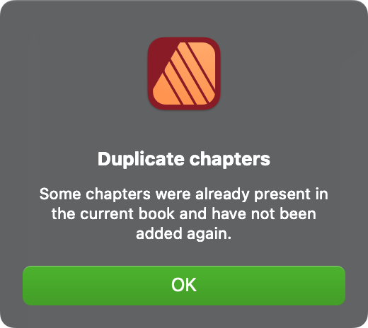
Hi @n.k.0508, Okay, there seem to be a few issues but the good news is I've managed to export your .afbook to a PDF file. Please check the attached file to make sure it looks correct... I noted that some of the Placed PDF files contain low-resolution images so don't reproduce very well, e.g., SWOT Schwächen.pdf and SWOT Stärken.pdf in the chapter FE Neu, Is that intended? Issues You should ideally store all your assets on your internal Hard Drive rather than a Cloud Drive such as OneDrive. This avoids potential synching issues when both working with and exporting the document. Having said that, I don't believe this is the cause of Publisher hanging on export in this particular case... With the assets you provided several files in the .zip are incorrectly named once unzipped, I suspect this is again down to the files being stored on OneDrive... Note the Umlaut and the Eszett in the file names are misinterpreted. You may not see this at your end as this may be a direct result of saving the files from OneDrive... I corrected the filenames and relinked the files. SWOT Schw„chen.pdf SWOT St„rken.pdf šbersicht Grundrisstypologie H”fe.jpg Bauko š4 EF Endabgabe-II S�dost.pdf Bauko š4 EF Endabgabe-Fassadenschnitt.pdf Bauko š4 EF Endabgabe-II Grundriss.pdf Schnitt 2_Geb„ude.jpg Perspektive B�ro.png IP_34_REN_auáen.tiff I've not tested in any great depth so far but it appears that the cause of the crash when exporting is down to the placed PDF files on Pages 5 and 6 of the 'IP Neu' chapter being set to Interpet rather than Passthrough. Coincidentally owing to missing fonts in the placed PDF files I had already changed all Placed PDF files in the other chapters to Passthrough so I would need to go through and check whether this is causing issues in general and if so report this as a potential bug. Once the placed PDF files on Pages 5 and 6 of the 'IP Neu' chapter are set to Passthrough (and quite possibly the other PDFs across all chapters) your file exports correctly. I also experienced a slightly odd issue which I've not seen before where initially the 'FE Neu' chapter didn't open when opening the .afbook and when I attempted to add it manually I received an error telling me it was a 'Duplicate chapter' even though it didn't appear in the list of open chapters and I'd deleted the Lock file for the chapter after a previous crash. I've attached an updated version of your .afbook file along with the updated .afpub Chapters so I'd be interested to know if you can now open and export the file without Publisher crashing. I've also attached the exported PDF. I hope this helps... Affinity Publisher Files Portfolio.zip Exported PDF File Portfolio.pdf
-
Wrong italic style for regular type face in Publisher
kenmcd replied to Babelfisch's topic in V2 Bugs found on macOS
The fonts are a mess. There are multiple duplicates in the style groups. Regular, Bold, and Book are in the same RIBBI style group. Bad. Similar errors with the Thin, ExtraLight, Black, Ultra, etc. These errors can result in the wrong font embedded in a PDF - like you have. And the weight settings are also a mess. Regular and Book are both 400. Thin and ExtraLight are both 250. Some apps use these to sort the font menu by increasing weight. So when they are duplicated things may not sort properly. So... I fixed the style groups. And set the weights sanely (Book is now 450). And changed the family name to GeomanistAF. (so you can install them at the same time as the originals, and they are not confused with the originals) They should work properly now. Will send them to you via PM. Only test I did was install them and check sorting. If you have any other odd issues, please let me know. P.S. Kinda bad selling fonts this badly broken.- 1 reply
-
- 2
-
-
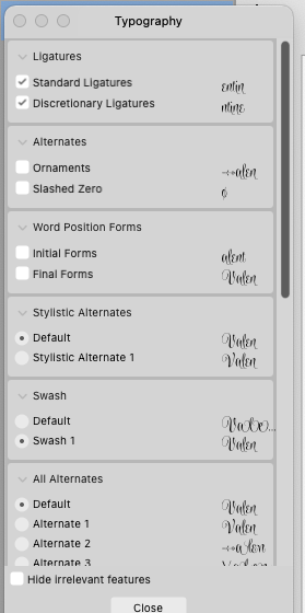
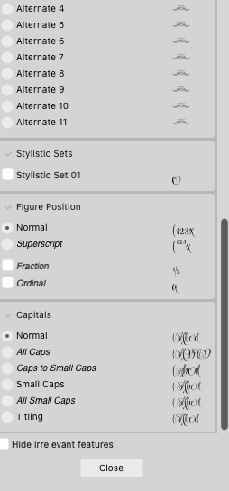
 I am using the font Wishes Pro Text. It has lots of different swashes etc. But for some reason I can’t get the otf font to give me just plain type without the swashes. I tried opening the Typography window and clicking through the options but none give me the plain type I want. The first sample is from Typeface The second is what I am getting in Affinity Designer 2.3.0 on my Mac 11.7.10 I’m also attaching the Typography window. Thank you for your help
-
Cascadia Mono variable is two font files (which are style-linked). So what you are seeing is the default master name for each style weight. Regular × six weights. Italic × six weights. Sitka is now variable in Windows 11. The instances are organized by six optical sizes. And each optical size includes three weights (so 6 × 3 = 18 total). Plus the Italic font is style-linked. Again you see the name of the default master. So... 18 × Text 18 × Text Italic Segoe UI Variable is only roman, no italic. Three optical sizes. Five weights. 3 × 5 = 15 of the default master - Regular
-
Canvas was a program that promised integration between page, vector raster and web. It failed. Theversions I tried were buggy. It had great fonts though! 2540 quality URW fonts. I always think historically that Affinity accomplished what was promised on the dawn of the DTP revolution (1980s!!) of an all in one program. No double clicking from Q to P, you just worked in it. Now there are two programs that can do this pretty well, PDF Tuner from CGS and Affinity. PDF Tuner is free! You have to have one of their other programs/plans to get it and it's pretty expensive!
-
Out of curiosity… what font are you using? And what is different that you like by using three periods instead? In some fonts the spacing of the ellipsis is the same as three periods. In some fonts the spacing of the ellipsis is tighter. In some fonts the spacing of the ellipsis is looser. So I am just wondering what font and what is the desired change.
-
Thanx for a great app but why not, and to maximise workflow especially when you have a ton of fonts, why doesn’t the ‘selected font’ window stay open as in photoshop! Instead you have to go back in and scroll down to where you were and go from there. This happens whenever you select a font and is extremely frustrating. A fix would be great! Cheers RPReplay_Final1701569269.mov
-
 Thanks for responding, Walt! I looked a bit more into the particular font files, and they indeed are variable. Each file is meant to be a different "instance" of the variable font. I tested it in MS Word just to be sure, and it also breaks there. However, MS Word does render the Black weight of the font correctly, and some other weights incorrectly. Hopefully a future version of Affinity will support variable fonts.
 -
 Having done quite a bit of practicing, I am ready to do actual formatting for a paperback. I did all the practicing with a manuscript in Times New Roman. But now that I'll be formatting for an actual book, I would like to know what font to settle on. I think it would be great to have one, single, font that would always be the first choice to consider for body text. And the font used in the image below can be that font, it seems to me. Is it Minion? (I tried to find out what font it is and was told that it is Minion). I opened my Publisher to see whether it has Minion. It has Minion, Minion Pro. I added a number of fonts to the default fonts of Publisher but I did not add any font that requires license for commercial use. And the search I've done let me know that Minion is not a free font. So the Minion Pro (it's not one of the default fonts, I assume) I downloaded must be a demo, or pirated version, not the official, licensed version. If the font is indeed Minion and I should have license to use it for commercial purposes, I would consider going about it soon. But then, it seems, strictly speaking, there aren't that many free fonts. I asked ChatGPT about whether Times New Roman is a free font and it says No, I need to have license to use it for commercial purposes. The same for Georgia, Garamond and Baskerville. About what fonts are free and good for body text, its response was: Libre Baskerville, Crimson Text, and some others. So knowing little about fonts to begin with, I became more confused. I somehow assumed the fonts that are default in MS Word are free to use for commercial purposes (and Georgia and Gararmond, not to mention TNR, are default, aren't they). What do you guys to with your chocies regarding fonts for body text? What are great (the best, for you) fonts to use for body text? And what are free fonts to use and what are fonts many people are willing to purchase? (Edit added). After posting this, I began search on this topic, and am realizing this is a huge topic and has been discussed over and over in many venues. I discovered that Caslon is also a good font for body text? (Never heard of this before). Google fonts provide "Libre Caslon" and it looks good in Word document. Is "myfonts.com" a good place to purchase fonts? I'm reading this article here: https://www.indesignskills.com/inspiration/fonts-for-books/ and its link to purchase a font goes to that site. Where do people purchase fonts?
-

Font style names all the same
walt.farrell replied to Paul Mc's topic in Affinity on Desktop Questions (macOS and Windows)
That's part of the issue with Variable fonts: they're not supported in PDF files. Instead, the application needs to generate Static versions of the fonts to embed in the PDF file, and Affinity doesn't do that. -
Font style names all the same
walt.farrell replied to Paul Mc's topic in Affinity on Desktop Questions (macOS and Windows)
The solution is to avoid using Variable fonts; only Static fonts are supported in the Affinity applications. Your client will need to provide a statis version of that font, or you will need to use a different application. -
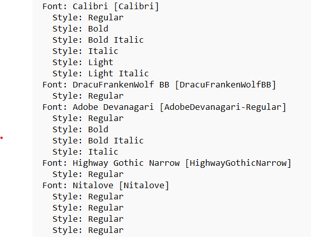
You have a number of Variable fonts installed, I think. That probably does not account for startup problems, but they aren't supported in the Affinity applications and won't work properly in them. Compare the Style listings for Calibri and Nitalove, for example. There are others like Nitalove that show multiples of the same Style. I'm not sure how to explain what Cascadia Mono shows, unless this means you have multiple copies of the font installed. Again, I would not expect that to cause startup problems, but could cause issues working with the font in the Affinity applications: Sitka also looks odd, to me. And several others. I'm also seeing multiple sets of listings for some of these fonts (including Cascadia Mono, Sitka, and Segoe UI Variable), and I don't know how to explain that.
-

Variable fonts support
garrettm30 replied to Athanasius Pernath's topic in Feedback for the Affinity V2 Suite of Products
I really want variable fonts myself, but your example is unfortunate and I am afraid doesn’t help the cause. The font of these posts is Inter, and while it is now available in variable form, this forum software is requesting the static forms from Google: <link href="https://fonts.googleapis.com/css2?family=Inter:wght@300;400;500;600;700&display=swap" rel="stylesheet"> Edit: the above is mostly true, but it may still be delivered from Google as variable anyway (see next post). I would delete this post, but as some may have already seen it, I need to correct it instead. -
 Just upgraded from V1.xx to V 2.2. Windows 10. Font install instructions in the app say to "right click on font in Explorer and choose install". If I right click on any of the .affont files downloaded with Version 2.2 I get "cut", "copy", "delete", "properties" and "open". The only logical choice ("open") opens my old version of Affinity Publisher (Version 1) The "guide to installing add-ons in Affinity Apps" says Affinity Fonts are installed and managed directly in Affinity 2.0.4 or later But if offers no clue on how. How do I install these new fonts? Thanks!
 -
This is a nightmare. PDF export just mangles all the text - well not all of it, just most of it. Randomly it leaves bits ok even with exactly the same font, styles, colours, weights, and the same master objects applied - you can see in the screenshots one spread in the doc is ok and one is not (most aren;t) . Some headings are ok but body text is mashed. There's no logic to this, nothing consistent about why and how it fails. Publisher came out just in time for me to start these two jobs with a hard print deadline. After 2 - 3 days of arsing about trying to fix this problem after setting 120 pages, I thought I'd finally solved this by stopping using my FontBase font manager, removing all the Montserrat font versions and reinstalling them to system fonts and trying again for the upteenth time. So I started the other doc. But it's back again. The problem is, every time I do this reinstalling fonts process, the document seems to interpret the fonts as new fonts, substituting the old, then I have to go through and set everything again. Like hundreds of Latin names in italic in the body copy I will have to go through and manually do again and again, every time it happens. And many more issues besides will need to be addressed again. This is a real problem. I see someone else has it to - I commented on that thread days back but there's no response on there. This is Windows 10 Pro, Montserrat (Google font) - marked as fully embeddable. I tried turning off the subset option on exports dozens of times and it makes no difference. It's extended this job into days more than it should have been. I really like what you're trying to do with this suite of software but please please please get this sorted - people are trying to produce pro documents for print but we're falling at the last hurdle. It's pretty crashy too but the recovery so far has been reasonably good. Plenty of other niggles with things but the PDF export thing really really needs sorting though. Please can somebody look into this urgently?
-
A couple of observations on the recent news, as a very special tester and the guy who suggested Serif bet the farm on Affinity at a time they were seemingly already doing it in secret (yes, remember that e-mail you got back in 2014, where I even quoted Churchill? That was me): • The video that was posted on the news page was not very reassuring, and any PR specialist will tell you that. • The pledge is all well and good, but it is not legally binding and, I take it, was not posted right away upon the announcement of the acquisition; and while the negotiations were done in two months and that does seem to be a very short time when it comes to these things, was it that difficult to have said pledge ready to go on day one? Another PR disaster, IMHO. • Canva doesn’t have the best reputation overall, as a tool, among professional designers; however, they do seem to be loaded with cash, and their explanation that there is not much of an overlap in functionality, but perhaps in target market (i.e., some Canva users may want and actually be able to graduate from it to Affinity, or use it as a more advanced editing tool for objects even if they stay largely within the confines of Canva, kind of like you can already do across Affinity apps, and Affinity users may benefit from collaborative tools, for sure), does make sense, and sure, there may be some synergies, and Canva might be able to undercut Adobe both in subscription price – because we all know a subscription is coming, let’s not fool ourselves – and flexibility – if it makes financial sense and they don’t get too greedy, yes, them offering perpetual or semi-perpetual (à la Typeface.app) licenses, for which Affinity is famous for, may remain a thing. And yes, we can’t be hypocrites and complain about Canva not valuing design as a professional pathway if they do indeed make good on their promises and start promoting their newly acquired serious tools and tutorials, which may lead people into making decent amateur design or even studying it at some level, and to Canva not just being part of the problem but also providing the solution. Heck, the files produced in Canva may even become better on a technical level if they move towards Serif tech at some point. • Canva also has bad reputation when it comes to AI, and while we don’t expect them to drop it, we may give it the benefit of the doubt out of necessity. Expect, however, thorough sifting of EULAs, and maybe even lawsuits if user creations are ever mined for content. • We’ve been burned in the past, and none of this is very surprising, only sad. In hindsight, it’s patently obvious that Serif was lacking the resources to keep up with Adobe after their seemingly vertiginous pace during the early years. • The promises of missing features being added to V2 are all well and good, but in a sense, they are a bit too good; some of us suspect the team is just trying to wrap it up, and that indeed V3 is shaping up to be a very boring cash-grab, or mostly Canva-focused (because that integration will surely take time and can only really start now, if it does become a thing), and us losing access one day to V2 activations is also a concerning prospect (the indefinite maintenance of activation servers for as long as Canva exists as a corporate entity, and maybe even some properly laid out exit strategy in case it goes belly up, should be part of the pledge itself, spelled out in writing or even added to the very EULAs, and become legally binding, between Canva and us, the customers). • Until all these fears are well and properly assuaged, I – and, I suspect, many others – won’t even bother with giving suggestions for my pet features on the betas, the topmost – variable font support – having been the first one mentioned in said video and on the pledge. Why should I, if Adobe already offers it in such stable form, and me having to switch back to CC may become a reality? Not until V3 rolls around as a truly groundbreaking, perpetually-licensed set of apps, and especially not now when Affinity devs are loaded with cash and could and should hire proper testers and pay for proper focus groups, instead of relying on community efforts. You see, you had a tacit, unwritten agreement with your testers, in that we knew you were, staying with the Churchillian metaphor, the strapped-for-cash underdogs that were fighting the good fight, and with this acquisition you obviously lost a lot of that goodwill and the tiny bit that remains is now on probation, if not on thin ice. With Canva being just the lesser and more affordable and flexible of two evils – at least for the time being –, we’re now just your customers, not your fighting buddies, sorry. That is not to say that you won’t keep fighting, but you’ll also have to do so to get at least our basic confidence back (not just to get new switchers from Adobe, which I still hope you do as long as you’re not trapping them into a technological dead end), and you won’t get unbridled word-of-mouth from us anymore because obviously we will warn our colleagues, students, etc. of all the corporate shenanigan and technical caveats (i.e. Affinity, in its free educational/non-profit version, is nice to learn just in case it turns into an alternative standard, but not safe enough to bet an entire portfolio on it lest it’s canned or something, and definitely even less of a safe option in its commercial incarnation for the same reason, and I hope Canva realizes this and doesn’t nix perpetual licenses based on understandably skewed sales numbers). V2.x, and especially V3 and beyond will be crucial in that regard. TL;DR: nice as all of you at Serif may be as people, unless Canva allows you to interact with the community as you always did, and treats the community according to its very special ethos and idiosyncrasies, you likely lost us all for good, and will see at best a cooling down period until we see you all make good on your pledges. It’s not vindictiveness, it’s just basic human behaviour; why would we, as old Macromedia users, old Creative Suite users, old Plus users, etc., keep blindly investing our time and mental energy in the development and improvement of this piece of software after having been so thoroughly burned, time and time again, by greedy corporate entities and technology transitions? My €0,02.
-

Image Policy?
thomaso replied to Tony Pritchard's topic in Affinity on Desktop Questions (macOS and Windows)
There is a misunderstanding, possibly caused by your unclear question "I assume if I link then the final output with be the quality of the scanned / photographed images?" The size / resolution of images in a PDF get defined by your settings for re-/downsampling, DPI and compression options in APub's export dialog – like in ID. Also like in ID a package contains copies of the layout document + fonts + images. If your layout (.afpub) has images embedded (or images converted to layers of type "Pixel") then those will not be part of the image folder of a package but still be embedded within the .afpub (means, they are not required in the mage folder). For the printer the PDF is sufficient, the printer doesn't need the package unless you want them to edit layout or images – like in ID. Thus a package is useful for the printer only if the printer has the Affinity app, too. -

Preflight warning PDF/X
GarryP replied to ymugmike's topic in Affinity on Desktop Questions (macOS and Windows)
Since the message relates to PDF/X and the document colour profile, it might be useful if you could tell us which PDF/X version you are exporting to and which colour profile is being used in the document. Looking at Wikipedia https://en.wikipedia.org/wiki/PDF/X I can see that: "The purpose of PDF/X is to facilitate graphics exchange, and it therefore has a series of printing-related requirements which do not apply to standard PDF files. For example, in PDF/X-1a all fonts need to be embedded and all images need to be CMYK or spot colors..." This, or something like it, might be where the problem is coming from but without the relevant information it could be difficult to know for sure.