

RobinMcL
-
Posts
91 -
Joined
-
Last visited
Reputation Activity
-

 RobinMcL got a reaction from StuartRc in Illuminated Fonts
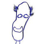
Thanks for the comments and suggestions. I have used effects on fonts but have not tried the calligraphy brushes yet but will do so now. I would really like to get the capability of doing things like the attached.
I'll keep working on it.
Thanks to all,
Robin
-
 RobinMcL got a reaction from walt.farrell in Illuminated Fonts
Hello Everyone,
Once again, the Forum (YOU) have helped me solve the problem, this time in a rather serendipitous way.
For my project the need is only for an illuminated W, P and F. I have, in this same project, made good use of (what I call) effects to enhance text but now I needed the really elaborative illuminated letters (but just three of them). In an effort to make the clear distinction between the two concepts, I thought I would try to get one example and attach it (the "N" that I attached) but I did not want to rip off someone's work from the Internet. Then I thought I would try AI Art (Midjourney). I have been experimenting with several AI art generators to see if, in the future, they may help me. (During the past five years I have been hiring artists for illustration work.)
So I asked Midjourney to give me "The letter W as an illuminated letter using various birds, hyper-detailed, rich colors, intricate, beautiful, Renaissance style"
That's right, I asked for a W and got an N! But it was a very nice N. So, I plugged away. All I needed was a W, P and F. The "N" was so nice that I thought I would keep trying. By the time I had the W, P and F, I had most of the alphabet - so I kept going. Now, hard to believe, I have the complete alphabet in gorgeous, illuminated letters. I suppose I could easily repeat the process, asking Midjourney to use, butterflies, trees, flowers etc.
This episode makes me ponder. In replying to one of your comments, I wanted to give an example but did not want to "steal" someone else's work. Have I done even worse? Certainly, legally, I have not. The (paid) user of Midjourney has the right to anything they produce (Midjourney also holds non-exclusive rights). So, I am "free and clear" on the legal side. But what about the people who paint such things as their livelihood? I could go on, but this is not the forum where I should philosophize. I just want to let you all know that my current problem is now solved, and you made it happen.
Thanks,
Robin
-
 RobinMcL got a reaction from Old Bruce in Publisher introduces "False" bleed
Thank you all for your comments.
To Old Bruce: I tried the TrimBox idea. Brilliant! (I'm only beginning with my pdf software and had not got to that stage. I had hoped that Publisher would do all I needed.)
To MikeW: I'm on my third book and, like you, don't want to do a fourth. I thought about creep but decided that I had enough to worry about. If I end up being crazy enough to try a fourth book, I would take your advice and try to deal with creep. On the sewing and binding, I discovered that the recommended sewing techniques were not good enough when using (heavy) photo-quality paper for the signatures tended to separate from each other when the book opened. I fixed this by doing a second, cross-sewing of the text block; more work. What a pain.
To thomaso: I wrote to Serif on this issue several years ago and was told that they had no intention of fixing this.
To pbasdf: I add my own guides, when designing the cover, so that I get the spine printing in the correct place. This made me wonder about creating my own crop marks but I could never think through how to do that. You have shown me how. Thanks.
Once more, to all, thanks. This means a lot to me. The first book was for our first grandchild. Then the parents had a second child and I could hardly do a book for one and not the other. After over five years of work, I delivered the second book a few months ago. Then the parents said "This has taken you so long and you have had so many trials and tribulations, we would like you to make a book outlining that, multi-year journey." Gulp! This third book I call "The Story of the Stories". None of these books could have been done without the help of you all.
Robin
-
 RobinMcL got a reaction from MikeW in Publisher introduces "False" bleed
Thank you all for your comments.
To Old Bruce: I tried the TrimBox idea. Brilliant! (I'm only beginning with my pdf software and had not got to that stage. I had hoped that Publisher would do all I needed.)
To MikeW: I'm on my third book and, like you, don't want to do a fourth. I thought about creep but decided that I had enough to worry about. If I end up being crazy enough to try a fourth book, I would take your advice and try to deal with creep. On the sewing and binding, I discovered that the recommended sewing techniques were not good enough when using (heavy) photo-quality paper for the signatures tended to separate from each other when the book opened. I fixed this by doing a second, cross-sewing of the text block; more work. What a pain.
To thomaso: I wrote to Serif on this issue several years ago and was told that they had no intention of fixing this.
To pbasdf: I add my own guides, when designing the cover, so that I get the spine printing in the correct place. This made me wonder about creating my own crop marks but I could never think through how to do that. You have shown me how. Thanks.
Once more, to all, thanks. This means a lot to me. The first book was for our first grandchild. Then the parents had a second child and I could hardly do a book for one and not the other. After over five years of work, I delivered the second book a few months ago. Then the parents said "This has taken you so long and you have had so many trials and tribulations, we would like you to make a book outlining that, multi-year journey." Gulp! This third book I call "The Story of the Stories". None of these books could have been done without the help of you all.
Robin
-
 RobinMcL got a reaction from s_cream in SpyderCHECKR 24 color chart
I have searched but could not find any mention of using color charts for color correction in photos. I apologize if I have, inadvertently, overlooked one.
I see that I can use a single white pixel or patch to help correct white balance and, indeed, this is helpful but I am wondering if I can do more. I have the Datacolor SpyderCHECKR 24 color patch and used to make test shots with this in the photo. I know that other software has a very simple way of using the entire chart to optimize white balance correction. Though tedious, I could enter a list of true colors and then select the corresponding pixels in the photo. Does anyone know of an add-on or separate software that would take this information and return the optimized color temperature and tint correction for Affinity Photo. Having such a tool would enable me to get a good starting point for my processing of RAW files.
With thanks,
Robin
-

 RobinMcL got a reaction from CLC in On "book" and "booklet" print modes
Does anyone know if there are any plans to have this feature? I have been asking for it for years. I am currently working on a 200 page book and feel that I am headed for a nightmare when it comes to printing.
Robin
-
 RobinMcL got a reaction from John Rostron in Create a layer from the difference between two other layers
Thanks John,
This is a very interesting suggestion. It almost works. It gets rid, completely, of the common areas and that is great. However, it blends the areas that are different. Instead of a blend in the areas that are different, I want the pixels from the top layer only. This then represents the addition I had made in the collage. Think of a big sheet of blue paper as my start. I photograph that and make it layer 1. Then I scatter some leaves on the blue paper, photograph it and make that layer 2. But I want to create (for future editing purposes) a layer that has only the leaves. (I could do it by selection but this can be tricky in my case.) Your suggestion obliterates the blue background and that it great. However, the bit left is a blend of the leaves and the blue that was behind the leaves.
However, it's a great idea and I will think some more along these lines.
Thank you.
-
RobinMcL got a reaction from Old Bruce in Using ICC profiles with Epson Printer
Hello Walt,
I feel a bit embarrassed. The problems I had with Canon were very real indeed. It took forever to get them all sorted out but, after that, I have made many profiles, all successfully. So, when the same thing happened with my new Epson printer, I assumed that the problem must have been with the printer. I then went off going through the entire litany of things that had cropped up in the Canon episode.
Eventually, after forever with no success, I decided to go through the whole process again. This time - no problem. What was wrong the first time? Ah well, sorry, shame on me, I know I'll be shunned by all on the Forum from now on but, well, I had forgotten to switch off color management in the printer when I was printing the test patches.
I've done it correctly so any times, why did I mess up this time and why did I not think about this after spending so much time messing with the printer. I guess my brain had become conditioned after the Canon episode.
On a brighter note, I did manage to print out the book, individual signatures, and I got the alignment done perfectly but it was an enormous effort. If I ever again have images that cross the spine, I will restrict them to the center sheet of a signature. So one book is now behind me and I need to find an artist for the next one.
Thanks to all,
Robin
-
RobinMcL got a reaction from walt.farrell in Using ICC profiles with Epson Printer
Hello Walt,
I feel a bit embarrassed. The problems I had with Canon were very real indeed. It took forever to get them all sorted out but, after that, I have made many profiles, all successfully. So, when the same thing happened with my new Epson printer, I assumed that the problem must have been with the printer. I then went off going through the entire litany of things that had cropped up in the Canon episode.
Eventually, after forever with no success, I decided to go through the whole process again. This time - no problem. What was wrong the first time? Ah well, sorry, shame on me, I know I'll be shunned by all on the Forum from now on but, well, I had forgotten to switch off color management in the printer when I was printing the test patches.
I've done it correctly so any times, why did I mess up this time and why did I not think about this after spending so much time messing with the printer. I guess my brain had become conditioned after the Canon episode.
On a brighter note, I did manage to print out the book, individual signatures, and I got the alignment done perfectly but it was an enormous effort. If I ever again have images that cross the spine, I will restrict them to the center sheet of a signature. So one book is now behind me and I need to find an artist for the next one.
Thanks to all,
Robin
-
 RobinMcL got a reaction from Leigh in affinity photo 1.7.0 not accepting product key
Hello,
I found the key in the Affinity Photo folder and all is now well.
Robin
-
RobinMcL got a reaction from walt.farrell in Imposition
Hello Walt,
I struggle to explain this and, I suspect, several people on the forum have not understood what I am trying to say.
Ultimately, after imposition, I have a collection of spreads, each one having a left hand page and a right hand page. Apart from the central sheet of a signature, the left hand page and right hand page will not be in sequence. That's what the imposition is all about.
Now, if I export spreads form Pub, the pdf software can't split them into pages. That's the new feature I would like to have.
So, I have to export pages. Okay. if I export them without bleed, then the pdf app can do the imposition, re-order the pages and create spreads from the re-ordered pages. The number of pages MUST be divisible by four since each sheet of paper has two pages on each side, hence four pages per sheet. So, what is actually printed out is a collection of spreads.
As an example, my page size is 8.25" x 9.75" so I am using 17" x 11" paper, two pages, side by side. These sheets of paper are folded right down the middle, stacked up in bundles (signatures), and sewn together. After that, they get trimmed down to the correct page size. But where's the bleed?
If I export the pages WITH bleed, then it adds this amount ON ALL SIDES. Say I have 0.2" of bleed. Then the actual image that is exported as a pdf is NOT 8.25" but 8.65".
The reordering works fine but, when two of these pages are stuck together again via the imposition, there is a 0.2" + 0.2" = 0.4" of bleed IN THE MIDDLE OF THE SPREAD.
Here's another analogy. Take a photo, cut it in half. Now FRAME each half (That's bleed.). Now take the two FRAMED halves and set them side by side. The photo is NOT together. It has TWO thicknesses of frame between the halves. That frame is exactly the same as the bleed.
IF (magic, magic!) I could export pages BUT ask for bleed ONLY round three sides, it would work like a dream. But I can't.
I hope this helps explain what is going on. I really wish I could print directly from Pub without having to go to a pdf. I find that, when I take images from Photo and put them into Pub, the colors change. Then when I move them from Pub to a pdf, they change again. I've got calibration equipment and do the printer/paper calibration to get the ICC profile but, by the time things have gone from Photo (where I start) through Pub and into some pdf, the colors are really messed up so all my efforts on calibration do is to assure me that they are rendering the wrong colors accurately! In Pub, I can try to fix up the changes that have happened in going from Photo to Pub so I get good prints when I can do it directly from Pub. Ah well.
This book is for my first grandchild. I started it when he was born. He's now over 2 and - another grandchild is on the way, so, another book! (Can't do one for one kid and not the other.)
I have everything done and am now struggling to get it printed.
Thanks for the interest. The Forum is all I have to help me. I spent ages trying to find local people with experience, but to no avail.
Thanks Walt.
Robin
-
 RobinMcL got a reaction from Patrick Connor in Printing Signatures
Hello,
I have a small book ready to print but have not yet managed to find a way to do so. I have many, many problems but the one of greatest significance is to find a way of actually printing the book in the signatures I need for binding. The following is what I have looked at. There must be a solution somewhere (It is called Publisher after all.) but I have not found it. Any help will be greatly appreciated.
I require signatures from 1 (rare) to 4 sheets of paper (that is, 4 to 16 pages). However, this requirement is not fixed as, for different books, I will be using paper of differing thicknesses and hence will select different numbers of sheets for the signatures. I have coloured photos that go to the edge of the spread and cover the entire spread, NOT just an entire page. This means that I have to use Bleed and then trim the text block. If I use Booklet as the printing option, it prints the entire file as a single signature (a "booklet" is, essentially, a single signature.) This is no good whatsoever. An average book has between 6 and 10 sheets for each signature. I've never seen a 100 page book bound in a single signature. Since I am using thick paper, my signatures will have about three sheets (on average). If I use Book as the printing option, then it does the page imposition assuming that each signature has a single sheet. This option is equally useless as it would force me into hand sewing every single sheet. As above, I have never seen a book where all the signatures have only a single sheet. Since neither of these options make sense in my situation, I have tried workarounds via the use of pdf files. I purchased a PDF editor (at twice the price of Publisher) just to do the imposition - but that failed too! The reason is subtle ( and very frustrating). IF I export spreads then I can get the bleed done correctly AND get crop marks etc., things that I need for alignment and trimming at the binding stage. BUT, while the PDF software CAN do imposition, it is NOT imposition of spreads that I need. It is imposition of pages AND .... Phew! IF I export, from Publisher, as Pages, THEN it puts bleed round each page. That is, Bleed round FOUR sides of each page (not round each spread)!!! So then, when the imposition is done, there are two strips of bleed down the middle of each spread! Ouch!! This is NOT what is required. If I export as pages WITHOUT bleed, then the imposition in the PDF software does look fine. BUT there is no bleed, crop marks etc. So, although this looks nice on the monitor, it is NOT suitable for printing and binding when I need to trim the text block on the Crop Marks. There are additional, still serious, problems.
I use Affinity Photo for photo-editing but, when I put a Photo image into Publisher, the colours change. I have checked and I have the same colour profile in each. I have also checked using Windows Explorer preview window. There is NO difference between the image in Photo and Windows Explorer (preview), but the same image in Publisher is significantly different. When I try my workaround by creating a PDF file, I have not yet found a way to get a PDF that does not change the colours. My monitor is a high-end NEC with its own 14-bit LUT and I re-calibrate it every two weeks.
Surely all I need MUST be in Publisher but I have not found it yet. I have searched the tutorials but found no reference. I have been struggling with this for two years (from PagePlus9 days). The imposition algorithm is utterly trivial. I expected to find it under Print but can't see it. Where is it?
I will be eternally grateful to anyone who can help me solve this problem. I have spent two years on this project, spent many thousands of dollars all the time assuming that printing a small book would be a feature in any publishing software. I have asked this question before and people have been sympathetic but could offer me no solution. I hope someone out there knows the answer. Splitting my file into several files is not practical as small changes are likely to be made from one printing to the next and these would cascade over all subsequent files. There is also the problem of all the photos covering entire spreads, not just pages.
Sincerely,
Robin
-
RobinMcL got a reaction from walt.farrell in Missing fonts
Great idea Walt.
I copied the text into Notepad then, from there, back into Publisher and saved as a new file. No error message when opening it! Good. However, the Font Manager claims there is Arial (not ArialMT) but, on location, it is NOT Arial at all. So, still something strange but at least I don't get the error massage anymore.
Where would I be without the Forum and people like you?!
Thanks,
Robin
-
 RobinMcL got a reaction from MEB in Transparency Tool
Utterly brilliant!!
I have been struggling with this problem for over a year (PhotoPlus, PagePlus, then Photo and Publisher). You have solved the problem for me. Many, many thanks.
I hope there will be a book for Publisher. The one for Photo is very helpful indeed.
Robin
-
 RobinMcL got a reaction from jmwellborn in Transparency Tool
Utterly brilliant!!
I have been struggling with this problem for over a year (PhotoPlus, PagePlus, then Photo and Publisher). You have solved the problem for me. Many, many thanks.
I hope there will be a book for Publisher. The one for Photo is very helpful indeed.
Robin
-
 RobinMcL got a reaction from Rich313 in Large file size
I'm not really sure if this is a bug or not, but I hope so. I had a PagePlusX9 file of a short story with images. It is 2.3MB. I entered it again in Publisher. The Publisher file is 1.3GB - same thing. This is huge. The corresponding PDF files, which I need to use in my imposition software, are 67MB (from PagePlusX9) and 355MB (from Publisher). The 355MB one is too large for my imposition software.
These are monstrous files. I hope this is a bug because, if not, I simply won't be able to use Publisher.
(Splitting into separate files, one for each signature, doesn't work in Publisher because, when I try this, Publisher loses images from the last page. With PagePlusX9, I could split the file into one for each signature.)
Cheers,
Robin
-

 RobinMcL got a reaction from adirusf in Large file size
I'm not really sure if this is a bug or not, but I hope so. I had a PagePlusX9 file of a short story with images. It is 2.3MB. I entered it again in Publisher. The Publisher file is 1.3GB - same thing. This is huge. The corresponding PDF files, which I need to use in my imposition software, are 67MB (from PagePlusX9) and 355MB (from Publisher). The 355MB one is too large for my imposition software.
These are monstrous files. I hope this is a bug because, if not, I simply won't be able to use Publisher.
(Splitting into separate files, one for each signature, doesn't work in Publisher because, when I try this, Publisher loses images from the last page. With PagePlusX9, I could split the file into one for each signature.)
Cheers,
Robin