Wosven
-
Posts
4,129 -
Joined
-
Last visited
Everything posted by Wosven
-
 Fine choices. I usually like his videos. Another interesting one is about brushes and how we don't need so many of them. It reminds me of when I used real paint and the same favorite bruches that didn't have a lot or long hair anymore but I was able to do a lot of thing with them. The video is : Make YOUR OWN Damn Brushes. Tutorial. The "Moment of supremacy" 's ones are interesting too.
 -
Thanks a lot @GabrielM ! I missed the link at the bottom of the page when I looked the first time ! I'm like a child playing with new brushes and all in Affinity apps… someday I'll try to do some real stuff and work with those
-
Hi, I saw this video and thought those luminance brushes were interesting, but they seem especially made/available for iPad. Will it be possible to get or buy them for our desktop applications or are they OS related ?
-
Try to put violet color in the last stop BEFORE fadding to 0 opacity.(or you won't be able to modify it).
-
It is usually said not to put your "worst" design with the good ones to make them stand out in front of the client, since he usually selects it And about bad choices… our new logo, selected/voted by our hierarchy, achieve unanimity for us — nobody asked for our opinions, even if it's our daily job — , it's the worst choice (shapes and colors) they could made and we hate it ! I'd rather have one with funny smiley like this one.
-
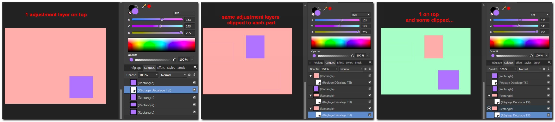
If you want to have the same adjustment to each parts, you can put the adjustment(s) on top of all “parts”. Some examples: adjustment layers on top (but one violet square). Each other violet square under the adjustment layer are light red. Each violet parts and the bottom violet layer get the same adjustment layer clipped : they became light red but the one without adjustment layer in the middle of the stack. Adjustment layers clipped and one not clipped : the colors are messed up.

-
I like better with the windows too, and I don't know if without them, it looks like one because I saw the first logo or not…
-
It's a really nice design ! If you permit an advice, like @MikeW , about kerniing but I would only put less space between "r" and "a", and put a little more between "a", "i" and "n".
-
Export as PDF 1.3 (Acrobat 4)
Wosven replied to Altod's topic in Feedback for the V1 Affinity Suite of Products
Hi, With Affinity you can create PDF 1.3 (acrobat 4) files with options PDF/X-1a-2003 or PDF/X-3-2003, files that won't allow transparency and avoid problems. Those are similar to inDesign parameters, and I expect your printer to allow files made with this application (cf. screenshots). I suspect some other problems with your file than as listed in the screenshot you did. Is the profile in the link provided a profile you can download and install for exporting PDF? Now, if you want to try to convert your file to PSD and convert this PSD to PDF, be carefull and give it at least 600 ppp resolution (I'm not sure texts and graphics will stay as vectors doing those conversions), so the printed result — especially fine text — stay crisp. Doing this for images containing text/details will give a better result and less blur. About PDFX-1a:2003 : BobLevine 14 juin 2011 08:38 “ Apparently X/1-a 2003 does support 1.4 BUT and this is a very big BUT, the file may not contain any transparency. ” Dov Isaacs 14 juin 2011 10:02 “As chairperson of the ISO PDF/X Commitee, I'll confirm Bob's response. Officially, PDF/X-1a:2003 (as opposed to PDF/X-1a:2001) is based on PDF 1.4 with the restriction that live transparency cannot be used. Note that the specification doesn't prohibit use of PDF 1.3 or earlier for such a file! In order to technologically fit into how InDesign and other CS applications “work,” PDF/X-1a:2003 export is done using the PDF 1.3 standard such that live transparency does not appear in the resultant PDF/X-1a:2003 file. Ironically, PDF/X-1a:2003 never really caught on with the print industry. Most print service providers that request or support PDF/X-1a, specify or imply support for PDF/X-1a:2001. Note that in reality, PDF/X-1a and PDF/X-3 really represent the best of 20th century print publishing workflows, not workflows that need to deal with very graphically-rich content with transparency. Adobe most strongly recommends PDF/X-4 direct export from InDesign (and save as PDF/X-4 from Illustrator and Photoshop). - Dov”
-
- Node deletion with curve preservation
Wosven replied to IcyPRO's topic in Older Feedback & Suggestion Posts
Yes, it would be usefull, especially when you convert text to curves and need to delete extra nodes. Sometimes, a round curve is made of 2 nodes with only one handle, or there are too many nodes for a simple curve. It would be handy when using the pencil tool too. -
Interesting technique @gdenby , the result is neat !
-
Export as PDF 1.3 (Acrobat 4)
Wosven replied to Altod's topic in Feedback for the V1 Affinity Suite of Products
Oups, @Altod I forget to ask : there's no log you can get from this page to know exactly what is the real problem ? -
Export as PDF 1.3 (Acrobat 4)
Wosven replied to Altod's topic in Feedback for the V1 Affinity Suite of Products
There's no lower settings for PDF (those settings are the same we use at work for printing a lot of magazines, this avoid transparency and some problems). I added a screeshot from inDesign options (I did mostly — no bleed, no print marks, for import in other apps — the same settings in Designer/Photo, and our fabrication team validated it). But there's a lot of points to check for a PDF, as in minimum stroke width, fonts (embedded, copyright…), images' resolution (clients often send us PDF with low resolution images embedded), spot colors, etc. Can you check your file with Adobe Acrobat preflight or some program like Pitstop ? (Serif's PDF pass our "Pitstop test"). Or know someone who can do it for you ? The screenshot you did show a list of requirements needed, but doesn't show your problem, or list them as in a Pitstop's log, so you can correct them. And I can't help you with a free software or online preflight test, since I usually do it at work with Adobe Reader pro or Pitstop. Perhaps someone can help about this ?
-
I didn't know Excentro, but those drawings remind me of an Inkscape image I really like (but I wouldn't know how to do this or use equation to do it) You can find the SVG file here.
-
Can you show your result ? I need to redo this, but this result isn't too bad spending few time doing it (I'm late too now ) I'll try later to get a better effect. (it was hight resolution, but I had to make it low res to get a lighter file). Easter_light.afphoto
-
The same as in Art : use tools depending of/appropriate for your canvas (i.e. no pencil for a 4 × 3 m… unless you've got a lot of time to draw )
-
If you paste the clouds, only the part of the clouds in the selected area will be modified AND the selection. You need to use Edition > Special copy… (it gives you different options), and selecting : Bitmap (screenshot below). And you'll have to apply a mask. With a shortcut it would be faster than the other way to do this : Create a mask with the selection, paste and resize the clouds (without selection) and apply the mask to the clouds. Same as the first (Edition > Special copy) : drag and drop the clouds image in your file : the new layer is an image, instead of the previous ones that were pixels. This way, you can select and resize the new image layer without modifing the selection. And you add a mask once your done modifying the clouds.
-
That's strange. AP and AD stay on the last selected palette I used. If I create a new document, the palette stay selected. The same happens when I close and open the apps. When I close different documents with different palettes, this is the last palette that is selected when I reopen the app. (Win 7). It's when creating a document's palette and closing the document, that the next new document get the Greys' palette selected. The trick is to keep your favorite palette on top of the list by saving and deleting the other ones, and importing them again.
-
Copying text from InDesign to Affinity Designer
Wosven replied to MickRose's topic in Older Feedback & Suggestion Posts
The larger shops using CS apps, that would need to upgrade computers and to pay monthly fees if they want to use CC apps, can think — the same as they did with QXPress — of switching to APub, and keep few CC subscriptions for old files they need sometimes to open or for specific works. Instead of finding a large amount of money and/or laying people off… to switch to CC. Depending of the number of licences needed, it can be an important decision, since switching need to get a different worflow, teaching new apps, converting files… -
Convert coloured vector to greyscale
Wosven replied to MickRose's topic in Older Feedback & Suggestion Posts
Sometimes, it's because some knowledge is not about the sofware but about generic features like color profiles. Same things with PDF export options. Does Affinity need to add the whole PDF x-1a:2003 to 1.7 documentation in the help file, or do people need to learn more about exporting to PDF/using color profiles, etc. ? i.e. To manage color profiles, I had to learn from specific web sites that explain such things, it wasn't provided (no more than how to select a profile) in the CC suite help. But there's a little bit of information in their documentation. Creating documentation/how-to/courses is difficult, sometimes you only need to explain where and how to modify settings, sometimes you need to do a complete course explaining more than the feature because people don't have enought knowledge. Sometimes, knowing tricks is enougth, but it's better to know why we do this or that -
I'm aware of this, but there're limitations to document's palettes. Document palette are usefull for specific documents, but it would be usefull too, to be able to add them while copying-pasting from another document (the same way they appear in others apps when you do this), perhaps with a prompt : "Do you want to add… ?" or in a different part of the current document palette ? Since creating a palette from current document create more colours than used in the shapes (only using plain fill in those shapes), and since we can't add or merge document's palettes. i.e. if I used a Pantone in another document, and copy-paste the shape using this color in another document, the only way to know it's a Pantone color is to add the color to the current document palette or have the same palette selected (to be able to see the selected swatch). If there're only few new colors, that's not difficult to add them, but if there are 20, it begin to be annoying to add them one at a time.
-
Hi, I rarely use color palette in my documents, unless I need Pantone. How apps usually manage colors swatches, and especially global swatches between documents ? Don't we lack a default color palette for each document (more than "recent used colors"), to show at least global colors used in the current document ? When I copy-paste from another document, shouldn't AD ask to create swatches to the current color palette or ask to add a color palette with (global) swatches ? I'm not sure about this, since it would be more complicated because of color profiles, but I would like some advices. For example: I just re-drew a logo in a separate file, and created a document color palette (global colors) since it use 15+ colors. I copied-pasted it in another document, and I was disapointed when the swatches didn't appeared in this document. Of course I can export-import the palette, but if I had a palette for this document, I would have to switch palettes to get the logo's colors or the ducument's colors.
-
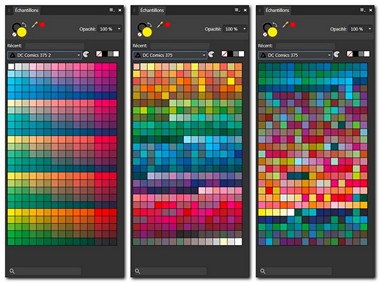
This would be usefull, and to be able to revert to default swatches order, since ordering by name or color can be worst. For now, we need to re-import the original palette when ordering by name or color is a misstep. Below : original order, by color, by name.
-
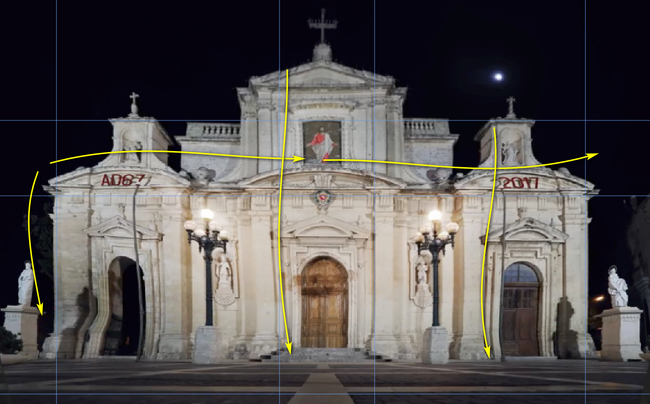
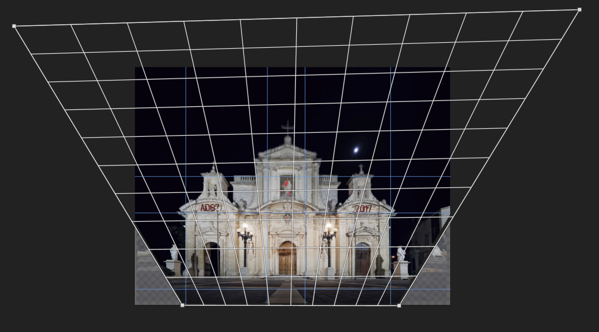
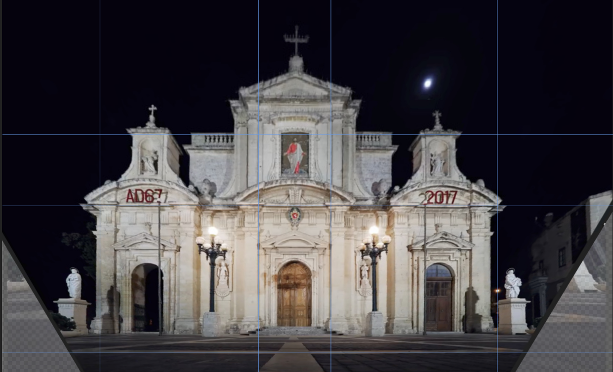
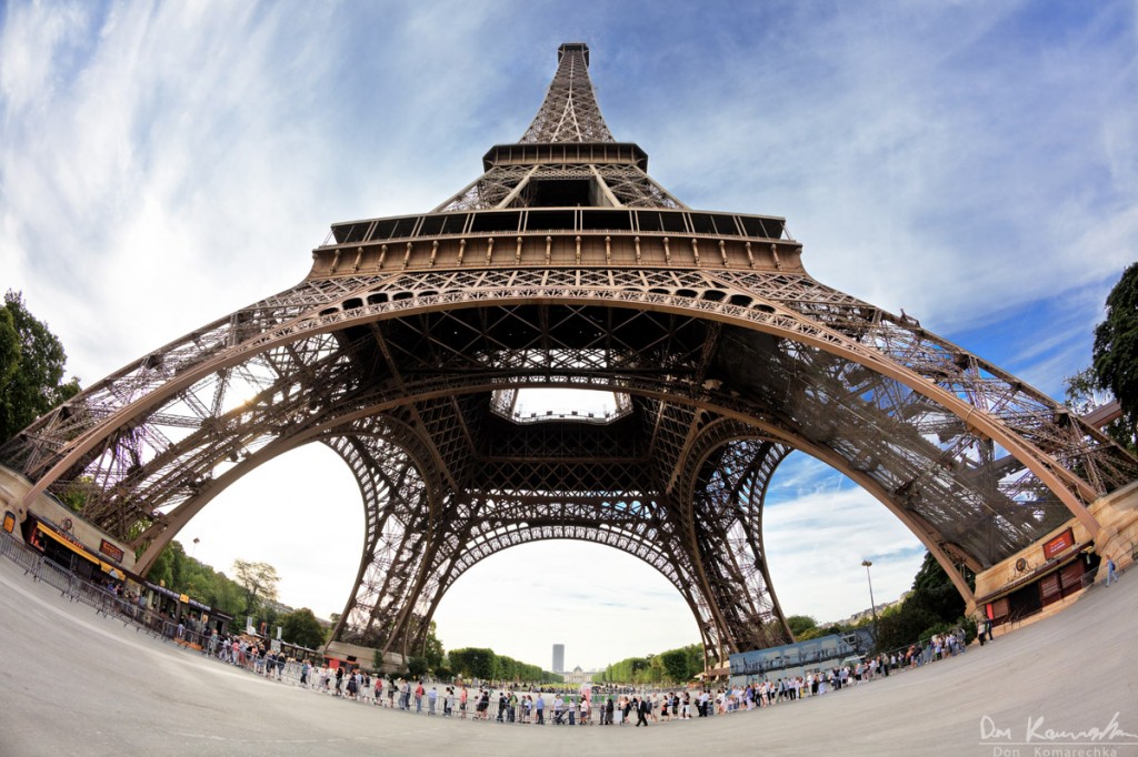
affinity photo Perspective Skew Correction Tutorial - Added Mesh Warp
Wosven replied to 0Kami's topic in Share your work
Don't forget that this façade was made of straight lines and regular curves. Imagine a cube, or rotate a box in your hands. The perspective grid is the best way to correct this photo, and we have to correct many angles. You can add guides to make the process easier. (in yellow, the curves added by the mesh warp grid). If you use fisheye lens, it's another problem since this add a lot of distortion, and it can be difficult or impossible to correct.