0Kami
-
Posts
27 -
Joined
-
Last visited
-
 0Kami reacted to a post in a topic:
P40 Warhawk
0Kami reacted to a post in a topic:
P40 Warhawk
-
0Kami reacted to a post in a topic:
Feature request for Luminal Neo Plugin Support (Photoshop)
-
0Kami reacted to a post in a topic:
Lie Yukkou
-
 0Kami reacted to a post in a topic:
Skin Color
0Kami reacted to a post in a topic:
Skin Color
-
0Kami reacted to a post in a topic:
Add Film Grain (free macros)
-
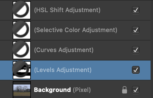
When the monochromatic iconography selection is ON the adjustment layer mask have a black/white circle overlay on them rather than being totally white or black (inverted). This circular icon blocks the users ability to see the strokes made by painting with the black or white (when inverted) brush. When the monochromatic iconography is OFF it shows the mask fully and any adjustments made by painting with the black or white (when inverted) brush is clearly shown. Attached is a screen shot of the Layers panel with the monochromatic iconography in the ON position. The highlighted Levels Adjustment layer shows an inverted mask with the center section painted in white. Everything is displayed perfectly when the monochromatic iconography is OFF. I'm using a MacPro laptop, Big Sur OS, Affinity Photo version 1.9.1

-
Monochromatic Iconography doesn't work anymore after update
0Kami replied to Jan Erik's topic in V1 Bugs found on macOS
Confirming across all 3 program updates. MacOS 11.2 Big Sur. -
I have the same nonfunctioning monochromatic icon issue in macOS 11.2. The problem is consistent across all three programs when upgraded to version 1.9.
-
0Kami reacted to a post in a topic:
After update to 1.9.0 the monochrome Icons are gone
-
rwakeford, I don't believe you are in the minority. Only the 'Default' adjustment was working for me as well (using Big Sur). Only after reading MEB's (always responsive and helpful) post about being in 'Separated' mode (my preference) did I switch to 'Merged' mode. That solved the problem but forces a constricted workspace on me. Hopefully, the upcoming release will allow AP to work with the latest Apple OS.
-
 0Kami reacted to a post in a topic:
Best way to replicate Photoshop Mixer Brush
0Kami reacted to a post in a topic:
Best way to replicate Photoshop Mixer Brush
-
0Kami reacted to a post in a topic:
Best way to replicate Photoshop Mixer Brush
-
MartinsRibeirro, I agree that combining the blur types can create a mess. It would only be used for "creative" experiments. Much like trying different Blend Modes. I should have mentioned this in my comments. Sorry for the confusion. Regarding the creation, of different blurs (gaussian, median, dust and scratches) and using ONLY ONE of them (depending on the type of smoothing you want to apply), does that make sense to you? I played with it and it seemed to give the proper results. Thanks for your continuing to follow the subject. Take care and stay safe.
-
Frequency Separation Actions
0Kami replied to photoadele's topic in Pre-V2 Archive of Desktop Questions (macOS and Windows)
Below is a simple workaround that allows you to let Affinity Photos automatic frequency separation filter do the hard work but still use whatever blur method you want: Open your document and create as many copies of the original background layer as you would like to have blur affects. For example, AP’s FS filter will create a High Frequency Layer and a Low Frequency Layer based on Gaussian Blur. If I wanted to have a Median Blur and a Dust and Scratches Blur you would create three additional copies of the original Background Layer. Use the top one to run AP’s Frequency Separation filter. Afterwards the Layers panel would look like this: High Frequency Low Frequency (Gaussian Blur) Background Background Background (Locked) You could then apply Live Filters (editable) to each of the two Background Layers above the original/locked Background Layer. Then your Layers panel would look like this: High Frequency Low Frequency (Gaussian Blur) Background (with child layer - Median Blur) Background (with child layer - Dust and Scratches) Background (Locked) At the point you can turn on only the blur layer between the High Frequency layer and the Original locked layer that you want to apply to the image. The High Frequency Layer will provide the texture to whatever is your blur preference. You could even combine blur effects by using the opacity slider. Just something to experiment with. Have fun. -
Below is a simple workaround that allows you to let Affinity Photos automatic frequency separation filter do the hard work but still use whatever blur method you want: Open your document and create as many copies of the original background layer as you would like to have blur affects. For example, AP’s FS filter will create a High Frequency Layer and a Low Frequency Layer based on Gaussian Blur. If I wanted to have a Median Blur and a Dust and Scratches Blur you would create three additional copies of the original Background Layer. Use the top one to run AP’s Frequency Separation filter. Afterwards the Layers panel would look like this: High Frequency Low Frequency (Gaussian Blur) Background Background Background (Locked) You could then apply Live Filters (editable) to each of the two Background Layers above the original/locked Background Layer. Then your Layers panel would look like this: High Frequency Low Frequency (Gaussian Blur) Background (with child layer - Median Blur) Background (with child layer - Dust and Scratches) Background (Locked) At the point you can turn on only the blur layer between the High Frequency layer and the Original locked layer that you want to apply to the image. The High Frequency Layer will provide the texture to whatever is your blur preference. You could even combine blur effects by using the opacity slider. Just something to experiment with. Have fun.
-
Smee Again reacted to a post in a topic:
Layer opacity vs. fill
-
Murfee reacted to a post in a topic:
Layer opacity vs. fill
-
Layer opacity vs. fill
0Kami replied to mso1977's topic in Feedback for Affinity Photo V1 on Desktop
Murfee, thanks for the visuals, the explanation, and the link to the other thread. I appreciate any help and new workarounds I can find. And, yes, I agree, we need the FILL slider in AP. -
0Kami reacted to a post in a topic:
Layer opacity vs. fill
-
Layer opacity vs. fill
0Kami replied to mso1977's topic in Feedback for Affinity Photo V1 on Desktop
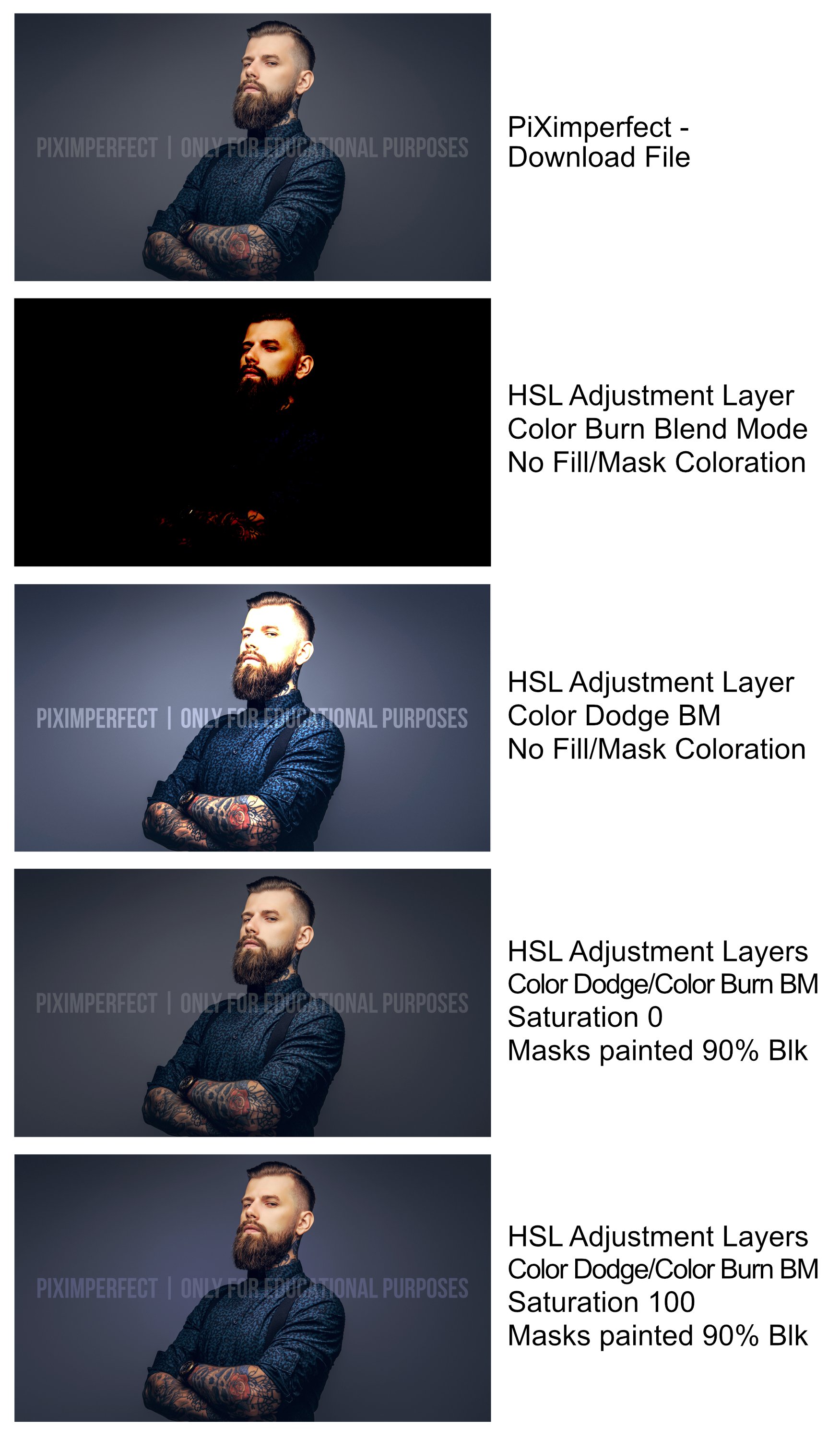
Smee Again, please see the images below. Because many of the forum users were trying to replicate what they were seeing in YouTube tutorials, I was trying to respond with a workaround to the lack for the lack of a PhotoShop FILL slider in AP. As an example, I attempted to reproduce the results from the PiXimperfect YouTube video technique shown in "Create Colorful Contrast with 2 Special Blend Modes!" Using the PiXimperfect downloaded image and applying the Color Burn and Color Dodge Blend Modes with the mask "shading" FILL technique I was able to closely replicate the video's contrast effects. The first image was the downloaded sample from PiXimperfect. The second is the image with an HSL adjustment layer with a Color Dodge Blend Mode. The third is the image with an HSL adjustment layer with a Color Burn Blend Mode. The fourth image shows the two adjustment layers with a 90% Black "Fill" on the Mask. The fifth image shows the two adjustment layers with the saturation sliders set at 100% and a 90% Black "Fill" on the Mask. (PiXimperfect used 9% and 7% fills respectively in Photoshop but I rounded up for this example.) I think your example shows no effect because you used a Luminosity Blend Mode. Take care.
-
Smee Again reacted to a post in a topic:
Layer opacity vs. fill
-
IPv6 reacted to a post in a topic:
Layer opacity vs. fill
-
Layer opacity vs. fill
0Kami replied to mso1977's topic in Feedback for Affinity Photo V1 on Desktop
There is a workaround for creating a "Fill" adjustment in any AP adjustment layer. Because each AP adjustment layer has its own mask, just fill the mask with whatever percentage level of "fill" that you would like. Just remember to reverse the percentage amount. For example, if you wanted a 5% "Fill" then use the paint bucket and fill the mask with 95% black. If you want a very targeted fill amoung you can use sliders to adjust the fill percentage or work in 5% increments in the grey swatches panel. I hope this helps. -
Blue histogram
0Kami replied to Pete G's topic in Pre-V2 Archive of Desktop Questions (macOS and Windows)
James Ritson, thank you for the explanation of why it may have been changed. However, why did the developers use a shade of blue (which already appears on the histogram) rather than a grey (if some people found white confusing)? I believe most people's issue is with the visual user interface aspect of the blue color rather any "help" the blue color might suggest/offer for it's meaning or use. And, although I appreciate your suggestion of using the waveform . . . wow, apparently my mind doesn't work on that level of perception. At any rate, I love your videos. They are always well-presented and informative. Thank you. PS - Please keep the videos coming!!!!! -
Blue histogram
0Kami replied to Pete G's topic in Pre-V2 Archive of Desktop Questions (macOS and Windows)
I just downloaded the latest version and the histogram is still blue ... maybe the developers (as compared to photographers/photo editors?) will change it back to white (or maybe a light gray?) with the next update. We can hope. -
Histogram
0Kami replied to Gerhard Herboeck's topic in Pre-V2 Archive of Desktop Questions (macOS and Windows)
Please encourage the Photo developers to return the histogram luminance channel to white or light gray. The change to blue did not enhance the user interface, it made it more confusing. Thank you for your consideration. -
Blend modes notes (52 A4 pages)
0Kami replied to dmstraker's topic in Tutorials (Staff and Customer Created Tutorials)
dmstraker, Thank you for creating and sharing this valuable reference. If anyone is interested, the YouTube channel PiXimperfect just presented a video that complements this PDF very well. It’s title is: The Science of All 27 Blend Modes in Photoshop: https://www.youtube.com/watch?v=i1D9ijh3_-I -
Thank you!