Search the Community
Showing results for tags 'colors'.
-
Hi all ! This is my palettes, extracted from Web/CSS Frameworks (Bootstrap, UI Kit, Material UI...) and Many brands. Get for free from my Github Repo Or from attached files... What is it ? In my work, like many people, i need to make lots of website sketch/présentation created with common Frameworks like Bootstrap or others. I made this with the excellent software Affinity Designer, and so, here are my own palettes created for this last. Palettes details Web/CSS Frameworks : Bootstrap 4.afpalette : 16 colors from Bootstrap 4 default theme {prefix bt4-} Bulma.io.afpalette : 19 colors from Bulma default theme {prefix bulma-} Groundworkcss.io.afpalette : 22 colors from GroundWork default theme {prefix gndwrk-} Material-ui.afpalette : 19 colors from Material UI default theme {prefix mui-} Spectre.css.afpalette : 7 colors from Spectre default theme {prefix spectre-} Uikit.com.afpalette : 12 colors from UI Kit default theme {prefix uikit-} - Kube.afpalette - Foundation.afpalette - Semantic-UI.afpalette Others : Brands.afpalette : 70+ brands colors (Affinity, Apple, Google, Microsoft, Amazon, Coca-Cola...) FlatUI 2 Japan.afpalette : 20 colors of Japan Flat UI 2 Old Colors.afpalette : 60+ old/vintage colors Human Body Human Body Bones.afpalette : 6 colors for human bones Human Body Hairs.afpalette : 70+ colors for human hairs Human Body Intimity.afpalette : 25 colors for human private parts Human Body Skins.afpalette : 26 colors for human skins Screenshots Material-ui.afpalette Spectre.css.afpalette Uikit.com.afpalette Bootstrap 4.afpalette Brands.afpalette Bulma.io.afpalette Groundworkcss.io.afpalette Human Body Skins.afpalette Kube.afpalette Foundation.afpalette Semantic-UI.afpalette FlatUI 2 Japan.afpalette Old Colors.afpalette Human Body Bones.afpalette Human Body Intimity.afpalette Human Body Hairs.afpalette
- 2 replies
-
- 1
-

-
- bulma.css
- spectre.css
- (and 7 more)
-
 Hello Peoples ! Coming again here but with few questions that you may like or not but i believe it is quite useful to ask. All my questions here are based on Beta version of Affinity Photo not on the stable version and they're intended for understanding and helping to improve what already exist and not to raise comparatives between Apples and Oranges. ---------------------------------------------------------------------- Object: The Ring Function! I've been using it (not that much) since it was added to HSL Adjustment; well i really enjoy it and found it very useful when it comes to narrow and make precise color selection ...but i only see it in few of the adjustment layer that aims to work on colors. Q: Don't you think Recolor adjustment needs it to ? --------------------------------------------------------------------- Object: I've seen that there is the gear icon on the bottom right of adjustment layer when we have them opened but for unknown reason it does nothing when i click on it. Q: What it is intended to do or achieve ? --------------------------------------------------------------------- Object: As we all know that there is not enough online tutorial talking about really crazy tricks with Affinity Photo, i usually watch PS tutos and work on applying them in my AP workflow and they just work but ... for some reason i get lost when it come to do the Blend if thing. Q: Can you please point to a tutorial talking about that in details or simply share here how you do Blend if with Affinity Photo ? --------------------------------------------------------------------- Object: i often use the blend ranges function and just found it not working even if you click a million times on that gear. Q: Bug or me missing something ? Possible to fix it ? --------------------------------------------------------------------- Object: Let say i select a red color and want to add more to already selected using the same method, well ! on other software such as PS i would simply sample more color selection color by clicking Shift + Click and drag or click to add to already selected color. Q: How to that with Affinity Photo ? --------------------------------------------------------------------- Object: It is really useful to save selection made on a Photo or any other pixel related stuff but in the same time i personally found it to be quite hidden, burried into menues. Q: Possible to create a button on related tools (Sel. Brush - Flood Sel. etc.) next to the refine tool that allows that to be done without trying to find it in the menu ? -------------------------------------------------------------------- Object: in this last one, i will come to something i already asked about but i see no change until now. Let's talk about Masks (also i target adjustment layer because i love using their masking functionality). Okay ! Let's create a mask and press cmd/ctrl+i to invert it ... it stays the same i mean pure white when it should turn black (actually dark grey) when inverted and even when i paint with the brush tool on the mask it shows after i do another action such as cmd/ctrl+s or switch to another and start using it. Quite bad hein ! Q1: it is possible to fix this and make work as it should ? Q2: Possible to make the painting on mask more live and less delayed ? Okay ! Here i'm done with this. few here you will understand are bugs that need to be corrected and few other are kind of request but i count them as things that needs to be corrected at this level of development of Affinity Photo and what i point to here should also be checked and if possible get applied to Affinity Designer and Affinity Publisher because all 3 are based on the same principle and should not grow independently one another when it comes to these basic stuffs. Blessing to Y'all and don't forget it is not to raise a troll but to help improve the software.
 -
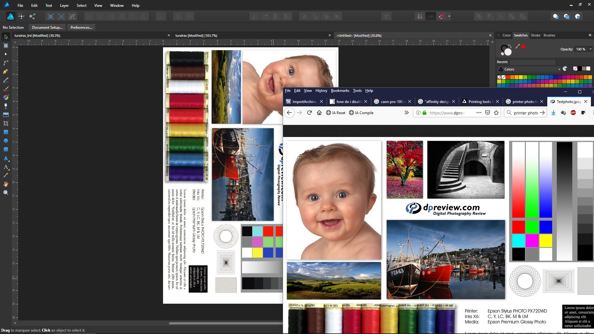
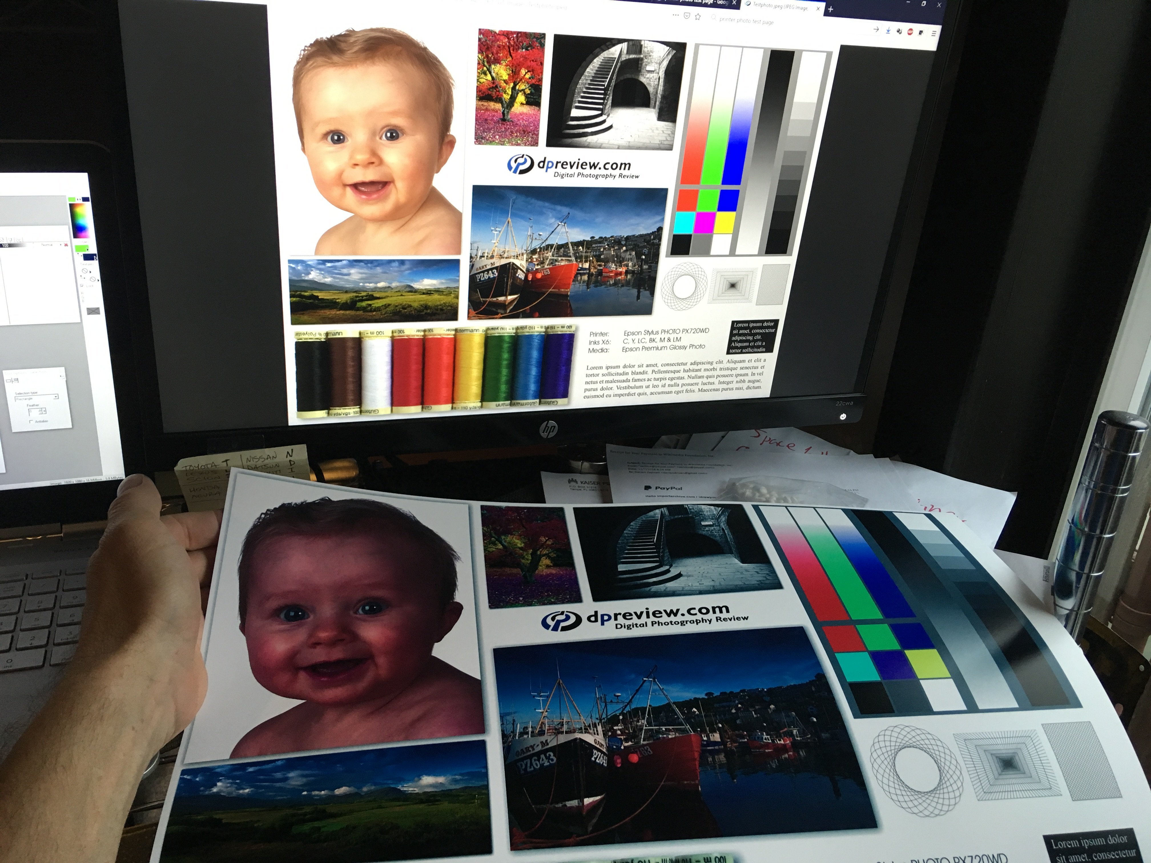
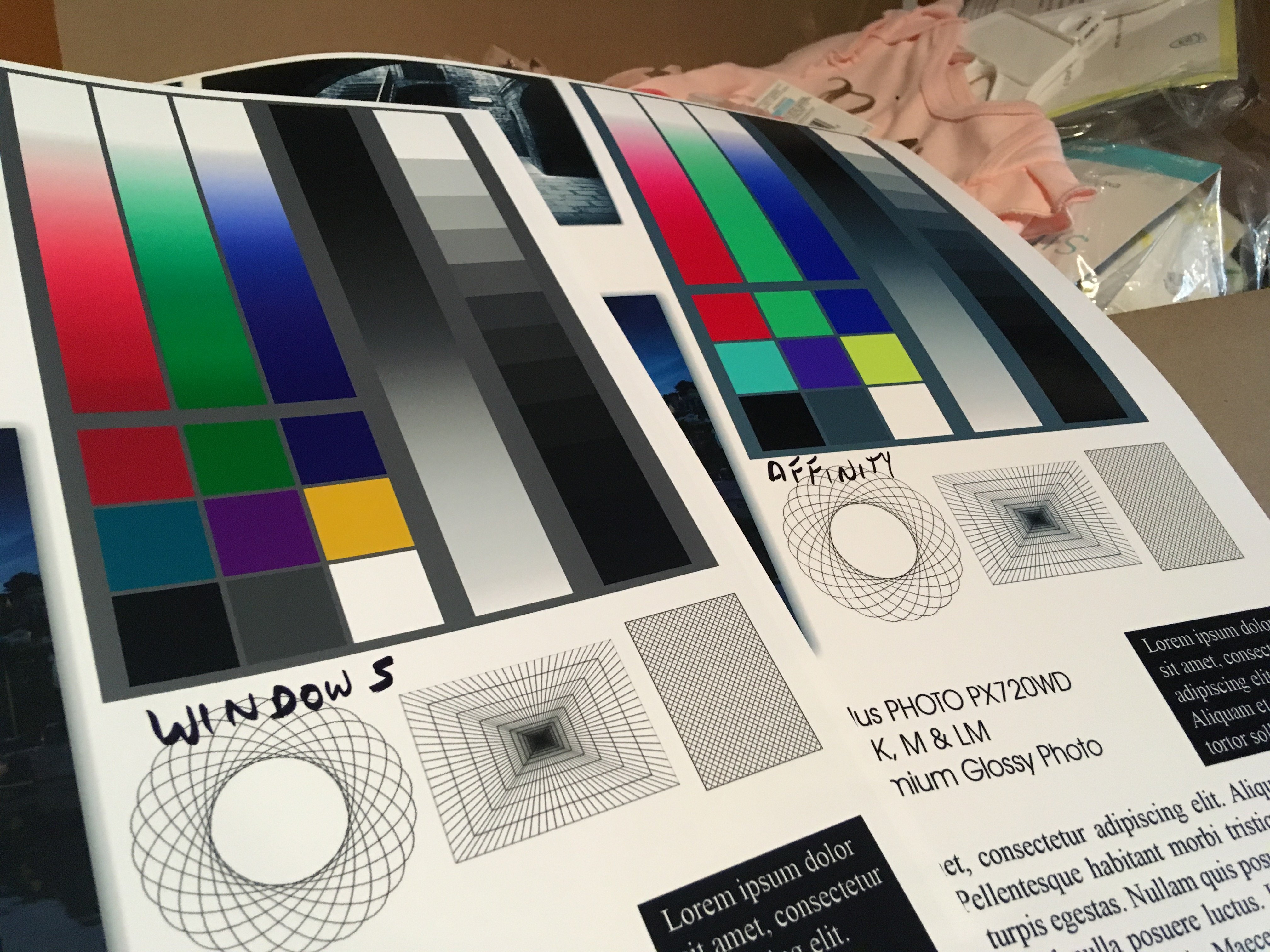
 Months ago I bought a Canon Pixma Pro-100 and started using Affinity Designer. My artwork came off the printer looking nearly identical to what I saw on the screen. I was very, very excited. Now I don't know what has happened, but everything that comes off the printer looks like crap. The colors are WAY off. Basics: - Affinity Designer on HP Envy x360 m6 laptop running Windows 10 Home (using laptop monitor and 2nd aux monitor) - Canon Pixma Pro-100 using Canon Semi-Gloss paper The default color profile that was being used was sRGB IEC1966-2.1. I don't know much about color profiles and that was the selection that showed up when I started digging. I have switched my document AND printer profiles to Canon PRO-100 <SG> 1/2 Photo Paper Plus Semi and Adobe RGB (1988) with zero changes in print output results. Everything I have read talks about calibrating monitors... I admit that I have not done this, however I am not printing photos but creating artwork in Adobe Animate using the standard color palette. I feel that no matter how my monitor calibration is set when I select red #FF0000 (255/0/0) that it should still print red, right? So here is the strangest part of this. I downloaded a test image to print. On my monitor the red looks red, green looks green, etc. When I imported the jpeg into Affinity Designer to print I immediately saw that the colors were different. The red appears more pale, the bright green looks like a pastel, etc. Here is a screen shot... pay special attention to the green in the 9-box just to the right of the ship photo. ...so I printed the sample graphic using Affinity Designer and the Canon Semi-Gloss color profile and ended up with this ugly POS: Granted, the light in my office isn't great, but the baby's face looks almost purple and not skin-tone like on the monitor. Hmmm.... WTF? Had a thought... hey, what if I print this using Windows instead of Affinity Designer? Right clicked the jpeg on my desktop and let Windows do it's thing and ended up with this... The color of the baby is VERY close to what I see on the monitor when I printed from Windows. The colors in the 9-box are DRASTICALLY different Windows vs Affinity Designer. So I thought that I could output my designs to a PNG and just let Windows print it... but I tried it with my own artwork and the results came out identical to every other attempt. (scratching head) Hoping someone can help. I'm overwhelmed by Google results on this topic.
-
 So yes this has been a issue that has been going on for some time Idk if i just didn't notice or if its just my computer but the purview its like yeh looks the way i want but then export it then its significantly darker? If anybody has has something like this happen please help and if i need to ill go into more detail.
 -
When the Designer for iPad was released back in July, I read the post on Affinity Spotlight showing the works of artists who had used the beta version (https://affinityspotlight.com/article/affinity-designer-for-ipad-a-special-beta/), and I was immediately captivated by the work by Ilya Shapko titled "Mystic Beast": I am trying to produce these same effects in my own works, and not sure I nailed it yet. I did find and download the color palette for this work from Dribbble: (https://dribbble.com/shots/4821906-Mystic-Beast), but it appears that he used some effects that I am as yet unaware of. Does anyone here know what tricks (bright/contrast adjustment, etc.) he used to produce these stunningly eye-popping effects, which layers/elements he applied them to, and how he applied them? I checked his website a while back, and someone else had already asked him to produce a tutorial showing how he did this, but I don't think is he inclined to do so. I did do two projects from the Affinity Designer Workbook (which is itself an exquisite work of art and beauty) titled "The Panther" and "Reflected Skyline", both of which are colorful works with dark backgrounds. However, neither of them really discuss how to make the colors pop like Ilya is able to do. If anyone knows of other places where I can go to learn this, please do share.
-

Add Background Color to Page
user099 posted a topic in Feedback for Affinity Publisher V1 on Desktop
I'd like to add background color to a page but can't figure out how to do it. I select the color with the color picker. There are two opacity slides, but neither does anything as far as I can tell. What am I doing wrong?
-
 Dear Team! So far, I do love your apps :-) One thing I would love to see is a common color swatch/palette management. In other words, having one common color palette database used by all the programs would help to keep consistency. Maybe that's somehow possible in future versions. Cheers, Chris
 -
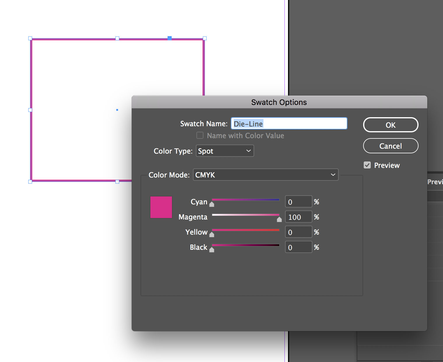
 Hey guys, I can't seem to find a way to convert process colours to spot in Affinity Publisher Beta. Not quite sure if there is a way yet. When I'm doing a print job that has a die-line, perf, fold line, etc, I usually set them up as a spot colour. In InDesign I usually convert one of the colours (either cyan, magenta, yellow, black, or whatever) from Color Type: Process to Color Type: Spot and then assign a name to each (like die-line). Is there a way to do something like that in Affinity Publisher at the moment? Thanks!
-
 Why is it the set of colors different from the layers panel to the options bar?
-
 Dear Affinity-Community, I hope you can help me in this case ! I created a flyer using Affinity Designer. Colors are CMYK (ISO Coated v2 300% (ECI)). For this flyer I have approx. 50 photos of leather watch straps, where the color is one of the most important things. I edited these photos in Photoshop CC and they really looked fine in PS CC (also CMYK !). The colors are very rich and deep if you are looking at the photos in Photoshop CC. Then I exported the photos from Photoshop and saved them as PNG (CMYK / ISO Coated v2 300% (ECI)). Also the image looked fine when I opened it at the preview on the iMac. But as soon as I import this image to Affinity Designer, the colors are very very pale ! I hope you can help me get this problem under control. Thank you in advance ! Best regards Lucas
 -
 I've been using Affinity Designer for quite a while now, but this is a first today. I have the color chooser open and I am working in 2 separate documents that look the same, but are different size. I copy and past the EXACT same RGB color code into both documents and they are 2 completely different colors. On one document its a bright green, they other a dull green. This is the first time I've had this happen. It's extremely difficult to know what color this will appear as on my website. Any idea why this is happening? Thank you
 -
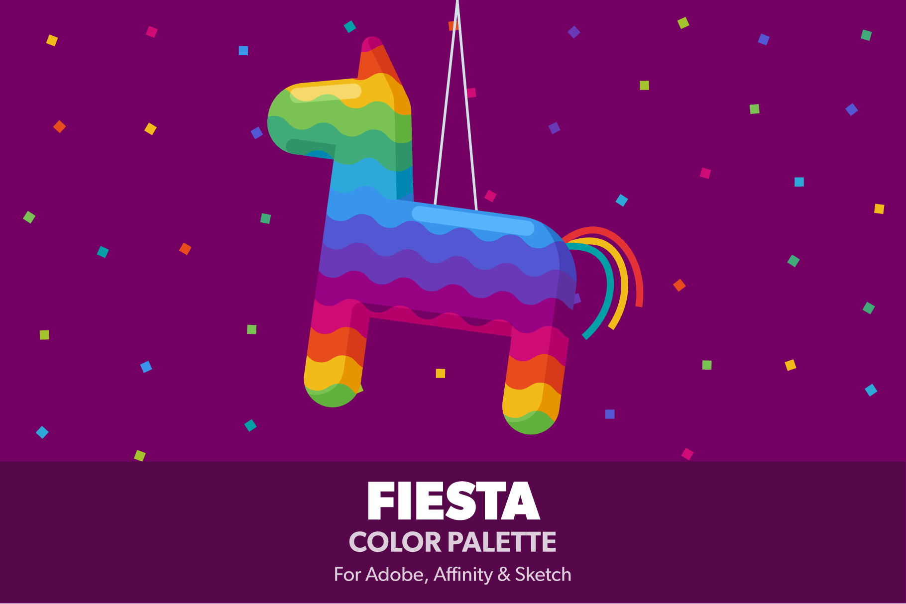
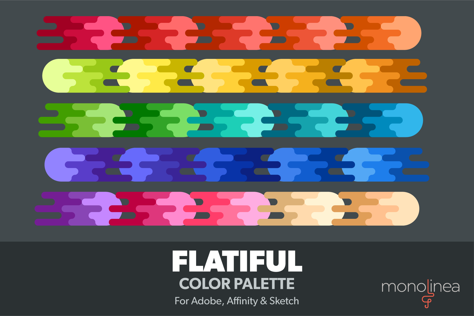
Just released a second color palette with support for Affinity's .afpalette format. It's a set of bright, happy colors to lighten up any illustration or design. Get it at creativemarket
-
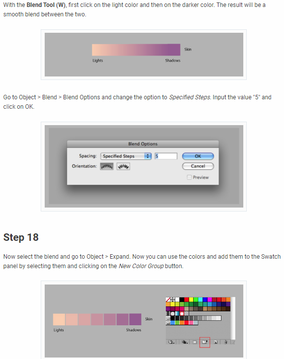
 So, I am learning vectoring, coloring, etc with Affinity Designer and I am reading some tutorials on different projects I want to try. One such tutorial has steps to blend 2 colors together then extract the shades from the blend to create a palette. The steps for Illustrator are listed in the attachment and I am wondering if Design has the same ability?
-
 I'm not sure what happened, but when I bought the software after having the trial I opened it and white in the program is replaced by light pink. I've looked up the issue and couldn't find anything like this problem. I did see that it could have something to do with monitor color calibration, however I have a three monitor set up and all three show the issue. I tried exporting a quick drawing with white squares and the exported png is perfectly normal, whites were white! I don't know if it's a simple fix or not, but I'd really like to be able to use the software, I really enjoy it. Please, if someone can help me I'd really appreciate it! Thank you!
-
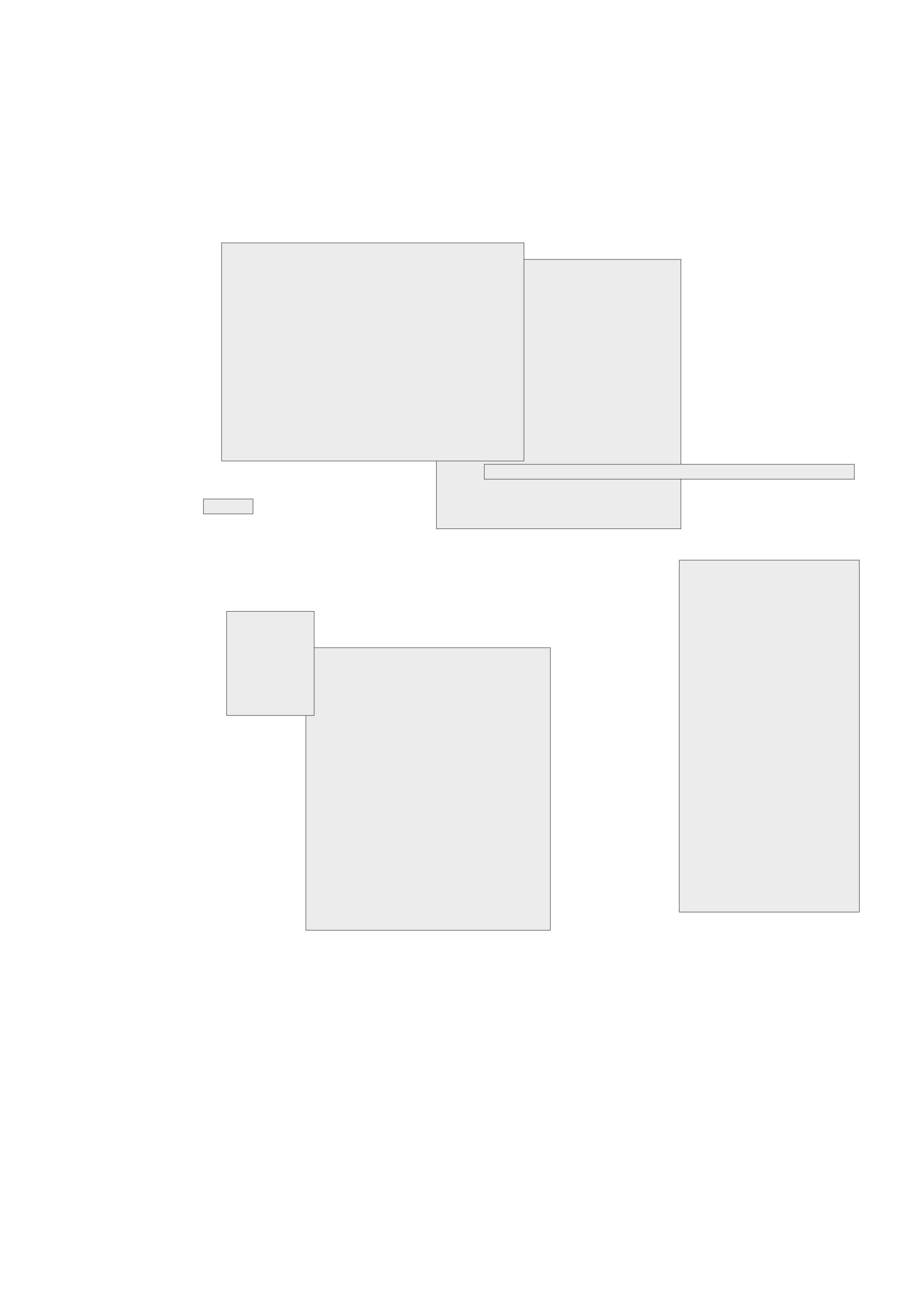
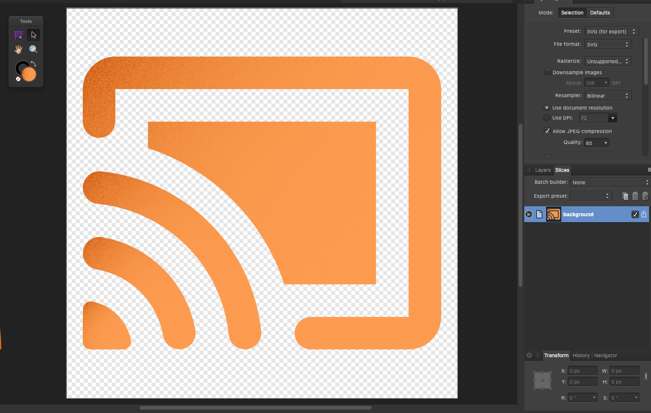
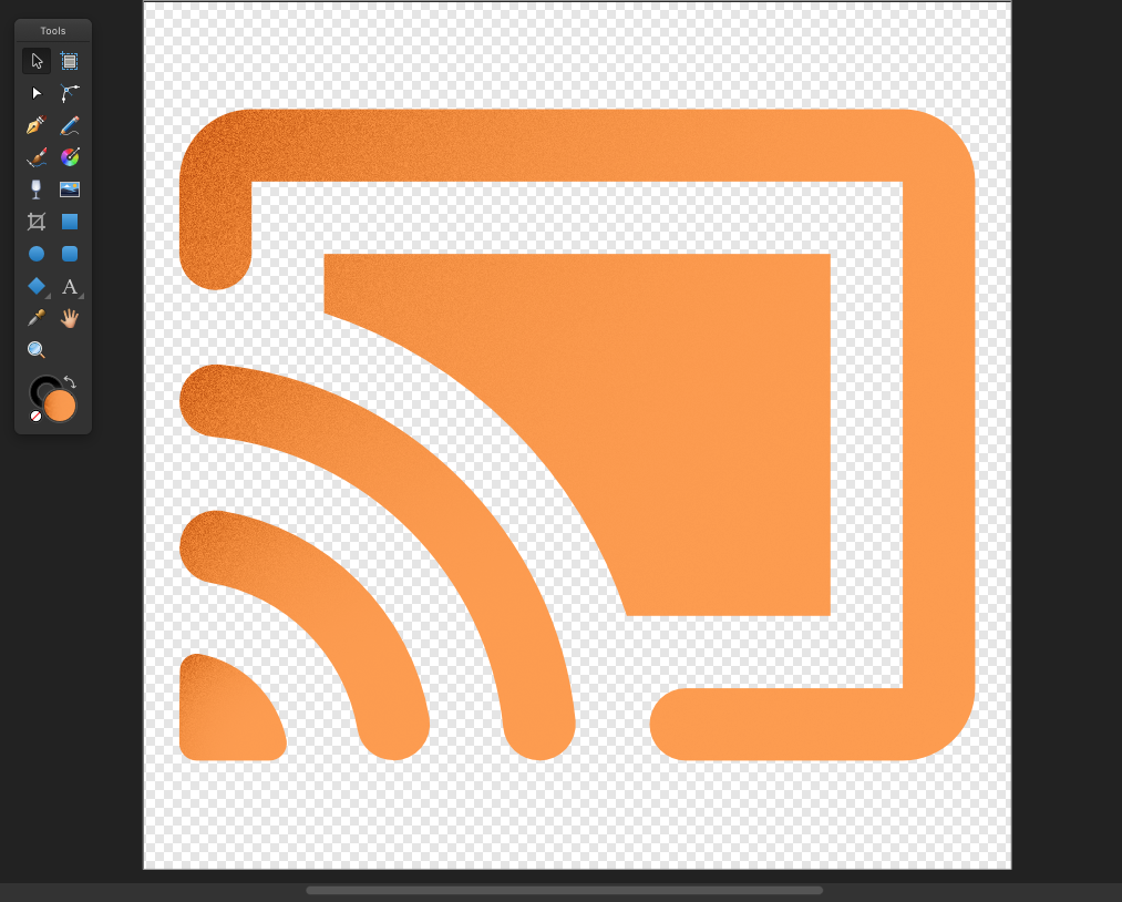
 I would like to export the same resolution in document in SVG. How do i do that or there is no option that can do it. Rasterizing ruins its (attached photos) background.svg
-
Does Affinity Designer have a Smart Color Wizard? It should be able to: Analyze all (or only the selected layer) colors in the project and then suggest one or more colors which best fit these colors by using different algorithms. That would be VERY useful!
-
Hi everyone, i´ve got a question, i couldn´t find a explanation about registration colors, you can produce them in the swatches panel, i found explanations for overprint and spot colors, but can someone point me to an explanation of "Registration Colors" ? what is it for ? thanks
-
Hi, So when it comes to colors, here´s a little suggestion what could be done to improve the workflow when you start your document and decide to use swatches and improve your colours. dont look at the design of my idea, rather look at the idea... When you creat colour chords, right now , you can select a colour and right click, select from some possibilitys like Complementary, Triadic and so on.. I would like a funktion to open a window like shown, get an optical representation inside of the color wheel and adjust my colors by just rotaiting in this example my colors, to change them, than just move some triangles or points, to adjust the amount of the color split, and than just klick load them to my palette.. only maybe, could it be possible for the program, to use my underlaying actual image, and interactive while rotating, moving and adjusting my Color Chord , somehow change interactive also the most corresponding olors of the opend image ? not sure how this could be possible.. but the first part, just creating color chords this way, as it is allready possible in many video edditing programs, would be an improvement.. maybe put it to your whishlists.. greetings
-
I wanted a base palette that I could use on my illustrations, with a range of shades, and highlights/shadows for each. So I made my own: It's a good starting point for illustrations, icons & UI work. There's more than 100 swatches, nicely organized. Comes in several formats, of course .afpalette included. Grab it over at CreativeMarket!
-
 Hello this is my first topic, I will probably buy windows license because I believe it is a great tool for developing raw xtrans-III files, I am using trial version right and I do not find 2 things: 1.- fujifilm color presets 2.- lens correction presets regards
 -
 Hi , My last Question for today.... Well , while using the collors palette, is there any shortcut, to fast switch over to Black or white color ? Someone told me in photoshop you can find a shortcut for this thanks.. Tom
 -
 Recently picked up a copy of Affinity photo and though much of the program works like photoshop and was easy to switch to, I found some short cut keys missing which I feel are very important. There are no short cut keys for changing the foreground and background colors to Black and White (Photoshop has the letter D) and there is no short cut for reverting back to the original image (Photoshop has the '\' key).
 -
 This feature would be very useful: An algorithm analyzes all colors used in the document and changes them to a harmonious color set. Then it presents a preview of several different (random) proposals on how these colors are distributed in the document. Then the user can pick the proposal he likes the most. This is how it could be achieved: For example, the document contains these 3 colors: ColorA, ColorB and ColorC. Then, starting from a CustomSetOfHarmoniousColors, the algorithm parses all document colors and for each document color, it searches the nearest color in the CustomSetOfHarmoniousColors. Then, it approximates each document color to its nearest harmonious color by a preset percentage.
 -
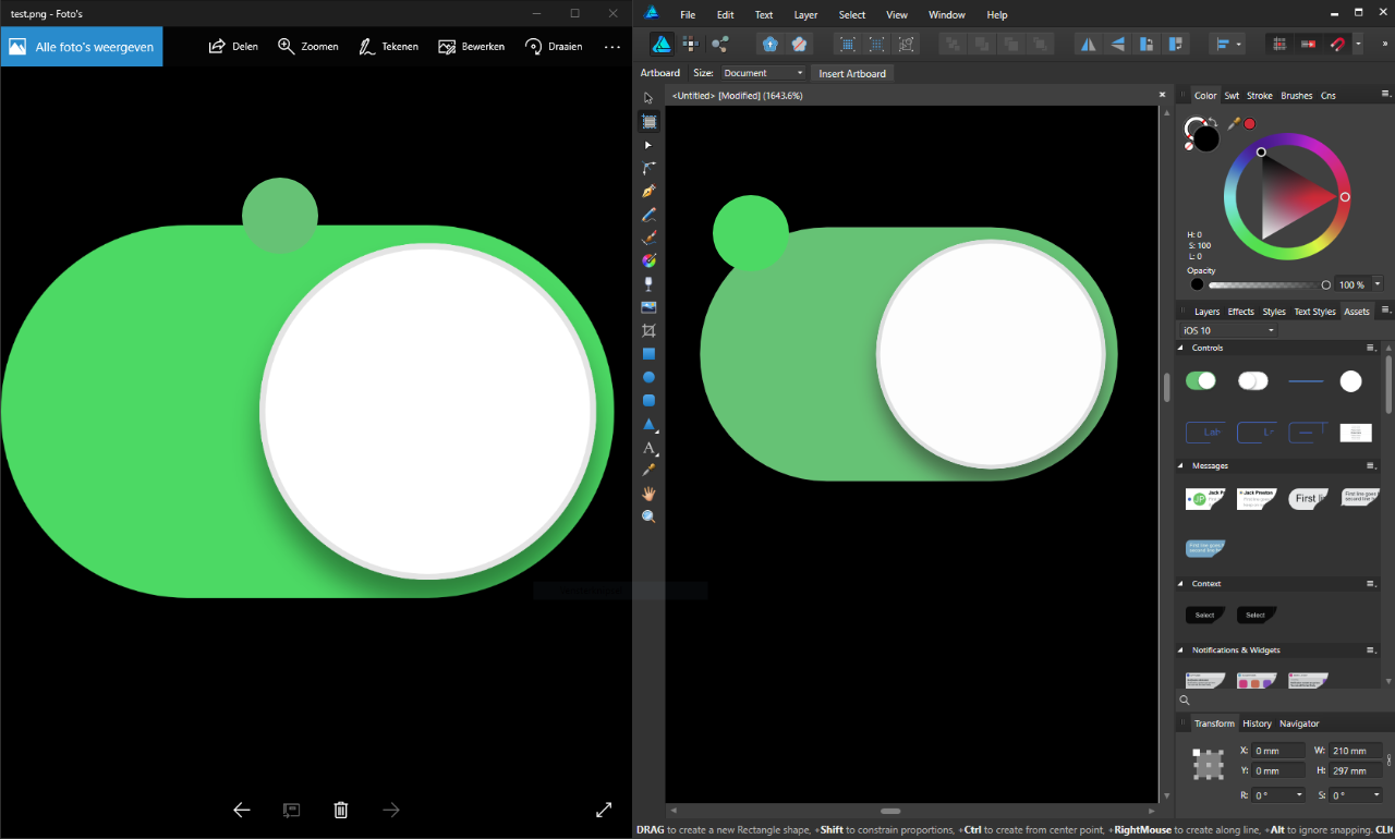
 Hi, I don't know if I'm posting this at the right place, but I have a problem in Affinity Designer on Windows. The colors of the program are not the right colors. When I export a file, the colors are right. I attached a screenshot of an exported image on the left and Affinity Designer on the right. How can I fix this problem? I can't see what colors I use when I'm designing, only when I export it. The problem applies to any document I open/create and also applies to the UI of the program. This makes it very hard to design. Sincerely, Tijmen
-
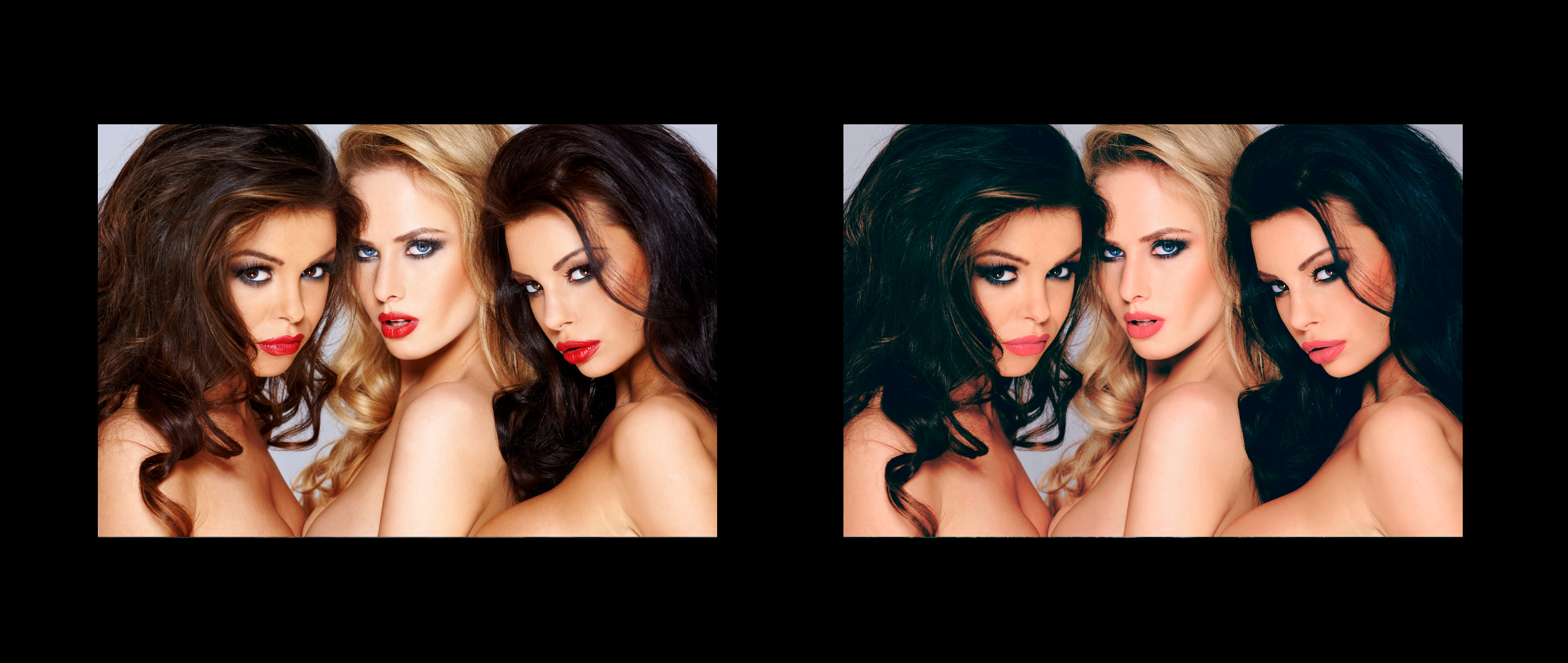
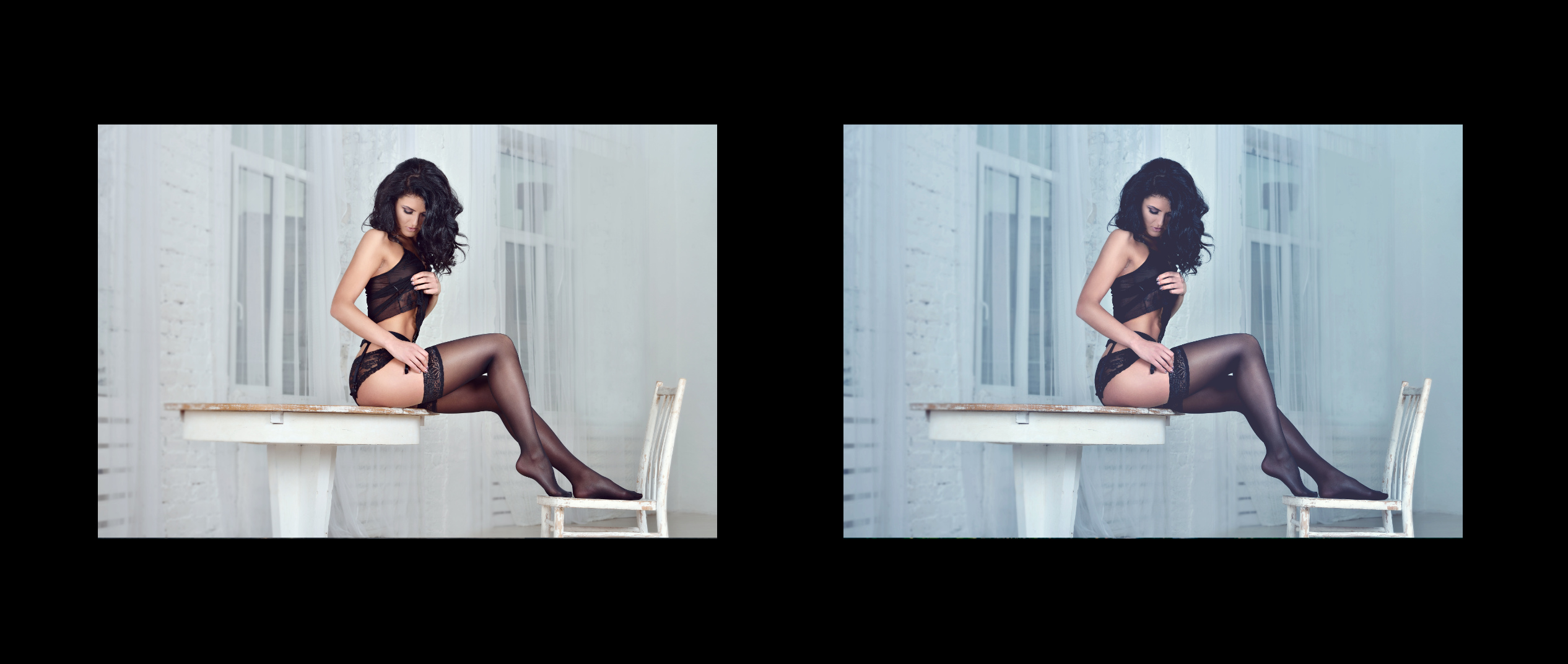
21 macros for Affinity Photos to make your photo awesome :) Made by me Download: Egor_Komarov_color_grading.afmacros Examples: Download: Egor_Komarov_color_grading.afmacros
- 22 replies
-
- 16
-
-