Michael Sheaver
-
Posts
80 -
Joined
-
Last visited
Recent Profile Visitors
1,385 profile views


-
 thomaso reacted to a post in a topic:
Export from Publisher to PowerPoint
thomaso reacted to a post in a topic:
Export from Publisher to PowerPoint
-
 Michael Sheaver reacted to a post in a topic:
Export from Publisher to PowerPoint
Michael Sheaver reacted to a post in a topic:
Export from Publisher to PowerPoint
-
Holy cow! This Adobe tool is EXACTLY what I was hoping against all hope for! I am dumbfounded and speechless, actually. It not only brings everything into PowerPoint correctly, but it also provides the ability to make final tweaks and edits directly in PowerPoint. Many thanks for sharing this! EDIT: True to their colors, this service is only "free" for a very limited time; after that they require a subscription to use the convert to PPT service.
-
I would like to use Publisher for creating slides for importing into PowerPoint, but I have not found a workflow that works for this. I had hoped that exporting to high-quality digital PDF would be the key, but alas, it did not work. Has anyone found a workflow that work? Not only does Publisher make so much easier to make consistent layouts and generate multiple pages using AutoFlow, it also makes it trivial to have page numbers based upon sections.
-
Reid Walley reacted to a post in a topic:
Gradient to follow the shape of a line
-
Ulysses reacted to a post in a topic:
Disappointed. No Multiple text columns in the next future?
-
Move Along People reacted to a post in a topic:
Disappointed. No Multiple text columns in the next future?
-
pruus reacted to a post in a topic:
Disappointed. No Multiple text columns in the next future?
-
One of the things I MOST respect about Serif is their persistence in staying true to their mission, and it becomes most apparent in situations like this. They have, by their actions, tried their best to stay away from the all-things-to-all-people paradigm that is endemic in the Microsoft ecosystem. This razor-sharp focus has enabled them to make arguably the BEST software out there, with a level of excellence in user experience that is woefully absent in most other software, at any price. Let us allow Serif to continue with their commitment to excellence, and accept that we will not get everything we might want. But what we do get is the creme de la creme of software. I just wish other companies would follow their lead on this.
-
deeds reacted to a post in a topic:
¿HowTo: Convert between Art Text and Frame Text?
-
Michael Sheaver reacted to a post in a topic:
Use Curve Object for Mask
-
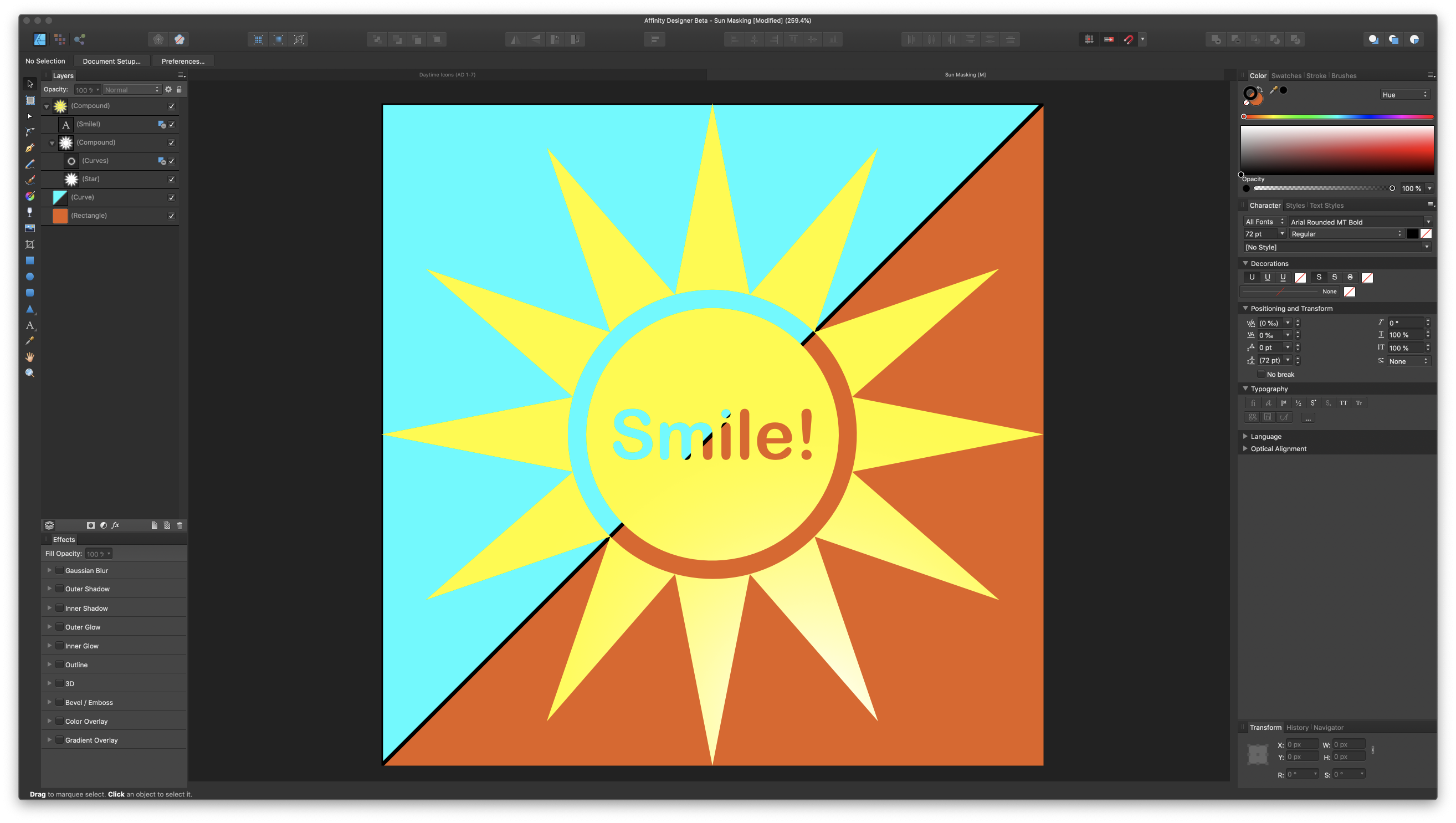
@R C-R and @PixelPest, many thanks for all your help! First, after I posted my question, it did dawn on me that the donut tool would be the perfect way to create the cutout. Duhhh, I sometimes wonder... Second, I thought I tried the subtract operation earlier and I couldn't get it to work. I have no idea what I was doing wrong, but after reading your responses, I tried again and it worked like a charm. Go figure! As you can see below, I went crazy with it to see how far I could go, adding text for cutouts (using a second subtract operation). I added some detail to the background to see if they showed through, and sure enough it did. (This could be my OCD coming through!) Anyways, many thanks for your help!

-
@PixelPest that is indeed one good way to do this, but I want to use the transparent mask for other applications, such as masking text or other shapes out of objects. I am sure it is possible, and would be surprised if it isn't.
-
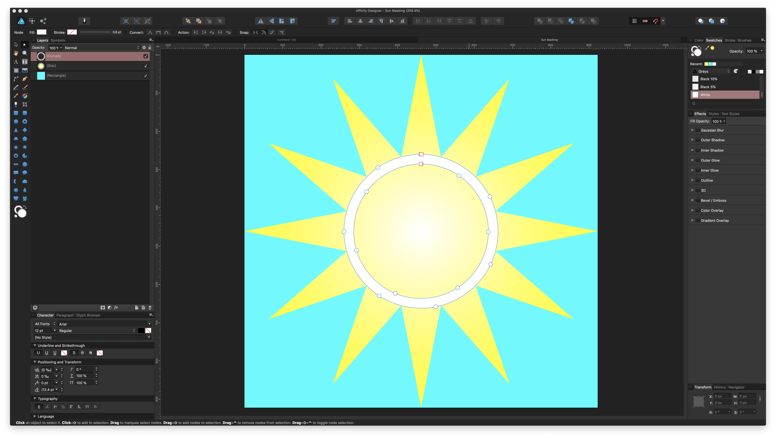
Happy New Year, dear friends! I am ashamed to have to ask this, but here goes. In this screenshot, I have a round object (white ring) that I want to use as a mask for the sun (star) shape: The intent is to make the white part transparent and allow the blue background to show through. I have tried the usual masking operations, and I cannot seem to get it to work as expected. I even tried the Layer -> Rasterize to Mask operation, and that didn't work either. My preference is to keep it non-destructive, if possible. Also, I am not sure that the way that I created the white ring is the best method. Create the circle object Set the fill to none Make the stroke large Layer -> Convert to Curves Layer -> Expand Stroke If there is a better way to create this, I am all ears! The file is attached, if needed. Sun Masking.afdesign
-
I just learned a new trick! Many thanks! I was able to get a good crop, as you see here: Now, I am stuck with what to do with the corners. I know I cannot use the Erase paper white, so how can I remove only the white in the corners and nothing else?
-
Yes, I agree, this is way, WAY better; my initial google search turned up 99..999% rubbish and most were very low res. After scrolling through a couple thousand images, I just took the best of what I could find. Did you use any special search tricks? (probably not, but HAD to ask).
-
Let me preface this up front with the admission that although I consider myself fairly proficient in Designer, over the past couple days I have learned that I absolutely suck in Photo. With that formality and implicit apology out of the way, let my share what I am attempting to do. I am helping my wife put together a presentation for her marketing class where they are comparing several products in a visual format. I need to extract images from their background so I can place them in a graphic. I begin with an image like this: I first try to use the Erase white paper filter, and got the following: I know that I cannot use the crop tool by itself, for there is a white gradient all around the image that must be dealt with: I am pretty sure that a mask needs to be applied at some point, but I do not know how to use masks in this context. After unsuccessfully wrestling with this for a couple of days, I appeal to your help. These are the questions that are on my mind: What is the best workflow for this type editing? Can I replace the white in the edges with a transparent fill so that the color of the new background comes through with a gradient effect? How can I fill in the white (circle below) with the appropriate colors? I tried using the Healing brush and the Clone brush for this, and the results were abysmal at best. Is there a brush or tool where I can nudge or push the colors around, kinda like our childhood finger painting? Can or should I fill in the upper corners (arrows below) to give it more definition? Should I apply the High pass or Clarity filter at the end, to try and remove some of the pixelation from the low-res image? I need to do this whole process for several images, so any help would be MOST appreciated!
-
lepr reacted to a post in a topic:
Gradient to follow the shape of a line
-
firstdefence reacted to a post in a topic:
Gradient to follow the shape of a line
-
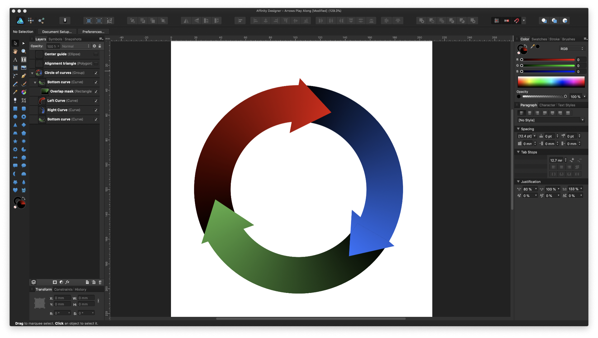
Wow, wow, WOW! This is an unexpected surprise indeed! @firstdefence, that lightbulb pop was definitely a flash of inspiration! The crazy thing is that I had tried the conical gradient in the beginning, but because I never did understand how it works, could not get it to work. So I looked for ways to do a gradient on a path and happened upon this post. Thank you for sharing your example work with the history with me! You might think I'm nuts, but I used it as my personalized tutorial and followed along with my own empty project. And man, I did learn a lot of cool things, including: Using the polygon-turned-triangle to get perfect spacing and proportions for the three curved arrows. Why you chose the polygon instead of the triangle tool for this, for it the alignment of the points with the outer circumference was perfect with the polygon tool. Aligning the center points of the arrow head (triangle) to be perpendicular to the center circle (I had eyeballed it before ). Using the erase blend mode for the overlap; I had never used. that one before. As an aside, I did set horizontal and vertical guides at the center of the circle to give me more precise placement of the focal points before transforming the duplicated arrows. I had a TON of fun with this little exercise. @>|<, as soon as I saw your screenshot with the conical gradient, everything clicked for me, and it now makes perfect sense to me! I honestly don't think I could have understood the work of @firstdefence had you not posted that shot! am so glad you did, and thank you deeply for that! I also like your use of the compound shape versus the union operation, and will definitely use it next time. And yes, I have used symbols quite a bit, and love them! Here is the result of my exercise: I do see that I need to be more careful of where to place the center guide circle, for the arrowheads look a bit off. Now that I have a good grasp of this, it should be no problem for me to redo it again. I just say that I absolutely LOVE the greater flexibility and control that this approach gives me! Again, my deepest heart-felt thanks to both of you!
-
Michael Sheaver reacted to a post in a topic:
Gradient to follow the shape of a line
-
Michael Sheaver reacted to a post in a topic:
Gradient to follow the shape of a line
-
Hi folks, I found Lynn's tips to be absolutely helpful. As you can see by this shot below, I got the result I was looking for - almost: A wrestled with this all afternoon, but no matter what I do, the borders between the pie slices just do not want to blend nicely. When I tried to apply gaussian blur to the individual slices like Lynn did, the results were really horrendous, with yellow bands at the shape borders. The best I could manage was to apply gaussian blur to the group and crank the value all the way up, but it still not presentable. Can someone look at the attached project file Circular Curved Arrows.afdesign and see what I might be doing wrong?
-
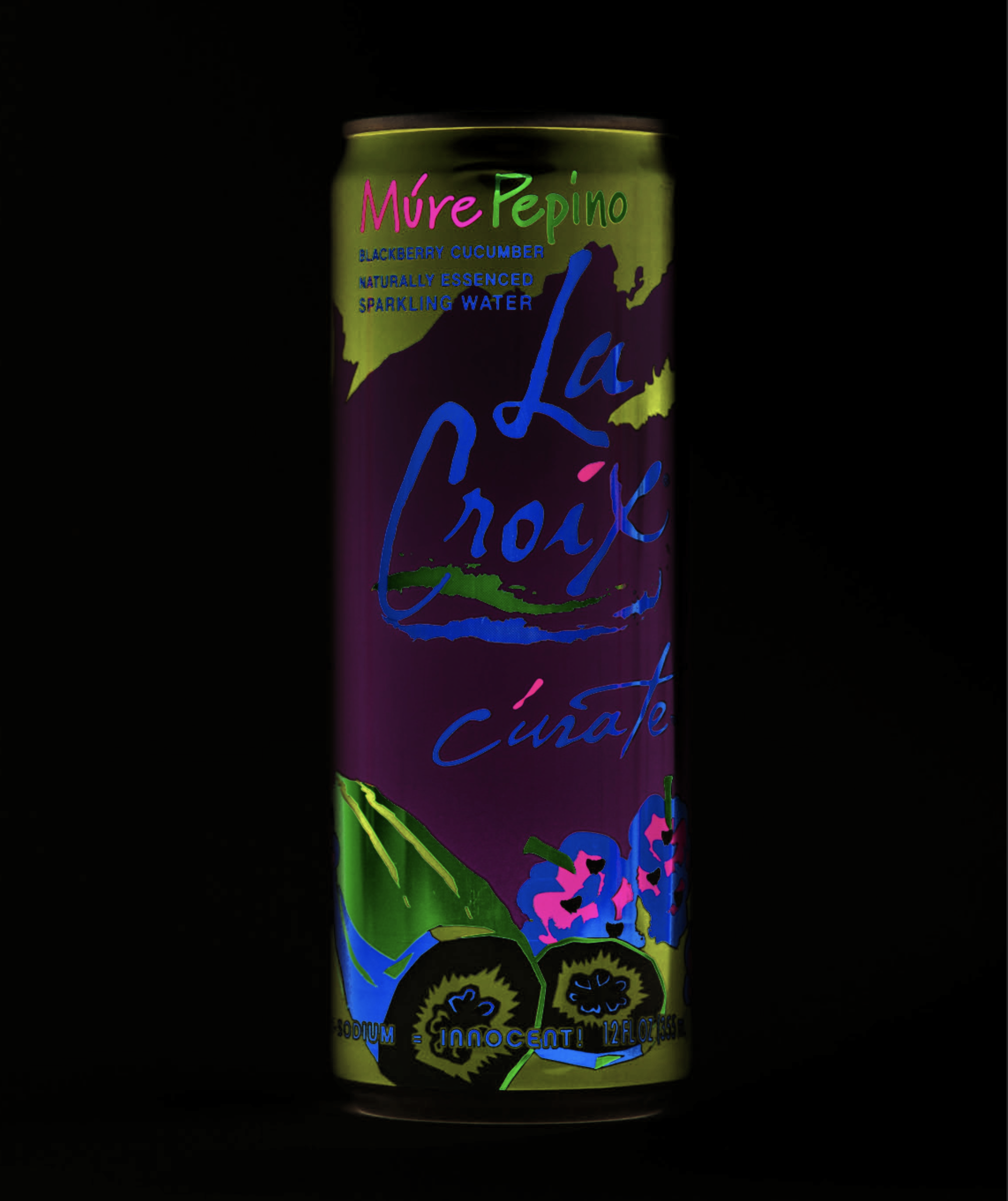
When the Designer for iPad was released back in July, I read the post on Affinity Spotlight showing the works of artists who had used the beta version (https://affinityspotlight.com/article/affinity-designer-for-ipad-a-special-beta/), and I was immediately captivated by the work by Ilya Shapko titled "Mystic Beast": I am trying to produce these same effects in my own works, and not sure I nailed it yet. I did find and download the color palette for this work from Dribbble: (https://dribbble.com/shots/4821906-Mystic-Beast), but it appears that he used some effects that I am as yet unaware of. Does anyone here know what tricks (bright/contrast adjustment, etc.) he used to produce these stunningly eye-popping effects, which layers/elements he applied them to, and how he applied them? I checked his website a while back, and someone else had already asked him to produce a tutorial showing how he did this, but I don't think is he inclined to do so. I did do two projects from the Affinity Designer Workbook (which is itself an exquisite work of art and beauty) titled "The Panther" and "Reflected Skyline", both of which are colorful works with dark backgrounds. However, neither of them really discuss how to make the colors pop like Ilya is able to do. If anyone knows of other places where I can go to learn this, please do share.
-
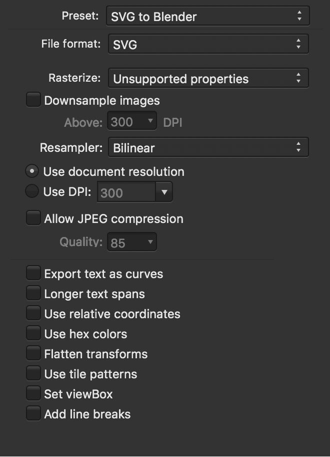
Searching for a doable workflow I am trying to develop a workflow in which I can create assets in AD (macOS or iOS), export them as SVG, and import them into Blender for animation. I have discovered, after quite a few failed attempts over the course of many months, that this is not as straight-forward as one would imagine. Breakthrough Yesterday, I stumbled across an old post that turned out to be a breakthrough for me. Apparently, while exporting the assets out of AD, a specific setting must be unchecked, as shared by @Dave Harris here: After playing around with the different settings, I settled upon the following combo that seems to work relatively well: This did indeed allow me to get them into Blender, colors and all. However, I did discover another problem. A New Challenge Here is an admittedly silly little project that I created in AD a while, just for fun: And this is what I got when I import it into Blender (after rearranging the layers for visibility): As soon as I saw this, my response was, "Ah yes, it did exactly what I told it to do, even if it was not what I had expected. Duhhh..." What I want to do What I would like to do is to get each of the letters of our names into Blender so I can extrude them into 3D objects and animate them - that is simple enough. But I also want the colors of each letter to go along with them - not so simple. Is there a way that this can be done? It seems that I will need to flatten out or convert the layer masks to something else before exporting them to SVG. This is where I am stumped. Finally... Kudos for the iPad app! I purchased the iPad app the very moment I received the email. The dev team really outdid themselves with this, big time! I truly enjoy using the Mac app for working, but I am actually LOVING it!
-
I have a photo that I am trying to do three things to: Crop an advertising poster out Fix the extreme perspective skew Fill in the missing part of one corner I know that AP can do all of these things, but I cannot seem to get past step 1. I did succeed in the first step using the selection brush. I know that the perspective tool is supposed to help in the second step, but I must be doing something wrong. The project file is attached; I hope someone can help. Thanks! Sign up.afphoto
-
Sam Neil reacted to a post in a topic:
Affinity Publisher - Sneak Preview
-
Max Basok reacted to a post in a topic:
Affinity Publisher - Sneak Preview
-
WWDC is just around the corner (next week), and I wonder... Shhh..... If Designer for the iPad might be announced?