Search the Community
Showing results for tags 'affinity photo' or 'photo' in content posted in Share your work.
-
Hello, these are some title pages from web site shopping mall product presentations created in APublisher. Thanks. https://www.behance.net/gallery/170509823/Graphic-Design-Product-pages https://www.behance.net/gallery/170510013/Pen-Case-Graphic-Design-development
- 2 replies
-
- 2
-

-
- affinity publisher
- affinity designer
- (and 1 more)
-
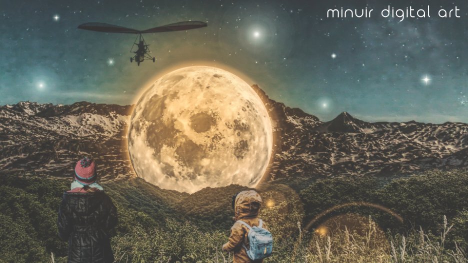
 This photo manipulation artwork is "The Rest Of The Moon". I want to give a break to the moon that works the same routine always~ "The Rest Of The Moon" speed art : https://youtu.be/AcqqmanKBRM?list=PLaYwL68IKsHT621IiqxrLp3tVp2xYHc7W
-
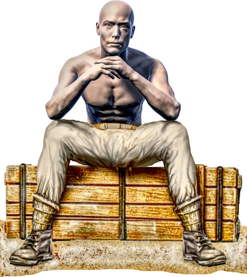
Male worker at rest. The body itself coming from "Magic Poser", IMHO an ideal complement to AP.
-
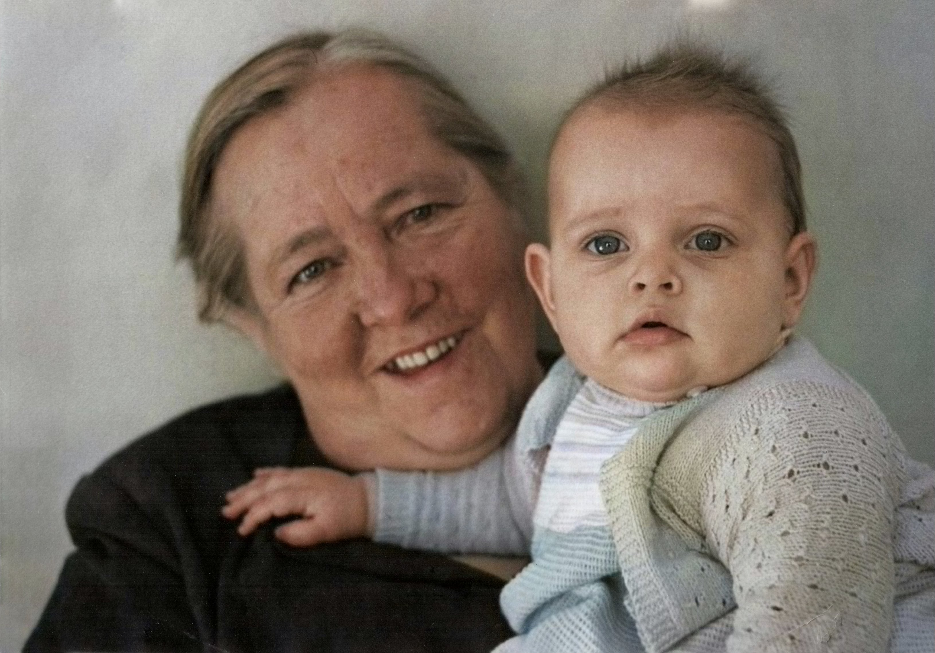
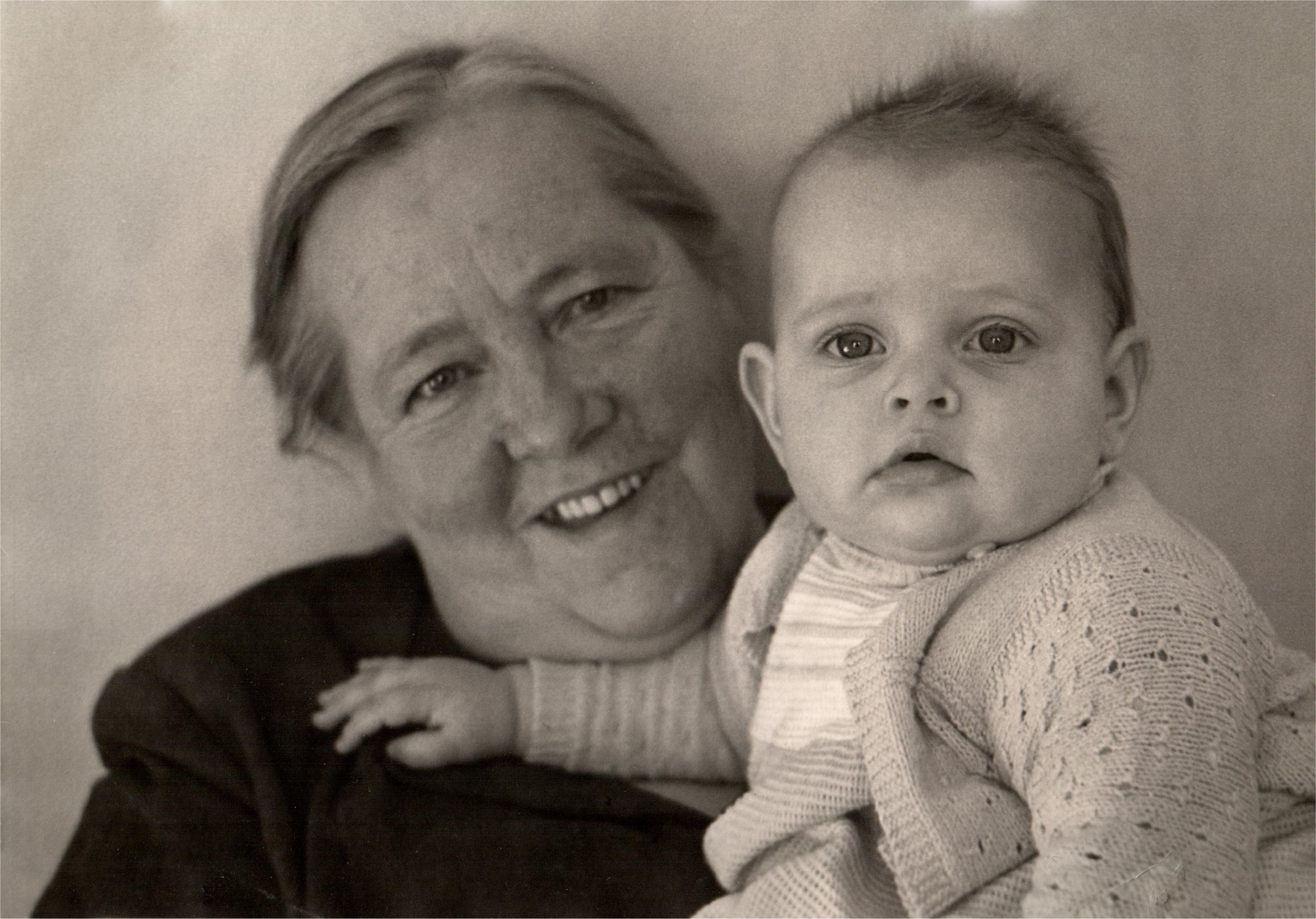
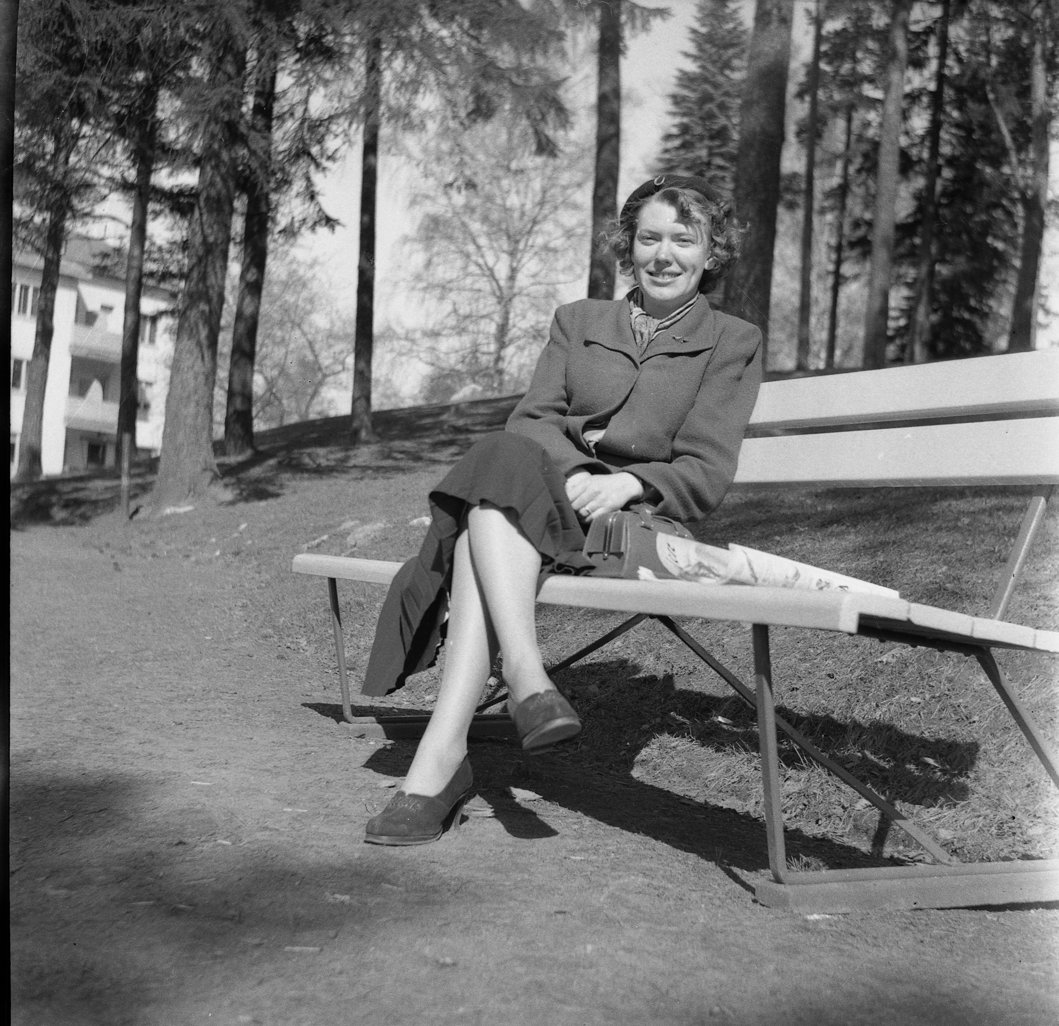
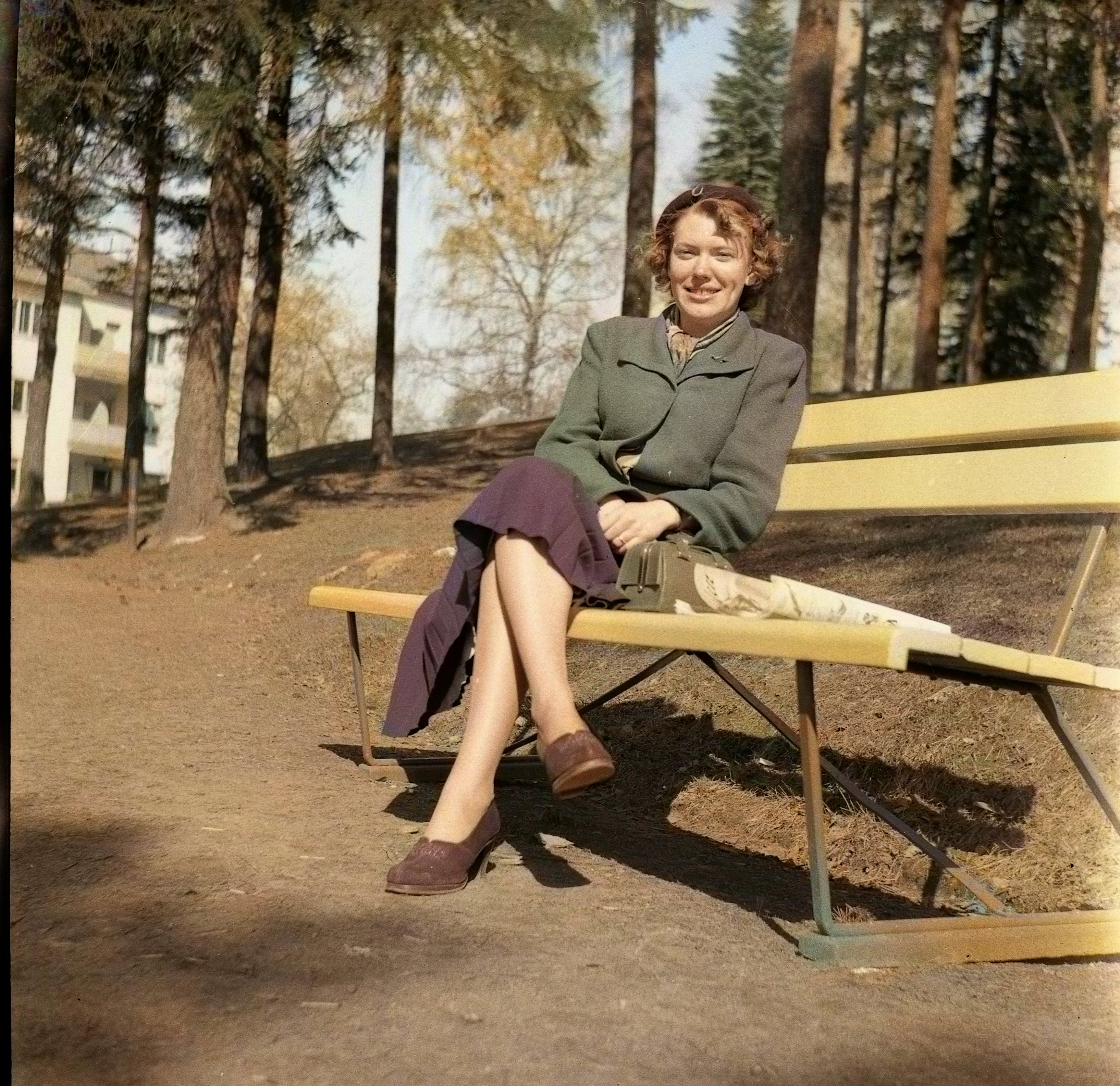
 Hi there! Stumble upon an video that demonstated how to colorize black and white pictures… He used an site called palette.fm, this use AI to colorize, take this new colorized pictures into Affinity Photo and use this in blend mode ’Color’ to get the color information to the hiresolution black and white pictures…
-
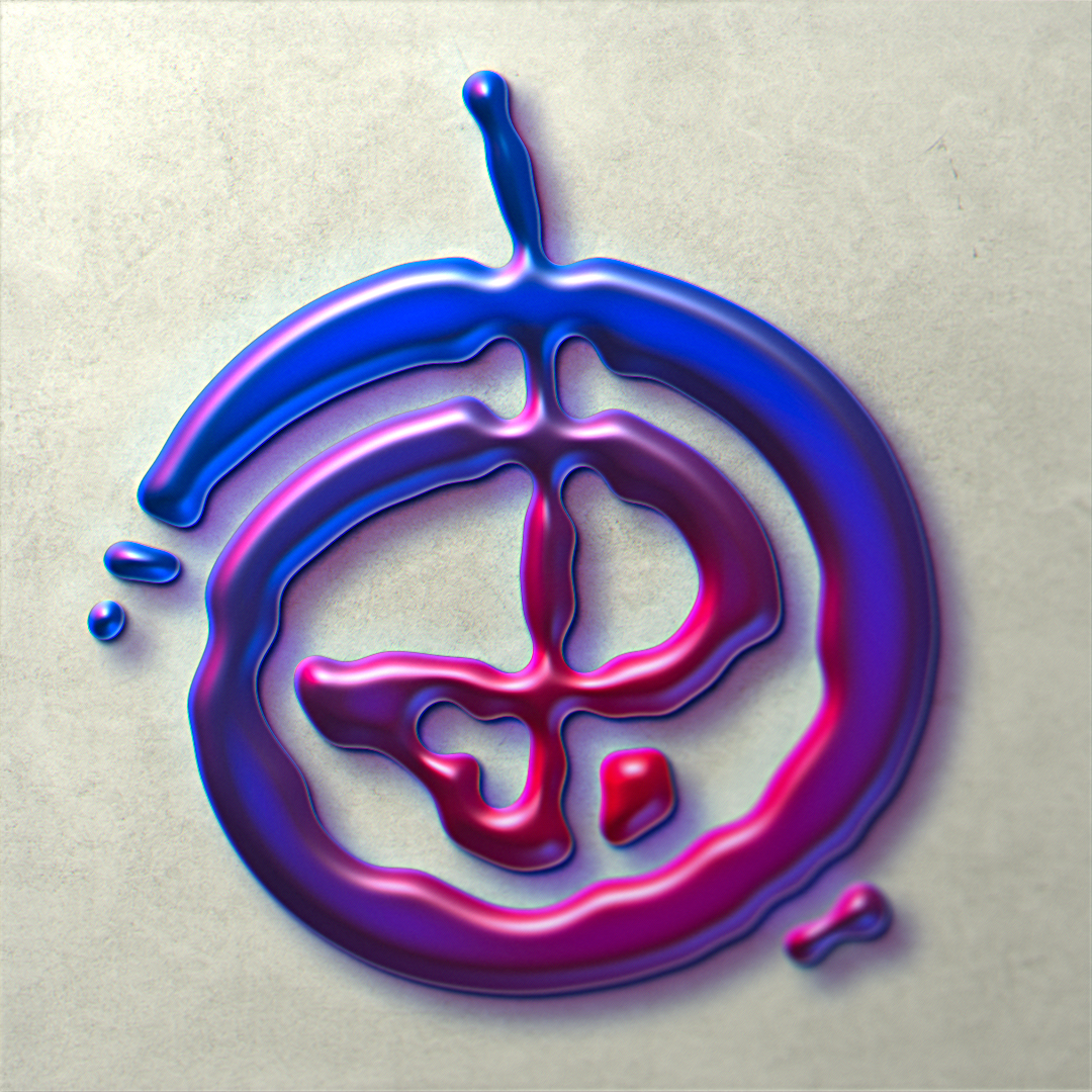
For a few days now I've been playing around with layer effects and some procedural filters – it's super fun and I love the results it can generate! This is the result this morning, based on my own logo and 100% pure Affinity Photo magic, and (except for the very last couple of steps) nondestructive. Maybe I'll release a macro for this sometime, if I can manage to squeeze it into a clean sequence. It'll work with almost any kind of base – images, texts, vector layers. This is what the base result will look like after the macro is applied, everything else is layer effects (and a background texture):
- 4 replies
-
- 7
-
-
- affinity photo
- layer effects
- (and 5 more)
-
Ref: Pexels or Pixabay. Started using dip pen - scanned, re-inked and colored.
-

multi Oh crap...I need an 'album' cover stat, you got 3 days.
Junkbox posted a topic in Share your work
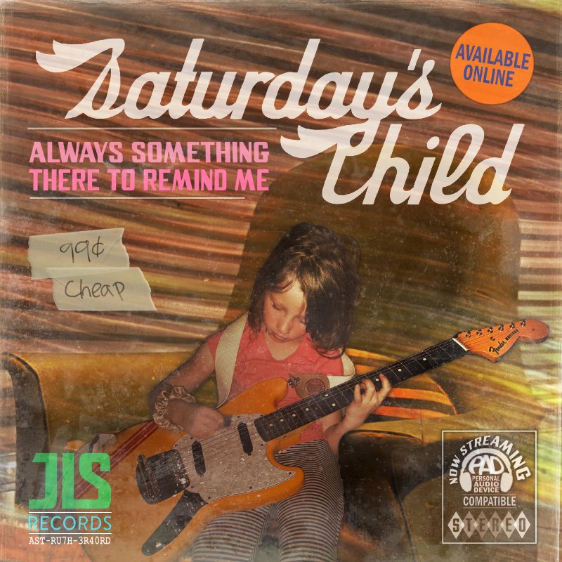
So my good buddy calls me says I need a CD/album cover in like a few days. Apparently, as we artists are the last to learn there's been all sorts of contemplations that the designer is only privy to after significant procrastination. Then come to find out that a late night decision the release is to be under their newly independent label. This has no effect on my process. I've done many graphics for the band, and even played in a side band or two with em. So yes, of course I'm in. The title track is a Burt Bacharach cover, so the idea was to make the 'album' cover appear as a dusted out 70's LP, replete with the 'I've been sitting in Mom's basement' look. Here's the final. This is the first time I've used Affinity Suite exclusively for a project like this. Just wanted to share. The suite works well, glad to do a full project with it. Thanks.
- 5 replies
-
- 12
-
-
- affinity designer
- affinity photo
- (and 2 more)
-
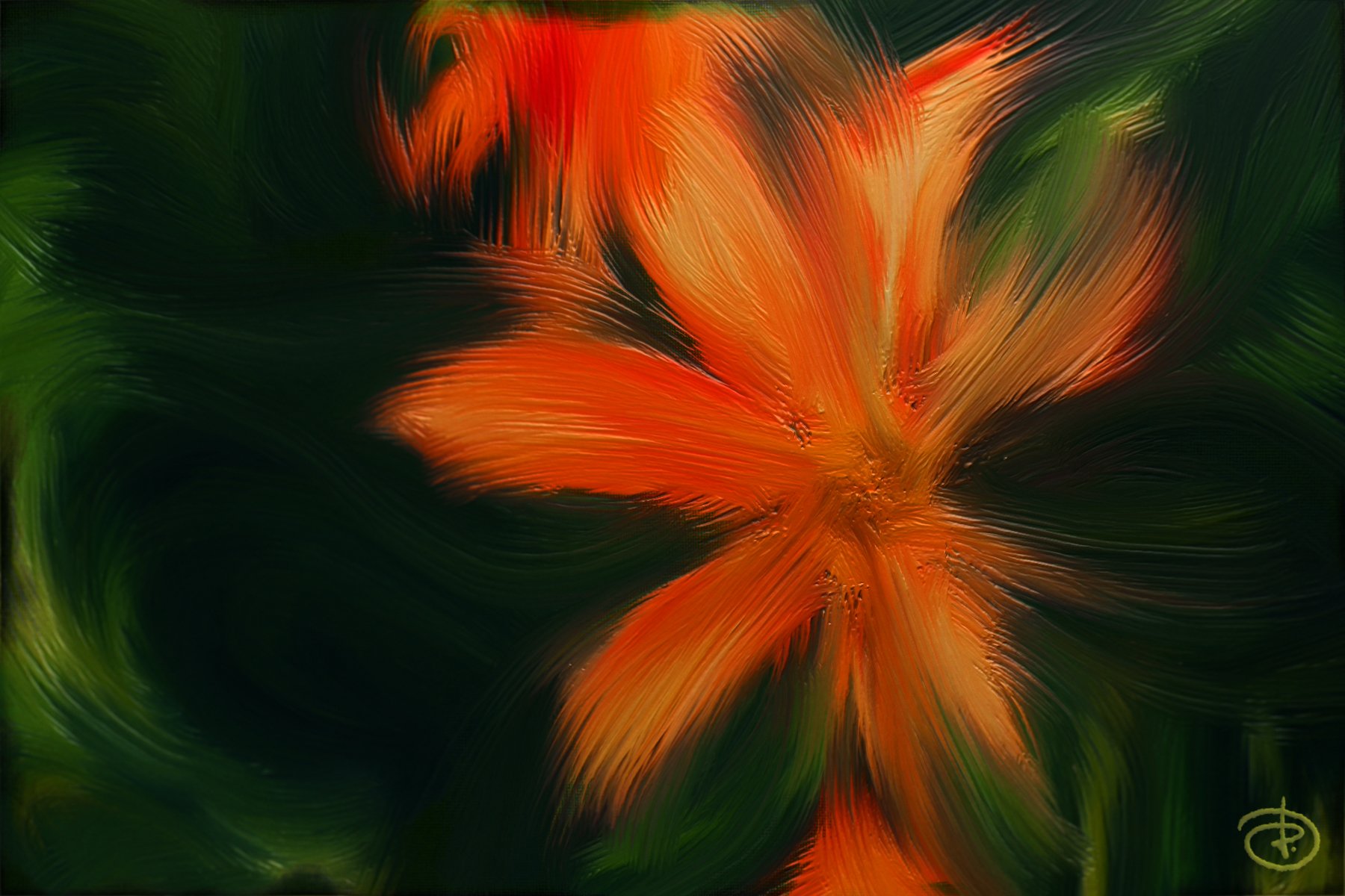
I'm always amazed how much plasticity a simple Lighting filter can add to an otherwise rather flat image. I used the Paint Mixer Brush quite extensively, painting over a stock photo of a lily with a coarse bristle brush and adding some layer effects. This was just for fun and to unwind, nothing serious. 😌 I thought I'd share it anyway, maybe it inspires someone to try something similar. 😊 Cheers!
-
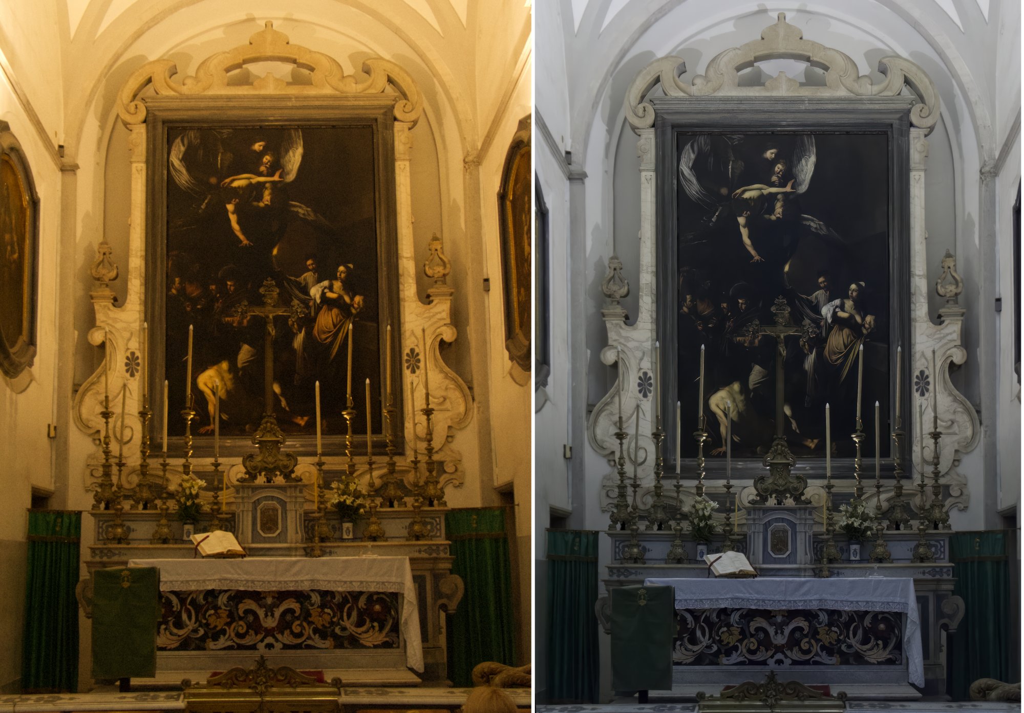
I was delighted with how well AP v2 dealt with this image of Caravaggio's 'The Seven Works of Mercy' shot in the church of Pio Monte della Misericordia, Naples in 2005. The camera was a Canon PowerShot G3 that produced a CRW Raw file of just 3.9MB. I though that some members of the forum would be interested to see. The comparison image is a jpeg and I have included a tiff version of the edited file. Most of the editing was done directly in AP, with noise reduction courtesy of the Topaz photo AI plug in and some geometry correction on DxO PL6.5 (the Raw conversion was not possible in PL6 because the PowerShot G3 is not supported by the software. CRW_2052_DxO.tiff
-
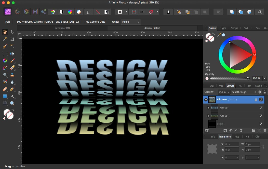
Trying out building some flip book text effect in APh v1, though it would be overall better to have some reusable macro/script for creating such text effect tasks. Also undoubtly it would be overall better to do the whole with plain vectors instead of pixels here. - BTW it's also one of those things where one is then sadly missing some blend tool for creating intermediate steps. For text not all letters/characters and fonts work & look well here, so using capitalized words in some heavy font is mostly recommended, as far as chars like an "J" or "L" aren't used, as those (as can be seen below) would produce unsightly effect gaps ...
- 3 replies
-
- 5
-
-
- flip text
- pixel data
- (and 1 more)
-
The face of a girl where a fairly large part of her skin is gone and you see the skull. Not realistic, there's no muscle tissue or blood or brain or anything but a skull might not be everybody's cup of tea. https://postimg.cc/BLRn1gcG
-
Lates flier for our local club.
-
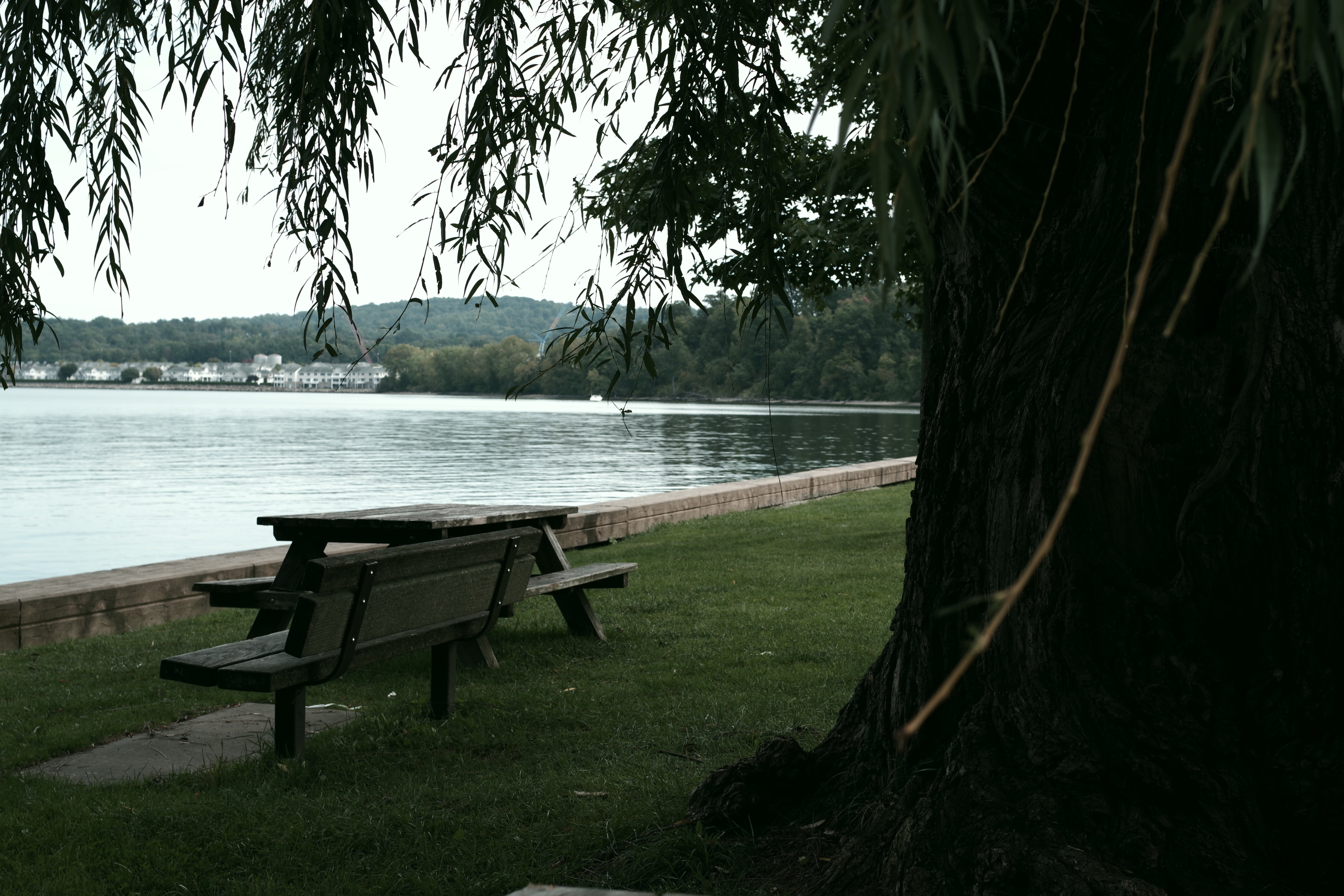
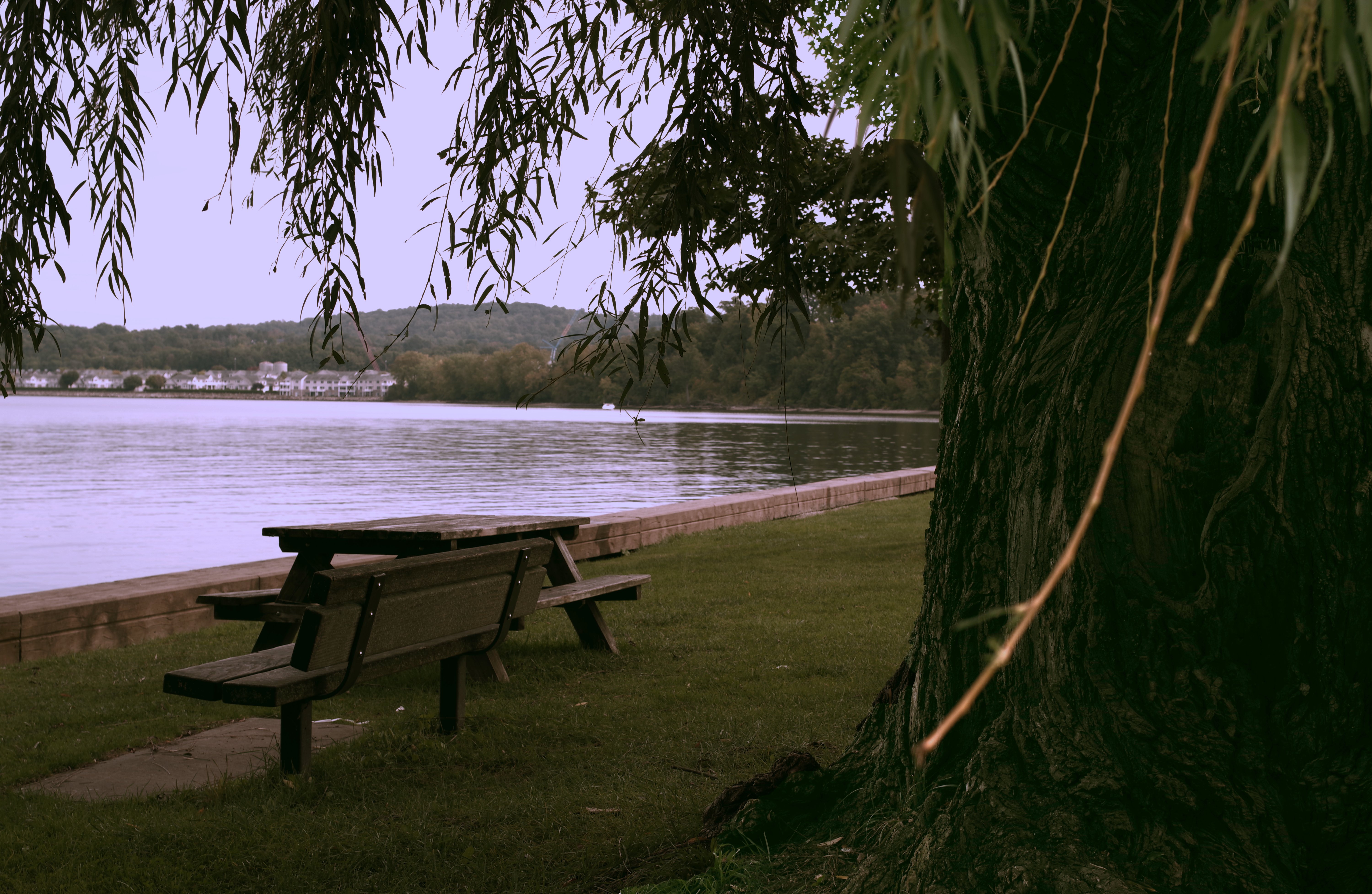
The picture has too bright and too dark image and made an exposure adjustment to the foreground.
-
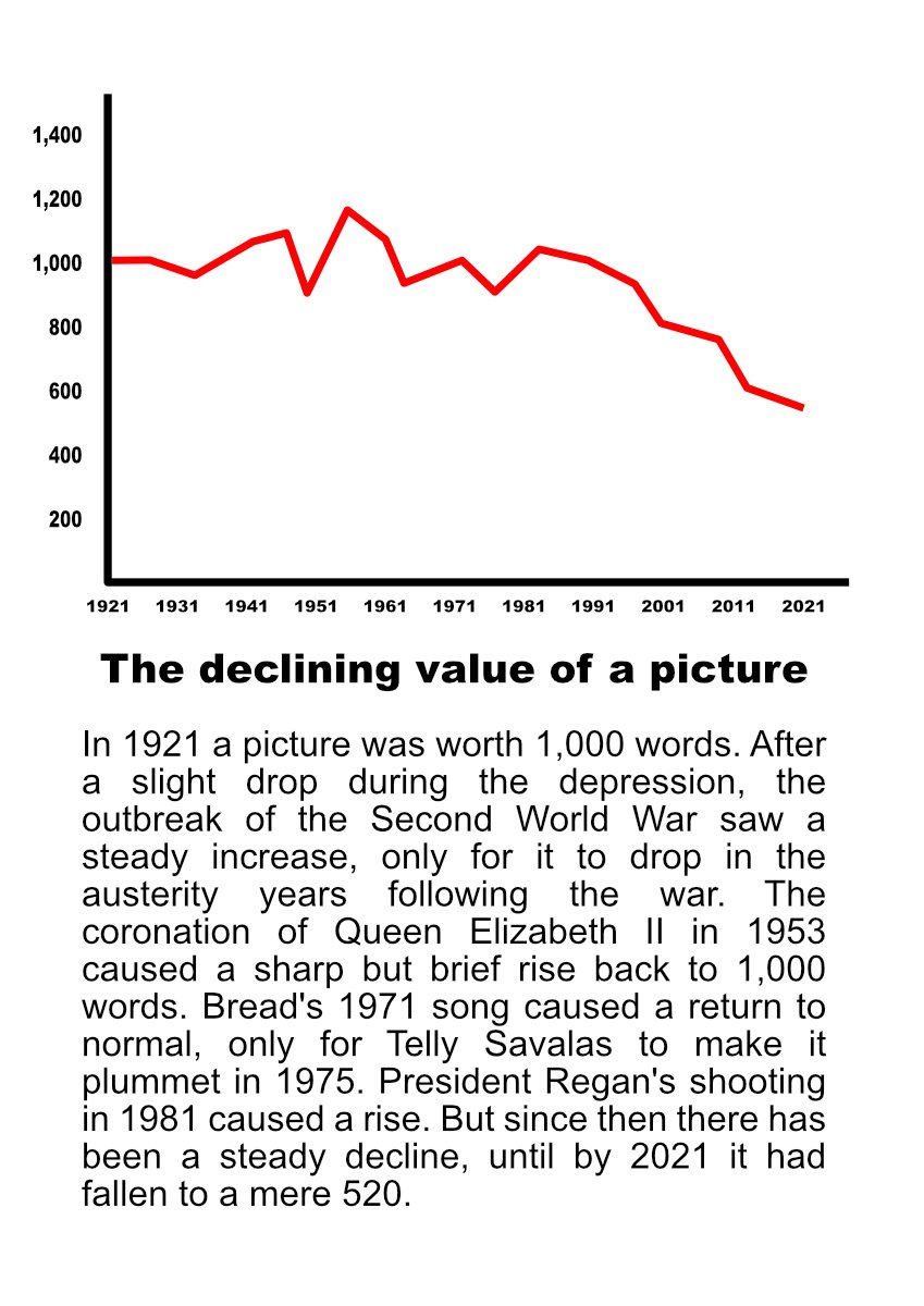
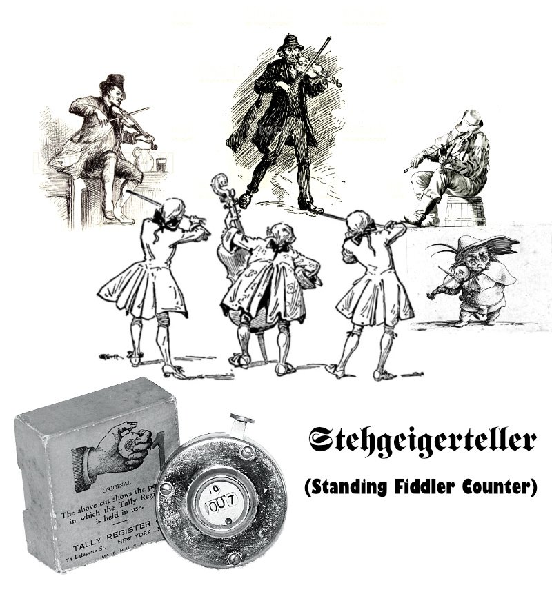
What is this life if, full of care, we have no time to stand and stare? Or make silly composite pictures from pure whimsy? I realise in the last couple of weeks I've been doing just that, and so why not share 'em with you folks! I read that Roald Dahl's children's books are being made more 'suitable' for today's children; mention of reading Rudyard Kipling has been changed to Jane Austen. Cue old joke made new: A long time ago on BBC TV, the late Michael Bentine had a sketch with a mad scientist who'd invented the next step up from painting by numbers: spray-on classic paintings. To demonstrate, Hals' Laughing Cavalier and da Vinci's Mona Lisa . . . -- or you can spray them both at the same time to get The Laughing Lisa! Serendipity! In the course of looking for something completely different (pace Mothy Python) I learned that Geiger is German for violinist; Stehgeiger is German for cafe violinist ('standing fiddler); and Geigerteller is German for Geiger counter. So there must e a German word for . . . And finally Esther (British in-joke):
-
-
Unsharp mask applied, black and white adjustment and lens blurr to gradient. Dropping the opacity by61 % to the selected background.
-
 Here's my first attempt at the focus and exposure bracket merge. Took four sets of three +/- 2.0Ev bracketed photos on four different focus points on the pistol in RAW. I then merged the exposure stacks into four separate photos, exported those HDR images as TIFFs, and then focus merged those four photos into a single photo as a JPEG. I think it said this single JPEG is over 40MB before I cropped it to this size. Taken with my A7R IVa and Sigma 24-70 f/2.8 (photos taken at f/8) on a tripod. Appears to be some artifacting/haloing on the rear-edges of the image such as the beaver tail and hammer/slide/rear sight. Otherwise, I'm pretty impressed with the quality. The tutorial I watched did say that Affinity 2 automatically selects the clone tool and allows you to view the component images and pick which parts look the best and can then use the clone to cover up artifacts, but I was having a very difficult time getting the rear-top edges to blend well. It was either accept it the way it is, or choose to have the pistol look great with the cutting board looking off, or the cutting board look right, but the pistol part is off. Does that mean I simply need more images of those possible problem areas to generate more data for a more seamless blend of images?
-
Stitch together 3 pics and sometimes the tones dont match together.
-
After developing my raw image, I put a layer mask of black and white.
- 1 reply
-
- 1
-
-
-
Created in Designer, applied the noise filter in Photo.
- 13 replies
-
- 19
-
-
Took 3 image and stich them together.