Search the Community
Showing results for tags 'affinity designer'.
-
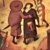
This were based on a chat between, an American, a Canadian and one of 'em blokes; from t'place stuffed with rhubarb, whippets, and flat caps.... Purely tongue in cheek lad! :P peter EDITED with grammar yorktube.afdesign

-
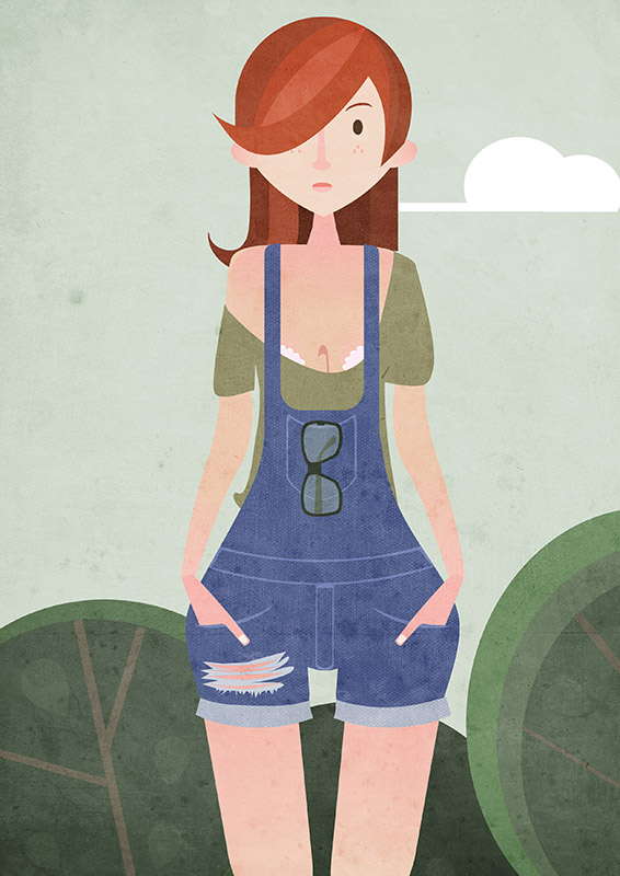
I did not know that you could share with the community work done. I want to share with you my first job with Affinity Designer. Criticism and advice are welcome (if also explains how to get with Affinity Designer better. So the program learn more) I also share my account of Behance, but now is empty until I put up. Thanks to all (: Behance: www.behance.net/elzekah
- 4 replies
-
- 4
-

-
- elzekah
- illustration
- (and 3 more)
-
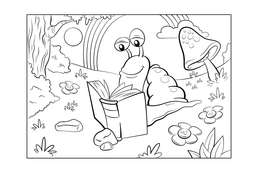
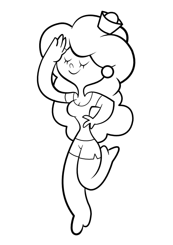
 Hi everybody, I've created this book reading slug. The drawing is to be used as a colouring page for free download at a website for kids. I really like the abillity to draw using the pen tool and then add the pressure feeling afterwards :)
-
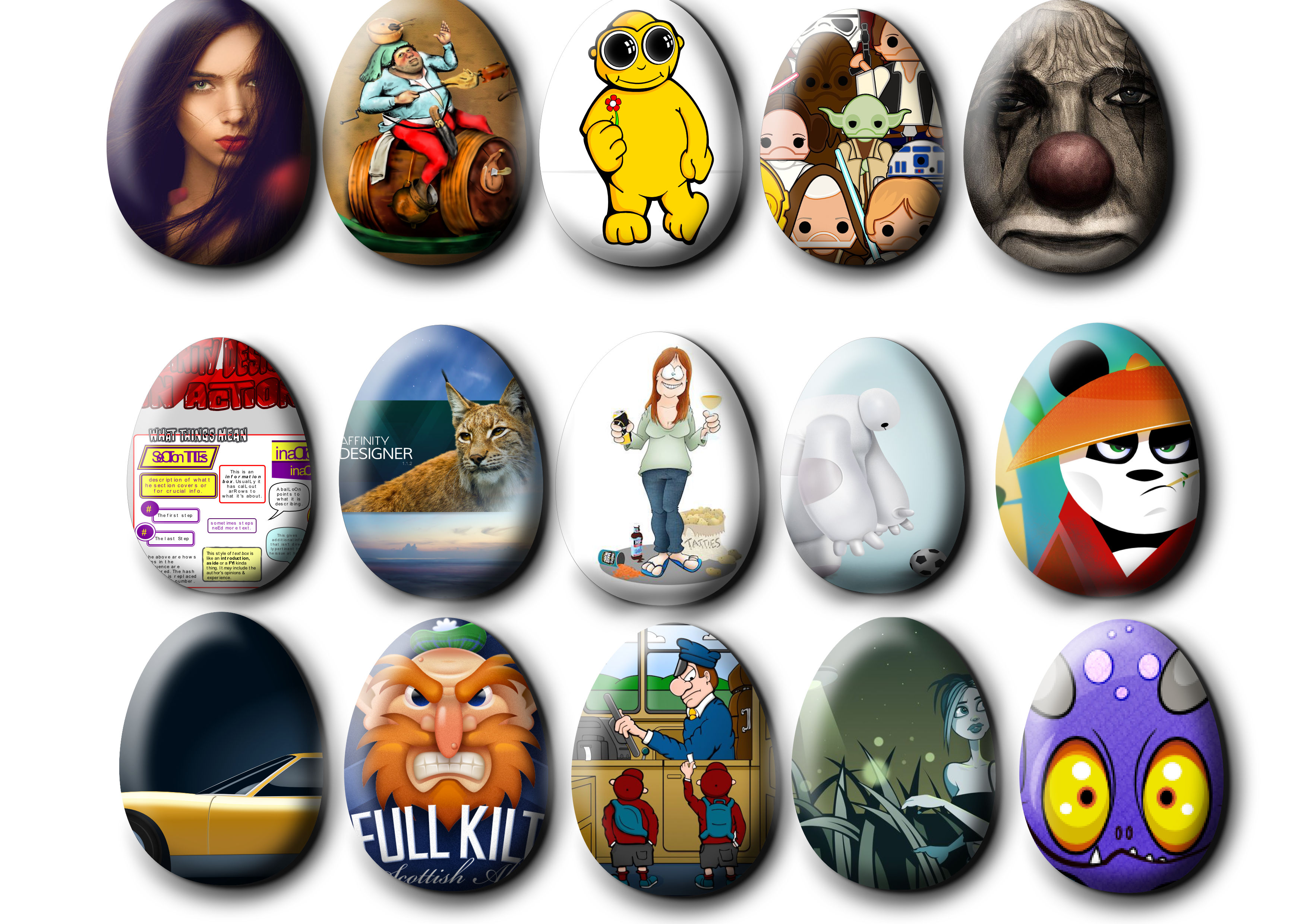
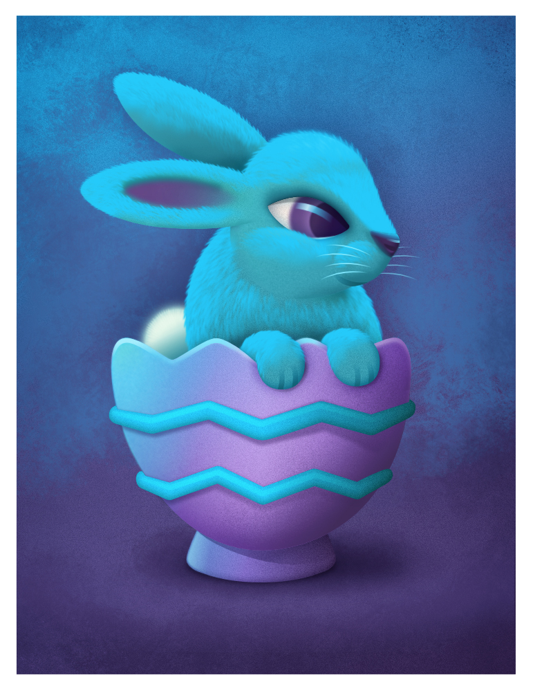
Thanks to a request called How to make egg shapes by ameleen07 and a nifty solution by MattP... https://forum.affinity.serif.com/index.php?/topic/5519-how-to-make-egg-shapes/ I got I little carried away. Hope you enjoy them, these are some of my favourites. They really look good in a slightly different context. Peter.
-
I so busy and so out of touch that I could not figure out what with all the eggs and bunny talk. Duh easter is next month. I so cluless! time to start pumping out some eggs and bunny drawing I guess!
-
Meet Blue Bunny, he's a happy little fellow... :) Continuing the Bunny series from some client concept sketches that never got beyond the proof phase. Thought I'd try something different on this one and play with some pixel painting texturing and also attempt at adding fur to this little guy. The fur is made up of repeating individual groups of "fur shapes" copying, rotating, skewing, repeat... each with transparent gradients and blur to add softness and hide some of the edges and yes it was a lot of work... ;) Really loving the ease of vector and pixel workflow!
- 36 replies
-
- 11
-
-
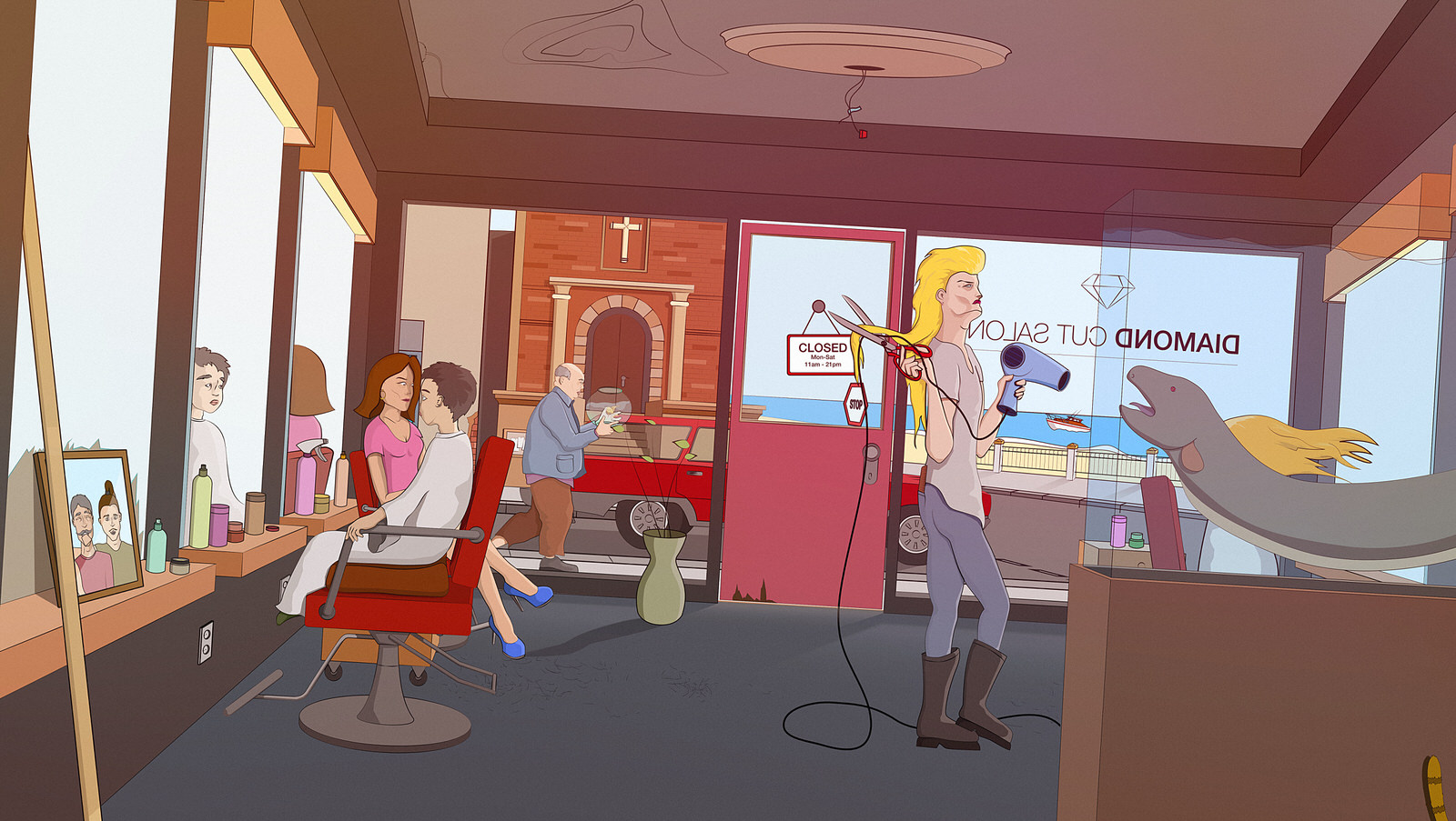
A small scene that I'm working on, whenever I have some spare time. There is a deeper story to this scene...maybe someday this will turn into a one issue comic. haha. Anyways, I made this one in Affinity Design and added a little bit over color cast in Pixelmator (I could have done this of course also in AD, but I just got a free copy of Pixelmator and decided to try it out.) Cheers, Mike
-
I got the pen tool working. Now to figure out how to add color!
-
 I just started trying out Affinity Designer and I was trying to "ink" some pencil art I scanned in. I'm using the "brush" tool with the variance set at 100% trying to get good varied line widths. I trace the line and the preview, as I'm drawing the line, looks correct but when I lift my stylus, it's nothing like the preview. It's either all thick or it snaps back to being a thin wispy line. Even changing my sensitivity in the Wacom preferences doesn't seem to help much. Am I missing something? I'm using a Cintiq Companion Hybrid and also trying it with a Wacom Intuos Pro. Same thing happens on both. Macbook Pro 15" (late 2011) with 16GB RAM running Yosemite (completely updated)
 -

affinity designer Affinity illustrations and experiments
Deadbyxmas posted a topic in Share your work
Hi all, my name is Robert (aka Deadbyxmas!), I'm an illustrator, animator etc and by accident I bumped into Affinity Designer a couple of weeks ago (I was probably googling around for alternatives to Ai....don't we all), tried the demo (in between paid jobs...hmm) and then, once I had a better idea of its workflow, bought it and got cracking with a few sketches and ideas. As usual I tend to explore new software by trial and accident, without tutorials and stuff, so probably I'm still overlooking a lot of its features - I noticed that every time I use it I find a better way around things etc. - but I thought I'd share with you some of my first experiments. Actually I'm not sure what I can share or not here - there is a pic that is proving quite popular on another social site, but is slightly (veeeeeery slightly, I wouldn't even consider it so) risquè, so you tell me - I can direct you to the external link. In the meantime here's my first (nearly) full illustratration done entirely in AD, included the texture masking. best! r.
-
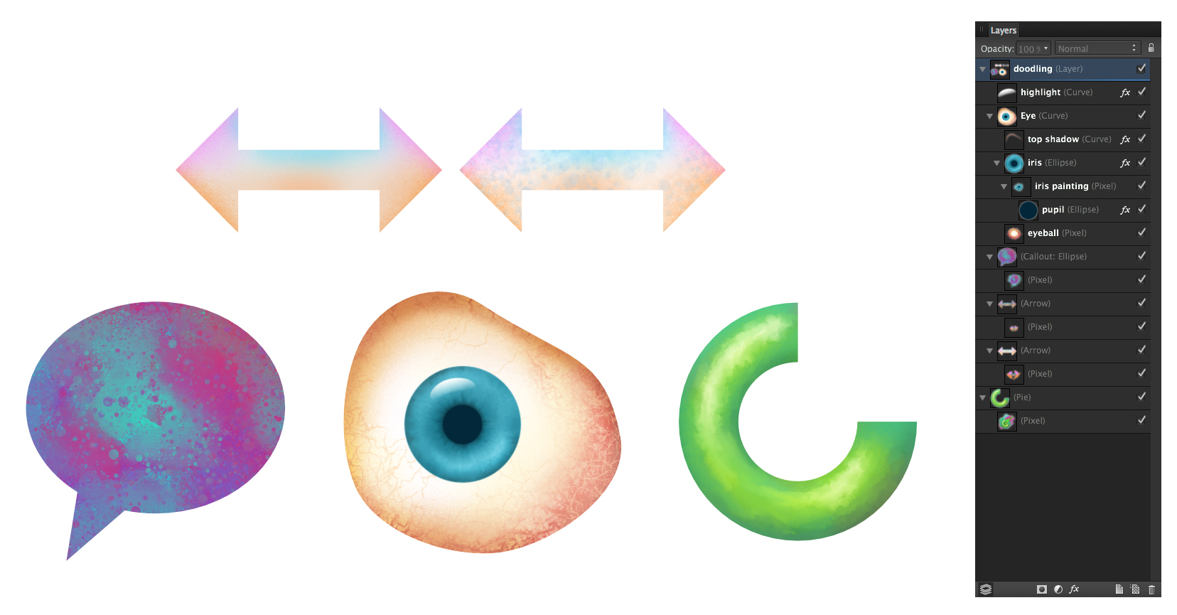
Hi all, just some doodling here trying out painting inside of shapes in Designer. Started playing with Paolo's blender brushes he so graciously created. When using them in conjunction with the smudge tool you get some really nice mixing abilities. In the call out shape for instance I painted a mixture of the 2 main colours then applied some "blending" using one of Paolo's spatter blend brushes. It just spatters using the underlying colour and doesn't put any new colour down. Changing the size of the brush changes the size of the texture it paints. For the eyeball, (I didn't start out to do an eye it just ended up that way) I used a mix of painting and blending especially in the white of the eye with the blood vessels and texturing... then in the iris I painted inside the circle shape laying in the colour in the general areas and using Paolo's blenders to really gave it a nice complex feel. I usually add a .01 gaussian blur to take the hard edge off the shapes. it tends to soften the paint work a bit but it's a reasonable trade off. On the donut-pie shape I was just playing with a nice painterly play of light and shadow. The blenders are great for adding that "painterly" feel with tons of control. Again by reducing the blender brush size the blend effect gets smaller and more precise. This is all in Designer, which for me is probably where I will spend most of my time. The fact that I can get these type of results in a "vector" app is incredible. The hardest part of all of this is knowing when to stop! :D
-
Hi! I have had great fun with Affinity Designer's shapes and making this series. So relaxing! I have learned a lot while doing this, as I'm sure you'll be able to tell as I post more-- such as, how to use gradients, boolean operations, converting to curves, centering objects, grouping, bitmap fills, etc. Essentially I've learned how to use AD while making these. I will say that after a bit I realized that if I was going to call the series "Compass Roses" they should have at least multiples of four points, so some of the early ones broke that rule. That said, here are the first five and I will post the others in a bit. There are other wonky things too, but I call that a process of learning and I'm very happy with the last windroses especially. I'm still working on my "villains" series, but they take a LOT longer to do than these compass roses...
-
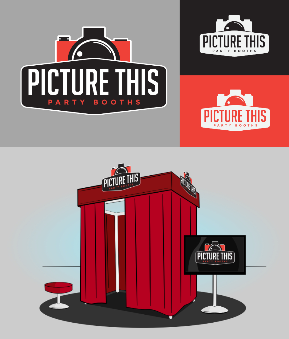
I have just completed my fist piece of 'paid' branding in Affinity, its for a local Party Booth company launching very soon.
-
Well hello there, I'm lucky enough to have been blessed with a lovely baby boy the last few weeks so haven't had much time to spend on this image. I really wanted to show everybody the characters though, so I've bunched em up and here they are! I've started a blog incase anybody's interested, http://craigearnshaw.net Why not follow me! Its pretty bare at the moment but hopefully I'll fill it up over time! Anyway thanks for having a look. Craig.
- 21 replies
-
- 10
-
-
Hi, here are some designs for my personal project: an iOS app for anglers: https://www.behance.net/gallery/23018151/iFishBook-App-Design (Still fighting with some AD bugs & UX inconsistencies, though :()
-
 Take a person out of a picture and putting it in another picture is probably one of the hardest things to do in an image editing application. The fact that I can do this inside a vector application excites me! You use to have to go back and forth from Photoshop to illustrator to do this while combining your vector and pixel workflows is just amazing. I am really digging this hybrid approach to design and image creation! There just not enough hours in the day! Thank You Affinity for putting the fun back into the game! I can't waitto see what the future of this application has in store for us!
 -
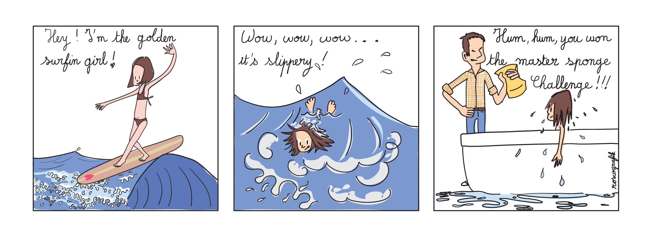
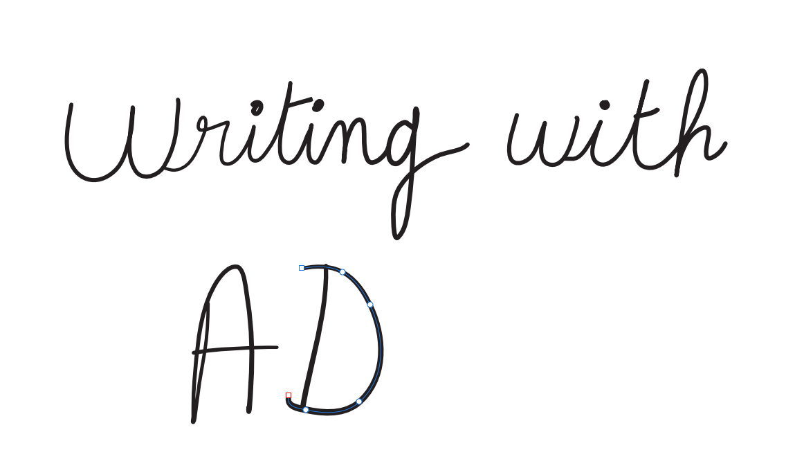
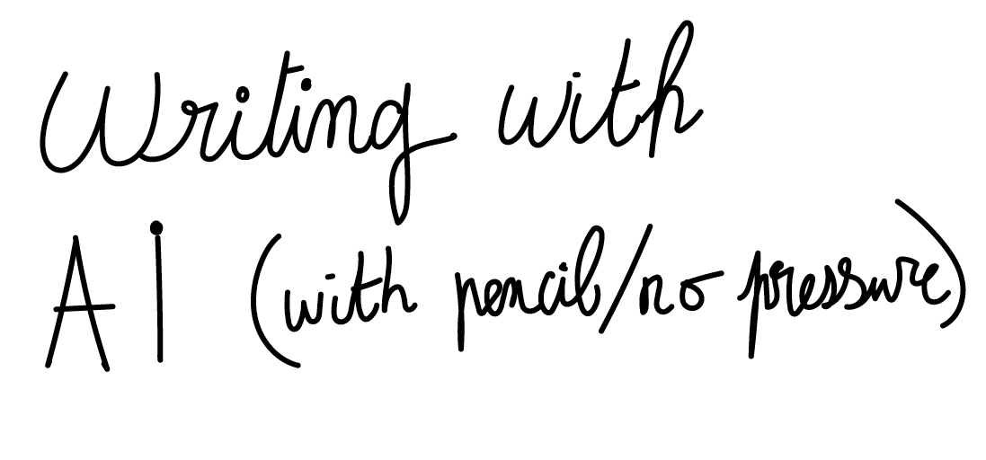
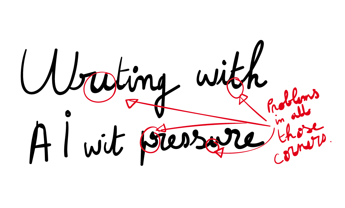
 Hi here a short strip done with AD. First of all it's very pleasant to work with it, the interface is clear and easy to understand. I work with wacom material (here a cintiq) and the pressure with the brush or with the pencil is fine. I can really use it, there is a light smoothing after drawing but the stroke is like I want. This is good and works better than in Illustrator where I only get pressure with brushes and where I get strange effects particularly on corners. In Illustrator I'm used to work with theyr pencil allowing to keep the last stroke selected and to redraw it again. With AD it's not possible so I draw a sketch on a layer and then my inking on another layer with undo/redo to get a good stroke, sometimes using the pen to adjust. I noticed that the brush has more options than the pencil and used here the pencil which is more simple. An advantage using the pencil is that after drawing the stroke stay selected (you can see the bezier curve) and you can change color and stroke. With the brush you can't change the color or stroke, you first have to get the move tool or you can press "cmd" and "alt" and then change color or stroke. In fact this the first time I can draw with a vector software and get an inking like in a bitmap software. Where handwriting was difficult in Illustrator it's here much more easyer with AD ! I attached three captures, one with AD and two with AI : This is interesting because AD will often be compared with AI requesting what AI has, but here AD do something very well that AI doesn't have ! After that my colors are simple, nothing special, using the pen was perfect, its precise and offer all the possibilities we can wait for a vector pen. One thing I found fastidious is the use of the eyedropper tool ( go right to get it, and left to use, and right to click…). Exporting the file offer many options, this is good, my file was 7,8 Mo as a pdf, it's heavy for such a file with no gradient or particular effect… SVG, PNG, PSD and JPG where ok. After this very good first impression I will seriously wait for Affinity Publisher…
-
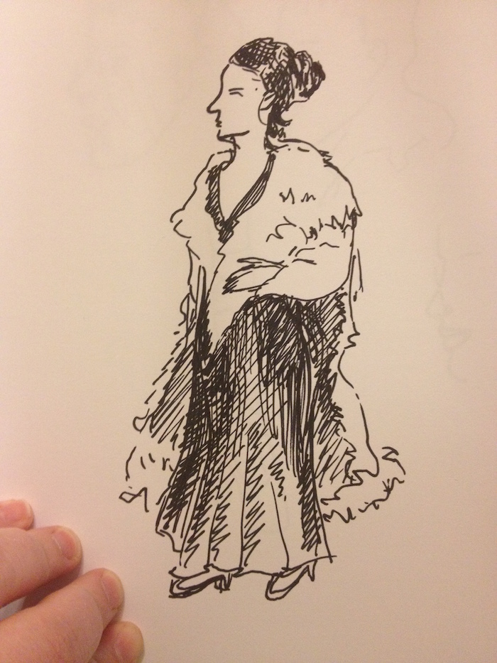
 Okay! So I have finished drawing my first lady villain; Cruella de Vil was a LOT of fun to draw. I loved the Disney movie as a kid and I am ashamed to say that I have not read the book, although I just picked it up to read on an online library. That'll happen maybe later on today. :-) "A large car was coming towards them. .... A woman came out onto the front-door steps. She was wearing a tight fitting emerald satin dress, several ropes of rubies, and an absolutely simple white mink cloak, which reached to the high heels of her ruby-red shoes. She had dark skin, black eyes with a tinge of red in them, and a very pointed nose. Her hair was parted severely down the middle and one half of it was black and the other white-- rather unusual." 101 Dalmations, Dodie Smith I've taken a couple of liberties because I felt they worked better with the design; namely, the coat and the hair. I'm still rather pleased with how this turned out, though. Also, this is a call for female villains from literature. I'd like some more ideas; I have a few-- Shine, from Archer's Goon by Diana Wynne Jones (plus a few others; DWJ had a THING about evil older ladies due to mother issues of her own, apparently), the Medusa, Belatrix Black or Dolores Umbridge from Harry Potter, and the infamous principal Agatha Trunchbull of Matilda's school by Roald Dahl, and the Winter Queen from the Dresden series too, perhaps. Anyway, critiques welcome! More villains to come later.
- 13 replies
-
- 2
-
-
- illustration
- villain
- (and 2 more)
-
Here's a flyer I built in AD for my ex girlfriend, who's a chef. It was so much fun not being stuck inside AI :D
-
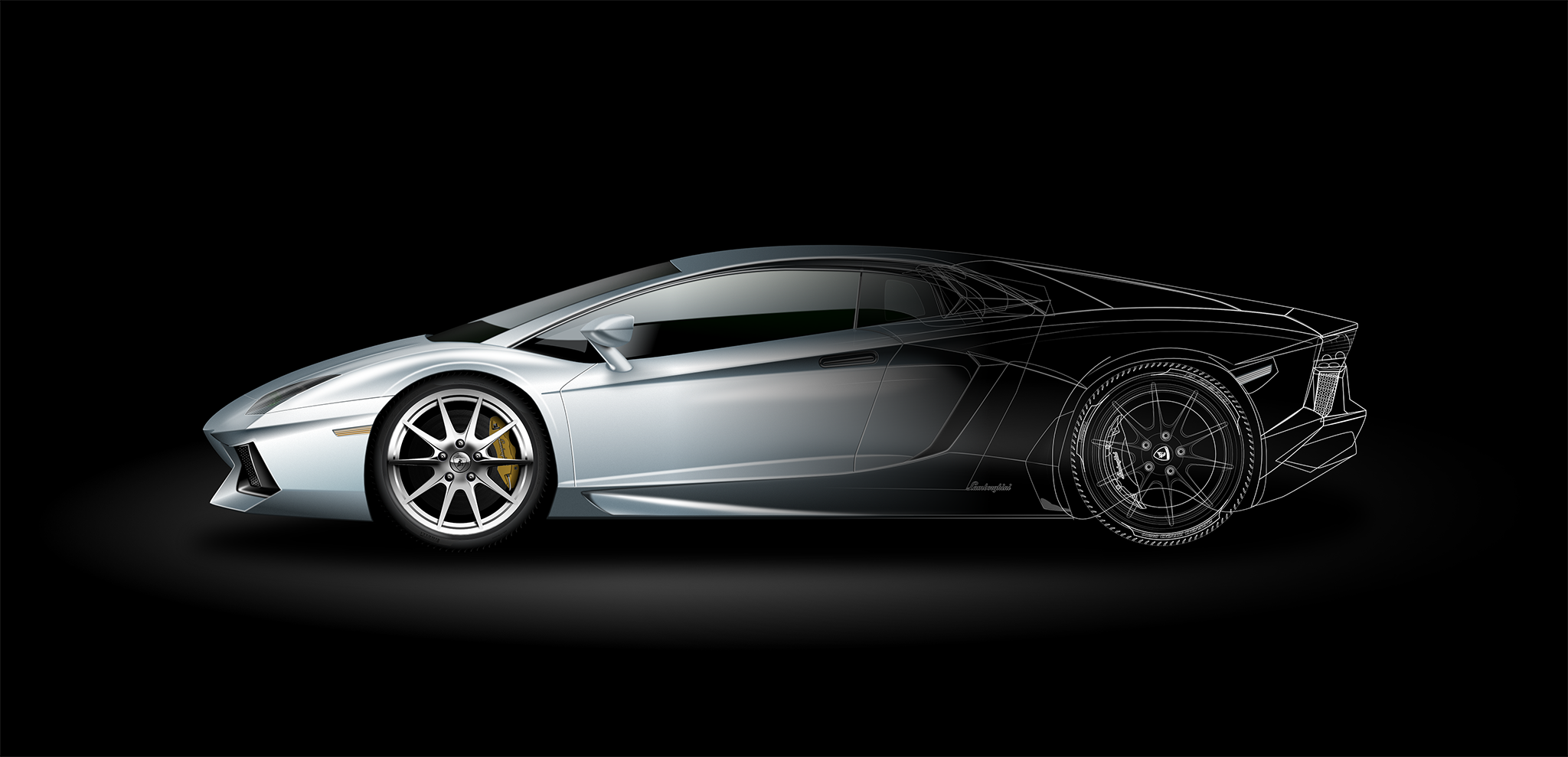
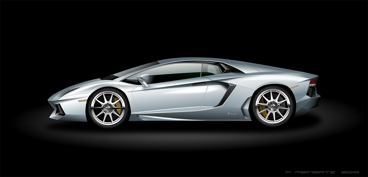
Hi, My next personal challenge (to learn AD) was to recreate a sports car. The Lamborghini Aventador is just so beautiful, so it had to be that one! All work is done in Draw Persona, no images added or "pixels" used. Really miss possibility to curve the gradient line, but I think I managed to find ways around it, where I needed soft surfaces :-) . Used a couple of images as reference. Hope you all like it. Amazing things can be done with AD, I just love it more and more. Having so much fun, just creating, not having the software being a limiting factor! Br, Philip Just added the original AD file. Lamborghini_Original.afdesign
- 47 replies
-
- 25
-
-
If you would like to view the entire layout click this link. more about this project can be found here
-
This was a study for me. I made this button inspiring on a picture I saw. It is a test for gradients, blurs and transparencies. I find more and more fantastic features inside AD. ^_^ Edited to upload the original file Enjoy and learn :rolleyes: RealisticButton.afdesign
-
Having used Affinity to do my first technical illustration on a computer I have now completed my second one using a perspective grid that I created in Adobe Illustrator. This time I decided to go for full colour. The perspective was in the top layer and could be switched in or out as I desired. This has been removed as it is not necessary once the drawing has been completed. This is a machine that I'm making for sharpening lawnmower blades. The blades and the gear wheel were quite a challenge. Interestingly Serif's DrawPlus had a very useful quick shape for creating gear wheels. Perhaps Affinity will eventually have such a feature. https://www.dropbox.com/s/3222owrg76lhswu/Grinding%20Jig%20Affinity.afdesign?dl=0
-
Overdone topic I know, started this a week ago with the news of that the shoes are to going on sale this year. It then found its way to the top of my "Avoiding real work todo list". (Don't worry, Pirate Cat riding a polar bear is NOT forgot and is in build)
- 24 replies
-
- 6
-
-
- back to the future
- shoe
- (and 2 more)