Search the Community
Showing results for tags 'Logo'.
-
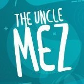
Company logo for son in law. His company sells vintage gear. He buys from merchants and shops and sells it again. Created in Affinity Designer.

-
 I've just swapped over from Procreate to Affinity due to Procreate not being vector based. I initially started designing a logo in Procreate until realising I needed to swap, but I'm unable to bring my brush with me. I've searched for days for a similar brush and cannot find anything! Any help would be massively helpful otherwise I'll have to start the logo again and re-jig the style I've attached 2 screenshots to show the brush. Thanks!
-
Hello guys, since winter is near and we are preparing for winter sport here is a glimpse of a mountain logo: https://youtu.be/uBwjis9CQdI
-
 hello i'm trying to design a logo for my scouts. We would like to print this logo on thirts and sweaters/hoodies. The problem i have is that the text needs to be transparent so it has the color of the tshirts. I looked it up and i came across the substract option but can't get it working. Is there somebody that can help me or explain it to me? I provided the document to make it a little clearer for you. (PS. Real noobie overhere) Grtz. Warre empty logo white try out.afdesign logo black.afdesign
 -
 Hi, This logo was made following the Material Design Product icon Rules. If you want a little guide that show you how i made this logo with Affinity Designer, just tell me and i will post it in the tutorial section of this forum.
-
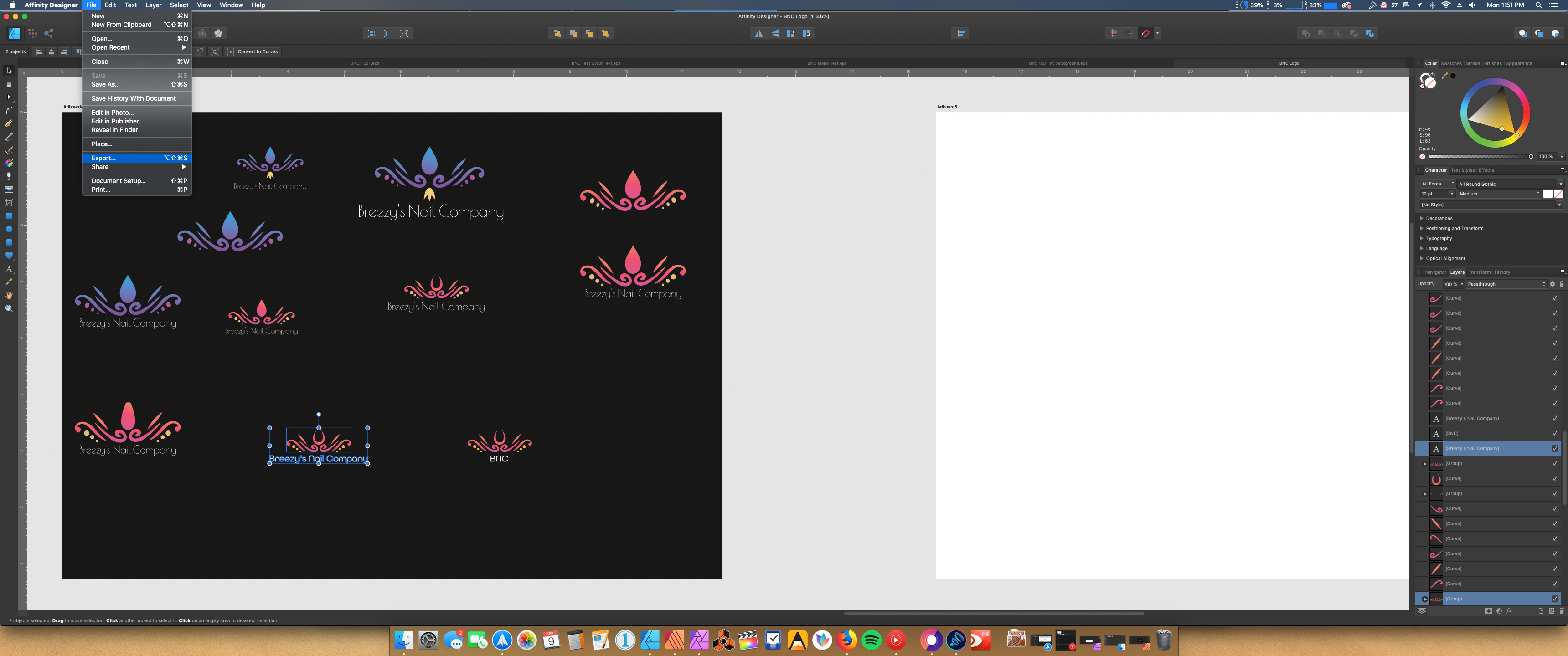
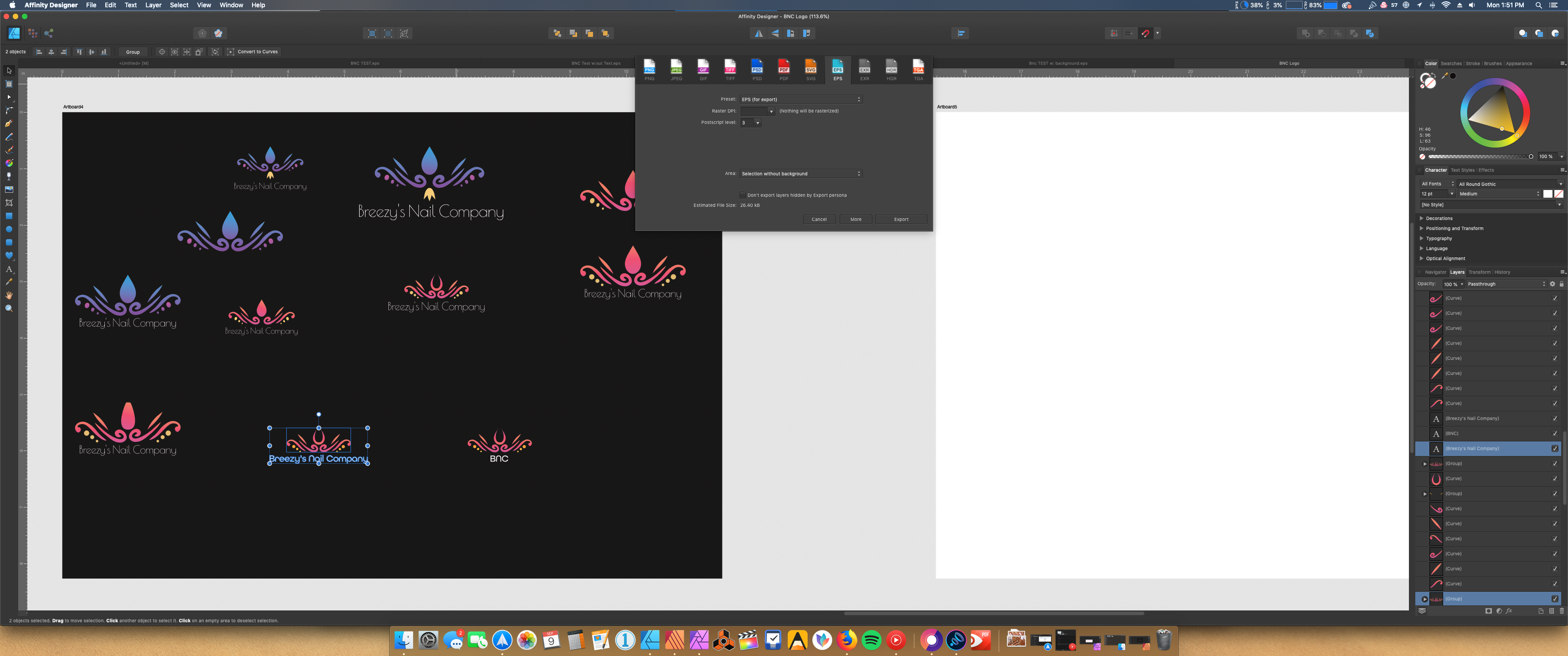
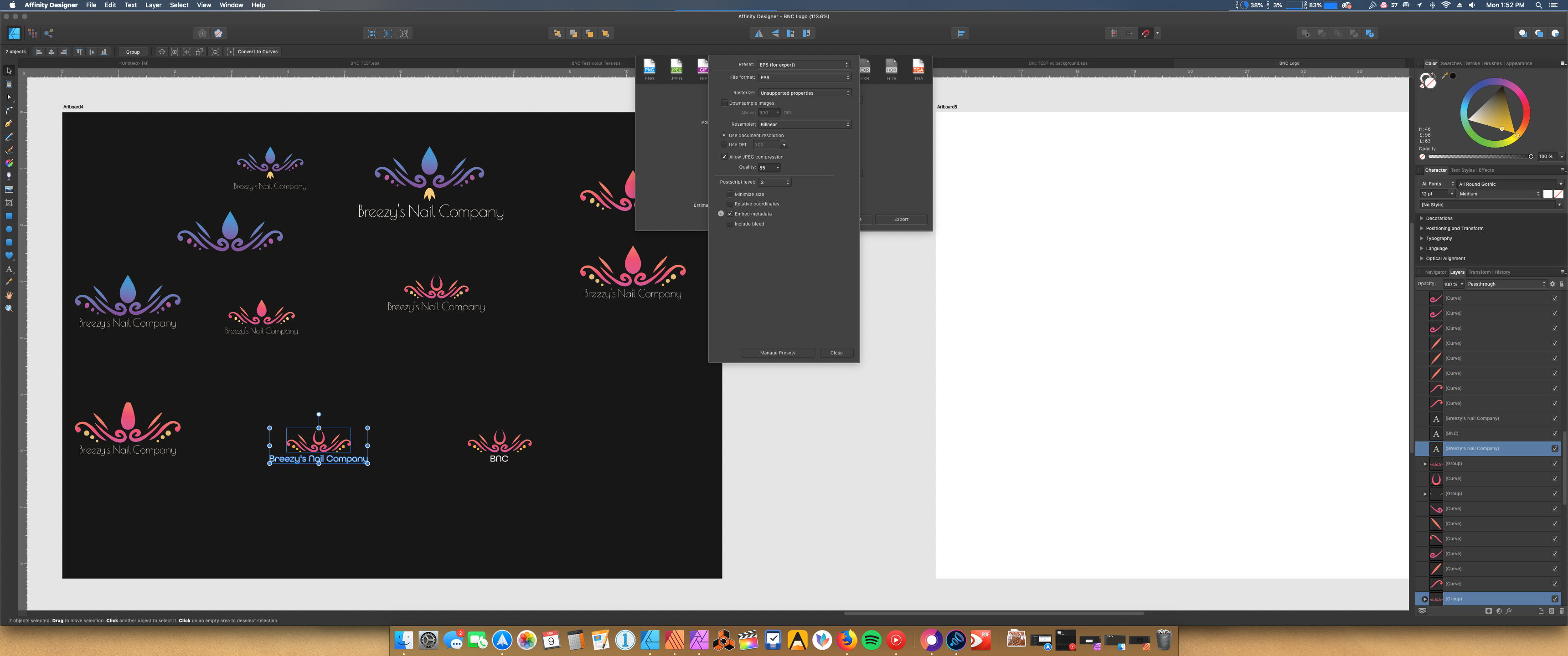
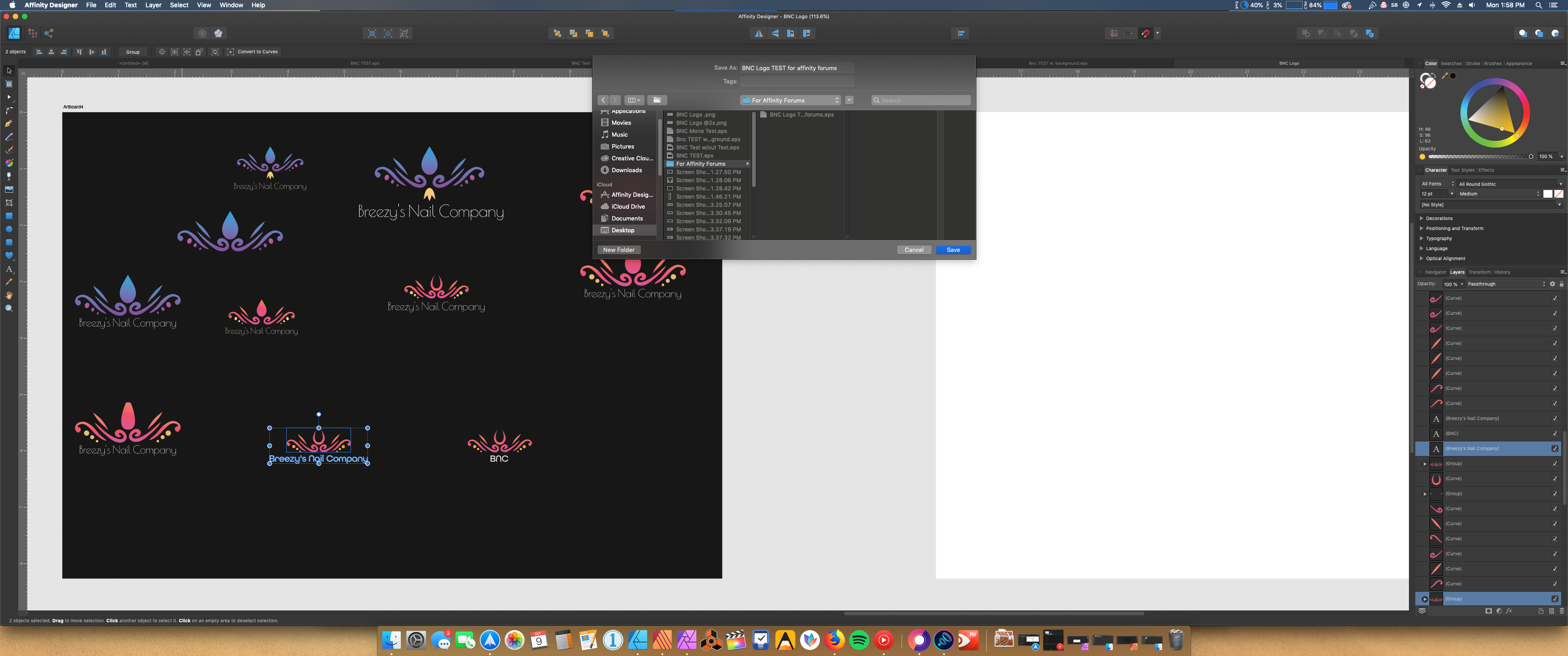
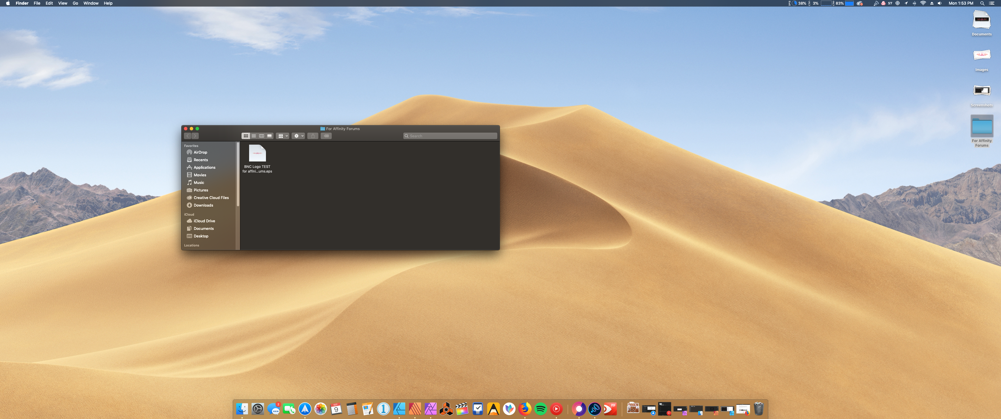
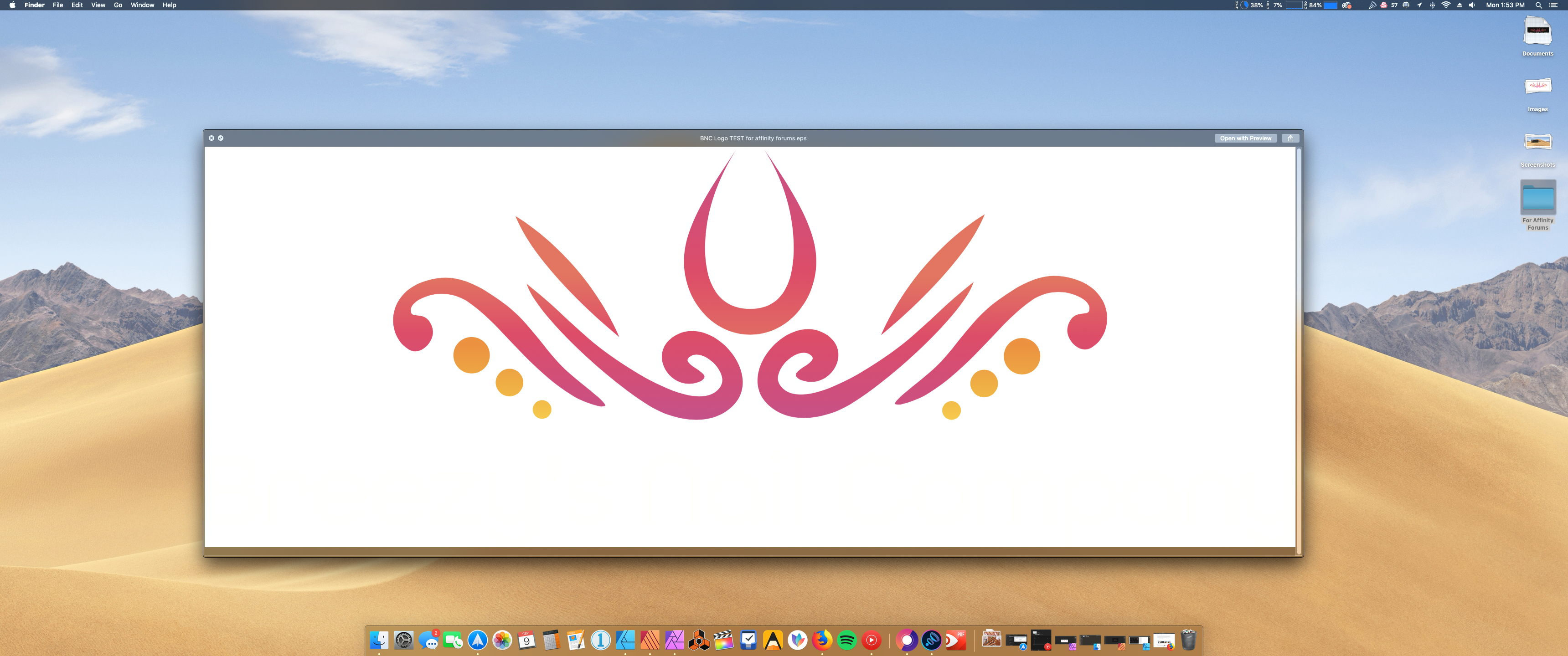
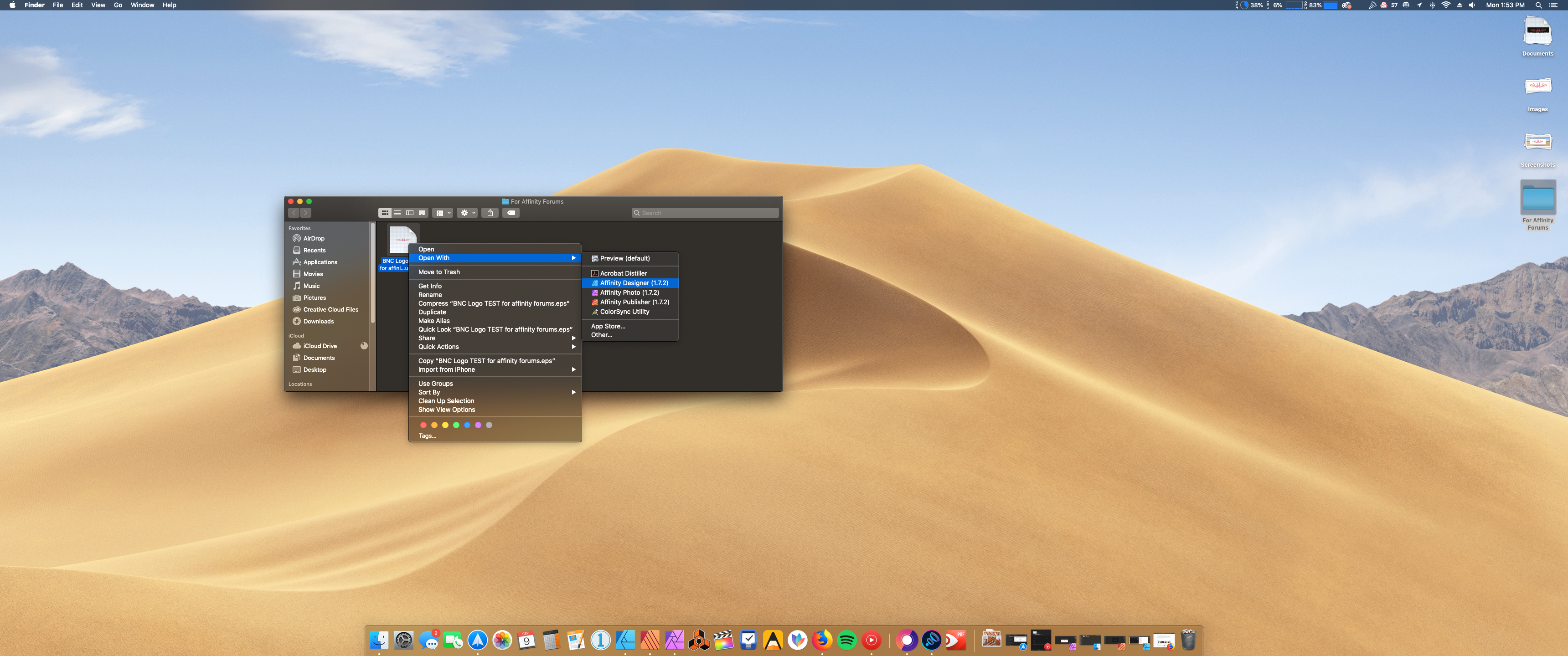
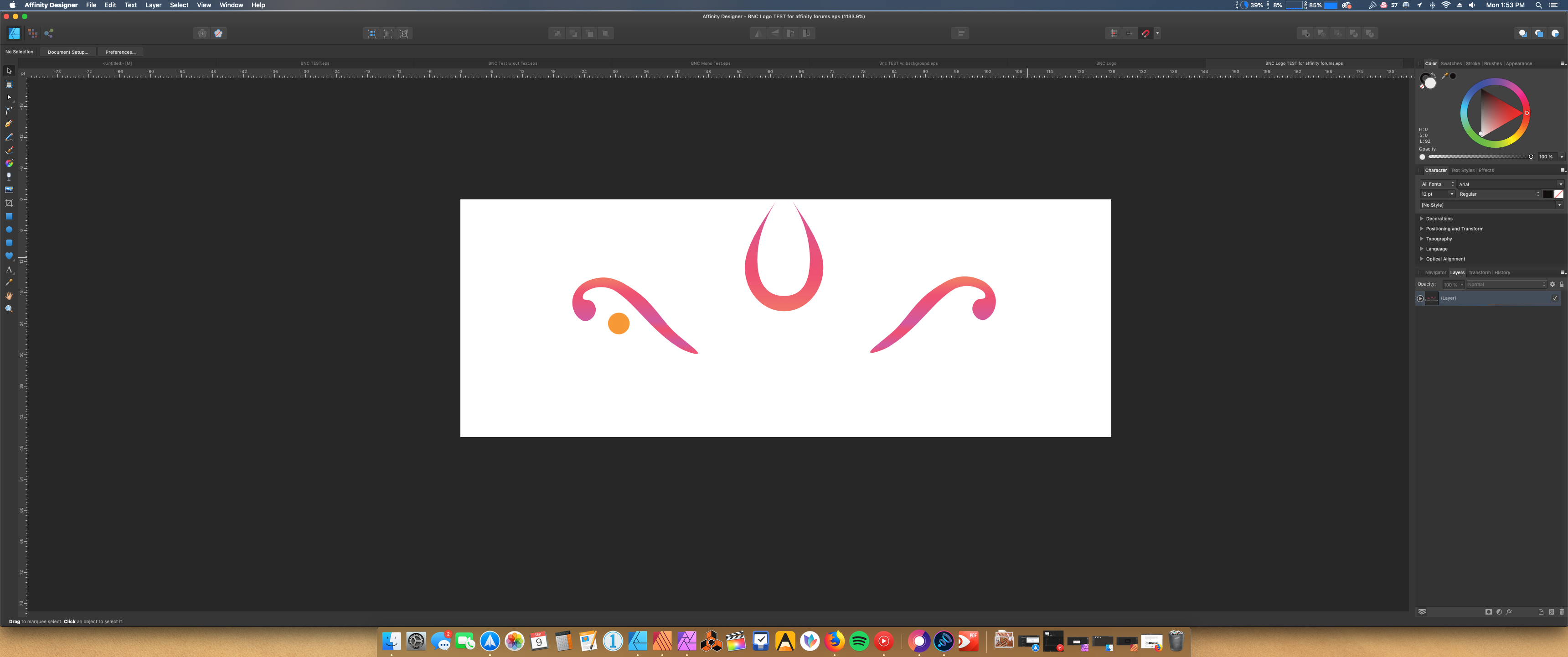
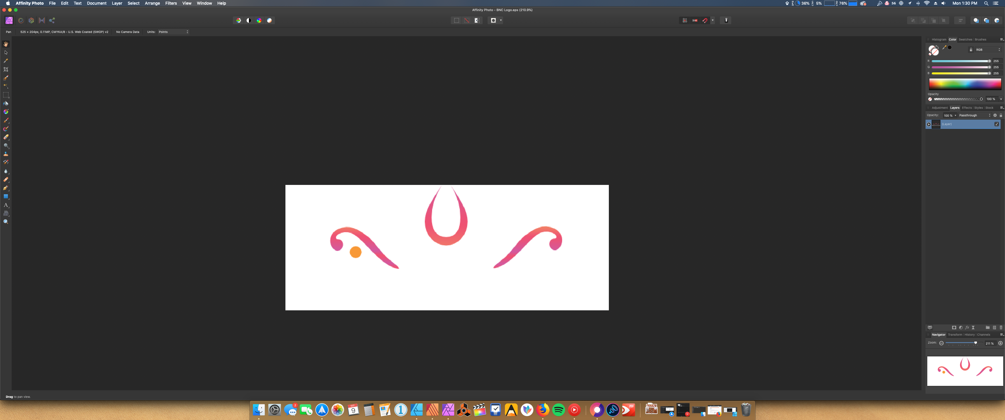
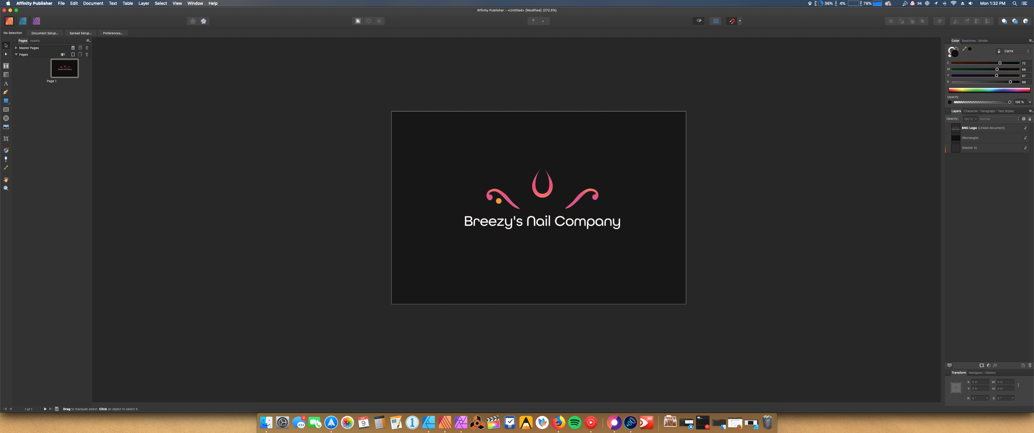
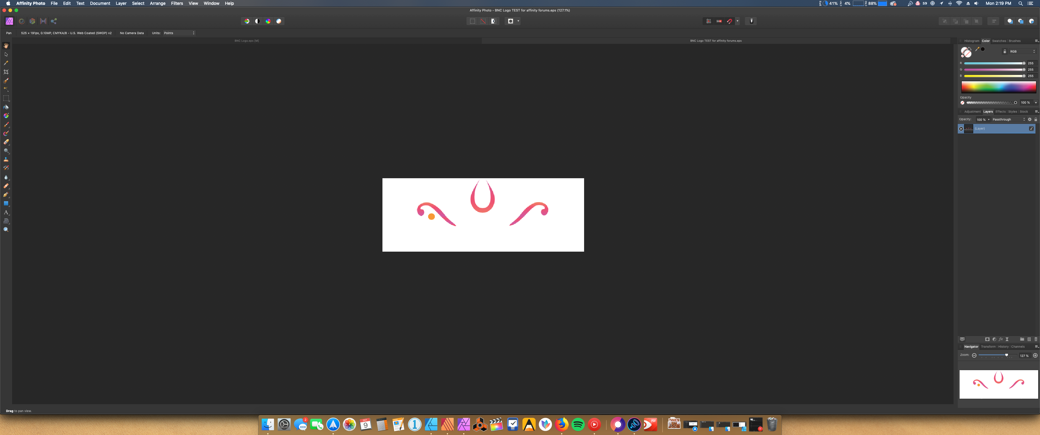
Hello, I've been tasked with making a logo for a client of mine and have ran into a dead end basically at the very end. My issue is this, I have my completed artwork ready to export, I use the default (EPS for export) preset and created the file. When previewing my file on the default Macos image viewer it displays it correctly with my shapes, gradients etc. Now I want to take my EPS files and open them in Affinity Photo and Publisher, both for mockup and business card work respectively. My vector artwork has missing elements and the elements that did stick have wrong gradients/colors. I thought this was a issue with my document so I opened a new one but the problem persists. When opening the said eps file Publisher and Photo they will always display the same missing elements and artwork. Ive tried expanding the artwork but the issue persists. I have no idea what else to do, I can only come to a assumption that Affinity Designer can't export EPS correctly. I even selected the artwork and changed it to one of the default grays found in the swatches and when exporting it the artwork comes out intact!!! Below are the steps I did to come these same results every time along with screenshots. 1. At my original document where the logo was created I then selected the one I want to use. 2. Next hit the menu bar and choose export 3. From there choose EPS for export and for the AREA choose selection without background and leave the other options untouched. 4. For this example I made a folder and exported the file to that location my desktop. 5. Here you can see the file in the folder I created and the preview it ends up showing. * There is no text because it is colored white so its hidden here. 6. Here I'm going to open the file in Designer. Notice how the artwork and the gradient looks. > These are just shots of the same EPS opening in Publisher and Photo. > I copy and pasted the same artwork but changed it to one of the greys in the default Greys swatches panel. Here I opened the EPS and it came it out intact! In the end maybe I'm still doing something wrong with the way the export is. If someone can help me with this I would definitely appreciate it! I want to continue using Designer to make my branding, and logos, etc.
-
I run normal APh and beta and sometimes it's confusing which is which. It would be neat if there was a different logo for beta versions - maybe just with an overlaid beta. Applicable for operating system display and when the programme is running. Could help resolve confusion when bugs are reported, too.
-
I got Affinity Designer on my iPad earlier this week. I’ve not used Illustrator before and only have some knowledge of photoshop. Quite happy with the first few, just some basic shape designs playing with gradients as well. Let me know what you think
-
 Hello again! I was given a hand-drawn logo to make into a digital EPS. I used the pen tool to create a black outline. Now I want to fill in with colour and some gradients, but I won't let me. I searched but couldn't find a solution. I've included screenshots to show you the layers(a few of them). Thanks so much!
-
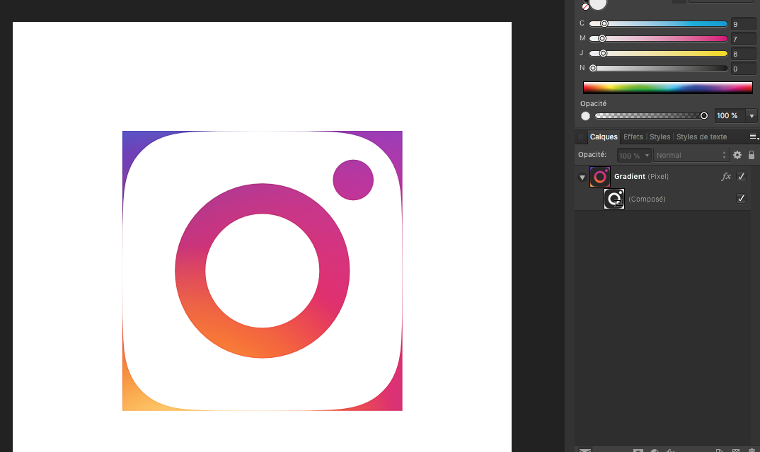
 I got the official Instagram logo files from here https://en.instagram-brand.com/assets/icons, and I opened up the .psd file they provide (see attached IG_Glyph_Fill.psd) with Designer. However I got something which doesn't fully look like the Instagram logo (see screenshot attached). It sounds there is a mask issue or something like that? Can someone give me the steps to get the Instagram logo properly drawn? IG_Glyph_Fill.psd
-
Illustration and Logo for a Guitar internet tutorials.
-
 I currently am learning/using Luminar 3 but it doesn't have a text tool for me to create a logo/stamp. I see that Affinity does. I watched the short video tutorial on this subject, but it didn't say if I could save my text-created logo as a "brush" (like Photoshop does) or a "stamp" for repetitive use and not have to re-create the logo for each photo. Is there a way in Affinity to do that? Thanks.
 -
 Hello ! this is not to mention a bug but more of a question and if it does not exist yet a suggestion. It is possible at this stage to draw a straight line with the pen tool then use some filter or options to create a Zig Zag from it ? Like one would do to make waves or to illustrate waters flowing/moving. i know it was possible with Ai but not yet tried to create it with Affinity Designer (Beta or Retail), so i ask. if it is not implemented (such a filter or a straight function to make zik zag of vector lines and smooth them or sharp them) then i would ask it (for both Windows and MacOS) because it is helpful and time saving and very useful for logos design. Blessings !
 -
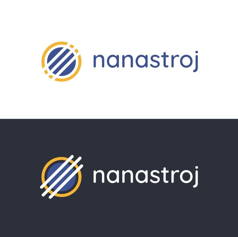
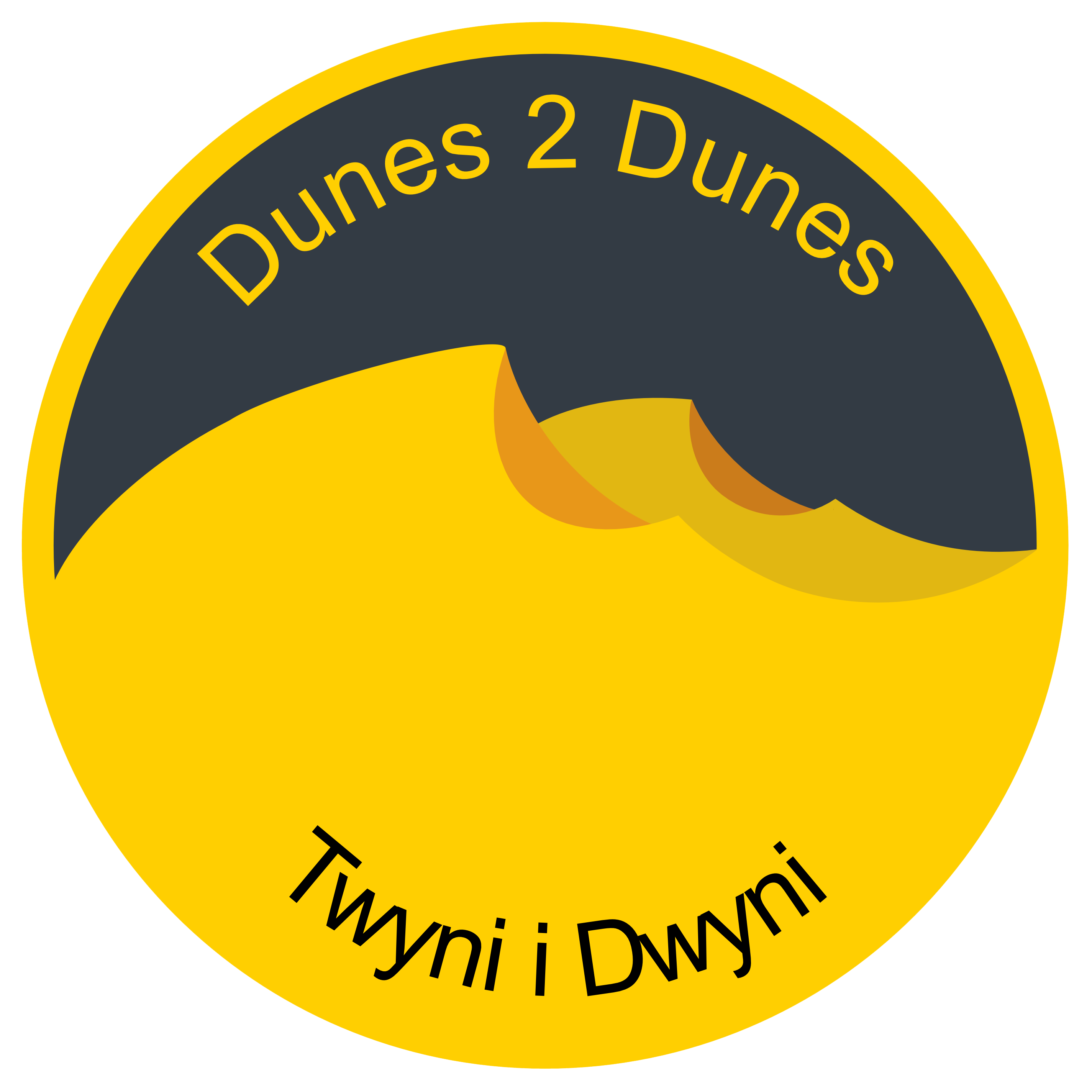
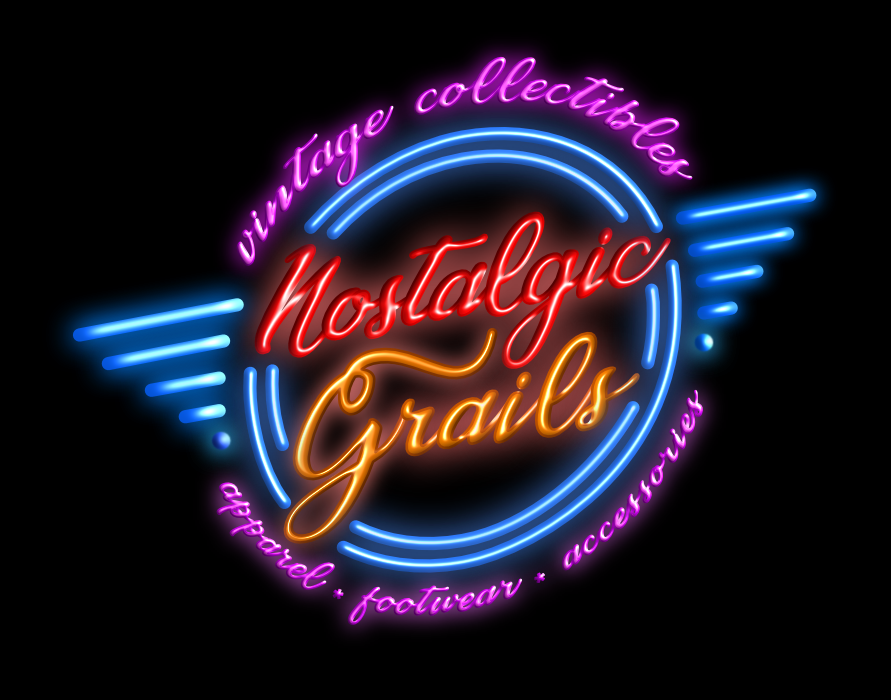
For a current project - made out of a lot of crescent shapes and a few ellipses. The dark colour grey came from the politico . eu website, the yellows/brown from a marketing design set we own. Langauges are English/Welsh (Cymraeg).
-

affinity designer My logo idea for container warehouse
Daviddesign posted a topic in Share your work
My logo design idea! For warehouse company.
- 2 replies
-
- 1
-

-
- illustrator
- work
- (and 1 more)
-
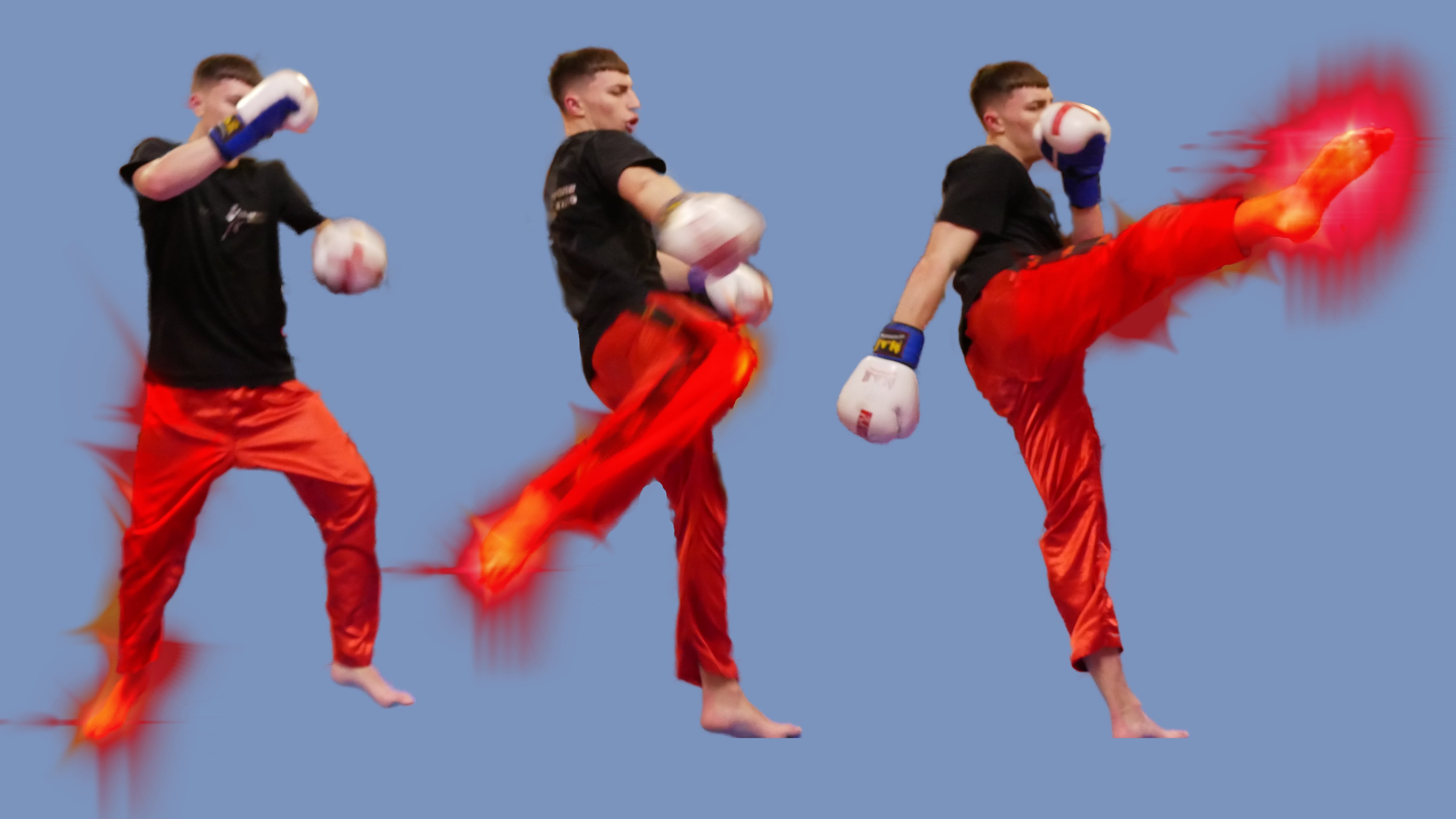
Still getting used to the whole photo editing and designing thingamajig. First one is logo Ive designed for friends Kickboxing club, its still WIP as I feel its not just there yet. Second is me messing about in Photo using the Xenon brush pack. I did wan't to try and use the smoke brush pack. But I just couldn't get it right and watching the creators Youtube video in slow motion still didn't help.
-
 Hello. I need some help for a work i'm doing right now. I have a logo that needs to be apply to a flask. Already got a file with the lines and curves. But i need to bend the logo and I can't find a way to do it. Any help? Thanks! example (the logo is straight and i need it to be like that line):
-
 Hey Guys, In this video I am going to show you, how to design a Gradient Professional Logo in Affinity Designer with easy to understand steps. In this video you will also learn, how to use fill tool with linear type gradient color. I hope you enjoy this video, If you like this video, Please subscribe this channel and share this video with your friends.
-
- 2
-
-
- logo ideas
- design
- (and 2 more)
-
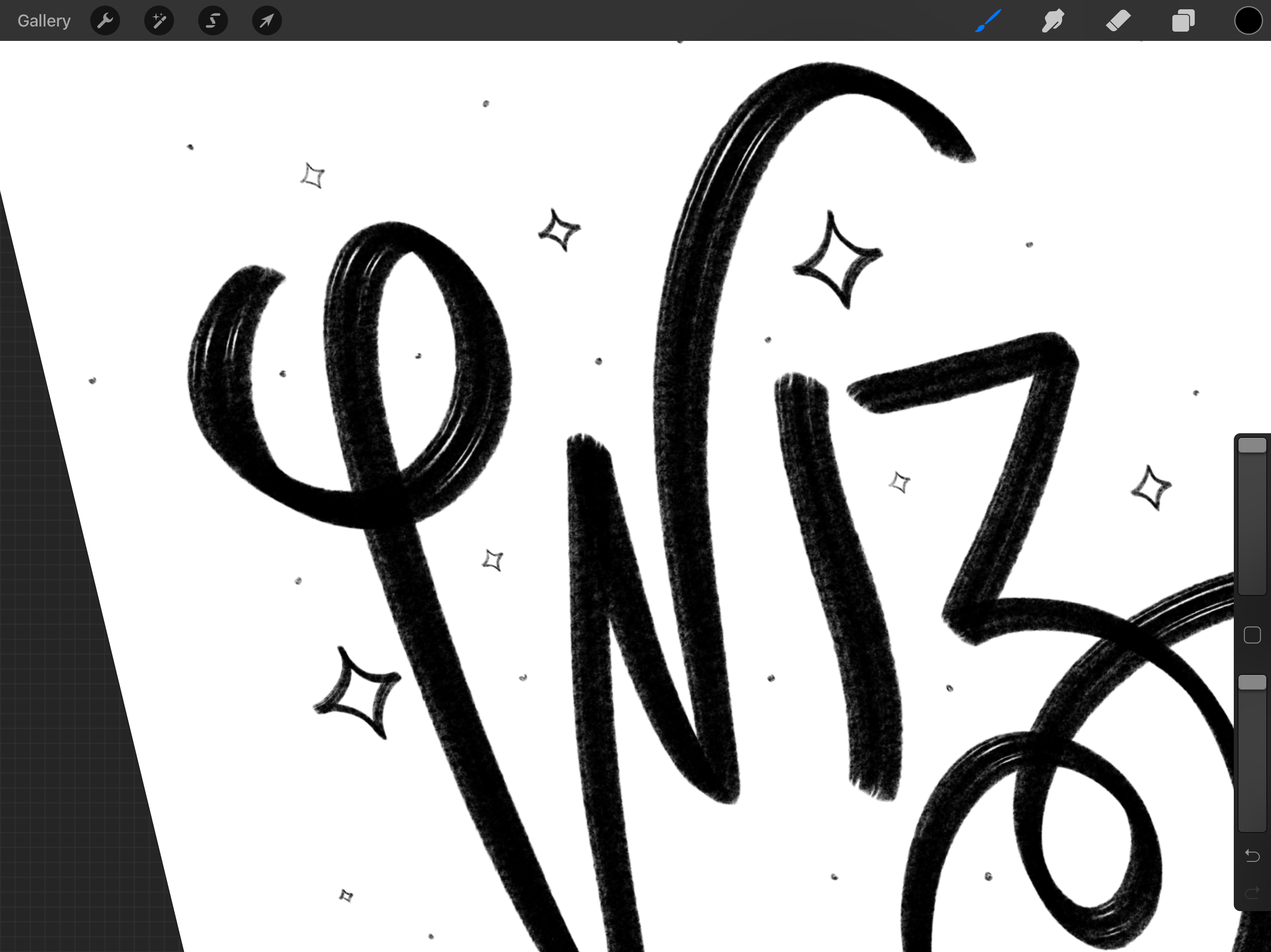
 Hi everyone! I'm a calligrapher, and I've just opened my calligraphy business - clearly the first thing to do.... create my logo! I did the calligraphy with a Wacom tablet and then edited the lines a bit etc to make it neater / thicker where needed. Simple but fun... and now onto the rest of the tutorial videos
-
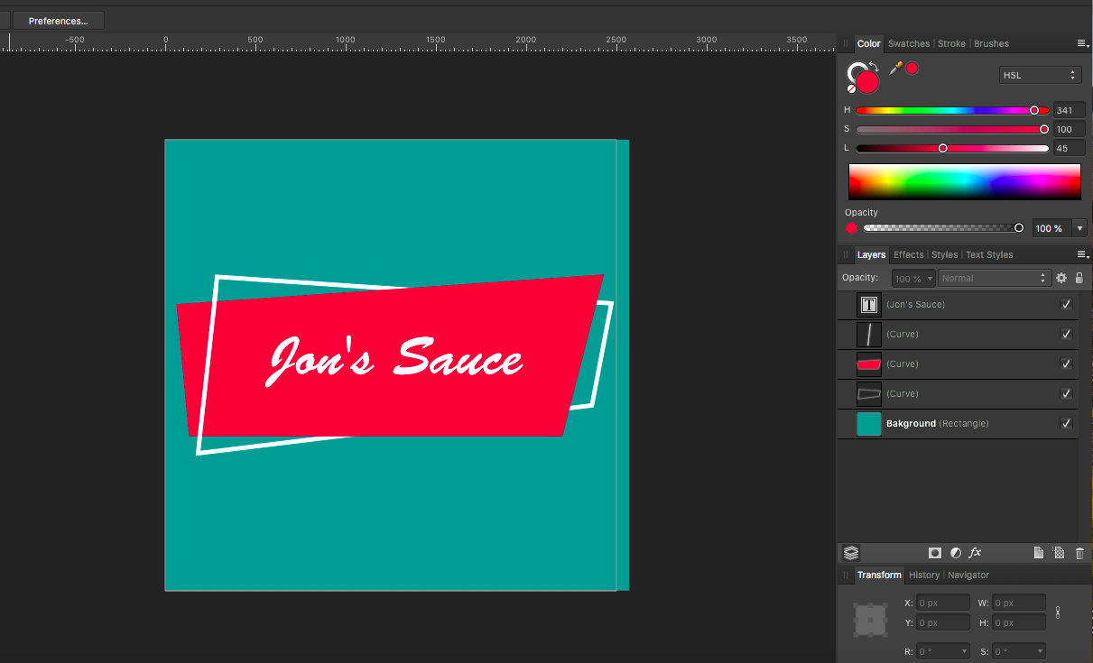
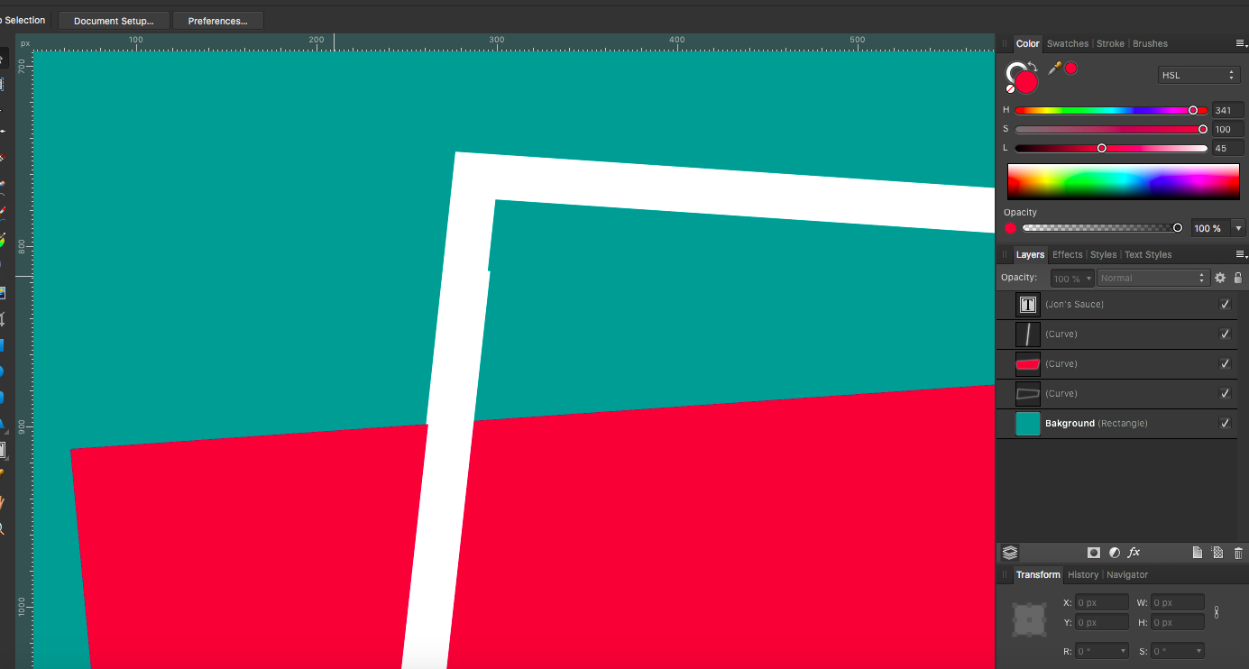
 Hey guys, I am trying to create a logo wherein the background of the logo contains a label shape that is made of two intertwined shapes. The solid shape is both in front of the outlined shape as well as behind it (see attached photos). Question: Is there an easy to create this look using just two shapes or will I have two use a line to complete appearance of intertwined shapes? Thanks!
-
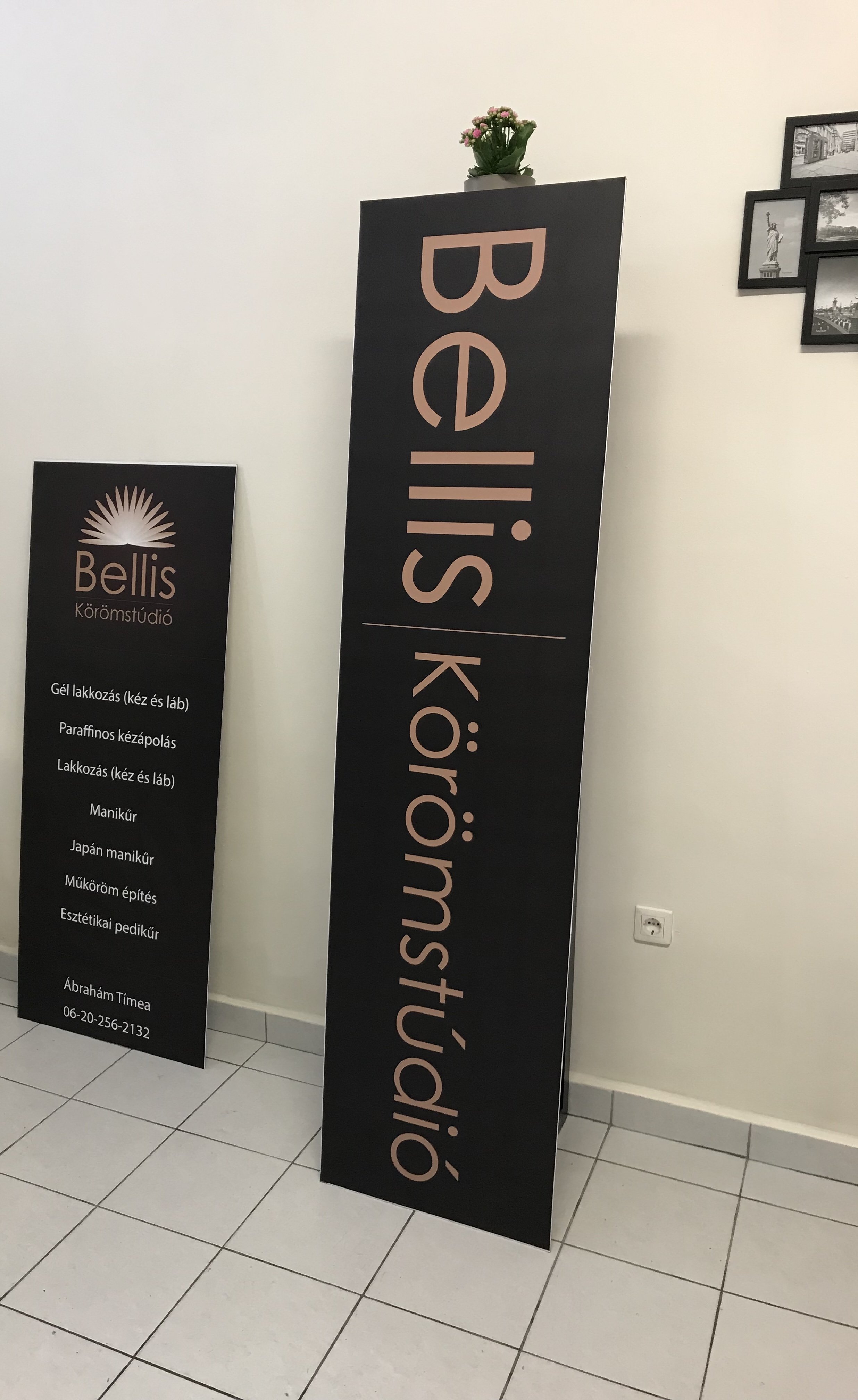
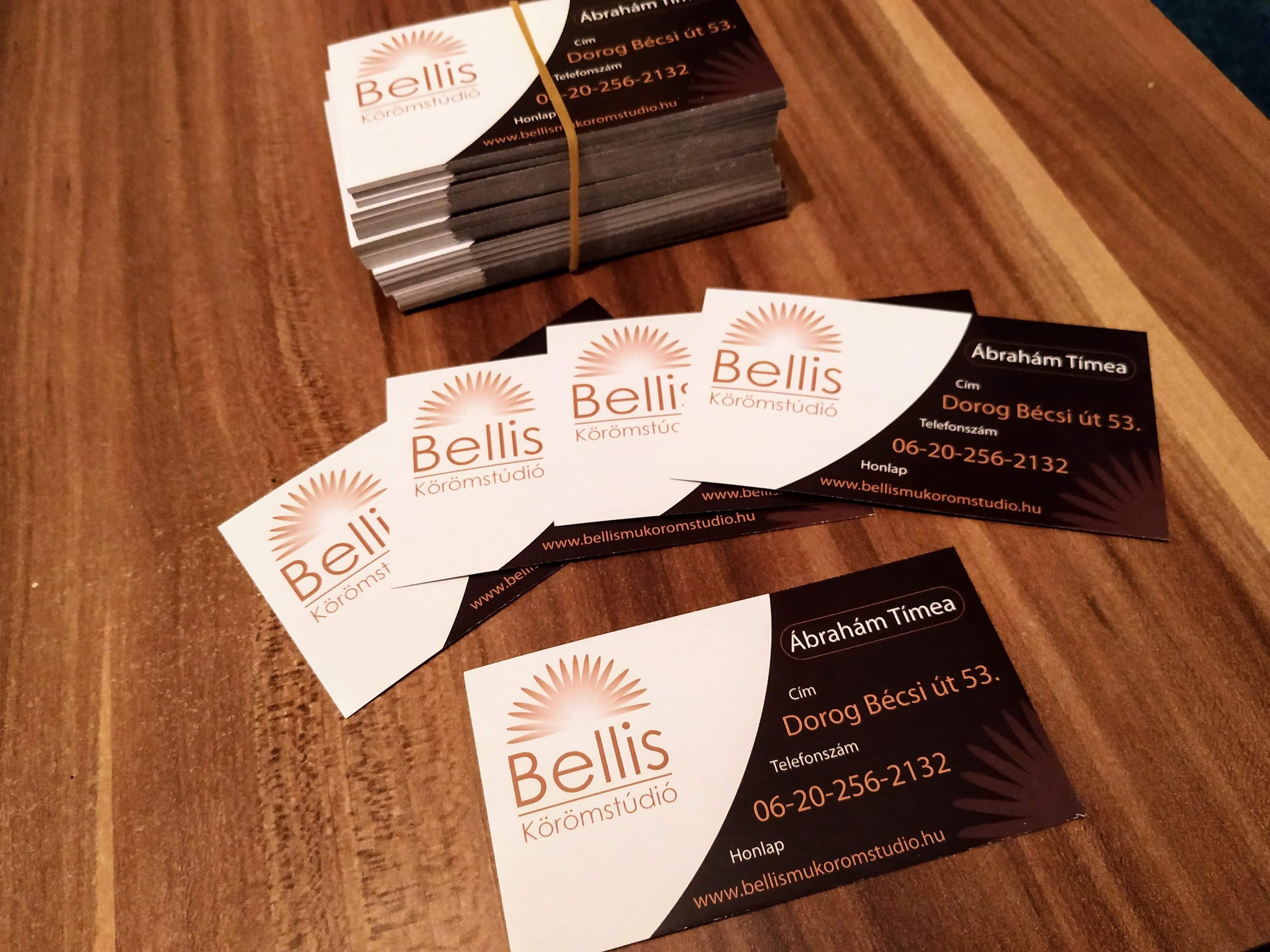
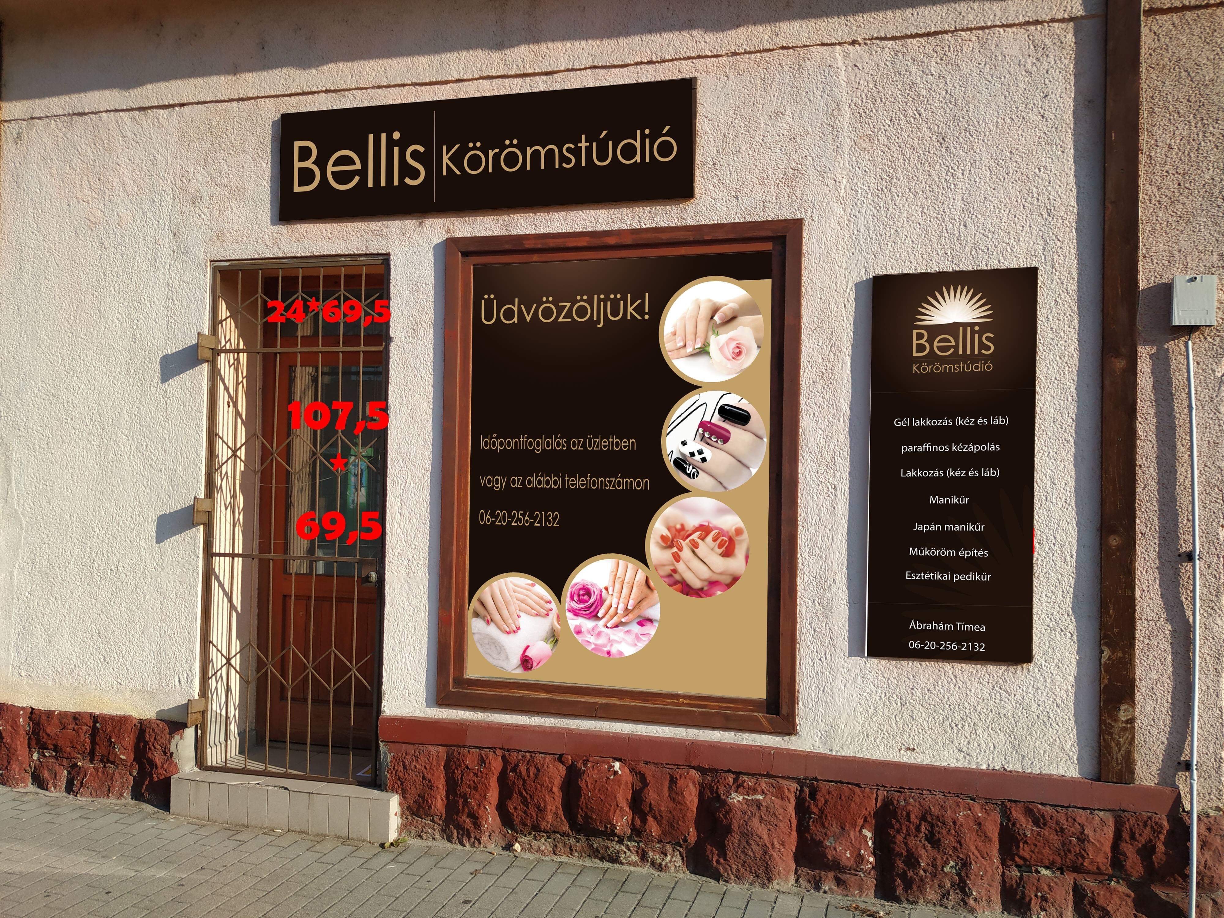
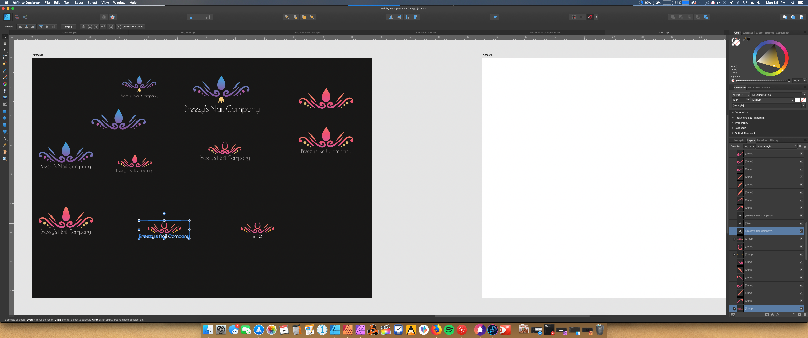
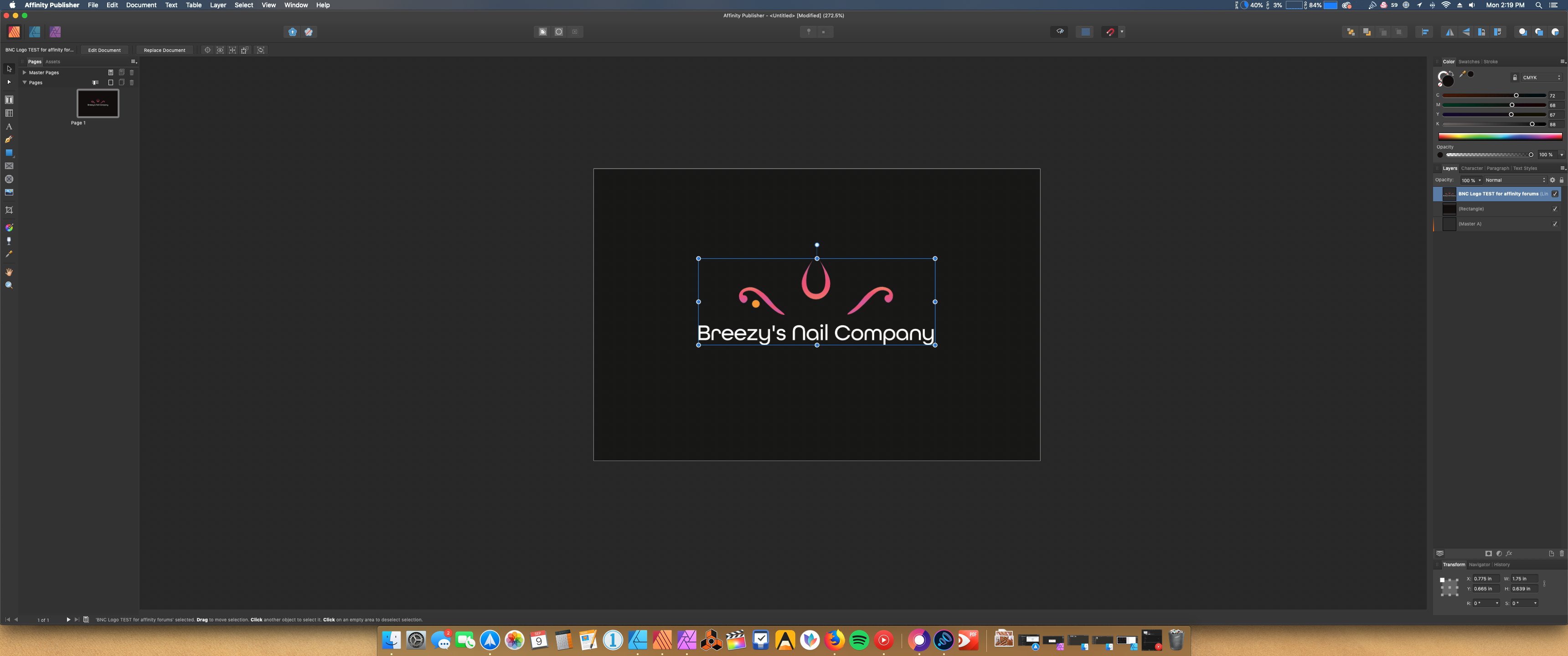
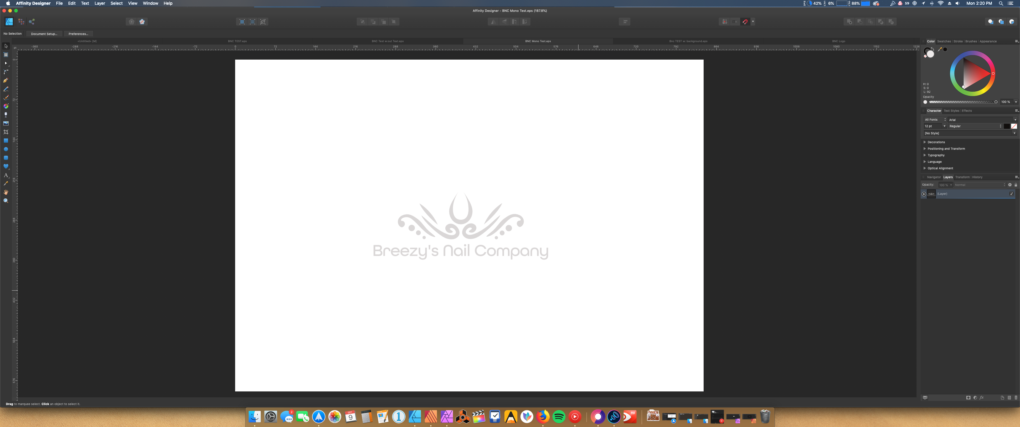
My last work for nail studio. Plan/printed Logo design Windowshop design namecard design
-
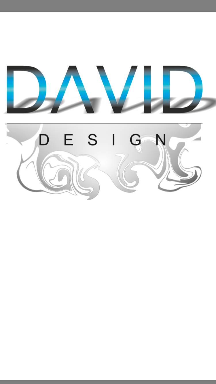
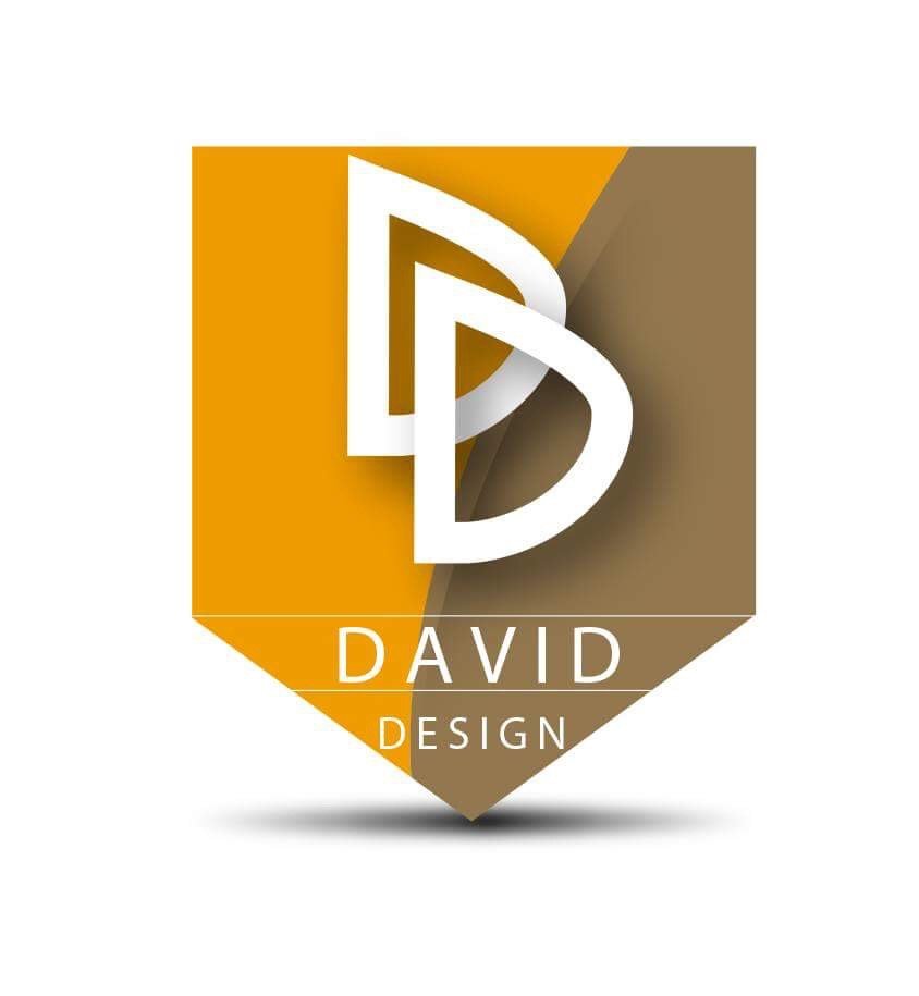
affinity designer My first minimal logo design for gallery
Daviddesign posted a topic in Share your work
Which version you prefer? I love minimal design.
-
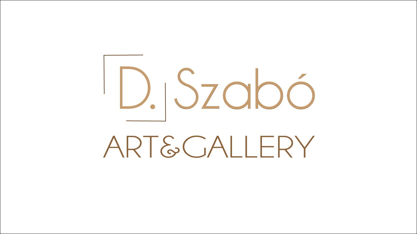
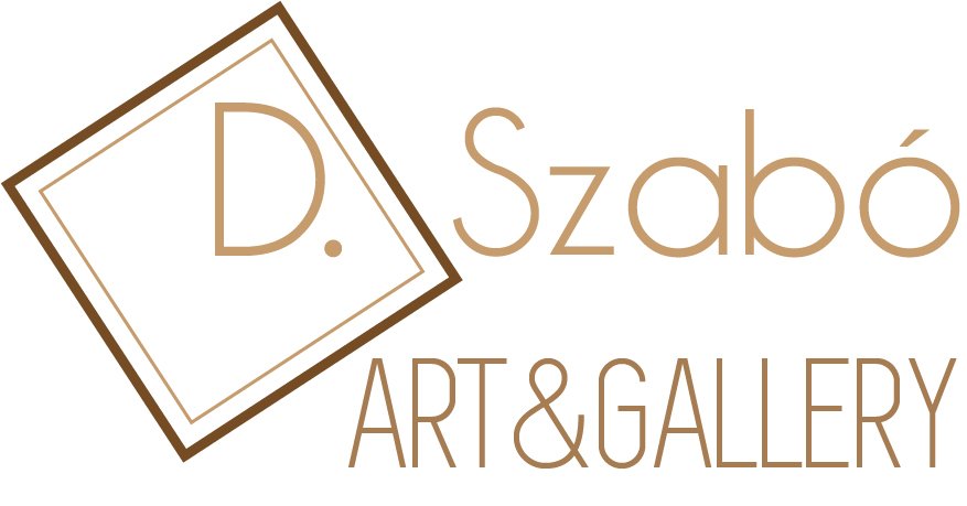
If you have any good idea for better way please write it! and which you choose of 3 examples. I prefer 3 the brown logo
-
 Hi, made a logo in Affinity. I provided the colors with the logo. HEX, RGB & CMYK. Now they ask the PANTONE color scheme. How to see that to pick the correct color? Thanks in advance.
 -
 Hi, i tried to make an updated facebook and whatsapp logo for a friend. I completely remade it in Designer. No matter how i export it, it looks messy on mobile and little size screens. I tried jpeg and png with different sizes. My export setting were: PNG-24 and 300x300 as well as 600x600 and bigger. Bigger makes it way worse. I followed the guidlines given by facebook support pages. But nothing seems to help. I know text on logos is a bit supoptimal, but that outcome is to bad for my taste. Do i have to change settings on my side and in Designer or does it have something to do with facebook compression? Any help is appreciated. Greetings =) Facebook on Desktop Whatsapp/facebook on mobile logo_source.afdesign


2019-06-2810-11-59.jpg.0b1c5caec2aa0911c27ae534ac557843.jpg)
2019-06-2810-12-22.jpg.226acf66d58efadcb60a09ae777db39b.jpg)
2019-06-2810-12-41.jpg.1f4163d1f7048a0a9a0bcd2a1b3176b1.jpg)
2019-06-2810-16-18.jpg.b14805643482ebd511e8b2b97fabb0e5.jpg)