Search the Community
Showing results for 'variable fonts'.
-
Like this suggestion Web Fonts are on the list but not variable font!
-
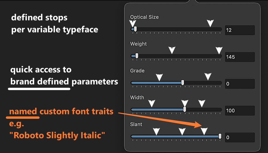
With Variable Typefaces, can we have opinionated styles definitions, something like our own custom "Fonts" per Typeface, e.g.: brand medium-slim super fat sweetspot extended sleek semibold slightly-italic optical-thin … which we can then directly apply just like named Font traits in Paragraph Styles, Character Styles etc., mixing them with these per main-axis font styles / stops or axis-combinations when there's a modifier (or secondary) axis like "optical" or "descender" involved and save like Document Color palettes or like Gradient Stops, per document or for the entire application (e.g. for recurring brand application), possibly as part of a sort of Design System collection? Doing this with Character Styles may work in a very limited way, but doesn't provide the composition capability needed for extensive Typography and Paragraph Styles.

-
 Arno Pro was included in Adobe CS3. If you purchased CS3, depending on how you manage fonts and migrate to new computers, Arno Pro may be installed in the Windows Fonts folder.
 -
It's possible to create a single variable font file that contains both roman and true italic glyphs, and changing the axis value will result in a change of the shape of certain glyphs such as "a" or "g" at the halfway point of the slider. Most of the Google fonts have a separate font file for italic, it's up to the font designer.
-

Problem with a font
GarryP replied to GIOVANNI ACANFORA's topic in Affinity on Desktop Questions (macOS and Windows)
Bahnschrift is a variable font and that sort of font doesn’t work with V2.4 but it should in V2.5 (currently in beta). A search of the forums for bahnschrift will give you the background to this. -
 This may conflict with the Adobe announcement @ https://fonts.adobe.com/ : "Simplified Licensing – The entire Adobe Fonts library can be used for both personal and commercial projects."
-
 Soms worden er alleen een bepaald gewicht/stijl van een lettertype vrijgegeven om je lekker te maken om de complete familie aan te schaffen. Voorheen waren niet alle adobe fonts verkrijgbaar via the creative cloud en zijn dus gewoon te vinden. En deze ,alleen de normale stijl, van Arno pro is alleen voor persoonlijk gebruik dus je kunt het niet gebruiken voor publicaties. Waarschijnlijk kun je geen scheef of vet gebruiken met dit lettertype dus erg beperkt in het gebruik voor een boek lijkt mij. Zou toch echt een google font (familie)zoeken omdat deze geen beperkingen heeft.
 -
And, if this is an Adobe font, this also would proof that the @AvdB-Netherlands is not generally unable to use Adobe fonts in Affinity and the Adobe Sabon LT Pro might work in Affinity for the OP … unless their OS and/or Affinity app does not get confused by a formerly (or currently) installed MyFonts file with the same name or font ID.
-
Only Arend can tell what he did that made the google fonts show the Arno pro font. But it sure isn't a google font or to be found on the site.
-
I think @AvdB-Netherlands thought I suggested to google fonts (verb) instead of going to the actual site. Ik denk dat @AvdB-Netherlands dacht dat ik voorstelde om lettertypen te googelen (werkwoord) in plaats van naar de eigenlijke google fonts site te gaan.
-
 Yes, it is again an Adobe font, and (as suggested by the word Pro in the name) it is not available for free. There is a font family named Arvo on Google Fonts, but it’s a slab serif typeface.
 -
Dat is zeer vreemd omdat er geen Arno(pro) font is op google fonts dus ik zou toch even kijken of je hier goed aan doet. Ik denk dat het zelfs opnieuw een adobe font is, zie: https://en.wikipedia.org/wiki/Arno_(typeface) Hier de link naar google fonts https://fonts.google.com/
-
 Dag Thomaso, Bedankt dat je nog even reageert! Het is mij niet gelukt om met Adobe fonts te werken in Affnity Publisher. Wel met fonts van de website 'Google fonts'. Daar plukte ik het font Arno Pro uit, dat mij zeer kan bekoren. Het was eventjes een kwartiertje werk vanmorgen om alle stijlen te veranderen. Maar nu staat alles weer goed.
 -

Variable Font Support
AffinityMakesMeWonder replied to Ash's topic in 2.5 Beta New Features and Improvements
I’ll confused here - is that really a single variable font on the market that offer both regular and real italic? I understand that almost everyone here knows what an italic font is, but, I meet some people that think that italic is just an regular font with some angle on it - so, is that a font that offer real italic and regular in one file (a real cut italic)? -

Optical alignment
lacerto replied to Tony Pritchard's topic in Affinity on Desktop Questions (macOS and Windows)
I do not think that there is a way to compensate effects of optical alignment setting for the text flow and wrapping, so I suppose the only way to try to correct this is decreasing one percent by one the "Left" adjustment and only to the point where the change does not result in rewrapping (or at least not in every place). The "Right" adjustment would occur only if capital A, T, W or Y appeared as the rightmost character in a row, so not probable if your text is not in all uppercase, and even then, increasing the "Right" setting (which could theoretically compensate the decrease of the "Left" setting), it is unlikely that the changes in optical alignment would happen so that you would have identical optically aligned characters both at the start and end of each affected text line). Btw, I agree that the default (20%) for these letters is too much. I am not sure how "optical" is defined, and whether it is something that gets analyzed real-time based on font metrics (or even rendered appearance???) but in Affinity apps e.g. non-serif fonts like Arial get basically similarly optically aligned, as fonts with serifs (e.g. Adobe Caslon which I tested). In InDesign, optical alignment is basically recommended to be set according to leading, and the effect is much more subtle there, and grotesque (non-serif) fonts get differently aligned than fonts with serifs. Typically only the tips of serifs get aligned off the text frame, and as alignment happens automatically (not by user-defined characters and percentages), there is obviously less control, but generally the effects of the feature are more balanced and "intelligent". In InDesign optical alignment related to frame edges is probably somehow connected to the app's capability to apply optical kerning, that is: it happens somehow dynamically, analyzing the shapes of glyphs, either "optically", or using metrics. -
@Hangman There is a single font version of Shantell Sans in the repo. Rather than two separate fonts, Roman and Italic, it also has an Italic axis in the one font. IIRC it's v1.009. On my phone at the moment, but I can post the font or a link tomorrow if you do not find it. Based on what @AffinityMakesMeWonder said above about the similar issue with the Italic axis font, it may be good to compare the similar version of Shantell Sans with an Italic axis. EDIT: May want to scratch that idea. Remembered GF gave up on Italic axis fonts and now requires two separate fonts. Too many problems. And IIRC it was either Helvetica Now variable or Avenir Next variable which came out with both - a single font with Italic axis, or two fonts. And they quickly withdrew the single font version. (can check this tomorrow to be sure) Affinity may also have problems trying to make single fonts with Italic axis work.
-
Yeah. Seems to be an Affinity bug(s). I closely examined the fonts @Hangman tested and found nothing which would explain the issues, of why the one font (Montserrat) did work as expected. The name table, the fvar table, the STAT table in all fonts appears to be fine. So something else is going on or I am just missing it. Thought it might be the use of ranges in certain axis settings, but another font with ranges is working. Got me baffled (easy to do). Beta Blues.
-
Variable Font Support
AffinityMakesMeWonder replied to Ash's topic in 2.5 Beta New Features and Improvements
I can also answer this (last sentence) - even when using a separate Italic variable font, it’s messy when using the axes, it goes pretty soon to non-italic and can’t be changed… MacOS 14.5 beta4… -

Designer Beta 2.5.0.2415 won't start
Cooperphile replied to Cooperphile's topic in Other New Bugs and Issues in the Betas
@Sean P, I forgot to answer one of your questions. I have 486 font files in my Windows fonts directory. -
 Unfortunately, in this Beta version 2.5.0.2430, the font list in Windows 11 is displayed much worse. Font patterns are smaller and less clear than in previous Beta and production versions. The font lines are squeezed and the last font name at the bottom of the list is truncated in half. I have about 1000 fonts and with this number of fonts the scroll bar shows a tiny slider of 8 pixels, so it is difficult to hit this slider with the cursor arrow. I know that as the font list increases, the slider to visually determine the number of fonts decreases, but this slider should be really larger. Also when scrolling the font list up and down the list, the width of the list jumps, changing its width and the heart icons and the names TT, O and OV are obscured. Please fix it for Windows 11, because it hurts my eyes to look at such a blurry font list, so far the list has been working properly. Please change it. Although it would be very good if it was possible to drag the length of the displayed list down with the mouse pointer, increasing the number of displayed font names. I know that in Apple the list is displayed at the entire height of the screen, and in Windows only up to half of the screen without the possibility of extending it. Please change it.
-
Interesting and good to know… Happy rummaging, let us know what you discover… I’ll run tests on some more fonts when I get a chance…
-
There has been a similar issue with some variable fonts from GF in InDesign. (you see this in the various issue trackers) That one is related to some non-standard stuff Adobe wants in the fonts. Specifically in the name table. I hope this is not the same thing - meaning Affinity is following the same path. Because that is a direct collision course with GF. Anyway, I'm off to rummage around... EDIT: correction "name" table And: Or this just could be normal Beta stuff.
-
Keen to hear what you discover… I think the main issue is that using the same Italic variable fonts only demonstrates the problem on Mac when dragging the weight slider, all works correctly using on Windows…
-
No, they are OpenType variables - of the TrueType flavor. There are two flavors of OpenType: - OpenType-TT - with TrueType outlines - (quadratic curves) - (TT) - (.ttf) - OpenType-PS - with PostScript outlines - (cubic curves) - (CFF) - (.otf) Currently 99% of the OpenType variable fonts are OpenType-TT flavor. Adobe has now been making OpenType PS-flavor fonts too. For example Source Sans, Source Serif, Source Mono include both OTF and TTF. A few commercial vendors are now doing it too. The current CFF table (where the glyphs are kept) in OpenType-PS fonts does not support variability. So this required a new kind of table in the font, CFF2, to be able to support variability. Very few applications support CFF2, and OTF variable fonts (surprise Adobe does). And the new OFF spec these guys are working on includes being able to put PS curves in the existing glyf table used for OpenType-TT flavor fonts now - so it won't matter. So, yes the new icons are a bit misleading, but not really wrong.
-

Variable Font Support
Bobby Henderson replied to Ash's topic in 2.5 Beta New Features and Improvements
Technically, variable fonts are "OpenType." The standard is called OpenType Variable. It's just like "color fonts" being part of the OpenType-SVG standard. The trick is whether the variable fonts are using TrueType style quadratic outlines or Postscript-based outlines. The ones with TTF outlines are packaged in a TrueType container.