

Mark Oehlschlager
-
Posts
644 -
Joined
-
Last visited
Posts posted by Mark Oehlschlager
-
-
Why are people expecting better communication from Serif rather than from Canva? It’s now Canva’s responsibility to actively communicate with the market about their plans for the Affinity Suite.
-
Feels like Canva have already killed any future development. With the buyout, I'm sure original investors, founders and employees with stock have cashed out long ago. I've no idea why Canva agreed to the purchase apart from acquiring the developer talent. Reminiscent of Adobe's buyout of Macromedia.
It's such a shame, as I had really invested myself in the longterm success of the Affinity Suite. I would have hoped that any sale would have at least fallen to a company with real interest in further development and increased market share. Apple acquired Pixelmator. I now wish they had been the ones to acquire the Affinity Suite.
In the meantime, web and mobile app designer/developers have migrated to Figma and to Framer. Print and publishing designers are left to return to the Adobe suite (Illustrator, Photoshop, and InDesign).
It was a good run while it lasted. I had just hoped for long term success.
-
-
I'm writing to ask what the future is for the Affinity Suite, post acquisition by Canva.
The product is stable, which I'm thankful for, but development and promotion has fallen off a cliff, post acquisition.
My fear is that Canva has killed all investment in development and promotion, instead, putting the suite on a shelf as a dying cash cow, stripping features for some augmentation of a Canva product.
Meanwhile, having mounted the beginnings of a successful challenge to Adobe's hegemony in the design space, market momentum seems to be shifting to design apps like Figma and no-code website apps like Framer.
Is there still an aggressive development roadmap for the Affinity Suite?
Is the relative quiet in terms of promotion an indication of new strategic thinking and planning, or of a Canva decision to retreat and abandon further development?
- R C-R and Andymerlino
-
 1
1
-
 1
1
-
I would like to suggest new dynamic color palette generation features for the Affinity Suite. An improved means by which designers can quickly explore and generate color palette options. Something in addition to the current "Add Chord to Swatch" command that is currently available via the Color Panel.
The inspiration comes from the color blending figures found in Johannes Itten's "The Elements of Color", wherein Itten creates stepped color blends between any 2, 3, or 4 "anchor" colors from a 3-D color space.
Consider this 7-step blend between two endpoint "anchor" colors:

Presently, there is no direct way to generate this palette within the Affinity apps. One work around is to fill a long rectangle with a linear gradient (where the two end stops are your anchor colors), then fill seven smaller neighboring rects using the Eyedropper tool to sample from the large gradient rect.
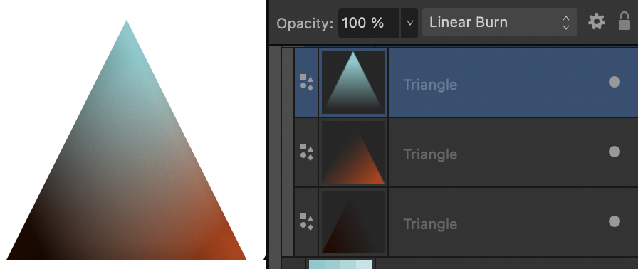
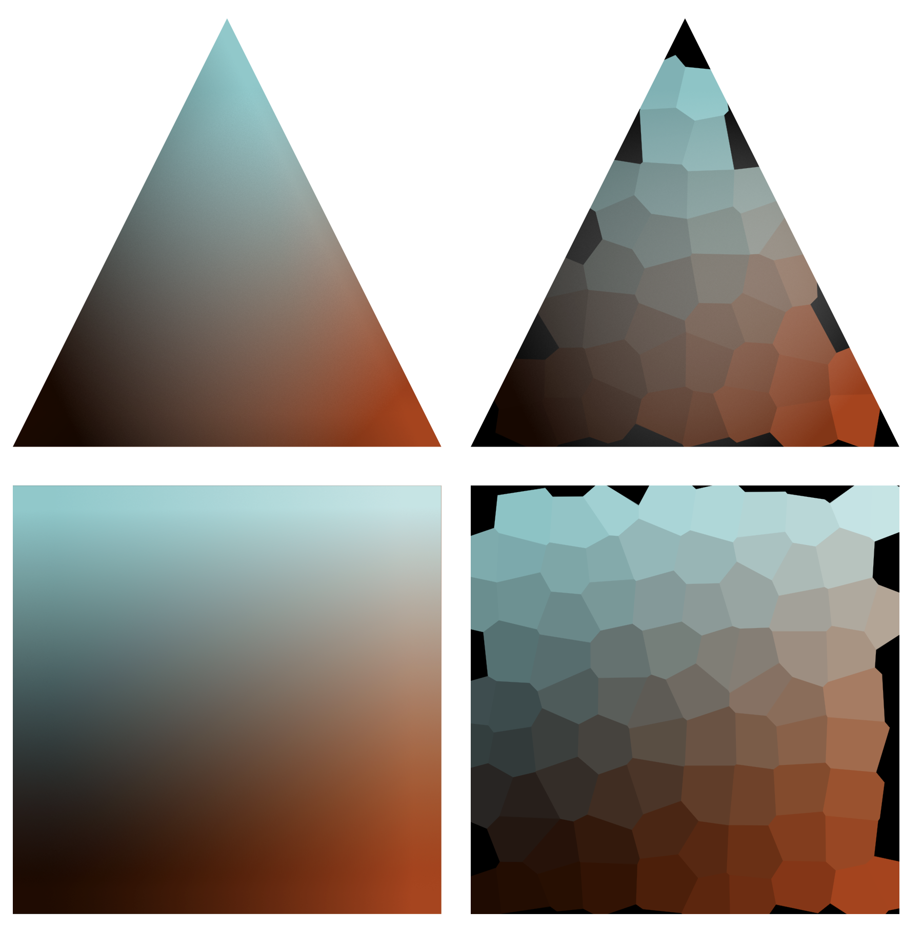
It's also possible to make use of the Voronoi filter in Affinity Photo to "posterize" the linear gradient into intermediate colors, like this middle image, but the result is irregular:
The built-in Gradient tool makes it easy to draw out a linear gradient between two stops. But three- and four-color gradient blends, conceived of as a plane between color points within a 3-D color space, have to be built by stacking gradient filled shapes set to the Linear Burn blend mode. For example:
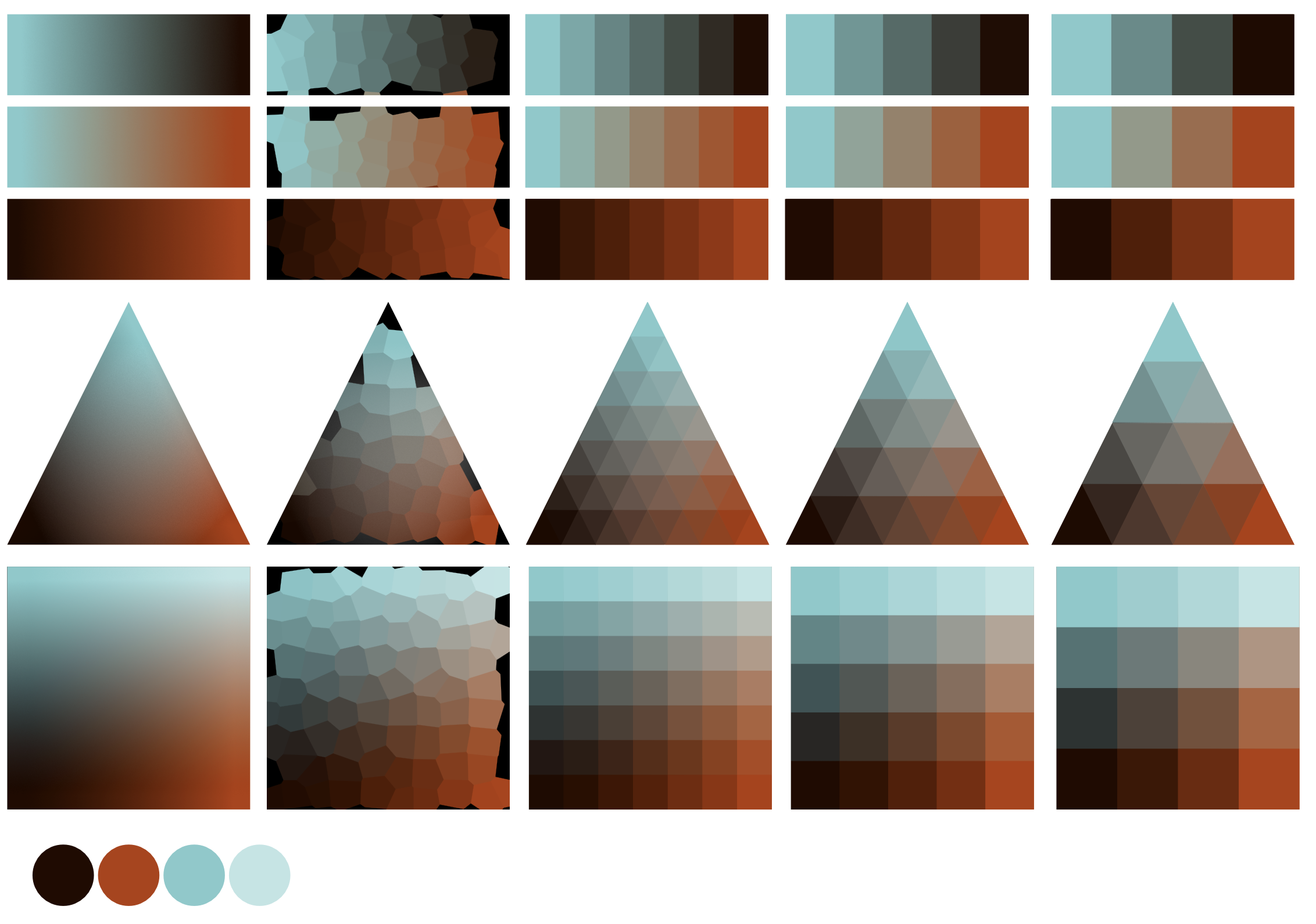
Again, one could then make use of the Voronoi filter from Affinity Photo to posterize three-color blends, and four-color blends like this:
But the effect of the Voronoi filter produces an irregular pattern, and it's laborious then to sample the results by hand to fill in regular shapes.
Is it possible for there to be a newly developed variation of the Voronoi filter that would produce perfect subdivisions of rectangles, triangles and squares for the purpose of generating 2-, 3-, and 4-color palette blends? Something like this:
Maybe the posterizing effect of the Voronoi filter gets built into a new color palette generating tool that allows designers to dynamically build 2-, 3-, or 4-color palette blends.
Maybe the new color palette generating feature gets its own panel. Maybe it presents as a modal dialogue box editing window.
The new feature should allow the designer to first indicate a 2-, 3- or 4-color blend, then to indicate the number of subdivisions in the blend (3 or more), and finally to specify the "anchor" colors at the extreme ends (or corners) of the blend shape. The new feature would present an image of the configured blend. At any time, the designer could change any of the "anchor" colors, and the color palette blend would dynamically update.
Once satisfied with the generated color palette blend, the designer could save the result as a document palette, or export it as a vector or raster image.
-
@bestman 8 Thanks. So, I suppose Photo releases the RAW file, and moves a "developed" copy into Photo persona as a new file. Is that correct?
-
Quick simple question here:
When one opens a RAW image file in Photo, makes adjustments, then clicks the develop button, what becomes of the original RAW file?
Do the adjustments made in the Developer mode "destructively" alter the RAW file, or is the original RAW file dismissed with a "developed" copy of the RAW transferred into the Photo profile as a new Affinity Photo file?
Maybe another way to state the question is this: If one wants to preserve the RAW file as shot, does one need to duplicate this RAW file before "developing" in Affinity Photo?
-
@R C-R , Thanks for the reply. I have not been able to reproduce the problem. Hopefully the experience was an anomaly. If the problem re-presents itself, I'll endeavor to document the circumstance and upload the problematic file.
– Mark
-
I've noticed clipping problems when using the vector Warp Group feature in Designer 2.5.5 for Mac OS. For example, if you push the value for Arc or Bend past a certain point, the artwork will become clipped at the bottom and the right. (See attachment.)
Is this a known bug? Is there a work-around solution?

-
I just became aware of OKLab and OKlch. Apparently both are now incorporated into the latest CSS specs.
OKlch is rapidly gaining popularity as a color model. OKlch is essentially a variant of CIE Lab wherein the abstract color components "a-opponent" and "b-opponent" are replaced with the more human readable color components of chroma (saturation), and hue.
OKlch improves upon the HSL color model by normalizing lightness values for colors with the same saturation and hue values. (Using the standard HSL model, a yellow and purple color sharing the same lightness (e.g., 50%) and saturation (e.g., 100%) will nevertheless show an apparent difference in lightness; whereas, using the OKlch model, that yellow and purple will display the exact same apparent lightness.)
Anyway, I'm sure the developers at Serif understand this and are aware. I would simply like to request that OKLab and OKlch color models be added to the Affinity suite.
-
-
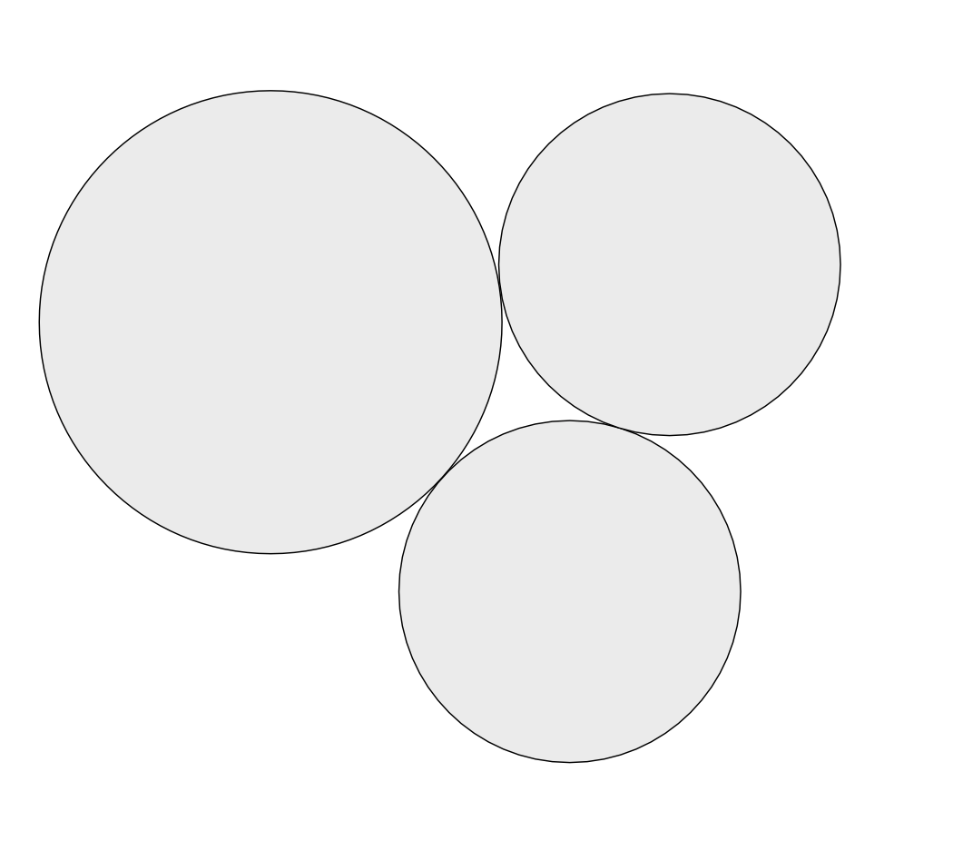
I'm here to request the ability to butt circles and other shapes up against one another with perfect snap alignment.
Whereas one can make use of geometry snapping to snap the anchor point of a curve to the circumference of a circle, one cannot (as far as I know) snap the circumference of one circle up against that of another circle.
How might one snap three circles together like those pictured below? Perfect tangential alignment.
-
It's close, but still produces small gaps for me. And then how does one achieve something like the arrangement below?
With anchor points, one can activate snapping to object geometry. But is there not something similar for butting shapes up against one another?
-
I'm wanting to perfectly align three circles with each other (no gaps or overlaps). Is there a way to get two or more circles to align at tangent points anywhere along the arc/circumference?
-
I've just attempted to use the Move Data Entry feature, asking a source object with an 8pt stroke to duplicate 5x to the left while scaling down at 80% with each step. I notice that while the object shape scales down, the stroke does not. (Strokes are set to scale with Object in the Transform panel.)
Is this a bug?
-
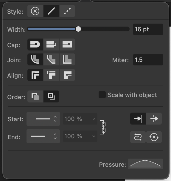
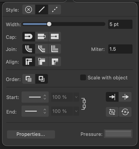
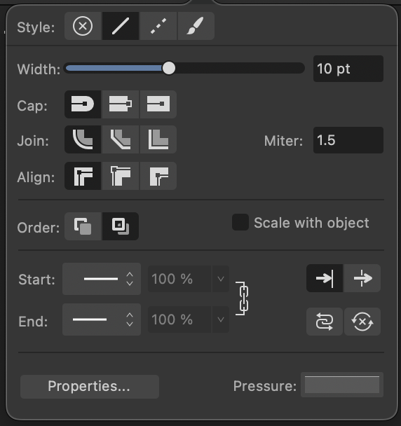
To follow up, attached below are the Stroke panels from Designer, Photo, and Publisher.
Photo's Stroke panel differs from Designer's Stroke panel by eliminating the "Textured Line Style" button at the top, and by eliminating the Properties button at the bottom. It makes sense. In Photo, raster brushes are segregated from simple vector strokes for curves and shapes. Because of this, simple Solid and Dashed Line Styles are not converted to brushes as they are in Designer, and the Pressure Curve applies correctly.
Publisher's Stroke panel lacks the "Texture Line Style" button seen in the Stroke panel for Designer, but it share's Designer's Properties button, which presents the same problem as seen in Designer: that simple "Solid Line Styles" get converted to "Textured Line Style" Vector Brushes if one should adjust the parameters of the Properties window.
Designer's Stroke panel has both the "Texture Line Style" button and the Properties button, which convert simple "Solid Line Style" strokes to Vector Brushes if one should adjust the parameters of the Properties window, or apply one of the Vector Brushes .
Proposed Solution: I feel there is a UI bug here to be corrected: there should be a simple way to convert a "Textured Line Style" Vector Brush (as applied to a curve or shape) back to a simple "Solid Line Style" stroke, responsive to Pressure Curves. That fix could be as simple as programming the "Solid Line Style" button to clear any Vector Brush "Textured Line Style" before re-applying a simple "Solid Line Style".
Photo Stroke Panel (Above)
Publisher Stroke Panel (Above)
Designer Stroke Panel (Above)
-
Hi @walt.farrell. Thanks for the reply.
Here are my observations:
- Once you open Properties and make a change to Brush Width, Size Variance, or Opacity Variance, you have permanently converted a simple stroke into some kind of Texture Brush controlled by the parameters of the Brush Options window.
- Once you apply a Vector Brush to a curve, it will forever remain a "Texture Line Style". There is no simple way (short of recreating the curve) to be able to get back to a simple "Solid Line Style" that is responsive to the Pressure Curve.
This seems like an interface bug to me.
-
I'm having trouble controlling the appearance of strokes from the Stroke panel. (I'm working with Designer 2.3.1 on an M3 iMac.)
- What exactly it the function of the Properties button in the Stroke panel?
- Why does a change to the Brush Options called up by the Properties button convert a "Solid Line Style" into a "Texture Line Style"?
- Why can one not convert a "Texture Line Style" from the Brushes panel back to a simple "Solid Line Style"?
- Are there Bugs here?
-
I begin with a Solid Line Style. If I draw an open curve with the Pen or Pencil tool, by default I get a solid line style with an assigned line width (e.g., 8 pt). No problem.
- I can taper the ends of the curve by editing the Pressure Curve in the Stroke panel. No problem.
- I can then use the width slider in the Stroke panel to increase the stroke width (e.g., to 12 pt), and the tapered ends from the Pressure Curve still apply. No Problem.
-
Odd things happen when I click the Properties button at the bottom of the Stroke panel, I get the Brush Options window where the Brush Width slider value does not correspond to the value of the Width slider at the top of the Stroke panel (e.g., 50 px vs. 12 pt). Is this a Bug/Problem?
- If I then adjust the Brush Width slider in the Brush Options window (e.g., from 50 px to 30 px), the taper effect of the Pressure Curve vanishes. It only returns if I now increase the Size Variance slider in the Brush Options window from 0% to 100%. Is this a Bug/Problem?
- Also, I notice that if I change the default value of the Brush Width slider in the Brush Options window, the Line Style option button at the top of the Stroke panel switches from "Solid Line Style" to "Texture Line Style". Is this normal?
-
If I begin with an 8 pt curve and then apply a Vector Brush from the Brushes Panel, I have a different experience.
- The value of the Width slider in the Stroke panel immediately changes to a larger value, and the Pressure Curve seems to apply to whatever Size Variance and Opacity Variance values are recorded with the specific Vector Brush. Is that normal?
- If I then select the "Solid Line Style" option at the top of the Stroke panel, I'm surprised to find that the curve does not lose the textured image of the Vector Brush. It seems that once a Vector Brush is applied to a curve, there is no way to convert the line style back to a simple black stroke of, say, 8 pts. Is this a Bug/Problem?
- How does one replace a Vector Brush with a simple solid Stroke?
-
@Rodi If one is doing layout for a document intended to go to press, printed by an offset press, one would set up the document from the beginning as a CMYK document. And in that case, by default, any type that one sets will adopt a process black color.
As for images/artwork to be placed into the layout of the CMYK document, you have options in development: a) for a pure CMYK workflow (press only) you could elect to build your images in CMYK; b) for a hybrid workflow (output to video, web, and press) you should build your images in a larger RGB color space, and then export final versions for the appropriate output color space.
-
@Lolalam Regarding your workflow, I would recommend a simple strategy:
Build / develop your images in the standard sRGB color space. From there, you can export to the same sRGB color space for web images, or to CMYK using the U.S. Web Coated SWOP v2 color profile. That should be your default.
If you want finer control, and you have a close working relationship with a printer, you might inquire whether or not that printer has specific recommendations for exported files.
-
On 3/2/2023 at 8:29 PM, Lolalam said:
2. i also am confused between RGB/8, RGB/16, I think there's even an RGB/24? then there's CMYK/8. What are their differences and similarities?
@Lolalam The numbers there indicate bit depth per color channel (i.e., how finely subdivided the range of values is for each color channel).
RGB/8 indicates that the dynamic range of color in your document it limited to 8 bits per color channel. In other words, for every pixel, the Red channel is capable of showing 256 levels of brightness. Same goes for the Green and Blue channels.
RGB/16 indicates that the dynamic range of color offers a more finely subdivided range of values, limited to 16 bits per color channel. Here, for every pixel, the Red channel is capable of showing 65,536 levels of brightness. Same goes for the Green and Blue channels.
Unless you are working on a high end display, and intend to display the final work on a high end display, it's not necessary to worry about these bit depths. Keep it simple: stick to RGB/8 and CMYK/8.
-
On 3/2/2023 at 8:29 PM, Lolalam said:
1. what is the difference and/or similarities between RGB and sRGB? i think i'm using rgb on my practice works but if i have a real client, i might have to switch or convert from rgb to srgb and vice versa.
@Lolalam RGB is simply an acronym for the additive color model wherein the colors of electronic displays (like you smart phone, desktop computer, or television) are described by mixtures of Red, Green, and Blue light contributions. Red + Green makes Yellow. Green + Blue makes Cyan. Blue + Red makes Magenta. The presence of Red, Green and Blue at full strength makes White. The total absence of Red, Green and Blue makes Black.
Not all electronic displays are capable of displaying the entire range (or gamut) of colors the human eye can perceive. Various electronic displays are capable of displaying a specific subset of the full range (or gamut) of visible color. Manufacturers measure and describe the range or gamut of color their displays are capable of reproducing, and the industry has developed names for these measurable color gamuts. These named color gamuts are also known as color spaces. sRGB is one such color space. sRGB does not offer the largest color gamut, but is considered to be the most common color space across the world of electronic displays. So, it's a standard RGB color space that most content creators target for images that need to be displayed as widely as possible.
Adobe RGB and ROMM RGB are much larger RGB color spaces. Some prefer to work in these larger color spaces at the beginning of their design/development workflows to preserve maximum color gamut before exporting out versions for print (CMYK) and web (sRGB), which are smaller color spaces.
When in doubt, keep things simple: build your images in sRGB. That way you're already in the correct color space for the web, and you can always export out a version for print in the smaller CMYK color space.
-
Ah. Yes. It makes sense that the auto-generated TOC paragraphs styles should not be duplicated – only modified.
But then the inability to specify a custom leader line character or pattern remains. Hopefully this comes to the attention of the Serif staff.
-
I've been working through Help files for Publisher 2.0.3, and have discovered a few problems:
- I'm unable to duplicate the auto-generated TOC Character and Paragraph styles. Is this by design?
- I'm unable to enter a custom character or character pattern for leader lines in the TOC Paragraph styles dialogue box. I'm limited to a period, underscore, or strikethrough.


Too quiet …
in Feedback for the Affinity V2 Suite of Products
Posted
The 2.6 update seemed to be that last product of the original Serif team. Feels as though it was already in the pipeline. Canva gets no credit for that.
Here’s why the poor comms from Canva are so worrying: software platforms are subject to the network effect that locks the market share winner into a dominant position. Users want and need an industry standard. Adobe has/had that position, though they made themselves vulnerable to challengers because of their odious subscription business model and abusive treatment of their captured users. Affinity had been gaining ground as a challenger to Adobe, but seemed to have hit a brick wall and felt compelled to sell out to Canva, purportedly for the financing and larger dev teams needed to continue the push to steal market share from Adobe. But Canva has dropped the ball in terms of comms and aggressive product marketing.
Can the Affinity Suite 2.6 survive as a niche product for individual creatives, hobbyists, and architectural offices? Maybe. But in the meantime, all the market chat and energy revolves around the old incumbent, Adobe, and the latest challengers, Figma and Framer.