

VectorWhiz
-
Posts
453 -
Joined
-
Last visited
Reputation Activity
-

 VectorWhiz got a reaction from Berthof in Crystal Reed vector portrait
Vector portrait of Crystal Reed as Sophia Falcone in Gotham, created in Affinity Designer. Update sequence and more info about how things are done can be seen in my portfolio blog:
https://communicats.blogspot.com/2019/05/crystal-reed-100-vector-portrait.html
and in my website:
https://vectorwhiz.com/Vector.html
Vector outline view
-
 VectorWhiz got a reaction from dannyg9 in Crystal Reed vector portrait
Vector portrait of Crystal Reed as Sophia Falcone in Gotham, created in Affinity Designer. Update sequence and more info about how things are done can be seen in my portfolio blog:
https://communicats.blogspot.com/2019/05/crystal-reed-100-vector-portrait.html
and in my website:
https://vectorwhiz.com/Vector.html
Vector outline view
-
 VectorWhiz got a reaction from CJRM in Crystal Reed vector portrait
Vector portrait of Crystal Reed as Sophia Falcone in Gotham, created in Affinity Designer. Update sequence and more info about how things are done can be seen in my portfolio blog:
https://communicats.blogspot.com/2019/05/crystal-reed-100-vector-portrait.html
and in my website:
https://vectorwhiz.com/Vector.html
Vector outline view
-
 VectorWhiz got a reaction from Hilltop in How to create a preliminary study for a 100% vector drawing
In this tutorial I offer an oversight of how I prepared a preliminary study, from which I will make a 100% vector drawing in the future, hopefully not too long from now (February 13 2022). I used 3 different photos from which I combined parts, that were clipped in Affinity Designer, that serve to extract the parts of the photo that I need in my composition. In addition I used a horse that I drew in vectors before starting this project. So in the foreground of this study there are 4 components:
The falconer The falcon The falconer's right hand The horse
Of course there is a 5th component - the background - as well, but that may change over time. In this blog entry I will focus on how the first 4 components were made.
1. The falconer
In the image below you see the original photo on the left side and the falconer that I extracted from this image.
Clipping of the falconer in Affinity Designer
I traced the photo with the Pen-tool (the red outline around the falconer) and clipped it inside the traced curve that I drew, which resulted in the part of the image above on the right side.
2. The falcon
In the image below you see the original photo on the left part of the image and the falcon that I extracted from this image on the part to the right.
Clipping, flipping and rotating of the falcon
I traced the falcon with the Pen-tool, drawing the curve that has a red outline and clipped the photo inside of it, leaving just the falcon visible. I flipped the clipped falcon horizontally and slightly rotated it in an anti clockwise manner.
3. The falconer's right hand
Since the composition I had in mind needed the falconer's right hand, that was not available in the photographs shown above, I had to clip the right hand from yet an other photo. Below you see the photo from which the hand was clipped in a way analog to the clippings in the previous paragraphs.
Clipping of the falconer's right hand
Again, I traced the falconer's right hand in the photo above with the Pen-tool, which resulted in the image on the right side of the photo. I shows the talons of the falcon's left foot, which are in the proper position for the composition.
4. The horse
Below you see the images of the vector horse that had already drawn a while ago. In the left half of the image the rendered view is shown, while the outline view is in the right half of the image.
The rendered (on the left) and outline (on the right) views of the vector horse
In the composition of the preliminary study, the horse is slightly tilted clockwise to obtain a balanced composition. In the ultimate vector drawing parts of the image will be embedded, because working in such a way speeds up the drawing proces, especially if one has a crappy graphic card, like me. The preliminary study composition
Below you see the composition of the study that will be used to create the vector drawing. In the end not a single pixel will be contained within the image; it will be a 100% vector drawing.
The composition of the preliminary study image
Why make the image a vector painting? In a vector painting objects can be made to stand out relative to each other and to the background in a much easier way than is possible with pixel images. This is done by applying a certain sharpness to the object, by changing its colour, hue, contrast, transparency and lightness, which will only be applied to that particular object. Objects can also easily be resized, flipped and rotated than in pixel art. This also is possible afterwards, when artists want to change the appearance of the image at a later point in time. It means that an image can be manipulated more precisely and more to the artist's liking than is possible with pixel images. Besides that of course a vector image can be re-scaled to any size without losing quality. Working with vector images may in some cases require more time than working with pixel images, but it gives the artist more freedom to make changes. Vector working methods Unlike most artists do, this reference image will be placed on top of the Artboard in the Layers panel in which I will draw the parts of the vector painting. This reference image will be made transparent, so that it is just visible and can be turned on and off at any time, its position in the Layers-panel saving me from having to find it each time it needs to turned on or off. Particularly when having loads of curves (I expect to need hundreds to give the vector image a realistic look) in the Layer-panel, this can be a real time saver. The image parts will be embedded in the main drawing, which is a working method that also saves time, because each of the embedded drawing files are smaller than the main file, which means they will load, render and save / export faster. This process basically describes my working method when making a study from which the final drawing will be made. I hope to begin drawing not too long after this, so check in regularly if you want to see the progress sequence of the various stages in a future blog entry.
To see the results of realistic vector art that I drew previously, in which I used a similar drawing method, please visit this page of my website. This tutorial was originally placed in my portfolio blog.
-
 VectorWhiz got a reaction from BobMoyer in How to create a preliminary study for a 100% vector drawing
In this tutorial I offer an oversight of how I prepared a preliminary study, from which I will make a 100% vector drawing in the future, hopefully not too long from now (February 13 2022). I used 3 different photos from which I combined parts, that were clipped in Affinity Designer, that serve to extract the parts of the photo that I need in my composition. In addition I used a horse that I drew in vectors before starting this project. So in the foreground of this study there are 4 components:
The falconer The falcon The falconer's right hand The horse
Of course there is a 5th component - the background - as well, but that may change over time. In this blog entry I will focus on how the first 4 components were made.
1. The falconer
In the image below you see the original photo on the left side and the falconer that I extracted from this image.
Clipping of the falconer in Affinity Designer
I traced the photo with the Pen-tool (the red outline around the falconer) and clipped it inside the traced curve that I drew, which resulted in the part of the image above on the right side.
2. The falcon
In the image below you see the original photo on the left part of the image and the falcon that I extracted from this image on the part to the right.
Clipping, flipping and rotating of the falcon
I traced the falcon with the Pen-tool, drawing the curve that has a red outline and clipped the photo inside of it, leaving just the falcon visible. I flipped the clipped falcon horizontally and slightly rotated it in an anti clockwise manner.
3. The falconer's right hand
Since the composition I had in mind needed the falconer's right hand, that was not available in the photographs shown above, I had to clip the right hand from yet an other photo. Below you see the photo from which the hand was clipped in a way analog to the clippings in the previous paragraphs.
Clipping of the falconer's right hand
Again, I traced the falconer's right hand in the photo above with the Pen-tool, which resulted in the image on the right side of the photo. I shows the talons of the falcon's left foot, which are in the proper position for the composition.
4. The horse
Below you see the images of the vector horse that had already drawn a while ago. In the left half of the image the rendered view is shown, while the outline view is in the right half of the image.
The rendered (on the left) and outline (on the right) views of the vector horse
In the composition of the preliminary study, the horse is slightly tilted clockwise to obtain a balanced composition. In the ultimate vector drawing parts of the image will be embedded, because working in such a way speeds up the drawing proces, especially if one has a crappy graphic card, like me. The preliminary study composition
Below you see the composition of the study that will be used to create the vector drawing. In the end not a single pixel will be contained within the image; it will be a 100% vector drawing.
The composition of the preliminary study image
Why make the image a vector painting? In a vector painting objects can be made to stand out relative to each other and to the background in a much easier way than is possible with pixel images. This is done by applying a certain sharpness to the object, by changing its colour, hue, contrast, transparency and lightness, which will only be applied to that particular object. Objects can also easily be resized, flipped and rotated than in pixel art. This also is possible afterwards, when artists want to change the appearance of the image at a later point in time. It means that an image can be manipulated more precisely and more to the artist's liking than is possible with pixel images. Besides that of course a vector image can be re-scaled to any size without losing quality. Working with vector images may in some cases require more time than working with pixel images, but it gives the artist more freedom to make changes. Vector working methods Unlike most artists do, this reference image will be placed on top of the Artboard in the Layers panel in which I will draw the parts of the vector painting. This reference image will be made transparent, so that it is just visible and can be turned on and off at any time, its position in the Layers-panel saving me from having to find it each time it needs to turned on or off. Particularly when having loads of curves (I expect to need hundreds to give the vector image a realistic look) in the Layer-panel, this can be a real time saver. The image parts will be embedded in the main drawing, which is a working method that also saves time, because each of the embedded drawing files are smaller than the main file, which means they will load, render and save / export faster. This process basically describes my working method when making a study from which the final drawing will be made. I hope to begin drawing not too long after this, so check in regularly if you want to see the progress sequence of the various stages in a future blog entry.
To see the results of realistic vector art that I drew previously, in which I used a similar drawing method, please visit this page of my website. This tutorial was originally placed in my portfolio blog.
-
 VectorWhiz got a reaction from Alfred in How to create a preliminary study for a 100% vector drawing
In this tutorial I offer an oversight of how I prepared a preliminary study, from which I will make a 100% vector drawing in the future, hopefully not too long from now (February 13 2022). I used 3 different photos from which I combined parts, that were clipped in Affinity Designer, that serve to extract the parts of the photo that I need in my composition. In addition I used a horse that I drew in vectors before starting this project. So in the foreground of this study there are 4 components:
The falconer The falcon The falconer's right hand The horse
Of course there is a 5th component - the background - as well, but that may change over time. In this blog entry I will focus on how the first 4 components were made.
1. The falconer
In the image below you see the original photo on the left side and the falconer that I extracted from this image.
Clipping of the falconer in Affinity Designer
I traced the photo with the Pen-tool (the red outline around the falconer) and clipped it inside the traced curve that I drew, which resulted in the part of the image above on the right side.
2. The falcon
In the image below you see the original photo on the left part of the image and the falcon that I extracted from this image on the part to the right.
Clipping, flipping and rotating of the falcon
I traced the falcon with the Pen-tool, drawing the curve that has a red outline and clipped the photo inside of it, leaving just the falcon visible. I flipped the clipped falcon horizontally and slightly rotated it in an anti clockwise manner.
3. The falconer's right hand
Since the composition I had in mind needed the falconer's right hand, that was not available in the photographs shown above, I had to clip the right hand from yet an other photo. Below you see the photo from which the hand was clipped in a way analog to the clippings in the previous paragraphs.
Clipping of the falconer's right hand
Again, I traced the falconer's right hand in the photo above with the Pen-tool, which resulted in the image on the right side of the photo. I shows the talons of the falcon's left foot, which are in the proper position for the composition.
4. The horse
Below you see the images of the vector horse that had already drawn a while ago. In the left half of the image the rendered view is shown, while the outline view is in the right half of the image.
The rendered (on the left) and outline (on the right) views of the vector horse
In the composition of the preliminary study, the horse is slightly tilted clockwise to obtain a balanced composition. In the ultimate vector drawing parts of the image will be embedded, because working in such a way speeds up the drawing proces, especially if one has a crappy graphic card, like me. The preliminary study composition
Below you see the composition of the study that will be used to create the vector drawing. In the end not a single pixel will be contained within the image; it will be a 100% vector drawing.
The composition of the preliminary study image
Why make the image a vector painting? In a vector painting objects can be made to stand out relative to each other and to the background in a much easier way than is possible with pixel images. This is done by applying a certain sharpness to the object, by changing its colour, hue, contrast, transparency and lightness, which will only be applied to that particular object. Objects can also easily be resized, flipped and rotated than in pixel art. This also is possible afterwards, when artists want to change the appearance of the image at a later point in time. It means that an image can be manipulated more precisely and more to the artist's liking than is possible with pixel images. Besides that of course a vector image can be re-scaled to any size without losing quality. Working with vector images may in some cases require more time than working with pixel images, but it gives the artist more freedom to make changes. Vector working methods Unlike most artists do, this reference image will be placed on top of the Artboard in the Layers panel in which I will draw the parts of the vector painting. This reference image will be made transparent, so that it is just visible and can be turned on and off at any time, its position in the Layers-panel saving me from having to find it each time it needs to turned on or off. Particularly when having loads of curves (I expect to need hundreds to give the vector image a realistic look) in the Layer-panel, this can be a real time saver. The image parts will be embedded in the main drawing, which is a working method that also saves time, because each of the embedded drawing files are smaller than the main file, which means they will load, render and save / export faster. This process basically describes my working method when making a study from which the final drawing will be made. I hope to begin drawing not too long after this, so check in regularly if you want to see the progress sequence of the various stages in a future blog entry.
To see the results of realistic vector art that I drew previously, in which I used a similar drawing method, please visit this page of my website. This tutorial was originally placed in my portfolio blog.
-
 VectorWhiz got a reaction from StuartRc in How to create a preliminary study for a 100% vector drawing
In this tutorial I offer an oversight of how I prepared a preliminary study, from which I will make a 100% vector drawing in the future, hopefully not too long from now (February 13 2022). I used 3 different photos from which I combined parts, that were clipped in Affinity Designer, that serve to extract the parts of the photo that I need in my composition. In addition I used a horse that I drew in vectors before starting this project. So in the foreground of this study there are 4 components:
The falconer The falcon The falconer's right hand The horse
Of course there is a 5th component - the background - as well, but that may change over time. In this blog entry I will focus on how the first 4 components were made.
1. The falconer
In the image below you see the original photo on the left side and the falconer that I extracted from this image.
Clipping of the falconer in Affinity Designer
I traced the photo with the Pen-tool (the red outline around the falconer) and clipped it inside the traced curve that I drew, which resulted in the part of the image above on the right side.
2. The falcon
In the image below you see the original photo on the left part of the image and the falcon that I extracted from this image on the part to the right.
Clipping, flipping and rotating of the falcon
I traced the falcon with the Pen-tool, drawing the curve that has a red outline and clipped the photo inside of it, leaving just the falcon visible. I flipped the clipped falcon horizontally and slightly rotated it in an anti clockwise manner.
3. The falconer's right hand
Since the composition I had in mind needed the falconer's right hand, that was not available in the photographs shown above, I had to clip the right hand from yet an other photo. Below you see the photo from which the hand was clipped in a way analog to the clippings in the previous paragraphs.
Clipping of the falconer's right hand
Again, I traced the falconer's right hand in the photo above with the Pen-tool, which resulted in the image on the right side of the photo. I shows the talons of the falcon's left foot, which are in the proper position for the composition.
4. The horse
Below you see the images of the vector horse that had already drawn a while ago. In the left half of the image the rendered view is shown, while the outline view is in the right half of the image.
The rendered (on the left) and outline (on the right) views of the vector horse
In the composition of the preliminary study, the horse is slightly tilted clockwise to obtain a balanced composition. In the ultimate vector drawing parts of the image will be embedded, because working in such a way speeds up the drawing proces, especially if one has a crappy graphic card, like me. The preliminary study composition
Below you see the composition of the study that will be used to create the vector drawing. In the end not a single pixel will be contained within the image; it will be a 100% vector drawing.
The composition of the preliminary study image
Why make the image a vector painting? In a vector painting objects can be made to stand out relative to each other and to the background in a much easier way than is possible with pixel images. This is done by applying a certain sharpness to the object, by changing its colour, hue, contrast, transparency and lightness, which will only be applied to that particular object. Objects can also easily be resized, flipped and rotated than in pixel art. This also is possible afterwards, when artists want to change the appearance of the image at a later point in time. It means that an image can be manipulated more precisely and more to the artist's liking than is possible with pixel images. Besides that of course a vector image can be re-scaled to any size without losing quality. Working with vector images may in some cases require more time than working with pixel images, but it gives the artist more freedom to make changes. Vector working methods Unlike most artists do, this reference image will be placed on top of the Artboard in the Layers panel in which I will draw the parts of the vector painting. This reference image will be made transparent, so that it is just visible and can be turned on and off at any time, its position in the Layers-panel saving me from having to find it each time it needs to turned on or off. Particularly when having loads of curves (I expect to need hundreds to give the vector image a realistic look) in the Layer-panel, this can be a real time saver. The image parts will be embedded in the main drawing, which is a working method that also saves time, because each of the embedded drawing files are smaller than the main file, which means they will load, render and save / export faster. This process basically describes my working method when making a study from which the final drawing will be made. I hope to begin drawing not too long after this, so check in regularly if you want to see the progress sequence of the various stages in a future blog entry.
To see the results of realistic vector art that I drew previously, in which I used a similar drawing method, please visit this page of my website. This tutorial was originally placed in my portfolio blog.
-
 VectorWhiz got a reaction from zaflemos in Camouflage II [Vector]
Absolutely agree! Vector brushes are almost infinitely editable, which is great for vector portraits and other images that have organic aspects. The standard hard edges of vector objects can be blurred subtly (adding scale with object), which gives them an appearance that makes them indistinguishable from (more realistic) pixel art. The editable fx and colour gradient tool allow to tinker until the desired effect is achieved. I was never able to create such properties in AI or CorelDRAW. Inkscape came close, but its UI has a rather mind bending learning curve. Also, if gradients and / or transparency of an object is in more than one direction I simply duplicate the object, apply the desired gradient (that is in a different direction) and apply a transparency to the part of the object that isn't needed (sometimes tinkering with the object filter in the Layers panel and applying a gaussian blur). It is far more efficient than mesh colouring and far easier editable afterward, which is a huge time saver compared to the tedious mesh colouring. All this makes AD the very best vector program available and all that for a price that the competition is unable to match!
-
 VectorWhiz got a reaction from Richard Fillebrown in Personal crest
My personal crest created in Affinity Designer and Photo. Brief tutorial on how to draw non-linear texture (the snakes's scales) at: https://communicats.blogspot.com/2021/12/creating-my-personal-crest-in-affinity.html
-
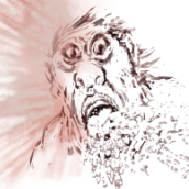
 VectorWhiz got a reaction from Rudolphus in How to avoid hard edges in vector portraits
In the images below cartoonish vector portraits of Rock & Roll legend Elvis Presley can be seen. This image was created in Affinity Designer. After having worked with Adobe Illustrator professionally, CorelDRAW privately and Inkscape occasionally for decades, I have come to the conclusion that Affinity Designer is better suited to create vector portraits that do not have hard edges in the face, even if it does not include the Mesh Fill function, that is very time consuming and tedious to work with. The drawing and editing process - particularly when editing the drawing at a later point in time - in this program takes far less time and effort. Progress sequence of the portrait on the right can be seen in an other blog entry: https://communicats.blogspot.com/2020/07/this-is-other-vector-portrait-of-elvis.html?fbclid=IwAR1Yp4CNvlXspX1W_S5LV5Q0UzM1sWsn_TibSegexxHwWyH6C7ayKQ3LJG4
The image below this paragraph is a screen dump of the vector outline of the double portrait. Extensive use was made of Affinity Designers Gaussian blur function, which allows to avoid hard edges in the facial features, as are often seen in vector portraits created in Adobe Illustrator. Many of the curves with which areas on the face were drawn are made by applying multiple node gradient fills and gradient transparency. This method allows to quickly edit (also afterwards) of the drawing which is much faster than while using mesh gradient fill tool that isn't present in Affinity Designer. Personally, I don't miss it. A brilliant Russian artist who works with mesh fills in CorelDRAW once revealed that it took him months to draw a vector portrait, while it is possible in Affinity Designer to make the same effect in much less time. I used CorelDRAW for many years, but only after accidentally running across Affinity Designer I was able to create realistic vector portraits a lot quicker, while making editing afterwards easier and faster. Examples of (more) realistic vector portraits and illustrations can be found in my website at: https://vectorwhiz.com/Vector.html To create (gradient) tints and blurs in the facial area of a vector portrait, it often is necessary to draw curves that have a variable level of blur along their edges, meaning that some edge parts are just slightly unsharp, while other parts are blurred and yet other parts are very blurry. To achieve this effect, I apply the following technique that is below this paragraph: In these vector portraits a Gaussian blur trick was applied in Affinity Designer, as can be seen in the third image. Ellipse 3 is clipped inside Circle 2 and circle 2 is clipped inside circle 1. In the image below you see, Circle 1 is transparent, the other two objects are opaque. Circle 1 has a minimal blur rate, Circle 2 has a higher blur rate and Ellipse 3 has the highest blur rate. The result of these settings are that circle one has an unsharp edge, circle 2 has a blurred edge to the left and an unsharp one to the right, while Ellipse 3 has a very blurry edge on the left and a less blurred towards the right. The blur values are indicated in the third image. The circle with the dotted line only serves to indicate the position and size of Circle 1 that is completely transparent, slightly blurred and used to clip the other objects. In the image below the Layer panel is shown containing the hierarchy of the objects in the image above this paragraph. Objects that are indented to the right are clipped inside the ones above them. The object names correspond with those in the Example drawing. The circles and ellipse are at the bottom of the panel. The objects marked with an 'A' thumbnail refer to the text in the Example drawing. In addition all parts can be given a colour gradient and gradient transparency, all settings that are independently editable of the ones described above this paragraph. In doing so the annoying hard edges of shadows in the face of a vector portrait can be avoided that are almost always seen in vector portraits created in Adobe Illustrator. Affinity Designer allows to create more realistic vector portraits in a much easier way that vector portraits created with the mesh fill function. The added benefit of working in this way is that at a later point in time all the parameters can be edited and tweaked to the preference of the vector portrait artist. Working in vectors with this method allows to resize the portrait without any loss of quality. Of course this technique can be applied to any shape you can draw, not just to circles and ellipses, that I used in the example above, as can be seen in the completed vector double portrait at the top of this blog entry and the vector outline view screen dump below it.
-
 VectorWhiz got a reaction from NotMyFault in How to avoid hard edges in vector portraits
In the images below cartoonish vector portraits of Rock & Roll legend Elvis Presley can be seen. This image was created in Affinity Designer. After having worked with Adobe Illustrator professionally, CorelDRAW privately and Inkscape occasionally for decades, I have come to the conclusion that Affinity Designer is better suited to create vector portraits that do not have hard edges in the face, even if it does not include the Mesh Fill function, that is very time consuming and tedious to work with. The drawing and editing process - particularly when editing the drawing at a later point in time - in this program takes far less time and effort. Progress sequence of the portrait on the right can be seen in an other blog entry: https://communicats.blogspot.com/2020/07/this-is-other-vector-portrait-of-elvis.html?fbclid=IwAR1Yp4CNvlXspX1W_S5LV5Q0UzM1sWsn_TibSegexxHwWyH6C7ayKQ3LJG4
The image below this paragraph is a screen dump of the vector outline of the double portrait. Extensive use was made of Affinity Designers Gaussian blur function, which allows to avoid hard edges in the facial features, as are often seen in vector portraits created in Adobe Illustrator. Many of the curves with which areas on the face were drawn are made by applying multiple node gradient fills and gradient transparency. This method allows to quickly edit (also afterwards) of the drawing which is much faster than while using mesh gradient fill tool that isn't present in Affinity Designer. Personally, I don't miss it. A brilliant Russian artist who works with mesh fills in CorelDRAW once revealed that it took him months to draw a vector portrait, while it is possible in Affinity Designer to make the same effect in much less time. I used CorelDRAW for many years, but only after accidentally running across Affinity Designer I was able to create realistic vector portraits a lot quicker, while making editing afterwards easier and faster. Examples of (more) realistic vector portraits and illustrations can be found in my website at: https://vectorwhiz.com/Vector.html To create (gradient) tints and blurs in the facial area of a vector portrait, it often is necessary to draw curves that have a variable level of blur along their edges, meaning that some edge parts are just slightly unsharp, while other parts are blurred and yet other parts are very blurry. To achieve this effect, I apply the following technique that is below this paragraph: In these vector portraits a Gaussian blur trick was applied in Affinity Designer, as can be seen in the third image. Ellipse 3 is clipped inside Circle 2 and circle 2 is clipped inside circle 1. In the image below you see, Circle 1 is transparent, the other two objects are opaque. Circle 1 has a minimal blur rate, Circle 2 has a higher blur rate and Ellipse 3 has the highest blur rate. The result of these settings are that circle one has an unsharp edge, circle 2 has a blurred edge to the left and an unsharp one to the right, while Ellipse 3 has a very blurry edge on the left and a less blurred towards the right. The blur values are indicated in the third image. The circle with the dotted line only serves to indicate the position and size of Circle 1 that is completely transparent, slightly blurred and used to clip the other objects. In the image below the Layer panel is shown containing the hierarchy of the objects in the image above this paragraph. Objects that are indented to the right are clipped inside the ones above them. The object names correspond with those in the Example drawing. The circles and ellipse are at the bottom of the panel. The objects marked with an 'A' thumbnail refer to the text in the Example drawing. In addition all parts can be given a colour gradient and gradient transparency, all settings that are independently editable of the ones described above this paragraph. In doing so the annoying hard edges of shadows in the face of a vector portrait can be avoided that are almost always seen in vector portraits created in Adobe Illustrator. Affinity Designer allows to create more realistic vector portraits in a much easier way that vector portraits created with the mesh fill function. The added benefit of working in this way is that at a later point in time all the parameters can be edited and tweaked to the preference of the vector portrait artist. Working in vectors with this method allows to resize the portrait without any loss of quality. Of course this technique can be applied to any shape you can draw, not just to circles and ellipses, that I used in the example above, as can be seen in the completed vector double portrait at the top of this blog entry and the vector outline view screen dump below it.
-
VectorWhiz got a reaction from BobMoyer in How to avoid hard edges in vector portraits
In the images below cartoonish vector portraits of Rock & Roll legend Elvis Presley can be seen. This image was created in Affinity Designer. After having worked with Adobe Illustrator professionally, CorelDRAW privately and Inkscape occasionally for decades, I have come to the conclusion that Affinity Designer is better suited to create vector portraits that do not have hard edges in the face, even if it does not include the Mesh Fill function, that is very time consuming and tedious to work with. The drawing and editing process - particularly when editing the drawing at a later point in time - in this program takes far less time and effort. Progress sequence of the portrait on the right can be seen in an other blog entry: https://communicats.blogspot.com/2020/07/this-is-other-vector-portrait-of-elvis.html?fbclid=IwAR1Yp4CNvlXspX1W_S5LV5Q0UzM1sWsn_TibSegexxHwWyH6C7ayKQ3LJG4
The image below this paragraph is a screen dump of the vector outline of the double portrait. Extensive use was made of Affinity Designers Gaussian blur function, which allows to avoid hard edges in the facial features, as are often seen in vector portraits created in Adobe Illustrator. Many of the curves with which areas on the face were drawn are made by applying multiple node gradient fills and gradient transparency. This method allows to quickly edit (also afterwards) of the drawing which is much faster than while using mesh gradient fill tool that isn't present in Affinity Designer. Personally, I don't miss it. A brilliant Russian artist who works with mesh fills in CorelDRAW once revealed that it took him months to draw a vector portrait, while it is possible in Affinity Designer to make the same effect in much less time. I used CorelDRAW for many years, but only after accidentally running across Affinity Designer I was able to create realistic vector portraits a lot quicker, while making editing afterwards easier and faster. Examples of (more) realistic vector portraits and illustrations can be found in my website at: https://vectorwhiz.com/Vector.html To create (gradient) tints and blurs in the facial area of a vector portrait, it often is necessary to draw curves that have a variable level of blur along their edges, meaning that some edge parts are just slightly unsharp, while other parts are blurred and yet other parts are very blurry. To achieve this effect, I apply the following technique that is below this paragraph: In these vector portraits a Gaussian blur trick was applied in Affinity Designer, as can be seen in the third image. Ellipse 3 is clipped inside Circle 2 and circle 2 is clipped inside circle 1. In the image below you see, Circle 1 is transparent, the other two objects are opaque. Circle 1 has a minimal blur rate, Circle 2 has a higher blur rate and Ellipse 3 has the highest blur rate. The result of these settings are that circle one has an unsharp edge, circle 2 has a blurred edge to the left and an unsharp one to the right, while Ellipse 3 has a very blurry edge on the left and a less blurred towards the right. The blur values are indicated in the third image. The circle with the dotted line only serves to indicate the position and size of Circle 1 that is completely transparent, slightly blurred and used to clip the other objects. In the image below the Layer panel is shown containing the hierarchy of the objects in the image above this paragraph. Objects that are indented to the right are clipped inside the ones above them. The object names correspond with those in the Example drawing. The circles and ellipse are at the bottom of the panel. The objects marked with an 'A' thumbnail refer to the text in the Example drawing. In addition all parts can be given a colour gradient and gradient transparency, all settings that are independently editable of the ones described above this paragraph. In doing so the annoying hard edges of shadows in the face of a vector portrait can be avoided that are almost always seen in vector portraits created in Adobe Illustrator. Affinity Designer allows to create more realistic vector portraits in a much easier way that vector portraits created with the mesh fill function. The added benefit of working in this way is that at a later point in time all the parameters can be edited and tweaked to the preference of the vector portrait artist. Working in vectors with this method allows to resize the portrait without any loss of quality. Of course this technique can be applied to any shape you can draw, not just to circles and ellipses, that I used in the example above, as can be seen in the completed vector double portrait at the top of this blog entry and the vector outline view screen dump below it.
-
 VectorWhiz got a reaction from walt.farrell in How to avoid hard edges in vector portraits
In the images below cartoonish vector portraits of Rock & Roll legend Elvis Presley can be seen. This image was created in Affinity Designer. After having worked with Adobe Illustrator professionally, CorelDRAW privately and Inkscape occasionally for decades, I have come to the conclusion that Affinity Designer is better suited to create vector portraits that do not have hard edges in the face, even if it does not include the Mesh Fill function, that is very time consuming and tedious to work with. The drawing and editing process - particularly when editing the drawing at a later point in time - in this program takes far less time and effort. Progress sequence of the portrait on the right can be seen in an other blog entry: https://communicats.blogspot.com/2020/07/this-is-other-vector-portrait-of-elvis.html?fbclid=IwAR1Yp4CNvlXspX1W_S5LV5Q0UzM1sWsn_TibSegexxHwWyH6C7ayKQ3LJG4
The image below this paragraph is a screen dump of the vector outline of the double portrait. Extensive use was made of Affinity Designers Gaussian blur function, which allows to avoid hard edges in the facial features, as are often seen in vector portraits created in Adobe Illustrator. Many of the curves with which areas on the face were drawn are made by applying multiple node gradient fills and gradient transparency. This method allows to quickly edit (also afterwards) of the drawing which is much faster than while using mesh gradient fill tool that isn't present in Affinity Designer. Personally, I don't miss it. A brilliant Russian artist who works with mesh fills in CorelDRAW once revealed that it took him months to draw a vector portrait, while it is possible in Affinity Designer to make the same effect in much less time. I used CorelDRAW for many years, but only after accidentally running across Affinity Designer I was able to create realistic vector portraits a lot quicker, while making editing afterwards easier and faster. Examples of (more) realistic vector portraits and illustrations can be found in my website at: https://vectorwhiz.com/Vector.html To create (gradient) tints and blurs in the facial area of a vector portrait, it often is necessary to draw curves that have a variable level of blur along their edges, meaning that some edge parts are just slightly unsharp, while other parts are blurred and yet other parts are very blurry. To achieve this effect, I apply the following technique that is below this paragraph: In these vector portraits a Gaussian blur trick was applied in Affinity Designer, as can be seen in the third image. Ellipse 3 is clipped inside Circle 2 and circle 2 is clipped inside circle 1. In the image below you see, Circle 1 is transparent, the other two objects are opaque. Circle 1 has a minimal blur rate, Circle 2 has a higher blur rate and Ellipse 3 has the highest blur rate. The result of these settings are that circle one has an unsharp edge, circle 2 has a blurred edge to the left and an unsharp one to the right, while Ellipse 3 has a very blurry edge on the left and a less blurred towards the right. The blur values are indicated in the third image. The circle with the dotted line only serves to indicate the position and size of Circle 1 that is completely transparent, slightly blurred and used to clip the other objects. In the image below the Layer panel is shown containing the hierarchy of the objects in the image above this paragraph. Objects that are indented to the right are clipped inside the ones above them. The object names correspond with those in the Example drawing. The circles and ellipse are at the bottom of the panel. The objects marked with an 'A' thumbnail refer to the text in the Example drawing. In addition all parts can be given a colour gradient and gradient transparency, all settings that are independently editable of the ones described above this paragraph. In doing so the annoying hard edges of shadows in the face of a vector portrait can be avoided that are almost always seen in vector portraits created in Adobe Illustrator. Affinity Designer allows to create more realistic vector portraits in a much easier way that vector portraits created with the mesh fill function. The added benefit of working in this way is that at a later point in time all the parameters can be edited and tweaked to the preference of the vector portrait artist. Working in vectors with this method allows to resize the portrait without any loss of quality. Of course this technique can be applied to any shape you can draw, not just to circles and ellipses, that I used in the example above, as can be seen in the completed vector double portrait at the top of this blog entry and the vector outline view screen dump below it.
-
VectorWhiz got a reaction from Alfred in How to avoid hard edges in vector portraits
In the images below cartoonish vector portraits of Rock & Roll legend Elvis Presley can be seen. This image was created in Affinity Designer. After having worked with Adobe Illustrator professionally, CorelDRAW privately and Inkscape occasionally for decades, I have come to the conclusion that Affinity Designer is better suited to create vector portraits that do not have hard edges in the face, even if it does not include the Mesh Fill function, that is very time consuming and tedious to work with. The drawing and editing process - particularly when editing the drawing at a later point in time - in this program takes far less time and effort. Progress sequence of the portrait on the right can be seen in an other blog entry: https://communicats.blogspot.com/2020/07/this-is-other-vector-portrait-of-elvis.html?fbclid=IwAR1Yp4CNvlXspX1W_S5LV5Q0UzM1sWsn_TibSegexxHwWyH6C7ayKQ3LJG4
The image below this paragraph is a screen dump of the vector outline of the double portrait. Extensive use was made of Affinity Designers Gaussian blur function, which allows to avoid hard edges in the facial features, as are often seen in vector portraits created in Adobe Illustrator. Many of the curves with which areas on the face were drawn are made by applying multiple node gradient fills and gradient transparency. This method allows to quickly edit (also afterwards) of the drawing which is much faster than while using mesh gradient fill tool that isn't present in Affinity Designer. Personally, I don't miss it. A brilliant Russian artist who works with mesh fills in CorelDRAW once revealed that it took him months to draw a vector portrait, while it is possible in Affinity Designer to make the same effect in much less time. I used CorelDRAW for many years, but only after accidentally running across Affinity Designer I was able to create realistic vector portraits a lot quicker, while making editing afterwards easier and faster. Examples of (more) realistic vector portraits and illustrations can be found in my website at: https://vectorwhiz.com/Vector.html To create (gradient) tints and blurs in the facial area of a vector portrait, it often is necessary to draw curves that have a variable level of blur along their edges, meaning that some edge parts are just slightly unsharp, while other parts are blurred and yet other parts are very blurry. To achieve this effect, I apply the following technique that is below this paragraph: In these vector portraits a Gaussian blur trick was applied in Affinity Designer, as can be seen in the third image. Ellipse 3 is clipped inside Circle 2 and circle 2 is clipped inside circle 1. In the image below you see, Circle 1 is transparent, the other two objects are opaque. Circle 1 has a minimal blur rate, Circle 2 has a higher blur rate and Ellipse 3 has the highest blur rate. The result of these settings are that circle one has an unsharp edge, circle 2 has a blurred edge to the left and an unsharp one to the right, while Ellipse 3 has a very blurry edge on the left and a less blurred towards the right. The blur values are indicated in the third image. The circle with the dotted line only serves to indicate the position and size of Circle 1 that is completely transparent, slightly blurred and used to clip the other objects. In the image below the Layer panel is shown containing the hierarchy of the objects in the image above this paragraph. Objects that are indented to the right are clipped inside the ones above them. The object names correspond with those in the Example drawing. The circles and ellipse are at the bottom of the panel. The objects marked with an 'A' thumbnail refer to the text in the Example drawing. In addition all parts can be given a colour gradient and gradient transparency, all settings that are independently editable of the ones described above this paragraph. In doing so the annoying hard edges of shadows in the face of a vector portrait can be avoided that are almost always seen in vector portraits created in Adobe Illustrator. Affinity Designer allows to create more realistic vector portraits in a much easier way that vector portraits created with the mesh fill function. The added benefit of working in this way is that at a later point in time all the parameters can be edited and tweaked to the preference of the vector portrait artist. Working in vectors with this method allows to resize the portrait without any loss of quality. Of course this technique can be applied to any shape you can draw, not just to circles and ellipses, that I used in the example above, as can be seen in the completed vector double portrait at the top of this blog entry and the vector outline view screen dump below it.
-
 VectorWhiz got a reaction from Mensch Mesch in Personal crest
My personal crest created in Affinity Designer and Photo. Brief tutorial on how to draw non-linear texture (the snakes's scales) at: https://communicats.blogspot.com/2021/12/creating-my-personal-crest-in-affinity.html
-
 VectorWhiz got a reaction from YU 5 in Affinity Roadmap
Perhaps the Blender approach to this matter may be worth considering. They publish their roadmap in a Wikipedia page, including functions and estimated date, which is a transparent working method. And by the way, Blender lately has implemented a ton of changes in their software that seems to me is quite more complex that 2D drawing software. In a sense Blender publishing its roadmap makes them more vulnerable to criticism while receiving a deluge of requests, but they don't seem to be intimidated by that and simply continue developing according to their roadmap.
-
VectorWhiz got a reaction from StuartRc in Personal crest
My personal crest created in Affinity Designer and Photo. Brief tutorial on how to draw non-linear texture (the snakes's scales) at: https://communicats.blogspot.com/2021/12/creating-my-personal-crest-in-affinity.html
-
VectorWhiz got a reaction from dannyg9 in Photorealism from vectors
Nice progress. I'm often amazed about the realism that AD allows users to create, which wasn't possible to do in CorelDRAW and AI (which I've used professionally and privately for decades), in spite of the fact that AD is supposedly lacking some functions that the competition has. AD offers great work-arounds that are easily and quickly editable resulting in shorter production times.
-
 VectorWhiz reacted to StuartRc in Inktober 2021
03 Vessel
Original: 500mm x 500mm 300dpi Raster
Upload: 1772 x 1772 px
-
VectorWhiz reacted to StuartRc in Inktober 2021
02 Suit
Original: 500mm x 500mm 300dpi Vector
Upload: 1772 x 1772 px
-
VectorWhiz reacted to StuartRc in Inktober 2021
It's that time again!... Year 6!
Using the new brush sets this year
1. Project Brush 19 Inker (2 sets Inker and Pattern)
2. Project Brush 21 Scribble and Scratch
3. Project Brush 25 Outline Inkers Set 2(Fine Liner Set!)
and my new favourites!...
4. Project Brush 26 Distressed Erase and Distressed Pattern
Image Palettes
Added image palettes
palettes.zip
Inker Brush set
Resources
01 Crystal
Original: 500mm x 500mm 300dpi raster
Upload: 1772 x 1772 px
-
VectorWhiz reacted to Greggry P in New Vector Piece: Dia de los Muertos II - La Danza Azteca
My second piece to celebrate the Mexican “Dia de Los Muertos” (Day of the Dead) festival is called “La Danza Azteca”, and is intended to reflect the Aztec origins of the festival, and the troops of dancers known as “Concheros” who dance in public spaces throughout Mexico to honour the traditions and rituals of their pre-hispanic culture.
My Conchero wears a headdress depicting Tlaloc, the Aztec god of rain, water, and fertility, and a necklace bearing the image of Mictlantecuhtli, the God of the Dead and ruler of Mictlan, the Aztec underworld.
As usual, I’ve included some detail shots and the original concept sketch, if you’re interested.
If you like what you see, please also check out my earlier Day of the Dead post “La Calavera Catrina”.
-
VectorWhiz reacted to Greggry P in New Vector Piece: Dia de los Muertos 1 - “La Calavera Catrina”
New vector work – Dia de Los Muertos I: La Calavera Catrina
Today the famous “Day of the Dead” festival begins in Mexico. Definitely NOT to be confused with Halloween, the Day of the Dead is a three-day riotous explosion of colour and joy, where people all across Mexico honour and remember their loved ones and keep their memories alive. This spectacular festival is something I’ve been fascinated with for years, and seeing it first-hand one day is definitely on the bucket list!
I’ve created two pieces to celebrate this festival, and my first one “La Calavera Catrina” (The Elegant Skull) is based on the traditional female costume for the Day of the Dead.
La Catrina is known as the “Grand Dame” of the afterlife. She wears marigolds in her hair - believed to lure the dead back to the world of the living for the duration of the festival through their powerful scent and vibrant colour - and a collection of skulls representing the souls of the departed. She also wears the Sacred Heart crown, to represent the fact that the festival takes place across All Saints Day and All Souls Day – two minor holidays in the Catholic calendar, the quetzal feathers represent her native Mexican heritage, and the roses are an obvious nod to Frida Kahlo.
I’ve also added some detail shots, the outline, and the original concept sketch. Hope you like them!
I’ll be posting my second piece, La Danza Azteca, separately, so if you like what you see - keep a look out!
-
VectorWhiz reacted to William Overington in National Poetry Day 2021 #NationalPoetryDay
Localization into French
C'est l'été.
Le soleil brille.
La couleur est bleu ciel.
C'est l'été.
Il pleut.
C'est l'été.
Le soleil brille.
La couleur est rouge.
La couleur est orange.
La couleur est jaune.
La couleur est verte.
La couleur est bleue.
La couleur est violette.
C'est l'été.
Le soleil brille.
La couleur est bleu ciel.
Localization into English
It is summer.
It is sunny.
The colour is sky blue.
It is summer.
It is raining.
It is summer.
It is sunny.
The colour is red.
The colour is orange.
The colour is yellow.
The colour is green.
The colour is blue.
The colour is magenta.
It is summer.
It is sunny.
The colour is sky blue
The artwork is from the thread
https://forum.affinity.serif.com/index.php?/topic/138654-artwork-for-greetings-cards/
The poem is from my first novel.
http://www.users.globalnet.co.uk/~ngo/localizable_sentences_the_novel_chapter_005.pdf
http://www.users.globalnet.co.uk/~ngo/localizable_sentences_the_novel_chapter_034.pdf
http://www.users.globalnet.co.uk/~ngo/novel_plus.htm
William
-
VectorWhiz reacted to Greggry P in Prince Caricature.
My friend - a Huge Prince fan - celebrates a big birthday next month, so I’ve created this as a present.
Hopefully he’ll like it!
Prince.pdf