CJRM
-
Posts
24 -
Joined
-
Last visited
-
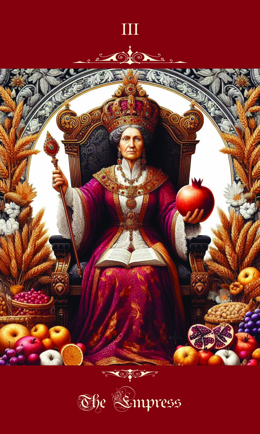
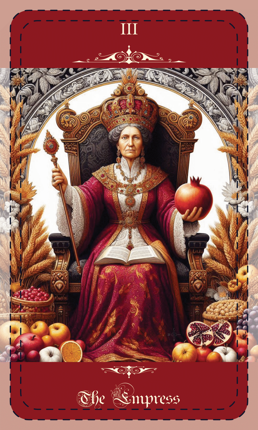
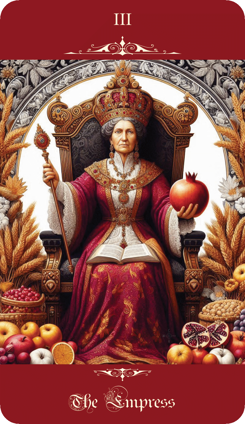
 I've been using Affinity Designer to lay out a deck of Tarot cards, one document per card. The document size is set up to include the bleed area you need if you are sending the files to a print house. However, I also need export PNG files of the cards that are trimmed to the cut line - the round cornered shape the print house will cut the cards down to - for use as graphics in a booklet that describes the cards. I'm new to using the Export persona, and I'm struggling with this. What I would like to be able to do is be able to export both the full-bleed JPG file to go to the printer and the trimmed PNG file for inclusion in the booklet from the same Affinity Designer file, but I haven't been able to figure out how to do that. Is this possible, or am I going to have to 'Save as...' and create entirely separate Designer documents for producing the trimmed versions?
-
 Hangman reacted to a post in a topic:
Help creating Celtic knots in Designer 2
Hangman reacted to a post in a topic:
Help creating Celtic knots in Designer 2
-
jmwellborn reacted to a post in a topic:
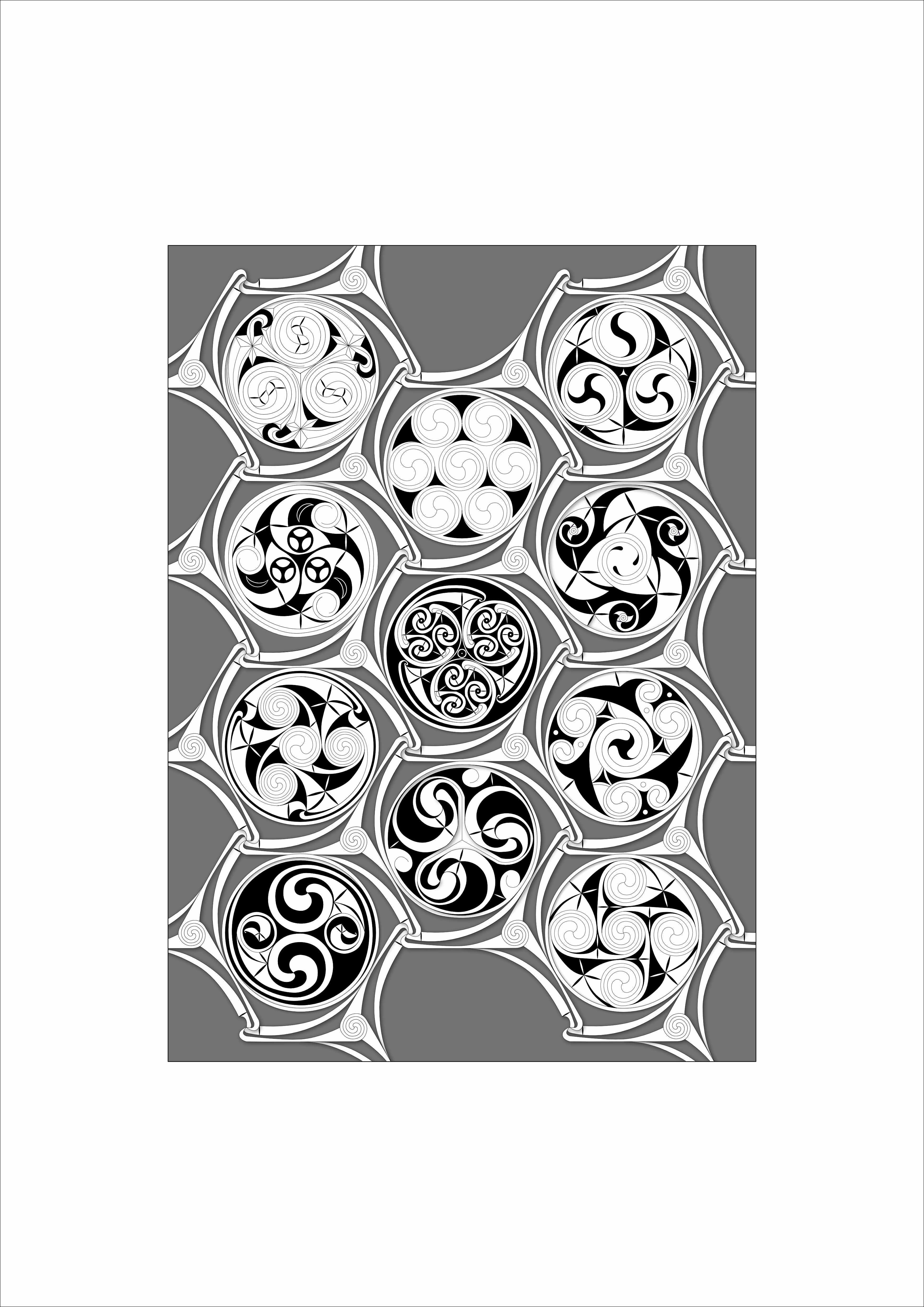
Celtic Roundels
-
stokerg reacted to a post in a topic:
Celtic Roundels
-
StuartRc reacted to a post in a topic:
Celtic Roundels
-
pruus reacted to a post in a topic:
Celtic Roundels
-
 StuartRc reacted to a post in a topic:
Seamless Pattern Overlays (Dots)
StuartRc reacted to a post in a topic:
Seamless Pattern Overlays (Dots)
-
walt.farrell reacted to a post in a topic:
Celtic Roundels
-
Very well done. Thanks for sharing!
-
Adapted from a design in 'Designa' by Wooden Books.
-
- 5
-
-
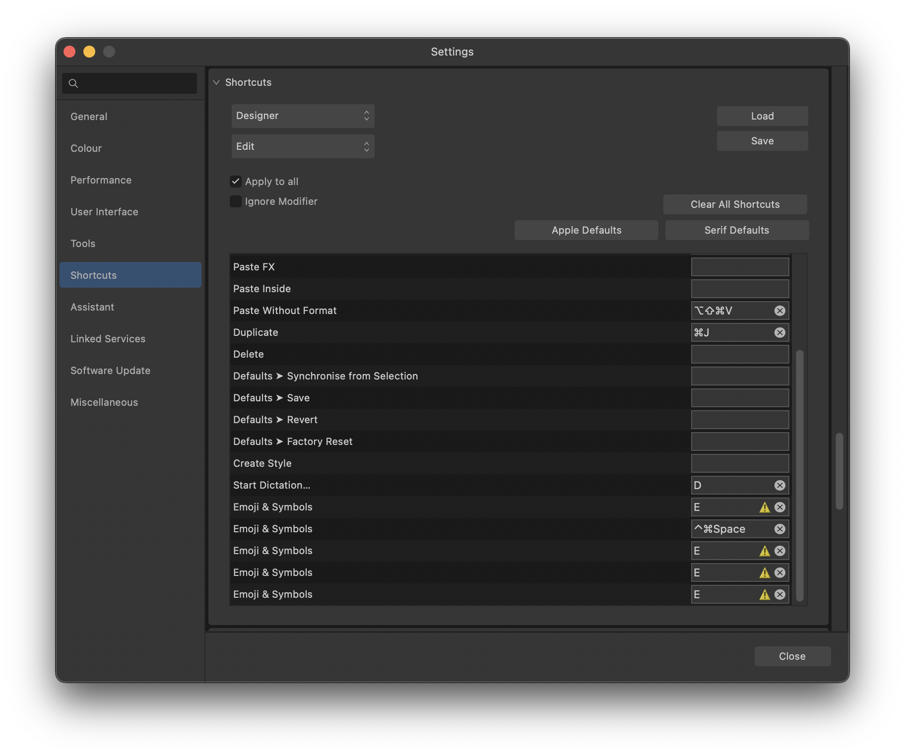
Using Designer 2.1.1 on MacOS Ventura (13.5.1) on a 2019 Intel MacBook Pro. In the Preferences dialogue, with Shortcuts selected, the Edit view (to modify keyboard shortcuts for the Edit menu) has a few recurring problems. See attached screenshot. The bottom of the list shows 'Emoji & Symbols' more than once, and with different keys assigned to it. The number of 'Emoji & Symbols' entries grows over time if I return to it after setting other keyboard modifiers. The 'Emoji & Symbols' entries, with key assignments, reappear after restarting Designer even if all 'Emoji & Symbols' entries were set to 'none' previously. The 'Start Dictation...' entry (immediately above 'Emoji & Symbols') is shown as being set to the 'D' key after every restart of Designer after being set to 'none' previously.
-
U. Dinser reacted to a post in a topic:
Allow modifier keys when setting keyboard shortcuts for Tools
-
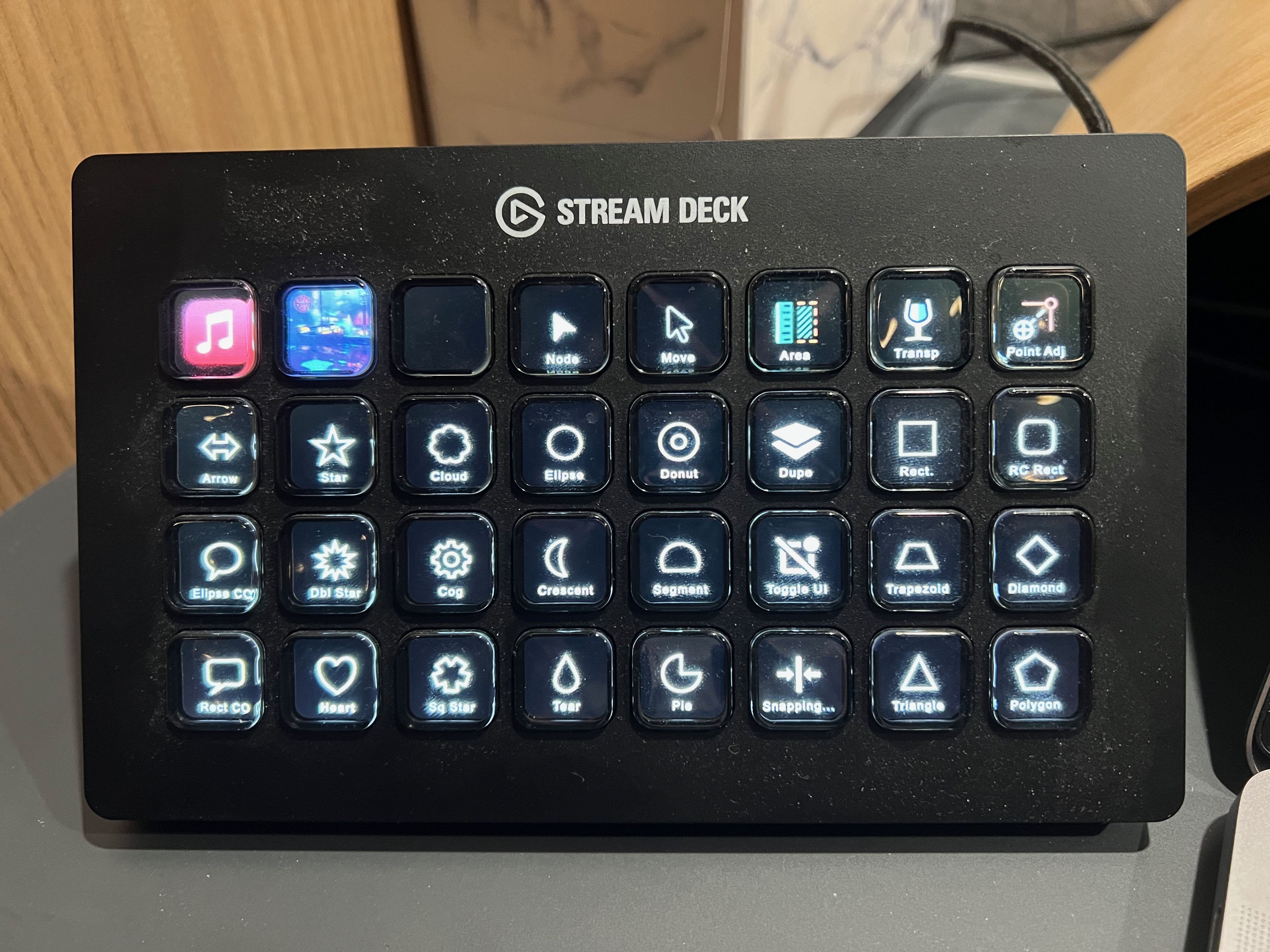
There are about 56 Tools and tool variants, but the limitations on assigning keyboard shortcuts to Tools, particularly the inability to use modifier keys, means that it is impossible to assign a shortcut to more than about 26 of them. Keys 0-9 are used for setting opacity levels, and this cannot be turned off. Several punctuation keys (e.g. the '[' and ']' keys) and the 'D' and 'X' keys also cannot be changed from their defaults. This may not be an issue for most people. I have an elgato Stream Deck XL, so I attempted to create Stream Deck keys for each of the Tools I use most so that I could access them with a quick button push instead of mousing to the menu. The limitations on Tools shortcuts meant that I could not do this. I had to decide which Tools to assign to the available number of shortcuts. Could you please allow the use of modifier keys when setting keyboard shortcuts for Tools? Alternatively (or in addition), you could allow the assignment of the number keys to the opacity levels to be removed/changed, which would free up ten more keys. P.S. There is a set of icons for Affinity Photo available for the Stream Deck from the elgato download page, which is what inspired me to try this in the first place. I recreated the Designer vector tool icons in Affinity Designer so they would appear correctly on the Stream Deck. I would be happy to provide the Designer icons file if Serif were interested in making an 'official' set of Designer icons available for Stream Deck users.
- 1 reply
-
- 1
-
-
Help creating Celtic knots in Designer 2
CJRM replied to CJRM's topic in Desktop Questions (macOS and Windows)
@Hangman That's an extremely clear explanation. Nicely done! And I have to highlight your comment about "when everything is positioned perfectly" as I learned that the hard way on this work. Small deviations in positioning points on a curve would cause unexpected problems. Your approach using exact math may look harder at first, but it will save a lot of time in the long run. -
CJRM reacted to a post in a topic:
Help creating Celtic knots in Designer 2
-
Help creating Celtic knots in Designer 2
CJRM replied to CJRM's topic in Desktop Questions (macOS and Windows)
@Hangman it says it can't show me whatever you included because I "do not have permission to see it." Strange. -
lepr reacted to a post in a topic:
Help creating Celtic knots in Designer 2
-
Help creating Celtic knots in Designer 2
CJRM replied to CJRM's topic in Desktop Questions (macOS and Windows)
Thanks for the advice. Particularly @lepr. Still working on the more advanced pieces, but I have what I need to make it all work now.
-
CJRM reacted to a post in a topic:
Help creating Celtic knots in Designer 2
-
Help creating Celtic knots in Designer 2
CJRM replied to CJRM's topic in Desktop Questions (macOS and Windows)
Indeed. And that seems to work! -
Help creating Celtic knots in Designer 2
CJRM replied to CJRM's topic in Desktop Questions (macOS and Windows)
Thank you! That showed me what I was overlooking. The step I was missing was breaking apart the line before performing Expand Stroke. My bad. -
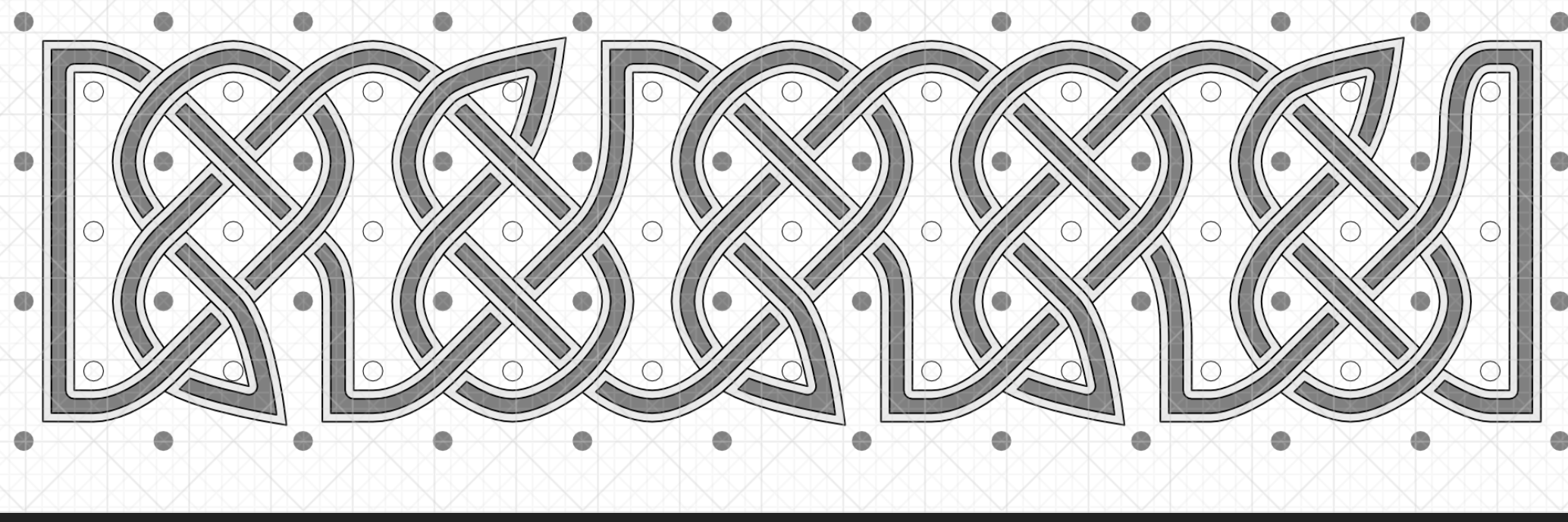
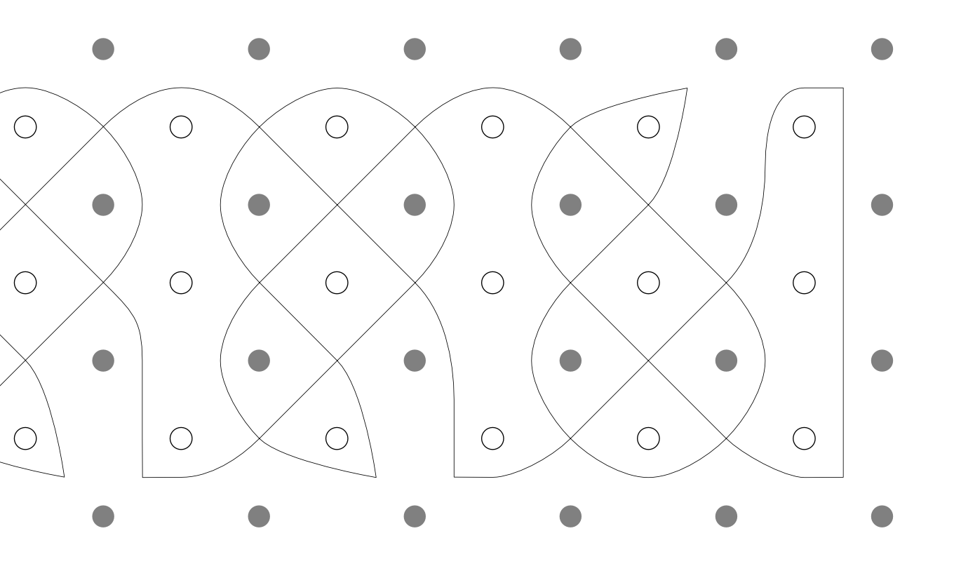
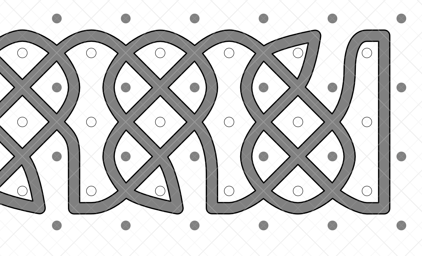
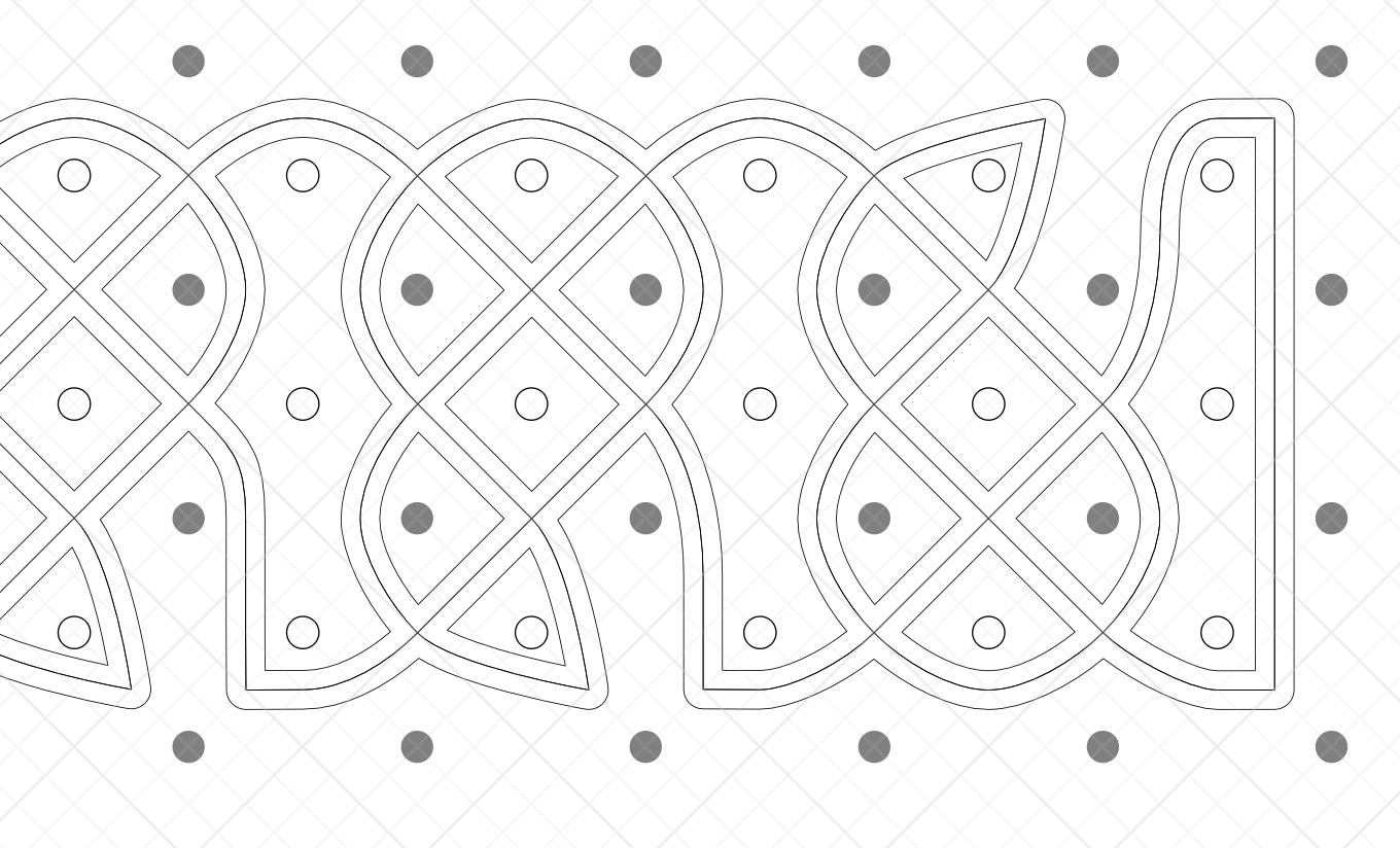
My searching skills failed to turn anything up, so I'm asking for help from the Forum brains trust. I'm working on a project that involves recreating some Celtic knot work. The first attachment shows a guide I'm using to create a part of the knot. The finished end on the left is the look I'm going for. I could draw it all in pieces, but I was playing with the v2 features to see if I could shortcut things. My hope was to use Shape Builder to stitch together the knot sections after drawing the overlapping paths of the knot in some way. I drew a section of knot work as one long thin line (see the second attachment), fattened the line, and then used Expand Stroke to create a wide 'path' from that. Unfortunately, where the line crosses itself, Expand Stroke just merges everything into the same shape. Instead of one path crossing over or under another I now have 'road intersections' were the crossing paths are merged, as per my third attachment. I tried to use the Contour tool, but it causes the same issue. Where the line crosses itself the offset does not preserve the overlap. See the fourth attachment which shows the result of using the Contour tool twice, once inward and once outward. The original line runs through the middle. I could break the original thin line apart and use Expand Stroke or the Contour tool on each separate piece, but the pieces won't connect properly and I'll probably spend more time fixing things up than I would just drawing each piece of the knot the hard way. Any thoughts?
-
I would like to be able to select a (vector) line or shape and apply a 'fractalise' effect to it that would make the each line segment appear jagged between its two end points. This should be adjustable to increase or decrease the jaggedness of the line, which would also affect how far the jaggies deviated from the original path. This would allow the easy creation of, say, lightning, or the line of a river, without having to manually draw the whole thing. The attached screen capture shows an example from a program I used to use that does this. The base shape is just a square with four vertices at the indicated points. 'Fractalising' the square turned it into the shape shown in the image. If the fractalisation setting were turned down the shape would become less and less exaggerated. With the fractalisation turned to zero it would display as a simple square.
-
iuli reacted to a post in a topic:
Font Book Demo
-
CJRM reacted to a post in a topic:
Examples of book cover art
-
CJRM reacted to a post in a topic:
A Stand of Trees I
-
CJRM reacted to a post in a topic:
A Stand of Trees I
-
Thanks @VectorWhiz and @iuli. Much appreciated. And iuli, were you eventually able to open it on your iPad? The PDF is big, but I'm surprised it blew out the memory limits on a newer model!
-
CJRM reacted to a post in a topic:
Font Book Demo
-
I'm just uploading a corrected version for anyone who liked the original. Thanks to feedback from friends I've stamped out over 100 minor issues. Now my OCD insists I do something about the one I've posted here. The Font Book.pdf
-
Simulating the handsetting of metal type
CJRM replied to William Overington's topic in Share your work
I had to hunt to find this again, but I thought you might enjoy it. https://graphicarts.princeton.edu/2016/08/24/cutting-the-letter-g/