aenimanu
-
Posts
19 -
Joined
-
Last visited
Recent Profile Visitors
2,480 profile views


-
 aenimanu reacted to a post in a topic:
Very very disappointed with Publisher 2
aenimanu reacted to a post in a topic:
Very very disappointed with Publisher 2
-
Ginette Hardwick reacted to a post in a topic:
Free Goodies: Vizier Amenemope's palette
-
aenimanu reacted to a post in a topic:
Free Goodies: Vizier Amenemope's palette
-
aenimanu reacted to a post in a topic:
Free Goodies: Vizier Amenemope's palette
-
 Wosven reacted to a post in a topic:
Free Goodies: Vizier Amenemope's palette
Wosven reacted to a post in a topic:
Free Goodies: Vizier Amenemope's palette
-
Alfred reacted to a post in a topic:
Free Goodies: Vizier Amenemope's palette
-
Song Palmese reacted to a post in a topic:
Free Goodies: Vizier Amenemope's palette
-
William Overington reacted to a post in a topic:
Free Goodies: Vizier Amenemope's palette
-
Usually it was hard to get a bright white background at the time, considering papyrus, wood or stone were the common canvas at the time. Even centuries later, when paper became more usual in the east, it wasn't completely white as we use today (normally some chemicals are used to bleach paper). So, a yellow backgroud would just make blue and green "greener" because of the orpiment and ocre, I guess. Maybe both. I searched for this vizier's art in internet (the palette is actually in the Cleveland Museum of Art, so it makes sense that the museum itself keeps some of this man's art) but I found nothing. Maybe he was just as curious as we are and painting was just a hobby apart from his counseling work, so the palette is just adapted to his preferences. Yes. Indeed pigments were incredibly expensive back in the time. Not only because the rarity of some minerals, but also for the difficulties to ground some minerals with copper or bronze tools (iron casting technics start spreading centuries later). For example one of this astonishingly expensive pigments was the lapislazuli blue, which was quite more expensive than gold at the time. Anyway, orpiment is a very soft ore (1,5-2 of hardness, almost like talcum) so my guess is that orpiment was a rare ore imported from other places, which the vizier, as a remarcable person in the pharaoh's court, could afford. Mixing it with other yellow pigmens and ocres would just dilute the percentage of pigment so it lasts longer. That's just my guess. Yes, I think you're possibly right. Most of painters and artists owns different palettes for different purposes. My guess on this is that he used black in a regular basis so this colour was the color that used to run out first. In the palette I configured, I used 2 different shades of black. The first is a carbon black, not completely black. but the second black is what we know in the printing industry as "rich black", which means that in the CMYK the colour used is not only the black ink (C=0 Y=0 M=0 K=100), but also the other inks are added tho the black base to enrich and enblack the black tone. I like to add just a 33% of CMY (C=33 Y=33 M=33 K=100), instead of the widely used 50%. Obviously, it is used in certain parts of a printing because it wastes larger amounts of ink, but the visual impact is bigger. Yes, you're right indeed, saving pigments instead of wasting them was necessary because the price of the pigments. I'm pretty sure that the good vizier actually had another palette containing a white lime white tone, probably composed of Calcium hydroxide, and Calcium carbonate, also widely used since ancient times.
-
aenimanu reacted to a post in a topic:
Free Goodies: Vizier Amenemope's palette
-
aenimanu reacted to a post in a topic:
Free Goodies: Vizier Amenemope's palette
-
aenimanu reacted to a post in a topic:
Free Goodies: Vizier Amenemope's palette
-
aenimanu reacted to a post in a topic:
Free Goodies: Vizier Amenemope's palette
-
aenimanu reacted to a post in a topic:
Free Goodies: Vizier Amenemope's palette
-
aenimanu reacted to a post in a topic:
Free Goodies: Vizier Amenemope's palette
-
aenimanu reacted to a post in a topic:
Free Goodies: Vizier Amenemope's palette
-
William Overington reacted to a post in a topic:
Free Goodies: Vizier Amenemope's palette
-
iconoclast reacted to a post in a topic:
Free Goodies: Vizier Amenemope's palette
-
PaulEC reacted to a post in a topic:
Free Goodies: Vizier Amenemope's palette
-
iuli reacted to a post in a topic:
Free Goodies: Vizier Amenemope's palette
-
AdamStanislav reacted to a post in a topic:
Free Goodies: Vizier Amenemope's palette
-
You're welcome!
-
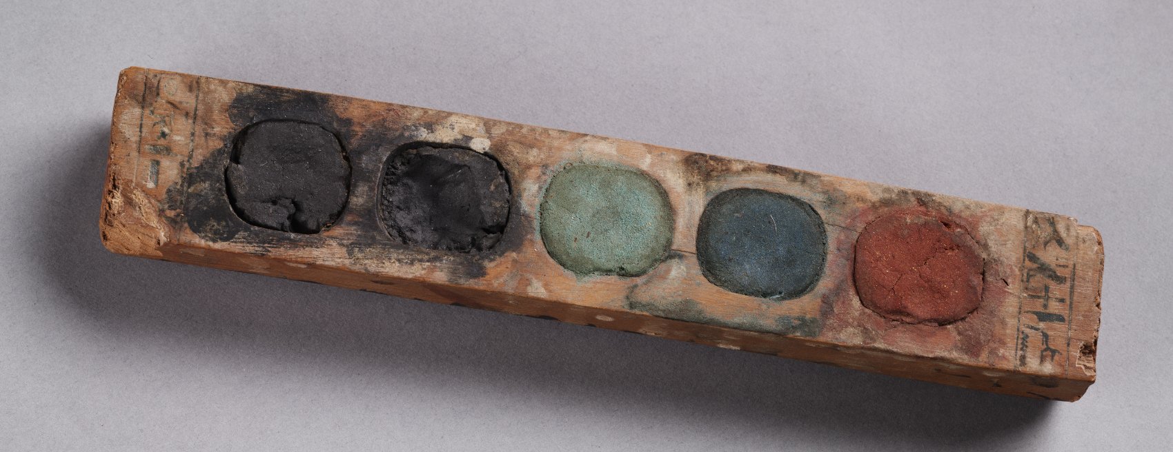
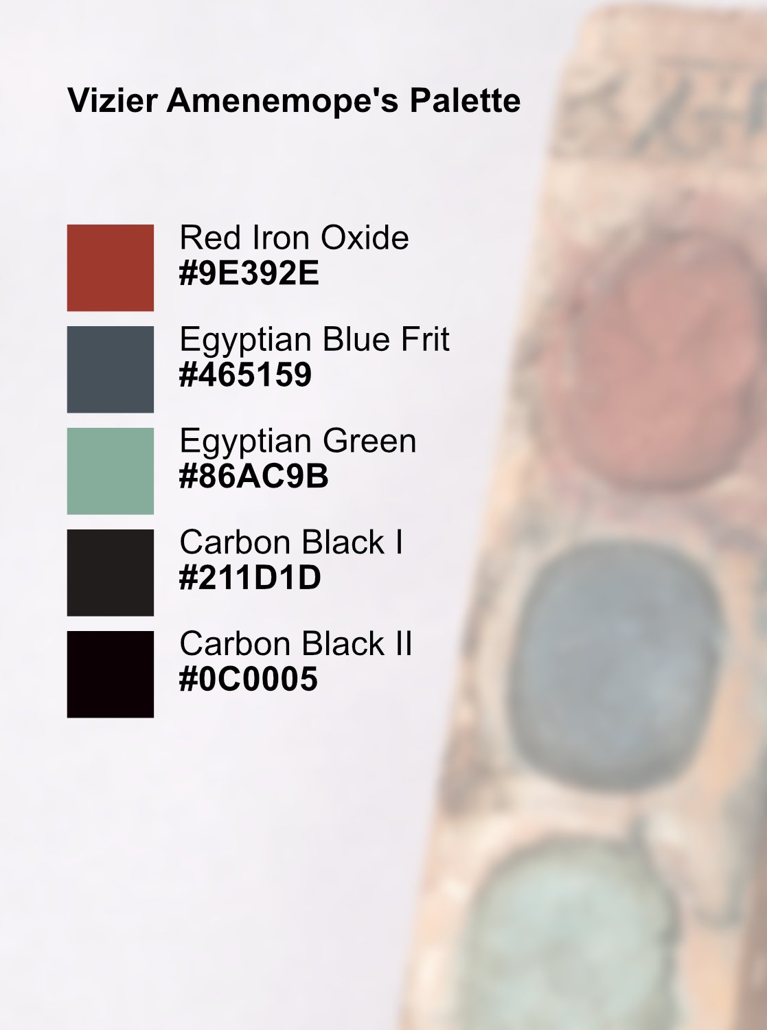
Hi everyone! I bring you something I found in an article. It was very interesting and decided to make a palette out of it and share it with all of you. This amazing 3400 year old paint box once belonged to Vizier Amenemope who lived during the reign of Amenhotep ll, c. 1427–1401 BCE. With a measure of 3.6x2.2x21 cm, It has an inscription inlaid in Egyptian blue. (Extracted from this article) This particular vizier, Amenemope, liked to paint for fun when he wasn’t advising the Pharaoh. The paint box, carved from a single piece of boxwood, shows inlay of Egyptian blue in incised hieroglyphics at each end. The rounded squares were carved into the surface to create the paint wells. From the far left the dry pigment cakes are: finely ground carbon black course ground carbon black green (mixture of Egyptian blue frit, yellow ochre and orpiment) Egyptian blue frit Red (red ochre/red iron oxide mixed with orpiment). The box is in surprisingly good condition and shows only minor cracking along the edges. Surfaces of the paint cakes look slightly dirty which would indicate the smearing of one pigment over another. Not bad for a three thousand four hundred year old artist’s paint box. Anyway, I took some effort to get the palette and translate it to #hex so we can also make compositions out of it. Here you can download my compilation of it and make your own compositions. Hope you find it as interesting and useful I do. Cheers! Vizier Amenemope's Paint Box.afpalette

- 14 replies
-
- 10
-
-
-
Thank you so so so much Walt! I just tried this and works perfectly! I'm telling you this have driven me crazy for weeks! Thank you!!
-
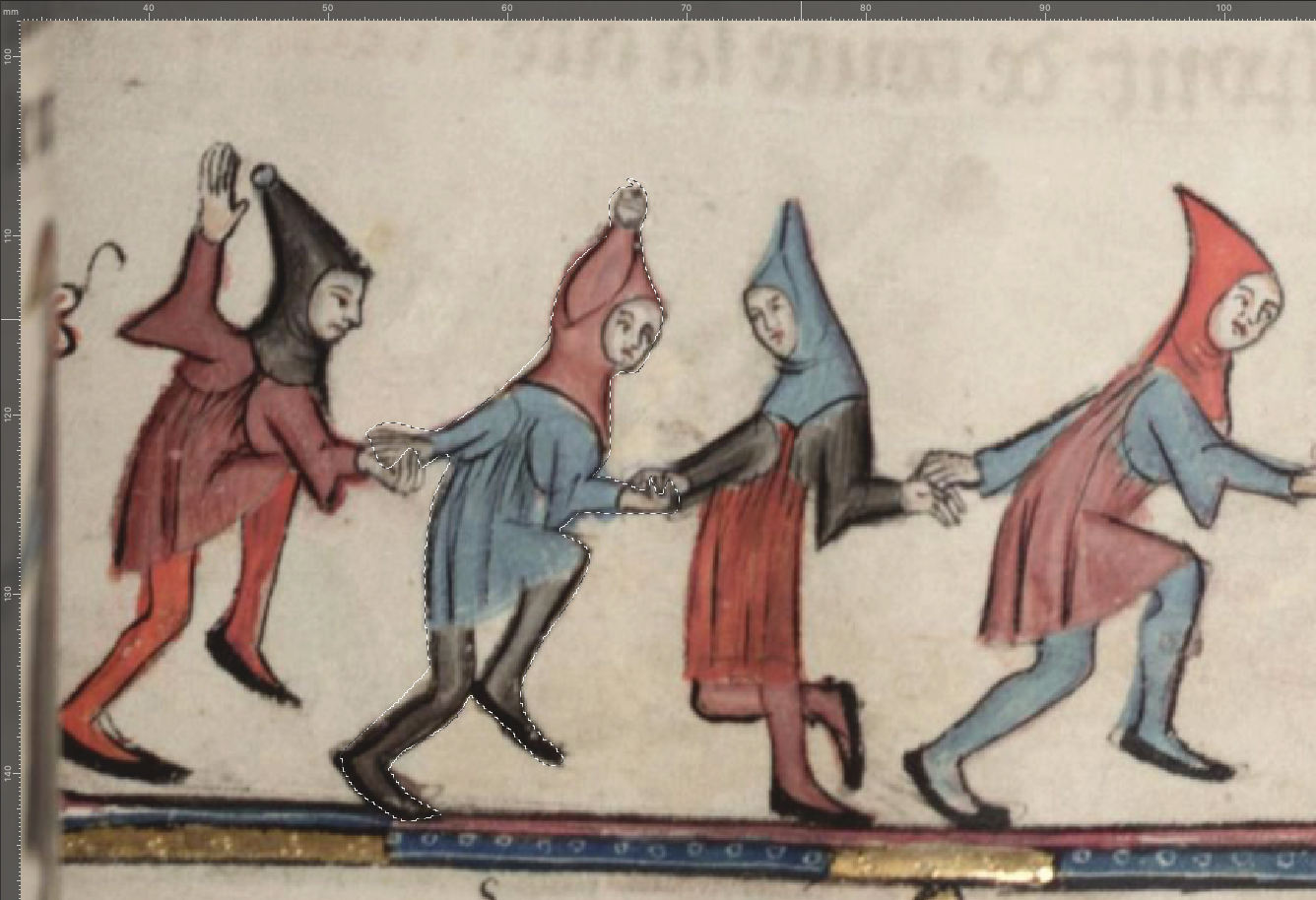
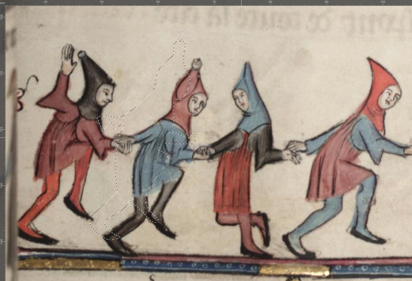
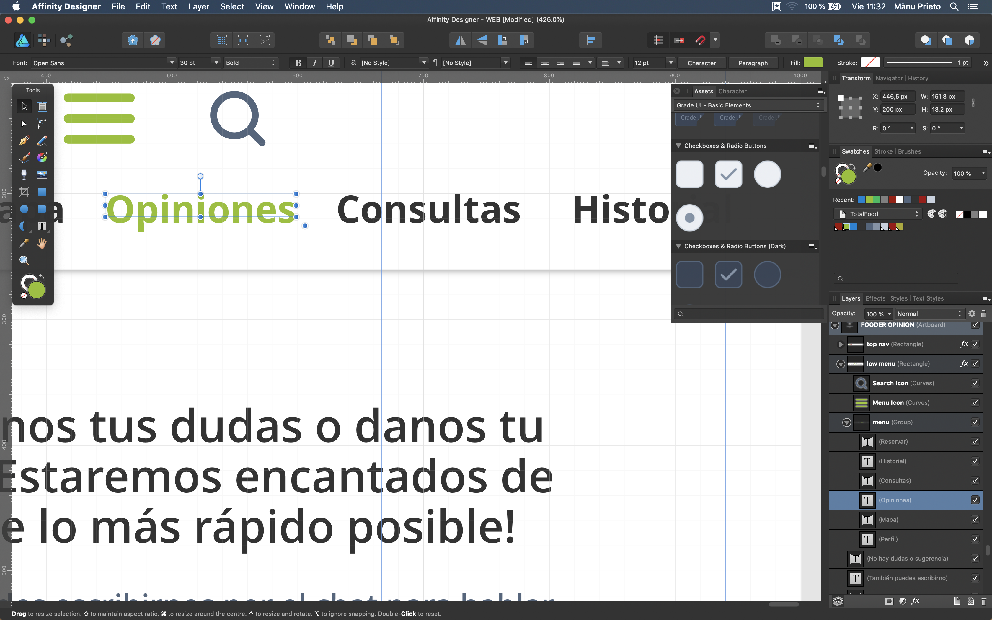
Hi everyone; Not sure if posting in the right folder, but I searched for someone having the same trouble and I didn't find this error: Whenever I try to make a pixel selection with the lace tool (or any other tool) in Photo, just as quick as I finish selecting, the selection made displaces a bit to the top left corner: It also happens whenever I try to select it and then press comm+⬆︎+I for making the invert selection. This is very unconfortable to work with because I lose all the precision and effort taken in selecting carefully, and I usually have to set it back by hand. I tried this both in Affinity Photo for Mac and Publisher with the Photo Persona, and still having the same trouble. Note that I also tried unselecting autosnapping, move by whole pixels and force pixel alignment but still doesn't work. Anyone know what possibly I'm doing wrong or badly set? Also, If i keep repeating the invert selection, the selection area keeps moving upwards in a progressive scale: Thank you all in advance for taking the effort in reading this lines (EDIT: i'm currently using the latest OS in Mac, Monterrey 12.2.1)
-
 That's right. I'm working with my 2017 Macbook Pro, and it works smooth. I saw most of the people use the app for Ipad, but considering both devices are Apple manufactured, they should work the same way. It actually helps me a lot because I use to combine Affinity Designer+Inkscape, but Inkscape does not run smoothly on mac, and also have to make more operations to get a final clean .svg archive.
 -
I just downloaded this and tried, and it happens to be actually really helpful. Looking good so far! Thank you!
-
aenimanu changed their profile photo
-
I just had the same problem, but It solved itself just by updating to 1.8.1 the three apps. Now it works fine to me 😊
-
Affinity Designer for MacOS - 1.7.0
aenimanu replied to Patrick Connor's topic in News and Information
Thanks Patrick, I'll stay tuned -
Affinity Designer for MacOS - 1.7.0
aenimanu replied to Patrick Connor's topic in News and Information
First of all, congratulations to the whole team for the amazing improvements! I was really looking forward to the latest release! Also, during testing the beta I got to build some assets which I'd like to export and import back to the latest version. Unfortunately, the "product key" screen prompts and I can't find my serial numbers in my Affinity account (nor in mail or in the web itself). It's the same issue that happens to VISION: So, Is there any chance I can get the assets and color palettes back or are they gone? Thanks in advance to the Affinity staff! -
Hi MEB Currently downloading the latest version. Will report if the issue is still happening. Thank you so much!
-
Hi everyone! Not really sure if there is another topic about this particular error, nor someone has experienced this before. I'm currently working on a UX/UI project at work making the design of the screens of an app interface. This file is 285,3 MB weight and it contains +30 artboards with mock-ups. The error I'm reporting occurs when I double–click on the constrain points of a text box to auto adjust the box to the type size. It gets stuck and the loading coloured wheel keeps spinning for ages, avoiding me to save, close or do anything else than force exit and restart the app. Happily, I never had major problems and the file remains (mostly) intact. Did it ever happen before to some of you? Thanks in advance!
-
Hello, Hokusai It is indeed a good thing. Nevertheless, a vectorization tool is nothing but the transformation of bit information in a bitmap bidimensional plane into equations which change proportionally considering the situation of each bit in this plane. 15-20 years ago, this was a very tedious task to program configure and used to take too many resources in a computer. But today's are faster, and the programation paths and online resources and forums allow people to interact, discuss, join for common developing and code-chunks sharing. There are several vectorization options both in software format and online free tools. I honestly think that it is not a matter of technical challenge but a matter of budget (or maybe some arrangements still in discuss by Serif developers). Anyway, I got the feeling that Serif programmers are taking it too seriously and all they want is to release a perfect software, no matter how long it takes. Sometimes, it is better to release betas and discuss them in forums, so the interaction between users and developers makes the software evolve and efficient gradually. It is a real pleasure to read comments here in the forum and discuss them, because it is the users the actual engine that shapes the software interfaces and capability.
-
This is amazing, Tamauro! Thank you so much for taking the effort! Cheers!
-
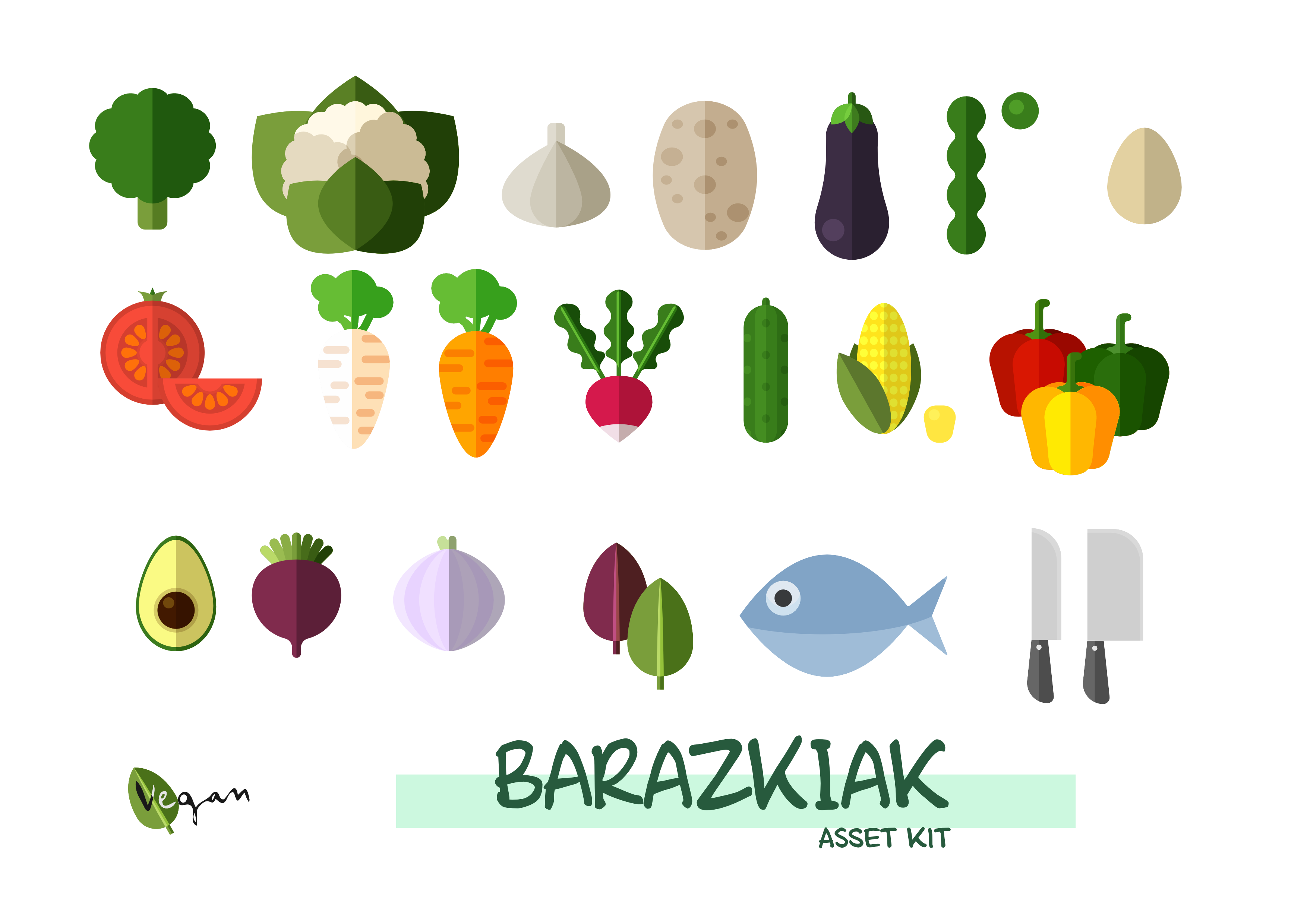
Hi everyone! So, I am this kind of person who don't check the forums so often… But at this time I want to contribute and share with you this assets I made some months ago, when I was experimenting with the AF. Designer for first time. I hope you find this resources useful for your works or simply to experiment. Cheers everyone! Barazkiak.afassets.zip