GarryP
-
Posts
11,056 -
Joined
-
Last visited
Everything posted by GarryP
-
Great work. You really know your stuff if it only took you around three hours. Looking forward to seeing more.
-
Thanks for that. I hope this gives people some ideas of what they can do to their own pictures. Nicely done.
-
If I was going to attempt such an image I would have probably gone for something more "vague and ephemeral" looming in the darkness rather than something that stands out so much. You could try knocking the opacity of the ghost way down and putting the figure slightly behind the door frame rather than in front. (You're more likely to snap a ghost when it's not so fully in shot.) Also, you could change the lighting as ghostly apparitions are very rarely seen in the daylight. I think you could get away with the light source being a full Moon if you darkened everything and lowered the colour range (somehow). These are all just my personal feelings so feel free to ignore them; I understand that you were learning a method more than anything else.
-
I really like this. I didn't like the colours at first but they've grown on me. Must have been a heck of a lot of work. Great job.
-
I don't use Affinity Photo myself but I'm sure I'm not the only person who would be interested in seeing the original image and a quick list of what processing you applied to it.
-

affinity designer Jelly monster playing cards (still in progress)
GarryP replied to meneerfretje's topic in Share your work
These are really great. The colours used are really nice and the artwork has a good sense of fun. I have some very minor comments: * Are you having a different colour jelly monster for each suit? That would make the suits easy to distinguish at a glance. * Have you tried using a number of jelly monsters instead of the normal suit symbols? E.g. Using six monsters instead of six hearts. (Might get a bit crowded when you get to ten though.) * Did you know that you've got two aces of spades? I know it's a work in progress, I just thought I'd mention it in case clubs was accidentally missed. * I noticed some tiny issues where some of the suit symbols aren't consistent across all of the symbols. E.g. The heart under the ace is different to the hearts in the five, and the spade on the top-left-hand of the ace isn't the same upside-down on the same card. Anyway, trifling issues aside, if I was looking to buy a pack of cards then this is the sort of thing I'd go for rather than a normal boring pack. I'm looking forward to seeing more progress on this. It might give me some impetus to have a go at trying to make my own. -
affinity photo Cutting Out Example but Pixelated
GarryP replied to RCPhotos_FineArtAmerica's topic in Share your work
Hmm. That latest one actually looks worse to me than the earlier ones. Also, you seem to have changed the aspect ratio of the deer when you resized it. From what I can see from your images, you shouldn't be resizing/scaling both images to the same new size. Keep your background image to be whatever it is and rescale the deer to be whatever size you need. Unfortunately I don't use AF myself so I can't give much more help in the actual techniques you need to use (having to cut and paste sounds a bit "archaic"). Maybe there's an AF expert out there who can take you through the process more fully. -
I really like the style of those images. Very nice.
-
affinity photo Cutting Out Example but Pixelated
GarryP replied to RCPhotos_FineArtAmerica's topic in Share your work
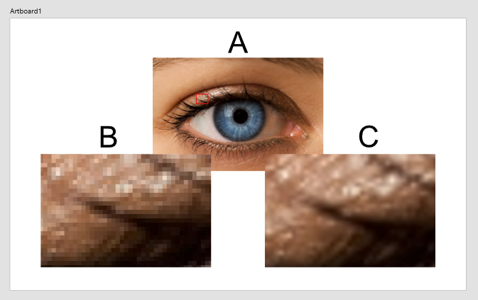
Just to add to what Alfred said, if you simply ENLARGE the image you will always get larger "dots" as you are making each pixel larger. Essentially you are just zooming into the image. However, if you RESCALE the image before you edit it then you can use something called Interpolation to guess what the "smaller" pixels should be. Consider the attached picture. The top image (A) is the original at x1 scale. The left-hand image (B) has been ENLARGED to x10 by enlarging the portion highlighted by the red rectangle in A (sort of). Notice that each pixel in the original image is now one hundred times larger (10 times the width multiplied by 10 times the height). The right-hand image (C) was SCALED using a "Cubic Interpolation" in GIMP (other software is available). Notice that the software has interpreted what the "new" pixels should be by looking at the pixels around it. Each pixel in (C) is now the same size as the pixels in (A). Different Interpolation methods produce slightly different results so it's worth doing some experiments on the images you;re using each time to see which is best in the circumstances. If you SCALE images first so that their pixels are the same size it is much easier to make them blend in with each other (as long as other things, such as lighting etc, have been taken into consideration). This means that you need to have a good idea of the composition of the picture before you start the editing - as you need to know how big everything should be at the end - and you will probably have to do a bit of basic arithmetic - to make sure that everything has the same pixel density - but it's well worth the effort. I probably haven't explained this well enough from an expert's perspective but hopefully it's good enough for what you need.
-
Given what you did with Elmo I was expecting something much scarier. Oscar actually looks quite friendly in comparrison.
-
Ditto.
-
Welcome to the forum DBoy. I'm not a photographer and I don't do much "proper" image manipulation so I can't really comment on your techniques but I can give you my initial reactions to viewing the images. In the order in which I can see the photos posted, top to bottom: 1. Nice subject but the "double sun" kind of spoils it a bit. Too much light, or too many points of focus? Also, and I don't know if it's because of the car's paint or effects used but there are areas that look odd. For instance, the lighter lines on the lower bumper and rear wheel arch are areas where it looks a bit "false/pixelated" but I can't explain why. 2. Don't have a problem with this one of the bike. I like the way the subject seems to be stationary and the background is moving. The image is a bit grainy - a bit "newspaper image" - but I quite like it that way. A surveillance photo perhaps? 3. Nothing to say about this one really. Maybe a bit bright on the left perhaps, or too dark on the right? 4. I like the grainy effect on this one. Dirty and rugged. It doesn't work well at full-size but it looks nice at smaller sizes. 5. The car on the right looks great - in the smaller size image, not so much at full-size - but there's something going on to the left that doesn't look correct to me. Couldn't say what it was though. Should it be more out-of-focus? I don't know. 6. Nice, but I have no thoughts either way. That's not particularly bad or good, it's just a nice photo. 7. Again, no specific issues. 8. There's a bit too much light and the chrome looks a bit "crazy" but nice enough overall. The colours really stand out. 9. Image is too small to say much but I think too many effects have been used. Post-apocalyptic on the left and too much "edge detection" on the right? 10. I think everything blends into everything else a bit too much on this engine shot. Nice reflections but I would have liked to see more definition. Anyway, after all of that, please don't take too much of my comments to heart. Like I said at the start, I'm not a photographer and the few photos I take are all way worse than yours. My comments are simply those of someone who is seeing the images for the first time and giving their honest - very non-professional - opinion. I would like to hear comments from some of the photography experts in the forum and see what they think. Whatever they say will most probably help me too, especially if they use the correct terms for things that I can search for.
-
Nicely done. I have two concerns (not big ones): * I don't know where this will be used but scaling it down might lose a good bit of detail. * There seems to be a mix of different art styles: one for the food; one for the tray; one for the woman; and one for the scroll. My feeble brain is having trouble accepting them all as being part of the same image. Neither of these things is a massive issue though. Just thought I'd mention them in case they became important somewhere down the line.
-
affinity photo Could you give some feedback on my seascape photos?
GarryP replied to jef.'s topic in Share your work
Very nicely done. You've certainly added some drama to those photos. The different colours of the sea on the last one particularly stand out for me. -
Lovely work as usual. Creepy but very nicely done. I agree with dutchshader, the hole does seem to extend further out than the curve of the head suggests. Maybe a crack, or two, on the cut of the skull could be a "quick" fix? (Never thought I'd be talking about putting cracks in a skull when I woke up today.)
- 10 replies
-
- 1
-

-
- book cover design
- bookcover
- (and 2 more)
-
Is it worth removing this post now? Or at least un-pinning it.
- 7 replies
-
- 2
-
-
- affinity designer
- affinity photo
- (and 1 more)
-
Welcome to the forum flashlarue. There are a lot more colours there than I would have expected but I've never seen a solar eclipse for myself. (Jealous.) Thanks for sharing.
-
affinity photo Digital Portrait -First Nations male
GarryP replied to Gregory-CJ's topic in Share your work
Lovely stuff. There's even loads of detail in the earrings and stitching. The sheen on the feathers looks great close-up. Brilliant work. -
Many thanks Alfred. It looks great and saves me a lot of time looking around. (And money too, there's no way I could justify spending £30 on a single typeface.) The Regular variant looks a little bit thinner than the Bookman Medium variant but it's easily good enough for what I would want it for. Now I've just got to try and remember that I've installed it.
- 4 replies
-
- 1
-
-
- experiment
- 1980s
- (and 2 more)
-
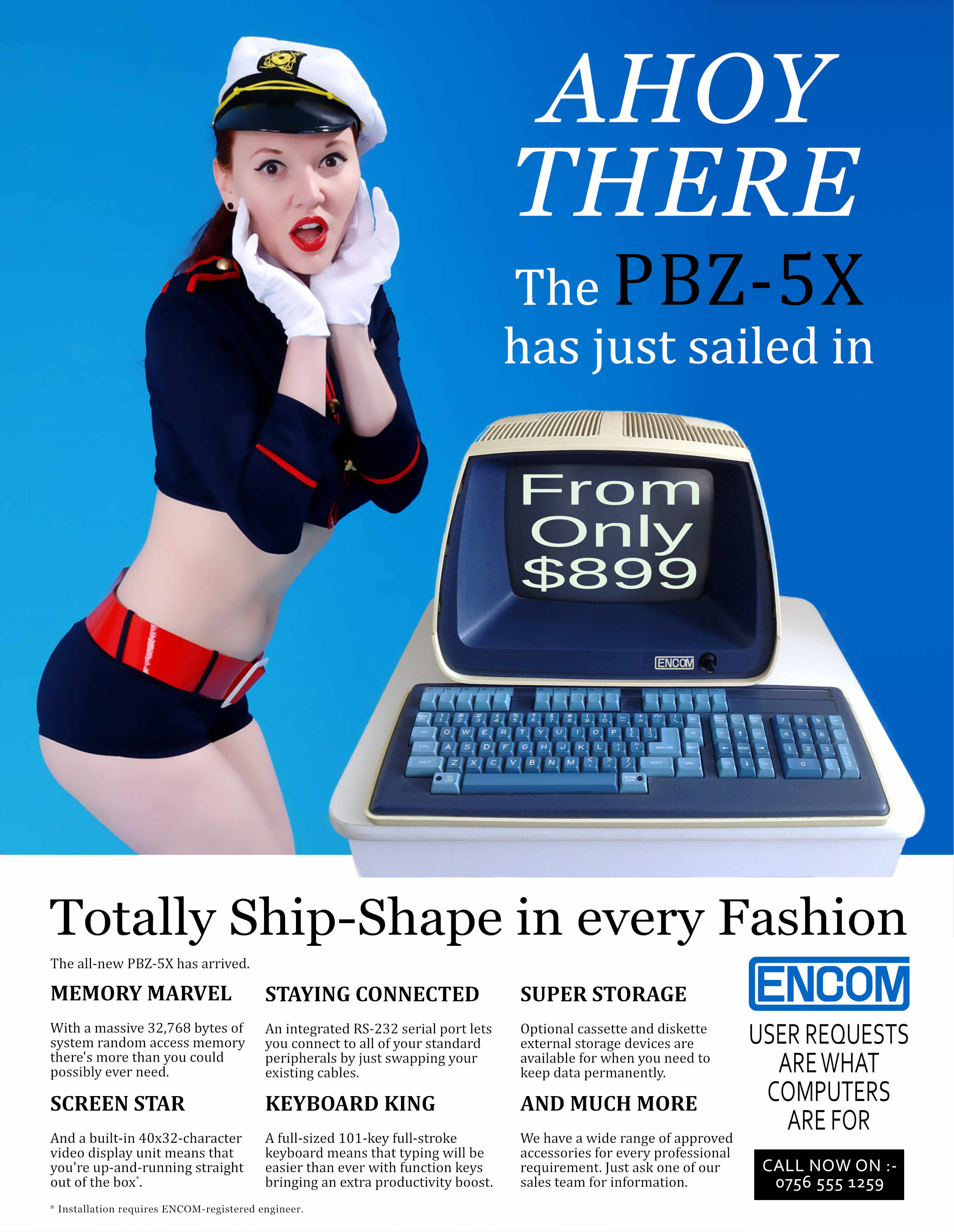
Thanks A_B_C. ITC Bookman is a great choice and would go really well with this. I'll have to look for something similar that's free (I'm still rebuilding my stash of fonts since moving over to Windows from Mac last year). If anyone is interested, the serif fonts that I used were Georgia - for "Ahoy..." and "Totally..." with Cambria for the body text and "...has just sailed in". I've stayed away from Cambria until now but it's starting to grow on me as a body text font. The characters are nicely distinguishable from each other and it's still readable on-screen at very small sizes. I've read that some people don't like it but each to their own.
-
For no particular reason, other than to try something different, I thought I'd put together a 1980's-style computer magazine advert. The checklist of features that I wanted to include was: * Dodgy theme that doesn't really suit the product; * "Dolly-bird" dressed slightly inappropriately; * Incredibly dull picture of computer; * Strange choice of typefaces; * Loads of text that doesn't say much. It was just a silly experiment - and, if you hadn't guessed already, it's supposed to look naff - but if anyone has suggestions for improvements I might try another one at some point in the future. P.S. Fans of a certain 1980's sci-fi film might also get the extra bonus nerdy reference.
- 4 replies
-
- 4
-
-
- experiment
- 1980s
- (and 2 more)
-
Really nice work. The "gloop" in the cauldron looks great. Well, it all does but the gloop catches my eye more.
-
multi I saw a redesigned Apple Music, so I (kinda) redesigned it again
GarryP replied to gus_0001's topic in Share your work
A lot of work must have went into that article and the associated images. Good stuff.- 3 replies
-
- 1
-
-
- affinity designer
- ux
- (and 4 more)
-
Yikes. If that's how scary Elmo looks I'm not sure I want to see how Oscar will turn out.
-
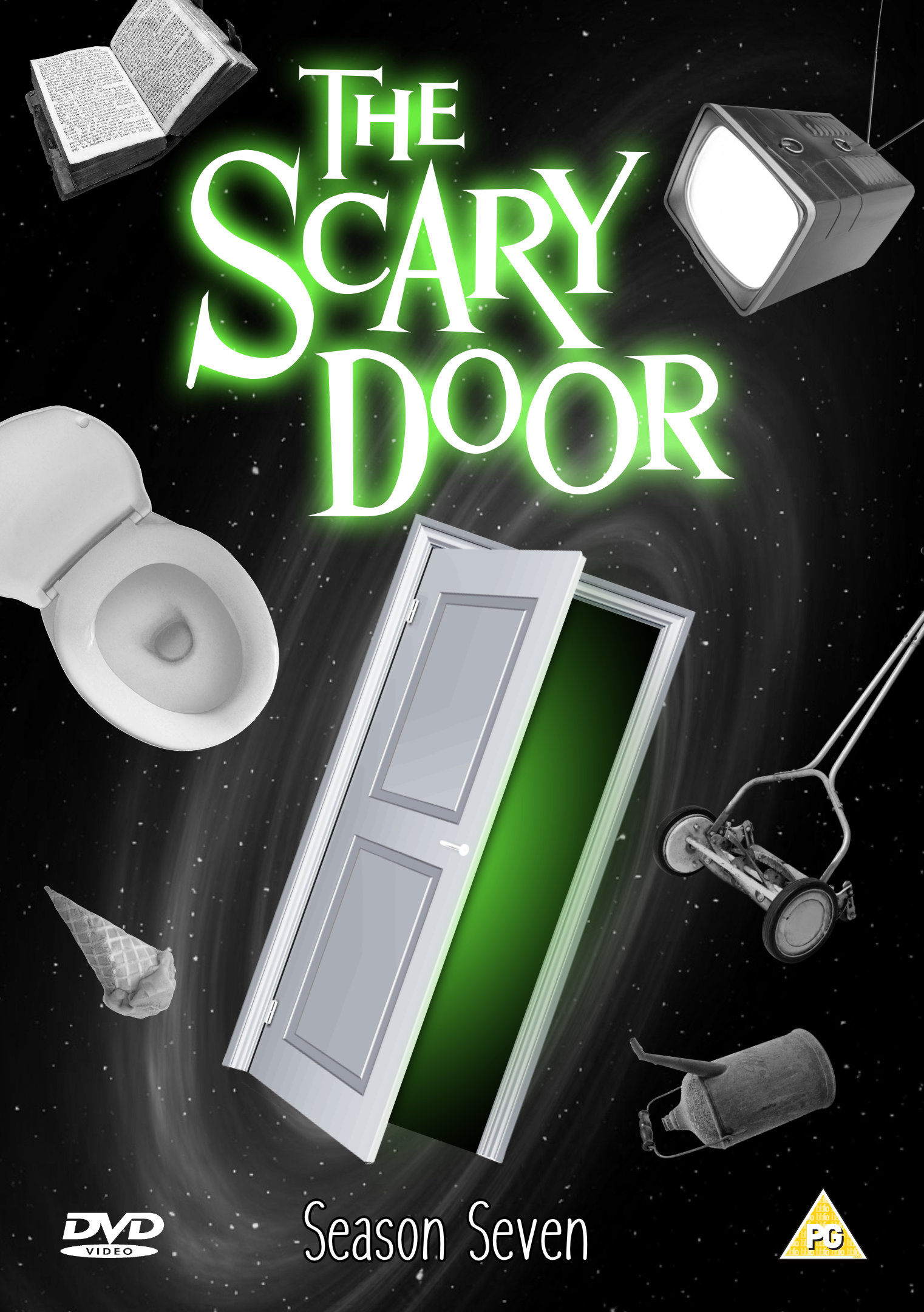
...The kind of place where there might be a monster, or some kind of weird mirror. These are just examples; it could also be something much better. Prepare to enter: The Scary Door. Just a silly DVD insert that I put together for a bit of fun. (Actually a re-hash of something I did ages ago with other software.) Nothing special but I thought it might bring a smile to some faces.