

JGD
-
Posts
549 -
Joined
Posts posted by JGD
-
-
On 12/6/2018 at 5:21 PM, fde101 said:
I don't think anyone here disagrees that the use of linked text boxes on master pages is the superior solution for this, and the Affinity team has reiterated several times that master page functionality for Publisher is currently incomplete.
I'm sure that will be coming, it just isn't here yet. The autoflow suggestion is about the best "for now" option we can suggest until more complete master page functionality is available.
That “best ‘for now’” you speak about is just not good enough. Sorry. If I were on the Serif team, on a management position, I'd drop everything else for the moment (save, perhaps, stability work; Publisher just crashed on me right now) and focus on that one feature for now (assuming, on a worst case scenario, that the devs can only focus on one issue at a time; I do believe they have a more complete team and can walk and chew gum at the same time, and tackle more than one feature at once). It might be limited in other ways at v.1.7.0, sure, but at least it would work as a proper DTP app from the get-go. Trust me, DTP pros and reviewers will completely eviscerate the Serif devs otherwise. :\
Also, another problem with not getting it right from the very beginning is the fact that you start training your users in using workarounds (sort of like little “vices”)… What if you need to change the interaction model later on? Yeah, you introduce changes which may confuse your users. Not an ideal situation either, if you ask me…
-
1 hour ago, Fixx said:
No need to use master pages for this, text autoflow works in all of them just fine. It is just if you want to have several text boxes / page, readjust after setting the text that manual work happens. (BTW you can have columns within text box).
Ok, I'll give it a look, then. Maybe it already works for really basic stuff. If so, I'll stand corrected.
That still probably doesn't change the fact that the philosophy for editing those after the fact (including parameters like, say, baseline grids, styles, etc) is a bit contrary to all other DTP apps (basically, if you want to change your document, you edit your master pages and styles, and boom, there you go; if your content exists outside master page objects, are you supposed to just change system-wide document settings and pray for that not to screw up your document in certain pages? That may be a recipe for disaster, because it doesn't allow for finer control on a per-master basis).
I get it, it probably removes an extra step, but it doesn't adhere to conventions and may make your work even harder in more complex documents. I'm all for challenging preconceived notions, but there are some sacred tenets in raster/vector/DTP apps that would be better left untouched. And the devs at Serif have a history of reinventing the wheel in some pretty debatable ways, like… that crazy artboard/layer implementation on AD, about which I've been complaining for months now.
[Edit: yeah, I just tested what you suggested. Great, if I set up my text columns on a regular page, outside of the master page, it works… but I still can't change them after the fact and have the text reflow accordingly, I'd still have to delete all pages after the first, redo my layout, and repeat that command. Sorry, but that doesn't pass muster…]
-
8 hours ago, Daniel Höpfl said:
[snip]
BUT: This auto-fills empty pages [/snip]
And therein lies the only major, absurd, unacceptable limitation of Affinity Publisher. You can't place text into text frames from master pages, period.
What are those good for, then, pray tell? Dividers? Box backgrounds? Page numbers? Give me a break… If you can't create a master column/box/grid layout and fill it out with pre-written text en masse, and just create some pretty page decorations instead and have to do all the typesetting work by hand, that's not a DTP app; it is, as I said, a glorified vector editor. Conversely, if you can just place your text in empty pages and then have to manually apply masters to them, it's yet another extra step you shouldn't have to take; again, that feels like you're fighting against Publisher, instead of having it work for you.
For the record, Adobe Illustrator also allows you to flow content between different text frames, so… might as well create the small leaflets/booklets Publisher is only good for in Ai instead, and keep using InDesign for serious DTP work (not that I wouldn't do all of that work in InDesign anyway… Ai is still pretty dismal when it comes to typesetting and performance after having only a few linked files).

-
On 10/25/2018 at 7:13 PM, Fixx said:
Hmmm.... I would say initial release will do simple long publications just fine.
Not at all, I'm afraid. If you have to typeset a 300-page book, with a single column on each facing page, but still have to manually create and link 300 text frames instead of just creating two of them and link them on your master page, how is that a good user experience?
In InDesign, QuarkXPress or even, I'm guessing, older stuff like Aldus PageMaker, all you had to do was create your boxes on your master pages, drop/place your text file on a single document page with said master applied, and boom!, you'd instantly get hundreds of new pages with the correct boxes and links, filled with all of your content, and ready for style testing, adjustment, etc. The fact that the Serif devs didn't nail this very simple concept right from the very first public beta (bizarrely, you can only place images, not text files, even on the latest beta…???), thus exposing themselves to criticism (if not to outright ridicule), just boggles the mind. For a DTP app, this is almost as bad as not having baseline grids, or styles, or even basic typography settings. It's just that baffling.
I mean, that whole lack of inline/anchored objects is a bit of a bummer and would preclude you to typeset complex, graphics-heavy layouts and manuals with Publisher v.1.x but, as you so eloquently (but, alas, mistakenly) put it, at least you could still use it for plain text books from the get-go if it behaved as a normal DTP app (which it doesn't; it may be a glorified, multi-page vector editor with baseline grid support, but a DTP app… it is not). I, for one, will not be purchasing v.1.7 in this state, even if the rest of it is polished to a sheen, as I have no good use for it (and neither will any self-respecting professional with a deadline to meet).
And yes, I know I am repeating myself, but this is way too serious for me to just let it go. The closer we get to the final v.1.7 MAS release, the more vocal I'll be each time we get yet another beta without this functionality sorted out. I know perfectly well that I'm a nitpicker about such esoteric issues like “poor keyboard support”, but that's just noise and a bit besides the point; this issue here should be priority #-n, not even #1. It's way overdue, because in this state I can't even bring myself to beta-test this thing properly in a semi-realistic scenario. I will say it again: if you can't realistically launch v.1.7 with proper master page support, wait until v.1.8 or later of the rest of the suite. And if you can't get this functionality ready for v.1.x at all, you'd do well in skipping v.1 altogether and wait for it to be ready to put it up for sale. Selling manifestly incomplete software (even if it suits, say, 50% of your user base, which is just pent-up demand anyway and can wait a bit more regardless), means risking alienating a sizeable chunk of would-be customers, and/or tarnishing your reputation. If you can afford it, keep it as a free beta for as long as you need; it's not like your users can complain about Publisher taking ages to surface anymore.
- jmwellborn and Arte
-
 1
1
-
 1
1
-
1 hour ago, Old Bruce said:
Hmm, could well be.
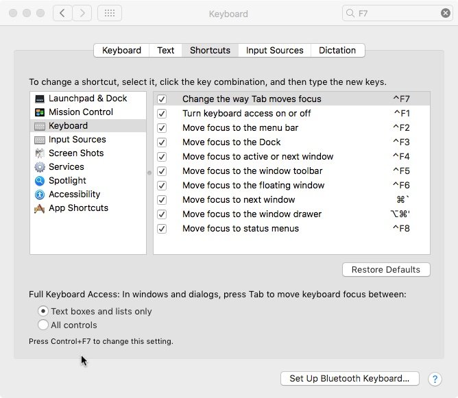
I would like to point out that I was unclear, a failing of mine, and that I think we agree on much of what you have written. My comment about 'hit and miss' was meant as a comment on the entire ecosystem using the "Full Keyboard Access:... All controls" I have found that many times I cannot use the tab key to speed things up because there are so many fields, buttons and checkboxes in a dialog box that it is easier and quicker to just mouse into the one I want. So I do not use the function. If I had difficulty using a mouse, as many people do, then I would engage it and silently curse the poor design of whatever dialog box I am in.
Much of the current betas from Affinity suffer from poor implementation of tabbing between fields.
Again, I think we agree on much of what you have written, perhaps all of it. Thanks for looking for instances of 'wrongness'.
Indeed, I sometimes don't use thad function on more complex pieces of software… We still live mostly on a WIMP world, especially on the Mac. However, I rarely use the mouse to trigger confirmation buttons on most dialog boxes and prompts. In fact, I sometimes even press Tab followed by Space instead of pressing Return and triggering the default option, thus adding an extra step, to give me a split second to thing if I really want to save changes, print something, etc. Interestingly, you really need to have the “All controls” option selected for such a basic option, because otherwise you can only press Escape or Return (and those don't really cover all the options on many prompts.
In my case, it's not a matter of difficulty; sometimes I just want to speed up workflows that aren't slow enough to justify using action/macro-based automation, but boring enough to, you know, justify me not wanting to use the mouse for them. I'm also a heavy keyboard shortcut user, something that came, as I said, from my Windows days, but also became further ingrained after working at a Mac lab. I was responsible for 16 Macs in one room, and 10 more in another, so imagine what it would be like to turn them off at the end of the day without my faithful Ctrl+Opt+Cmd+Eject shortcut, or updating them without full keyboard access (again, those numbers and the high network speeds we had didn't justify using imaging techniques, but doing it without resorting to the keyboard would be a damn chore).
In my experience, that inconsistency, or overzealous UI coverage (that's precisely the point, in fact), is far outweighed by the advantages. It's just too bad that some apps which I already paid for and to which I desperately want to switch seem to be fighting me at every corner; Adobe's apps are also cumbersome in other regards, but seeing how I would always need them for certain projects and would, thus, have to use them on occasion (even if that entails running my trusty CS5 Design Standard on a crusty VM, or on Bootcamp, or whatever), the value proposition of Affinity apps comes out severely damaged from any and all defects that actually hinder the jobs I could indeed do with them right now.
As it stands, I only use Affinity apps for stuff which is manifestly better on them. Which means, guess what: mostly gradients. https://feedback.photoshop.com/photoshop_family/topics/photoshops_gradient_editor_needs_an_overhaul And only of the RGB or CMYK kind, because Affinity's support for spot colours is, I'm afraid, pretty substandard, especially when it comes to, ironically enough, gradients (and, alas, transparencies, which is a great – and seemingly simple to implement, one would guess? – use case for them); those are precisely the kinds of projects which would always force me to use Ai, the others being type design (Affinity Designer's support for sending standard PostScript-compliant objects to the clipboard, on the MAS 1.6 version, at least, is, alas, dismal and completely incompatible with digital type design apps such as Glyphs or FontLab).
[Edit: regarding gradients, I am very happy to see that the latest Affinity Designer 1.7 Beta finally supports spot colour transparencies/tints and gradients without converting them to CMYK but, when it comes to the latter, only to white (not even to a 0% tint of the same spot colour, which is a complete head scratcher because on Corel Draw 7 the reverse was true, and on Ai I believe both work just fine)… It is also indeed possible to make cross-spot colour gradients, but it entails setting an entire spot colour to be a global overprint colour (I sincerely hope you can have multiple swatches of the same colour, one in overprint, and one in normal mode, otherwise having to add an extra white object behind each object with a spot colour fill will be a pain), and overlaying the topmost colour over the other; the thing is, it only works for print, because on the regular display mode on normal PDF readers, only the topmost gradient to white will be visible… Overall, it's an extremely cumbersome workaround for something which Affinity will – or should –, hopefully, support soon]
[Edit #2: Upon further testing, I am also happy to report that the “Multiply” blending mode works effectively as an always visible overprint on the final PDF file and on a per-object basis, even for spot colours, which is great and maybe explains why the developers didn't even bother to implement overprints in any way other than on a global basis… On one hand, that makes my workaround easier and more visible, while also avoiding the side effect of undesired overprints on all other objects of the same colour, but on the other hand, it still doesn't excuse them for not implementing cross-colour gradients; it is technically feasible, it's just a matter of implementing it, so there's no reason why they should be converted into CMYK by default. I will likely update my original post accordingly, with new PDF and .afdesign file demos]
-
Since I've already expanded a lot on the subject on my last post, I'll keep it short and to the point:
Affinity apps almost completely disregard the macOS system-wide option “Full Keyboard Access: In windows and dialogues, press Tab to move keyboard focus between: All controls”, in the Keyboard prefpane. In fact, they don't even honour the alternative and default “Text boxes and lists only” on all places, which would include the very useful input fields on many different palettes.
There are issues on important dialog boxes such as “New Document”, and the only palettes where fields are properly addressable via tabbing are, AFAIK, the Transform palette, and only partially so. Some allow for tabbing between one or two items, and all of them, regardless of the number of fields, drop the user into the “Tab to hide the Studio” behaviour, instead of cycling back to the first field like in Adobe CC.
This behaviour is, for lack of a nicer term, undesirable and unintuitive, and I could also reproduce it in the Windows beta of Publisher; seeing how I can also reproduce it in the MAS versions of Photo and Designer, I'm willing to bet that it's also reproducible in the release-quality Windows versions of those as well. I also noticed input field and UI control ordering inconsistencies between the Mac and the Windows versions of Publisher.
I am aware that fixing this would require an overhaul (or at least an internal review process) of six different codebases across two different OSes (though the fact that some palettes and dialogues are rather similar across apps, so there should at least be some economies of scale at work there), and introduce further overhead in your development process from now on (because it does indeed require a change in philosophy, as tabbing has up until now been added just as an afterthought and only in the places where we specifically asked for it, instead of everywhere, organically and by default, following a predictable scheme and behaviour), but this is yet another thing which I believe you also must do in order to be taken seriously by design professionals who actually use your apps for UI and UX work; you must lead by example, because many of your users will know a lot about that very subject.
For the same reason, Adobe was the butt of all jokes for the better part of a decade on account of their lack of polish and consistency (there's even a Tumblr page called “Adobe Gripes” [formerly “Adobe UI Gripes”] dedicated to their misgivings: https://adobegripes.tumblr.com ), but even they got their act somewhat together as of late (there are still inconsistencies between different apps of their suite, but at least most of these nitty-gritty UX issues are pretty much solved by now). Seeing how you're still in the beginning of your expansion in the market, and only have 3 apps in two platforms to contend with, please take the opportunity to polish all of them before the arguably momentous 1.7 release, which will mark the completeness of the originally announced Affinity 1.x suite. All eyes will be, then and once more, on you, and some reviewers will possibly go through all those details (maybe even making brand-new reviews of the original first two apps), and call them all unpolished or unfinished. I know I would, because that's the way they feel, at least on this major point in particular.
-
On 12/1/2018 at 11:20 PM, Old Bruce said:
I find this feature to be quite hit and miss depending on the various ways it gets implement, more often not, by developers so you can see it is off for me. All controls means anything that could possibly be highlighted gets attention from the Tab key being hit. No rhyme nor reason to it.
Well, let me put it this way: I know it is a bit hit or miss, but consider the following:
1. Apple does it right;
2. Adobe does it right;
3. It's something that when activated on macOS, makes it behave a little more like Windows (something that would please a user like @walt.farrell, for instance, and which makes the Mac so much better and quick to use for me);
4. Seeing how both Adobe *and* Serif offer cross-platform apps (in fact, Serif started out as a Windows-only shop), and that tabbing is a pretty natural behaviour in Windows, it stands to reason that Affinity should behave well with keyboards and tabbing in particular.
Is my reasoning a bit of a stretch? You see, it's also not the first time I find weird tabbing behaviours in Affinity apps, the earlier one being, IIRC, a completely inconsistent tabbing order in the Transform palette, which made inputting values extremely cumbersome and unintuitive. Oh, news flash: I just checked, and I realised that it's still not completely fixed (at least the ordering on those four fields is now correct, I'll give them that). You see, when tabbing from the “link chain” constrain proportions button, you can't get to the next field, Rotate, and instead hide the Studio right away. This behaviour goes completely against this system-wide setting, too. You should be able to not only tab between all fields and buttons in each palette, but also to the palette separators and even between other palettes from the same group… Not even Adobe does that (when you select a field and start tabbing, you get stuck in an endless loop between the fields available in that panel, even with said system-wide “All controls” setting activated, but at least Tab doesn't hide the Workspace), but hey, there you have another golden opportunity to one-up them at something.
Also, while I'm at it (and even though I will probably create a new thread, or just bump one which I started on the same subject and which has been lying around dead somewhere in the forums for 2 or 3 years now, I still feel this other bug is completely relevant to the topic), I should add that the Separated mode still doesn't work properly; I'd love to be able to use it in Affinity Photo (in fact, I still use it in Photoshop), but Serif never got around to fix it and allow for docking the toolbar and toolbox, and/or at least prevent windows from going full-screen at all, zooming or even being dragged behind them, something which Adobe, Macromedia, FontLab, Microsoft, etc. etc. etc. got right more than 30 years ago (if that happens, you either have to toggle full-screen from the menu, or switch to a different app just to be able to access the window chrome)… Serif isn't adhering to the best practices from even the Macintosh 128K era! It's in these little things that their former Windows-centric background really shows, but please, oh please, if you're answering user requests (and said Separated mode was probably born out of one of those), at least polish them to… I won't even say perfection, but just basic usability. Actually take the time to learn how the Mac's original “floating window + toolbars + palettes” UX concept works, *and especially the zoom button*, and get the details right (if you have to fire up a bootleg Snow Leopard VM and install FreeHand 12, or Office 2001:mac, or FontLab 5, so be it… Oh, wait, never mind all that hassle; you just have to fire up Photoshop CC 2019, turn off the very prominent “Application Frame” on the Window menu, dock your stuff and you're all set, boom!, with a fully functional Separated mode for comparison's sake and reverse-engineering… and do try the zoom button while you're at it, please! Because having it duplicate a sort of “maximize” function is just useless, we might as well just use the regular full-window or fullscreen mode!), because some people, and some apps/workflows, really do benefit from that model (especially Affinity Photo, for obvious reasons; in fact, we'd be better off if Serif just killed Separated mode in the rest of the suite and concentrated just on getting Photo right). The same goes for keyboard support, I guess, and here I speak as a former PC user who actually values the competition's effort in keeping the software as close between platforms as possible…
IMveryHO, your (@Old Bruce's) way to go about OS-level features and Beta testing is completely lenient and backwards… I know I border on the obsessive and sometimes even on the aggressive with my nitpicking, but surely we should expect developers, especially self-proclaimed user-friendly ones and to whom we already gave our hard-earned money (maybe it's not your case, but it's certainly mine), to adhere as strictly as possible to Apple's HIG, am I right? Why make excuses for something which shouldn't be that hard to code correctly? This is not a full-blown new tool, or something that messes with the graphics engine and dependencies or whatever, and it's not some obscure accessibility setting either; it's actually just plain adhering to a top-level OS-wide setting which affects a default input method that makes a Mac or a PC, well… a Mac or a PC. In fact, I'd go even further and say that this is the kind of thing that should also be available on the iPad versions of Affinity apps or the upcoming Photoshop for iOS… I don't even know if you can tab between interface elements on iPad apps, but since there are first-party Smart Connector keyboards and built-in first-party and third-party Bluetooth keyboard support, complete with support for some system-wide keyboard shortcuts (yes, with a Command key, just like on a real Mac), you definitely should. Face it: keyboards may be archaic as hell, but they aren't going anywhere any time soon.
Now, some final considerations on the reasons which may be behind these issues… I'd venture a guess and say that it all comes down to the usage of custom interface elements, and a desire to keep the interface as close as possible on both the Mac and Windows sides of things (which, as you'll soon realise, it's not a fully achieved goal by default on Publisher, either; I have yet to test it on release-quality software, but I'll be sure to run a trial of Photo and Designer on a fresh VM just to check it out), and the usage of not entirely native/first-party frameworks as they were conceived (I'm talking about Interface Builder and default Aqua interface widgets, specifically, and its equivalente Metro counterparts in Windows). Interestingly, when tabbing on the “New Document” dialog on the Windows version, you can't even get to said button, you also get to a phantom field which triggers nothing when pressing space (in a different ordering… but maybe it corresponds to said button, only it doesn't work?), and you can indeed get to the lower fields, too, but never to said middle separators, either… In addition, the ordering on those lower fields is also different, and it makes less sense than on the Mac version; whereas on the Mac, you get from the two Width/Height fields to the “Portrait” checkbox and, only then, to the DPI field with drop-down button, on Windows you get straight from the Width/Height fields to said DPI field and, only then, to the “Portrait” checkbox. You see, consistency across platforms is also key (pun unintended), especially considering how Apple doesn't produce certain devices like the Surface Pro, or easily upgradeable desktop computers, and some creatives may indeed end up working with a mix of both iMacs and Surfaces, MacBooks and PC towers, etc. etc. Those users already have to deal with the nightmare of different shortcut triggers by default, so let's at least spare them the indignity of those inconsistencies, minute as they may seem…
-
Hi guys,
I know I'm probably in the minority here, but as a former longtime Windows PC user, all my Macs get the "tab between all elements” treatment (using the Ctrl+F7 shortcut), and I'm the master nitpicker when it comes to finding inconsistencies in the tabbing implementation because I happen to use the Tab key *a lot* (that's also what having two big screens and losing your mouse cursor a lot on a daily basis, even with El Capitan's “shake cursor to enlarge” function, does to you).
This time, I realised two things:
1. When tabbing between fields and interface elements in the “New Document” window, I can never get to the four separators on the bottom half;
2. The little “Presets” button, with the four horizontal lines and the down arrow and to the right-hand side of the “Page Preset” drop-down menu, is never visually highlighted, though it is indeed selectable; also, when pressing the spacebar, the corresponding menu will not open adjacent to said button but underneath wherever the mouse cursor is; furthermore, this behaviour is reproducible in all Beta Affinity apps.
So, yep, that's about it. If I can reproduce any of these behaviours elsewhere in Publisher, I'll let you know.
-
Count me among those who also think this is a must-have in a pro-level application. GREP styles saved my proverbial derrière in more than one InDesign project already…
-
Oh, by the way, kudos on the Preview mode. Is that new in the .145 beta? I was about to point out that it would be a nice to have, and just noticed it's there, yay!
And… do you reckon you could do away with having to press the Control key and just be able to press W to toggle it, or is that a requirement because of the way Publisher is coded, an over-zealous adherence to the HIG or some other factor (like… not wanting to ape Adobe too much ^^ )? I know, I know, but… you know, muscle memory and not having to use my pinky so much… First-world problems!
-
On 10/1/2018 at 11:58 AM, MEB said:
Hi JGD,
Thank you for your feedback and support. As said there's still quite some work to do here. We are aware the current feature set is limited for long documents and the way master pages work is still far from ideal and limited in its scope. Your considerations about global layers should also be addressed at some point. As with other things I can't give you an ETA for these or any other features, nor I know exactly how they will work at this point since I'm not aware of all these details (I'm also not the most suited person to do so). I don't think it's wise to expect Publisher to replace InDesign (or any other high-end publishing software) right after its first release. We are still building its foundations and some of that work will extend through the 1.x cycle of the app. We do understand master pages functionality is essential for any serious workflow. The only thing I can assure you is the development team is well aware of these limitations and hope to address them as development moves forward. It will take some time though.Hi @MEB, obrigado pelo update [thanks for the update], and you're welcome; I do my best with the little time I currently have. Not having ETA isn't the best of scenarios, but knowing you're taking our concerns and expectations seriously is way more important than that, and it's very good to know you are.
As for those concerns and expectations… I was never suggesting that Publisher could ever replace InDesign for all, or even most of the use cases in its first commercial iteration. I only hoped that much like Designer, which I can use for almost everything except auto-tracing, 3D effects and projects which require gradients and transparencies with proper spot colour separation (yes, my exclusive use cases for good ol' Illy are now that much limited, and the only reason I don't use Designer for 90% of my work right now and use it instead mostly just for RGB stuff that requires gradients is the fact that, well, Publisher isn't officially out yet – or feature-“complete”, for that matter – and I want to switch to the entire suite at once, because of the obvious economies of scale).
The thing is, as things stand, I can't use Publisher even for the most basic of projects without feeling I'm fighting against it and, in a sense, “losing” money because of wasted time. None of my usual projects are especially complex, by the way… It just so happens that some have dozens of pages, others are smaller but require multiple pages per spread, and pretty much all of them require object linking. And I'm not some über-elite designer doing exotic stuff, just leaflets and booklets for events, not unlike the ones I did at the company I worked for previously. Let me tell you, it's all very mundane stuff, really.
Pardon my cheekiness (especially any old-time Serif customers reading this), but it seems that… PagePlus could be used for way more serious stuff but was bought mostly by people who just wanted to typeset their local church newsletter (maybe because of marketing, maybe because of the way the program was laid out, maybe a bit of both; I can't really tell because I never used it, but I did give it a look on your old website before I wrote you that prescient long-ass letter after Adobe threw their CC-only strategy at us, and it seemed to be a bit of both), whereas Publisher is being marketed as being suitable for more serious stuff (come on, man, read your own marketing materials when it comes to Affinity as a whole and Photo and Designer in particular; it is being aimed at pros) but is only good… for typesetting the local church newsletter. And it will still be hard to use and not exactly educate users in DTP's best practices, because of the reasons I've stated.
Maybe part of your audience (and even a number big enough to recoup development costs) doesn't know any better and will lap it up, but you won't get as many [happy, satisfied] switchers from InDesign as you've got earlier from Photoshop and InDesign, that much I'm certain of. And that might in fact tarnish your reputation to a certain extent, especially among pros (which, for a change, have been taking you seriously; just compare the kind of coverage you've been getting to that of Pixelmator, Sketch, etc.). You know, as they say, never overpromise and underdeliver, and even if you don't do so on an official and ostensive manner, the very existence of Photo and Designer with the “Serif” label on them is, in a way, a form of “overpromising”. Publisher isn't exactly being marketed as “Publisher Elements” either, now, is it?
In fact… Now that you've shown your hand, and haven't yet revealed any novel feature which Adobe might copy (good on you, really; the last thing we want is for them to rip you off, like they did with the corner tool), you would do better to keep this as a public beta for as long as you need until those three basics (global layers, proper masters and linked objects) are implemented (sure, multiple and/or differently sized pages per spread could certainly wait a bit longer, I guess; after all, InDesign didn't have those for years, either). We're not asking for anything very advanced, just the absolute basics. Please listen to your professional users, as we do have your best interests at heart (if anything, because it will also benefit us in the long run). And yes, that takes into account the fact that we had to wait much longer that we initially thought for the public beta to come out, but at least now we know why, and we know at what point in development it stands (as a matter of fact, I believe it should still be in internal alpha/beta, instead of being rushed to the PB stage)… If you try to charge (even if it's an extremely affordable price, yes) for a manifestly incomplete/unusable product, I'm afraid pros and reviewers alike will pile on you, no matter what you state in your forums or press releases, because Publisher will always be compared to your previous successes. In a weird twist of fate, Serif is now its worst enemy, more than Adobe itself.
But yes, @tariq is absolutely right, transparency is key, and we can't fault you for not being transparent enough right now. Delaying the release but having an ongoing public beta will keep all your users entertained and content, and buy you more time (and heck, this wouldn't be the Duke Nukem Forever of creative software, now, would it? We know you have sound internal goals and management, and a fine team…). In fact, I'm sure most wouldn't mind to see some delays in Photo and Designer development (hey, where are our customer betas!? Just kidding…
) if that meant that Publisher came out “right”. My/our €0,02…
-
On 9/13/2018 at 4:31 PM, MEB said:
Hi kubapet,
Welcome to Affinity Forums
This area is still being worked on. Currently objects coming from the masters placed in the spreads/pages cannot be unlinked from them. So currently the masters should be used to place objects that you want replicated equally on all spreads/pages to which that master is applied to. All objects specific to each page/spread should be created in that page/spread not on the master. There will be improvements here in future updates/versions.Note: there's actually a way to unlink them through the symbols panel - detach button - (which is the master functionality is based on) but its convoluted and not intended to be used as it is for this.
I am now a bit more at ease by reading this, as it seems to at least address some of the similar concerns I voiced on a different thread. While I'm not in the least bit happy about the current situation, at least this is confirmation that addressing it is indeed on the pipeline, and that it is already technically possible.
MEB, can we please get an ETA or some stronger commitment on this feature (in its final, usable form, at least, and it shouldn't be too different from how it works in InDesign or Quark; and allow me to elaborate: there should be an intermediate state where you could “unlink” objects in order for them to accept content placement, – and as for content flow, it should indeed be automatic with no “unlinking” shenanigans –, but they should still be “linked” in the sense that they would reflect changes done in the corresponding master pages)? It's just that I won't be buying Publisher nor recommend it until it is implemented it – it's unusable and an outright joke without it –, and I'd rather know your timeframe than having to check the forums every other week.
[Edit: I have just tested what you said, and two things became self-evident: one, I can't seem to find a way to unlink said objects, and two, your master pages are “master pages in name only”. The objects contained therein are indeed… symbols, of sorts? I can't click on them directly with the selection tool, but if I select them via the Layers panel, I can indeed edit their contents, and all the changes will be automatically reflected in the master page view, even without deliberately selecting and editing it via the master page section in the Pages panel. This is crazy! I'm sure you either want to accommodate Designer users, or just haven't gotten around to fixing this yet, but… it makes no sense to a DTP (Quark/InDesign) user. Master pages are supposed to be these “sacred”-like entities, which you set up once and are actually hard to edit on a whim. You really have to commit when doing so and know what you're doing, as they can completely change the look and structure of your document with the slightest of edits… You know, much like styles. I see why you'd use your existing Designer framework (even from a file compatibility standpoint), but master pages really look like just a tech demo/visual proof of concept at this point.
While on that subject, a third thing becomes self-evident, which is that you've philosophically painted yourselves up into a corner with your approach of defining artboards as layers, and layers as dependent upon artboards, hence the very need of your internal talk about “Global layers” (guess what, in Adobe apps, and apps by most other developers, all layers are, indeed, “global”) because your users are clamouring for a different – and more standard – approach. Your so-called “layers” are anything but, they behave more like artboard/page and object folders (whose visibility you can toggle, sure), and you have to recreate them for each and every page, much like your so-called “master pages”. While that would still fly with Designer users (and it's very debatable, still), it won't fly with DTP users in a multi-page document-centric application environment like that of Publisher et al..
Global layers, while supposedly being too “left brain” for your audience (or so you think), are an absolute necessity for long, complex projects that require some level of abstraction, and you should also port them into Designer while you're at it, even if you have to introduce further complexity and two different object management models (“layer-dependent + page/artboard-independent”, and vice-versa) into what's an otherwise quaint little vector illustration program (UX designers, on the other hand, would love that, and it was precisely on such a project that I missed global layers the most – in Designer, yes, and it was paid work, not just spec work for my portfolio or beta testing for your benefit).]
By the way, I don't know if you read my reasoning on the other thread, but I strongly believe that it really should be a v. 1.7.x (if not v. 1.7.0 RC/GM) feature and that Publisher will not be taken seriously by professionals – as I've just said, as far as we're concerned, it isn't by me or my colleagues, at least – unless it's there, and soon; Serif would be doing itself more harm than good by rushing Publisher out of the door without basic master page functionality, I'm afraid. In fact, I feel so strongly about this that I'll take it up a notch and do a little comparison: that would be akin to releasing Photo without support for layers or filters.
You see, this isn't some nitpicky, obscure typography thing like Drop caps or some of those bloated InDesign features which you can compensate for with workarounds; you're basically expecting your users to not use master pages for *any* editable field (and DTP is all about… filling up hundreds of fields), which is nuts and makes working with Publisher harder and less efficient than working with even Microsoft Word (and that's really saying something, as Word is a cumbersome old dog of an application). It defeats the whole “create once, reuse often” purpose of master pages altogether.
I'm very, very sorry for my tough stance on your collective work, which is hard and has been great so far… I'm mostly sad and frustrated, almost as if the wait for the first Publisher beta was still going on as we speak and this was just some cruel tease. I really, really wanted to get rid of InDesign and I just can't, and from the general tone of your post I don't feel I will with v. 1.7.0 either.
-
+1. Essential for things as basic as the leaflets mentioned and book covers as well.
-
36 minutes ago, Wim Daniels said:
@JGD I think most of my assumptions remain valid. But indeed, we should add support for baseline on a text-frame:
- Baseline grid can also be managed from a text-frame perspective.
This still means the baseline grid manager-button on the top toolbar makes no sense. It should be a pane in Studio > Text Frame (and a global setting in the spread setup, keeping two levels for baseline grid management)
Yeah, well spotted, and it does make sense. Well, if anything, Serif would also get it right and more intuitive as opposed to Adobe. I never understood the latter's reasoning behind putting baseline grids, a mostly document-level setting, mixed in with the app-level settings. Shouldn't that be the kind of thing that would go along with margins and master text frames?
- Wim Daniels and Old Bruce
-
2
-
1 hour ago, James Brokenshire said:
I think there is some confusion about what Alpha and Beta is:
- first there is user research to understand your users, what their user needs are, who they are, how they work, their context
- then based on this (and only after) you develop ideas for how you might meet these user needs .. these ideas become experiments to test ... that is what an alpha is .. an alpha is one of potentially many experiments to see of your ideas really do meet user needs in an efficient and pleasant manner as possible
- beta is where you have already established how you're going to meet user needs, and have the evidence that it works .. you then test .. test.. test.. for bugs, issues that didn't emerge earlier from use at scale, many more and different kinds of users and use cases ...
So right now it seems that Affinity are experimenting to see how they can meet user's needs for creating documents / books with over 100, maybe even 600, pages. Right now the alpha is proving that you can't.
Like someone said earlier - alpha and beta are not points on a timescale to product launch, nor are they a division of product features or user stories.
So - perhaps we're being really stupid and Affinity has an even better way of meeting the needs of users who need to produce documents with more than 10 pages ... in which case the calls for them to be open and publish their user research and user stories are well founded.
But they haven't, and they continue to censor / "approve" posts here. Which suggests they've gone further in the direction they should - closed secretive design by committee. They've already been a little arrogant here and told someone they "have over 25+ years of DTP experience and know what we're doing" to paraphrase.
Evidently not.
My understanding of what alpha and beta stages are seems to be a bit different; I was of the conviction that those stages pertained more to the overall stability of the software – and did indeed correspond to points on a timescale to product launch, obviously –, and that features could indeed be added or removed (more likely removed, but Serif does have a history of adding stuff, too) until release.
But yes, I do agree that this is an alpha-level app (per your definition) with beta-level stability (per my definition). Which is sad, because for all the wait, us pros were certainly expecting bigger and better and now feel a little deceived and disappointed, alas.
As for them publishing their research: nope, I fully stand by the Serif devs on that one, as I've been following the development of Affinity since its very inception (in fact, I predicted/guessed it in a letter I sent them a full year before they announced the suite) and I can still appreciate why they might be mum on that. Adobe does have a history of stealing features from Serif rather quickly, as the corner tool appearing on Illustrator shortly after being released in Designer should attest. Hence me putting such a strong emphasis on the ETA, and not on the specifics of the implementation; I don't care about the details, as long as it works and it arrives in a sensible timeframe which justifies resuming my testing. If you want to partake in a fully open development process, by all means go to the Scribus forums, or something. Besides, Serif is already way more open than Adobe, so I believe the tester doth protest too much on that regard.
On that subject, though, and considering how all three apps are going against a 300lb established gorilla and have a lot of catching up to do, I think it would be nice to see Serif use a trac-like version timeline/graph with all the publicly announced and expectable features; that way, we wouldn't have to be pestering them about ETAs or progress anymore. Unless, of course, they wanted to still be able to reprioritise stuff on the fly and still avoid raising expectations only to fail them right afterwards, a degree of strategic opacity which I can also appreciate… The constant delays in the Publisher beta launch were already bad enough, so imagine if they did promise a more complete feature set than the one they ultimately delivered (though we did assume, and rightfully so, that these features I mentioned would be there, because the only ones they explicitly said weren't coming were very advanced InDesign/Adobe features that would take years to replicate regardless of how far along the overall development of Publisher was).
As for their supposed “arrogance”, please do point us towards the relevant post. I'm keeping an eye open for that but, for now, I don't share that sentiment, though I do feel they sometimes suffer, to some extent, from hubris (and understandably so, seeing how successful they got with the first two apps). But that's what we, the pro forum-goers, are here for, to anchor – pun unintended, but funny in retrospect – them back to reality. Again, if we did a comparison with Adobe (and their insufferable engineers who sometimes argue with their users even in the face of overwhelming evidence, like in that infamous thread on gradients on an Illustrator user forum), the Serif team would, once again, come out on top. Still, these oversights and misguided priorities may add up over time, so what do I know…
-
Actually, now that I read that review and got around to take a small break and test master page item usage/content editing/overriding (or its lack thereof; I really didn't think it would be missing and I just assumed it would be there, as it's so, so basic), I am aghast at how seriously behind Publisher is functionality-wise. Master page items ARE NOT used for decoration only, they serve very serious workflow and time-saving purposes for content insertion as well. I teach students how to use creative software, and a recurrent theme is telling them how to use as many of those “do once, reuse often” automation features as they can (in my case, it's side-bearing and kerning-pair grouping, as well as component usage – it's a kind of “typographic symbol/asset” of sorts, which you can fully parameterise – and basic scripting with classes for contextual alternates in the acclaimed type design application Glyphs). I would never, ever recommend Publisher to them if it didn't adhere to this basic standard of operation at launch, of which even Designer seems to be a great example, with its symbols, assets, etc..
I concur with the reviewer's assessment; this may end up hurting Serif more than helping. This isn't even the “nice to have for complex projects” kind of feature like the ones I've mentioned before here in the forums (to save you some time, I mean having multiple-page spreads), let alone an advanced professional-level feature which no one really expected because the Serif team had already shot it down (think Multiline Composer), this is actually the kind of “I'd rather use the car-crash-interface-Scribus, install InDesign CS5 – or Page Plus, if that's your cup of tea, as I don't believe you can't override master page items on PP – on a VM, pay the Adobe CC tax or sell a kidney to buy a license from Quark if I can't do this on Publisher” kind of feature.
So I will ask the Serif devs very bluntly: what is the ETA for this very, VERY basic feature, without which Serif shouldn't even be allowed to called Publisher a DTP application as many people would see it as, more than incomplete, actually broken/useless? 1.7 GM? Or 2.0 GM? I should also restate the same question re inline/anchored images and vector objects as well, while I'm at it… Is it a 2.0 affair, or can we expect it sooner?
Sorry, mac_heibu, while I do concur that calling it “alpha” may be an “insult”, in the sense that Publisher is indeed way more stable than alpha-quality software, calling it “proof-of-concept” would be, as of now, entirely fitting, as it's a functional stage somewhere between alpha and beta (betas don't have to be feature-complete or even completely stable, but they have to be at least usable for basic stuff; for instance, Gmail was officially in beta for years on end and, guess what, you could always quickly and easily send e-mails – and then some – from the very beginning). It's an interesting piece of software, but in its current state it would be cumbersome (if not downright useless) for even the most basic of tasks (and yes, typesetting a 300+ page book of prose or poetry, without footnotes, is something I would call basic, as it's precisely the kind of easy DTP exercise we had to do at an undergraduate level). At some point, if using a word processor is easier and quicker than even using Publisher (and I had colleagues on my BFA that did indeed set entire, complex 40+ page documents in Word – and by complex I mean stuff with images and recurrent, master page-like decoration –, and I can assure you they looked good), its point of even existing is moot.
To do DTP you can't just make do with multi-page Designer with cross-frame text flow, baseline grids and static masters tacked on; you need way more than that, and Publisher is currently failing to deliver on that basic set of needs (not of being an InDesign/Quark/Scribus clone per se, but at least a prosumer DTP app), period. After you properly set up your document, a DTP app should work for you, and not the other way around. Never, ever, in a million years, otherwise its cheap price will just be quickly offset by diminishing returns, as any economics 101 will tell you. I'd say 10 pages would be about the top limit over which that effect would kick in and hey, guess what, Designer can handle as many pages just as well so, again, Publisher's very reason to exist is rendered moot, and by another Serif app, no less.
And to the Serif devs, I am very sorry, as you've been very kind to me in the past, a kindness which I haven't returned for personal reasons (as I said before, I'm finishing a beast of an MA thesis – on typography, no less) that have nothing to do with what I think of your work and mission, which I feel is mostly useful and positive, but… While I used Designer and Photo betas for professional work with glee (despite all your recommendations to the contrary; yeah, sometimes I like living on the edge), I wouldn't subject myself to actually test Publisher even in a speculative setting in its current state. Please do appreciate where I'm coming from: reengineering old InDesign projects into APub format could be useful in the future, but only if I had the guarantee that by 1.7 or 2.0 GM they – or the muscle memory acquired in the process – might actually be useable and useful, hence my insistence on getting an ETA from you (also, it's not like I'm asking about some super secret feature Adobe mustn't know about, lest they rip it off from you).
I know it could be in my (eventual) best interests as well, but it would feel like a potentially pointless chore (and an unpaid one, at that… wait, even worse, I would be the one paying for it after the GM launch!), and not like a fun (and actually useful from a strategic standpoint) thing like the earlier betas did. Also, I know that you always make a point of warning users that files created with the betas are not guaranteed to work properly with the GM versions, but that's a gamble that at least has some chance of return; Publisher's value proposition, even from that standpoint, is pretty much null at this point.
I am impressed and relieved to see that you are taking typography – my baby – seriously enough, but when it comes to the mundane nitty-gritty of DTP workflows, I really do believe you have your priorities all mixed up and that most serious users would be more forgiving of many other bells and whistles not being there in the beta (like… many features from Designer – including, yes, advanced typography controls –, which are already there by default anyway). Please fix this, and then let us know in the forums or via e-mail newsletter when you do, so I can resume testing in earnest…
My honest advice is: I know the road to GM is hard (having worked on a personal project with a somewhat fluid deadline for four years myself, I can absolutely relate) and, at some point, you will have to freeze the feature set (ditto for that), but please, oh PLEASE, do not ship this thing with either of those features missing, as you'll lose a few important pro testers/potential DTP clients in the process (me included; and I specified “DTP”, as Designer and Photo are, indeed, “good enough”), even if temporarily (though it won't make you look good in the eyes of the pro crowd even if you do get around to adding them in a later 1.x or 2.x release, that's for sure…). And don't think for a second this is a slippery slope and that, after these features were implemented, I'd start harping on about a myriad others (like literary/academic/technical-related ones, such as multiline composer, indexes, footnotes, the works; those should come eventually, but I'm obviously not holding my breath). No, these features would elevate Publisher into “good enough” status and put it at least roughly on par with its brethren, even if it stayed a bit behind the other incumbents in the DTP space… It would still be the inexpensive option, but the value proposition would be there and work its magic, as usual.
As a matter of fact, I could quickly redo 90% of my professional freelance work (as opposed to some of what I did – and all of what my colleague did, as she was responsible for a medical magazine – at the medical event management business I worked for, namely long-ass conference programmes and books of abstracts) in a practical and sensible fashion (as in, in an easily editable/expandable/reusable form) if only – and only if – you added those two features. As long as they are not there, I won't be spending my money on Publisher or recommending others to do so, sorry; that's where I draw the line, and it's a sensible one at that, as the kinds of projects I worked on seem to match pretty well with your target demographic (people who do more artsy/marketing/advertising work and less literary/academic/technical – in essence, “boring” – work) and with those most of my colleagues worked on, too; I don't know what kind of market research you did but, unfortunately, I do believe reality will get the better of you and once the disgruntled InDesign user reviews start pouring in you will regret that decision (if you do indeed go the opposite route of focusing on fluff over workflow, that is). On that subject, I should also add that I have been heavily pushing Publisher (and Affinity in general) on social media and IRL (and while I don't have a metric crap ton of followers/acquaintances, I am a bit of an influencer on my niche, on account of having been a – still somewhat locally famous – computer room monitor and being a teacher), so my personal credibility would also be on the line, so to speak… In a sense, not recommending Publisher in its potentially incomplete 1.7 incarnation may hurt your wallet a bit in the short term, but it will also spare you some needless (and, I reckon, somewhat unfair, because I do think you have your heart in the right place) humiliation. Peace, and godspeed!
-
5 hours ago, Wim Daniels said:
I agree that the baseline button as it is implemented now, doesn't make much sense. A baseline grid is most likely a global document setting, so the baseline manager belongs in the document, spread, master-ages area. That's where I would like to manage my baseline grid.
Having my tools snap to the baseline grid is something I like to use in a flexible way. So to me it makes sense to have a button to switch it on or off in the top toolbar. But I can imagine that others prefer a switch to turn other snapping options on or off: guides, margins, spreads, objects... It would fill up the toolbar pretty soon. So better to keep the snapping option as the are now with the magnet button.
Simply remove the two baseline grid buttons because...
- baseline grid should be managed from a document perspective
- baseline should be define in paragraph styles
- snapping to the baseline grid belongs in the snapping options.
While we're discussing the baseline grid, why is displaying the baseline grid not an option in the view menu? We need to switch visibility from the baseline grid manager. That doesn't make sense when you want to change the view on you document.
Also when I want my baseline grid relative to the margins, I prefer it being displayed/active only inside the margins...
Wim, you can't make assumptions of that kind re baselines. InDesign allows for frame-level custom baseline grids for a very good reason:
It's good practice to set captions and margin notes in a different style than the running text, and since said style is usually in a smaller body, it follows that the baseline grid should be in a smaller leading as well; good practice also dictates that you should use some kind of cross-alignment scheme, usually with a sensible ratio (like 3/4, 4/5, etc.)…
If it wasn't for that, you'd have to use a minimum denominator, which, in turn, would mean that you'd have a stupidly small leading and have a confusing excess of baseline grid lines, thus defeating its purpose. I should know that as I sometimes use that technique in simpler projects with a 1/2 ratio, and it already gets very confusing as it is.
-
12 minutes ago, serge said:
So my document should show like that (screenshot in publisher) with the grey lines being the bleed?:
and my pdf layout should be :
Exactly! Those grey lines are there just to show where the page will, ideally, be cut after binding. But it never works out that way…
If you look at, say, a couple banknotes, which are as precise a printed object as they get, not even those are all entirely the same (there's a reason why the background design – or their lack thereof – extends over to the edges in a simplified way, so they can be cut to measure from large sheets and still allow for the tiniest bit of misalignment).
As you might guess, our regular printing jobs are not very mission-critical by comparison, and one or two mm. of deviation are actually fairly standard especially after the booklets are bound, as the edges of the inner spreads extend outwards a bit more than the outward ones (that's why most bleeds are at least 3-5 mm in width).
-
16 minutes ago, walt.farrell said:
I never said it shouldn't be done. I said (somewhere upstream) something like "letting the users vote on which things should be done first generally can't work, as there are complications the users don't know about."
Oh, sure, I can appreciate how that could become very chaotic and misguided, and quite fast. But perhaps allowing them to rank a pre-compiled list of features and suggest others in the forum like we already do (and the Serif devs would ultimately be the arbiters of which made the cut) in order of importance would give the devs a bit of insight on at least which would make the app more competitive, ASAP.
Of course, dependencies would have to be taken into account and would always dictate the order by which they were tackled in the end, but that doesn't change the fact that, all things being equal, tool A, being more popular than tool B, could also get priority treatment.
16 minutes ago, walt.farrell said:Are you asking for a way to have overflow text automatically flow into additional text frames? If so, try shift-clicking on the "link" triangle on the lower-right edge of the text frame, near the eye icon.
Quite the contrary! I wanted to prevent InDesign from doing that and adding page after page near the end of the document (until said limit is reached and I keep getting those stupid pop-up messages warning me of just that).
IIRC, I believe I once came up with an ersatz solution; I broke the link on the last page of the main section of my document, and linked it instead to a dummy text box outside of the master (which would just show the overflow [+] sign, instead of, you know, actually flowing to a new page). There's probably a proper, more elegant way to turn that off, but my jury rig achieved the desired result anyway.
In any case, don't worry too much about that. This is a Serif forum, after all, and we're all itching to ditch InDesign rather than keep dealing with its quirks.
-
On 9/4/2018 at 1:41 AM, walt.farrell said:
And that sort of complication (assuming it's even intended to work) will have to factor into development plans for new features.
(In a discussion a day or two ago where I mentioned different size pages in the same Publisher document, and one of the requests was for 3 pages in a spread, 2 outer book covers and a spine, one of the Serif staff wondered what the test scripts would have to be like for that situation. I can only guess that I wouldn't want to be the one testing it But it brings back memories of one project I was designing at my former employer, where I had a nice design for a new function that the users of our product would like, and our testers vetoed the development of the item because they had no way to test it adequately.)
Well, just because something is hard to do, doesn't mean you shouldn't do it… Especially if it's something you must do in order to be able to be taken seriously by your target audience. AFAIK, Affinity is supposed to be geared to the professional print market, and though we do not expect all the same bells and whistles from CC (many of which are, let's face it, bloatware at best), basic features pertaining to the actual physical layout of our print jobs should be a given (hence the insistence by the tester community on the need for bleed previews; however, in the grand scheme of things, these features are actually way more important for more complex projects).
I mean, page and spread management in ID is sometimes unintuitive (especially that stupid habit it has of automatically adding more and more pages – until that magical… what's it, 10-page limit? is reached, and that's something that would also be cool to see being addressed in Publisher, too – whenever the content overflows; maybe there's a way around that, but if there is I still haven't found it), but it gets the job done. It's actually not the most unintuitive of Adobe's apps when it comes to page/artboard management, unlike Ai (oh, how I loathe that stupid Artboard panel and miss FreeHand's page navigator/editor… Artboard management in AD is a bit better than in Ai, but still not as intuitive as in FH, and it has quite a few issues of its own – namely object ownership and out-of-bounds visibility –, as I pointed out in the Designer forum some time ago), and it doesn't look that hard to replicate, either.
The whole “can you give as an ETA” thing is not meant a diss on the Serif devs or anything. I am, of course, fully expecting them to add that functionally eventually (even if it has to be postponed to an also paid 2.0 version), but having an ETA, especially on a feature which is not exactly novel (and, hence, won't really tip off Adobe's or Quark's devs in any meaningful way) but is, at the same time, essential, is of material significance for their customers, as it may affect their future buying decisions. If I were using InDesign CC and intending on switching to Publisher, and realised this or that feature would be completely missing for months, I would start looking for a CS6 copy+license on eBay ASAP so I could set up a dedicated virtual machine in the mean time (even considering the initial investment, it might be worth it in the long run, if anything to be able to convert old files into .PDF so as to import them into Publisher even well after the subscription expired).
-
5 hours ago, Edward said:
You never know they might be on stage next week!
Not very likely, as that will probably be a strictly iPhone-focused event, but it would be cool, yep. Maybe on next year's WWDC, to receive yet another award?
-
1 hour ago, serge said:
I just downloaded it and I noticed that it keeps crashing out.
serge, I thought I should warn you about this: sharing your Mac serial number on the web for everyone else to see can be a bit of a security liability…
-
29 minutes ago, walt.farrell said:
And that (different page sizes within the document) is already possible in the Publisher beta. What is not possible at this time is having a spread which contains more than 2 pages or pages with different sizes. Standalone pages can have different sizes. I'm not sure if a spread can have a size different from other sites.
Maybe you're right, but I have no idea what's involved with the snapping that makes spreads
Interesting… Pardon my ignorance, but… How exactly does one go about changing an individual page's size? I looked for it and I couldn't find it anywhere.:\[Edit] Nevermind, I found it. You just have to edit the spread properties…
In any case, those two features make much more sense in conjunction, as I just explained. Besides that use case I've mentioned, when doing two fold, three-flap flyers that have one of the flaps folded under the cover flap (as opposed to being folded in a Z shape) you have to subtract 1-2 mm off of that inner flap so that it fits.
Just having the option to change spread sizes may allow you to do a book cover, in the same document as the rest of the book, which includes the spine, back cover and inner flaps as a single page, but it's still a PITA because it forces you to make a specific layout all by hand, and fine tune it according to the print shop specifications (just like I had to do waaaaaaaay back in 2010, in InDesign CS4, with the only added – but negligible – advantage of being able to keep it in the same document… I mean, you wouldn't expect Publisher to be four or five versions behind CC 2018 in basic stuff like that, let alone eight full years, now, would you?).
Also, I just found that the weirdest thing happens when customising a spread to have a different page size: I had a portrait A4 document, with a cover page and two full spreads; I customized the first full spread to be landscape A3 sized; then I proceeded to delete one of the A3 pages to see what happened and, guess what, I still had a landscape A3 spread and the last A4 page was gone. I am very curious to see how Publisher would behave if those pages had a Master applied to it and had content in them. This may make sense in some use cases and makes print documents more foolproof (in general, you shouldn't be able to have differently sized facing pages), but it feels woefully unintuitive.
Oh, by the way, now that I think about it, it would be awesome if Publisher actually had a “print project” persona/tool of sorts (maybe a grouping tool in the pages panel?) for books, that let you define how many sheets/booklets you had (perhaps even with a paper colour/texture preview), how they were folded, and in which order they were stitched/bound. That way, you could “freeze” a physical layout, so that it was physically possible to produce and that your content would fit it and not the other way around. That would be great both for newbies and professionals alike, especially in the DIY camp, and would ensure that every project would always be made up of multiples of 4, 6 or 8 pages. That would definitely not be a priority, but it would be a “nice-to-have”, which would give them a leg up over Adobe. I am a pro and, while I don't exactly need such a feature, I would love it. -
On 9/3/2018 at 3:43 PM, walt.farrell said:
In my experience, voting by forum users doesn't really work well, although it certainly may make the forum users feel good about being heard.
First, a technical issue: Some features must be implemented in a certain order, because they depend on each other (even if the users may not know that) or they impace (or are impacted by) other things being developed.
Next, a practical one: Some forum users are very vocal, but others are very quiet. Some would vote, and some wouldn't. Some probably don't even visit the forums at all. And you might have 10 very vocal users with a particular workflow who desperately want function A, but 100 quiet ones who have a greater need for B.
Finally, it's hard to be sure that the users participating in the beta are representative of all the users who might buy the product later.
Yes, those are all valid questions. And then there are users like me, who would be [more] actively participating in the Beta if they only had the time. It's extremely frustrating, as an old-timer beta tester, to not even be able to really put the apps through their paces, but such is life (and I am certainly representative of the people who will buy this thing – and I will, anyway, regardless of how incomplete it is; I am treating Affinity a bit like if it was a Kickstarter project – because a) I already bought the other two, b) I've been using ID professionally for almost 10 years now and c) I don't intend on leaving the DTP market any time soon).
As for feature dependencies… Sure, we don't know exactly which are dependent on which, but we can take some informed guesses. Seeing how Affinity Publisher is based on the same codebase as Affinity Designer, the internal support for variable page sizes (which should be just a different, more specialized implementation of artboards, after all) must be there already in some form, as should be the option of having more than two pages per spread.
It should be just a matter of exposing it via the UI, adding a spine indicator and getting the pages to snap nicely to one another (and that's yet another area in which Serif could one-up Adobe; I've always hated how when you change some page's size, the adjacent ones don't snap neatly to it automatically, forcing you to break your spreads apart and rejoin them…), and while I can appreciate that it might take a while to implement, it should be an absolute priority for a self-proclaimed “professional” DTP app. Otherwise, when it comes specifically to page management, it behaves just like a glorified text editor, am I right?
And the same goes for in-line, anchored objects… No self-respecting designer would start more complex projects in Publisher if that meant they would take even more work to do than even editing a Word document. That would defeat the whole purpose of using a dedicated DTP app, and would make the amateurs/prosumers default to Word/Pages and the professionals default to InDesign/Quark. That's why this thread is so important, and why I'm guessing at least this feature in particular will arrive in time of the 1.7.0 GM release.
")


Master pages
in Feedback for Affinity Publisher V1 on Desktop
Posted
Judging from the description other users made here (I still haven't had time to fully test that, sorry), that appears to be the case in Publisher, too. And the column manager, plus the shaded column guides, really do seem to match InDesign. But that comes down to philosophy; it makes Publisher work too much for you in bad ways (as in work for you in the creative phase of the process, and not in the boring, later parts).
As a professional app, it should allow you extremely fine control, even if it means a bit more work on your part. I know this sounds paradoxical and in contradiction of what I said before, but if you look at Designer and Photo, they also share that philosophy with their Adobe counterparts; both easy/intuitive and advanced/hard precisely where they should. Publisher, on the other hand, seems to be shaping up to become the new [Microsoft] Publisher. Ohhh boy…