Ren De
-
Posts
118 -
Joined
-
Last visited
Everything posted by Ren De
-

affinity designer Vector Omega Watch illustration
Ren De replied to Dazmondo77's topic in Share your work
Dazzling! Very impressive! -
As Dannyg9 says, “Craftspeople of a feather... 🤓
-
Dannyg9, you are so right! I could not agree more! Creativity finds its way no matter what materials or tools are at hand. When artists first began using digital images the aesthetic was different with the clunky, chunky pixellated images and some people I knew were disparaging the work as non-art. I pointed out that we do not criticize a masterful woodcut for not being an etching... PeterRex, i like your work - especially the b/w stuff. Brings to mind solarization...and pen and ink. Very cool.
-
random We Need A General Section For Random Stuff Like This
Ren De replied to VectorVonDoom's topic in Share your work
If simpleton is the bar I feel slighted - still no invite... (maybe i’m overqualified in that area)... 🤨 -
random We Need A General Section For Random Stuff Like This
Ren De replied to VectorVonDoom's topic in Share your work
O.k. Time to toss in my 2 cents worth. I count myself marginally artsy (maybe more than a little fartsy) and it appears to me much of this genre relies far more on marketing than the magic one would expect from a master designer, or painter. (Now head down again)... 🤓 -
Fantastic!
-
Beautiful!
-
Thanks VectorVonDoom! I agree that it does lean toward fur. I tried to create the feathers with the pen tool by first drawing only two then duplicating, flipping, distorting, or scaling, grouping with originals followed by more duplicating,... ad infinitum.. to allow laying down the groups while changing the colour/opacity/ fx values. (There are probably less than 12 or 14 separately drawn feathers.) but I can see I should have brought these further down the breast and with more attention to the direction of the growth. Also allowing some of these the lay atop the vector bird object and project over the edge rather than be contained within it would have lent a more realistic look. I’m wondering if there is a way of using masks to achieve a better result? Maybe symbols have a place here? Lots of experimenting and learning ahead for me. Thanks for your kind critique! It is very helpful to hear how it is seen by a more experienced eye!
-
Bright bird on a branch. Upsplash photo reference. Still trying to develop technique. The branch with buds and flower are rough and sort of impressionistic with the most detail reserved for the bird to draw attention and focus.

-
Love the stark and sparse simplicity... so reminds me of our Canadian landscape.
-
affinity designer Misty Dawn Liftoff ( loose formation )
Ren De replied to Ren De's topic in Share your work
Thanks guys! I really appreciate the feedback.... especially from the forum members all of whose range and depth of experience I so highly respect. Thanks Dannyg9, Slammer, Alfred, StudioJason, Kasper-V, and all the others who have so kindly given a positive reaction to my postings! You keep nudging me in the right direction..🤓 -
affinity designer Misty Dawn Liftoff ( loose formation )
Ren De replied to Ren De's topic in Share your work
Hi, Danny! I initially thought to illustrate both bird and “beaver”, but then decided to just make this one with photo manipulation. So the beautiful crane became the main focus and the aircraft secondary. Both of these creatures of the air looked to be climbing out of the mist, working to gain altitude, setting their course with purpose. Mixing in the idea of a misty environment meant an overlay of warm grey to tone down the sharply contrasted and brightly coloured De Havilland. Neither of the elements are pictured in direct sunlight so this solution seemed natural to me.... Anyway, thats my story and I’m sticking to it. 🤓 But thanks for your comments - keep them coming - they help keep me honest! -
Sandhill Crane and De Havilland Beaver on floats on a dawn takeoff from a northern Manitoba lake.
-
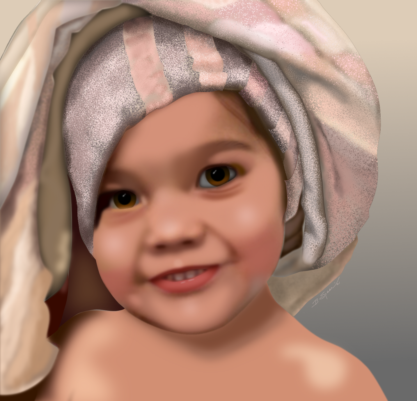
affinity designer Commission Portrait: Caroline
Ren De replied to Greggry P's topic in Share your work
Once again I am humbled and awed by the talent on this forum! Excellent work, -
affinity designer Happy Valentine's Day To All
Ren De replied to jmwellborn's topic in Share your work
Plucks the heart strings...feels good! -
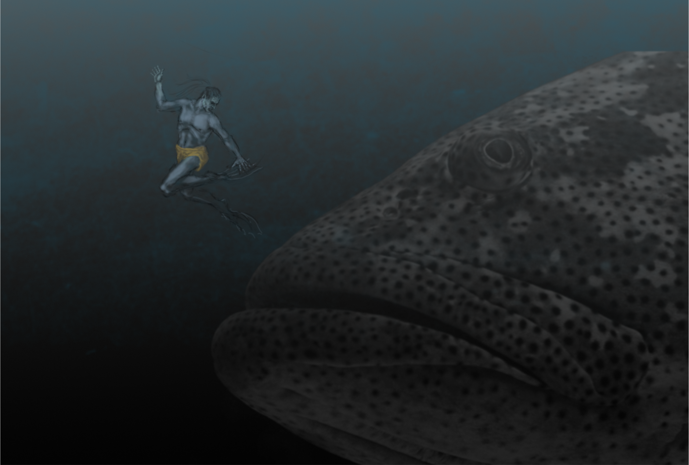
I can relate (a little) but being located smack dab in the middle of the continent I’ve had only one opportunity to experience skin diving / snorkelling in the Caribbean (loved it). I saw some big groupers - maybe 200 to 300 pounds, but nothing big enough to consider me as a dietary supplement. Never been stung by jelly fish but saw many close-up under water. They were the scourge of the divers on our ship the U.S.S. Vulcan AR5 when I was in the U.S. Navy. The divers hated them. (Hope you had a wet suit on when your only option was up through them!)
-
Haven’t done any figure drawing in ages... I like that AD lets me correct all my mistakes (at least the ones I can recognize...)🤓 The fish is a stock Upsplash photo, and the figure drawn from imagination...
-
Hi Alfred! Love the subtlety of your comment...🤓. Hi Danny9, I can’t believe I totally missed doing something with the shadow under the bowl! ...tried making a reflection/shadow combo..? Anyway I thank you for your kind encouragement! Even if this one had some worrisome flaws there’s more where thIs one came from - I keep learning from each one I do...
-
affinity designer AirPods - Just a challenge...
Ren De replied to Pedro Soares's topic in Share your work
Fantastic! A delight to see... -
The bowl was difficult ... not sure if a strictly pixel drawing would have been more successful. The photo version was the reference but lack of detail was problematic. The perspective on the “leaves” is not quite right. Any and all criticism or suggestions are welcome...
-
(Any chance this would work on the ipad?)
-
affinity photo Bernie- First use of Affinity Photo
Ren De replied to Rickray's topic in Share your work
Nice concept, and well done. -
I really like this one! It is so strange to discover this lovely lady so formally attired in a flooded forest under a cloud-shrouded moon. Deliciously spooky!
-
Very nice presentation.