Pedro Soares
-
Posts
88 -
Joined
-
Last visited
1 Follower

Recent Profile Visitors


-
 Davide Galilei reacted to a post in a topic:
Snow Brushes
Davide Galilei reacted to a post in a topic:
Snow Brushes
-
Cmak reacted to a post in a topic:
Extract Detail Macro
-
 ACDesignStudio reacted to a post in a topic:
Snow Brushes
ACDesignStudio reacted to a post in a topic:
Snow Brushes
-
WWSsupport reacted to a post in a topic:
Snow Brushes
-
Pedro Soares reacted to a post in a topic:
Copy/paste paths to Figma
-
Komatös reacted to a post in a topic:
Snow Brushes
-
CPritchard reacted to a post in a topic:
How to Create a Glow Effect
-
Adalbertus reacted to a post in a topic:
AirPods - Just a challenge...
-

affinity designer AirPods - Just a challenge...
Pedro Soares replied to Pedro Soares's topic in Share your work
Thanks a lot! 🙂 -
Pedro Soares reacted to a post in a topic:
AirPods - Just a challenge...
-
Pedro Soares reacted to a post in a topic:
AirPods - Just a challenge...
-
Naruto reacted to a post in a topic:
AirPods - Just a challenge...
-
Naruto reacted to a post in a topic:
AirPods - Just a challenge...
-
Naruto reacted to a post in a topic:
AirPods - Just a challenge...
-
affinity designer AirPods - Just a challenge...
Pedro Soares replied to Pedro Soares's topic in Share your work
Thanks! 😊 -
Pedro Soares reacted to a post in a topic:
AirPods - Just a challenge...
-
affinity designer AirPods - Just a challenge...
Pedro Soares replied to Pedro Soares's topic in Share your work
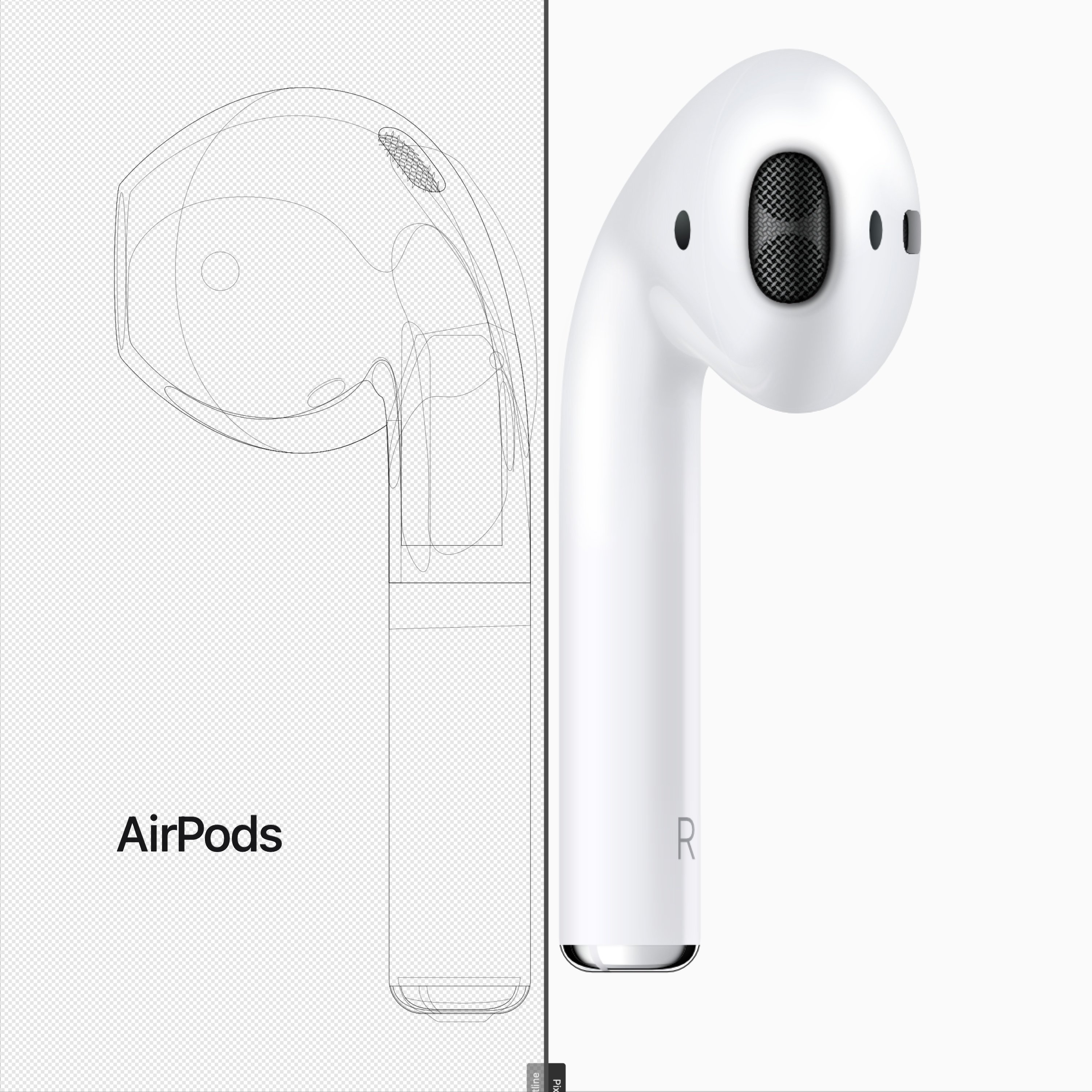
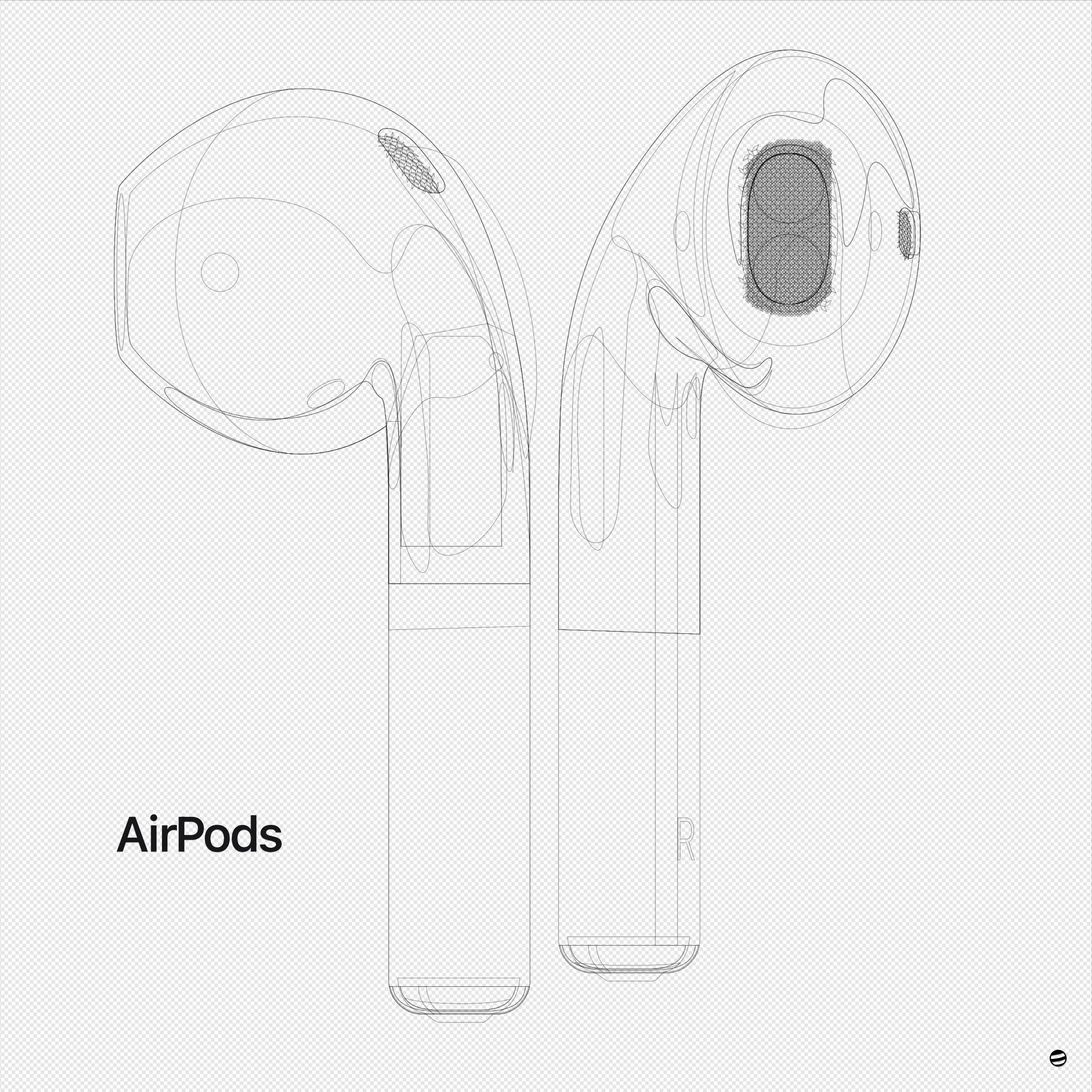
That's a good point but the idea was to explore what we can achieve in Affinity Designer working only with vectors. Nevertheless I can give you the AirPods in any color you want 😁
-
affinity designer AirPods - Just a challenge...
Pedro Soares replied to Pedro Soares's topic in Share your work
Thanks! 😊 -
Pedro Soares reacted to a post in a topic:
AirPods - Just a challenge...
-
affinity designer AirPods - Just a challenge...
Pedro Soares replied to Pedro Soares's topic in Share your work
Thanks Alfred. This was the challenge of January. More to come... -
Pedro Soares reacted to a post in a topic:
AirPods - Just a challenge...
-
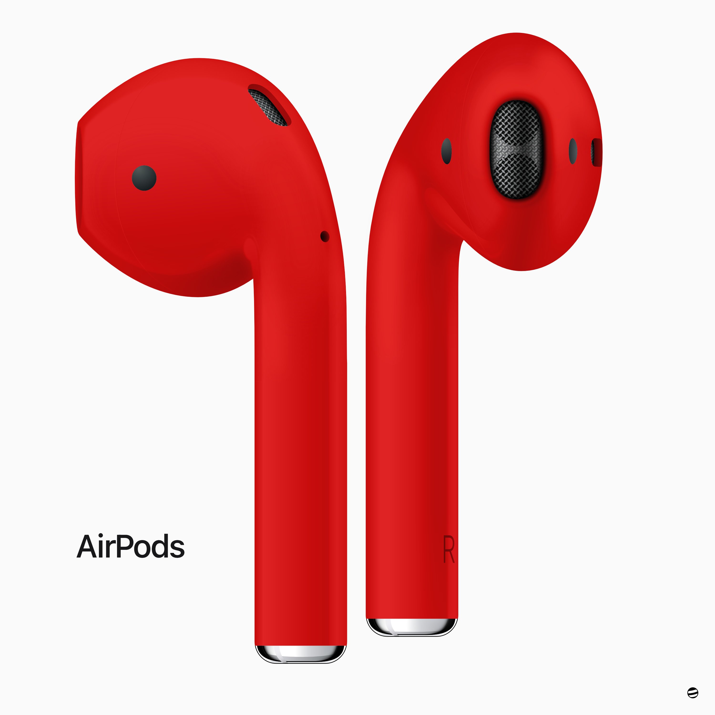
Sometimes I just need a break... and a challenge 😁 Going back to the good old days with this work. What do you think? Cheers. P.S. - Made entirely in Affinity Designer (lots of layers, transparencies, gradients and symbols).
- 13 replies
-
- 16
-
-
Pedro Soares reacted to a post in a topic:
Affinity Designer Customer Beta (1.7.0.3)
-
Pedro Soares reacted to a post in a topic:
Affinity Photo Customer Beta (1.6.7 - GM Seed) [Now Released]
-
Pedro Soares reacted to a post in a topic:
Affinity Photo Customer Beta (1.6.7 - Release Candidate 1)
-
You're welcome briandrum. Seems you're doing everything right. My other suggestion is that you play with the Strength value to see if you can minimize the problem. As an extra you can also use FX effects to get some more realism (I normally use Colour Overlay and Bevel/Emboss). Nevertheless and as stokerg mention, something is not working as it should. We don't have consistency using the Displace Filter. Hope you can get the results you need.
-
Hi briandrum, welcome to the Forum! Did you use a black and white copy of your image with a slightly Gaussian Bur filter applied to it as your displacement map? I find this to be the best approach with the best results. I can give a look at your file if you provide it.
-
opening pictures
Pedro Soares replied to Tonitanz's topic in Pre-V2 Archive of Desktop Questions (macOS and Windows)
Hi Tonitanz, welcome to the Forum! The problem you mention is real and something several users are facing, just like me. The solution I know about is to use the latest Beta version where this issue seems to be corrected. You can also expect to be fixed in the next public version. -
Hi Gnobelix, Thanks for the feedback.
-
Hi everyone, I recently wrote a post on my blog covering my workflow regarding the steps I follow when I'm editing a portrait. I also made available a PDF file with the same checklist I use so you can download it. The post is available both is Portuguese and English. [PT] http://blog.pedrosoares.photo/lista-de-tarefas-edicao-de-retrato/ [EN] http://blog.pedrosoares.photo/portrait-retouching-checklist/?lang=en There are also other articles talking about Affinity and other free resources. Let me know if it was useful. Cheers
-
Pedro Soares reacted to a post in a topic:
Sneak peeks for 1.7
-
Fix a reflection in AP
Pedro Soares replied to jer's topic in Pre-V2 Archive of Desktop Questions (macOS and Windows)
Thanks Roger C. I'm always glad when I can help. I believe we should keep an open mind and a continuous desire to learn.We should also not forget that for a specific problem we could have more than one solution. This was mine. Kind regards, -
How to Extract Detail
Pedro Soares replied to Pedro Soares's topic in Tutorials (Staff and Customer Created Tutorials)
Hi John Rostron, Thanks for the feedback. I'm gonna try as you suggested and implement the tip of zooming every time it's pertinent. For my upcoming tutorials I'm also using a new workstation where I have a better/bigger/higher resolution display so I believe it will improve the quality of them. Thanks again, Pedro- 11 replies
-
- 1
-
-
- affinity photo
- tutorial
- (and 6 more)
-
How to Extract Detail
Pedro Soares replied to Pedro Soares's topic in Tutorials (Staff and Customer Created Tutorials)
Hi Vasto7, I'm really glad that my tutorial could help you in some way. Thanks for the feedback. I invite you to keep an eye on my Youtube channel and Blog because new posts and tutorials are coming... And by the way, my last blog post was about a quick tip both for Affinity Photo and Capture One regarding retouching and has another two Macros you can download Cheers -
Background
Pedro Soares replied to Yousuf123's topic in Tutorials (Staff and Customer Created Tutorials)
Hi Yousuf123, Hanzz made a very good point, you have to use a PNG or other format that supports transparency. But why don't you work in only one file making your design in one layer and having the t-shirt on a background layer. It could be easier and faster even to see the result as you work. Cheers