Search the Community
Showing results for tags 'ui'.
-
 There it goes, my inspiration that is, out of the window, and I lost it trying to change who knows what shortcut key... again. As a professional in video, animation, 3d and audio I have used many many applications over the years, and find Affinity package a real refreshing leap forward. However, I must admit that the preferences window across all three Affinity apps (Photo, Designer and Publisher) is one of the most useless I have ever encountered. I am not afraid to switch and learn applications and am ready to customize the new ones I learn to my own best practices, and the preferences window is my friend or it should be, but Affinity's is not at all. Please let me try to explain what I find is wrong with and suggest some changes which I did not think a lot about, but seem much simpler to use. Let's start: 1. The preferences window uses a unique visual paradigm, completely different from any other dialogue I have encountered in the rest of the application. It has a header with Back/forward buttons, "home" button (with an odd icon and a drop-down menu) and search bar. No other panel, toolbar, manager, assistant or any other window in Affinity uses this paradigm or at least my humble knowledge of the app does not bring any into the mind. I doubt that this is good. For instance having tabs, like some other windows would do the trick no need for back/forward buttons, no need for home button, no need for drop-down menu, just 7 simple instantly accessable tabs. 2. search bar is a sneaky red herring! It is in fact dangerously useless! I'd like to change a shortcut for brush size in pixel persona? typing any of these terms does not help me to find where to do it. It seems that this search bar is good for searching only a couple of dozen words which does not make any sense at all, either you make every single preference item that can be change searchable or get rid of the search bar because the way it is now is frustratingly useless. 3. I will not go in depth on my thoughts about "General", "Color", "Performance", "User Interface" and "Tools" pages as I do see some benefit of "bite sized" preferences pages even if some items on them seem to belong to another page, and the number of these pages could actually be decreased. (for instance half of the "Tools" preferences could easily belong to "User Interface" tab) 4. Checkboxes, since they have really powerful results would benefit from tooltip help with a more verbose description of what they do. 5. "Miscellaneous" could easily be renamed to "factory resets" or something on that line, as that is what it does. 6. And now I come to my nemesis, the "Keyboard Shortcuts" page. Where to start?! a) there is a search bar on the upper right, that is as we said a sneaky trap, and a red herring. It does not help us here, and will take us "home" probably finding nothing of interest. b) we need to use these two fiddly drop-downs. The first one could easily be replaced with beautiful Draw, Pixel and Export icons cutting the number of actions for picking persona to edit to only one click (or even better none.. read on). The second one is really unintuitive as its items partially overlap in different personas. It took me a while to get the idea that this second one is contextual to the first one (as the list changes "behind the curtain")... I got it only after learning my way a bit around the app so I recognised that some items belong to some personas. c) a quick overview of other buttons and check boxes in this upper region of Keyboard Shortcuts page; "Apply to all" -what? to all what? I had to dig through the manual to see what it does, and all it would take to fix it is to call it "apply shortcut changes to all personas" without this information there is no way to know that there actually are some connections possible between personas. As if the for instance, brush size in pixel and draw persona must be separate. "Ignore Modifier—Lets you create shortcuts using a single letter designation instead of using keyboard modifiers." says the manual, and I still do not get it. Does it allow me to pres only the letter in application without modifier keys and get what I want? No, as Ctrl+S is stil "save" and "Ctrl+Shift+S" is stil Save as. Does it filter out the input of Modifier keys while assigning new shortcuts? No. So what does it do? Maybe a better explanation in manual would help, and a more verbose checkbox title or tooltip. "Load/Save" what? it loads and saves what? a file obviously, but what does that file contain? All shortcuts, or only those in focus? Maybe "Load Shortcut configuration" or something on that line would be better. to be continued...
- 44 replies
-
- 22
-

-

-
Using Affinity Designer, I made a UI of a make-belief browser called Surfer. When ever I search the web, I need to be organized, and I need to browse in style. I feel that there are some areas in browsers that can be improved, so I decided to present my idea here. Let me know what you think.
-
 The panel contents are clipped and don't extend all the way down. Resizing the panel only increases the gap between panel content and panel edge. Edit: And you get a light show of selections when you hold the left mouse button down up/down arrows next to the value fields.
 -
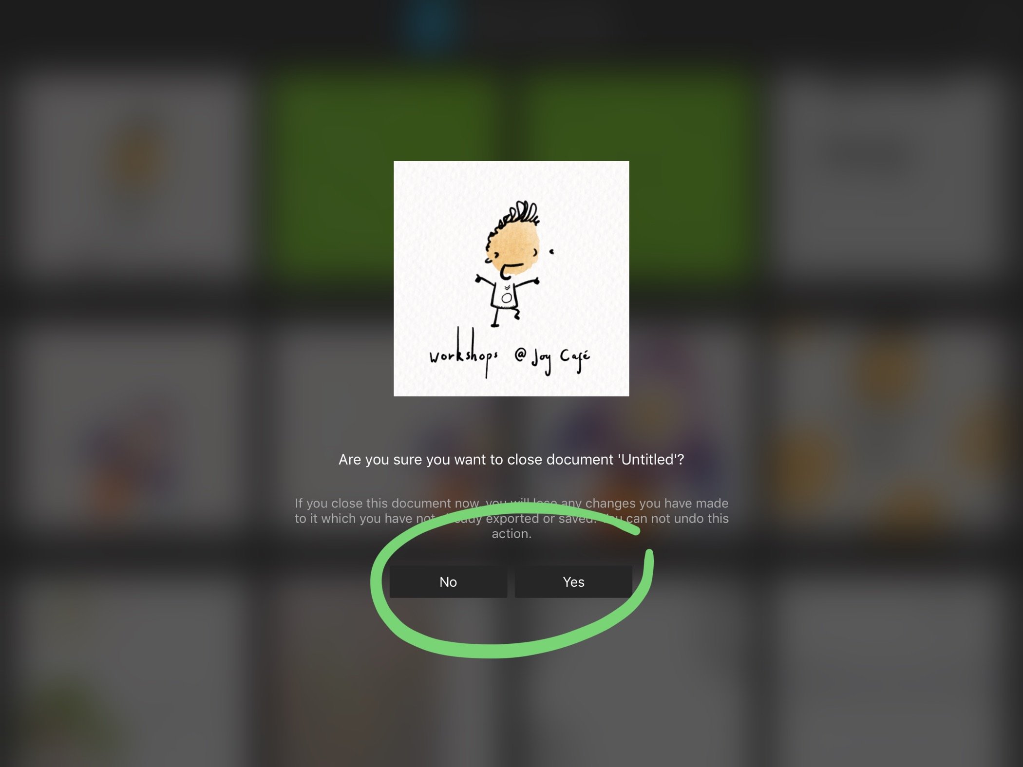
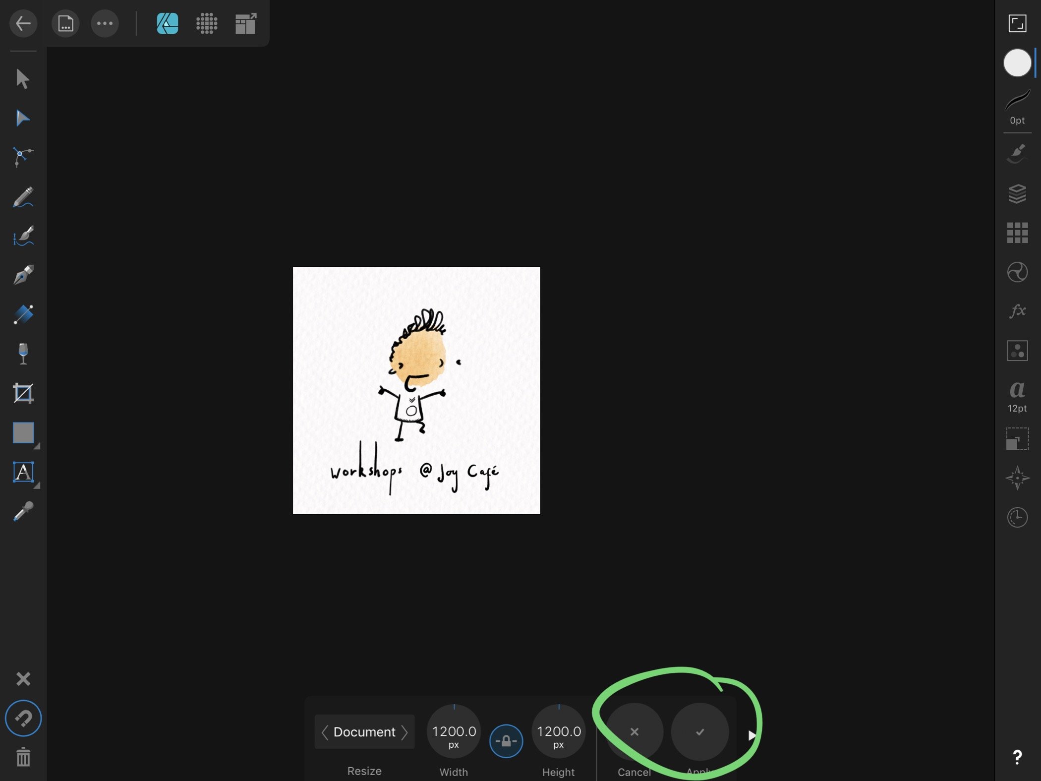
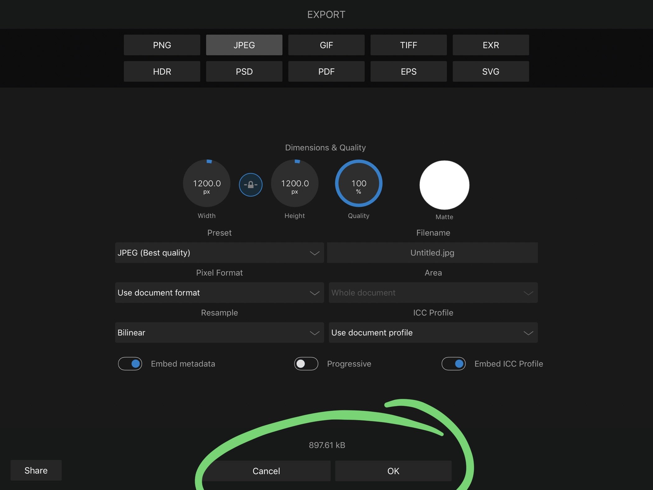
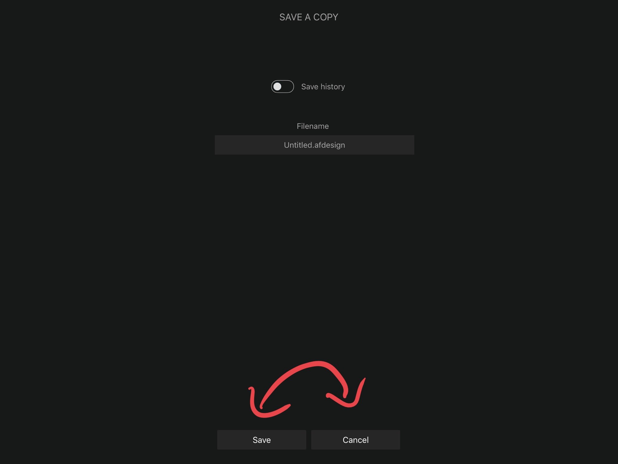
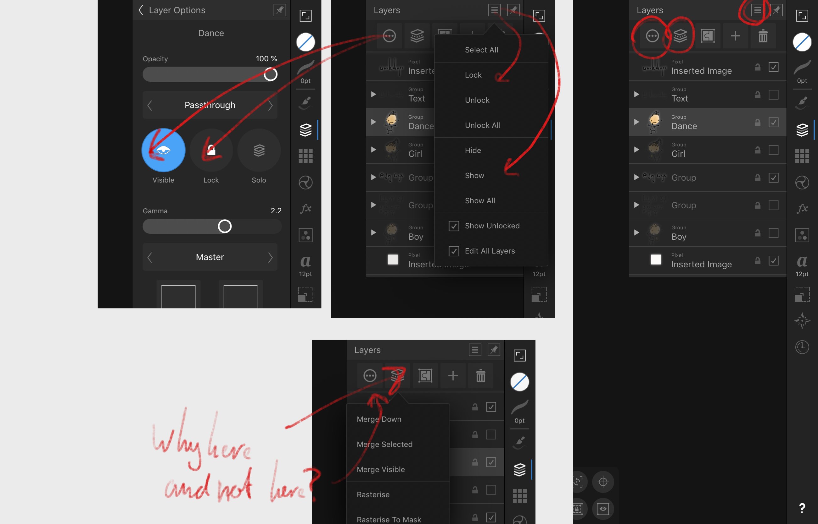
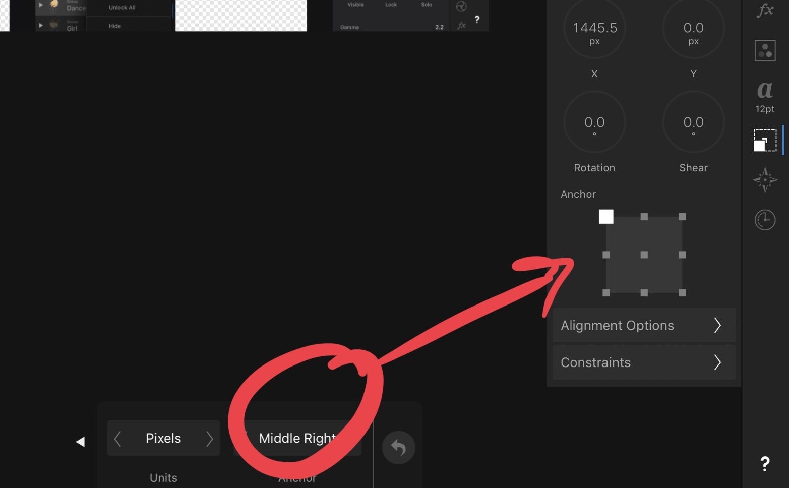
I’d love to see better consistency within the Affinity apps. Small things like the order of buttons make a real difference. Almost everwhere, the cancel button is first and then the confirm button is on the right. Unless you press Save A Copy. (See buttons) on iPad I so quickly skip around the interface because it is so intuitive, but a small change like this can throw me. Seems small, but makes a big difference. My other UI gripe is some buttons are either in strange places or don’t make sense. 1. Why do I have to close a document to save it it place? I only have save a copy when the document is open. I’d like to be able to quickly save. (I’ve had documents crash before and I’ve lost the data because I didn’t hit save ever. Kinda my fault, but I think this could help) 2. Why can I lock and hide layers in two places? This is not a bad thing but feels confusing. Means I forget where certain settings are and doesn’t help set a precedent for where I should find certain types of settings. 3. Why is rasterise not in the generic layer menu? (And can the layer menu not auto hide after rasterising? Or should I pin it to stop this behaviour?) 4. When resizing the canvas, can we have the nice transform square from the transform menu rather than the text-based popout? I know my right from left, but that square is so much easier to understand and edit Note: the first four pictures are related to the cancel/action button order These small gripes make me sound incompetent but I’m not! Haha. I say these because I love the apps and want them to be better.

-
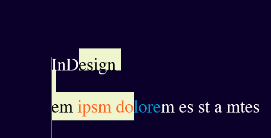
 I use separated mode and as someone told me in the Affinity Designer-Forum, this mode is officially considered broken. This needs to be addressed, as it should be an "easy" thing to repair. Yeah I really mean this. First: as I found out in Designer, the transform palette (even in publisher) has the wrong order when "tabbing" through them to key in your values – it should be: x > y > width > height, not x > width > y > height. Second: the CMYK-palette goes completely bananas: I type in my cyan-value, press tab and the magenta-field is highlighted but as I type a number this keypress is recognized by other parts of the program.. then when I tab again i invoke "Toggle-UI" which is set to TAB (as it works in Indesign well enough without these issues...)
 -
Hello Two major issues with affinity when coming from mac and adobe or word or excel or any other software out there: It would be really great if Serif could stick to standards here a bit more (and help users a real lot): It is really common that CMD+Enter does a new soft line break (no new paragraph), not CTRL+Enter - in all Software I know including all Web-Editors in CMSes It is also in the same way common, that OPTION scales from center and SHIFT limits scaling to contain proportions Using MS Office, Photoshop, InDesign and others I stumble every single day upon these differences when switching apps - please unstress my daily racing brain a bit! Thanks! Alex
-
I love Publisher so far - it only crashed on the very first time I opened it, after 2 seconds (hitting command-F) But the UI needs more love: In Separated Mode, when exporting documents, the toolbar hides the export-sheet -> which should be a free floating dialog box instead of a modal sheet. And it goes up in the popup-charts if you select MORE and then save presets... see screenshots. Thats a mess!
-
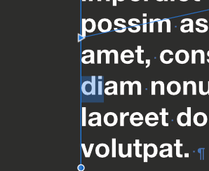
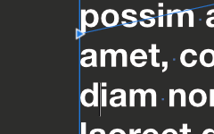
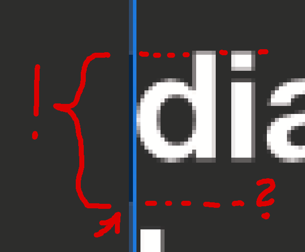
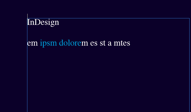
When layouting, for example, white text on dark grey background the text cursor (not the mouse i-beam)is nearly invisible at the most left edge of the text frame. In Indesign it was not ideal either, but at least they offset it by 1 pixel in so the frame-edge gets double width. Also: the selection colour is just an simple overlay-color instead of inverting the selection, as was standard for over twenty years of dtp-software... I'm sure today there are more advanced blending modes possible to highlight an area.
-
 Great product, first of all! 1. On my computer, every time I start up APub it takes about 30 secs to load the UI. 2. More annoying: Opening the "Character", "Paragraph" or "Text Styles" tab for the first time takes up to 10 secs, each. I have about 350 installed fonts. My Specs: Affinity Publisher 1.7.0.57 WIN 10 Home, 64-bit i5-7300HQ 16 GB RAM GTX 1050ti 4GB WIN, Fonts and APub installed on SSD
 -
 The UI for changing the text styles in the main window is robust and of high quality. It would be useful if it were easier to redefine existing text styles, or create new ones based on the customised text we already have established via overrides. The current version, where you have to create new text styles manually via the text menu is a little awkward.
 -
 Product: Publisher 1.7.0.57 for Windows Bug: Open Preferences Dialog: There are 11 big Icons displayed (General, Colour, ...). 1. If you select the drop down list in the top menu, only 10 small icons are displayed there ("Title Exceptions" is missing) 2. The drop down menu items are not in the same order compared to the big icon field
 -
 Is it possible to save a custimized setting of window/pane positions? It appears to happen accasionally with 2 open documents that choosing "Window" > "Merge all Windows" results in a crash and closes the Application. After reopening the app all panes are spread somehow chaotic on my two monitors and neded to get reanged. And: how can I go back to the deafult window/pane setting? Meanwhile the tool and document and the long pane with the persona icons aren't locked anymore to the main monitors edges and partially covering the document window.
 -
 Finally we got it what we've been waiting for.. Thank you Affinity. On the first start I found some visually issues. Like the UI font's are too pixelated in windows 10. I've used both AP and AD on mac, but downloaded this Publisher on Windows as trial. please check the screenshot I attached, the left is Photoshop and on the right Publisher. I didn't check any performance or functional thing. this was the first thing I found apparently.
-
Finally we got it what we've been waiting for.. Thank you Affinity. On the first start I found some visually issues. Like the UI font's are too pixelated in windows 10. I've used both AP and AD on mac, but downloaded this Publisher on Windows as trial. please check the screenshot I attached, the left is Photoshop and on the right Publisher. I didn't check any performance or functional thing. this was the first thing I found apparently.
-
 Found: Overlaid text on Colour Palette
-
 Hello, it would be really awesome if AD could add a simple, generic Batch Builder that can export coordinates for Artboards and Slices and basic information for exported object layers to either JSON or XML: Any slice Coordinates Slices created from objects Stroke: Thickness, Color & Alignment Fill: Color Slices created from text frames (assuming a constant style for the entire frame) Family Weight Size Alignment Bonus points for any additional properties (everything in the contextual context toolbar and the effects panel may be of interest) That would dramatically increase the usefulness for UI design in collaboration with development teams! We're currently trying to use the Spine JSON-Export to automatically create design specs for our dev team, but the proprietary structure (origin in bottom left, anchor at center of any object, no text support) makes it kind of finicky. It's awesome that it's there, but a few more attributes would make it much more useful for us. If it's too time intensive to make a pretty JSON/XML-file, I'd also settle for Batch Builder that prints a parsable ToString()-Dump of the document tree .
- 3 replies
-
- 3
-
-
- ui
- batch builder
- (and 3 more)
-
 A number of apps allow me to set the font size of the text in the UI (for example menu and other section headings) Is this possible with Affinity? If not how do I request the feature?
 -
 Hello, is it possible to make the toolsbar larger? Thank you
 -
 The new Affinity designer for iPad looks and feels awesome. I would love to see a similar version of the Designer on Windows 10 which uses the full potential of the Windows 10 touch functionalities. A direct copy of the iPad UI could be awesome.
- 24 replies
-
- 11
-
-
- ipad
- affinity designer
- (and 3 more)
-
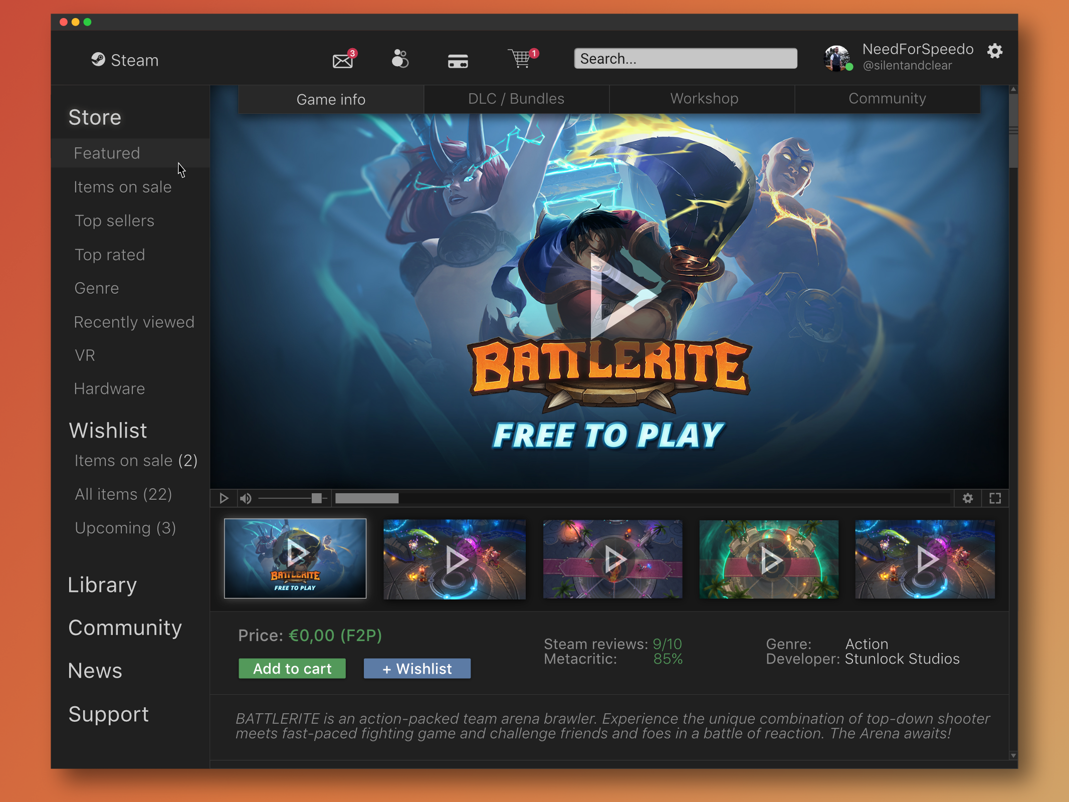
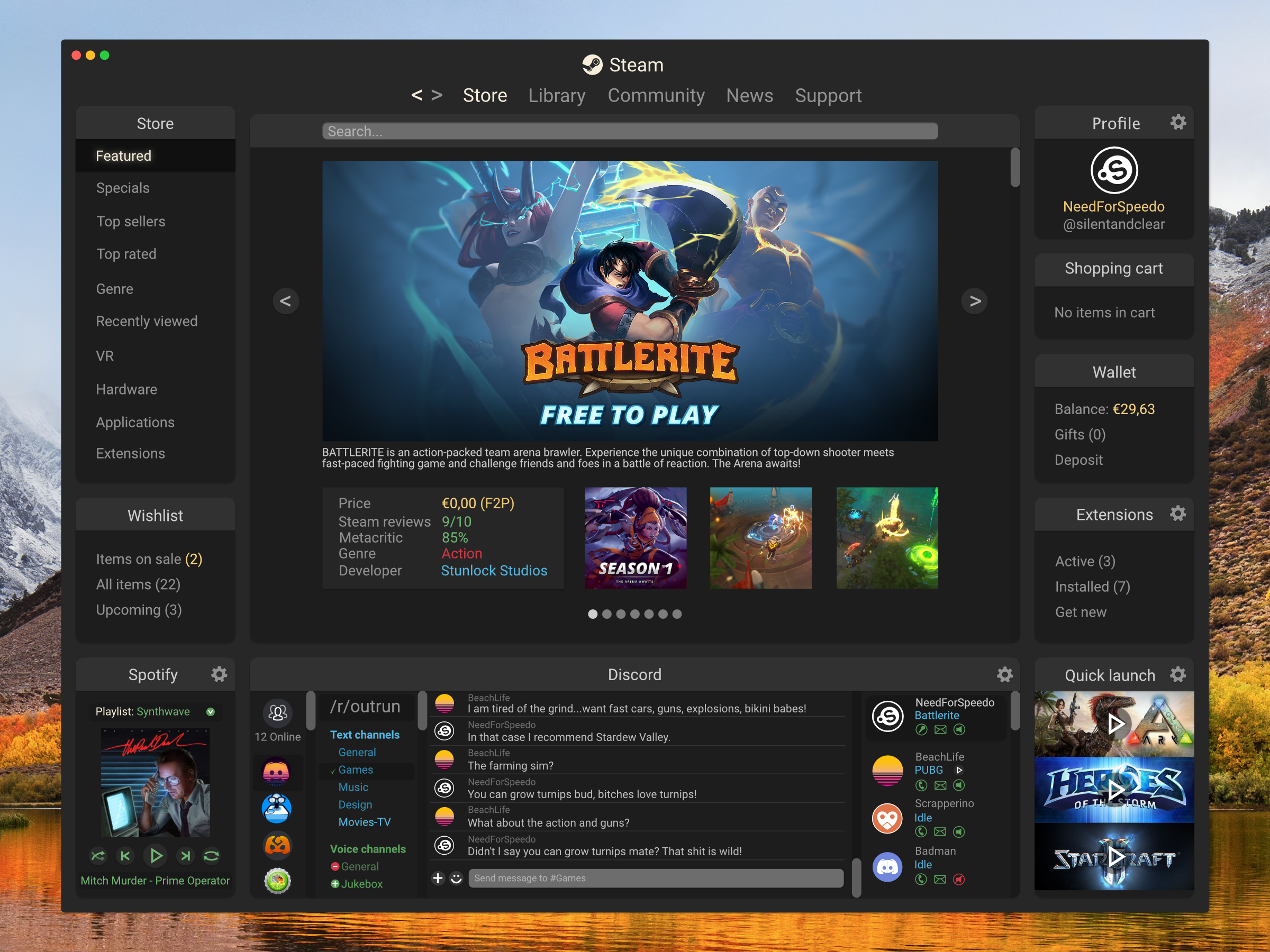
Redesign concept of the Steam client. This concept aims to make the navigation of the app more intuitive and giving it a clean, smooth, more visual appealing design overall. More screens will follow in the future. What do you guys think? Feel free to follow me on: Dribbble Behance Twitter silentandclear.com (revised version of Original project)
-
As a designer and a developer I find there's an area where design apps could really learn something from code editors. There's a trend in recent code editors to use a Command Pallet (⇧⌘P) which allows you to type anything and find/invoke anything. It's great for quickly getting to hidden things. For me, Affinity apps packed with a power and you have to hide some of those options (if not most) to make the user interface, well... usable. A Command Palette could really help users to find and use different aspect of apps without having to dig around the user interface. Some example use cases: find and open any palettes show/hide studio panels run macros open a specific preference run commands that don't have keyboard shortcuts Take a look at how code editors (like VS Code, Atom, Sublime Text) are using them to get some ideas.
-
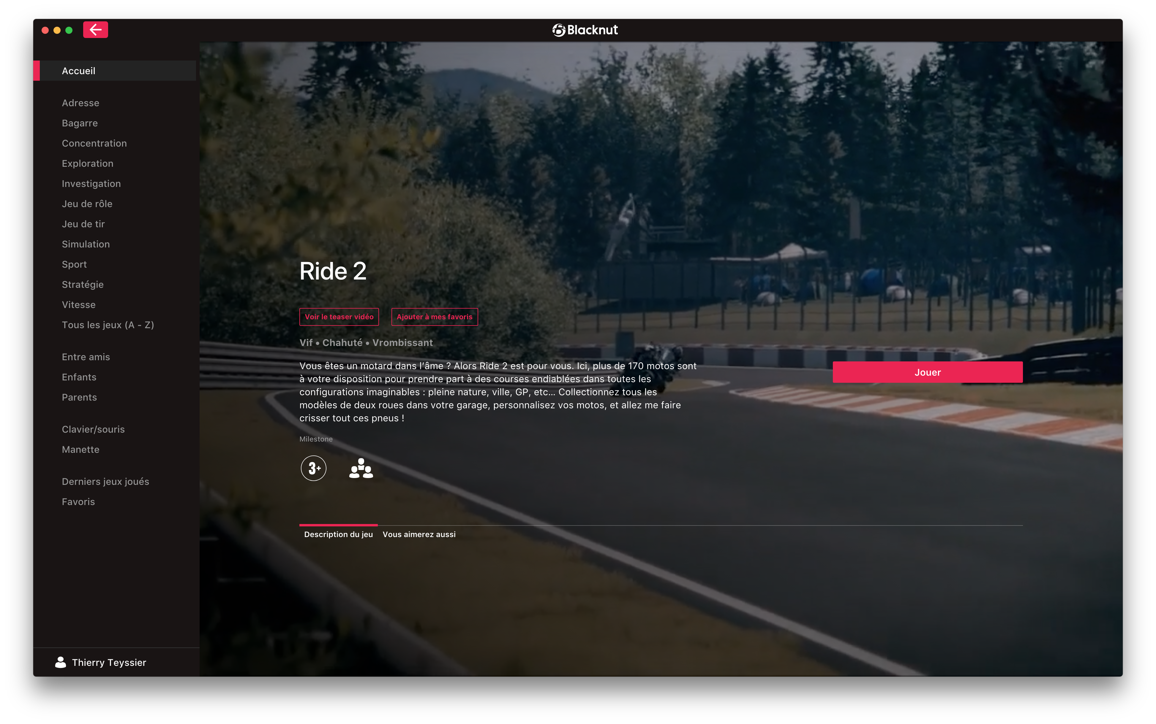
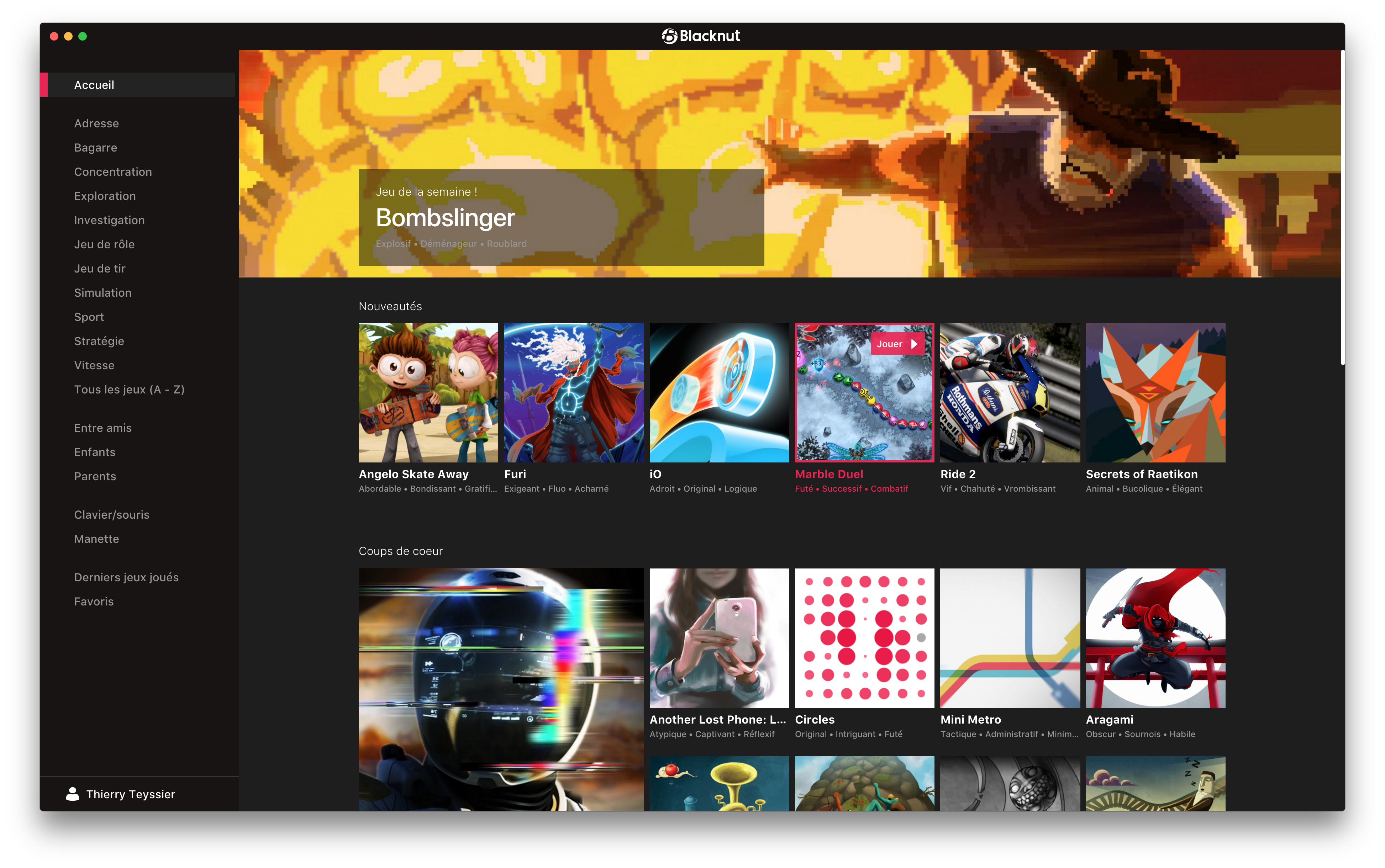
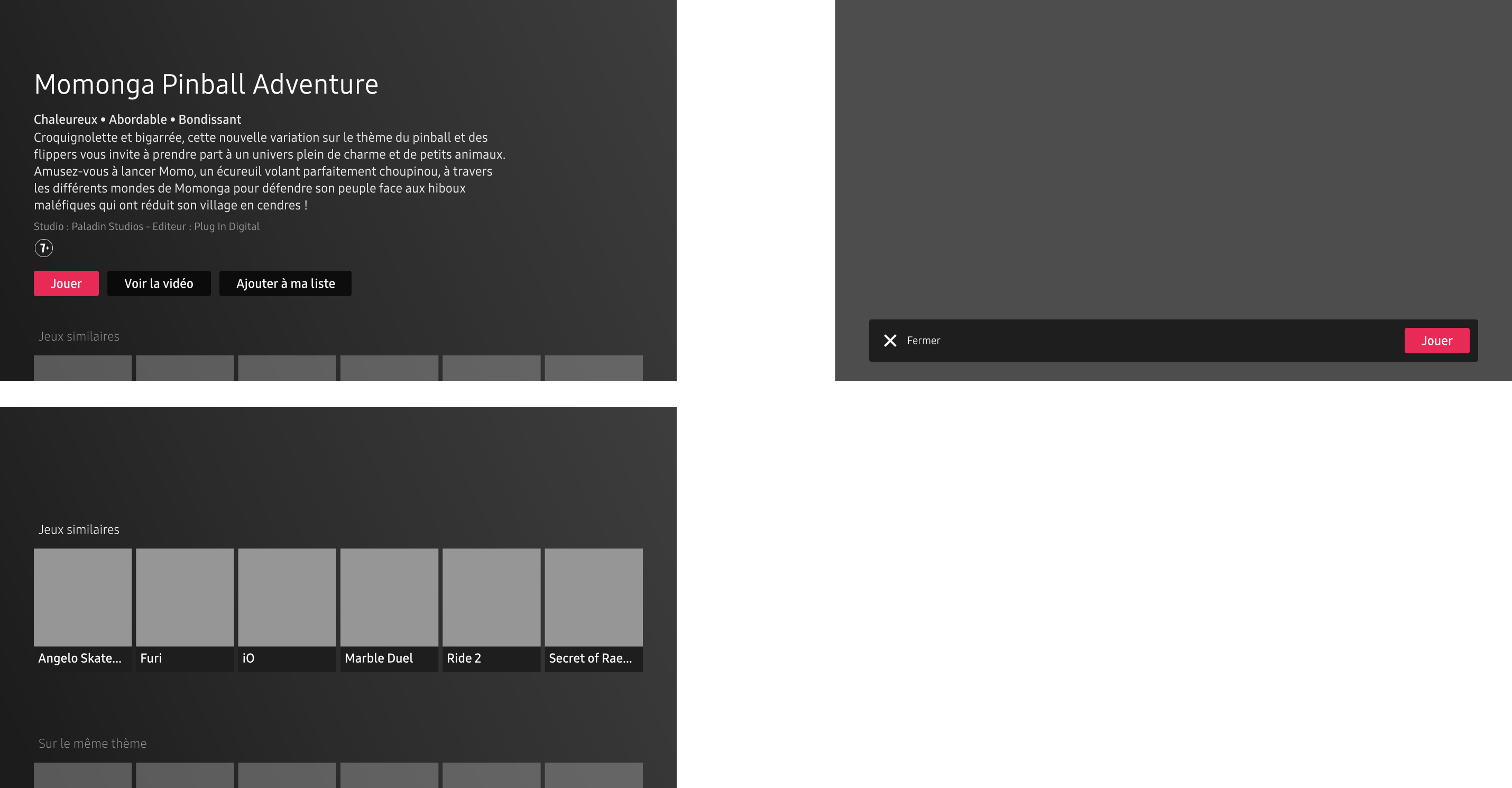
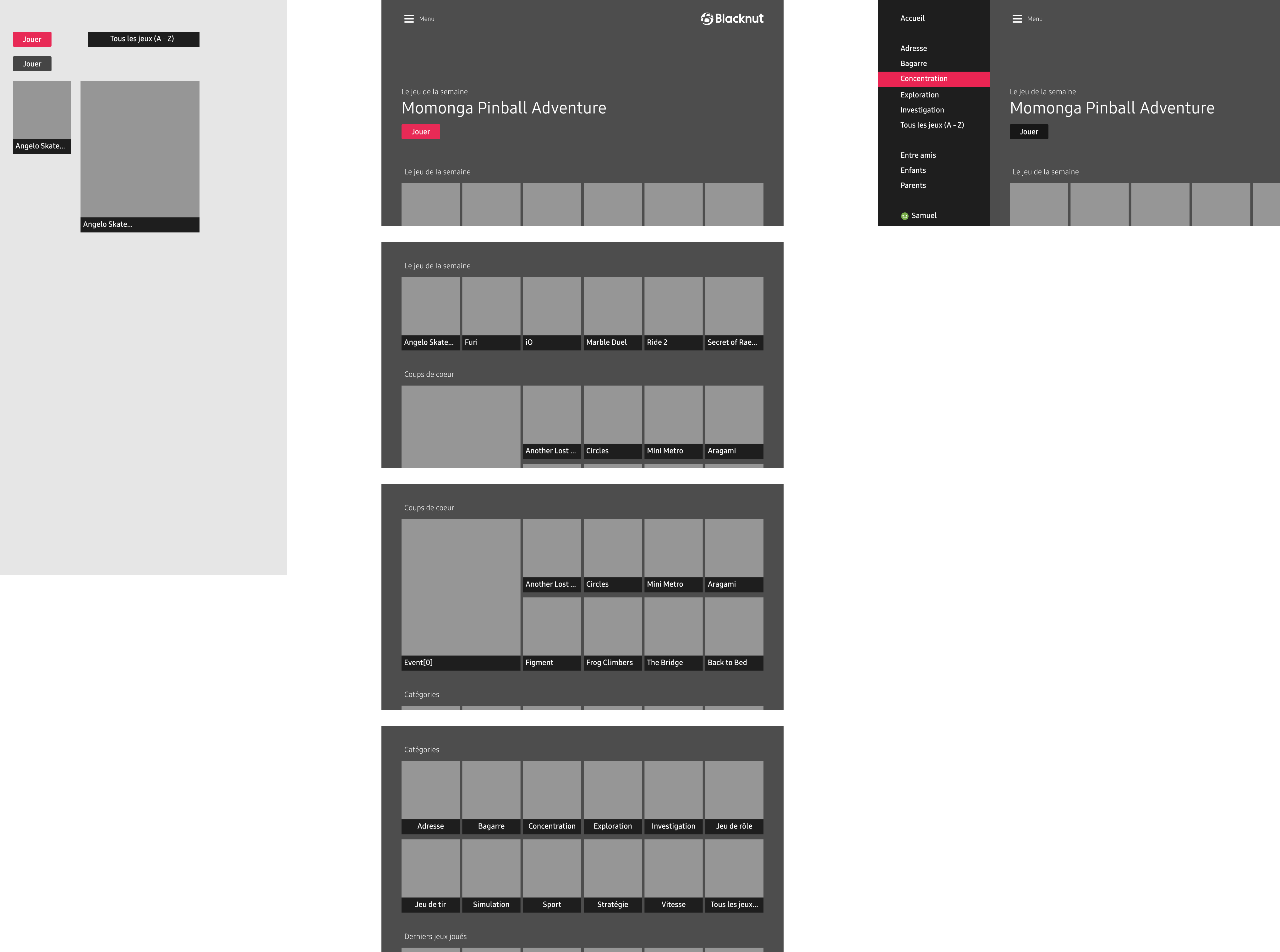
Hi there, Blacknut - Get instant access to a vast collection of premium games with a single click. https://www.blacknut.com All plateforms (desktop, android tv, firetv, android, ios...) done with Designer & Photo on iPad Pro and Macbook 15" (because designer not available on iPad.... ) ...
- 1 reply
-
- 1
-
-
- application
- ux
- (and 2 more)
-
 Hi, I'm facing an issue when I export SVG with Affinity Designer. I'm working on a website and would like to export an SVG in the best way following some guidelines describes here : https://www.sarasoueidan.com/blog/svg-tips-for-designers/. My Issue : I want to export in SVG a shape and move it with code. When I export it, I get a <path d="..."> instead of a <polygon> or <rectangle>. Sadly I'd like to have a <polygon> object in order to move it with Javascript. Can anyone tell me what am I doing wrong ? I would like to do someting like that <polygon points="215, 110 0, 110 0, 0 47.7, 0 215, 0"/> But I get path like this <path d="M1920,0l-1669.99,0l-250.011,0l0,1200l1920,0l0,-305.211l0,-894.789Z" style="fill:#fa9090;"/> animation.svg pos2.svg pos3.svg
 -
 Hi everyone! I would like to receive critique for the following redesign concept: https://dribbble.com/shots/4560443-Steam-redesign Hit me from left and from right, I can take a beating! Thanks in advance!