Search the Community
Showing results for tags 'typography'.
-
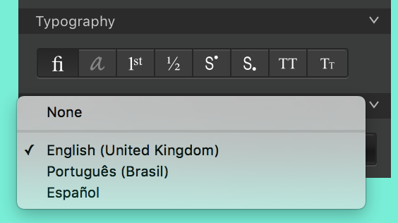
 The language dropdown of my Character panel only shows English, Portuguese and Spanish. Is there a way to add more languages to it? For me, this is not about spelling, but language features that are built into OpenType fonts. (I’m a type designer and I use Affinity Designer to make the promotional images for my fonts, btw.) For example, this is some of the OpenType code that is present in the locl feature of my fonts. These substitutions only happen when the language of the text is set to Dutch, Catalan and Romanian, respectively. If the glyph doesn’t have a Unicode assigned (which is the case of iacute_j.loclNLD), there is no way for me to input it into AD. And while we’re here, any chance on getting a Glyphs panel?
-
One thing that always bothered me about the adobe suite was the lack of options for organizing typography so I had to look through lots of fonts to find the one I was looking for if I didn't remember the name of it off the to of my head. It would be awesome if fonts could be organized into folders of my choice so that I could put decorative fonts in one folder, favorite fonts in another, sans serif, serif etc... Having an organized font system would improve my workflow immensely as a graphic designer. As it is now with illustrator picking fonts is a nightmare. (All this would be in the font drop down.)
-
 I'm having an issue that happens quite frequently when I export a document to PDF. It seems like Publisher is switching languages on me. I have everything set to default except my spell check language, which is set to English (Canada). I suspect it is font dependent, but in this case, I'm using a font that was created by the US government for US publications, and it's happened with fonts purchased from established vendors as well, more than I can recount. At the end of the day, the only fix is to change the font or create outlines of the text, which, as you can imagine, is not ideal. I get the feeling there's some typography setting in AfP that will override this, but for the life of me I can't figure it out. I've attached the afpub file and the PDF that was output. Other than the Public Sans font, found at their own page (https://public-sans.digital.gov) and FontSquirrel, I'm using Merriweather (Google fonts), which works fine. Any ideas? Thanks! Demo file.afpub Demo file.pdf
 -
 Hi Affinity Designers, I have a very simple question, sorry, I was not able to figure this out: How do I transform fractions in my text into a single glyph? My intuition was to insert something like "n/k", highlight it and then click on "Fractions" [1/2] in the "Typography" section in the box that pops up when you hit "Show Typography" (is its name the "Character Box"?). For some reason, the "Fractions" button stays unclickable though. This is the case in all fonts tested, like Helvetica, Arial, Myriad Pro. Can you help me out here? That would be awesome! Cheers, Christoph
 -
When editing text inside a text box, the dismiss button begins to dismiss the keyboard before it pops up again. The only way to actually dismiss the keyboard is to select a different tool. I would prefer to be able to exit editing a text box by either tapping outside the box or by hitting the keyboard dismiss button, in which I would have the option to create another text box, tap inside the last one to edit it again, or select a different tool. I understand if the current functionality is intentional but I found it confusing as a user. RPReplay_Final1626976729.mp4
-
 Just curious if there is a standard practice for designers exporting PDFs using AD…when you create a pdf, do you prefer to embed your fonts in the pdf, or do you convert them to curves when exporting? (I assume “Convert to Curves” is the AD equivalent of Adobe’s “outline fonts”?) I haven’t run into any issues either way but wondered what others do. Thanks!
 -
When I define 2 alternatives in a Character Variation feature, Affinity shows 4 in the menu. The first (default) entry is repeated at the end. When I define 16 alternative glyphs, affinity shows 18 in the menu. Example: https://twitter.com/FontFabrik/status/1362050899049332739 I also wonder if, and where, tooltip, sampletext and parameters are going to show up in the interface: cv03: name: Ampersand collection tooltip: I love ampersands sampletext: A&B, c&d, 1&2 parameters: - Aligns with capitals - Small for Small Caps - Italic e scripty swashy (InDesign completely crashes if fonts contain Character Variations built according to the specifications on their website haha)
-
 Hi, Alex here from Druide informatique, editor of Antidote (https://antidote.info). Some of our users are requesting the ability to use both software (Designer and Antidote) simultaneously and as seamless as possible. How can we deliver that to our mutual users? Thanks, Alex
 -
 Publisher has problems using the integrated kerning pairs of Postscript Type1 fonts. It ignores them! I noticed this with extreme pairs like LT. In new OpenType fonts this works correctly. Not so with Postscript Type1 – no matter if the AFM files or only the font suitcases are included.
 -
 Hi guys. I need an advice. I know there is no such a thing like "Faux Italics" or "Faux Bold" in Affinity products. I tried to find the way how to push Photo to do that... and there is way. ITALICS: In Character - Positioning and Transform there is an option Shear to slant selected text = set an angle. BOLD: Add the stroke to selected text Fine, it works, I could do it manually so let's make some macros and set couple of possible options which I can use in the future. I was able to record the macros for both, even for combo "faux bolditalic". It's not a rocket science, macros are really simple 1 or 2 steps. But it might helps you, guys... or inspire you to play with macros and set some other interesting text styles And my question is: Is there any other, more elegant way how to do this kind of trick? Edit: I uploaded macros for you FauxBoldItalics.afmacros
-
I followed the instructions in the stylistic set tutorial and it's not working. See this short video:
-
Having some fun with custom Type in Designer
-
- 7
-

-
- designer
- illustration
- (and 2 more)
-
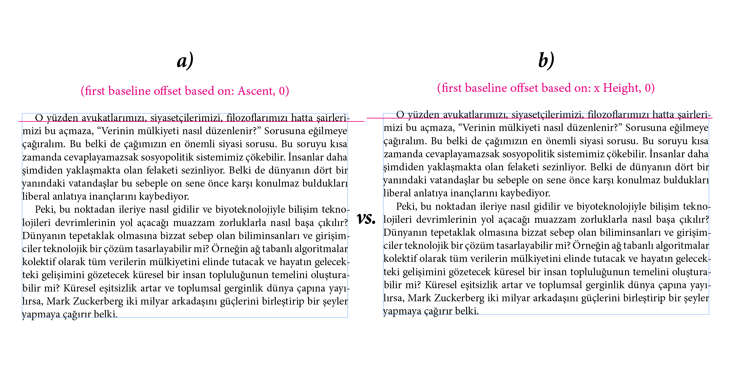
 I couldn’t find any way to set the baseline of a text frame depend upon a typeface’s x-Height i/o it’s Ascenders. IMHO, it’s kinda essential for vertical aligning —sentence case or capitalised case— text blocks properly. Sorry for the screenshot, I’ve just tried to explain myself more clearly.
-
I can't seem to be able to split text in Affinity Designer? From what I can gather it's only shapes that can be divided? Is there a way this can be achieved? I've attached an example that I had to call my boyfriend and ask him to do this on Adobe Illustrator for me as I couldn't achieve this design like I was hoping to on Affinity. Is there any sign that this could be a feature in the near future?
-
I'm just trying out the demo version of Affinity Designer and I have to say it looks very impressive! However, it would be really great if you could include Japanese typography features such as mojikumi (文字組み) and kinsoku shori (禁則処理). Edit: I just noticed that vertical writing (tategaki) is also missing from Affinity designer. This is really quite important for Japanese.
-
 Hi, Simple question. Is there a function in publisher to prevent a paragraph ending with a single word? Im not talking about pages ending with or starting with single lines. I simply want to eliminate single word lines at the end of a paragraph. Cheers in advance
 -
 Adobe Photoshop has an option to convert Paragraph Text to Point Text (Artistic Text) and vice versa. https://textuts.com/type-tool-in-photoshop-cs6-point-text-and-paragraph-text/ It is very useful at times. Hope to see this feature soon on Affinity Photo! 😅
-
 What are the type of work each tool is suitable for? For example I was designing UI and I have been using artistic tool and I saw there was some spacing around the text. For example when I choose 24 pt text using Artistic tool there is some space while for frame tool it's exactly 24 pt. I hope I making sense. I wanted to know in what type of design do you use each one of them?
 -
 Can I link text frames on Affinit Designer?
 -
 Like everyone else, I am absolutely thrilled about the beta, and can't wait to see how it develops. One of the key reasons to use LaTeX or InDesign over Microsoft Word is their superior type composition. While Word simply dumps in text as it occurs, without regard to spacing or line breaks, these other programs look at an entire paragraph to remove rivers of type, reduce the need for hyphenation, and so forth, just as human type compositors do. In TeX, this is the Knuth-Plass Line Breaking Algorithm; InDesign has the Adobe Paragraph Composer (which it uses by default, but also has an option to turn this off with a single-line composer). Implementing this in Affinity Publisher would make it far easier to produce professionally typeset documents.
 -
 Please support Japanese vertical writing. This is the function most needed by Japanese. Website with detailed explanation: https://w3c.github.io/jlreq/#vertical-writing-mode-and-horizontal-writing-mode Adobe uses this because it supports vertical writing in Japanese. This is the only reason why I and my workplace cannot adopt “Affinity”. If this problem is solved, “Affinity” may become the top share in the Japanese market. Can Japanese donate development costs to support vertical writing in Japanese? In Japan, Adobe dominates the market. That is not good. The Japanese market requires the emergence of competitors that compete with Adobe. I hope that Affinity plays an active role for Japan.
- 5 replies
-
- 7
-
-
- typography
- text
- (and 6 more)
-
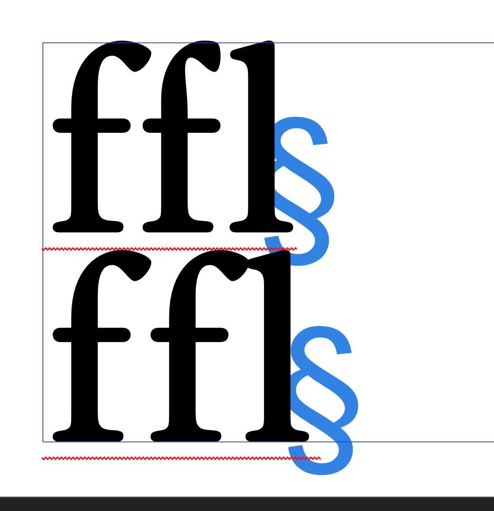
 I understand why you did it, ligatures lock text from tracking. I have designed a font where this is solved by changing f and l not by single glyph fl but by just chaning the f, as you can see in the atached picture. 1) user should have option to turn this off. If can, where can I do it? 2) it should be applied only on liga feature where two glyphs change with one glyph Thanks, Jan
-
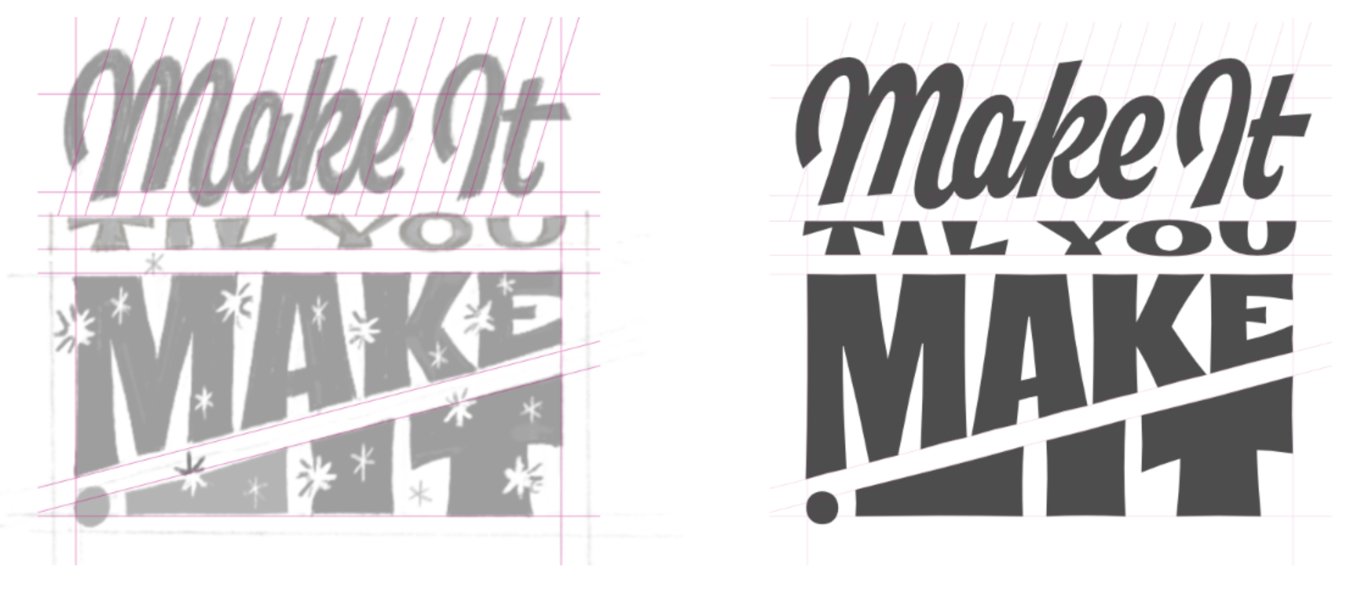
 Hello everyone and good luck with your projects. I am slowly starting to design typography in AD for Ipad and just wanted to ask whether there is a tool to personalise guidelines depending on your project as in the attached picture? I am aware that in Illustrator you can just drag and drop as many guidelines as you need, both vertical and horizontal. Is there something similar in AD for Ipad or do I have to do it manually? Thank you in advance!
-
Cool, I did some typography art in Affinity. I copied texts & arranged them to create a square that surrounds another text. I grouped all the texts, then I used the photo persona to 1st copied the text, then I went to the menu, then selected >File >New from Clipboard. Then I exported it to PNG.
- 1 reply
-
- 3
-
-
- typography art
- affinity photo
- (and 3 more)
-
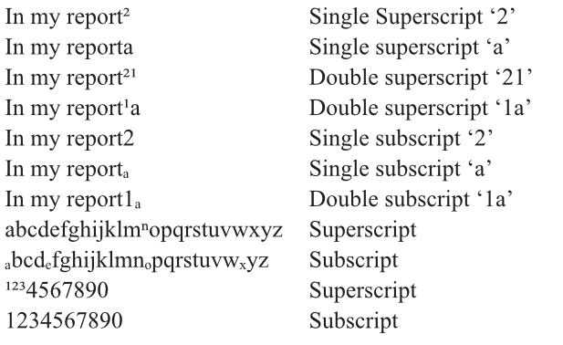
I cannot find any previous listings for this topic so if it has been raised before I apologise. There seems to be a major problem with superscript and subscript. Only the numbers 1, 2 and 3 and one letter n superscript and only 4 letters and no numbers subscript. The chart i'm including was created with Times New Roman Open Type. I have used the same text and font in a Pages document and all correctly format.