jackjohnbrown
-
Posts
39 -
Joined
-
Last visited
-
 lacerto reacted to a post in a topic:
How to Reduce Total Number of Colors in a Design?
lacerto reacted to a post in a topic:
How to Reduce Total Number of Colors in a Design?
-
 Thank you so much for taking the time to do this! As you wrote, it seems a bit tricky with the brush profile and additional tones being created, but I am inspired to dig deeper. Hopefully a future update will include a "recolor" feature to make these sorts of things a bit easier. Thank you again!
- 10 replies
-
- 1
-
-
- recolor
- color separation
- (and 4 more)
-
jackjohnbrown reacted to a post in a topic:
How to Reduce Total Number of Colors in a Design?
-
Brian_J reacted to a post in a topic:
How to Reduce Total Number of Colors in a Design?
-
 Ldina reacted to a post in a topic:
How to Reduce Total Number of Colors in a Design?
Ldina reacted to a post in a topic:
How to Reduce Total Number of Colors in a Design?
-
haha, yes I definitely could have been done by now if I had simply redone it...but once I have a question it's hard for me to let it go. So even if I decide to simply remove the texture on this one I'd still like to see if I can figure out a solution for other projects down the road. Thanks!
- 10 replies
-
- 2
-
-
-
- recolor
- color separation
- (and 4 more)
-
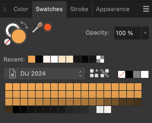
I must be doing this incorrectly - when I add those adjustments to my project (copying what is shown in the video) my palette is still just as big, though the tones do change. I've attached a copy of the afdesign file if anyone is interested in taking a look and making suggestions! My ideal would be to get this down to 5 colors: a black, a gray, and a white, and the two oranges of the center label. Thanks for the help, everyone! DiJ 2024 copy.afdesign
-
I am working on a design that may end up getting screen printed, so I am trying to be thoughtful of how many colors I use. However, the current iteration has a high number of colors that are very similar (see the orange/brown tones in the screenshot). This came out of using a brush texture on a solid color layer. Is there a way for me to limit the number of colors in a palette, and then have all these very similar colors adopt a single color? In other words, can I define a specific "orange" and then use that as the only orange? Thanks!

-
Interesting — even when I set the Zoom to 100%, the adjustment "flickers" on and off. I can see the changes as I am making them, but they don't "stick," if that makes sense. I will keep playing with it; maybe it's not the adjustment itself but something else that I'm overlooking.
-
I am seeing an issue in V2 where I have applied a Vibrance adjustment to a layer, but it seems to come and go as I zoom into or out of the document. When I try to export a pdf, the adjustment seems not to be applied. Any thoughts on what might cause this behavior? The attached screen recording shows the issue. ScreenRecording.mp4
-
I am having an issue with masks not behaving the way I'm expecting during export. Not sure if it's a AD issue or a me issue. - I have a white object/icon (the Massachusetts text) - I placed the icon/text over a navy rectangle and used "Mask to Below" to create the navy icon/text - on export to pdf, the final file just shows the rectangle as in the screenshot Where am I going wrong here? EDIT: I sort of figured it out...if I use a black version of the MA logo, it works. I am still confused by why it appears the same in the project both ways, but when exporting only works if the logo is the black version. Would love to learn more!
-
That was it, thank you!
-
I am trying to use the attached .eps file, but whenever I try to open or place the file I get a "file not supported" message from my Affinity V2 apps. This list suggests .eps files are supported by Affinity. Can anyone tell me what might be happening here? I am on an M1 MacBook Air running Ventura 13.1, with Designer 2 version 2.0.3. Publisher V2 gives the same error. MOTTlogo.eps
-
Affinity 2 Apps not visible in App Store on Ipad
jackjohnbrown replied to Castellan's topic in Affinity on iPad Questions
Nothing was showing yet for "Affinity" in App Store search on my Mac. I had to go to my Purchases list in the App Store to find my V1 apps, then navigate to the More by Serif Labs section to find the V2 apps. -
walt.farrell reacted to a post in a topic:
Locate specific color in image?
-
Great idea, I had done the Select but didn’t think about hiding the results. Hadn’t considered that, thanks!
-
I’m prepping a file for screen printing, and need to limit my colors to 3. The file has black, green, and blue — but somehow I used two slightly different blacks. How can I find out which element of my design is using the “wrong” black? (I’ve been manually selecting objects and checking their color value but this seems both ridiculously inefficient and open to creating new problems (moving objects a pixel by mistake, etc.)
-
Thanks so much, I’ll try that!
-
Thanks, makes sense especially as they’re web ads!
-
Oh! Maybe it’s just something to do with Quick Look on the Mac…What program are you viewing it in? (Sorry just saw you used Gapplin!)