Search the Community
Showing results for tags 'affinity designer'.
-
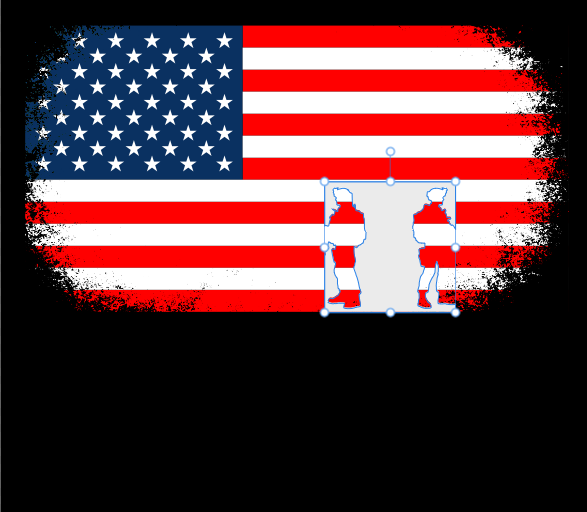
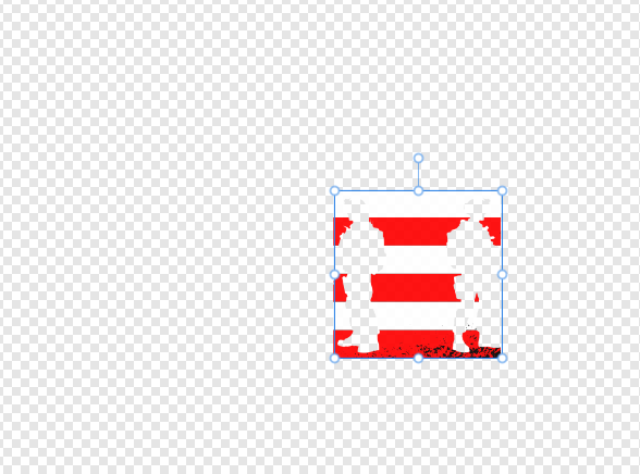
 i have an issue with applying textures in Affinity Designer. When i apply a texture, it's only affecting the area where the texture is placed, and everything outside that area gets deleted i'm a beginner and didn't find the solution of this problem in youtube , or maybe i didn't search enough , anyway this are picture that describes the problem in details This is the Steps that i did : - i used the svg soldiers element - Rasterize To mask into American flag and this what happend
-
Bildschirmaufnahme 2024-04-26 um 19.37.11.mov Tab Key is not working in FX Dialog.
-
The problem is quite simple. I am not able to use variable fonts installed on my system. I have attached screenshots showing that my computer properly recognizes the font however, none of the programs, Photo 2, Designer 2, Publisher 2, correctly recognise my font. And yes, this is the case with other variable fonts as well, not just one. Fonts were downloaded from Google Fonts. Running Windows 11 22H2. Downloaded all programs from Microsoft Store. If you need any other info, I'll be happy to provide. P.S: Sucks to not be able to create something on the first day itself. But I guess launching a software has its share of challenges.
-
 Will there be any value of including Variable Fonts accessibility in Affinity products? I see this as being a great time-saver when working on projects requiring a single font in various weights. ** Not heard of Variable Fonts? reads here: https://developers.google.com/web/fundamentals/design-and-ux/typography/variable-fonts/ https://v-fonts.com/ https://developer.mozilla.org/en-US/docs/Web/CSS/CSS_Fonts/Variable_Fonts_Guide https://medium.com/variable-fonts/https-medium-com-tiro-introducing-opentype-variable-fonts-12ba6cd2369
 -
Here's my latest upload and work in Affinity Designer! Please click the picture below and enjoy 2hrs of finest breaks alongside some vectorizing! Thanks for your precious time!
-
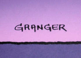
 🇬🇧 A little tribute to the graphic designer Michel GRANGER, French author of several album cover illustrations by Jean-Michel JARRE including the 4th, “Equinoxe”, released in 1978. The character on this cover is called “the Watcher”. He is adorned with the three Serif colors and looks into the future, saying to himself: what will I become?... And what will we become?... 🇫🇷 Petit hommage au graphiste Michel GRANGER, auteur français de plusieurs illustrations de couverture d'albums de Jean-Michel JARRE dont le 4ème, “Equinoxe”, sorti en 1978. Le personnage de cette couverture se nomme “l'Observateur”. Il est bardé des trois couleurs Serif et scrute l'avenir en se disant : que vais-je devenir ?... Et nous, qu'allons-nous devenir ?... 😉
- 1 reply
-
- 11
-

-
- serif labs
- cover lp
- (and 1 more)
-
 Hi, On Mac Monterey, Designer and Photo 2.4.1 don't show newly opened or created documents, after you have closed the background window. 1. Close all the document windows. 2. Close the blank, background window, to avoid it to block seeing everything that is on the back in the other apps. 3. Crete or open a new document. No window can be seen in Photo or Designer. The documents are there, since when closing the app you are asked if you want to save them, but you can't see them. To start seeing documents again, you have to relaunch the app. Paolo (who would like some more love for the Apple UI guidelines )
 -
 Hi dear community, is there any option to create a PDF/X-4 with layers? (I attached a screenshot of the AD export dialogue where the layer checkbox is greyed out - sorry only in German language) The special print shop I have a cooperation with has the requirement of having PDF/X-4 Pdf with separate layers for the print of cosmetic tubes. I know there's this option in Adobe Illustrator (there's a checkbox for creating Pdf-Layers in PDF/X-4). I have read that PDF/X-4 was introduced to enable, among other things, the possibility of layers in PDFs. PS: I created a design in Affinity Designer already, to benefit from it's included PANTONE+ Library (another requirement for the cosmetic tube print). Sadly Adobe Illustrator has no preset/included PANTONE+ Library anymore since 2023. I ask for your help and look forward to your feedback Thanks and greets, Gregor
-
 How do you enable Studiolink in Affinity Photo and Affinity Designer? It's only enabled in Affinity Publisher?
 -
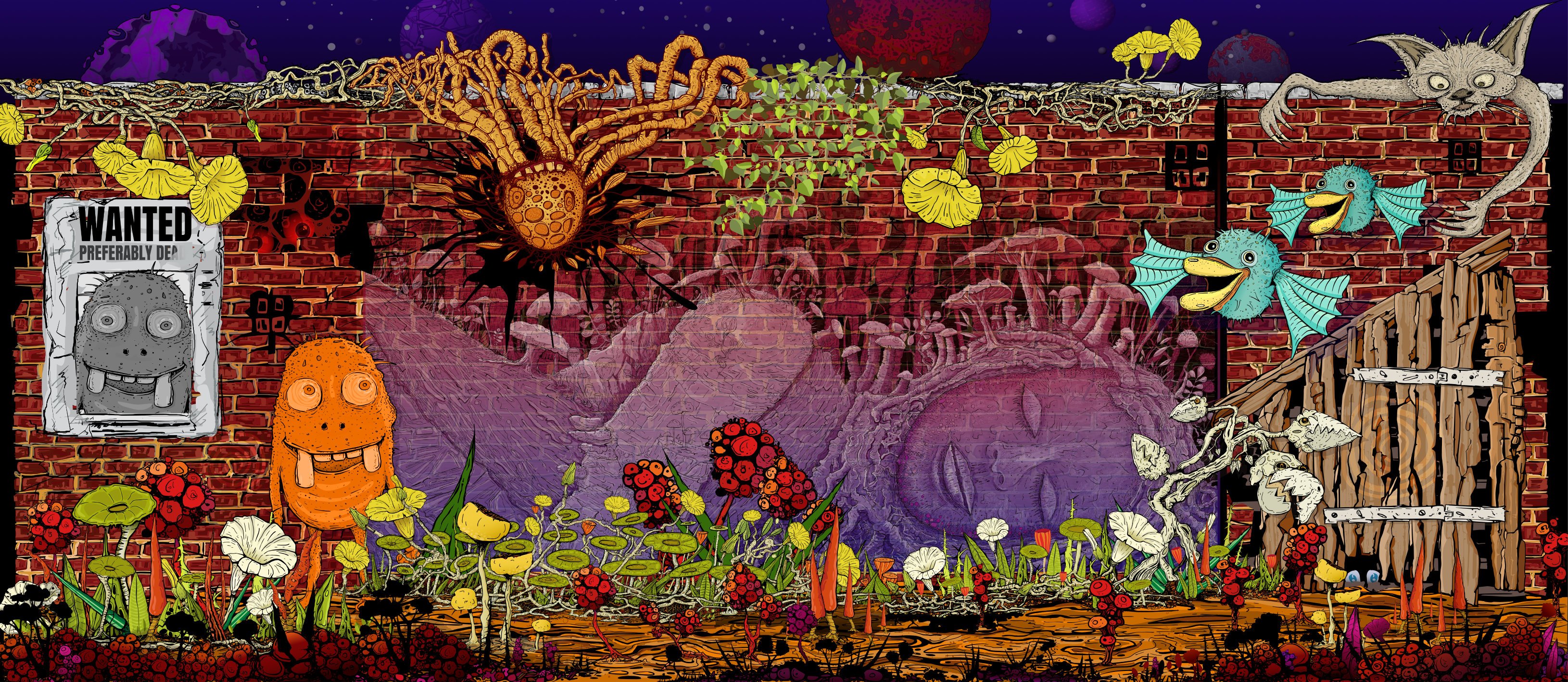
The Wall Affinity Designer | 1840 x 800mm 300dpi | Mixed raster and vector but mostly vector! Used Untamed: 'Planetary Toolkit' of for the Sky
-
 I'm trying to look for an angled/tilted brush for hand writing with my pen tablet. I know it sounds extremely simple – it's one of the default brushes on Adobe Illustrator – but I can't seem to find it on Affinity Designer. Everything is rounded... Some taper off a the ends. But none are actually angled. Please help!
- 62 replies
-
- 3
-
-
- brushes
- affinity designer
- (and 1 more)
-
Make your own digital mosaics and fauxsaics in Affinity Designer! >>GET THE PACK HERE<< After a trip to Sicily, where I saw some stunning ancient Roman mosaics, it occurred to me that there was no tool which allowed Affinity Designer users to draw their own mosaic designs. So, I set about making this complete mosaic tile tool kit – it contains everything you need to create your own realistic looking fauxsaics. In this pack I’ve captured the irregular, chipped edges of the original Roman source material (c. 4th century AD) allowing you to create stunning designs and illustrations with a sense of antiquity. However, the pack isn’t just for adding a vintage look – as you’ll see from the screen-shots you can use the Affinity Designer brushes, patterns and textures to bring a unique twist to contemporary designs too. To test the pack I studied real mosaics and put the Affinity brushes through their paces by re-creating a real Roman design – the bear image screen-shot. >>GET THE PACK HERE<< The pack contains all of these fantastic components: The Brushes A variety of mosaic tile Affinity Designer vector brushes, all sourced from genuine 1600+ year old material. A grout brush is also included – perfect for adding a rough, undulating edges to vector shapes. The Pattern Styles 6 authentic mosaic repeat patterns – perfect for backgrounds or for flooding areas with tiles quickly. Supplied as One-click Affinity Designer styles. The Border Brushes Add authentic looking borders to your mosaics. 6 Different designs supplied, each made using multiple vector brushes – simply layer them up. The Seamless Overlay Textures 2 Stone textures and 2 grunge overlay textures – use these to flood areas quickly and add age and authenticity to your designs. The featured Affinity Designer textures are seamless, so you can fill any sized area. Supplied as One-click Affinity styles. A quick reference PDF guide This will help you quickly find the right brushes and styles for the task in hand and get the most out of this brush, pattern and texture pack. Example file The Skull image has been supplied for you to backwards engineer. Supplied as an Affinity Designer file. Instructions A very thorough guide on how to load, apply and then adjust this brush, style and texture tool kit is included. >>GET THE PACK HERE<<
- 2 replies
-
- 4
-
-
- vector brushes
- patterns
- (and 3 more)
-
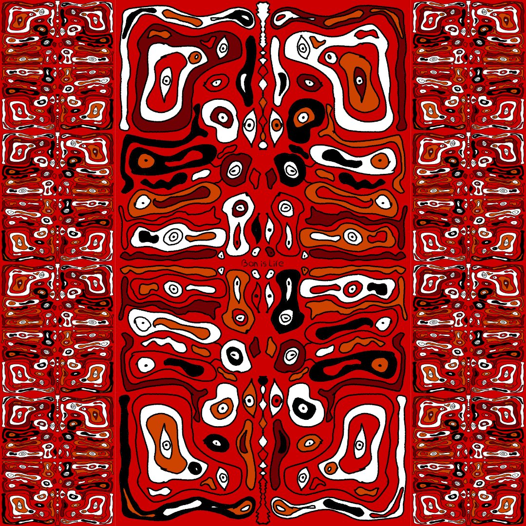
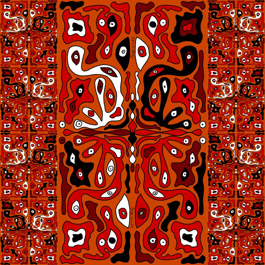
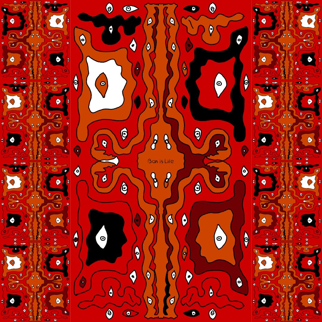
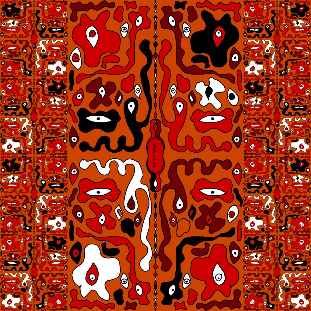
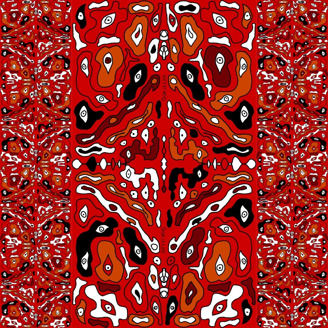
After watching a couple of Ocean documentaries I was deeply intrigued by the endless number of sea creatures that exist. Eventually I got tired watching and got inspired to create this Ocean inspired Deep See art. Enjoy. Tools: Affinity Designer, Affinity Photo, Affinity Publisher Let's connect: https://www.behance.net/bah-is-life https://www.instagram.com/bah_is_life/
- 4 replies
-
- 3
-
-
- affinity publisher
- affinity photo
- (and 2 more)
-
A5 flier, all done in Designer and Photo apart from the 5 star logo and Chef along with Gary's image. Colour laser printed (20 A5's for double sided Perspex table flier holders)(3 A4's for notice boards) (1 A5 emailed as an attachment to the membership)
-
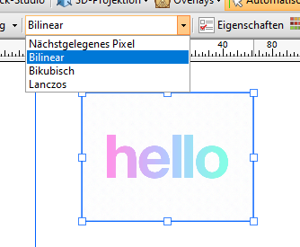
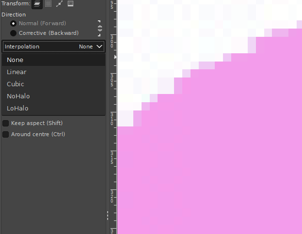
 Hi, I know there was already a topic like this. But always, when I try to resize pixel art or old graphics (low resolution), it always destroys my work and creates blurred edges. Affinity Photo has a tool named Pixel Tool, and in Serif 2.3, they added a pixel grid. And I think Affinity can be good software for editing pixel art graphics, but having the ability to change interpolation during resizing would significantly enhance its capabilities in this regard. I do not want to rescale the whole document, I want to rescale one or two elements in the document. Like Draw Plus 😎 (bugged version with immutable german language as default): or like Gimp:
- 5 replies
-
- 1
-
-
- 2.3
- affinity photo
- (and 5 more)
-
 Hi there, I'm getting stuck with masking and the paintbrush tool (in Affinity Designer)... - Pixel Persona - Have a photo I want to mask - When I select a part of the photo with any of the selection tools and create a mask from that selection, things are fine. I get a proper black and white mask layer. - Now I want to REFINE my mask, by selecting the mask layer, selecting the brush tool, setting the brush color to BLACK and then painting black inside the mask over parts I want to hide. The problem is... I can never make the brush tool to paint in COMPLETELY BLACK color! The color setting in the color panel is set to completely black (#000000), but the actually painted color on the mask is always dark gray. Never completely black. Thus there are always semi-transparent parts of the image visible. I can never mask them completely. Any ideas how I can make the brush color to be 100% black? Thanks!
 -
 Does anyone know if it is possible to separate a layers "effects" / fx into it's own layer? Similar to how we can do this in Adobe Illustrator? I am speaking specifically in Affinity Designer. Basically take this layer's effects and turn it into its own layer - https://prnt.sc/LI-IOjlfTBsz Thanks, Aaron
 -
 I've completed designing, 3d modeling, surfacing/texturing and rigging a 3D City Bus for my upcoming Animation Short Film. Completely ready to animate, including rigs for the doors and to drive and steer the bus. Affinity Designer was used for all logo and texture designs. Here's a demo video
-
Finally finished the 1st episode of the animated series I've been working on for years with my nephew 🙌 Affinity Designer and Photo was used to create some of the backgrounds and design most of the characters. Would love to know what you think of it!
-
 When working with the vector tool, its great that the pressure can be recorded when using a graphic tablet. But when only using the mouse, you have to use the pressure controls inside the stroke-panel. For short curves this is pretty ok, but if my curve gets too long, the precise configuration of the pressure is near to impossible. To improve the usability I suggest an seperate pressure-edit mode or something like that where you can specify the pressure value directly on the actual curve (maybe by adding points similar to those handlese on bézier-curves). This should be additional, so you could also edit the pressure on the old way.
 -
Vector brushes are cool but when they are applied to long curves, many of them break because they get streched. On the other hand with vector curves are perfect for geometric or very precice shapes because they can be reajusted afterward. Pixel-based brushes don't have the downsides mentioned before. So it would be cool to have in addition to the normal vector brushes the option to use the rasterized brushes for curves. The curve represents the mouse movement when working with the pen tool. Other advanages inclue: You could change the the brush size afterwards You could also vary the brush pressure (because this is an already existing feature in vector brushes) Have a great day!
-
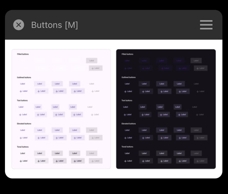
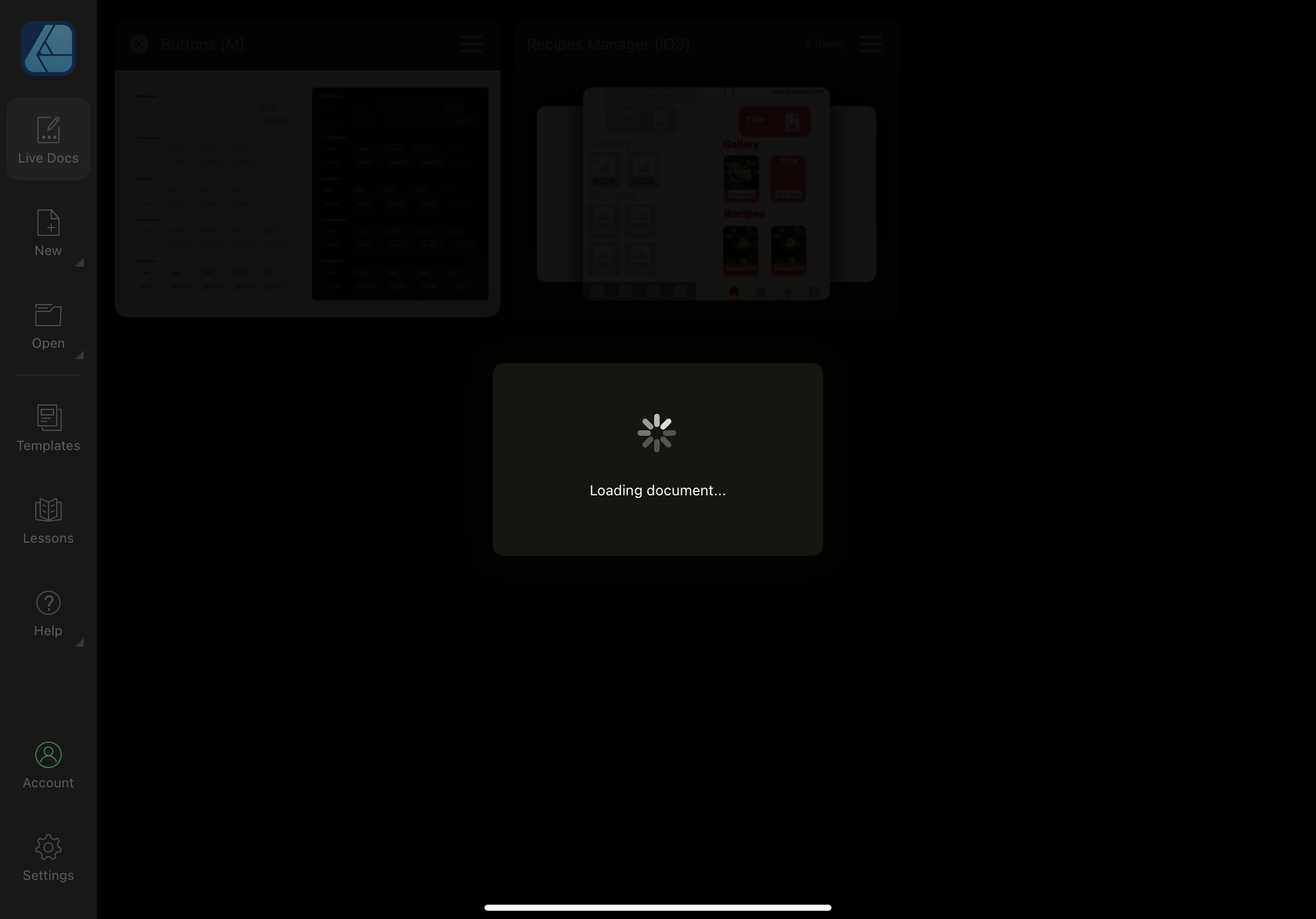
 I’ve recently tried to open a Photoshop(.psd) file in Affinity Designer. The file could successfully been opened in Photoshop, but not in Affinity Designer. Also the size of it hasn’t been big(2 MB). When I pressed open -> open document from the menu and selected a file, It has imported it successfully, but then it said loading file, and the app crashed. I tried both opening and importing document, but neither helped. I restarted the app, even the device, but still couldn’t open that file. Each time I press on it - the app crashes. I don’t know whether the issue occurs in other Affinity apps, but in Designer it exists for sure. I ask developers to fix importing/opening psd files in Affinity Designer on IPad. Thank you, in advance! Buttons.psd
-
 Get our FREE Canvas Creator and give your digital art the authenticity it deserves! Infinite Canvas Creator features a range of real-world artist’s textures and papers – perfect for showcasing your designs and illustrations. The canvas textures include watercolor paper, canvas, vintage parchment, chalkboard and more! All textures were sourced from the real thing and have been supplied as seamless, repeat patterns so, you can fill infinite areas without untidy edges. >>FIND OUT MORE HERE!<< >>FIND OUT MORE HERE!<<