Search the Community
Showing results for tags 'Icons'.
-
 How do I export images to match Apple's Icon requirements?
 -
Hi guys, I decided to make my icon pack free. I am busy with my startup and don’t have time nor interest to improve this further. Hope it comes useful to you. Thanks, Vlad Eclipse - Icon Pack.afdesign
-
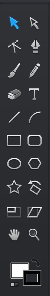
I am a new convert to Affinity, and so far it is the best thing going in my world. It has all the features I need and more. My problem is my transition from Adobe products. Others have complained about the size of the icons down the left side of the screen and I too would like larger icons as I learn. I have plenty of screen real-estate with multiple monitors etc, so larger icons would be a big help with no down side. What would be an ever bigger help is text labels on each icon. There are over 100 tiny icons, and each just might make sense to the originating programmer, and they may eventually make sense to me, but until I learn, having the ability to turn on a text label to the right of the icon would make my learning process much faster and just might increase the speed of adoption of your great software by others. You already have text labels on the icons across the top and the ones on the left, so how about some on the right. I can hear the programmers now: "That is not possible because there can be multiple columns of icons with multiple languages." My reply is as I stated at the start of this request - Screens are cheep and most of us have plenty of screen real-estate so if I select labels, make columns of icons with labels. As for languages, I suspect if you asked, there would be hundreds of volunteers to provide translated labels. Yes it will be less elegant, and it will take up lots of screen space, but it would make my life and the life of other adopters much, much easier. As a side note, that is why I do not use Olympic brand cameras. They only have icons for functions and I was unable to operate the camera without a manual in my hand and I tried for over 3 months. This is where I am with your software today. Nikon has a better answer I can read the screen in english for every function. Could you please follow Nikon not Olympic! Finally - Thank you for an excellent replacement for Adobe products. I only commented to make an excellent product even better. You will be receiving more of my money even though I need to keep a paper manual nearby with function names.
-
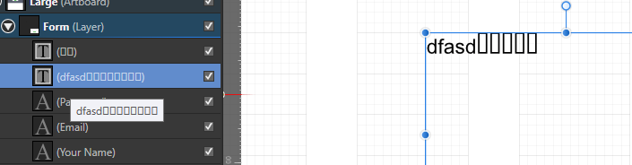
 How to change the global size of the icons, and other fields in this program? With different monitors may not appear correctly. For example, my laptop is 15.6 "- 1080, and the home PC 24" - 1080p. But the laptop is not very pleasant to work because of the small screen and huge icons. Look a screenshot to understand what I'm saying. PS In Photoshop you can not change the size, but substituting other "manifest file", you can change it. I changed the size of a laptop (reduced), and for 4k monitor (increased).
 -
I find the thumbnails in the layers palette very useful. However, the thumbnails in Affinity present a number of difficulties for me. The idea of using a different background colour for image and mask or adjustment is a good one, but the black background can be a real visibility problem when working with dark objects. With a pale grey this might work better. Obviously any colour is going to conflict with some layer content but I find the black very hard to read indeed. The thumbnails are quite modest and in the case of masks, adjustments etc. are also occupied by a quite large and very distracting function icon making the contents very hard to read sometimes. Could these icons be made much, much more discreet or, even better, moved outside the thumbnail and placed immediately beside it, before the name and description? I think this would be a huge improvement in legibility. In an ideal world I would love to see a palette option that allows us a choice of thumbnail sizes.
-
 I'm trying to use an icon font in Affinity Designer, pe-7-icon-stroke (freely available here). However I have trouble finding and pasting the right glyph into Designer. I have tried the built-in Windows app Character Map to copy glyphs, but when when I paste them into Designer, all that is pasted is a line break. Similarly, when I try to paste glyphs from Font Awesome, I get an empty rectangle instead of the actual glyph. On Windows, what is the recommended way to paste and use icon fonts? How do I get the desired glyphs from a font into Designer? Using 1.5.0.26 RC2 on Windows 10.
-
 I used to use Graphic (formally iDraw.) I liked how it used large icons for people like myself who have retina displays that make traditional UIs seem small. This option should be added under view > customize tools so that I can change the size and which tools to display at the same time.
-

affinity designer Flat Shaded Icons for Windows Explorer
Checkmate posted a topic in Share your work
Inspired by the icons on the Affinity Designer export panel, I thought I'd design some icons to give my Windows 10 install a refresh. It's the first time I've experimented with the 'Export' Persona. Combined with IcoFX Portable I can batch process the icons really quickly. I've attached the .afdesign file, plus .ico files for anyone who wants to use them on their PC. I use a great free app called Default Programs Editor to change the icons on Windows (amongst other things). Flat Shaded Icons.zip
-
 In Affinity Designer Beta, I have an EPS vector with more than 1000 icons. I want to drag a selection box around one of them to copy or recolor it. But Designer selects ALL the icons with the Move tool, or individual elements of each icon with the Node tool. In Illustrator, I can easily drag around any icon to select it. How do I do that with Designer? 1111_XXL_set2.eps
 -
Hi there guys, I have taken a pre-made template by a guy in PSD and converted it to Affinity Designer format, with embeded Icon in 1024 x 1024 which you just double click for editing. I took the idea for embeded editing from another template here for IOS (green tech I think? Thanks!). All credits listed in copyright of the file. To edit, just double click the massive icon and boom. Enjoy, Mart OSX.afdesign
-
 I have problems with the toolbars in the application. They seemed to be "greyed out" -- I am currently running OS 10.11.5. My mac has the following specs: Hardware Overview: Model Name: Mac Pro Model Identifier: MacPro3,1 Processor Name: Quad-Core Intel Xeon Processor Speed: 3.2 GHz Number of Processors: 2 Total Number of Cores: 8 L2 Cache (per Processor): 12 MB Memory: 32 GB Bus Speed: 1.6 GHz Boot ROM Version: MP31.006C.B05 SMC Version (system): 1.25f4 Graphics Card: NVIDIA GeForce GTX 660 2048 MB Here is a screen capture of the problem. Can you help?
-
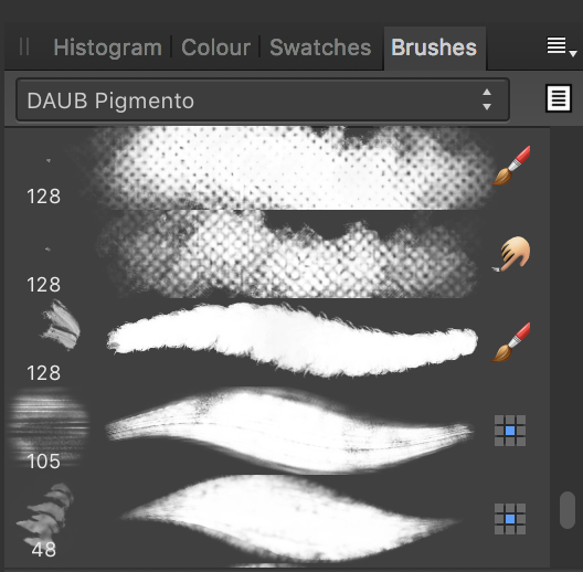
 So I purchased Daub Pigmento (a set of 72 brushes) and noticed after installing them that there were little icons on the right of each brush, I have no clue as to what they mean... I need enlightment :huh:
-
Hey all, A little freebie for all from Affinity TV . A set of 15 colourful icons for you to use in your projects and designs... Icon Design.afdesign All neatly named and organised for you. Enjoy, Allan
-
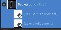
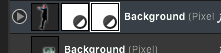
 All the adjustment layers have cool and colourful icons to help you easily read which adjustment you would like to make, and what it does... Yet when you apply this adjustment layer to the image, you get the same, boring white box, every time. Worsely (!), you don't know what they are or what they do!.... ...and you have to open the group up and read the WORDS to see what adjustments you have.... Is there a really, really good reason that we can't have these pretty, colourful icons also displayed in the layers palette? I think it would be nice, and helpful, and, ultimately, less annoying, which is related to helpful, but the direct opposite of it. Thanks for listening. Wayne
- 4 replies
-
- 1
-

-
- adjustment
- layers
- (and 1 more)
-
 Hi, I am going to make a set of Icons in the material design style, Has anyone got any tips on what size i should make my document, and what grid i should use etc? i took a look at googles guidlines here and underneath is a snippet, how do i create an edge of 1dp? DP unit gridAndroid expects product icons to be provided at 48dp, with edges at 1dp. When you create the icon, maintain the 48-unit measure, but scale it to 400% at 192 x 192 dp (the edge becomes 4dp).
 -
 Was the AD 1.3.5 update supposed to fix the missing/mixed icons issue? They still aren't working for me. Is there a way to "reset" the icons without reinstalling?
 -
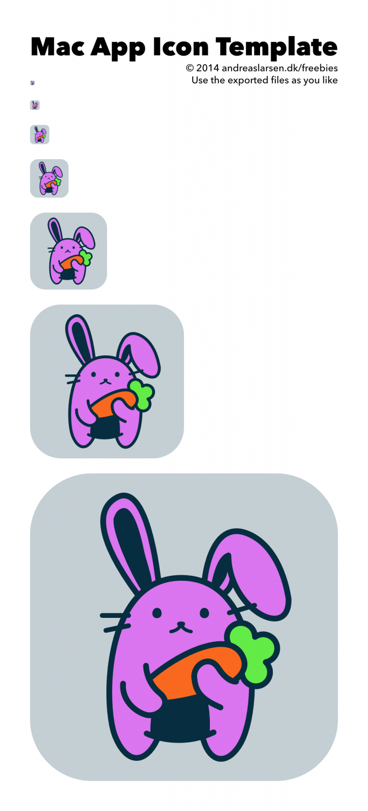
Free to use as you like :) Icon template mac.afdesign
-
Today I downloaded the new version of beta AFF-Photo. This is spanish-localized (good job!) BUT...... not all has been translated and WORSE...... some of the UI mini-buttons have texts/literals into them that exceed its size........ very disapointing so I PROPOSE: -- either use mini-icons and the text explanation as a help bubble when mouse is on it (mouse enter) -- or use symbols (a "+" or similar) with the same text bubble as before This can be also useful in the mini-tabs of the tools in the right side (layers, effects, styles, colour, histogram, history, etc)...... better mini-icons or symbols and help bubbles than shrinking text literals. Thanx Emilio
-
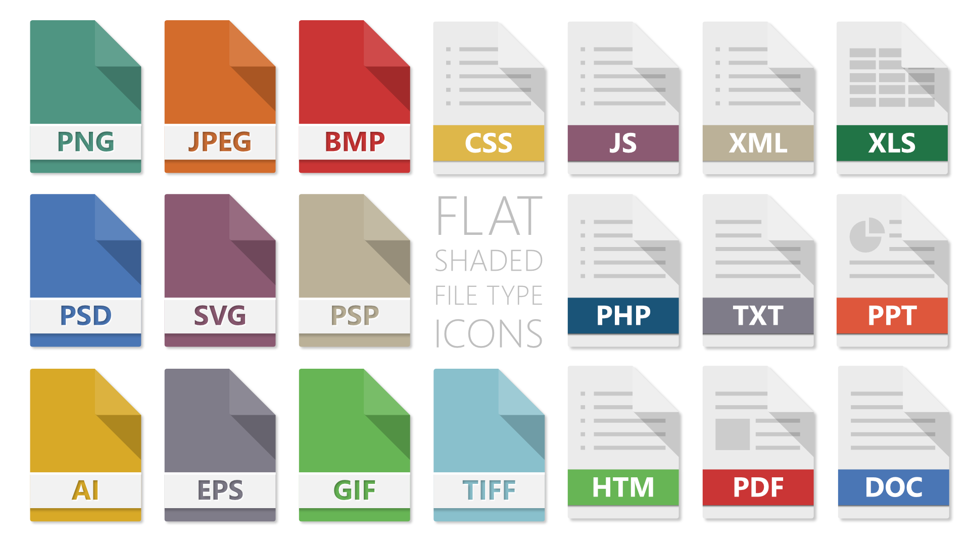
 Just wondering where the icons of the files went/are?! The suite hast such wonderful program icons, and every export to pdf, jpg has a file preview as icon - just the workfiles have a plane sheet of paper. Is it a local problem of mine or is this just wanted? A file preview or a clear icon for the filetype would be great. Just look at the screenshot for what I mean. :)
-
It'd be wonderful if the ability to export slices was expanded even further for the creation of icon sets. With icons, I want the ability to dump raster images of various sizes. So, for example I might want to: 1.) For each slice, generate a PNG file with the object centered at 16x16, 24x24, 32x32, 64x64, 128x128, and 256x256 2.) For each slice, create a .ico file with all of the following images at multiple color depths. Use case #1 is something I need multiple times per week. Use case #2 is fairly rare.
-
Hey there! In my company we are using the tool "realtimeboard" for brainstorming stuff. In realtimeboard there is the "ICONFINDER" feature, a collab with www.iconfinder.com. You can easily search for an icon you need and just drag & drop it to your board. This will make prototyping or layouting websites, apps, .... easier and faster. What do you think? Regards Basti
-
Hello, i'm Clem, and young french designer for print. I discover affinity designer, because, i search an alternative software for Adobe (too expansive, and i don't want to be prisoner of the CC tools). I made some test with affinity ! and it's so cool, i thinks it can be a good alternative for the professional print designer, because there are full CMYK support and i hope later pantone support. So, this one of my test. An icon for my an fake app (i'm on the interface) for christianpiot.fr (print and web clients). Tell me what you thinks about my realization. it's an begin, i will upload the interface later off course ! Sorry for my bad english ;-) and ! i thanks you for read me. Icone CHP.afdesign
-
 We often draw icons in adobe Illustrator to use them in our Photoshop layouts as scalable "smartobjects". We tried to copy and paste the icon that we have drawn in affinity designer but it sadly turned out to be a rasterized picture in Photoshop instead of a vector object. It would be really nice to have this "smartobject" opportunity with AffinityDesigner, too.
 -
If you select the move tool or gradient tool or the transparency tool the cursor icon for all is the standard pointer icon. Because there is no visual feedback in the cursor tool icon that I am using the gradient tool and it looks to me like the move/select tool this stumps me every time and I'll go and grab the object I have just adjusted to move it and I end up unwillingly adjusting the gradient (because I'm still using the gradient tool :blink: ). Same happens with the transparency tool... it's not a big deal but it seems to be something that trips me up every time and I wonder if each tools cursor should be unique for on screen visual feedback of the tool you're actually using...? Anyone else experienced this? Is this still in development?