Search the Community
Showing results for tags 'Affinity Designer'.
-
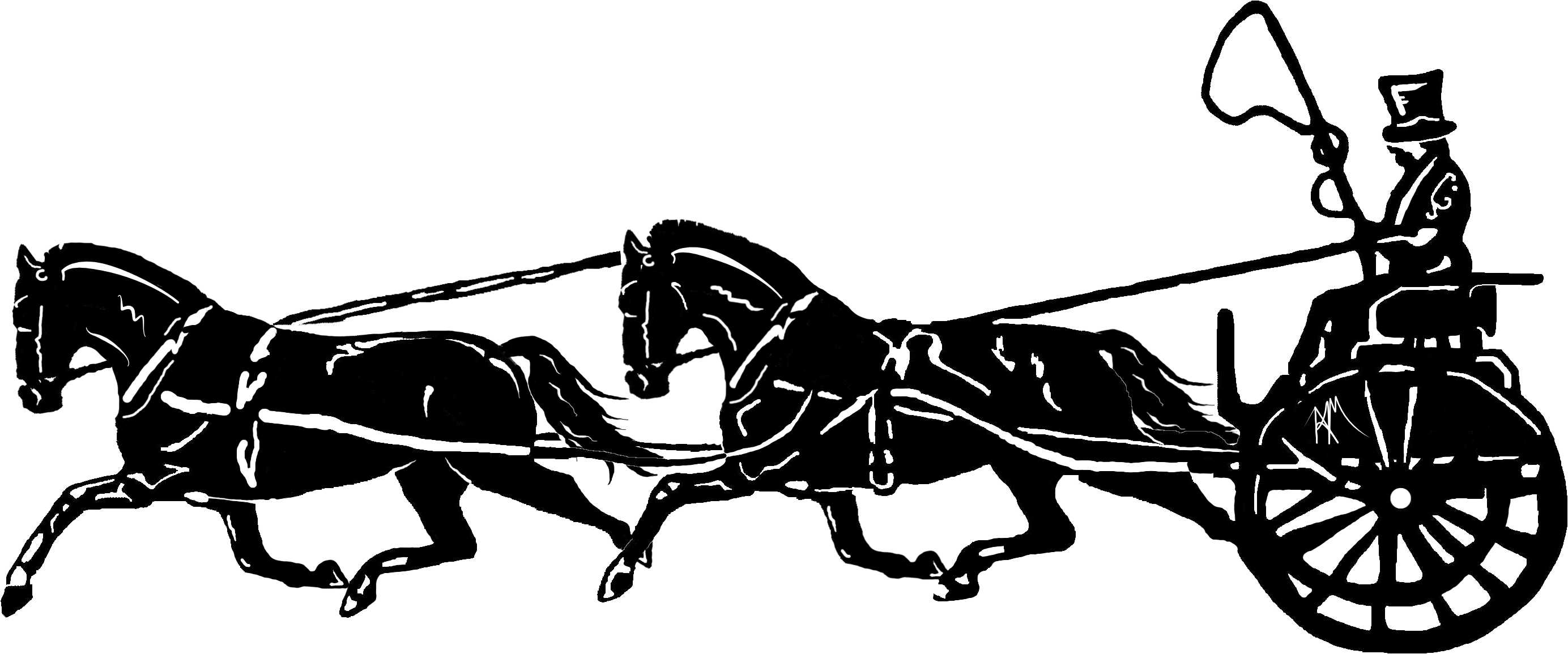
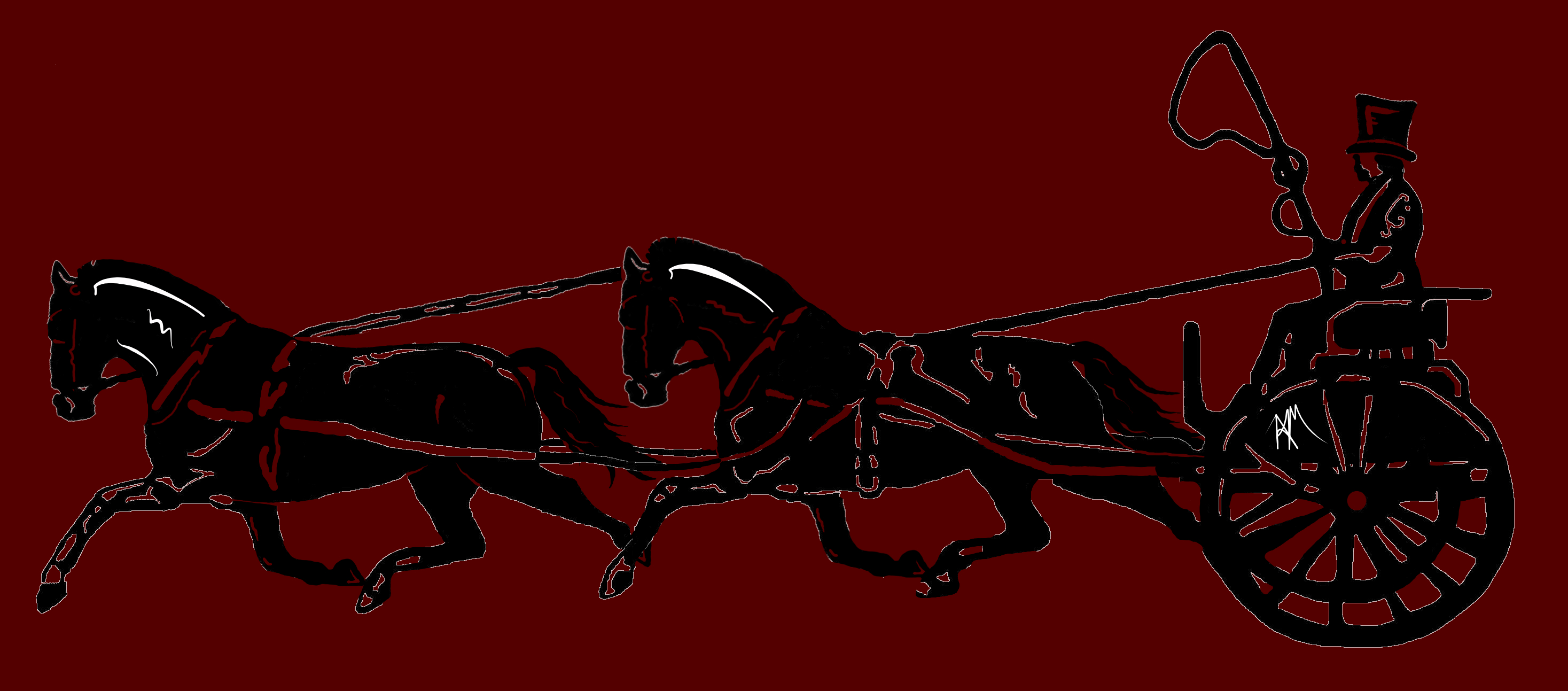
 I'm working on updating a new logo graphic. I want to make the graphic a one color silhouette. The problem is, in the process of editing and tweaking, there's lots of left-over junk from various edits. The graphic looks fine if it's on a white background because you can't see the leftovers. However, if it gets placed on a dark background, there's a halo effect from previous edits. Tolling around to remove each and every last non-black pixel with the eraser is possible, but pretty darn time-consuming. I've tried all the options I can think of, and searched the forum like crazy for the solution. What do you suggest?
-
They just came to torture! Inked with brushes with new affinity stabilizer, they are cool! And as always my favorite EGA palette )
-
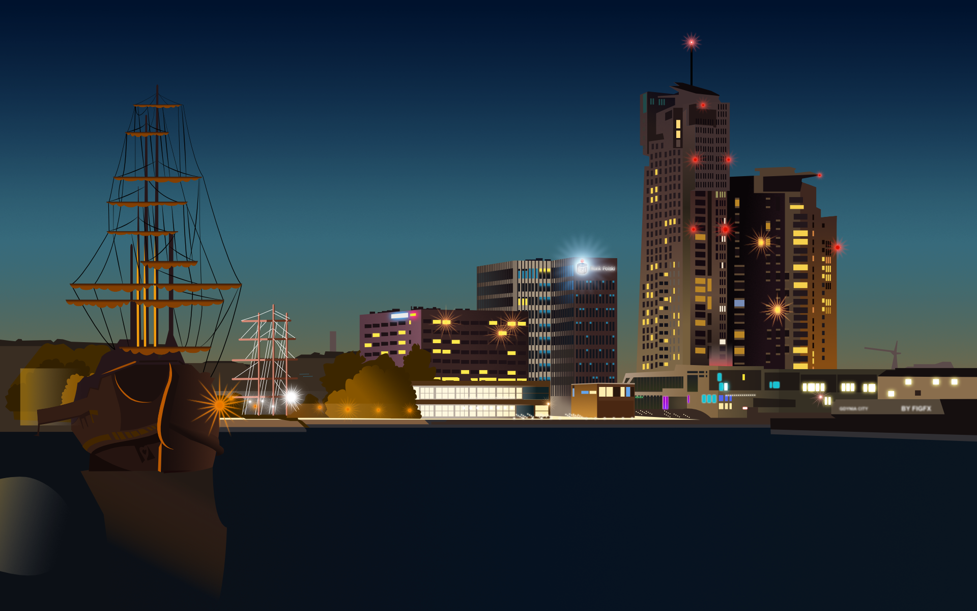
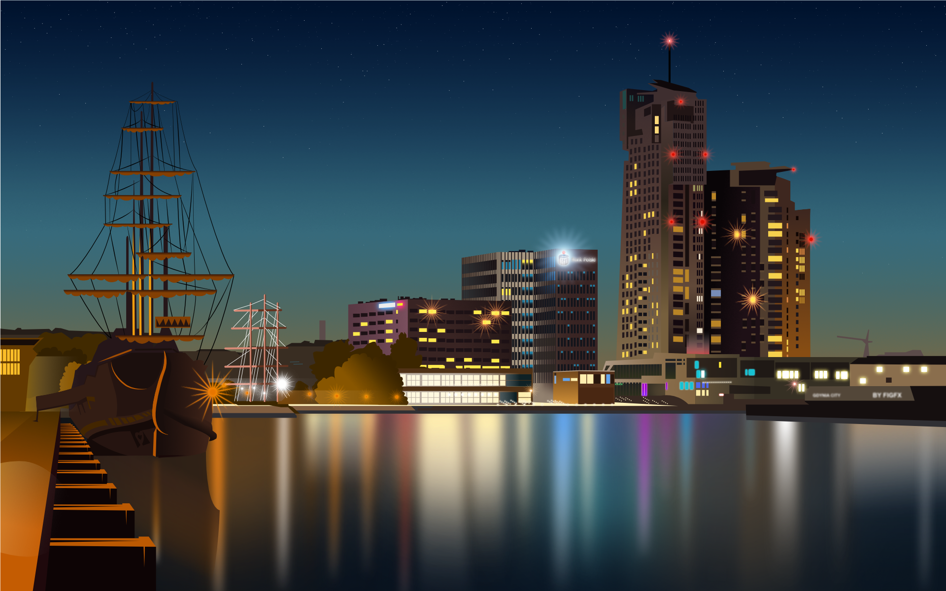
Hello to everybody in the forum, I'm getting started with landscape illustration. Today I share with you my illustration of Gdynia, the city where I live in Poland. The illustration was done with Affinity Designer. I would invite everyone to comment thoughts and feedbacks, or to share own works. This is my first landscape and maybe your works will teach or inspirate... Cheers Francky The project on Behance
-
- 4
-

-
- illustration
- vector
- (and 4 more)
-
I rebuilt this invitation from a card I found in the internet. Everything done in Affinity Designer. Ok, I extended the duration of the party a bit, but then again...
-
A logo study to get to knoe AD better - God, I love this Programm! Haven't been so intuitively creative in a while...
- 10 replies
-
- 14
-
-
I rebuilt the box from Affinity's Website from Scratch into a new design. hope you like it.
- 1 reply
-
- 4
-
-
Recent works,It is done in AD and AF.
-
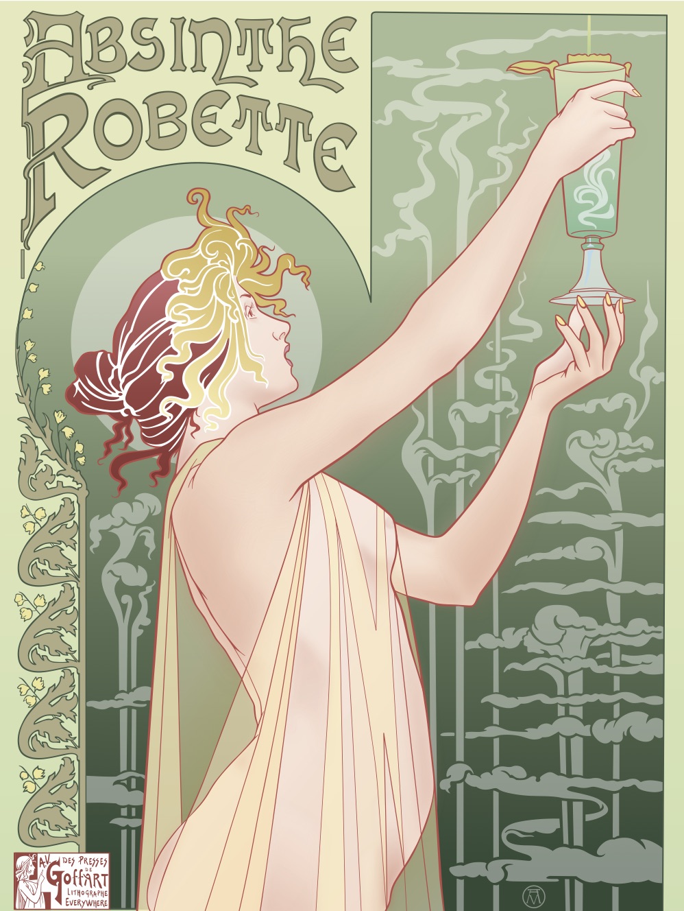
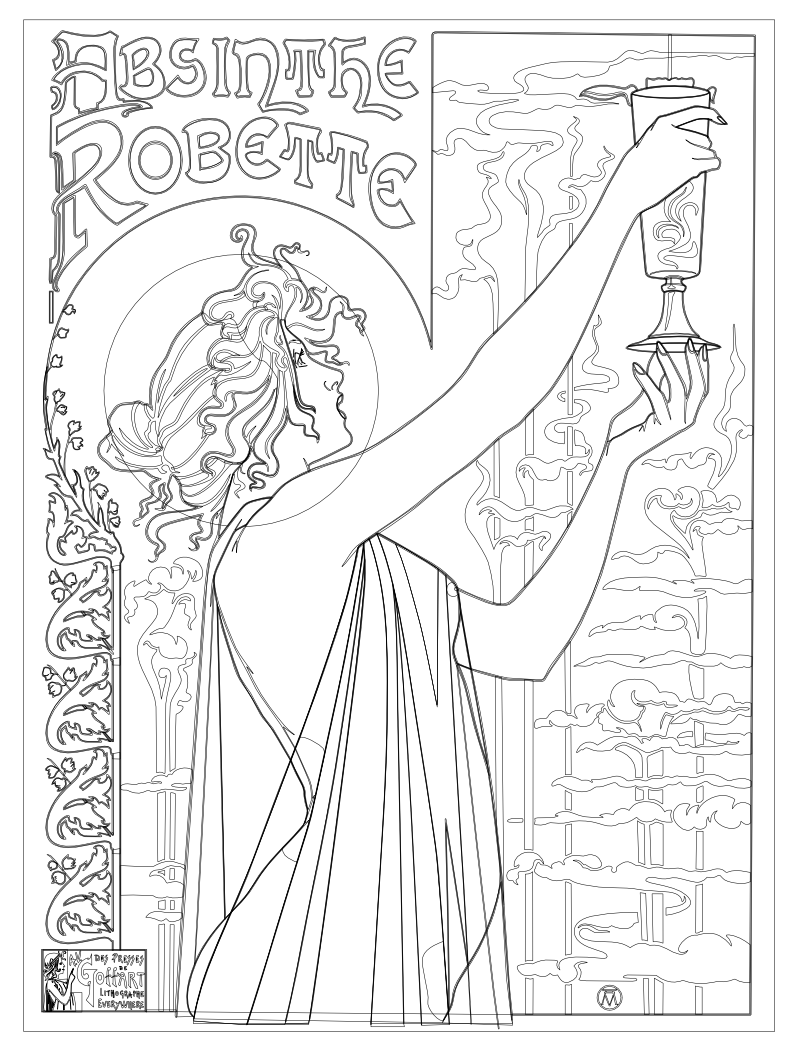
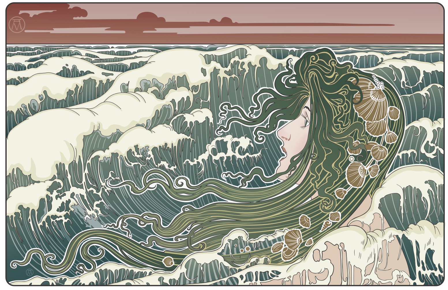
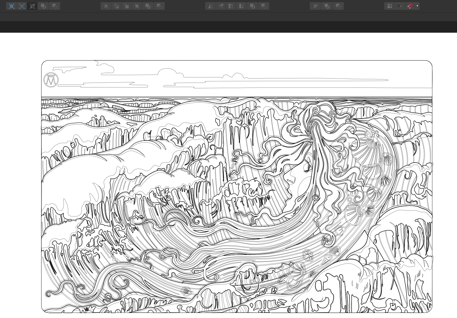
This is my second Art Nouveau piece (and probably my last as I'm ready to move on to something else). I based my version on a Henri Privat-Livemore poster from around 1896 or so. As I mentioned in my previous piece, I normally don't use the "effects" in Designer because I normally work only in pure vectors but the effects worked so well with shading on the skin in my last piece that I decided to recreate this piece as well adding my own little touches along the way. I chose this poster because I liked the composition and it had a lot of shading on the skin tones and I wanted to see what I could do with it using Designer's effects. I was very happy with the results. I hope that you enjoy. Thanks for letting me share my picture. Hokusai
- 17 replies
-
- 13
-
-
- absinthe
- art nouveau
- (and 3 more)
-
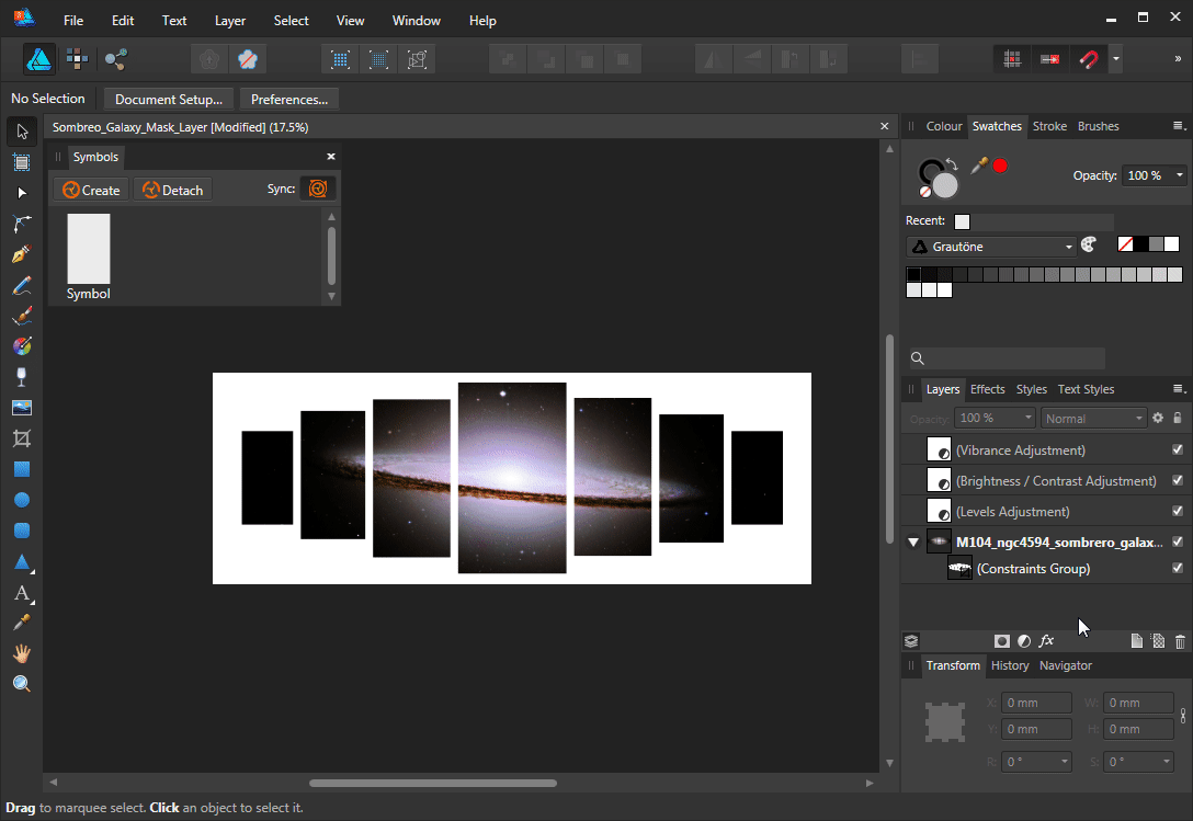
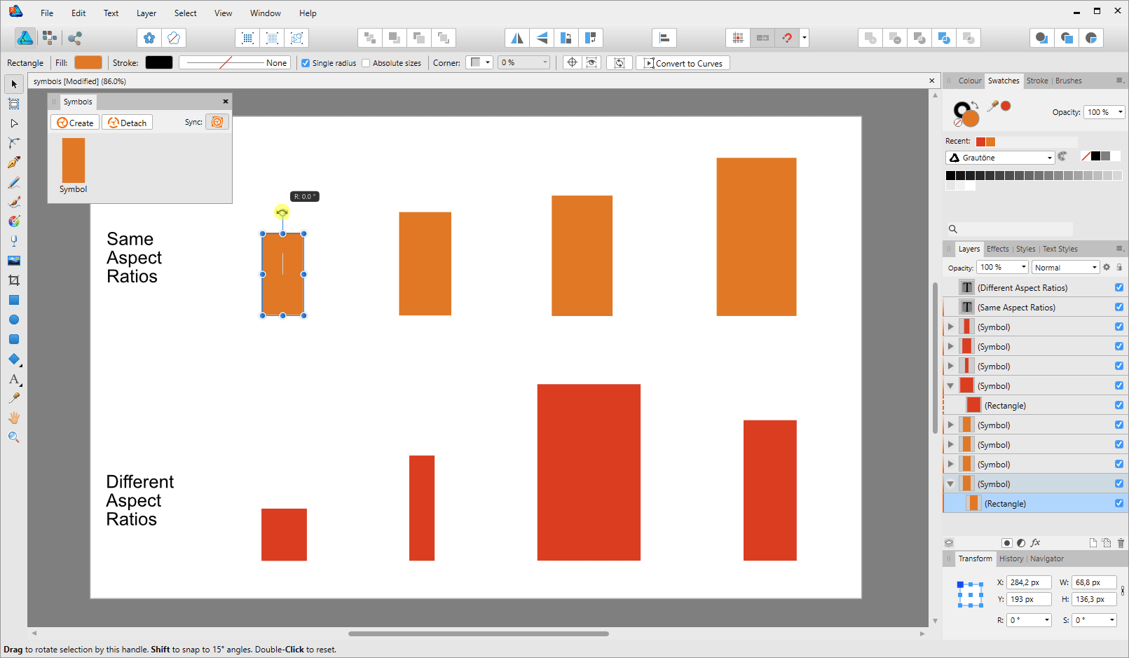
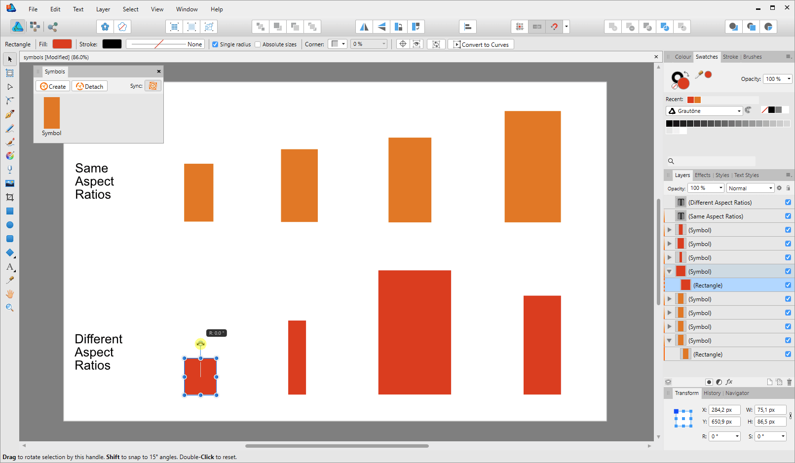
 Hi guys, At the moment I'm fighting with the theme of assets, symbols and grouping in the Affinity Designer. Compared to the illustrator, Affinity has revolutionized the handling of symbols and I am "relatively" satisfied with the available tools, but there is still room for improvement! I've been looking for the same ideas for a long time. There are many suggestions with different content and it is very difficult to follow them, so I do not know whether there have been similar proposals or not. So, let's go! With the identical objects I was able to help myself with assets and symbols, but when it comes to working on other forms in a group simultaneously, it's over with fun. Replacing symbols or objects with inheritance of their original size and position is not possible in Affinity Designer or I haven't found a function for it yet. I have found a good example of how such a thing can or has been realized in Microsoft Powerpoint (2013). It is not a real illustration program but the simple way to modify objects is unsurpassed! Please have a look at the examples here and I am curious about your review. Is this a "Nice to Have" feature for you or a feature that allows you to work quickly, effectively and flexibly? Or is such a feature already in your portfolio? Here you will find some visual examples without the generation of symbols "cloning" like in AD: Objects can be modified individually or together in a group. Different objects can be modified together Objects can be replaced together or independently. The size, position and rotation of the original object is taken over. Just a very simple drawing like the pentaptych or tryptichon is a challenge in AD An example of how PowerPoint works. Try to do this in AD with symbols at the same time and then replace them afterwards. In addition, AD (such as Adobe Illustrator CC and Incscape. With the exception of the CAD programs, because it would be fatal) a strange feature to deform the symbol duplicates (which are changed in their aspect ratio) during rotation. It is also not possible to edit the symbols in the "quasi" mask group, since this group is converted to a solid layer.
- 1 reply
-
- 2
-
-
- affinity designer
- suggestion
- (and 5 more)
-
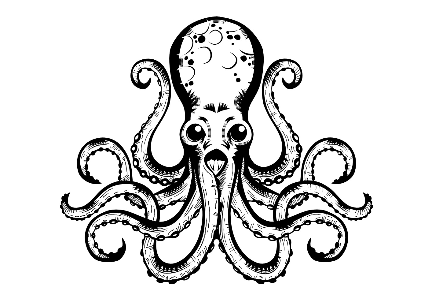
Just wanted to share with you something i've been doing with Affinity Designer recently. I'm in love with black and white these lightless winter days...
- 6 replies
-
- 7
-
-
- black and white
- octopus
- (and 1 more)
-
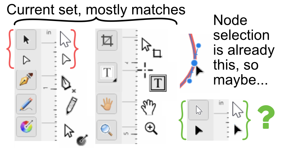
For the most part, Affinity Designer's tool cursor shapes are very clear to understand and the cursors match well with their icons. All except the Move Tool. When I first started using Affinity Designer and I was switching between the Move Tool and the Node Tool with keyboard shortcuts, I would often confuse them (OK, maybe my eyes are getting bad too...). Even after using AD for many months I am puzzled by why they are not consistent. My suggestion is to change them so they are clearer for the user. I made a suggestion below, but this is not the only solution— you may have a better one, but really the goal is to reduce ambiguity and increase consistency.
-
 Hey guys, I am new to the forum. I am creating a logo and need to get it ready to export for t-shirt printing. That is a whole new beast for me. Any tips on how to prepare it when exporting? Also, I noticed there is no measuring tool. I can use rectangle tool for that but have not found where i can input exact measurements. Thanks guys
 -
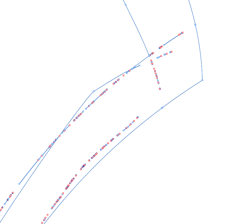
 I made overlapping strokes and then did layer>expand stroke, to convert it to fills. I then hit the "divide" option to split up the fills where they overlapped so I could erase the extra. i then wanted to merge the remaining pieces together to make a solid fill shape, so I hit the "add" option (in the upper right corner near the "divide" option). This worked great, as it became one general shape, but it left a lot of debris - leftover nodes and partial lines of nodes...I included a picture of the same section in outline view mode and in regular mode. Anyone know a solution for this? Or a better way to accomplish what I was doing in order to avoid the debris leftover? Thanks!
-
 Hi there, I'm getting stuck with masking and the paintbrush tool (in Affinity Designer)... - Pixel Persona - Have a photo I want to mask - When I select a part of the photo with any of the selection tools and create a mask from that selection, things are fine. I get a proper black and white mask layer. - Now I want to REFINE my mask, by selecting the mask layer, selecting the brush tool, setting the brush color to BLACK and then painting black inside the mask over parts I want to hide. The problem is... I can never make the brush tool to paint in COMPLETELY BLACK color! The color setting in the color panel is set to completely black (#000000), but the actually painted color on the mask is always dark gray. Never completely black. Thus there are always semi-transparent parts of the image visible. I can never mask them completely. Any ideas how I can make the brush color to be 100% black? Thanks!
 -
 I like my taskbar to look uniform, so I always create custom icons to match the Windows-10 esthetic (typically solid white, simple icons). I just switched from Adobe to Affinity this week, and I created a couple of simplified icons to pin to my taskbar. I figured I'd post them here for anyone else who's looking for something similar. ZIP file contains SVG, PNG, and ICO formats. affinity-icons-windows-10.zip
-
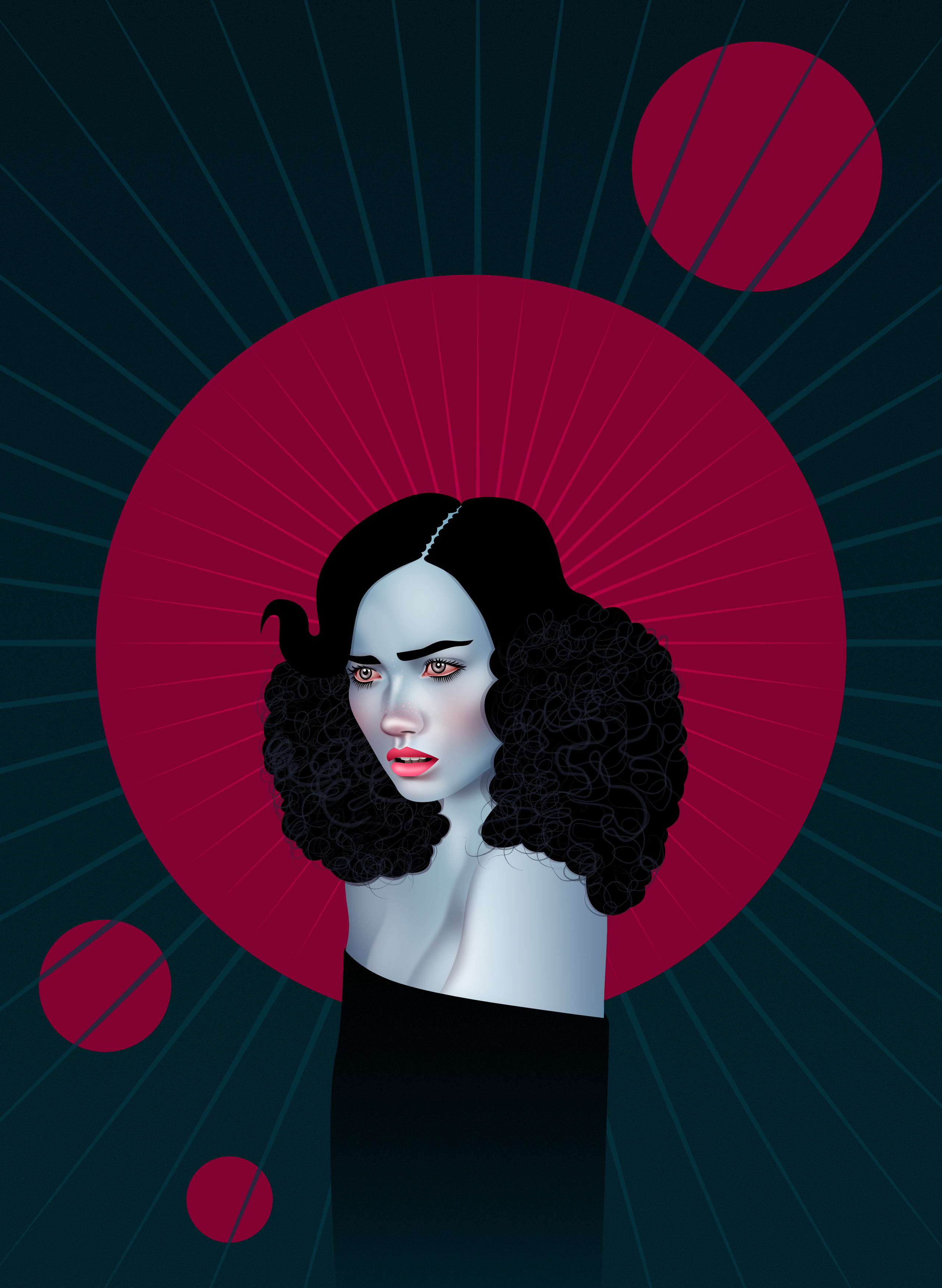
This is my first work in Affinity Designer. Didn't expected to enjoy this software this much after only few days of using it. I call this one "Red Moon" I hope you'll like it.
-

Fonts not displaying correctly
befehr posted a topic in Pre-V2 Archive of Affinity on iPad Questions
Fonts display improperly (wrong font) when opening a Designer file in Affinity Photo on my iPad Pro. Are fonts imbedded in the file? -
it's a time ago ... I don't remember why i drew this bird with Affinity Designer. I don't know what moved me, but it has become beautiful. What do you think? http://b-bertuleit.de/bird-vector/
-
As I'm quite fussy about how my desktop looks, I decided to revamp all my icons. I wanted the same colour scheme throughout and for them all to match. Standard program icons I basically recreated, reducing the amount of colours to just two, and shortcuts to my folders etc. I gave the same look and designed myself. I'm pretty happy with them, and of course used a registry tweak to get rid of those unsightly shortcut arrows. I went a bit further too, and made new drive icons to match.
-
 In Affinity designer, every time you make an object, it create it own layer for it. Is there a way to change this?
 -
Hello to everybody in the Affinity forum I'm sharing with You vector illustration of Mario Balotelli, the star of football now playing in OGC Nice club. Can illustrate people in hundreds different way I think, this is my own way... The drawing was done in Affinity Designer, only the background and the OGC Nice logo are raster images. Every comment is welcome, reply with your avatar or people drawings, opinions. Below a detail. The full project on behance
-
- 2
-
-
- soccer
- illustration
- (and 6 more)
-
I have been wanting to do my own version of an Art Nouveau piece for awhile and I just happen to come across an old poster that was originally created by Henri Privat-Livemont and I thought it would be a good one to recreate with vectors using Designer. I added quite a bit more shading and some other minor things here and there. I normally don't use any effects in my work as I prefer to keep things purely vector but with this one I used two effects to help soften the colours on the face. The effects can easily be removed and it doesn't take away from the picture much but in the end I decided that it looked better with the effects. I've also included a view of the outlines that were used.
- 6 replies
-
- 10
-
-
- art nouveau
- vector
- (and 1 more)
-
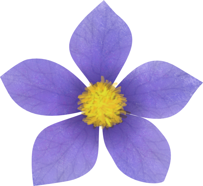
Part of a work in progress . a clematis flower created in Affinity Designer
-
 We know that's not a mistake
-
 Hey I'm new on Affinity, I used to work on Adobe. I'm not an english native speaker so I hope my explainations are clear... I used to draw on Illustrator. In this software when you draw a shape with the pencil tool, then you can select it and draw "over" the line to refine it, or extend it. In affinity designer if I draw a curve with the pencil tool above an other curve it creates a new curve, it doesn't change the old one... I don't know if you see what I mean... Is there an option to change that ? Thank you!