Search the Community
Showing results for 'variable fonts'.
-
 Then it is very likely (almost certain) that you still have the Variable version of those fonts installed. You need to remove that version, and download/install the Static version instead.
 -

Glyphs with internal overlaps render incorrectly
kenmcd replied to Vozka's topic in V1 Bugs found on Windows
Another workaround is to use the OTF fonts if available. OpenType-PS (.otf) fonts do not use components so they will not have overlaps (for now). To support variable fonts, text rendering engines must support properly rendering overlaps. So apps which support variable fonts have already dealt with this issue. Typically when font developers export their fonts from their GlyphsApp, or FontLab source files, they select "Remove Overlaps" as one of the export parameters. So the fonts they provide in their repo generally do not have overlaps in the TTF files. Google Fonts takes the original source files and uses their own tools to build the fonts for GF. That does not include "remove overlaps" (fonttools can do it but it is not 100%). Overlaps is not the only rendering issue they have to contend with. There are a number of other issues where the rendering in apps does not work properly. And that includes Adopey, Apple, and others. Bugs. All the time. They have made the decision to not modify valid fonts to work around various app limitations. Otherwise you end up with a bunch of non-standard franken-fonts. So until Affinity supports variable fonts, the easiest workaround is to use the OTF fonts. If it does not need to remain text, you can merge the shapes too. -
 There might be some individual variable typefaces that seem gimmicky, but that's a subjective judgement. I, for one, utterly detest the Arial typeface. I think it's harshly ugly looking, especially when set next to a far more "neutral" sans like Akzidenz Grotesk or Helvetica. That's my subjective judgment on it. My hatred for Arial is extended by all of its horrible over-use. It's the default font in many applications. In the sign industry Arial is perhaps the most misused and abused typeface there is. So many hacks out there just love artificially squeezing and stretching it to force-fit it into a tight space. That makes an already ugly typeface even more ugly. The tyranny of that typeface (and poor quality graphic design in general) helps fuel a growing anti-signs movement in many city governments. Variable fonts can help fight some of that problem. I have a few "work horse" variable typefaces in my collection that come in very handy when I'm working with very demanding space limitations. A single variable font file with weight and width axes can yield many thousands of possible combinations. The results look far more graceful and professional than taking a stock, static font and artificially distorting it to squish it into a space.
 -
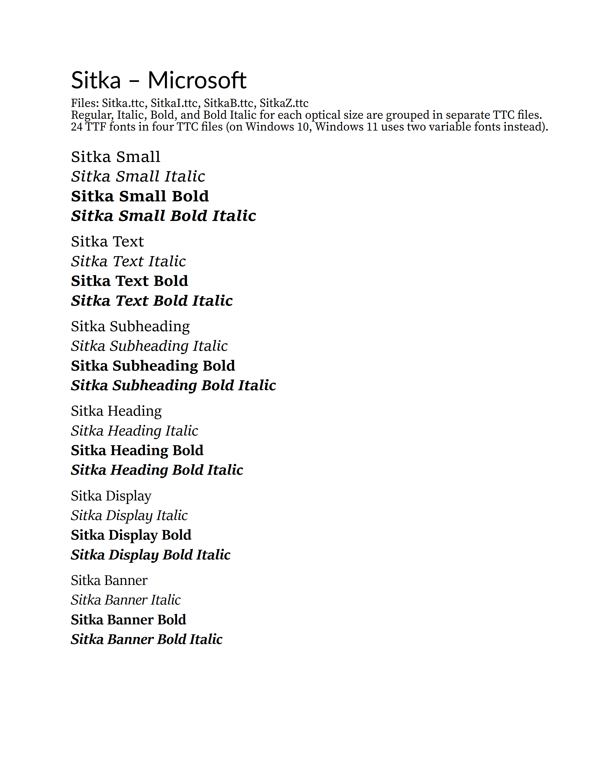
Wanted to see what would happen with the Windows 10 Sitka fonts (4 TTC files). Six optical sizes with two weights, Regular and Bold, plus the italics. The optical sizes are: Small, Text, Subheading, Heading, Display, and Banner Six R/I/B/BI style groups - one for each optical size. On Windows 10, Sitka comes in four TTC font collection files - grouped by R/I/B/BI. So all Regular styles for the six various optical sizes are in Sitka.ttc. All Italic styles for the six optical sizes are in SitkaI.ttc. All Bold styles for the six optical sizes are in SitkaB.ttc. All Bold Italic styles for the six optical sizes are in SitkaZ.ttc. I suspected that this may confuse APub, and it did. First, when I pasted the correct working text from LibreOffice into APub, all of the various Sitka font optical sizes (groups) were changed to Sitka Small. Italic and Bold still applied - but all optical sizes were now the just Small font styles. So I selected each of the other optical size four-line R/I/B/BI groups and applied the correct family/group - Text, Subheading, Heading, Display, and Banner - with the intention to use the Bold and Italic buttons to finish the corrections. But noooooooo... The Bold and Italic buttons instantly turned the family/group back to Small. So for example highlight some Sitka Display text and press the Italic button and you now have Sitka Small Italic. So I used the Font Style dropdown to apply all the correct styles, and that seemed to stick - the PDF output is correct. But do not touch a Bold or Italic button or it will all return to Small. Affinity wacko style group handling strikes again. The image below is APub Export to PDF, and then exported to PNG from PDF-XChange Editor. Note: This is on Windows 10 where Sitka is supplied as four TTC files. On Windows 11 Sitka is supplied as two variable fonts, Regular and Italic. Hmmm... let's see how it does with the Recursive TTC file - four families, eight weights, plus italics - 64 fonts... that should be fun.

-
Also, wherever you decide to download your fonts from, make sure you get Static fonts, not Variable fonts. At Google Fonts, for example, the download will usually contain both kinds, and you need the ones from the Static folder for use with the Affinity applications.
-
 Blambot probably has a few options, and Google Fonts (particularly ‘display’ fonts) might offer some possibilities. The Affinity apps support standard .otf and .ttf font files, so almost any font file you find should work, it doesn’t needs to be a ‘Serif font’ (.affonts are just Serif’s packaging of standard fonts exclusively for distribution to the Affinity apps via the Serif store). You may occasionally find that a standard font file doesn’t work as expected, but this is often down to the font itself rather than the Affinity apps. The only real caveat is that the Affinity apps do not currently support variable fonts, which are increasingly becoming far more common today. FYI standard .otf and .ttf font files are installed on the desktop (macOS and Windows) through either a font manager app, such as Typeface or FontBase or via the methods provided by your operating system.
 -
 Hi and welcome to the forums. Lexend and Readex Pro are presumably variable fonts; however, variable fonts are not supported by Affinity programs. If you want to use these fonts, you need the static versions, if they exist.
 -

Variable fonts support
A_B_C replied to Athanasius Pernath's topic in Feedback for the Affinity V2 Suite of Products
I’m not so sure. Take the Mac versions as an example. I could be mistaken, but far as I understand, the Affinity apps do not use Core Text on macOS, but are based on a custom text layout and rendering engine that reads the raw font data directly. So handling variable fonts would have to be done by that custom engine. If the Affinity apps were to use Core Text, they could also provide variable font support. As far as I remember, the Mac operating system started to include variable font support in version 10.5. Though “support” certainly meant something different then, compared to what is possible today. In general, I would also support the request made in this thread. While I used to be sceptical about variable fonts in the past, my mind has changed since. These fonts are highly useful design tools. -
 When will variable fonts be finally supported???
 -

Variable fonts support
Patrick Connor replied to Athanasius Pernath's topic in Feedback for the Affinity V2 Suite of Products
Thought is being given into the complications of fully supporting these fonts, particularly exporting to formats like PDF and SVG, which do not support variable fonts natively and therefore need to convert them to traditional fonts at export. Not insurmountable but not straight forward. -

Variable fonts support
David Cake replied to Athanasius Pernath's topic in Feedback for the Affinity V2 Suite of Products
It’s true that variable font support is more advanced in the web world, and that variable fonts are more compelling in web applications. But they are certainly where a lot of the interest in new font development is, and the Affinity suite certainly comes across as behind the times without it. There are some compelling creative effects you can do with them too. And often people try to create a unified look across web, PDF, and print. If you can’t use variable fonts you can’t do the web side as well. it’s a real issue for people doing eg a corporate branding, or developing resources that are available as web pages or downloadable resources. Frankly, lacking variable font support is a bit embarrassing for a 2022 app. And once they fix that (which should be near top of the list for features to add), color fonts are becoming important for some similar reasons. -

Tracking/kerning displaying incorrectly in Affinity Designer V1
MikeTO replied to jesi-rgb's topic in V1 Bugs found on macOS
I haven't tried using variable fonts with Apple's apps but apps can support variable fonts and still provide only a list of named weights. Perhaps that's what Apple's apps are doing but macOS natively supports them. But good news, Mona Sans is also available as a standard font - I'd only read GitHub's news release when I replied earlier which stated it was a variable font. If you download the font from https://befonts.com/mona-sans-font-family.html you will get a folder that contains some subfolders. Ignore the Mona-Sans.ttf font at the root of the folder, that's the variable font. Instead open the TTF folder and you'll find 48 traditional TTF font files that you can install. So uninstall the version you have now and install the traditional version and you'll be all set. I just tested it with Affinity and it worked fine. Cheers -

Variable fonts support
Shrinks99 replied to Athanasius Pernath's topic in Feedback for the Affinity V2 Suite of Products
@Patrick Connor Ha! Mixed direction text is always fun. We haven't thought about that yet for our applications and I'm sure I'll be dealing with it in the years to come! Lucky for me, ours is web based with all of the affordances and limits that brings. 🙃 @walt.farrell Output format utility would mostly remain the same I think? There's not a lot regarding variable fonts that change the format one might deliver something in. As I understand it, Affinity Designer does not aim to be a 1-1 SVG spec adherient editor so while SVG can include things like animation, I wouldn't expect that to be editable through Affinity's software. As such if I wanted to animate a variable font's axes in an SVG exported from Designer I would expect the ability to edit the file in an external text editor with text exported as <text> objects (not paths) which is something the program is capable of doing today. The axes controls would have to be added to the CSS export that Designer already performs reasonably well. In any case, SVG and PDF are probably the most relevant formats to worry about regarding variable fonts due to the different way type can be embedded in the files. Other than that — as far as I know — exporting is the same as with regular cuts of typefaces. It's less about the specific format and more about having the feature consistency across my pipeline which involves software like Figma, web browsers, Blender (through Coldtype st2), and of course Affinity's software. -
Can't import fonts properly
walt.farrell replied to arconi's topic in Affinity on Desktop Questions (macOS and Windows)
Welcome to the Serif Affinity forums. That symptom indicates that you've installed a Variable font. The Affinity applications only support Static fonts. You'll need to uninstall all those fonts, and install the Static versions instead.- 1 reply
-
- 1
-

-
 @kenmcd, thanks for the information. This is all pretty confusing. I have very little experience of using variable fonts and cannot fully understand what's going on in this file. I later noticed (from screenshot by @firstdefence) that there is stuff that is off the PDF MediaBox in the attached .AI file, which cannot be read even by e.g. by CS6 version of AI. Xara, too, only opened the top part of the job. On the other hand, the PDF stream part can be placed for passthrough by apps like QXP 2018 not supporting variable fonts but so that embedded fonts are passed through, and by Affinity apps that will convert text to curves when further exporting to PDF. So on the other hand, it seems that the fonts used by the design are embedded in a way that is compatible enough for passing through even by legacy apps (not supporting variable fonts), and on the other hand, that the AI part is exclusive also for legacy Adobe apps (which is to be expected). Basically extended compatibility was not the primary interest in delivery of this content, intended to be editable, so support for at least post CC2020 native proprietary format was assumed. Personally I think that advertizing AI compatibility in non-Adobe apps is a bit misleading as it seems it is mostly restricted to PDF streams when it is legal, and if there is licensed compatibility (as I assume there is in CorelDRAW), it is pretty limited. The rest (e.g. in Xara or VectorStyler) seems to be based on de-engineering and sometimes works, sometimes does not.
 -

Some font weights missing when exporting as PDF
Hangman replied to MarcBPL's topic in V2 Bugs found on macOS
Hi @MarcBPL and welcome to the forums, You need to ensure you have the static versions of Open Sans installed rather than the variable font version as variable fonts are not currently supported. I just uninstalled the variable version of Open Sans and replaced it with the static version and everything then exports correctly using the correct font weights. -
Outlined text problem
lacerto replied to Adit's topic in Affinity on Desktop Questions (macOS and Windows)
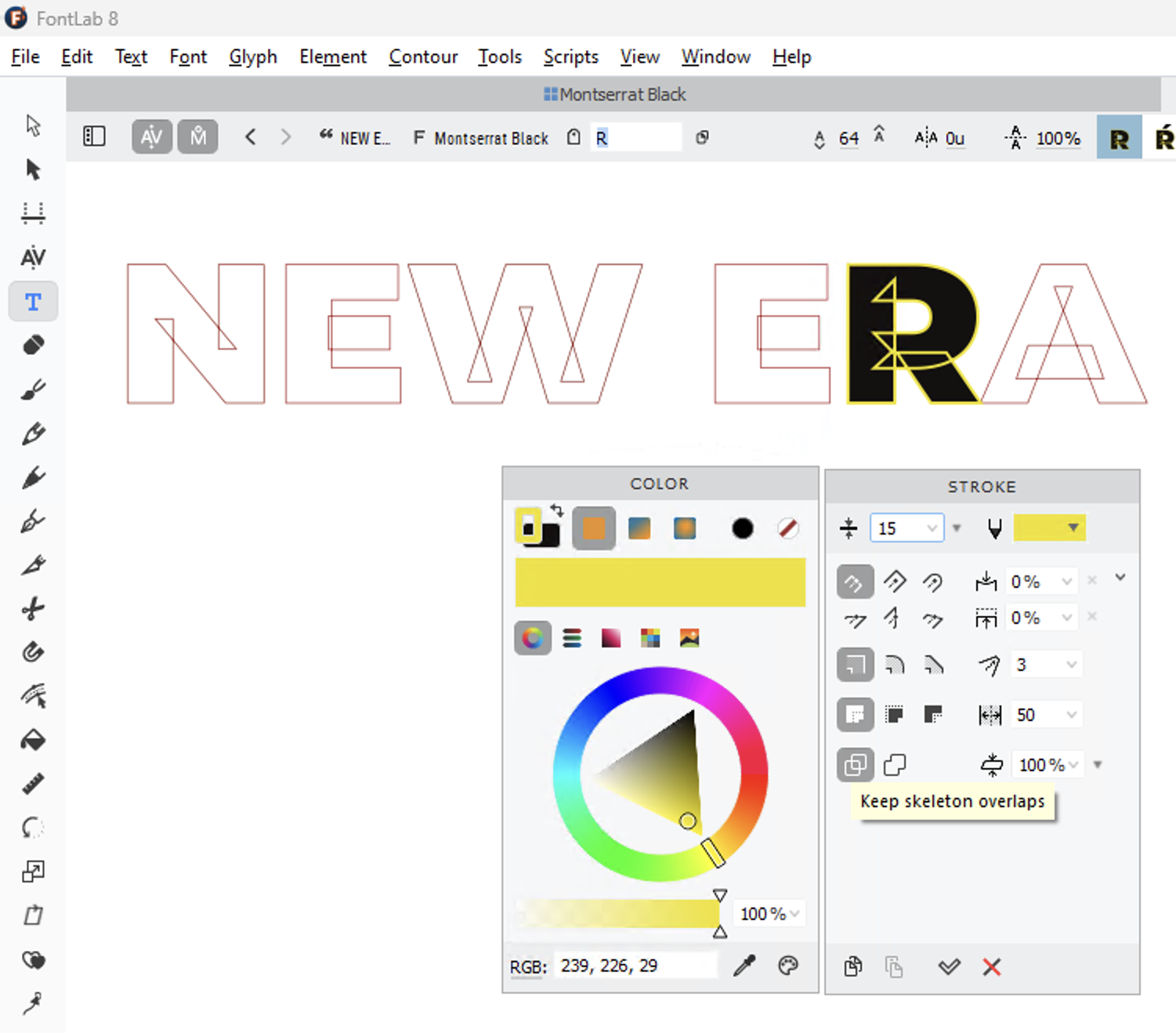
I installed version 18.2.1 of InDesign and yes, it can render these fonts without issues, so it seems that Adobe apps have been able to do so for some years now (possibly starting from late 2019 when support for variable fonts was implemented in InDesign). No, I was just sloppy when testing. There is no change from CS6 versions, it is just that if these problematic glyphs have a fill, they will be rendered correctly, not showing the overlapping outlines. If the fill is removed, they show also in the latest versions of Adobe apps (InDesign and Illustrator at least; as mentioned Photoshop handles text outlines differently and does not have this issue), both when using variable and regular fonts: Affinity apps by default draw the stroke in front so they would show the crossing outlines also if there is a fill, but this can be changed by using the Order option of the Stroke panel. EDIT: The behavior shown above in InDesign with filled text only works when using outside aligned stroke. If using center aligned stroke, the strokes would show similarly as in non-filled text. Affinity apps can avoid that by changing the paint order but when using other than the outside aligned stroke, the stroke width would of course be affected (e.g., half or all of the stroke would be covered by the fill color). EDIT2: There is also another consideration and that is whether a graphic design app, capable of converting text to outlines, should actually (by default or at least optionally) honor the original design, using the exact construction of the glyph outlines and control points? Could the designer intentionally use crossing outlines in a way that causes an effect shown above in letter "W", and that would show also in filled letter when using center aligned strokes? Perhaps not in letter shapes but e.g. in symbols? Is there a property (meta data, instruction) that allows the designer to indicate whether such shapes are to be removed when rendering the font, or honored? So far the only app that I know that can actually remove these "artifacts" and that allows full control of stroke (width, alignment, cap and join type, etc.) is FontLab 8, and there showing or hiding them is an option called "Keep/Remove skeleton overlaps". That's an option I would like to have in graphic design apps, as well (along with the ability to choose whether outlines are drawn in front or back), but perhaps this is just something that is intended to be used in font editor? But I am not sure if "removing skeleton overlaps" should be something that a graphic design app should do automatically, without giving the user an option of keeping them, instead.
-

Variable fonts support
Old Bruce replied to Athanasius Pernath's topic in Feedback for the Affinity V2 Suite of Products
I was thinking about variable fonts a few weeks ago and came up with the question: "What is going to happen in a year or two when people are trying to figure out what all the settings are for a variable font which was used in a PDF they have been handed. Note that I am sceptical about the utility of Variable fonts, they seem far too gimmicky to me with my increasingly conservative outlook. -
It is disappointing v2 doesn't offer OTF Variable Font support. I found out v2 didn't support the feature soon after it was announced. I waited until practically the last day of the introductory price discount period before caving in and buying copies of v2 for my PC and iPad. There is a decent number of other improvements in the upgrade. I'm still holding out some hope OTF Variable Font support will be added on a point-release update. Variable fonts are only gaining in popularity. They're not going to be a flash in the pan the way Type 1 Multiple Master fonts were in the 1990's.
-

Include Variable Fonts
DamienG replied to Friksel's topic in Feedback for Affinity Designer V1 on Desktop
Also really wanting support for variable fonts. My use case is I have a lot of variable fonts installed and I'd like to be able to choose them from inside Affinity Designer and then choose from the various axis parameters (e.g. bold, slant, whatever) and have it render properly in Affinity so I can convert to curves. Right now I'm limited to whatever pre-set combinations of static fonts were exported by the variable font vendor which I then have to install probably to find it's not the combination I want. If the axis work is too much then at a minimum listing the variable fonts correctly with the various weights calculated correctly like Wordpad, Paint, Notepad would be something. Right now Affinity packages show the same font name X number of times but with "Light" over and over unlike those apps mentioned which correctly show a number of preset weights for the variable font. -
Variable fonts support
kenmcd replied to Athanasius Pernath's topic in Feedback for the Affinity V2 Suite of Products
The PDF does not know, or care, if what is embedded came from a variable font. The "PDF format" does not need to "support" variable fonts. If an application can create and display characters/glyphs (shapes) from a variable font, the application can also embed those characters/glyphs (shapes) in a PDF. Just like alternate glyphs for character variants, ligatures, or swashes, etc., etc. And what they call that embedded font does not matter. The PDF does not know or care. There is no limitation on the use of variable fonts because of supposed PDF issues. It works now. -
LMAOOOOO Serif, in almost a decade of nonstop begging from the user base, hasn’t been able to implement basic, VITAL tools such as image/vector trace, variable fonts, or RTL writing, and now you guys are asking for AI. 🤣🤣🤣 Yeah, maybe in 40 years when everyone has AI microdermal implants that set software preferences to the user with one tap, Affinity might start looking into adding an archaic version of it.
-
 Just wanted to add my support for this topic. I've been trying out the free trial for Designer and Publisher, and was hoping to finally move away from Adobe, but just discovered this issue with variable fonts. Everything in the industry right now is pointing towards variable fonts becoming the norm, not the exception - Google Fonts, for instance, no longer offers individual weights if a variable version is available. So if you wanted to download, say, Playfair Display SemiBold, won't get Playfair Display SemiBold. You'll ONLY get the variable version, which Affinity will only be able to display as Regular. Because Affinity doesn't support variables, I would be forced to hunt down the individual styles on different, more questionable font sites. And this isn't just an issue when downloading new fonts; it also poses problems with file compatibility, such as when I need to work with other designers' files that contain variables. I'd also be limiting my pool of resources in the future as more and more foundries pivot to variable. Variable fonts are no longer emerging technology - they're becoming industry standard. I would love to make a full switch to Affinity, but this gap would have me stuck relying on workarounds, doing extra legwork to fix compatibility issues, and clinging to old technology while new ones pass me by. I don't think any designer should have to do that for variable fonts in 2022.
 -
Export Slices keeps crashing in Export Persona
Old Bruce replied to XT500's topic in V2 Bugs found on macOS
You experience the "deadlock", I don't. The variable is the fonts. Just try replacing them with a TTF or OTF font like Arial and see if the "deadlock" still occurs. You may be able to find TTF or OTF versions of the fonts. Here are a couple of web pages about the demise of PostScript type 1 fonts, they are from two years ago. Sorry to be the bearer of bad news. https://helpx.adobe.com/fonts/kb/postscript-type-1-fonts-end-of-support.html https://www.extensis.com/blog/adobe-ending-support-postscript-type-1-fonts https://appleinsider.com/articles/21/02/15/adobe-is-retiring-type-1-font-support-heres-how-to-prepare-for-the-change -

Variable Fonts in the works?
michacassola replied to michacassola's topic in Feedback for the Affinity V2 Suite of Products
Hey @Ash, hope you are the right staff member to ask? Saw you on the beta forums, that's why I thought you might be the right person to ask. I am pinging a few staff members without knowing either if they are the right ones to ask since you didn't answer for 20 days. @MattP @Dave Harris @TonyB I get that you don't like sharing too much regarding things that might be a bit further in the future because of people reacting badly in the past, but Typography and therefore Variable Fonts are a cornerstone of design. Please share.