Search the Community
Showing results for 'postscript type 1'.
-
It looks like Edit Text Styles has been rebuilt for 2.5 (narrower dialog, slightly larger text size, some Mac combo boxes changed to pulldown lists, larger colour sample wells, always opens to the Style pane...) but there may have been a few inadvertent changes. #1 is a functional issue but the rest are cosmetic. Bullets and Numbering > Text - if you created a new document and edited a style like Body, it previously defaulted to [No change] and you could revert to that by changing the list type back to No Change, but it now defaults to blank and there's no way to revert to No Change. Now it defaults to \#.>> and there's no way to set this control to No Change now. Also, Bullets and Numbering > Name - this previously defaulted to [No change] and there was an issue in 2.4 which may not have been reported that you couldn't revert to No Change. It now defaults to blank instead of No Change and there's still no way and there's no way to revert to No Change. For example, change list type to 1,2,3,4 and set Name to Test. Once you tab out of the field Test will be shown in the summary. Now delete Test and tab out of it again. Change list type back to No Change but you'll still have List name="" in the summary. The left nav font size was bumped a lot, and the old large size is now the new default size and the large size is very large - descenders are cut off and it will be an issue for languages with longer strings. The shade of grey used for the Style Settings summary at the bottom was changed a tiny bit in dark mode, but in light mode it has been reversed to a very dark grey with white text which really pops. This doesn't look right to me. Paragraph Spacing - "Same between same styles" should be listed after space before and space after to match the panel and the way it was in 2.4. And oddly, the capitalization of the options in this list don't match the panel - even words like At and Between are capitalized whereas those are not capitalized in the panel. I know it's because it's a checkbox and not just a label, but the large amount of space between the "Space between same styles" and its list is so great now that it doesn't feel like it's really the lists's label, too. It was nicer before. Really wide text fields, very minor: The default tab spacing and decoration indent text fields seem oddly wide. Decorations: Very minor, but now the Decoration # list is disabled if there's only one decoration when the panel is opened. When you add another it is enabled. When you delete the second-to-last decoration the list is not disabled again. This isn't new in the beta but while I remember it: Most of the panel section titles are prefaced by Character, Typography, and Paragraph but several are not: Optical Alignment, Bullets and Numbering, Hyphenation, Drop Caps, Initial Words, and Decorations are not prefaced.
-
This is indeed new to this Beta, note also the additions at the top of the font dropdown menu which now allow you to filter by True Type, Open Type and Variable Fonts which is an excellent addition...
-
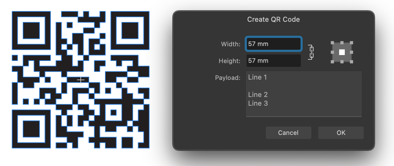
Apps: All Platforms: macOS, Windows and iPad A new QR Code tool is now available from the shapes flyout in the toolbar, making it easy to add a QR code to your documents. After creating or selecting a QR Code object you will find a 'Payload' option in the context toolbar. Here you can type whatever URL you want the QR code to link to when it is scanned. You can insert line breaks in your payload by using the CMD/CTRL + Click on canvas dialog In addition to URLs you can use other syntax as detailed below to have the QR code trigger other functions when scanned by a device: SMS Payload structure: SMSTO:number:text message Eg. SMSTO:07513123456:Hello mate! GEO location Payload structure: GEO:lat:lon:height Eg. GEO:40.71872,-73.98905,100 WIFI credentials Payload structure: WIFI:S:ssid;T:type;P:password;; Eg. WIFI:S:MyWiFiSSID;T:WPA;P:MyPassW0rd;;

- 108 replies
-
- 34
-

-

-
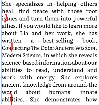
 Setup: 1) Hyphenation is enabled (checked) in the Style that I am using for body text and the language is set to Auto (US English). 2) I have studied the help file on hyphenation and have kept the default settings since, if I understand correctly, they provide the most aggressive (so to speak) hyphenation. But it's not working well. I often get loose lines; see the screen shot. In each place where I have inserted a red line, if I type a hyphen followed by a space, the preceding letters and the hyphen jump up to the previous line. So there is certainly space available, but no automatic hyphenation happens. Adding a soft hyphen at these points has no effect. I would appreciate any advice!
-
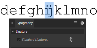
 Type abcdefhijklm in a monospaced font, Courier, Consolas etc. The letters i and j are combined into the Dutch digraph/diphthong "ij", which is a letter with its own pronunciation, it is not a ligature. (It might look like one though, many fonts have a special shape in dlig.) Monospaced fonts do not have a ligature feature on purpose, inventing and activating a wrong ligature changes text lengths. Please stick to the OpenType features of the font. (observed in Affinity Designer Beta 2.5.0.2415) In the screenshot, Courier with the letters ij occupying the same with as any other character. In the (magnificent) Typography window, the font seems to have a Ligature feature.
-
Typing into notes is normally as fast as typing anywhere in Publisher but I can easily out type Publisher with notes on some pages of my Publisher manual, it feels like I'm using a 68030. The first screen recording contrasts typing into a sidenote with typing into a paragraph. The same issue occurs with footnotes. With sidenotes, it can happen with a single note anywhere on the page. Deleting the rest of the story from after the reference marker seems to make it a bit faster but that's not the issue. The clue is that deleting the other stories after the current story will make it fast, as shown in the second screen recording. I recorded these in the beta by mistake, it's my regular working environment, but this problem occurs in 2.4.2, too, so I'm reporting it here. Screen Recording 2024-05-01 at 11.08.21 AM.mov Screen Recording 2024-05-01 at 11.16.37 AM.mov
-
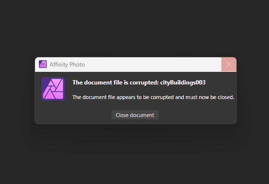
 During these past two weeks I have been on a project of mine to do environment and matte paintings using in Affinity photo instead of PS. However last week and this week, two files that were safely saved at the end of day just to find next day that they where corrupted and gone cant open them anymore. First file last week thought it was a fluke, yet it happen again yesterday in another file. Latest file, its even more annoying as you can see the file is open, yet the window pops up saying it failed to load, its corrupted and needs to close, then after closing another dialog that reestates the same kind of thing. This happens randomly without notice and it seriously puts the breaks on developing the workflow and proudly publishing work done only in Affinity. Processor Intel(R) Core(TM) i7-10750H CPU @ 2.60GHz 2.59 GHz Installed RAM 32.0 GB (31.8 GB usable) 1. Which Operating System are you using? Edition Windows 11 Home Version 23H2 2. Which version of Affinity did the file last get saved in? Affinity 2.4.2 3. What drive type was the file last saved to? Local SSD one of the files, external SSD the other I would need a dropbox link to upload the file. Hope this gets solved, as last problem I found was not solved, cataloged as a BUG and still to be fixed.
-
When I started Photo for the first time, the studios had reverted to a default setup and I lost my configuration. After installation, the sections in most panels (Character, Paragraph, Notes...) were all expanded in all apps even though I'd left most of them collapsed. Fields was still collapsed though. I haven't checked too many others yet. Artifacts are drawn on the Character panel's section expand icons when I type in a document. This is only with collapsed sections and the artifacts are consistent as shown here. It happens docked and undocked, light and dark modes, and in all three apps.
-
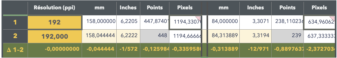
Millimetres are first converted in pixels which are Affinity's internal measure units. Then on export, —because EPS is a format based on the Adobe PostScript point used in all their programs (this so-called DTP point is exactly 1/72" or about 0,3527 mm)— that pixel measure is converted in points, according to the chosen resolution (when I open your EPS export, it's given to be 192 pixels per inch?), and then rounded up to the next full point — shown in grey on the 2nd line. At this stage, we have the error you saw: rounded points and corresponding millimetres. You better see it in width because to rounded gap is very large, almost a whole point ; in height, the rounding error is not so noticeable.
-

Missing variable fonts are not requested on macOS
Floor replied to Floor's topic in Other New Bugs and Issues in the Betas
Who's they? Adobe? I honestly don't know the ins and outs of the spec, but as far as I understand nameID 25 is optional. A type designer can also add a custom PostScript name to each variable instance in fvar. Then nameID 25 isn't used (for those named instances). This is the most straightforward in my opinion, you can directly identify a named instance by its custom PostScript name. Adobe has a spec that defines how a PostScript name should be constructed if there is no custom one (and for custom axes values), but all this doesn't (shouldn't?) really matter for Affinity. I have no knowledge of the internals of Affinity, but this is how I expect it to work: Affinity loads available fonts on launch. This list is given by macOS. Each font in the list has a PostScript name, as provided by macOS. When a user uses a font its PostScript name is written to the document. When the document is reopened Affinity asks macOS for the font with the saved PostScript name. Variable axes don't matter, because those are applied on top of the loaded font. Affinity doesn't have to construct any PostScript names in this case. InDesign might store the constructed PostScript name in their document. Such that it can identify the exact var axes, for example: RobotoFlex_20.000slnt_372.000wght. -
 I don’t have a very firm grasp of Affinity itself, but I feel that by finishing Astrophotography image processing in Affinity might help improve the quality of images beyond what they are now. PixInsight appears to be very data number driven and it is very good at what it does. Whereas I have believe there is more freedom within Affinity to bring out the artistic details hidden in the WBPP stacked image. I am almost certain that it would be best to do some basic development in PixInsight such as Dynamic Background Extraction, Blur Xterminator and Star Xterminator. From this point I would really like to finish my deep sky image in Affinity. I am stuck right at the very beginning in what type of file to export for use in Affinity. I have tried using the Astrophotography FITS format but I find the file that I imported is essentially blown out with detail (even in linear state prior to stretching in PixInsight). Next I tried bringing the same image in using the 32 bit TIFF format. With this there is not even any stars showing and I don’t even know if they exist in the file. Could you help me solve what the preferred format for Affinity to work with? Once that hurdle is solved I am wondering whether it is preferred to establish a bright part of the image as well as a dark part of the image as I have seen some do as their initial step of processing in Affinity. I have seen others just starting out with dropping the darkness level and pushing the gamma level. I believe I have seen another example of starting out with a curve adjustment. Is there a prescribed method of processing an image that has already been worked on somewhat in another astronomy software?
 -
 A file from the past suddenly won't open, formatted correctly, help me。210816.afdesign Popup window display:Failed to open file File type not supported
 -
 Wäre now entering the old-but-never-to-be-fixed-bugs section. any layer, including adjustments, and specifically the alpha channel of those layers, will be constraint to the not-fully-transparent areas of the parent layer, when nested to child position. When nested to mask position, it will impact the full canvas. take an rectangle (smaller than full canvas) with black-to-transparent gradient, and nest an adjustment creating 100% alpha (curves, channel, mixer, levels), and try out both child positions to spot the difference. and then try to zoom in / out between 10% and 450% to see rendering bugs. Why buggy? Depending on version and layer type and groups used, it often does not work correctly, or leaves squares in black or white depending on zoom level.
 -
During these past two weeks I have been on a project of mine to do environment and matte paintings using in Affinity photo instead of PS. However last week and this week, two files that were safely saved at the end of day just to find next day that they where corrupted and gone cant open them anymore. First file last week thought it was a fluke, yet it happen again yesterday in another file. Latest file, its even more annoying as you can see the file is open, yet the window pops up saying it failed to load, its corrupted and needs to close, then after closing another dialog that reestates the same kind of thing. This happens randomly without notice and it seriously puts the breaks on developing the workflow and proudly publishing work done only in Affinity. Processor Intel(R) Core(TM) i7-10750H CPU @ 2.60GHz 2.59 GHz Installed RAM 32.0 GB (31.8 GB usable) 1. Which Operating System are you using? Edition Windows 11 Home Version 23H2 2. Which version of Affinity did the file last get saved in? Affinity 2.4.2 3. What drive type was the file last saved to? Local SSD one of the files, external SSD the other I would need a dropbox link to upload the file. Hope this gets solved, as last problem I found was not solved, cataloged as a BUG and still to be fixed.
-
Taskbar Issue on Windows 11 With Designer 2
debraspicher replied to adekn's topic in V2 Bugs found on Windows
Check Windows Logs in Event Viewer for the cause. Will be under Windows Logs>Application or System. Sounds like your explorer.exe is crashing. You can type it into Windows Search to access it: https://www.windowscentral.com/software-apps/windows-11/how-to-get-started-with-event-viewer-on-windows-11 -

Taskbar Issue on Windows 11 With Designer 2
walt.farrell replied to adekn's topic in V2 Bugs found on Windows
Welcome to the Serif Affinity forums. I haven't seen that exact issue reported before, though there are several about the taskbar icons on Windows: https://forum.affinity.serif.com/index.php?/search/&q=Taskbar icons&quick=1&type=forums_topic&nodes=128 Did you install using the default MSIX version of the application installer, or did you use the optional EXE/MSI version? -

Box around text. For some reason every time type text, in Affinity Designer 2.4.2.2371, using frame Text Tool or Artistic Text Tool there is a frame around and touching the typed text. How can I stop this occurring, and/or remove the frame? The frame pri
Stuart Frisken posted a topic in Affinity on Desktop Questions (macOS and Windows)
For some reason every time type text, in Affinity Designer 2.4.2.2371, using frame Text Tool or Artistic Text Tool there is a frame around and touching the typed text. How can I stop this occurring, and/or remove the frame? The frame prints and I can’t find any way to remove it!!! Altering Colours just effects the text and there is no ’Thickness’ to adjust. I'm using a 26” Retina iMac, OS 12.7.4 Cheers! Stuart -
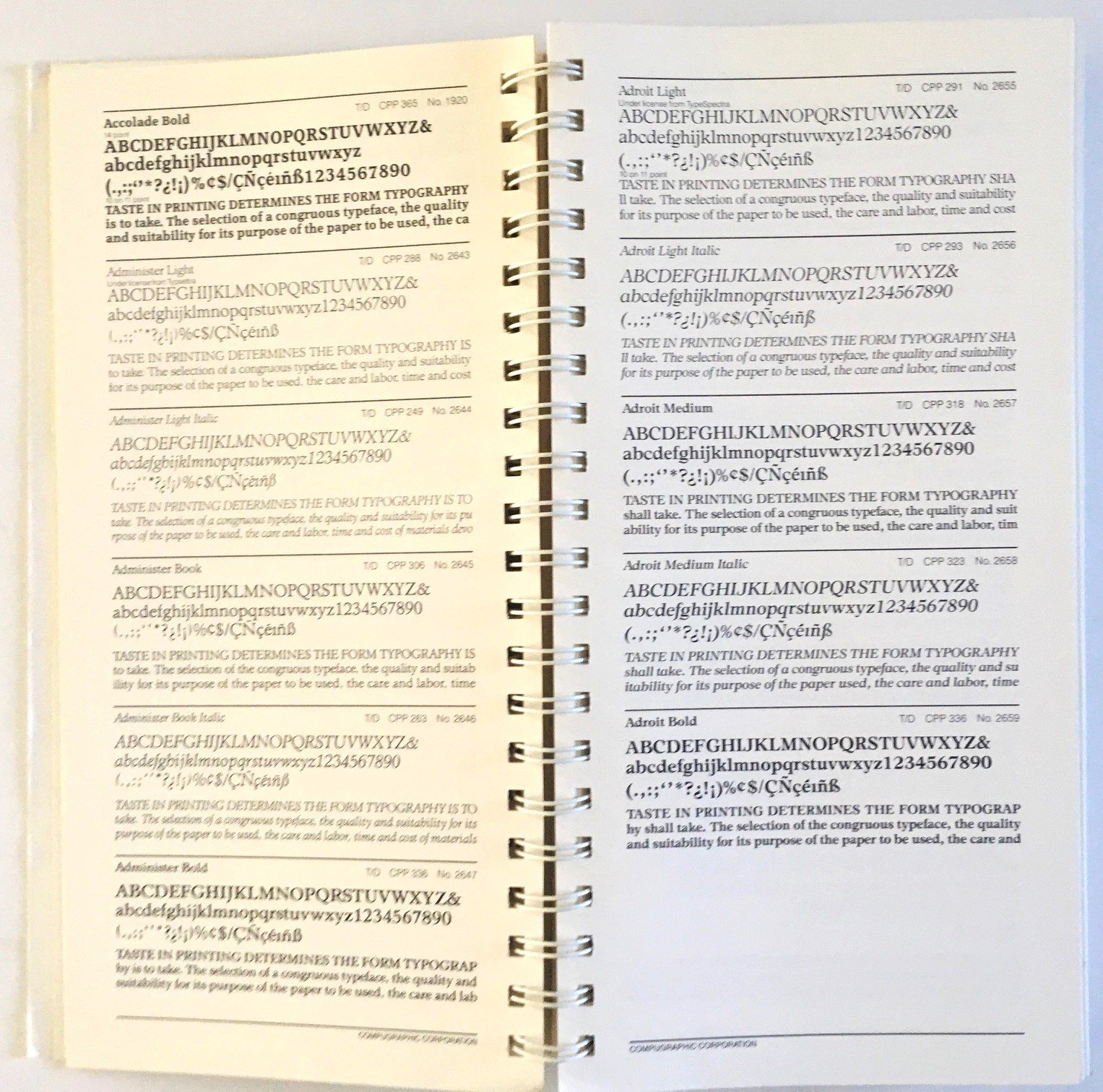
I have several books of type and typefaces in my library, including a couple on how to identify a typeface. Some are catalogues from typesetters, others just show glyph sets from various faces, and others offer comparisons of similar faces. I use these all the time when I'm hunting for a suitable face, but I also just like browsing the pages. Does anyone else here have similar books? I'd like to see more. I will make a list of those I have and post it in the comments (with some images) if anyone else is interested in this sort of book. (I also have some books on designing with type). I've attached some images of one such book. I recently came across this particular typeface catalogue buried in my library and somewhat forgotten. It was printed for the 25th anniversary of CompuGraphic in 1985, but reprinted in '87. Has some interesting and innovative typefaces in it. I picked it up in the late 1980s, likely when I was doing freelance editing and writing for tech companies.
-

Edit Text Styles dialog issues
MikeTO replied to MikeTO's topic in Other New Bugs and Issues in the Betas
One minor quibble, the dialog is now named Text Style Editor as opposed to Create Text Style and Edit Text Style which is the common way to do things, and the way most of Affinity works (anchors, cross-references, index topics...) It also used to have the type of style in the name but I understand why you changed that, it was confusing if you changed the type after opening the dialog. -
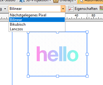
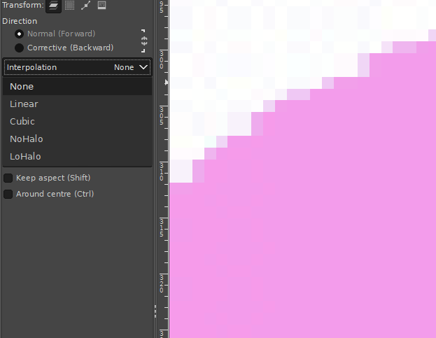
 Hi, I know there was already a topic like this. But always, when I try to resize pixel art or old graphics (low resolution), it always destroys my work and creates blurred edges. Affinity Photo has a tool named Pixel Tool, and in Serif 2.3, they added a pixel grid. And I think Affinity can be good software for editing pixel art graphics, but having the ability to change interpolation during resizing would significantly enhance its capabilities in this regard. I do not want to rescale the whole document, I want to rescale one or two elements in the document. Like Draw Plus 😎 (bugged version with immutable german language as default): or like Gimp:
- 5 replies
-
- 1
-
-
- 2.3
- affinity photo
- (and 5 more)
-
The text cursor in Publisher should blink when the document window has focused and be non-blinking when it doesn't have focus. A bug was introduced during the 2.2 beta in which focus is not fully returned to the document window. The cursor doesn't blink but you can type however pressing Delete will delete the text frame because it's being intercepted by the Delete menu shortcut. This bug was originally reported during the beta as a problem with deleting a space prior to custom fields. It hasn't been fixed yet but that's just one way to trigger it. Here are some of the other ways: Saving the document: Place the text cursor and see it blink. Save the doc and the cursor will stop blinking. You can type in the document but pressing Delete will delete the text frame. Edit certain panel options: Place the text cursor and see it blink. Using the Paragraph panel > Flow Options, set Keep with Next to a different value and press Return. The cursor will stop blinking. You can type in the document but pressing Delete will delete the text frame. I tested many fields and some trigger this, others don't, I can't see a pattern except that when it happens the text field will be left with a blue focus ring, perhaps indicating it still has focus even though you can now type in the document. Edit a sidenote: Often when editing a sidenote the cursor will stop blinking. I haven't figured out the steps to replicate it yet but I'm always deleting sidenote frames by mistake. It might be related to using sidenotes in master page frames. This issue may be specific to Ventura and Sonoma. I'm reporting this here because the original 2.2 beta thread is in the archive and I'm unsure if anything other than the custom field trigger is being reviewed.
-

Missing variable fonts are not requested on macOS
kenmcd replied to Floor's topic in Other New Bugs and Issues in the Betas
Yes. Adobe for InDesign. The way they want nameID 25 used for variable fonts does not follow the spec. Hence the concern by other fonts vendors. Also, from some of the InDesign PDFs posted here in the forum it appears Adobe does not follow their own guidance regarding embedded font names for variable fonts (from Adobe Technical Note #5902 - Generating PostScript Names for Fonts Using OpenType Font Variations). And it appears they save the variable font settings in an encrypted "roundtrip" section (which they created and is not a part of the PDF spec). Anyway. This detour is not helping answer your initial issue. My apologies. Hope the Affinity folks get back to you soon about your issue. -
Missing variable fonts are not requested on macOS
kenmcd replied to Floor's topic in Other New Bugs and Issues in the Betas
Thanks. They have been requiring a unique nameID 25 PostScript Name Prefix be present in variable fonts. All the Source font families are an example. So I am wondering exactly why and how they are using that. The Google Fonts folks think it (that non-standard requirement) is basically a bug. And they have reservations about requiring it. But I have seen font developers including it for ID compatibility. So just wondering if it has any bearing in Affinity variable support. Thanks again. -
 Windows 10 Pro x64 Affinity Photo 2.2.0 To be clear at the start, I am not asking for: Instructions on tools, or changes to tools. Instructions on hotkeys, or changes to hotkeys. Instructions on changing cursors, or any new cursors. Instructions on changing macros, or any new macros. Here is a very simple example of what I would like to see happen: Open an image file. Type CTRL-A. The entire image is now selected. (Yes, there are easier ways to see the dimensions of an entire image. But this is the simplest example I could think of.) What are the dimensions of what I have selected? I would like to see this information on my screen, preferably in the Info box. I would not like to have to click additional tools or keyboard combinations in order to see it. I would like it to be displayed in the Info box at all times (if something is selected, of course). Whether the selection has been made with a keyboard shortcut, or a lasso, or a magic wand, or a color-range-select -- none of that should matter. If a region(s) is selected, I would like to see the height and width of what is currently selected displayed in the Info box. I hope I am being clear, but if you have any questions about what I mean, do please ask me. Please be as specific as you can about what I have been unclear about. Thank you. P.S. See also:
 -
Missing variable fonts are not requested on macOS
Floor replied to Floor's topic in Other New Bugs and Issues in the Betas
I believe InDesign uses custom font loading. Fonts are typically identified by their PostScript name. It doesn't really matter how to identify a particular instance of a variable font, as the variable axes are applied after loading the font file.


.JPG.80986e4c586194cc37f2f93a0d96635c.JPG)
.JPG.d18d2ad71485bdadfe10afcc872a162a.JPG)