DJP
-
Posts
40 -
Joined
-
Last visited
-
Many thanks! It does seem like a transparency issue. I went to the master page, selected the text frame, and the Color tab shows 100% opacity (same as other text frames in the document). I would really like to get to the root of this, but I think I have found a workaround that will let me submit the project on time. I exported from Affinity using PDF/X-4. I opened this file in Acrobat Pro and converted it to PDF/X-1a. I can't see any rasterized text when I examine the result on screen. We'll see how the proof from the publisher looks. EDIT: just received an updated e-proof from Ingram; it looks OK.
-
Thank you. So the problem does lie in Affinity rather than the conversion to PDF/X-1a, which is very helpful to know. I have looked carefully at the master pages (Color tab, Layer tab, whatever else I could think of) and cannot find any difference between recto and verso. I did not intend to apply any effect or adjustment, but I suppose I must have somehow. Do you have any further suggestions about where to find the difference? I just don't know where to look.
-
Update: I've been poking around some more. I now suspect that the problem is not in Affinity Publisher. Publisher cannot export PDF/X-1a:2001 files. I export using the PDF for Print preset, and there is no visible problem in this PDF. I then convert to PDF/X-1a:2001 using a PDF editor (PDFX/Change). I still don't understand why only verso pages of one section are affected (could there be something in the PDF exported from Affinity that is not visible or in effect until I convert??).
-
The final section of a textbook project consists of a Latin to English dictionary. In this section -- and not elsewhere in the book -- the verso pages have text that is fuzzier/lighter than that on the recto pages. See the two samples, which are screen shots from a PDF sent me by the printer for approval. In Affinity Publisher, the text on the recto pages looks OK; it _might_ be a tiny bit lighter, but it's really hard to tell even when zoomed in to a high percentage. This explains why I never saw a problem until I got this proof to review. My printer (Ingram Spark) requires that the PDF be a PDF X/1a-2001, if that has anything to do with what's going on. 1. I have a paragraph style and a character style used here. The same styles are used on all pages in this section, so the styles are not the culprit (I doublechecked them anyway). All text is set to CMYK 100% black. 2. I have a master page spread used for this section. It seems logical that something might be different about the verso page master compared to the recto. The text in the running heads is sharp on both recto and verso, as are the horizontal and vertical rules. So the problem is confined to the vocabulary entries. I cannot find anything different on the master pages between the recto and verso. I'm totally at a loss for how to fix this and would greatly appreciate any suggestions.

-
Thank you both for the replies. @thomaso, thanks for pointing out the possibility that exported black might get changed. I usually leave the default alone but will watch out for this more carefully. I have sometimes used "based on" styles but will do this more consistently for the reason you state. @lacerto, the video is helpful as is your detailed discussion of color spaces and how they might get changed. I did some more experimenting. It appears that Publisher includes a style 'Base' which is applied by default to new text frames, with 100% black (at least when a document is created with CMYK). When I change to one of the built-in styles, such as 'Body' or 'Bullet 1' (which are based on 'Base'), the text still shows as 100% black. But if I open the style to edit it, I see CMYK sliders set to rich black (I guess . . . ), but these values are not applied when I check the box next to Text Fill. The fill remains at none until I change one of the slider values. I now see how it works, but it's not exactly intuitive.
-
I create a new document using CMYK, add a text frame, and type some text. Then I apply one of the built-in paragraph styles (bullet, line below -- I tried a few and they all worked the same way). If I select a few words and click on the 'font color' rectangle in the toolbar (or font color on the Color tab), it is shown as 0, 0, 0, 100 -- that's what I would expect for text. But if I right-click on the style name in Text Styles and choose to edit the style, then go to Font/Color and Decoration, I see something like 72, 68, 67, 88. a) Is this supposed to be a rich black? It adds up to more than 240, which can cause problems. b) I want to be sure that all my text is 100% black, since that's what my printer recommends. What's controlling the font color? What's the easiest way to ensure that I get only black? I make extensive use of styles; do I need to edit each one to be 0, 0, 0, 100? I will appreciate any clarification on this.
-
You make an interesting point about the blank lines at the bottom of p. 127 not being distracting because of the page turn. What do you think about the ones that come at the bottom of a column where a page turn is not involved? There are many more of these than there are that come at a page turn. Throughout the book (except on some glossary pages) text ends at the bottom of the text block, as it should. So I wish there were a better solution. The authors and I had long discussions about the typography of the glossary. No italics for gender (I did suggest that). All Latin words, not just lemmata, are in semibold (full bold would create a very black appearance). I don't think sans-serif for the Latin words is a good option. Throughout the book, we use sans-serif to distinguish introductory sections and comprehension questions written by modern authors from the ancient texts. I also noticed that 'to' at the ends of lines does not always look good. I did put manual line breaks before the worst offenders; maybe I should add some more.
-
 walt.farrell reacted to a post in a topic:
How to align top and bottom text on verso and recto?
walt.farrell reacted to a post in a topic:
How to align top and bottom text on verso and recto?
-
Followup: after posting that screen shot, I noticed that there were 24 pt of space above the 'Q' heading, not 12 pt as the style calls for. (That was probably a result of changes made by the authors; they kept adding to and removing words from the glossary as a result of changes they made in the body of the book. I have now put my foot down about this issue.😖) Fixing the spacing above made this spread come out OK, but I do still have a few with one blank line at a column bottom.
-
Thanks to you both. I have used Balance Columns but only on the last page of a two-column section. I'll experiment and see what happens (if anything) when applied to a page other than the last. I am reasonably familiar with the usual considerations of font size, line spacing, line length, etc. I did the math carefully and pages work well as long as the paragraph at the bottom of a column requires only one line. See the attached screen shot. The left-hand page is fine, while the right-hand one is the worst in the book, since the entry that should come at the lower right requires three lines. Text is 10/12. The book is 6 x 9 inches. Sample printouts look good to my eyes, except for the occasional issue at the bottom of columns.
-
I think I understand all the information in the posts above. My issue is really more a general book design question then one specific to Affinity Publisher, but I’ve searched the web and haven’t found a good answer; so I will ask here. I am working on a textbook that has a glossary at the end, set in two columns. Many of the definitions take only one line, while some take two and a few require three. I’ve set up the leading and line spacing so that many pages come out properly at the bottom. However, if a two line-definition comes at the bottom of a column, the whole paragraph (two lines) moves to the top of the next column since I have widow and orphan control turned on. The same thing happens with a three-line definition. I could tell Publisher to vertically justify the text, but I don’t like the extra white space introduced in one column and not the one next to it. I don’t like leaving, in effect, a blank line at the bottom of one column. I could turn off widow and orphan control; again not a good solution, but perhaps the least offensive one. I think this is particularly true when a three-line definition is involved, since this results in only one (not two) single-line elements. Which of these do you think is the way to go? Or is there another option that I haven’t considered? The glossary is somewhat different than the body of the book. Readers will be focusing on the latter to understand and remember it. They will turn to the glossary when they need help with a specific word or concept, but won’t focus on it the same way. So perhaps a few widows and orphans are acceptable here.
-
Marginal notes (aka Marginalia)
DJP replied to DJP's topic in Affinity on Desktop Questions (macOS and Windows)
Thanks for all the replies, and particularly to @MikeTO for the very detailed instructions and explanations. I have copied this info to the folder where I store files for my new book. It will help tremendously. -
Publisher has the ability to place references as sidenotes. These have (typically) a reference number in the text keyed to the note. I'd like to create a document where explanatory notes appear in the margin but without any numeric reference. This is the layout used, for instance, in the manual by @MikeTO (and thanks to Mike for that excellent resource!). I could create a document with wide outer margins and manually put in a text box for each note. But it would be nice if the notes kept their position relative to the main text (if, for instance, I added text above the note location). Is there any easier/better way? Edit: I think this ended up in the wrong section (it's not a tutorial). Not sure how to move it . . . .
-
 DJP reacted to a post in a topic:
Text box weird size with red dots
DJP reacted to a post in a topic:
Text box weird size with red dots
-
Text box weird size with red dots
DJP replied to DJP's topic in Affinity on Desktop Questions (macOS and Windows)
Thank you! "Ignore text wrap" seems to do the trick. -
Text box weird size with red dots
DJP replied to DJP's topic in Affinity on Desktop Questions (macOS and Windows)
OK, I found the answer (I think). There was an inset at the top as shown in the Text Frame panel. I have no idea how that got there; is that part of the paragraph style? I edited the style in use but could see no setting for this. Edit: spoke too soon. I just added two more captions and ran into the same extra-tall text box problem. For these two there is no indent shown in the Text Frame panel. -
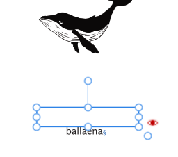
I created a picture frame and inserted the image of the whale. Then I added a rectangle below it, converted to a text frame, and entered the caption. a. Why is the text box so tall? If I drag the handled to shrink it vertically, the text moves outside the text frame -- weird! (See second screen shot below.) I also get the text overflow symbol, but there is no additional text; it's just the one word. I have checked the paragraph settings and there is no space above. b. What do the two empty circles mean?