CartoonMike
-
Posts
453 -
Joined
Everything posted by CartoonMike
-
 I agree totally with Bungle 100% Just to add, I think it's a bad idea for this specific company/product line. It's clear from the roadmaps and such that Serif/Affinity has things pretty well figured out and to do a crowdfunding would muddy that up, as those who pledge could feel even more "ownership" than license-holders do now. If just the lead up to AD 1.5 beta is any indication, there's going to be very healthy-bordering-on-obsessive anticipation that may be expressed in not so wholesome ways While I feel that crowdfunding is great for some creative endeavors (I'll be doing a kickstarter in Sept. with my team to cover publishing and paying for work done for the first issue of a comic), when it comes to software, It's great for opensouce apps, not so much for closed-source apps, like the Affinity line of apps. From my observations and experience, setting up a crowdfunder isn't just like flipping a switch. There's a hell of a lot of prep work before it gets started, even more (constant) work once it gets going (there's updates, constant monitoring of the pledges, stretch goals) and then quite a bit once the funding has ended. That means that at the minimum, at least 1 (probably 2) full time work slots would have to be devoted to the crowdfunding for at about 3 months. And for Kickstarter, what if the goals weren't met? All that work and effort lost. While it's depressing for a writer/artist, it would be a healthy bit of red in the company's ledger. Serif, as noted earlier in this thread, isn't just some scrawny startup, it's been around for a while and, from how they rolled out AD and later AP, clearly have a plan that they're following. A crowdfunded would muck that up pretty well, imho. I feel that the time/effort in a crowdfunded for Affinity would be much better spent/used for work on the actual apps themselves. It's like this, Crowdfunding is just one tool of many. It may be the flavor-of-the-day currently, but just because it's there, doesn't mean it should be used by everyone. I feel that the choice to use it or not should be totally up to the company and not its user base.
 -
Just opened another batch and this time I checked the size and date created for the files. No match. It seems that the order of the files are totes random.
-
See what resolution the PNG is. Consider the "print" size -- if it's to be printed it needs to be at least 300dpi, if it's for web the pixel dimensions should be equal to or larger than the document you're placing it into. Rule of thumb for raster/bitmapped files or clipart, it's better to scale down rather than scaling up. If you upsize too much, you'll get stair-steps and a "grainy-pixelated" appearance. Although there's smoothing methods that apps use, upscaled images will usually look not as good as images scaled down.
-
... At least to me. Here's the situation, I'm resizing the canvases of a comic I've scanned in. It's going to be about 50 pages. So to save time with open-change-save-close-open next file routine, I'm just opening 10 files at once. So far Both Affinity Photo & Design handles this very well. No real slowdowns or odd behavior (using the current MAS versions, not the betas for this). The oddness begins after AP opens files. I have the files named in a sequence: QS no 1 pg 01, QS no 1 pg 02 ... QS no 1 pg 50. So the first ten files are opened. And the order that the files are in the Tabs are not in any sequence I can determine. Maybe it's the size of the file as I haven't checked that yet. But it's discerning to say the least. I'm used to seeing the files in the alpha/numeric order when I open a group of them. Now if I want to see a specific page, I have to hunt for it, rather than scanning the titles. Am I missing something or just the first one to whinge about this? Secondly, after dragging the tabs to have the files be in order, I start working on the lower numbers first. I have the tabs ordered so that the page numbers go up the further right one goes (i.e. page 1, page 2, page 3...and so on). I finish work on the left most file, save it and close it. Now the "active" tab is the rightmost one. This has made me really confused many times. Now after closing the file, I have to click on the actual file I want to work on. Is there some well hidden preference or option I may have missed? What I'm expecting is that when I open a sequence of files, for them to open in tabs arranged in that sequence; from left to right. Also I expect to close the leftmost tab and have the newly leftmost tab to be active. While not a bug (I ... think...) this is a slowdown as I have to re-learn NOT to go left-right as I've been doing from birth, but right to left. This is an annoyance that kind of tarnishes an otherwise shiny UI experience. Is this newly opened tab (files) behavior intentional or is is just "the way things are." Is there any way to either change it or allow the user to determine the order the tabs are displayed? Even if it takes a few seconds, it'll be faster than my re-ordering by hand. Also, can it be an option to keep the active tab on the left instead of the right when closing an file? Or is this an insidious conservative plot ... ? Thanks for any answers.
-
I'm sure others will chime in with more elaborate descriptions but here's my tl:dr version of the differences betwixt Photo & Designer: Photo uses pixels. Wee squares that are assigned a color. when you make a line or brushstroke, all those itty-bitty pixels (Picture Elements) under the brush gets colored according to how the brush works. Designer uses Vectors. Think about a square, there's the 4 corners and the thickness of the line not to mention the color it has. What vector does is to describe this using coordinates (you can call 'em Nodes) and includes the color and thickness of the line. Here's where it gets interesting... when scaling, both are different. With Photo (pixel-based, also known as Raster) things get enlarged and the new size has more pixels than the previous. The new pixels get assigned colors according to it's neighbor. This results, sometimes if the enlargement is huge, in what's called Pixelation. Basically there's not enough information in the original to smoothly scale to the new size. Vectors (also known as Bezier Curves, btw) have all the information they need to scale up that 1inch circle to be over 100 yards (I'm exaggerating to prove a point). The curve and rendering (how the app displays the content of the file) of the circle is every bit as sharp for the huge circle as the small one. When reduced, the Pixel/Raster/Affinity Photo image may look good, but it's a one-way ticket to Lossy Town. In order to reduce an 12 inch square picture/photo of a face to an 1 inch square, information (y'know the colors of each of the original pixels in the 12 inch pix) is thrown out. And like opportunity, once it's gone, it's gone for good. (which is why it's always a good idea to work on copies of photos, paintings, etc -- so you have an "original" to fall back on when things get FUBAR) On the other hand, when scaling down a Vector image in Design, the math that describes the image is still kept, no matter how small. It's math, doncha know. The description of the objects stay the same, only the values of location change. Now when it comes to creating,Pixel-based images can have colors or areas selected and changed. Each pixel has a color assigned to it -- we're considering "transparency" to be a color here, just to be simple. So if you have a face that you want to turn into a martian, you have to select the areas that have skin and then change the color of the pixels in the selection. (How exactly to do this is a book unto itself, suffice to say there's many different ways to do it). And if you want to change the color again, you need to repeat the process. I'm glossing over a whole lot of techniques, but hopefully you're getting the gist. Doing a similar thing in Vector, all you need to do is change the fill of the skin object(s). Done. See, there's 2 aspects to a vector object: Stroke (the outline) and Fill (what's inside the outline). Both can be changed independent of one another. Strokes can also have their width changed. Usually it's in Points (fun fact: there's 72 points to an inch, which is why the original Macintoshes had a screen resolution of 72 pixels per inch). The final thing about the differences between the two apps/drawing "methods (so to speak)" is that rascal, Resolution. Basically it means how many Pixels there are in a given area (sometimes it's inches, millimeters, etc) or how many pixels there are in a document, which is how we get "create a file that 800 pixels wide and 200 tall" being written as 800x200 pixels. Usually print describes pixels in a given measurement unit, while video or web describes how many pixels wide and tall something is. This is crucial to understand, because that beautiful banner you painted that's 800 by 200 pixels wide will either be crap when printed out to fill a sheet of paper or way too small to even see as print is usually around 300 Dots Per Inch -- aka DPI (in print we can say that Pixels=Dots and be pretty safe) And that banner is now almost 3 inches wide by not quite an inch tall. Although Vector, like the honey badger, don't give a sh!t, about resolution, it is important when exporting the document or printing the document or exporting slices. You need to know what resolution to export or print it in. In general, Vector drawings are usually (but not always) somewhat cartoony or highly stylized, or just used for adding embellishments (curvy adornments to photos or whatnot) and for setting type (most modern computers use Truetype and/or OpenType which use vectors to describe the shape of the letters). Raster/Pixel drawings can look like pencil sketches, a high quality photo or that neat poster of that movie you want to see. Comics are now colored using Raster-pixel based apps. (just to be clear, Not all vector drawings are cartoony/stylized -- I've seen images that I swear were photos, but they were hand crafted in a vector drawing app and used gradients and transparency to pull it off. Again, I'm describing with a huge brush and there will be exceptions...) Last thing, I swear, is what's called Color Depth. This is for pixel-based documents or how vector drawings get exported as raster. Basic computer thing: Bits are the smallest bit of info that can be stored on a computer. 8 bits equal a Byte, 1024 bytes equal a KiloBite and from there each 1024 "level" equals a higher metric name, 1024 Kilobytes = 1 Megabyte and so on through Gigabyte and TerraByte. For us artists we are confronted with things like "8bit color" "16bit color" and so on. Real simply, if all we're concerned about is just black and white, we're talking 1 bit (where black is a digital Zero and white is a digital One). Sticking with black and white, a 8 Bit Greyscale image has 256 levels of grey (from zero - black to white- 255). There's 8 bit color, which has 256 different colors. Don't be scared by there suddenly being an extra color -- Zero is a number as far as computers are concerned. Originally, since GIFs were used as the prime image format for the Web, that's why the legacy colors for browsers have a palette of 256 different colors. When we start going up the color bit to 16 bit, it contains many more colors (as things progress like this: 2, 4,8,16,32,64,128,256,512,1024,2048, and so on --Powers of 2). So 16 bit has thousands of colors, 32 bit has millions and so on. However, the more colors a file has, the larger it is. There's ways to remedy that, somewhat. Remember way back when I was describing reducing an image and losing information, that's basically how formats like JPG works, it throws out "unnecessary" information every time it's saved. Which is why you usually don't want to alter JPG files too much, each time you save a bit more info it being lost. Other file formats, like TIFF retain all the information. And, of course, apps native format usually are "Loss-less" and not "lossy" like JPG files. Hope this helps and not confuses.
-
+1 for this. Trying to use AD/AP for digital comic creation and it's just one of those aspects that is mildly annoying and would be great if there was some sort of "user defined sizes" category. With dealing with printers and clients, the measurements for my documents have to have specific sizes for bleed, trim and such. Fortunately Mac users can get info (command-I) and check the Stationery pad entry (below the Kind-Size...Modified info block), but that still isn't as convenient as having my custom sizes in the New Document dialog box. The new document dialog box is pretty much still unchanged in the 1.5 beta. :(
-
Text style alignment is good now. I don't have to size up the palette to see the full name anymore! Thanks!
-
Thanks for these. Looking forward to seeing what else you come up with & supporting your efforts!
-
And I found out (prob. this was hidden somewhere, as I haven't had time to read the help files) when adding files to a panorama, I just added a bunch of files (divisible by 3, since I scanned each page in 3 passes) and AP stitched 'em up in the intended page. Meaning that AP "knew" that files 10,11 & 12 was the same page and that 13,14 & 15 was a different page. TL:DR version -- I was able to stitch 28 pages in 3 "sets" of Panoramas in under 20 minutes. That includes applying the Panoramama and saving the file with its proper name. Before AP this would be a near all-day effort! Keep in mind that the scans were letter sized at 600 dpi and AP just handled it without a hitch. I'm basically a day ahead of schedule thanks to this amazing (to me) feature. Thanks AP developers!
-
Just a quickie, if you're scanning in original artwork and can't get the panorama to "stitch" from the scans, try an additional scan. For example, I'm scanning in 11 x17 inch artwork and using the Epson software (which is just a bit wonky-sucky on the Mac), I can scan in an entire page, sideways on my letter sized scanner. But the Panormama doesn't have enough over lap to do stitching, so I just scan in the Top, middle third and bottom. That did the trick. Fortunately the additional scan doesn't take that much time and the stitching results I got was just stunning! Usually, prior to AP, I would have to stitch by hand (as the "free" stitching app that Epson promotes is Windows only. Boo, hiss -- amateur programmers!) and that really soaked up the time, not to mention just being a speed bump. Now with the successful stitching that I'm getting from AP, the scanning itself is just a few minutes and the panorama stitching is just moments from placing the art on the scanner to seeing the complete page on my screen. I even did a scan of a huge (or yuuuuuge) original pencil drawing in 4 pieces and the resulting Stitched Panorama is seamless and looks like it was scanned in one pass in one of those $1K+ scanners! Not bad for a $100 scanner. :D I may try the Image Capture app on my Mac and see if it can scan well and work in this workflow. Mostly I'm posting this because the panorama stitching feature is just one of the most pleasant surprises I've found in software in some time. So thanks Affinity (and Serif)! I'm dangerously close to becoming an Affinity Fanboy for Life...
-
@MEB, thanks for the quick reply. So it seems that the panel emulates the actual style it labels... got it. Quick question, if that's the case, then why does the text get cut off? It's like the center is responsive only when the palette is "just so wide" but not when it's as narrow as it can be. Another thing, um, most comic dialog is centered, so for me,I know what alignment each style has, so a visual reminder is just redundant -- as the label prefix "ComixDialog" implies that already. I also will have ComixNarration, ComixSFX etc each with their own justification (left, right, center) as it applies to conventions used in comics. If this could be fine tuned to use the "center" of the palette -- no matter how narrow it is -- would work fine. Just discovered the "show sample"setting. Turned it off and now I have a nice and neat list, I can live without seeing samples of the text thanks to using descriptive style names. And it doesn't have to take up way too much screen space just to be readable as the narrowest it can be shows the entire name with room left over. However, I feel that my original comment still is valid, the centering should match the size (and "center-point") of the palette as it is displayed -- the user shouldn't have to drag out the width to be able to see the entire name -- as I had to stretch out the palette to be over 3 times it's smallest/default width just to see the name of the style and just look at all that empty space around the name. I realize this is a nit, but I feel that UI elements should make use of space efficiently and not waste space.
-
Great beta so far. Can't wait to use this "for reals" -- i.e. for production work, as I have a 25pg comic to letter for a kickstarter coming up in Sept. and I want to use AD for it & the char/paragraph styles are exactly what I need. Thanks. Speaking of which, little UI thing on the Text Styles palette: the names for Paragraph styles are centered to a palette that is wider than the default (I guess...) size. I mean that part of the name is cut off when the palette is as narrow as it can be and the full name is only shown if the palette is very wide. The attached images should make this clear, ADB-3 issues01 is the "default" (narrowest) size of the palette and ...issues02 is wide enough so the entire name is readable. And I have no idea why "Body" and "Heading 2" are not centered like the others. The fact that "Heading 1" kinda came with the styles upon opening, indicates that this may not be an operator error thing. TBH, I like it better without the centering. Thanks, and I'm back to kicking the tires of this beta. :)

-
Great news. Can't wait for the 1.5 beta/update! The speed/frequency of the updates are just fine with me. See, this allows me to really drill down and get comfy with how AD works without a bunch of new features/adjustments being constantly thrown in the mix. In fact, imho, it makes the updates even better when spaced out -- allows me to truly appreciate them and work with them much better.. As a former Update Junkie, I understand the rush one gets when a new update is released, but time and maturity has shown me that updates happen when they do and there is no schedule nor compensation for time between updates. To expect X amount of updates in Y amount of time may be great fodder for a Dilbert cartoon, but it has no real place in reality.
-
Charming. It would definitely catch my eye.
-
Font Manager Suitcase Fusion
CartoonMike replied to kanihoncho's topic in Older Feedback & Suggestion Posts
I posted that question and the answer from Extensis here: https://forum.affinity.serif.com/index.php?/topic/20334-compatibility-with-suitcase-fusion/ What I was told from the Extensis rep is that if Extensis gets enough requests from users of AD, they'll consider adding an auto activation system for AD. It doesn't seem that the Affinity Devs won't have to do much if anything at all. -
Hi Seneca, Then maybe a bit more wouldn't hurt. It's not like the Dev team is lounging around eating chocolates and binge watching Netflix. :P The new update may be one-way as far as files go and since it's a Beta, the team probably (according to what they've conveyed) wants to make sure that there's no show-stoppers. That will take time, esp. with how Affinity products share the same file format (if I understand that correctly). And since many may use the Beta for work, this is crucial (even though "Beta" apps should, as a rule, never be used for important work). And then there's the Symbol feature (what ever it may end up being called) is a bit problematic, iirc. This update promises to be massive and worth the wait, I feel. In other words, the update will come when it comes. It is just, imho, poor form to constantly ask "are we there yet, are we there yet" when all that does is ignoring what the Staff here has said, many times, and distract the Devs from their work. It doesn't matter how much "consideration and patience" the user base has extended -- software development is not an exact science in many ways. There are factors that we just don't need to know. Affinity has earned my trust and no matter how antsy I am to get that update -- I'm willing to extend to them all the patience in the world.
-
affinity designer Security Company Logo
CartoonMike replied to Brett Stebbins's topic in Share your work
Very nice work. Great visual. -
Having a more robust grid feature would be so beneficial. I'm using the grid now and it almost seems to be deliberately hard to see -- the faint grey against white (or any other color except black)) is basically useless, as I usually set opacity to my reference layer (the one I'm tracing/drawing from) to 25% and that seems to be the exact color/whatev of the grid. In my comic drawing app, I can set the color for the Main and division lines to be separate colors (wonderful for hand lettering, btw). By being able to use different colors for the Main/division lines and also to choose different colors for each of the other 2 axis would be very helpful. As it stands, when I have a object selected, the selection obscures much of the grid and it's hard to see if I'm on it or not and it's a distraction to constantly fiddle with the snapping to see if I'm on the grid or not. Here's a screen cap of how the grid appears in a project I'm working on:
-
Oh. Got it. In that case, the 5th one -- grey toned photo of some kind of construction site or some such. I think that will show off the content better by virtue of it not being colorful. It's like you don't want the frame of a painting to compete with it by being more busy or colorful. To me that background infers building and activity more than the others. And to make different sections different you can either lighten or darken that bg picture. And the logo will work with the background as it's geometric and the background echoes it without being repetitive. Hope that makes sense.
-
The first set, with the greenish to purple gradient -- the colors are too intense for my eyes, but it is attractive in any case. The photo would work if it was masked and filled with a semi-transparent white (so the gradient would be muted in the "clear" areas of the photo. I believe that PNG can export masks that are semi-transparent. Are all of these images for the same portfolio or different sites entirely? Are the pages themselves what the portfolio "contains"? Assuming that they are for the same site and will contain images of your work, there's no visual "through-line" on these pages. Taken as a whole, there's no unifying visual theme amongst them. TBH, they all look like dozens of responsive websites I've seen since "responsive" became the new "cool thing." Not to say they aren't serviceable, they are and should showcase whatever they're selling. But as something that's promoting your work, the landing page (which I'm assuming is the one with the green-purple gradient) should sizzle more than a "mere" gradient can do. Maybe adding some kind of header/navigation at the top of the page could unify the pages a bit more. The newest version of WordPress (at least at this writing, they update so often...) has a attribute to add a logo/masthead to pages. Perhaps by adding a "branding" mark could help. Can't really give any more feedback, mostly because all those pages look, to me, as if they are the middle part of a large page and I'm missing the top and bottom of them. hope this helps.
-
I like it and the homage to Pamela Coleman Smith (artist of that Tarot deck that Insecto mentioned). The one thing that bothers me is how the tail knots up. It just knocks me out of the picture and doesn't visually "follow" because of the flat illustrative style and especially with the abrupt color change. IMHO, that knot could just be removed and the curve of the tail between the beginning of the knot and the ending be continued. If one looks at pictures of snakes moving, they don't knot up. It seems that knotting only happened when two snakes encounter each other. And by continuing the curve, it echoes the curves of the background better and thus makes the illustration seem (to my eyes at least) more whole and harmonious without losing that engraving look that you have done so well.
-
affinity designer ironman hulkbuster illustration
CartoonMike replied to digital_wampa's topic in Share your work
Great work! Nailed that gold color that doesn't look greenish (that is all to easy to get). The gradients look like fine airbrushing. Just a few nits about the background, the building on the right has a tangent with Iron Man's shoulder. There's also some tangents with the buildings in the center and those buildings seem to be floating as they don't appear in the background, but there's blue sky there -- between IM's right (our left) arm and leg. -
Dave & the rest of the Affinity crew, Damn. I do feel for you re: that update/beta thing. Personally, I think the best thing we users could do is just show some patience and consideration. Affinity has been very open (more than any software company I can remember!). It's so nice that we're given real reasons why things are delayed other than "the update is coming soon." In the meantime, I'll just continue to use the current versions of AD & AP and get to know them much better. Sure I can't wait for 1.x, but it'll come. In time. But right now the current version is enough.
-
affinity designer Logo Design for Web Comicl
CartoonMike replied to CartoonMike's topic in Share your work
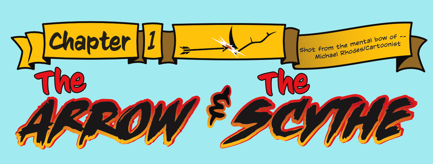
Been a busy, busy boy of late. Here's the title to the first "issue" of the webcomic. All done in AD. I wanted to emulate the old Marvel titles/dislplay lettering of the '60s and '70s a bit (big fan of the "banner-ribbon" element). I really like the noise attribute that can be added to fills/strokes. Like with most seasonings, it's best if done sparingly. Yeah, right. :P I had fun doing the flat iconic representations of an arrow and scythe here. Thanks to Insecto Design (whatta name! love it!) and his work, not to mention tutorials, helped me to just do the shapes. The fonts are all from ComiCraft, btw. These titles are going to be on a med-dark green background, so it should pop pretty good. Had an absolute blast working on this. Did a lot of option-dragging to copy elements and the credit lines were done using the Art Text tool on a path. So smooth to do that. While I would love to have some features (warping in freehand and perspective, for example), the current version of AD was great to work in. This is a screen cap on a file with 9 Artboards. While I haven't read the online help about them, I was able to just grok how to use them by, y'know, using them. While I'm certainly not alone in the throng of users waiting for 1.5 beta, the current version certainly gets the job done very well and with style! I just sealed the deal to letter a graphic novel and I'll be using AD for it. Thanks, Affinity!
-
Bubble-lishous!