Our response time is longer than usual currently. We're working to answer users as quickly as possible and thank you for your continued patience.


David
-
Posts
402 -
Joined
-
Last visited
Everything posted by David
-
Always makes me chuckle when people post "Im no designer" then I open it and its a beautifully neat piece of work ;) So great start.. from my point of view the illustration is lovely, but the font is "childish" if you want the curly fonts I would change to a more grown up classic script font or for readability a sans serif font like Open Sans (which is free) but keep it a light weight to compliment the illustration.
-
Really nice, great brush work too.
-
Clever stuff and the final photo looks great.
-
No idea, I tried a hole bunch of colours and overlay filters....I found using the lightest colour in the artwork in this case the yellow/cream at 20% opacity with a Multiply filter worked.
-
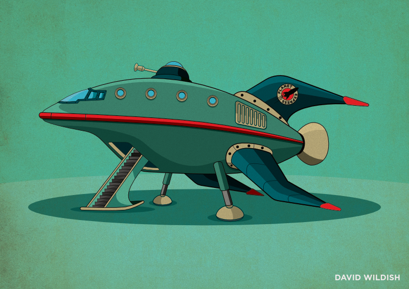
Slack Monday...so rather than doing any actual work spent my morning playing about illustrating a rocket ship for fun.

- 4 replies
-
- 4
-

-
- planet express - futurama
- futurama
- (and 1 more)
-
For me its because she doesn't look to be dreaming about anything and she's looking directly at the reader. If the 'dream bubbles' where a little closer to give ownership, then her eyes were looking up into the clouds to give interaction with her thoughts. Lovely work though.
-
Thanks George thats kind of you, I wish I was as good as you make out but I just pretend I know what I'm doing ;)
-
Oh uuuuuuurm of course it was ;)
-
Oh the irony of not asking for typos to be called out when I tittle the hole thread "Sweat" rather than "Sweet" thats the second time and last time I will make that typo ;) Mmmmm who wants a sweaty leaflet?
-

Robot in thong, armed with a super soaker, ready for the party
David replied to Ros's topic in Share your work
Sexy robot -
Love this....looks even better in full than on twitter :)
-
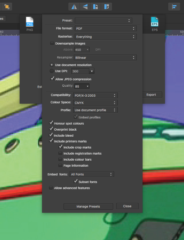
For the booklets I exported as flat 300dpi PDFs with bleed but no marks, and imported into (sorry) Indesign to make pages then exported for print. For flyers I exported as Hi Res PDFs with bleed and marks - I'm having very occasional issues with hole filling back inside shapes so everything is going out flat at the minute. I opted for PDFs for the booklet because I think its the only file type that exports all the Artboards in one batch with bleed and marks??? I could be wrong. Just to add PDF will be Hi-Res if your doc is 300DPI in the doc set up...unless you change that in the export window,
-
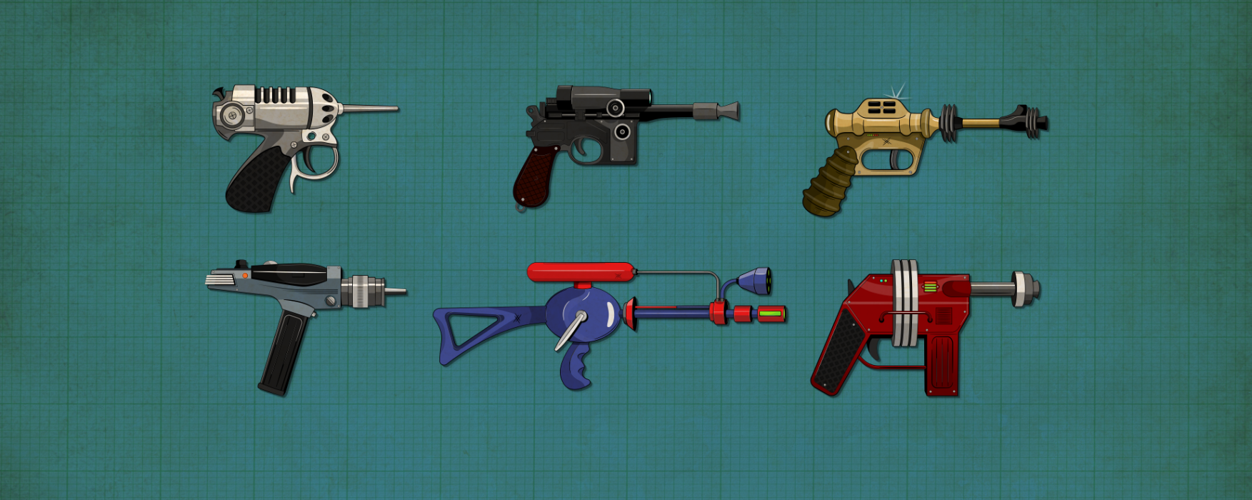
Haha thanks I'd be more happy if was payed to make laser guns and goo monsters all day but this was a fun project.
-
Well truth be told I didn't make the logo concept....However some muppet agency made it in photoshop with stock photo textures so I re-drew it as a vector element with distressing included. It was more a project of take on brand half way through development and evolve it into something with consistency.
-
PS anyone spots a typo or the like keep it to yourself ;)
-
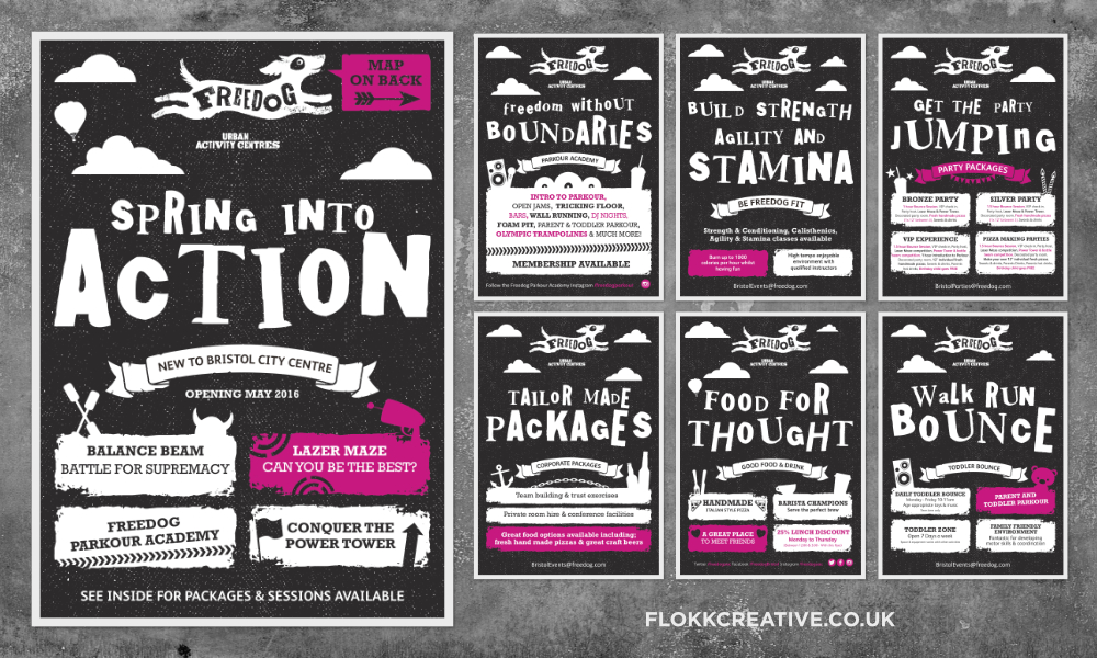
Eight flyers and an Brochure created in AD for a new client opening the UKs largest (I'm told) Parkour and trampoline park. Pretty scary sending these off to print, however 15,000 booklets came back looking brilliant.
-
affinity designer Star Wars propaganda poster
David replied to hushthatpanda's topic in Share your work
Brilliant, get this up for sale on a print store :) -
Ha, look again it may be gone ;)
-
Never did get round to finishing this set, which is annoying. I dug them out today for a new website slider. I was quite pleased with the outcome and used a bit of noise on the texturing too.
- 33 replies
-
- 2
-
-
- laser
- men in black
- (and 1 more)
-
Wow, better not let my wife see that...its hard enough to see where I'm going with all the junk we have hung on the mirror as it is
-
affinity designer I like wine made with Affinity
David replied to ronniemcbride's topic in Share your work
Well its obvious to me that the light on the left is from the Steam room (Hence the all the steam) and the right is the heated spa pool...Someone left both doors open (again) on the way through to the bar. -
affinity designer I like wine made with Affinity
David replied to ronniemcbride's topic in Share your work
Very Nice....looks expensive. Add a bag of pork scratchings and thats a good evening right there. -
affinity photo Tomatoes on my fridge
David replied to My Strawberry Monkey's topic in Share your work
I once had tomatoes (in some form) on every meal for 3 months....I love tomatoes -
very neat line work, impressive :)
- 1 reply
-
- 1
-
-
Thanks for your suggestion, one of my areas of focus was that my over engineering in illustrating items wasn't going to take over the design and become a hinderance (again). I did play with a range of feathers large and small. But in the end it boiled down to a few factors: I'm not a feather specialist or shop specialising in feathery products, I only wanted a subtle nod to a bird to work with the name. I'm happy with the more gently approach and I actually like that you can't see it at small sizes and may take a second glance to find it. Plus there four extra facts: 1. I'm sick of drawing feathers. 2 Feathers in 99% of cases end up looking Phallic). 3. I have 7 flyers to make before 9am Monday morning, So, Better get off here and get busy. 4. I'm sick of drawing feathers. Thanks for taking the time though, much appreciated :)