Timber
-
Posts
135 -
Joined
-
Last visited
-
 cephii reacted to a post in a topic:
Splash screen - add open recent menu
cephii reacted to a post in a topic:
Splash screen - add open recent menu
-
MattP reacted to a post in a topic:
Affinity Designer Customer Beta (1.7.0.5)
-
Affinity Designer Customer Beta (1.7.0.5)
Timber replied to MattP's topic in [ARCHIVE] Designer beta on macOS threads
Hi Matt, here's the file with the line with two arrowheads that shows the stepped issue I'm seeing. If you zoom in you can see the stepping on both ends. – TImber ArrowSteps.afdesign -
hawk reacted to a post in a topic:
Affinity Designer Customer Beta (1.7.0.5)
-
Affinity Designer Customer Beta (1.7.0.5)
Timber replied to MattP's topic in [ARCHIVE] Designer beta on macOS threads
Also, on my item 1. above, the swap arrow head with arrow tail, button/icon is really hard to see in light UI, not so bad in dark UI mode. -
Affinity Designer Customer Beta (1.7.0.5)
Timber replied to MattP's topic in [ARCHIVE] Designer beta on macOS threads
Here's a zoomed in snapshot of the stepping I'm seeing...
-
Affinity Designer Customer Beta (1.7.0.5)
Timber replied to MattP's topic in [ARCHIVE] Designer beta on macOS threads
Great to see new features implemented~! A couple of notes: 1. It would be nice to make the 'reverse direction button' of arrow ends a bit more visible... it's so grayed out on my screen I guessed at what it was... couldn't really see the icon. 2. I don't recall seeing the OS requirements for 1.7 but I've been testing it in Mavericks and up... the Appearance Studio - multiple stroke and fills, seems to not work at all using Mavericks. One of the nice things about Affinity programs so far.. is that they have been usable in older OS's. Is this a change, or a bug? 3. In some quick playing with arrowheads, I get some stepping using arrowheads/ends at 500% size and using a pressure mapping of the line (bringing both the start and stop ends down but leaving the middle up). If I remove the arrowheads/ends this stepping goes away. Bug?
-
These are nice, thank you. However I've gotten good results with the Colour Sketch, a number of photos I've tried go to a black and white sketch devoid of colour. Any suggested tweak to the macro to keep the colours intact?
-
RNKLN reacted to a post in a topic:
AP icon suggestion
-
Thinking of ways to improve the application icons... So, I'm thinking maybe at least the "aperture" portion of the icon should be black/dark like an opening/aperture would be.
-
In Designer 1.7.0.3, it seems if I add a Soft Proofing layer and it's not at the top of my layer stack, as soon as I try to move it to the top, Designer crashes. Very repeatable so far in my testing.
-
So, it looks like I drew the curves using either the pencil or brush tool... then when curve was still selected I selected the Text tool... which seems to automatically convert the curve to text curve and wonk the ability to further adjust it's fill, stroke, etc. Lesson seems to be, to de-select curve before selecting Text tool.
-
Interesting... the idea of going back through the history panel was helpful, though I had saved file previously before turning 'save history with document' on, so where this happened in history wasn't there. In trying to replicate this, if I draw an object and then select under the Layer menu > Convert to Text Frame, it turns my object into a text frame and cannot be turned back unless one goes through history to before that action (or issue an undo command). The interesting thing is, I know I did NOT select Convert to Text Frame, so I am still unsure how this object became a text frame. Once a text farme... you can no longer edit the fill.
-
Hi, working in Designer Mac... I created a curve, say of a mountain range... using the pen tool. It looked good and I made some edits with the node tool, added a color, then selected the gradient tool and added some gradient shading. Odd thing is, when I went back into the file today to edit the gradient color... when I select the mountain layer, 1. there's not color, nor gradient available to edit. and 2. It shows in the layer's panel as a T (text) curve. There's no text in it and I really don't recall converting it. Is there any way to get it back to where I can edit the color and gradient? Anyone ever run into anything like this before?
-
Soft Proof Question
Timber replied to Timber's topic in Pre-V2 Archive of Desktop Questions (macOS and Windows)
Also then, does setting or changing the Color profile in Document Setting change the way one views the colors on screen? If so, then what's the difference in setting color there vs viewing with a Soft Proof layer? -
Soft Proof Question
Timber posted a topic in Pre-V2 Archive of Desktop Questions (macOS and Windows)
Hi, working in Designer Mac, I've got an ad that I'm working on... my normal printer uses an ICC color profile of US Web Coated SWOP V2 and it looks on screen fine and prints out fine. Another print company that I'm sending the work to uses GRACol G7 GALCol2013_GRPC6 ICC and when I soft proof with this ICC profile the overall design looks like I put a light gray blanket over it. Question, can I use an overall color layer adjust that compensates for this? Or do I need to tweak each color as best I can? Thanks in advance!!!! -
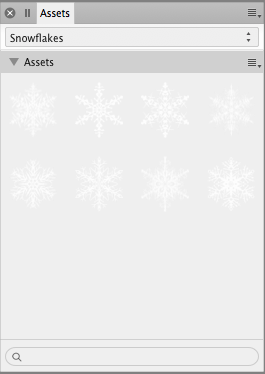
Adding the snowflakes as Assets seems straight forward enough.... only thing I find not great, is the snowflakes on the light gray background barely show up... it'd be cool if one could control or set the background color somehow to 'see' the assets better. Just a thought.
-
Affinity Designer Customer Beta (1.6 - RC1)
Timber replied to MattP's topic in [ARCHIVE] Designer beta on macOS threads
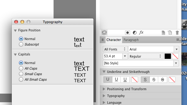
Studio panels... both for AD and AP I'd love to see the Typography panel be made available as a dock-able panel, so that it could fit alongside the Character and Paragraph panels as well as being a separate window. Just seems to make sense to have it another tab alongside the other text formatting panels. And, there's times I really wish the Studio panel AND/OR some of the panels had a scrollable length. There are times I simply cannot see enough of the panel info and scrolling would help. Thanks – Timber
-
steve_m reacted to a post in a topic:
Affinity Photo Customer Beta (1.6.6 - Beta 7)
-
lepr reacted to a post in a topic:
Affinity Photo Customer Beta (1.6.6 - Beta 7)
-
Patrick Connor reacted to a post in a topic:
Affinity Photo Customer Beta (1.6.6 - Beta 7)
-
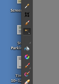
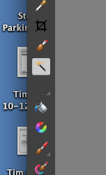
One other interesting thing, when I switched from Light UI mode to Dark UI mode, initially the selected tool keeps a light gray highlight. If I clicked on it again, it went back to the Darker highlight mode. I've gotta tell you, the lighter highlighted tool stands out far quicker to my eye than the darker highlight. See screen shots below.