jmwellborn
-
Posts
2,167 -
Joined
-
Last visited
Everything posted by jmwellborn
-
Love the Open sign, the hours and credit cards. What a splendid touch to an incredible creation!!
-
@markw The bottle is beautiful. The Kudu watercolour is magnificent! What a talented artist you are!!
-

Color Picker for External Programs/Windows Failure
jmwellborn replied to boberto's topic in V2 Bugs found on macOS
It is working correctly here with both Designer 2.1.1 and Designer 2.2.0. Both devices using Ventura 13.6. -
Wonderful! I am so glad I could help.
-
@andreasj Actually, you can turn an image of a pattern into a style in Publisher, Photo, or Designer, but it will take a little bit of preparation (steps 1-3). If you are planning to use the pattern image more than once or for more than one purpose, or for more than one project, I recommend this. 1. Create a New Document, then Open your pattern image. 2. FILE>EXPORT and select PNG. (Very important.) 3. Delete all layers in your document (steps 1-2) so you have a blank canvas. 4. With the Move Tool, select the Rectangle Shape Tool and draw a nice-sized rectangle on your canvas. Don't worry about filling it with a colour. 5. Select the Gradient Tool (V2), or the Fill Tool (V1), and on the Context Toolbar in the "Type" box, select BITMAP. 6. In MAC, Publisher will send you to FINDER (don't know what it is with WINDOWS) where you select the PNG image (step 2) you wish to use. Click on that. 7. Your pattern image will now appear on the canvas inside your rectangle shape. 8. With the handles highlighted (see attached video) you can adjust the size, rotation, etc. of the parts of the pattern image you want to appear initially in your Style. 9. With the handles still highlighted, go to your Styles Panel, select the Category where you wish your new style to be stored, right click on the little hamburger menu, and select Add Style From Selection. 10. Your new style will be added and your rectangle shape on the canvas will be immediately filled with your image. 11. So will any other shape you draw, or shape tool you use, or Font that you use. Then, with the Gradient Tool selected again, you can move the image about. I am sure you are completely sure of most of these steps, but just in case anybody is new to Publisher, I thought I might as well include them all. Video shows steps 4-11. Screen Recording 2023-09-22 at 14.38.15.mov
-
affinity photo A Magical Creature of Nature
jmwellborn replied to Mortimer's topic in Share your work
@Mortimer what a glorious image! And what difficult birds to photograph without a blur of wings! Simply beautiful. -
Insert Filler Text
jmwellborn replied to Phil_rose's topic in Affinity on Desktop Questions (macOS and Windows)
No, you are not missing anything. You can definitely link filler text frames. I just did it. I also expanded and contracted a text frame (and expanded and contracted the size of the text within the frame) using @Old Bruce's method. Also very useful for fast, one-stop shopping when experimenting with Drop Caps, or text wrapping, or Font style and size, etc. -
I have a copy from the Twenty-eighth Printing February 1970 with the original type and drawings. I can attest to the fact that you did a whole lot more than just "colour between the lines" from the illustrations on p. 64. You brought the characters alive!
-
@Kasper-V Your Weather House 1642 is delightful. I especially like your quote from 1066 And All That. One of my all-time favorite books! And the two characters are inspired!
-
Note to self: Never volunteer. Need to change my computer-screen-reading glasses!
-
I am afraid I don't understand. Can you attach a screenshot, or better still, a video?
-
@augustya Here you are. Perhaps this will help. As you can see, Screen Recording 2023-09-01 at 14.39.07.mov I only used the Move Tool.
-
@augustya I did not use ALT. Just the Move Tool. I’ll make a video a bit later.
-
Yes, they will also work with V1. Just tried it.
-
If you are trying to preserve folds, shading, etc. another way to do this is to use FILTERS>DISTORT>Deform, and then create a closed area where you want to move things by making a series of dots with the Move Tool. Then click on each dot with the Move Tool and drag. The image may need some cropping at the end to straighten the edges. Just a thought.

-
@augustya I may be really stupid, but are you sure your image layer is a pixel layer?
-
Justification word settings
jmwellborn replied to stevewhit's topic in Affinity on Desktop Questions (macOS and Windows)
Welcome to the forums @P_Bellefeuille !! Your in-depth knowledge and past experience will be a great asset in these forums as people learn to use the Affinity apps — particularly Publisher. InDesign may have been fine in its day, but for those of us who thoroughly despised the idea of being forced to “rent” our own work from Adobe, when that company changed to the subscription model, I am sure that Affinity was (and continues to be) a breath of elegance and fresh air. I don’t care if there are some things that Photo, or Designer, or Publisher “can’t do” exactly the way they did with Adobe’s stuff. They can do so much so smoothly, and there is almost always a way to accomplish the same thing by different means. Most of all, the developers and support staff at Serif, are uniformly courteous and helpful in an old-fashioned way that has unfortunately widely disappeared in public interactions. The world would be a much nicer place with many more Serifs!! -
Where is everything?
jmwellborn replied to perfidious's topic in Affinity on Desktop Questions (macOS and Windows)
I can give you a very rough estimate. Each time I have tried something new, or something I didn’t understand while learning to use Affinity Photo, Designer, and Publisher after years with InDesign and Photoshop (and disliking both) I have made a “HOW TO…” example and printed the page. These are very sophisticated apps, each offering so many ways to accomplish a single result. I now have about 1500 pages of stuff and I am not finished. And new stuff crops up every day, learning more from posted questions in these forums. Can you imagine the problem — if I tried — indexing all that? Or creating a useable table of contents? Even so, since I learn more easily by reading and doing, rather than by watching videos, my reams of paper have served their purpose, although I keep them around for the occasional search. But I don’t suggest it to Serif as the solution — defies logic and common sense. -
The crash in the Beta has happened here immediately — four times in rapid succession in Designer Beta (1903) and the first time I tried it in Publisher Beta/Designer (1903). Could be my version of the MAC OS versus yours.
-
@TrentL Thank you! I don’t suppose I am the only person on Earth who usually learns more rapidly by reading than by watching a video whiz by in a minute or two or three or six. You take the time to show the in’s and out’s with such clear explanations and demonstrations! As I watch there is no hitting Pause, scribbling some notes, then Play, then Pause, etc. while trying to spot “which icon on the Context Toolbar was that?,” or “where is that box he unchecked?” Or etc. I am hugely appreciating your tutorials and the information sticks!!! As for the Knife Tool, it is one of my favorite things about Designer V2, but I easily learned things I hadn’t figured out by myself from this tutorial.
-
Just testing to see how many filters, adjustments, blend modes, etc I could use before crashing the latest Photo and Designer Betas. Couldn't!
-
@MmmMaarten It is charming!
-
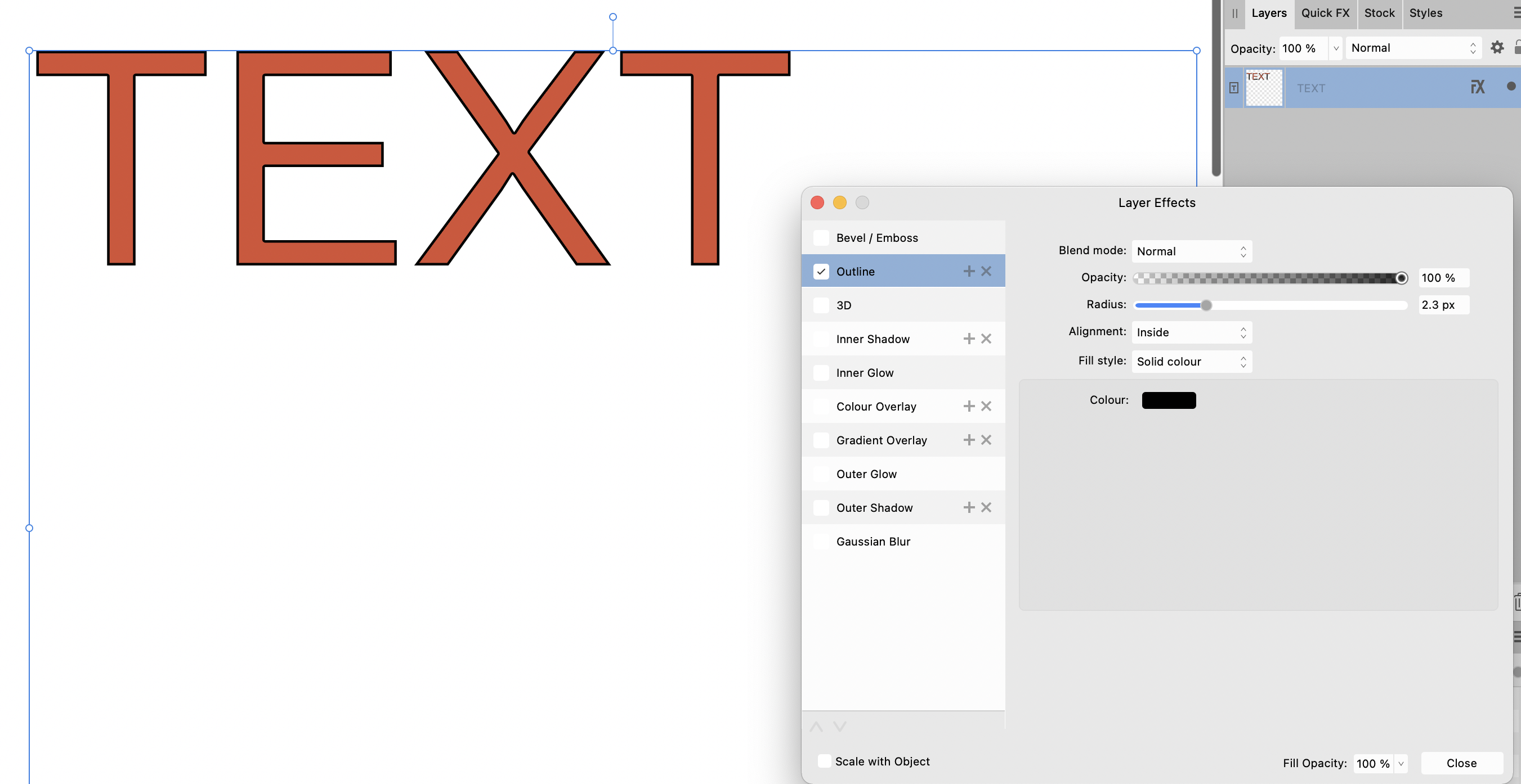
You can also do this in Photo quite easily, if you are using the Text Frame Tool, after you have increased your radius parameter and the stroke appears, by changing the Alignment to Inside. Although this will reduce the radius of the text somewhat.
-
Best Mac OS for Affinity 2
jmwellborn replied to StewartTower's topic in Affinity on Desktop Questions (macOS and Windows)
For what it is worth, I am using Big Sur, and all of the V2 apps are performing flawlessly, including the latest Betas 2.2.0.1903. One step beyond Catalina but not venturing into uncharted territory! (At least for me. IOS 16.5.1 (c) did a number on several of my iPad and iPhone settings for which I am not a happy camper.) -
No, I wouldn’t logically want to apply the macro to the whole text. Just reporting an anomaly. Why doesn’t the strange issue apply to all macro categories? Or why does it only apply to certain Macros in one category? And why did it crash Photo 2.1.1? Not only that, but if the text layer is above the image layer but beneath the macros layer (not shown in the video) some of the macros (i.e. Charcoal) apply the macro to the text but it still types correctly.