gdenby
-
Posts
1,887 -
Joined
Everything posted by gdenby
-
Wow, that was fast. Ordered yesterday, delivered this morning. About 150 pages in. Pretty good. Noticed a few basics I hadn't tapped into yet, going over the core skills. Have learned a few things among those, also.
- 544 replies
-
- 1
-

-
- affinity designer
- user guide
- (and 3 more)
-
Beautiful swan image. In a moment of madness, I thought to myself "How could those feathers be turned into vector shapes?" But why, when a photo does them justice? There is a feature request section of the forum.
-
 I messed around a bit just now, and didn't get rectangles of slightly different sizes. But I don't recall exactly what I did previously, which was the result of various random rotations and translations.
 -
I think technically what AD can produce at present is a rose. Related to a cycloid, which is what a guilloché is, but not the same.
-
Using both the Mac store 1.4 & 1.5 beta, the red dots appear at the position above the vertex when the "curved edges"check box is activated in the context bar. That is not the default in the versions I have. I suppose the tutorial was for an earlier version.
-
Yup, Circle on the bottom, 7 curves.
-
I tried various sizes, and variations on the layer order. Lowest number count of curves after division was around 30. highest, somewhere over 80. The most expedient method I came up with was to draw the nested squares, and the circle. Copy the circle. Select inner square, subtract. Paste circle, select next, subtract. Repeat. Took maybe a minute. Far less painful than trying to sort thru the arc fragments made by dividing.
-
Peter_MK Your question intrigued me. I tried to come at the question as a physics question. It appears to me that from a full spectrum of light, colors bellow 570, nanometers, blues thru greens are only slightly reflected. Between 570 and about 630, the reflectance increases almost to an average of 90%, w a rapid shift above 600. There is complete reflectance above 700, which is red. In normal daylight, which has a strong blue component, this means pure gold reflects a slightly orange yellow. In fire light, it might appear more orange, or even red. The average color I could find from various reflectance charts seemed to be a hue of about 51 in the HSL model, and a luminance of 45, saturation 100. But there are many other things to consider. Most gold is not pure. In manufactured objects, it is usually mixed w. other metals to make it harder, which also modifies the color. 18K gold might be part silver, or part palladium, both of which reflect differently. And the light environment changes everything. Since gold reflects almost no blue, under a blue light, would gold look like a dull grey? Here is a story that might interest you. I went to a symposium where one of the presenters was demonstrating a method of photographing antiquities under very low light levels. He had started out making pictures in ancient Hindu temples, where the mural pigments were too fragile to be exposed to bright light. Often, the murals had gold leaf on them. He found a method to produce very long exposures in an area that was almost pitch black. He demonstrated his method using a medieval manuscript. 1st, he made the photo under dim room light that would not damage the antique document. The gold lines on the document appeared a dull yellow green, some almost brown. The other colors were much like one could see. Then, he reset his camera, closed the door to what he needed as a demonstration, and had every one leave. He stopped the process at 90 minutes, and we came back when the film was developed. The ordinary colors were a bit more saturated, but the gold was glowing as it should have been. So, what gold looks like depends an awful lot on ambient light and how the recoding device works, and how well burnished it is.
-
It seems reasonable that shifting to another app would slow AD's operation. AD operates very much in real time, sort of like a video game. I would suppose shifting to another app, especially one that might some shared resource, or need lots of real time input, would decrease AD priority. As a btw, I mucked around making a much simpler set of lines, just 200, expanded those, expanded again, and then did a boolean add. I had the activity monitor open, and briefly, I had a number of 104% CPU usage!? I looked at the CPU load window, and saw that doing a similar process again had the User CPU load jump to about 30. After I selected the object, which was 800 circle curves added, and went to use the node tool, and zoomed in about 500%, user cpu load went above 40%. I also noted that even simple things, like scrubbing the stroke width slider back and forth would greatly increase the CPU usage. Clearly not much of a mathematical process, but display update seems to use up quite a lot of CPU. Oh, and I tried working in outline mode, wondering if the drawing routine was less intensive. Made 360 intersecting squares, added them together, then Selected all nodes and used the corner tool on all at once. User CPU load went to nearly 50% on the bottom graph, and the CPU % column went above 250% Definitely had a pizza wheel at that point.
-
No real answer. Do you absolutely need to expand the strokes? Looking at some of my much less complex files, the size can triple between simple strokes and the same expanded. I've had a few instances where I thought AD was hung. I'm running an i5, which has 6 cores running at 3.3 GHz. After a few times, doing one of the booleans on maybe 1100 curves, I realized it was just a processing load. I did go and make coffee. Typically that takes 2 - 3 minutes. Given the differences between the machines and the curve count, I'd guess 2 hours would be a reasonable time to do the union.
-
I opened the file in the Mac 1.5.2 beta. I found that if I zoomed in to about 500%, Where the icon filled most of the screen, I could use the move/select tool by double clicking a line segment, and then shift click to select all of the other parts.
-
Hi, FluorescentTurban, Here is another approach, a bit fussier.I don't know yet how to make a small video, so will offer some screen grabs and text to describe what I did. Looking at the WiFi icon, it seems to me that the structure is as follows. There is a central circle. There are 3 arcs of about 120 degrees positioned above it. Each arc seems to be as thick as the radius of the central circle, and seperated from the other elements by the same distance. From the center of the circle there are 7 equal intervals. I want to create a structure to give me those. Easiest way for me is to draw a constrained rectangle, a square, and then notw its size in the transform panel. I duplicate the square, and move it to the side. I make the duplicate 7 times taller. I duplicate the original square, and move it to the top of the elongated rectangle, till it snaps in place. I make 2 other copies, and with the squares selected, use the menu command "Layer-Alignment-Distribute vertically" Then I draw a constrained ellipse, a circle, off to the side, with the center positioned at the bottom of the 1st square. Then, copy and paste the circle and scale it up till it snaps to the next square up. This can be a little fussy, as you may need to click on the square to make it an active snapping guide. Repeat 2 times. Results shown in outline view Next, Stretch the squares into horizontal rectangles. Select the 2nd nested circle, and use the make doughnut widget. Size the hole to come up to the bottom of the rectangle. Repeat the proceedure for the outer 2 circles Delete the rectangle guides. Switch back to vector view if you like. Select the 3 arcs. Switch to the corner tool, and grab all the arc end corners. Using the rounded corner option, pull the corners into round. Ta-Da! Hope this helps. On screen, you can work at any scale you like. The advantage of vector art is that if made small or large, they will scale smoothly.

-
What tutorial did you use? There are several from different sources showing how to turn a sketch to vector art. Also, if you could post a screen capture of what you are working on, it might be easier to understand what you are trying to do.
-
Redcross
gdenby replied to tiago1801's topic in Pre-V2 Archive of Affinity on Desktop Questions (macOS and Windows)
Or, use the square shape, and modify the square with the cut out corner tool? -
I very much like the spattered background. It is convincing as a view of heavy, vegetation rich, mossy soil. Just the sort of place one might imagine finding an ancient artifact.
-
I'm supposing you are trying to make screen wallpaper. When starting a new document, select "display" for type. There's on in the drop down menu of exactly the size want. Or choose the next larger. Also, the doc units will be set to pixels, not mm, inches, points, etc. Make a rectangle in the new document, either filling the whole work space, or smaller, and adjust via transforms as #Alfred mentions.
-
affinity photo Fairy and Vampire Kingdom Library Concept Art
gdenby replied to Brett Stebbins's topic in Share your work
Thanks for the screen-cap showing the whole studio workspace. Sooo many layers of different kind, groups, and all. Good demonstration of how much can go into a single scene.- 4 replies
-
- 1
-
-
- fantasy
- concept art
- (and 4 more)
-
Groovy, dude.
-
Eva. Here's what I came up w. I decided to see if it was possible to type 366 lower case "o", font Arial, using the artistic text tool to conform to a circle. I arbitrarily chose a 2 point size for the font. I set up an A4 size document using points as the measurement unit. I did some math figuring out the radius of a circle that would hold 366 2 point letters. I had some trouble getting the letter positioned on the outside of the 129.5 point radius circle. Then I typed 61 "o" and copied and pasted another 5 times. It worked just about perfect. the beginning and end appeared a fraction of a point off. The results were miniscule, somewhat small for even an A4 document. But the method worked. Depending on how the print was made, larger point sizes would work. I suppose any mono-space font would work, perhaps some sort of dingbat set. If you don't mind, why do you need this?
-
My recollection from using AI years ago is that the AD "subtract" does the same thing as "trim".
-
Working now w. symbols. Happy to have seen the in-house vid, viewed several times, took notes. Figured out that some of my problems to date were not understanding how the symbol container and contents selection changed operations. Question. Symbol contents have attributes. There are obvious ones such as fill, stroke, and layer blend. It appears that transformations are also an attribute. Any others? It seems that if a symbol content object/layer, or one within a group of objects making up the symbol contents has a geometric transformation, it is un-synchronized. An example. I made a symbol of a group of 2 nested stars. Duplicated the symbol several times, and selected one internal star in one instance. I turned off synch, and squashed the star some. After that, while it would move and rotate within that instance. Size and rotations in other instance objects no longer affected it. A similar thing happened when I reshaped a square into a rectangle, at which point I saw that transformations were unlinked. Which leads to a question. Is there a way to re-link? Or, should another symbol be made out of the transformed shape. IE, detach, re-create so that particular form can be retained. Then place that inside and existing symbol. Anu advice, or comment appreciated. Sorry to make this longer, but... here may be a bit of a bug. I made several instances of a rectangle. Moved individual containers around, and rotated them some. Then started rotating and moving one of the content rectangles. The various instances would shift in place in relation to each other, and/rotate synchronously, as expected. After 5 - 8 positional shifts, I tried centering 2 of the rectangles on each other. and found they had slightly different sizes. If de-synched so I could try and duplicate the center positions, rotation and XY sizes, as above, they no longer synched. My suspicion is that in the course of the positional transforms, there was a very small rounding error on the defining node positions. By small, I mean 1 or 2 hundreds or thousands of an inch. Enough to be visible on a retina screen, though perhaps not enough for most printers.
-
Only 64 steps in the original, some of which use functions not currently present in AD. An amazing feat. I think the blur problem is partly because some of the thin hairline feathers are not blurred a little, as in the original. Step eleven, section 5. That adds to the depth blur effect. Also, there may be some slight differences in how the blend modes in the 2 apps work. How long to do the project, if you recall.
-
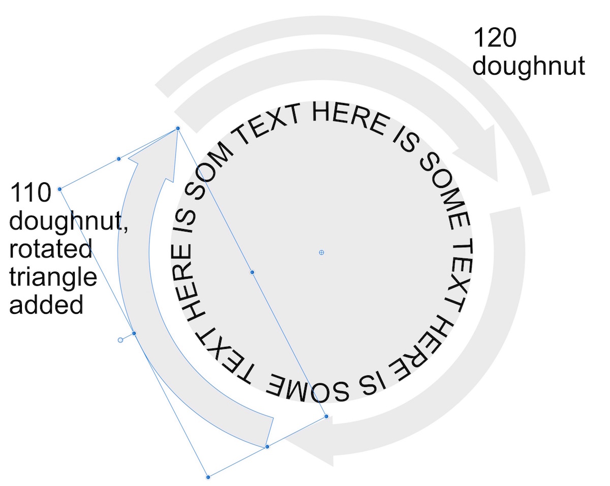
Here is a shot of something I just put together, a little different than the previous example. Snapping is turned on. I made a circle, and added text to conform to the shape. Not very good, I've never done much w. text. Then I drew a doughnut from the center of the text holding circle. I made it big enough to have space for the arrows after I opened made the doughnut hole. The total arc was 120 degrees, 1/3rd of the circle. Repeated the operation to make another doughnut, but w. less of an arc. It was a little messy. I had to fuss with the arc size to find enough space to fit an acceptable arrowhead triangle. I'm just doing this by eye, not fine math. After making a slightly acute triangle, I rotated it, and moved it to where it slightly overlapped the circle arc. Then used the boolean add function to create a single shape. Next step. This is important. Click on the "show center of rotation" widget. Move the center of rotation to the center of the text containing circle. The illustration shows where the rotation center is for 1 of the arrows. Copy. Paste. Rotate the curved arrow by its rotation handle. Hold the shift key down when doing that, and stop when reaching 120 degrees. Repeat. Hope this works for you. W. a little practice, many things can be done very quickly.
-
Again, I'm a Designer user, but assuming the donut tool is part on of Photo's shapes, sure. The doughnut tool appears to just be a sub-set of modifiers for the circle.