Lisbon
-
Posts
397 -
Joined
-
Last visited
-
 keiichi77 reacted to a post in a topic:
Clipping Warnings In Photo Persona
keiichi77 reacted to a post in a topic:
Clipping Warnings In Photo Persona
-
 MarvinR reacted to a post in a topic:
Clipping Warnings In Photo Persona
MarvinR reacted to a post in a topic:
Clipping Warnings In Photo Persona
-
hawk reacted to a post in a topic:
How to protect transparent areas in APhoto
-
DavideDozza reacted to a post in a topic:
Fill with Primary and Secondary Color does not work correctly
-
Affinity_Pro reacted to a post in a topic:
Clipping Warnings In Photo Persona
-
gdippe reacted to a post in a topic:
Clipping Warnings In Photo Persona
-
James19 reacted to a post in a topic:
Clipping Warnings In Photo Persona
-
Blueprint reacted to a post in a topic:
Clipping Warnings In Photo Persona
-
Lisbon reacted to a post in a topic:
How to Simulate a Bayer Matrix
-
Lisbon reacted to a post in a topic:
1950s-style ‘Creature Feature’ movie title still experiments
-
jacekp reacted to a post in a topic:
Layer mask - Gaussian blur - not visible on a mask preview in 2.1.0.1714
-
Please click composite alpha in channels tab. Does the blur become visible? If the intention is to blur only the mask drag the Gaussian B. to only affect the mask.

-
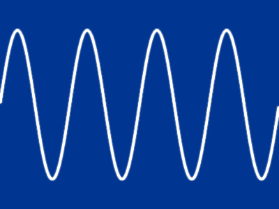
Hi @keithrt I don't know if it helps, but procedural textures (PT) come with the sine function and with a few adjustments you can actually get sine waves. Just play with the PT and gradient map. Avoid changing group content. Download at the end. Example: SineWave.afphoto
-
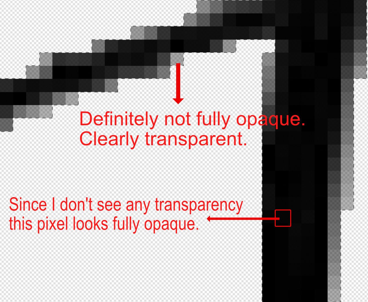
Note that in the info panel we have the RGB information and also "A" (Alpha). If a pixel is fully opaque A=255. If a pixel is 50% opaque then A=127. And so on.
-
mardymarvin reacted to a post in a topic:
Magic Wand why when you have tolerance set to 0 with antialias off it selects other colours
-
Hi @mardymarvin I use A.Photo v1 but I think that won't be a problem. I assume you are referring to the Flood Select Tool [W], right? Since in your example the pixels have very different opacities, we can be led to think that gray tones are being selected. The only way to be sure is to open the info panel and measure some pixels. As you mentioned, with the tolerance set to 0%, all selected RGB values must be the same. In the case of black RGB = 0 0 0 If they are different then we may have a problem. Is it possible that you are trying to select fully opaque black pixels?
-
how can i get these smooth edges?
Lisbon replied to RetroDesire's topic in Desktop Questions (macOS and Windows)
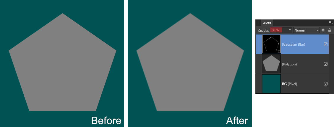
"how can i get these smooth edges?" By blurring them. Here is one way. Start by loading the shape/layer as a selection (Ctrl + Mouse click on the layers thumbnail) Convert the edge selection into an outline (Select > Outline / Radius=2px) Finally, add a live Gaussian blur (Radius=1px) Note that I have reduced the opacity of the blur. This helped the shape blend in better instead of just looking blurry around the edges. The most important thing is to get an edge selection. Affinity Photo v2 allows band pass masks. I've never actually used it, but I think it might work.
-
Lisbon reacted to a post in a topic:
Best/easiest way to accomplish this?
-
Don't get me wrong, I'm all for consistency. Brightness and contrast by default works in a non-linear way, but in the Develop persona it is linear. Should I report this as a bug?! What I'm saying is that I suspect the fixed grid was intentional hence my suggestion for a feature request. Maybe i'll do the same for Brightness and contrast in Develop Persona 😀
-
I see. I think you should make a feature request because i think that this fixed grid attached to the document is intencionial by design.
-
Voronoi works with a fixed grid. You can test this with two different images with exactly the same dimensions. Let's assume that the color of each cell is determined based on the average of the pixels of the original image. So if the grid is fixed and you change the position of the original image, the pixel average for each cell will be different.
-
Lisbon reacted to a post in a topic:
Can anyone get close to this style of photo manipulation? See photo attached
-
Lisbon reacted to a post in a topic:
Tonal Correction Tools Explained in Affinity Photo/Develop Personas
-
Thank you @Ldina Very useful. ---###--- Many of the adjustments in Develop Persona are linear. Brightness & Contrast for example. Notice that in Photo Persona the Linear option is unchecked by default. It's the same in Photoshop and it works that way at least since CS3 (2007). For most cases it is a bad idea to make the adjustments linear. I wonder if expensive Raw Developers like Capture One work the same way.
-
Lisbon reacted to a post in a topic:
Making a background image more web contrast friendly!
-
Lisbon reacted to a post in a topic:
"transparent" background when exporting
-
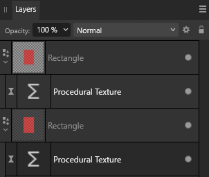
Hi @stokerg This was intentional on my part. Just to show on how Procedural Textures (PT) affect according to their current position. Personally I know how to work around the problem as I demonstrated in the video. But in the specific case of rectangles like in the @Zero1 example I don't think the area around it should be replaced by some color. I think that there isn't supposed to be anything around shapes. When I say nothing I am including RGB+A data. If that were the case the surrounding arround the rectangle would never be replaced by 50% opacity black. Regardless of whether I drop the PT filter in the right position or not. (The bottom PT filter is in the wrong position - Transparency arround rectangle replaced by 50% opac. black)
-
Are you including adjustment layers? I always had the idea that adjustment layers were very simple compared to, say... adjustments within raw developers. Wouldn't that affect greatly the performance after a few adjustments if they were performing complex operations on the background? I agree. And with very nice results i must say. This screenshot, refers to A.Photo right? I only ask because in Photoshop, the saturation slider within the vibrance adjustment also affects reds differently.
-
Agree 100%. Undoubtedly, Photoshop has tools that A.Photo does not have. What I question is the quality of the results compared to this generation of AI software. I don't know if things have improved, but "shake reduction" used to leave a lot of wavy patterns in the image.
-
I find it quite interesting how vibrance works. Low saturated colors get an extra boost in saturation compared to already highly saturated colors. But this extra protection on the reds i dont understand why. I admit that it can be useful when there are skin tones but not all images have skin tones. Photoshop works the same.
-
masks. what am i doing wrong?
Lisbon replied to maxegb's topic in Desktop Questions (macOS and Windows)
Same with me in version 2. No problems with A.Photo v1. (A.Photo 2.04 MSI / Win 10)