Search the Community
Showing results for tags 'affinity photo'.
-
 Congratulations – Photo for iPad seems like an incredibly capable tool that finally opens up iOS for more professional work. My iPad Air is not supported, so here are my initial impressions based only on the tutorial videos (which do work fine on iPad Air). These are what I think are the most pressing issues that, if fixed, would get this thing even closer to perfection ;) Putting something like "Deselect" into a contextual menu isn't that great – I think if each Persona had a few buttons next to the Persona selector for quick access to very frequently used operations, that would be much more fluid. This would also solve having the "Develop" command being only visible when you have the Hand tool active and having to dive into a menu for toggling clipping preview, which is something that is often used in a "switch it on, change something, switch it off to check how it looks, switch it on again" type workflow. Maybe it's just the videos, but I didn't see any way to use a brush to paint selections. It would be good to have a setting that switches the Adjustment and Filter studio panels to a simple list or icon view, or, alternatively, add buttons to the Layers panel that show popovers with filters a iPhone-style sliding categorized navigation list. The current design seems to require way too much scrolling and also has very colorful icons that distract from the document. If I just want to add something fast, the current design is not great. Also, a "previous filter" item at the top like on the desktop version might be a good idea. Levels does not have any histogram whatsoever – if the intended use is to just use the scopes panel, some kind of indicator where the selected black and white points fall inside the histogram/waveform is needed for precise control, as well as a way to make the histogram/scopes bigger than they currently are. Quick access to clipping highlights also (which would actually make more sense as a global option that's available in the other Personae as well, excluding Liquify). Output levels are missing as well. Double tap to fit to screen is nice, but quick pinch to fit like in Procreate seems more fluid to me (it might just be that my middle finger is somehow abnormally long, but two-finger taps are often recognized only after the second or third try for me) Straightening seems a bit fiddly – it would be nicer to be able to drag out a line and then have the end points movable even after you release the touch. Basically with an "Apply" button instead of committing right away. Right now, if you get it wrong or wonky, there seems to be no way to cancel and no way to get it really precise. Similar problem with the Inpainting and Mask Refinement brushes – an "apply on release" check box would make this more convenient. If disabled, it would allow you to paint multiple strokes and then press an "Apply" button. Same on the Desktop – I can't count the number of times I've used one of these brushes, hit the screen edge and had no way to scroll the document without the incomplete operation being applied, leaving no way but to undo and repaint a potentially complex selection. The curves UI in Develop (and possibly the regular Adjustment, it's not shown in the videos) seems to be too small for precise adjustments. A button that pops it out over the full screen like Procreate does by default would be very nice. Also, like with Levels, there needs to be a way to see where a point falls on the histogram/waveform, numeric coordinate inputs and a clipping warning for it to be really useful. It would be much more useful if dragging on the layers would adjust Opacity instead of doing multi-select. Selecting could be implemented either by having an additional column with checkmarks permanently shown to the left of the layer name, or by having a "Select" mode that makes that column appear after press of a button like in many other iOS list views to prevent accidental selection. That would also be more intuitive for new users. A "Hide Selection" option would be very useful to see what selection edges look like after an adjustment. Goes for Desktop as well. This is nitpicking, but the square buttons in the Layers panel don't match the round look on the other buttons, like "Return", "Document Menu" etc. The Inpainting Brush "Inpainting in progress" overlay seems like it would get really annoying if you have to do a lot of inpainting because it would make your screen flash after every brushstroke. It also makes it harder to compare before and after since you get to stare at that blurry wall instead of before/after images in direct sequence. A smaller progress indicator like the non-intrusive "Marked as Pick/Reject" feedback popups in Adobe Lightroom or a global progress bar next to the Persona selector would be a lot less distracting. A lot of the Develop UI is really colorful and could distract from the image. I already mentioned the Adjustments previews as another case of this. In Develop, for instance, the RGBCMY sliders could just have their knob colored instead of half the slider (background of the slider indicating the percentage could be gray instead of R/G/B/C/M/Y), or maybe the colored part could just be a thin line like on standard iOS sliders. It's not clear from the tutorial videos if this is there, but a "double-tap any numeric input, slider or option to reset to default" feature would be great. On the desktop as well. Or alternatively or additionally, a "default" button in the popup calculator would seem like a good idea to me. Develop seems to lack an option for numeric inputs. This is essential for precise corrections. It would be nice if the popup calculators could do basic maths, like those in Flame. So something like "current setting * 1.5" would be really easy to do. History seems to have no "Purge History" button that would save storage space on complex documents, especially ones with a lot of paint strokes. The only way to do this currently seems to be to do a "Save as". Also, having the initial document state in the history list would be useful. And an option to use the great split-screen compare mode with history steps would be nice (though admittedly not essential). The size of the application bundle is extremely large, more than a GB. Anything you could do to reduce this would be greatly appreciated since storage is usually extremely limited on Apple devices, there is no way to use memory cards, and the images being worked on potentially get rather large, especially considering that they are saved with history by default and that 41 megapixel raw files are within the norm these days. Hope this feedback is helpful, congratulations on the spectacular launch! :)
 -
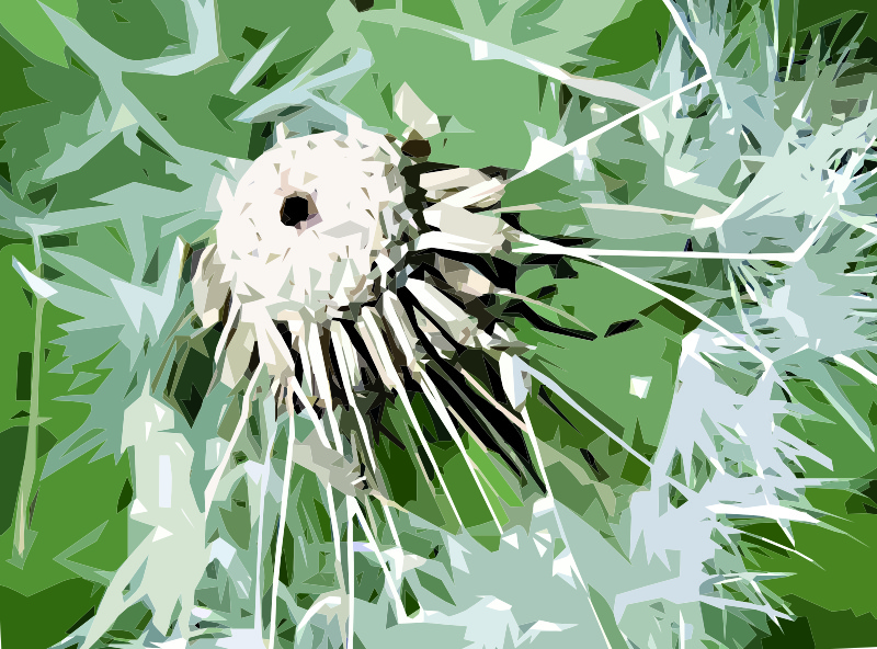
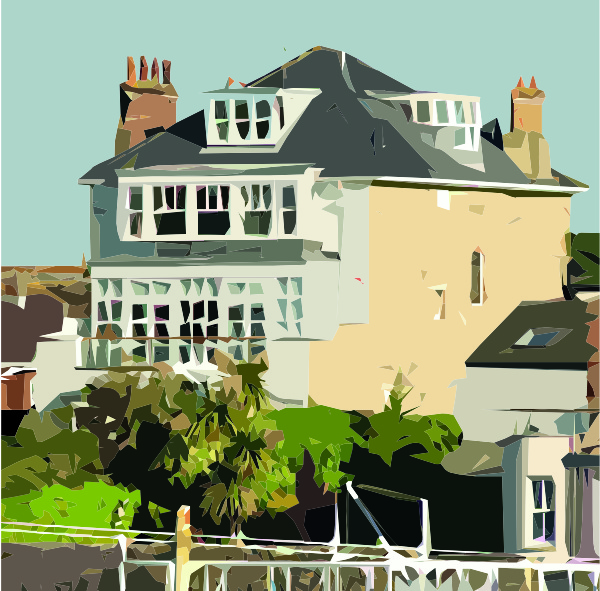
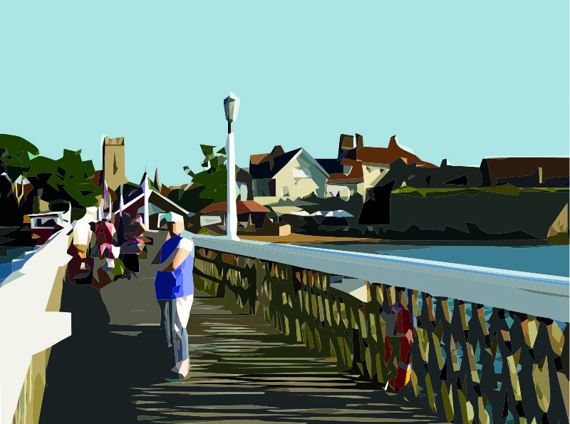
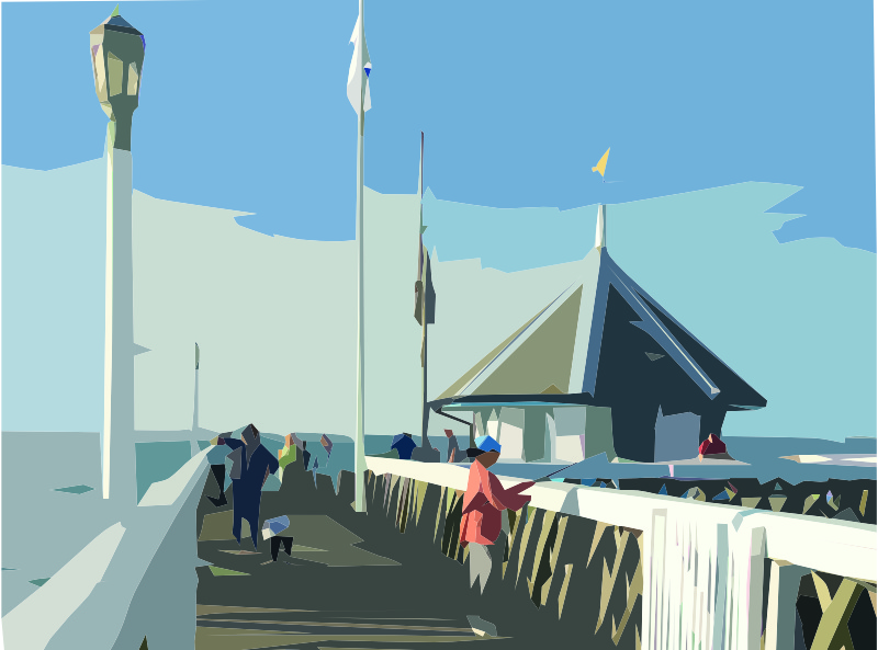
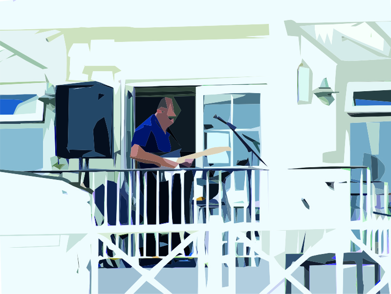
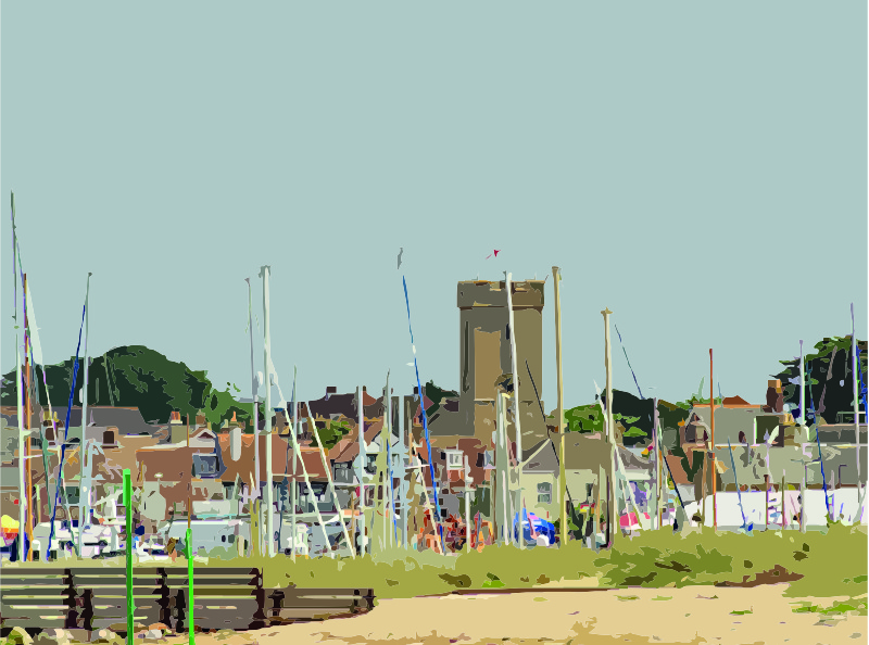
I'm being a bit cheeky, I have to admit! Someone a while back pointed out that you can pass vector images from DrawPlus to AD by exporting them as PDFs. The Autotrace studio in DP is a lot of fun to play with, and these pics were put through it with suitably tweaked parameters. I imported the PDFs into AP to clean them up a little and trim any white space from the edges. I don't claim any artistic merit (except in the Dad-ist sense that I chose the originals and decided which ones to post and which ones weren't good enough). But I like the kind of near-abstract decomposition that often comes out, and I shall take inspiration and have a go at making some vector jobs entirely by hand.

-
 I'm interested in finding out if there are any digital art plug-ins that work with Affinity Photo. I don't need anything too fancy but I'd be interested in plug-ins with filters that can create and customize a variety of "painterly" looks from photos. If there's nothing that will do this as a plug-in, I'd be interested in recommendations for stand-alone programs that could be applied after an image is processed in Affinity and exported to a TIFF or PNG file.
 -
 I just downloaded Windows Version 1.5.2 of Affinity Photos. Many changes but not a single tutorial explaining where past features went and how to use modified ones. Worst part... no concern by Affinity.
 -
 Hi there, guys! Long Time I don't share anything. Well, today I wanted to practice some digital painting (still trying to get myself on it, drawing is way easier), and, the fruit of that is this work in progress, some weird humanoid being. Best regards!
-
 I have just bought a XP-Pen Star03 tablet, and I can't get it to work in Affinity photo. Is there any way I can get the pressure sensitivity to work?
 -
Hi everyone I've done a macro with 3 elipses for dodge and burning like lightroom but in ap, one for dodge other for burn and another for contrast. How to use 1.import the macro 2. clic on the dodge elipse macro but ensure the fill color is white 3.clic on the burn elipse macro but ensure the fill color is black. 4.Clic on the contrast macro but ensure the fill color is white 5. Select the move tool [v] for modifying and moving the elipse. You can play with opacity for making stonger or softer the effect or even change the blend mode. The macros will generate an elipse with a name like dodge, burn and contrast for that reason you need to set the correct color fill before apply the macro, and the other reson is because affinity photo didn't allow me record fill colors with elipses. Enjoy :) D&B with elipses.zip
-
 I am starting to see a few posts asking Serif why Publisher hasn't been released yet. After just completing my first BASIC layout project with Designer and Photo it makes sense to me for at least some of the reasons why Publisher hasn't been released. The two currently available apps are still missing some very basic layout tools so Serif needs to get the basics put in those two apps before moving on to the more complex layout software. I wrote a lengthy piece about this in another thread but it was buried one hundred posts down. I just wanted people to be aware of these points so I am starting a new thread so that they can get more exposure. Original post: After doing my first layout project on Affinity I can understand why Serif isn't rushing Publisher out (even though I enjoyed using it for layouts.) There are still a number of basic layout features that need to be added to Designer and Photo to even work well as a basic one page layout software. Why rush out complex layout software before you even have the basics working right? This is the list I have come up with that Affinity should complete before moving to a layout program. - Visible bleeds in the program, not just after exporting the file. There was too much work trying to set up bleeds at a half an inch when I could see an object after it was dragged out into the bleed area. I basically had to draw a half inch box and then drag the object to the size of the box and then delete the box after I no longer needed it. - Adding and editing artboards needs to be done in Photo. If Photo let me edit artboards I could have done my entire book cover layout in Photo (I think) and not had to jump back to Designer each time I needed to make a slight revision. For an example the publisher I was working with said that my book spine needed to be .58" rather then what I previously had it set to which was .5". Such a small adjustment should not require me to go to another app. - I consider text wrap to be a basic tool so this needs to be done without having to rely on a workaround. There is also a feature from InDesign where the text follows along the side an object that I find to be very useful but I can't remember what it is called off the top of my head. - I should be able to select a shape that I want to import an object into. I know there is masking from the layers panel but with InDesign I have gotten used to selecting a shape, selecting place and then having an object get imported in. This object could then show up in the layers panel as a masked item. -The first version of Publisher should include some of the features that InDesign users have been clamoring for over the past several years and never get. The goal is not to just make a clone of InDesign but provide functionality it can't do or can't do well. I think Affinity got off to a good start as a basic layout tool but I really believe that all of these basics need to be done before Publisher comes out. Ideally Publisher should be a solid app right from the first version since so much polishing would have been done to layout tools in Designer and Photo already. This way the focus for Publisher can be placed entirely on things like long document features and ebooks rather then adding layout tools that have been available for decades now (those features should already be in Photo and Designer by release.) Another advantage of placing the focus on Designer and Photo is that people will get comfortable using those programs as solid basic editing apps so when Publisher comes out the transition to the more powerful long document tools will feel more natural since it will be so similar to the programs they already use. PS. I noticed as I was typing this that there is a shortcut for adjusting leading. That is a useful idea. Is anyone else getting this to work? It doesn't work for me. That seems like a much better idea then having to type numbers into a leading box.
 -
Having fun with the new Photo 1.6 beta and Blender texture painting workflow. Liking the new light UI in Photo too. I'm using the file path option in Blender's preferences (see screenshot) so it's a one click jump to Photo for painting. Then just save in Photo, jump back to Blender and click reload image. Boom, couldn't be easier. :-) Blender's internal texture painting is pretty good but not quite as dedicated yet as Photo is for this sort of stuff. EDIT: sorry for the yuge screenshots...
-
Good day! I'm fairly new to the whole photography thing let along photo editing. I'm absolutely in love with Affinity and its ease of use and user interface. Anyways, here's a few random shots that I've done and edited with AP. Comments and critique welcome!
- 2 replies
-
- 2
-

-
- edit
- photography
- (and 2 more)
-

affinity photo My first crack at a double exposure in AP.
misguid3d posted a topic in Share your work
Here's my first try and doing a double exposure. I always loved the style and wanted to see if I could do it. Both underlying photos were taken by me and then edited in Affinity Photo. Comments and critique welcome!
- 2 replies
-
- 3
-
-
- photography
- beard
- (and 2 more)
-
 Are there already more precise information about the realese date and the price of Affinity Photo for iPad? I'm really excited and can't wait anymore :)
 -
Hi, I bought this program a while ago and love it, also bought the book but because of a lot of other commitments I haven't had a chance to learn it 100% yet. I'm no graphics designer, I just make silly make comics for people. So can anyone please give me a quick lesson on how to create an effect with this screenshot of how to make it look like the plane is going through some time warp, something where it's stretched out or going into a time tunnel or some kind of look like that? I watched almost all the videos but couldn't find anything like that effect. Many thanks to all who wish to help. Jack
-
 I downloaded the trial of Affinity Photo, and tried opening it on my Windows 10 computer. An error just pops up that says "This app can't run on your PC. To find a version for your PC, check with the software publisher." I am running Windows 10 Pro Version 1607 OS Build 14393.1198 I really want to buy this product, but if the trial won't work on my computer, I am guessing the full product won't work either. :-( Any thoughts?
 -
I've been away from the camera for some time now, but last night I decided to revisit a photo I had produced late last year. This was a 3-image HDR shot while vacationing in Northern California. Processed in A.Photo... I was just playing around with some settings, nothing too serious. I realized that I haven't had much time to play with the latest features in the app and I'm hoping to change that soon.
-
Hey guys! Thank's for your app, it's great! Makes some of my routine tasks much faster =) In my work I really get used to check the pic with before/after. In PS it's very easy to do with picking the history state you need and then just jumping back and forth with just one button combination cmd+z. What I'm saying is that I can jump in PS between the state I need in the middle of history and the last state in history using cmd+z only. Unfortunately that doesn't work in AP. I have to use slider or manually scroll through the history. Which is not convenient at all when I need to check if I'm not over dodging/burning... Please, add this option in future releases! Thousands of retouchers would be happy! Oh, and also is there a way to use Frequency Separation with 3 level separation? Adding extra frequency in between will increase precision and accuracy of retouch, especially with high-end portraits.
-
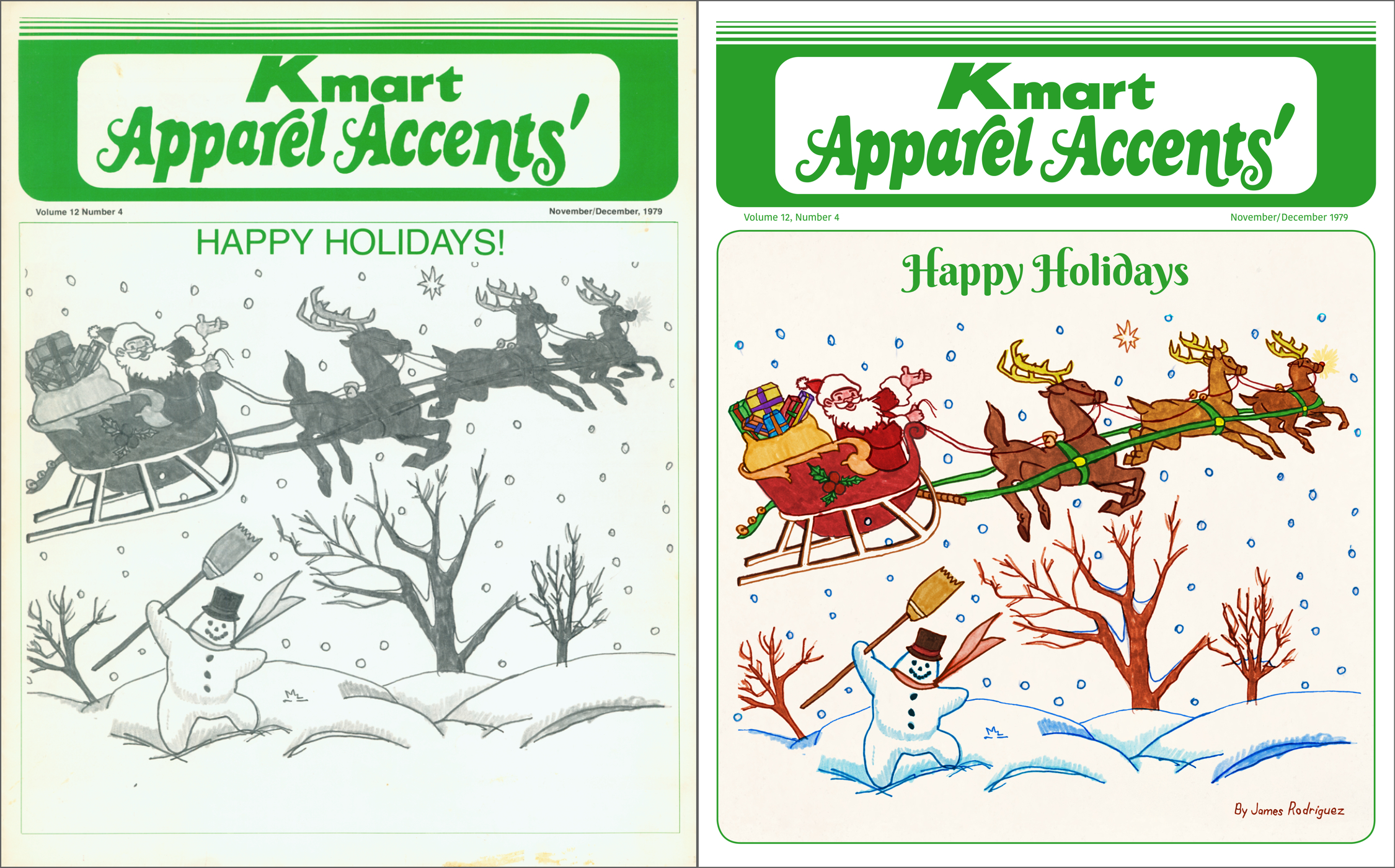
Hello all, I drew this when I was 11 and rediscovered it while looking through my ancient portfolio. Long ago it was printed on the cover of this newsletter in black and white even though my original was in color marker. As practice with Affinity Photo, I chose to recolor my old illustration, but all I had was the printed copy on the left. The colorful original was never returned and I think you'll agree the black & white reproduction is muddy and lacks contrast. I scanned the reproduction and AP helped bring color back to my childhood drawing. My main goal—aside from returning color to a cherished memory—was to keep the integrity of the marker work. Under no circumstance did I want to clean up or improve what is otherwise a child's drawing. I'm happy to say Affinity Photo handled this personal project flawlessly. The file is over 300 layers, and each hue is isolated and colorized using Recolor Adjustments and further manipulated with Brightness/Contrast Adjustments, and of course Masks. Before recoloring, I painted out the gray fills to isolate & retain the strokes. Separate layers of the original B&W fills were then used for colorization. The Paint Brush tool and its options helped me get the job done. My old childhood drawing has color again, thank you Affinity Photo. For screen shots and descriptions of the process, including Affinity Designer to redraw the title, please visit Behance at https://www.behance.net/gallery/51578699/Kmart-Christmas
-
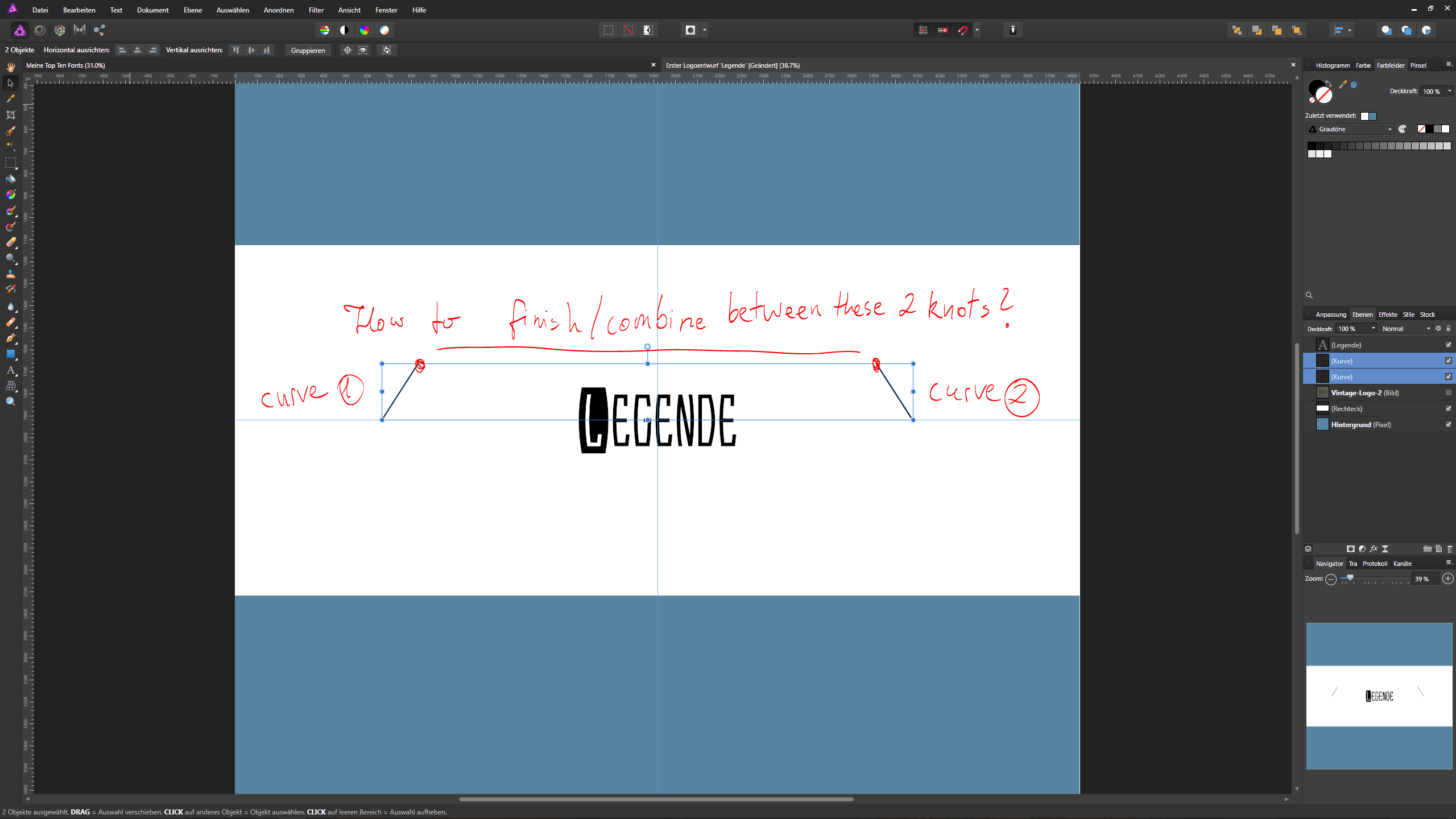
 Hey, I'm new to Affinity Photo and I would love to know how to finish or add a curve/line between 2 separate curves. Enclosed you will find a screenshot, so that you can understand better what I mean with this issue.
-
 Hi, I've just joined Affinity and haven't purchased yet, no doubt I will but don't know which one to get. Ok so I do some photography ( normally use LIghtroom for edits) I have the Adobe Suite but can't seem to get it on with Photoshop, I'm going to be curating a hell of alot of images soon, so photo editing/manipulation needs to be a lot easier. I'm also a fabric designer, and want to do digital designs for print and screen and some other brand designing stuff. I haven't a clue which one to get as I can see I need both elements. Any advice is appreciated. Thanks in advance.
 -
 I cannot get the Paragraph or Character panels to appear. I assume there are supposed to be panels for those options? With the text tool active, i see Character and Paragraph buttons, but when I click them, nothing happens. If I click the Text menu - Show Character or Show Paragraph - nothing happens for either one. Text/Show Typography does pop up a panel though. From the View menu - Studio - Character and Paragraph are both checked, but they do not appear in any of the areas where the other panels are shown. I'm just starting with Affinity Photo, so there could be something I'm missing, but everything else has worked as I expected - a refugee from Photoshop. :) Version is 1.5.1.54 OS is Windows 10
 -
An art of a rocket taking off with stars around. Still trying to get comfortable with AP
-
Hola a todos los que hablan español. He estado trabajando en una forma para usar el filtro aplicar imagen de Photoshop y los rangos de color con los que se crean mascaras, en affinity photo y encontre una manera de hacerlo y quiero compartirla con ustedes con varias macros que he creado, una para aplicar imagen y otras tres para hacer la selección de los colores CMY que no estan disponibles en affinity photo ya que solo permite seleccionar los rangos de color RGB, luminosidad, medios tonos y sombras pero no CMY. Como usarlos 1. Importar las macros 2.Con la imagen seleccionada clic en la macro de aplicar imagen 3.Se abrira una ventana con unos deslizadores para ajustar los parametros de la mascara creada, estos permiten mostrar mas o menos partes de la mascara. 4.Clic en aceptar y crear una capa de ajuste como curvas y arrastrar la mascar creada dentro la capa de curvas como una capa hija (child layer) 5.Ajustar los parametros de curvas para afectar las areas deseadas. (Se pueden usar otros ajustes). 6. Disfrutar Para usar las macros de CMY, aplicar la macro a la imagen para seleccionar el color deseado y con la selección activa abrir un ajuste de curvas o el que quiera y automaticamente creara la mascara del color dentro del ajuste y mover los parametros. Esto se usa para aplicar un ajuste a areas concretas de la imagen como el cielo solamente o como alternativa a las mascaras de luminosidad para hacer HDR. Selecciones CMY y Aplicar Imagen.zip
-
- 5
-
-
- rangos de color
- aplicar imagen
- (and 1 more)
-
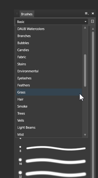
 Can we get the ability to make our list of Brush Categories in Affinity Photo sort alphabetically? It would also be nice to have sub-categories or tags to better organize our libraries.
- 6 replies
-
- 3
-
-
- Affinity Photo
- Brushes
- (and 1 more)
-
Is there any way to make my list of Brush Categories in Affinity Photo sort alphabetically?