Search the Community
Showing results for tags 'Color'.
-
I am working changing the Sofware from the A.Designer to A.Photo, but when I do this the color in Affinity Designer are different of what it must, I attach a Video where I show this issue, and I put it here becuase sometimes when I export an image from A.Designer, it change the color and I already check all the options to corroborate that all are the same whit Affinity Photo and they are. RJpEnoA5N0.mp4
-
 Hi All, I have a photobook I originally created in InDesign, and am porting over (manually recreating) into Affinity Publisher. I am having problems around color consistency while exporting. When exporting to JPG, colors visually match between InDesign and Affinity exports. I am having issues when exporting to PDF. InDesign PDF colors visually match JPG exports, but for the life of me I cannot get the Affinity Publisher PDF colors to match. I have confirmed visually by opening both PDFs in same reader side by side, as well as actually physically printing (3rd party) on paper. They are washed out and dull in comparison. I am attaching a page of the book from both. Please tell me what additional settings you need me to provide. Cheers! Affinity Publisher.pdf InDesign.pdf
 -
 Hey guys, I'm trying to make a black to transparent fading gradient, I drew a rectangle shape on 1/3 height of the page and use the transparent tool to click on bottom of the shape and drag to the top straight, midpoint set the standard 50% but on top of the shape, it appear to have noticeable edge and not completely fade to transparent and blend in to the background image, can you guys let me know how to settle this? I try to set the midpoint to 55% because I want the black are to be a bit higher and then make a second midpoint and set it to 45% and the edge don't noticeable much but because there's 2 midpoints, the gradient looks like a 3 bar with black, dark gray and light gray shading. And how do i make sure tire's no banding problem with amazon KDP print? Please help! Gradient Test.afdesign
 -
 Following an AP tutorial I have created my own swatches. I use 5 colours palette that to my judgment correspond well to what i see in the original (template) image. If this is not a case, the 5 colour palette by AP is incorrect, I create a swatch again with a higher number of colors and make my selection to limit them to again 5. When color grading with 5 colours I add 5 colours from the swatch palette very carefully by ensuring that the Location value on color grading scale matches the Lightness (L) value of the color an indicated in a window for color picker. When I copy the colour palette from the swatch and apply it to my own image the result is different as regards tonality. Some additional adjustments are needed to match my image with the template. However, it is almost never the same. Is it what correct? Using swatches for color grading does not guarantee that the image that is edited will match the template and there might be differences?
 -
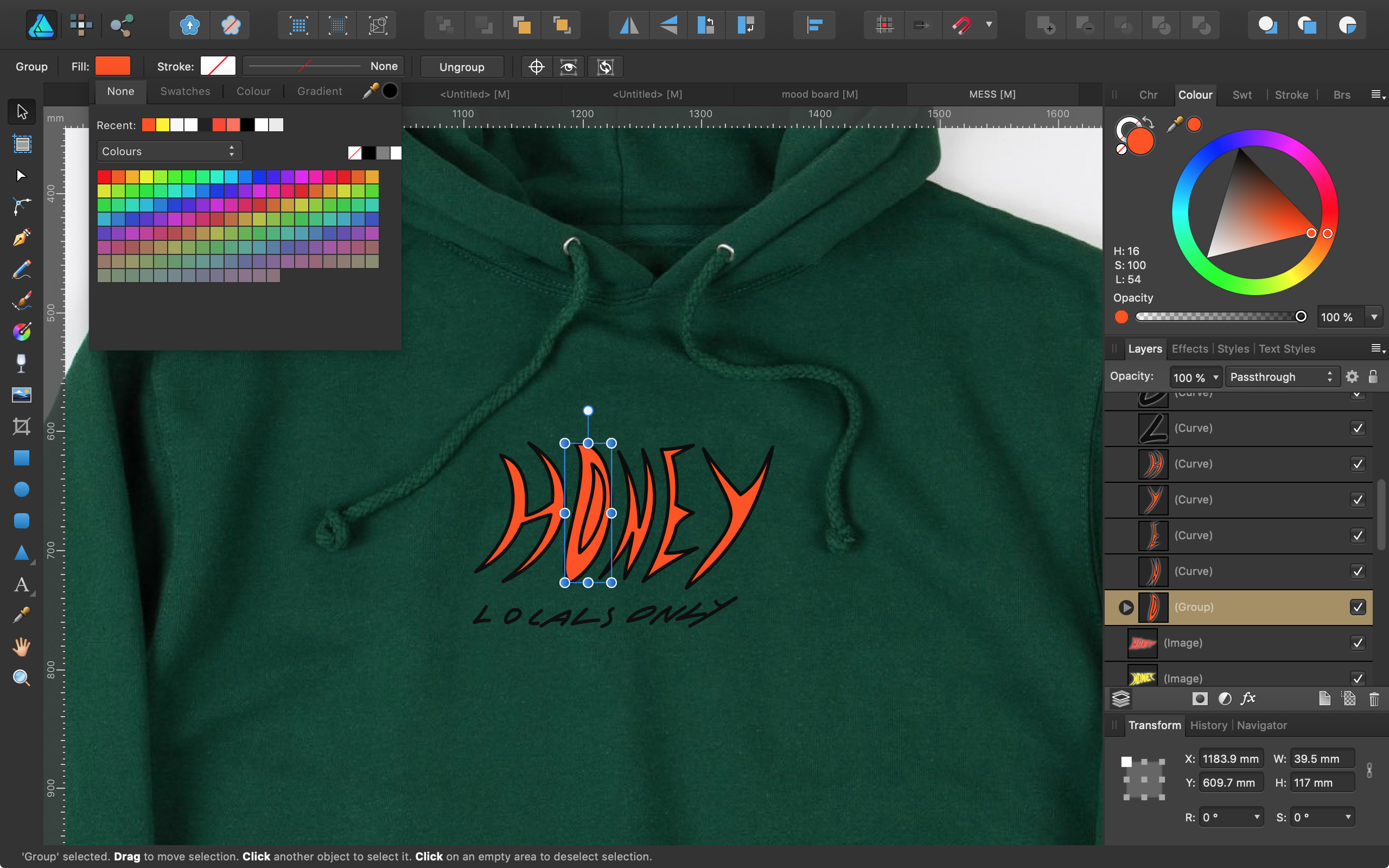
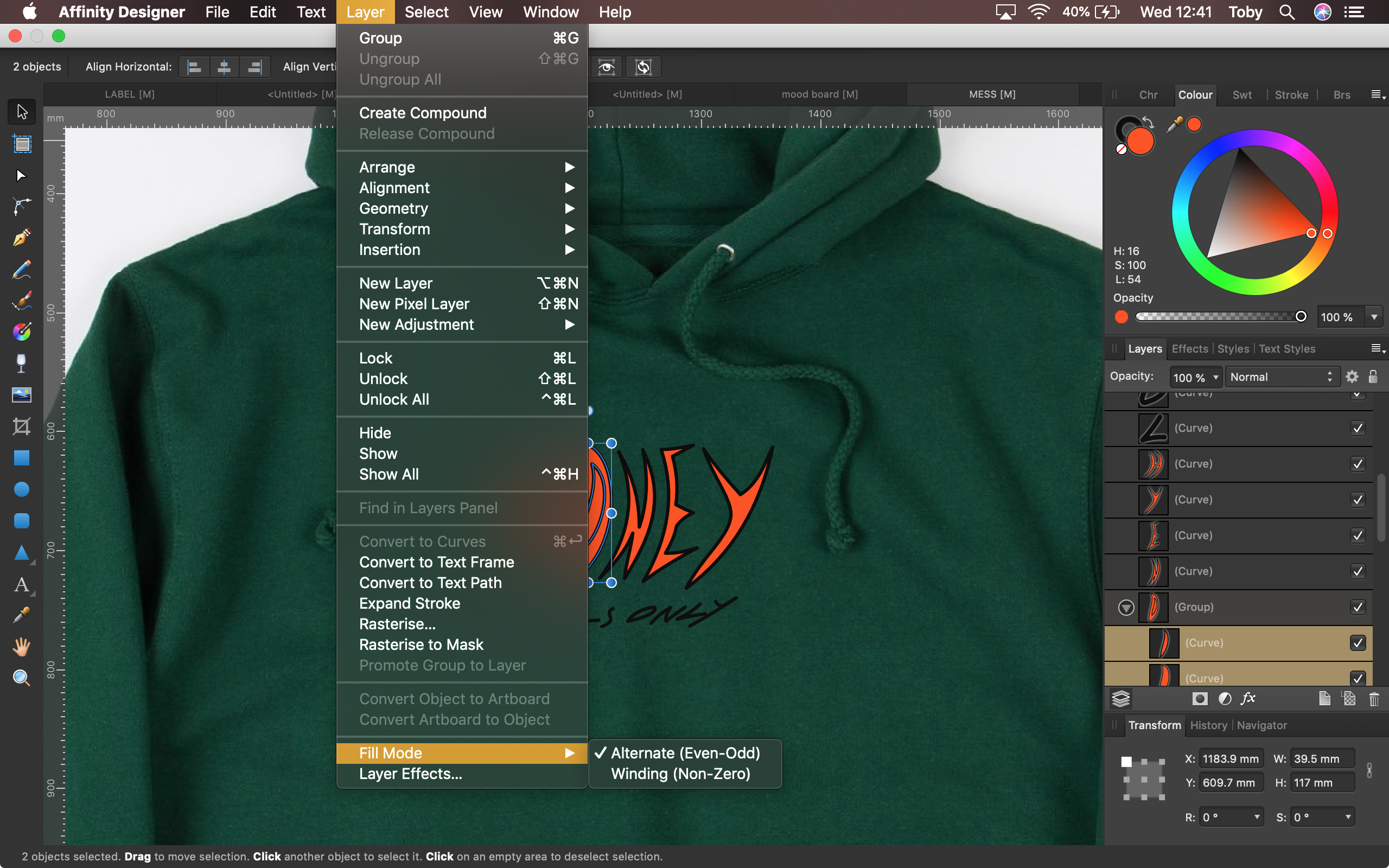
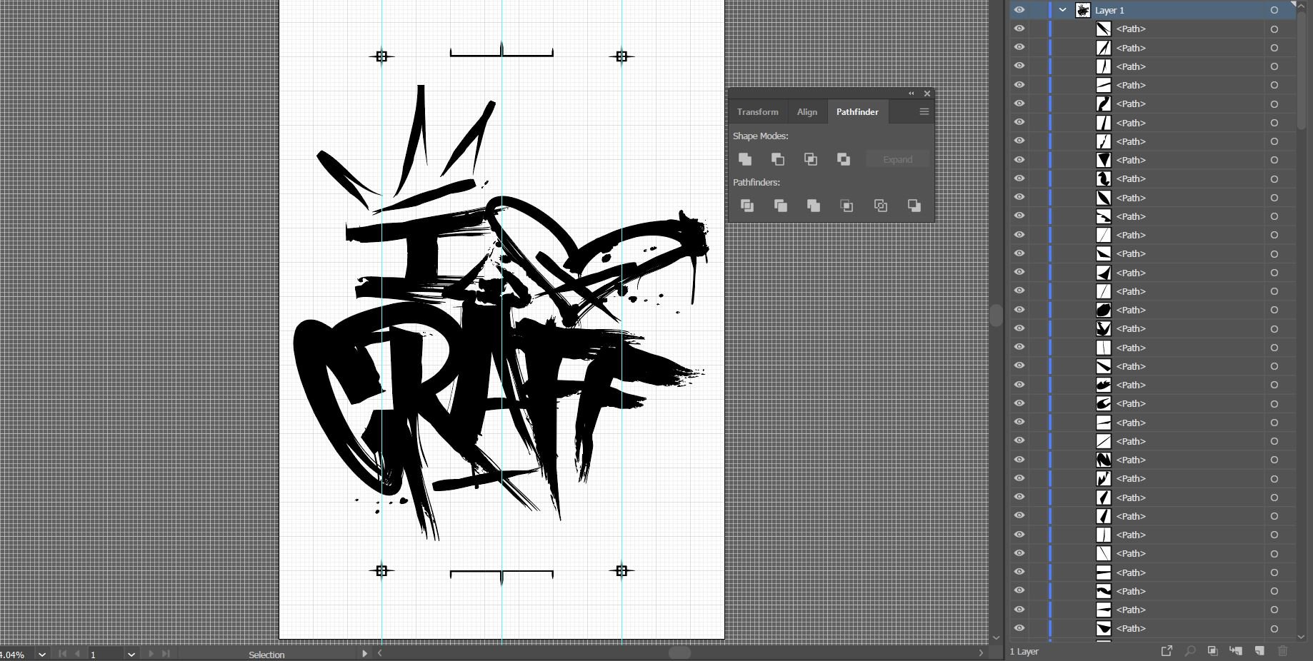
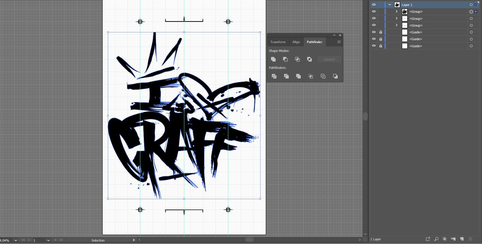
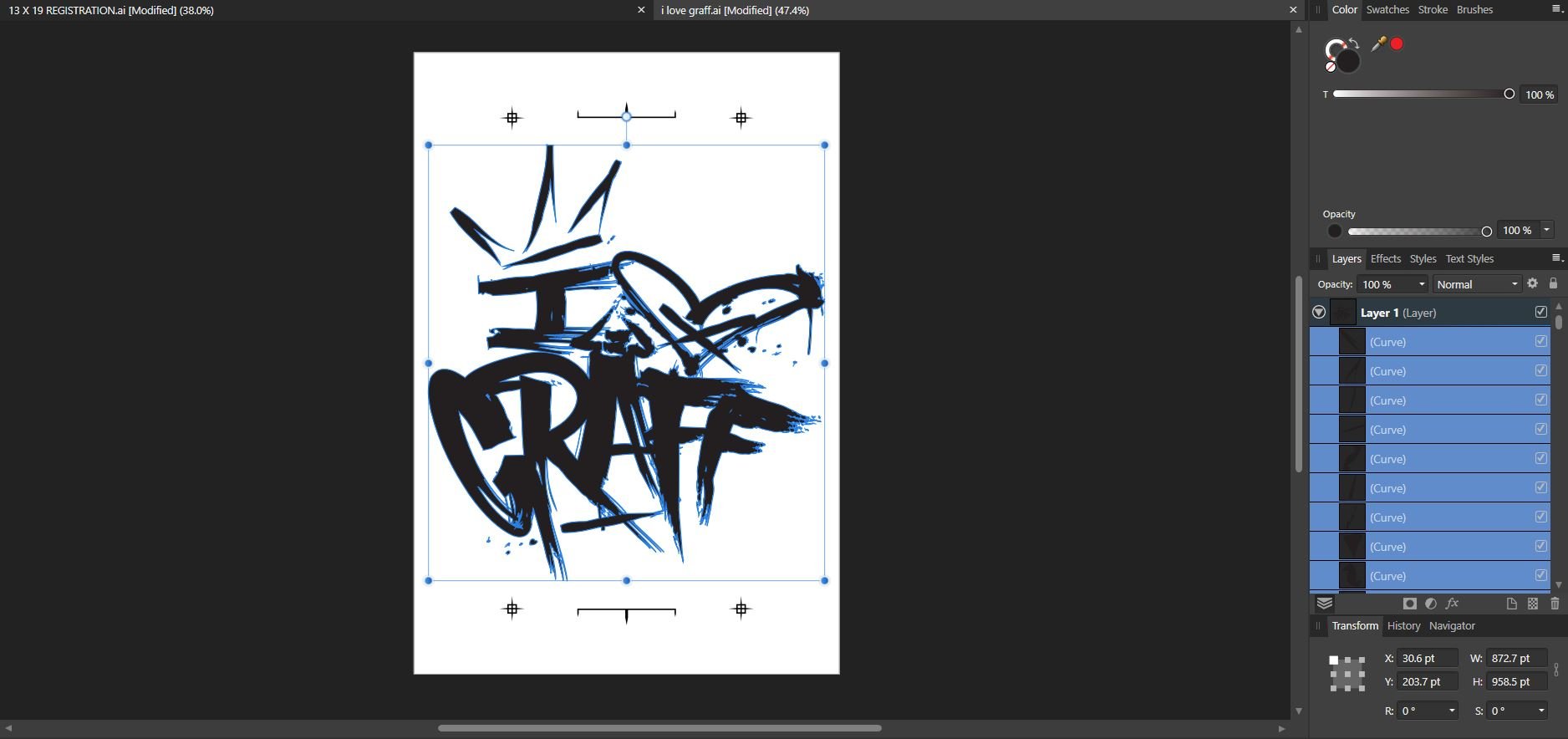
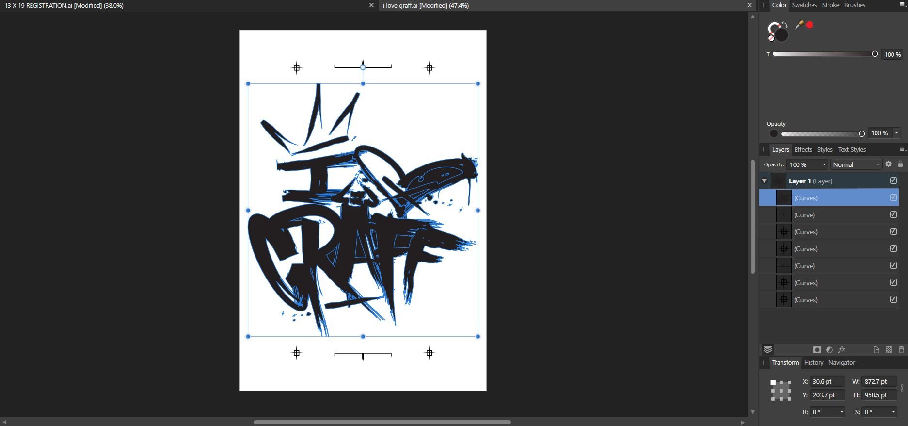
 Hi, I'm trying to fill a capital 'O' without filling in the middle of it. As seen in the attached screenshots. I found a post with the same issue, there they were told to select the individual curve layers rather than the group, and then change the fill mode in the layers menu to "Alternative (Even-Odd)". However, I tried this and it didn't seem to work. Is there something I'm doing wrong or something else that might work? Cheers
-
 Hey guys, I want to toggle between gray scale values up and down, eg in 5% increments or down without having to click on the swatches panel. It would allow for full screen painting/drawing while hiding the studio. Curious is anyone knows if this is possible. Thank you! Tobias
 -
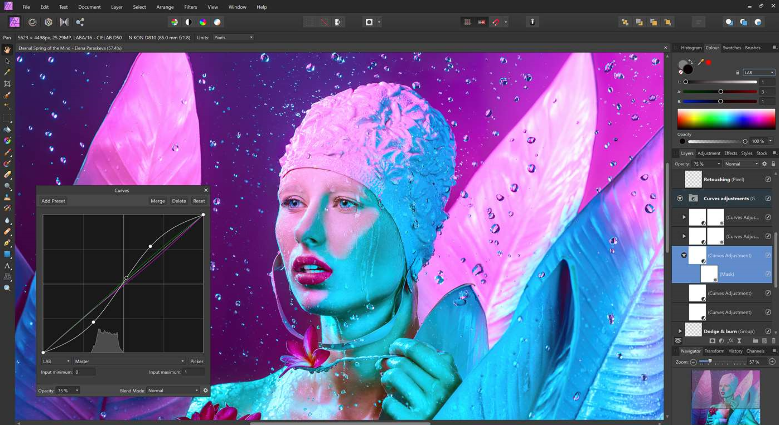
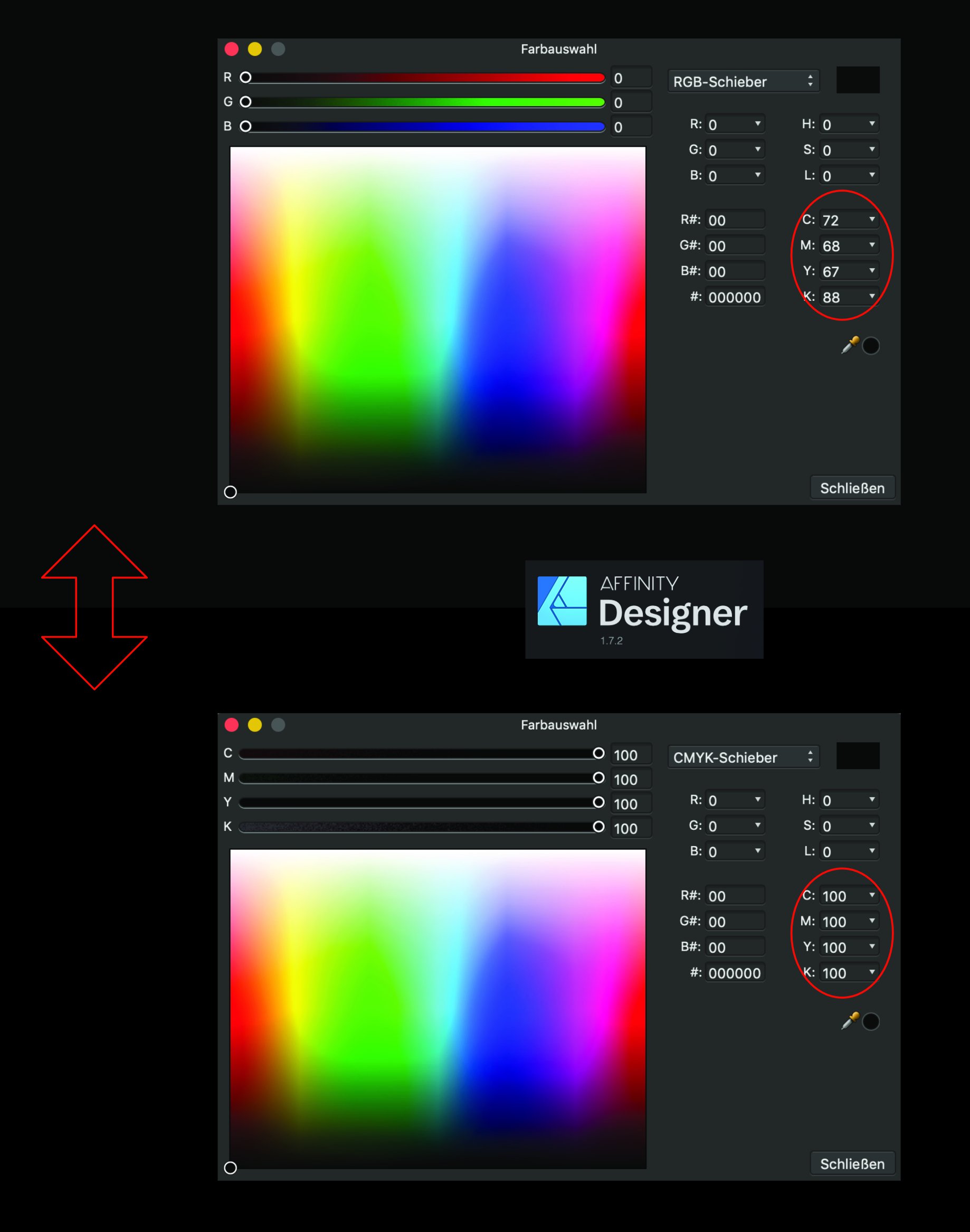
It would seem that a RGB value of (0,0,0) does not result as a CMYK value of (0,0,0,100) as it should, but as a (72,68,67,88) CMYK value. A (0, 0, 0, 100) CMYK value is converted to a (35, 31, 32) RGB value instead of (0, 0, 0) To test this, you can simply switch from RGB to CMYK color mode in the color panel on a black colored shape Is that really a bug in the conversion formula, or am I missing something ?
-
Farbauswahl.pdf
-
 So not sure how this is not done right in Affinity's programs. Global Swatches, are only in document, not available in application swatch palettes! I work in a high volume, fast paced shop, we have a number of what we would call basic or default colors we use in designing, and then tweak them from there. I have always been able to set up a swatch book in Indesign and use that swatch in all my work as a base. While Affinity has that feature as an application swatch, the colors once applied to items do not not retain any connection to the item as they should so color can be adjusted once for all items in the document that use that swatch, this is only available as a Global Color and will only work in a Document Palette, which I would have to rebuild every time. So while I really like Publisher in a lot of ways this is a really crimp on my movement away from Adobe, and is right up there with no step and repeat function (power duplicate is not the same thing) and not opening Indesign files (I know that is more difficult, but Quark can do it, so it is possible). I am also at a loss as how to get all my prints from printing so dark, no color management settings seem to change anything and all my photos come out extremely dark, but only when printed in Affinity Publisher, any other program prints perfectly.
 -
Is there any way to sync the color profiles between all the affinity apps? We have 20 seats in our office that need the color profiles prefs to be consistent throughout all the affinity apps. In Adobe Bridge we can set it up in bridge and all colors settings are set for all the adobe suite apps. Is there any way of doing this in the Affinity Suite of apps? Doing this makes the it easy for all the apps to be centrally controlled, maintained, and ensures the color profiles are consistent throughout the workflow. Setting them up individually makes room for something to be mismanaged or a setting being missed. This can be be catastrophic if somehow the wrong profile is used on one of our files when going to press. Is there a way to set up color prefs that transcends the other apps from affinity? Maybe I am overthinking this but, would someone tells me how this works when using studio link with different color settings?
-
 I just made up an ad (in Designer) for publishing in print, and my husband suggested that we need to see how it would look to a colorblind reader. It would be VERY helpful to have that in all the Affinity products! I do have ColorSchemer Studio, which does have the function of showing how your chosen colors would look to someone with different kinds of color vision problems. But I can't load my ad into it and see how the gradients would look, for instance. Maybe someone has such a program, and I'll go looking for one. But it would sure be great if I could check it within Affinity programs! Maybe you could find a developer who's doing this and pay him to incorporate his product into the global Affinity program.
 -
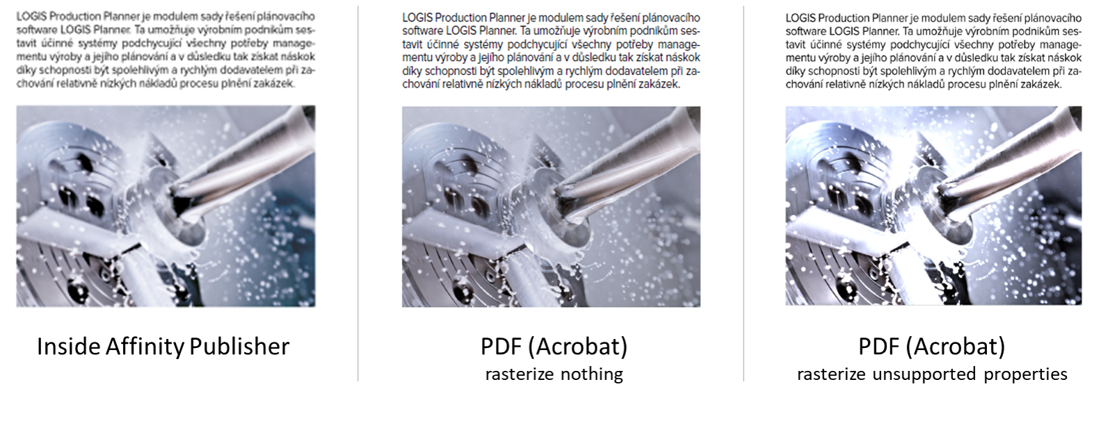
 I have a simple document in Publisher with some images placed inside. After placing them inside the Publisher document, I have edited the images using the Photo persona, just tweaking the levels a bit. The image looks correct inside Publisher, but looks bad in PDF - almost as if the edits I made in Photo persona were not applied at all. I am exporting to PDF with the "PDF (for print)" settings applied. I have also tried setting the Rasterise property from "Nothing" to "Unsupported properties", which does seem to apply the adjusted levels to the image, but in an overly-corrective way. Just to be sure: I am trying to have the PDF look as the thing I see in Publisher. Could anyone push me in the right direction, please? source_file.afpub
-
 I have an issue with the Add operation in comparison to Illustrator. As of now, I don't believe there is a feature that allows us to select by fill or color, this prohibits me from being able to select only the black infill and then add or merge them together as one shape. In Illustrator, I can select by fill color, select "unite" in the pathfnder window (which I believe is the equivialent to "add" in affinity) my design comes out perfect. With affinity, since there is no option to select on by fill color, I have to select everything, then select "add" which fills in portions of the object with solid black.
-
Tinkering during a slow work week. Inspired by the rain hammering against my office window.
-
 I have a Publisher file with color profile CMYK Coated FOGRA39 in which different Publisher and Designer files with the same color profile are embedded. In all of these documents I am using the same color palette and everything looks fine in the main publisher file. But when I export it as PDF same colors clearly have different shades, depending on wether an element was part of the main file or an embedded file. If I import the PDF into publisher again, all is fine again and same colors have the same CMYK values. But as I said, the PDF looks wrong on my screen. Any help is appreciated!
 -
Hi there.. I'm super new to designing and started using A.Publisher a few weeks ago. I've been designing a logo in RGB in Inkscape & using APUB to do all my file conversions especially for stuff I need in CMYK. I'm aware that CMYK colors will usually come out differently from RGB when it's sent to printers. Anway, I decided to just do a quick check on my colors and noticed that the CMYK values that's been generated by APUB don't match the RGB color's supposed CMYK color.. example. I have a color #134A84 which https://www.htmlcsscolor.com/hex/134A84 tells me should give me a CMYK value of 86/44/0/48 but in APUB, the CMYK value showing is 98/79/22/7 instead. When I plugged in the value of 86/44/0/48, I obviously got a different color and the RGB hex became #004B79. So I guess my question is, does APUB convert our RGB colors into CMYK to match what I actually see in RGB or is this a bug? This is a concern for me because I'm working on this for a client and want to make sure I deliver the right stuff. Thanks in advance!
-
 Affinity Photo for Desktop feature request: 1. Add a selection wand to select areas of related color when creating a mask, with +/- and antialias options. I use Corel Draw's "magic wand" to do this. I'd love to have this feature in APhoto.
 -
 Hello, I just started using some smoke brushes from the Affinity store. The brushes are black. How do I change the color of the brush, so that I can change it into white? Thanks
 -
 I made a document with black Typo in CMYK. Defined color like: 0/0/0100 and exportes as PDF X4. Opened for Preflight in Acrobat and black is shown: 86/85/79/100. What can i do that the color i define ist the same in the PDF? I tried all Options and there is always the same mistake
 -
Hello guys, I'm on the latest 1.7 version in Affinity Designer. I noticed that when i select a color by dragging inside the color picker box i end up getting 3 different CMYK values as shown in the screenshot below. I think this is a bug, unless i'm missing something. Can someone explain what's happening? Thank you. Edit: When i minimize the Program window and then maximize it, it shows the correct color in the large picker box, but it doesn't refresh in the color tab on the right until i select another object.
-
Hi there, as I'm likely keen on collecting fonts, I somewhat regularly look for awesome ones and stumbled over Color Fonts (https://www.colorfonts.wtf/) On the page, there is Affinity Designer listed as supporting svg-Color Fonts - which must be svg packed within otf, if I understood that right -, but anywhere else including this forums, I only found the whole Affinity Suite does not support this yet, but also found some users, that would appreciate having it supported. So am I, and as I didn't find a posting about, I opened this one - excuse me if this wasn't right. I'm using Photo and Publisher at the moment, but would also buy Designer, just to get Color Font-Support I don't really make a lot of publications, but everytime I do, having color fonts supported would be fantastic. Thanks, and so long, sistra
-
 Values in the color panel show as white (all other colors appear correctly), but not to my eyes. So I checked using another program and confirmed white in Designer is not. Just checked Photo and it has the same 'not white' issue. So I checked, of all things, Paint (Windows 10), and white appears correctly. I must have changed something for this to occur and obviously can't remember how to make it right; I need white, can someone help?
-
 Perhaps this is a user error, and not a bug, but it's driving me bonkers. Help! I have a 20-page publication for a client I handle every other month, and each month they like having a new color theme. I have always handled this by creating a global spot color, and then editing that color each month so that all colors change across the document. One edit, and everything updates! This seems to work fine with everything aside from Drop Cap styles. I want the Drop Cap to refer to the theme color. I have a special Drop Cap Character style that is linked (supposedly) to the global spot color. This Drop Cap Character style is referred to in a Paragraph Style, which I apply to the first paragraph of each article, with a Next Style of the regular non-Drop Cap text. EACH MONTH I go through the agony of having to open and edit the Drop Cap color. Otherwise, for whatever reason, when I apply the Paragraph Style, it pulls the OLD spot color from the previous issue, instead of the updated Spot Color. In fact, I have to open the Character Style, select another swatch, CLOSE the style, then OPEN IT AGAIN, and select the global spot color and close the style again for it to update correctly. Nothing else seems to work. I have paragraph rules that also refer to this spot color and update just fine. I have various graphic elements at various tints that refer to this spot color and update just fine. I even have tables that refer to this spot color and update just fine. It only seems to be Drop Cap that is affected. Please let me know if I'm doing something wrong, or if this is a bug. Thanks! (I am running the Publisher Beta 1.7.0.257, though this has been an issue for months and I simply haven't bothered to report it. I'm an a 2017 MacBook Pro running OS 10.14.3.)
 -
 Blend ranges are both easy and powerful. I would like to see a way to make the blend ranges a function of color (or hue). I have attached two different mockups. Option 1—the one with the curve like how blend ranges work now—would probably need (1) an option to pin the leftmost and rightmost points together to easily enforce periodicity of the curve, and (2) a way to shift what color is in the center. I used "color" in my mockups, but perhaps "hue" would have been a better choice.
-
Hi all, I recently updated to Affinity Photo 1.7.1.404 from 1.6.5.x through the Windows Store and now every image that I open, whether it's an *.afphoto, DNG, JPEG, PNG etc., opens way too dark. Documents created in previous versions are also rendered way too dark but are exported with the right colours and brightness, while new documents result in overly exposed images, more like as if the gamma went through the ceiling. The samples available in the Welcome screen also seem to not match the snapshots available on the Windows Store. From the same snapshots I also noticed that the icon for the Photo persona also seems darker. The "Color" panel also gets way too dark. My device: Windows Store snapshot: Software configurations: I tried running the trial version of Affinity Photo 1.6.5 (got it from the Downloads page) and the problem now seems to happen there as well My device is the Dell XPS 9570, running Windows 10 1903 with Intel UHD Graphics 630 (driver version 25.20.100). This issue also affects Affinity Designer but every other app on my system works just fine. Ideas?


.png.2bdd4bd5519e9306690d4e15e24c4e62.png)
.png.f87fd08908a77289a060b1aed7fb64c3.png)