Search the Community
Showing results for 'group text size'.
-
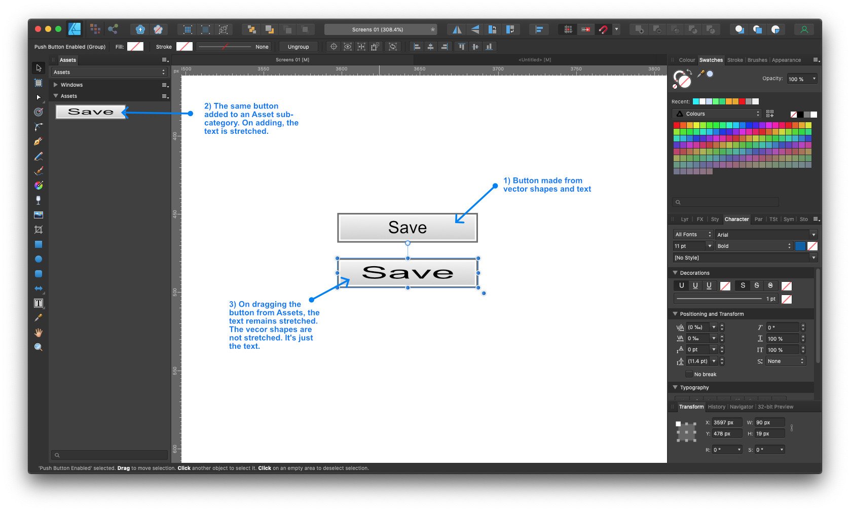
On adding assets made up from vector shapes and text to the Assets panel, any text in the asset gets stretched. Sometimes the stretch is small, sometimes it's large. This means the stored assets are of little use. Recording 2022-07-06 at 2.49.36 PM.mp4

-
 Hi. Thanks for abiding my dilettante ways. My Publisher skills are pretty spotty, and I was trying to pin a text frame to another text frame, but I can't. Seems like my document is only allowing pins of elements in groups of layers, which may well be default and sensible behavior. But I can't drag this element into the group in question AND if I duplicate an element in the group, it is duplicated above the group and...can't be dragged into the group. I can reorder the element anywhere else on the page. The document has no master pages, and none of the layers are locked. I have no doubt the answer is something very obvious, and I thank anyone who might give me any of their time or attention (or point me to where this issue is addressed).
 -
 Hello, If someone wants to have footnotes in two columns, with different margins than the main text area which could be single-column and have different margins, this is currently not possible at all. There is not even a way to instruct the footnotes to be displayed in another Text Frame. This feature request is to give the “footnotes area” the ability to have its own layout options, just like any other Text Frame. Define the number of columns, for example. Define the margins, etc. (So it is possible to have a text area with 1 inch margins, but a footnote area with 0.5 inch margin, for example. This gives nice design flexibility.) Kind regards.
 -
 Hi there, I've been using Affinity for a while now and while I've been able to overlook the odd crash here and there, it's now becoming almost unbearable to use publisher. Every time I move a text box across from one page to another the program straight up crashes. I've tried this within my normal document I've been working on, with 150+ pages, as well as a brand new, blank, document. I'm actually unable to upload, or see, any crash logs as no crash logs are created; it's simply a CTD with no error messages. Publisher works and doesn't crash at all when there's no documents loaded up, but as soon as any document is loaded up and I move a text box across from one page to another, it crashes. It doesn't matter what's in the text box either. It also crashes when I had been editing a text box on one page, then click on another text box on a different page. I really hope someone can help me as this is frustrating. I am willing to provide anything I can to help get this sorted.
 -

Adding Items to Assets Stretches Text
walt.farrell replied to Chris Heath's topic in V1 Bugs found on macOS
Sorry, but how do you know what the scaling was originally, and after inserting the asset? What was the font size, and what was the size of the text frame? Can you share the the document with the original text object that you made into an asset? -
I had this strange text anomaly on a PDF export for a job going off to print. on visual inspection of the file I found this. I went to the page in the document and placed the text on the top layer on that page and re-exported. The problems cleared up. Unfortunately, I overwrote the "problem file" always, check those files before sending them off!
-

Adding Items to Assets Stretches Text
LMLIN replied to Chris Heath's topic in V1 Bugs found on macOS
Sure, thank you. I created a new Category under Assets and added one text frame item. The horizontal scaling was 100% when I moved it into Assets. It was instantly transformed to 151% horizontal scaling, and when I move it out and onto my artboard, it appears stretched. I exported the new category (attached). Very curious to know if you see the same problem. Thanks so much. text frame asset with horizontal scaling problem.afassets -
 Win 11 / ADv2 I know I have done this a dozen times, but I can't remember how. I have a group of .png's in a file. I need to resize all of them. I know there is a way to select them all and resize them without manually bringing them all into AD one at a time, but I can't remember how. Anyone remember? Thanks.
 -

Publisher 2.4.2 Delay before using the zoom
anto replied to anto's topic in V2 Bugs found on Windows
Here is video and another bug. It is a vector object. At the 36th second, the object is hidden behind the text frame, but it is transparent. At second 50, I hid the text layer, but it disappeared only after zooming. The orange rectangles on the screen are the text decoration 2024-05-12 19-06-59.mp4 -
I just noticed that in the Notes panel, using 2.5.0.2437 on Windows, the text that specifies Document-wide or Custom is cut off on the bottom edge. (If it was reported before, I couldn't find it.)
- 1 reply
-
- 1
-

-
 If the main frame is 2+ columns and you want the footnotes in 1 column, you can do that. If the. main frame is 1 column and you want the footnotes in 2 columns, you can't do that. I agree that adding Columns and Gutter options for Bottom of Frame and Below Frame could be useful. I don't think they should be added for Below Text or Bottom of Column options. I'm having difficulty understanding the request for margins. Could you provide an example? You can indent the footnotes on the left and right separately from the main text by editing the footnote style and setting Paragraph > Spacing > Left and Right Indent. You can indent the footnotes from the main text on the top by setting Min Gap Before. There's no bottom option but that is easy to fake with a line break and setting the font size as required.
 -
 If you click and drag when placing an image, the DPI will increase or decrease depending on whether the placed size is smaller or larger than the original size. If you click without dragging, it should be placed at its native resolution; I say ‘should’ because I have a feeling that under certain conditions it may automatically shrink to fit. As far as I’m aware, the ‘Allow JPEG compression’ option should only affect the file size, not the image resolution.
 -
 Hi, new to APub. I am formatting my large (poss 300-400 page) textbook with many images. Have made assets of image templates in square and rectangular shapes, set sizes, with grouped text boxes. My images to input vary in dpi but mostly over 300 dpi. IF an image is at or >300 dpi… and if 1-set dpi at 300 in the APub original file setup, and 2-use place image button (brilliant, btw), 3-as long as image fills the image box and I use the sliders, 4-* can I safely assume the image is still at 300 DPI ?* THANK YOU, going round and round here. I have been manually resizing in Preview on my mac and think i may go (more) nuts. Is printing out a page the only way to see what it will look like or is there a digital way? (Seems likely not, but at least might see if they resize physically?) I am loving Affinity, just trying to get my head around it before i format much further! thank you all! xx Lizzi
 -
 Hello Everyone, New to the forum. Has anyone figured out a way to group/merge lines of text into a single text frame if you did not tick the box "Group Lines of Text Into Text Frame" option? Have looked through previous posts however not found a solution. Many thanks,
 -
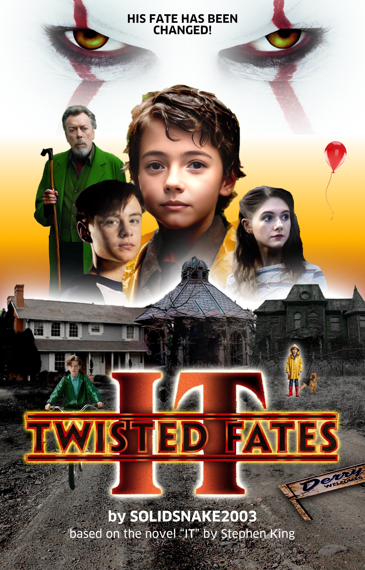
 🇬🇧 Hi, I have just looked at the 4 pages of your post and I find the idea very original (it gives me ideas for a future gift for my family), the progression of the different tracks and modifications made over time interesting. Good work. For fun, I took the liberty of producing another version with a few rules that I imposed on myself as I put together my edit (in very, very low quality, with images from your numerous posts and a few others on the web). First of all, the story and what I was able to interpret just by looking at your latest visual @SolidSnake2003, like any spectator in front of a movie poster: the threat is there, IT'S BACK!… Then, the claim: HIS DESTINY HAS BEEN CHANGED! But, whose destiny?... Is it the destiny of this little boy with such calm and gentle eyes?... Is he hiding a more dramatic destiny?... Is he promised later to... act as a clown?... I took IT out of the group of characters in the center of the poster so that it is not the same “value” as the others: it represents THE threat and therefore has a particular status. The character on the left seems to be different due to his age and his distance and I accentuated his singularity by saturating the green color of his costume: he will certainly have an influence on the story, perhaps an external force against IT?… The cyclist was also colored green: a future ally?… I reduced the color range of the set by removing all the blues and desaturated the background of the houses in order to have greater color unity. Compared to the known visuals of IT, white is often very present like the color of his skin on his face. So I put white as a halo above the houses (like a heavy threat), around the two letters of the title, at the top of the background and also around the little boy in the parka: does he have a linked destiny? to IT?… But, his dog is there for his protégé!… Finally, I tried to establish shot values in order to create depth and possibly help tell a story… Good reception, I hope this will give you some ideas… 🇫🇷 Bonjour, je viens de regarder les 4 pages de votre post et je trouve l'idée très originale (cela me donne des idées pour un prochain cadeau pour ma famille), la progression des différentes pistes et modifications apportées au fil du temps intéressantes. Beau travail. Pour le fun, je me suis permis de produire une autre version avec quelques règles que je me suis imposées au fur et à mesure de la constitution de mon montage (en très, très basse qualité, avec des images issues de vos nombreux posts et quelques autres sur le web). Tout d'abord, l'histoire et ce que j'ai pu interprété juste en regardant votre dernier visuel @SolidSnake2003, comme n'importe quel spectateur devant une affiche de cinéma : la menace est là, ÇA est de retour !… Ensuite, le claim : SON DESTIN A ÉTÉ MODIFIÉ ! Mais, le destin de qui ?… Est-ce le destion de ce petit garçon au regard si calme et si doux ?… Cache-t-il un destin plus dramatique ?… Est-il promis plus tard à… faire le clown ?… J'ai sorti ÇA du groupe de personnage du centre de l'affiche afin qu'il n'est pas la même “valeur” que les autres : il représente LA menace et a donc un statut particulier. Le personnage à gauche semble être différent de par son âge et sa distance et j'ai accentué sa singularité en saturant la couleur verte de son costume : il aura très certainement de l'influence sur l'histoire, peut-être une force extérieur contre ÇA ?… Le cycliste a aussi été coloré en vert : un futur allié ?… J'ai réduit la gamme colorée de l'ensemble en écartant tous les bleus et désaturé l'arrière-plan des maisons afin d'avoir une plus grande unité de couleur. Par rapport aux visuels connus de ÇA, le blanc est souvent très présent comme la couleur de sa peau sur son visage. J'ai donc mis du blanc en halo au-dessus des maisons (comme une menace pesante), autour des deux lettres du titre, en partie haute du fond et aussi autour du petit garçon en parka : a-t-il un destin lié à ÇA ?… Mais, son chien est là pour le protégé !… Enfin, j'ai essayé d'établir des valeurs de plan afin de créer de la profondeur et éventuellement aider à raconter une histoire… Bonne réception, j'espère que cela vous donnera des idées…
-
 I want to create an asset group of electrical and pneumatic symbols to use in my design work. These symbols exist already from various sources and allthough they can be imported they remain in the original format ? They are simple to make, but time consuming. The output of my work is training documents or specification documents.
 -
 Serif team, For God's sake, please make it possible to link (vs embed) text documents. The Affinity Publisher team seems disinterested in supporting document collaboration. Affinity Publisher is not a reasonable choice in most corporate environments, since reports, user guides and similar documentation requires multiple contributors, necessitating some form of collaborative capability. As a technical writer I have worked in multiple corporate environments, currently for the US Government. In each environment I advocate using Affinity Publisher ─ since the alternative is Microsoft Word 😒. While exploring the feasibility of using Affinity Publisher for the Government I ran into the same issue ─ the only major issue, no collaboration capability. Affinity Publisher is mature enough for collaboration to be a high priority. The following is a Serif Affinity sponsored video explaining linked and embedded resources in Affinity Publisher. At 30 seconds it explains: "an advantage of using linked resources is you can utilize collaborative workflows. It allows colleges and other users to make changes to the image files separately": https://www.youtube.com/watch?v=v5YIUkksr4Q With publications, collaboration needs are primarily for text, not images. Please make Linking and Embedding work with text documents!!! In June 2022 I offered the following suggestion, which is more comprehensive and complex to implement, but would also satisfy this need and may further distinguish Serif Affinity as an innovator.
- 20 replies
-
- 1
-
-
- resource manager
- linking text
- (and 2 more)
-
 Is it possible or not yet? I mean copy text attributes onto another text frame?
 -
 Usually the best way is to think about such things before you start creating an image. I would at least keep a backup of your actual version, before you start turning it inside out completely. If you look at the "Stranger Things"-poster, there is a background coloured in red on the left and blue on the right side. And the whole scene is gathered by a black vignette. That could be a solution for your design too. If you don't like the blue/red-scheme, test out if the vignette works without it. For my taste Pennywise looks too much like a sidekick on your poster. He is the character the whole story is based on. He and the "Club of loosers" on the other side. I don't remember who the guy on the left is - the one with the walking cane. Is he important? I could imagine Pennywise's face big, looking evil in the background, and the other figures smaller standing in front of him. The vignette also gives a good background contrast to the text elements.
 -
Publisher 2.4.2 has performance issues. 1. I selected an object and deleted it. It remained on the page. 2. I hid a text frame in the Layers panel, but it remains on the page. 3. I dragged the frame with the image. The outline of the frame moved, but everything else remained in place. These artifacts happen until you scale the page.
-
 Yeah, I'm making this a new post because searching through the manymany threads that already exist on it has been a huge waste of time. Problem: Text frames in Affinity Designer inexplicably have a white background. No matter what the fill color or outline color of the text is, pasting, pasting without formatting, retyping text doesn't help. Every new text frame ALWAYS has a white background. There's no way to change it in the character studio and Designer doesn't have a text frame studio Solution: open a new blank document, go back to the original, delete all of your text layers, copy the remaining layers and art boards, go to the new document. paste them into the new document. Re-create all of your text boxes. Why it happens: for me it was an issue caused by opening a template my printer needs me to use. Apparently the document was setup to have white backgrounds in text boxes and since Designer shows the background frame color but has no way to get rid of it, all of my text boxes had white backgrounds. Other solution if you only have a couple text boxes: Create a new shape layer, set the background to transparent, convert it to a text frame then paste the text repeat for every single text box I've found thread after thread about this issue here, on Reddit and elsewhere going back to 2019. Hey, Serif. It's been 3 years! just quit showing text frame background color at all if you aren't going to give us any option to control it.
 -
Adding Items to Assets Stretches Text
LMLIN replied to Chris Heath's topic in V1 Bugs found on macOS
Was this ever resolved? I am having the same problem with Affinity Designer 2.4.2, two years later. I am using a text frame with the horizontal scale set to 100% when I add it to Assets. When I pull it out of Assets and place it on my artboard, the horizontal scale is 151%. -
I hadn't used Style Picker much until somebody asked about it today so I gave it a good workout and found a few issues with it and its help page: https://affinity.help/publisher2/English.lproj/index.html?page=pages/Tools/tools_stylePicker.html?title=Style Picker Tool I apologize for including some general feedback with these bugs but I thought it might be easier to review it all together. Mouse Pointers: the help page doesn't describe the pointers. Perhaps something like this could be added? Unloaded - you have not yet picked up any styles or you have cleared the previously loaded styles Loaded - you have picked up styles and the pointer is over a blank part of the page or an object that cannot contain text Loaded - you have picked up styles and the pointer is over an object that can contain text, such as a text frame, artistic text, or table I'm unsure why the T is shown in the pointer because it seems to have no impact on what will be applied. I thought it might be a cue to indicate it was applying styles to text and not to the frame or table but that doesn't seem to be the case. There is no P when it's over a picture frame. Selected Objects or Text shortcut: When the Style Picker is selected, any objects that were selected are not shown as selected but picking up styles will immediately apply the styles to those objects. You can't deselect the objects so if you accidentally leave the target object selected you have to Undo, choose Move, deselect, and choose Style Picker again. If a text frame was selected this shortcut applies the styles immediately to the entire frame as if Cmd was held down, you can't opt out of that. Help doesn't describe what happens for a picture frame with this shortcut but you get different results if a picture frame is selected versus the picture layer itself so it might warrant documenting. This shortcut works better for selected text – if text is selected before choosing the Style Picker tool it will still be shown as selected when you switch tools so it's less confusing. But if I've selected a text range, switch to Style Picker, and then click a different word in the same frame, it doesn't apply the styles picked up from that word to the selected text. This shortcut works only for text when the source and target are in different frames which seems like a bug. Also, Publisher's nice feature that remembers what text was selected in a frame even if you switch to the Move tool confuses this shortcut. Put the text cursor in a word or select a text range, switch to the Move tool, and then switch to the Style Picker tool. Loading styles will apply them to the word that the cursor had been in or the text range even though a frame was previously selected with the Move tool. In fact, if you selected a text range it will show that as selected even though the frame was the last thing selected. You have to switch back to the Move tool, deselect the frame, select it again, and switch back to the Style Picker tool for loading styles to immediately apply to the selected frame. I think it would be much simpler just not to automatically apply picked up styles to selected text and objects. Context Bar tool settings: It might be helpful if the help page stated that it doesn't matter which settings are set when you pick up the styles. Help does state these settings control what is applied but at first I assumed the settings also mattered when picking up styles so I perhaps a more explicit explanation could avoid confusion. Stroke and Fill: Since text stroke and text fill are character attributes and are applied when Character Settings is chosen I expected the Stroke and Fill settings to be for object stroke and fill and apply to the text frame. Applying styles with these settings just applies text stroke and fill to the text. If I hold down Cmd when applying it will apply the stroke and fill to the text frame but it also applies the text stroke and text fill. As far as I can determine, there is no way to apply the text frame's stroke and fill separately from the character's stroke and fill. Object Settings: I thought that Object Settings would let me apply just the frame's stroke and fill, especially since Help states that it will apply "text frame settings". Applying styles to a text frame with this setting applies nothing unless you hold down Cmd and when you do it applies everything in the Text Frame panel except for: Text Frame > General: Fill, Stroke, and Ignore Baseline Grid Text Frame > Independent Baseline Grid and its related settings This feels like a bug but perhaps there's a reason for it. Tables: I don't think there is a way to apply stroke and fill to a table cell separately from the table because you can't choose a cell when applying, just a word, text range, or the table as a whole. Maybe another modifier could be added for this? If Cmd means apply to whole object perhaps Cmd+Shift could mean apply to a cell within an object? Switching Tools: I expected to have no loaded styles when I switched to the Style Picker but it always remembered what I'd last loaded, even if it was an hour ago. While it's great that it doesn't unload when applying like MS Word does, perhaps it could unload automatically when switching tools? Or perhaps a setting for this and MS Word-like behaviour? Switching Documents: You can't apply styles between documents. Since this works like copy/paste I assumed I'd be able to pick up styles in one document and paste them into another. Text vs. Object Stroke and Fill: This is probably the root of the stroke and fill issues I mentioned above and I realize it's as designed, but it's confusing. Here's a screen recording for this test file in which I pick up the styles from the upper text frame and then apply the styles to the text frame, picture frame, and shape below it. I think most people would expect that all three objects would have thick red strokes and light blue fills but instead the green text stroke and yellow text fill is applied to the object stroke and fill. test3.afpub Screen Recording 2023-06-14 at 2.04.04 PM.mov
-
 I don’t think there’s a better approach for pinning. I would recommend avoiding pinning in a resume and using a 1-column layout with no groups. If multiple text frames must be used, make sure they are ordered from bottom to top in the Layers Panel. Many companies use Applicant Tracking System (ATS) to review resumes. It’s my understanding that a simple resume structure is recommended to ensure ATS software can accurately read the resume. To check your resume for issues, it’s a good idea to copy/past the resume content from the final PDF file (that was exported from APub) into a plain text file. If content is out of order, missing, or displays as symbols instead of readable text, there are structural or font issues that need to be addressed. This LinkedIn article provides recommendations about resume formatting… see section: Step 2: Format your resume in an ATS-friendly manner https://premium.linkedin.com/content/premium/global/en_us/index/jobsearch/articles/the-easy-how-to-guide-for-formatting-resumes-for-applicant-tracking-systems
 -
Thanks so much for the reply, Callum I've attached a screenshot of the file here. It's a resume, so I've put the personal info behind some solid squares that also show the major text frames. The thing I'm trying to move is the selected text frame. It's currently pinned to the "Experience" frame above, as you can see. I'm trying to pin it to the green-colored frame. That frame is the frame that shows as "Science Department" in the Layers panel (which has other, similar elements pinned). But I can't physically move the pin to that panel, or drag the layer to the group. And if I duplicate any of the elements that are pinned to the green panel, they wind up unpinned, ungrouped, and not able to be pinned to that panel. I hope I'm making sense. Happy to add more as might be needed. Thanks again for your time!