CartoonMike
-
Posts
453 -
Joined
Everything posted by CartoonMike
-
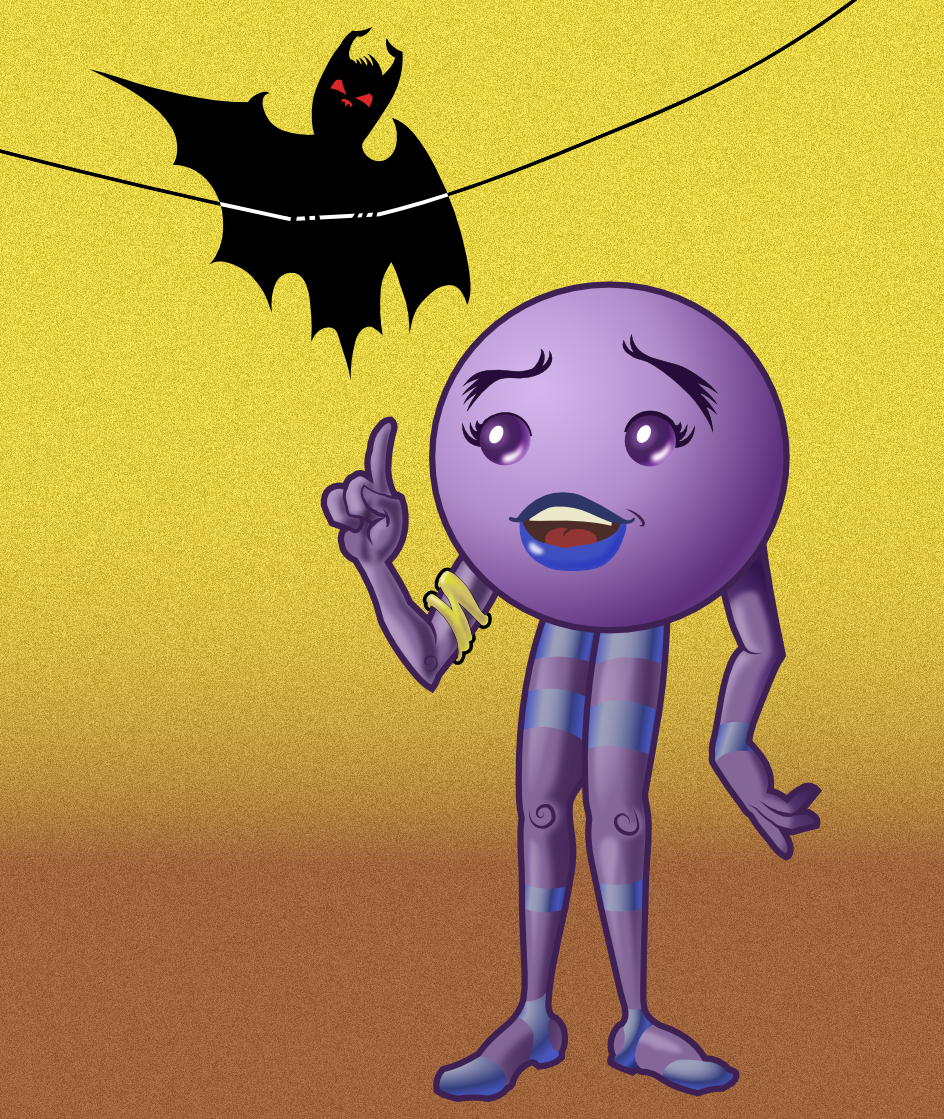
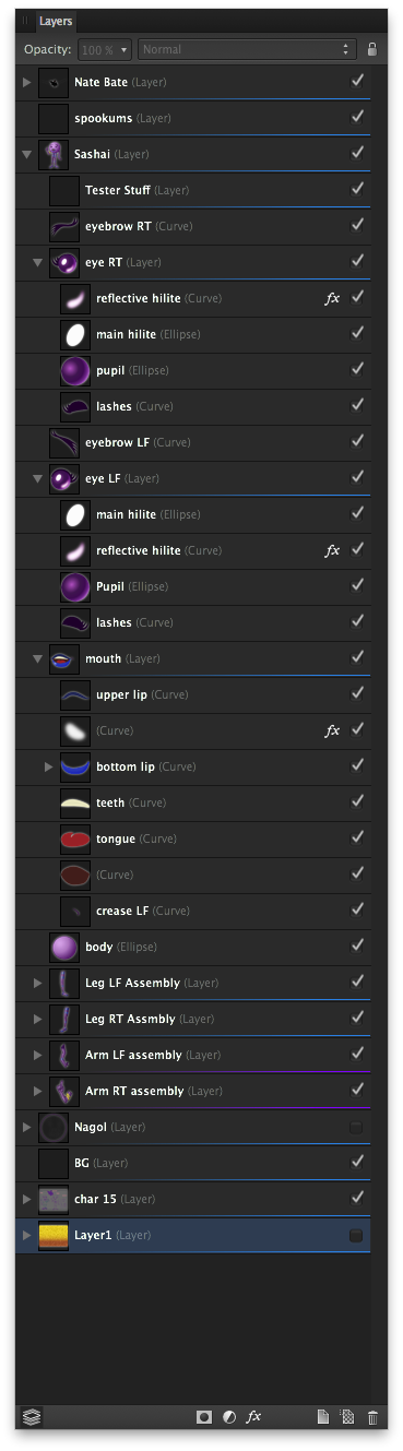
Hi all! Thought I'd share a work in progress. This is one character sheet for a possible webcomic, Glorious Junk. The purple character is Sashai and the bat is still looking for a good name (suggestions welcomed!). Basically this was a test to get a good feel for using Affinity Designer. As far as testing goes, I'd call it a major win. The best thing that I finally got was that Layers are storage for curves and objects. The Layer_org.png is a screen cap of Sashai's layer structure. I made extensive use of the masking abilities that curve objects offer: the legs, arms and head all use them. All shading (except for the gold yellow arm band) is from closed filled curves with gaussian blur FX and I used the Transparency Tool a lot (way cool tool, btw). I'm not too happy with the shading on the arm with the gold band, but that's why this is a WIP. :) For the interior curves (the detail on the hands and the spirals for the knees and elbow were done by just making a curve and then selecting the curve with the Node tool and adjusting the pressure profile. It took a bit of playing around with to get a good handle on how best to use it, but once learned -- it's a really wonderful feature to add some life to curves. When the pressure sensitivity of tablets are working better (in the next beta for AD if what I've read is correct), then it should be just awesome to use in order to really fine-tune line thickness. The Move and Node tools are better than any other equivalent tool in other vector apps. Only minor gripe, is that when a node is smooth the indicator changes from a square (for corner node) to a circle. The fill color for the indicator is the color for the layer (right click on the layer's name and in the contextual menu is where layer colors can be selected). In some instances when there's a lot of nodes, the I clicked on the "wing" of the node and accidentally created a new node when I thought I was clicking on a node. If the node "wings" (the actual name escapes me at the moment) indicators could be filled with a lighter tint of the layer color it would be easier to see which is which. I like how when clicking on the handles, when the handle indicator turns red, it's aligned with the opposite handle and if I let go of the cursor then, the node is now a smooth one, if I continue moving it remains a corner node. Absolutely brilliant usability feature that took no time at all to appreciate and take advantage of! One thing that has stopped me from doing a lot of art in vector apps was the struggle between what I wanted to do and what the interface allowed me to do. In Affinity Designer it's like the interface makes it easier and quicker to do the art I want to do, in the way I want to do it. Sure there's this and that thing I wish AD could do, but for a first release version, it's the most stable (have yet to crash on me!) and easy to figure out app I've had the pleasure to use. To go all Spinal Tap, I'd give this app 6 out of 5 stars!

- 12 replies
-
- 3
-

-
- cartoon
- character design
- (and 1 more)
-
+1 just brainstorming here: In the layer Effects floating palette, if there were 2 panes, the left would have the list of FX and the right side would be blank. Maybe have some temporary text saying "Drag and drop an Effect on this area." Once an effect is dragged, it's opened for adjustments. There's an disclosure triangle, so the effect could be reduced down to just it's name, the visibility checkbox (like in layers) and opacity/strength slider. The individual FX entries could be dragged up or down (like layers) so some kind of hierarchy could be established for the effects. Perhaps something like applying a Gradient for the effect (like the transparency tool) could have a Blur FX as a child, so the black areas of the gradient would blur the layer and the white parts wouldn't be blurred (IOW the gradient would act as an Effects mask). For the "attached" palettes, there could be an "Add Effect" button that displays the list of FX that can be chosen, once one is chosen, it'll appear in the panel (where the list of FX are currently).
-
That'll be great! A toggle shortcut would be very helpful in a lot of ways. +1
-

Brushes
CartoonMike replied to Rik's topic in Pre-V2 Archive of Affinity on Desktop Questions (macOS and Windows)
In the brush panel (from the screen cap from #3), click on the "properties" button and make sure that size variance is set at 100. I was able to get something that resembles the line in that image by setting the SV to less than 80% (or so), iow: worked for me. -
Or a separate floating palette, like a Reference Image palette. It would display image(s) or a folder of images. There could be a next/previous navigation, zoom and panning controls in it. It would work just like a floating palette, be able to be resized or collapsed like the others. It could work like the media browser -- drag and drop images or folders on it.. Manga Studio has a feature like this named "Sub View Palette" (gotta love the sublime surreal naming of things in Manga Studio!). It's a great feature that allows me to load up reference images, so my characters stay "on model." It's implemented in MS as a app-wide thing, the images that are loaded up (have to load up images one at a time) and will remain the same until deleted in the viewer for all new documents. If it was document-specific, different documents having their own images in the reference image palette, it would be so much more useful.
-
Learn Affinity Designer by example
CartoonMike replied to dalacv's topic in Tutorials (Staff and Customer Created Tutorials)
Thanks! -
Tutorial videos.
CartoonMike replied to kat's topic in Tutorials (Staff and Customer Created Tutorials)
@Jobalou -- very good tutorial. It moved just quick enough without being too fast with the menu/FX options. Thanks for doing this. -
Stroke Width
CartoonMike replied to nametag's topic in Feedback for the Affinity V2 Suite of Products
Anime Studio (a vector-based animation app) has a stroke width tool, this operates on each point, you move the cursor/mouse to the right to thicken and left to thin. I like it better than the width scribe demo I tried out. -
The Opacity/Noise toggle is described in the Help files, under the Colour palette description. The help files are the best I've read, better than some manuals too. The writer(s) did a very good job on them. Very appreciated.
-
Slightly shorter delay for tool tips
CartoonMike replied to Dale's topic in Older Feedback & Suggestion Posts
In some apps, the preferences have a setting for tool tip delay. Some have micro seconds others have "short, medium and long" This way it's a set it and forget it kind of setting. As it is now, the delay is just fine for me. -
Hey Peter, Sometimes the best art comes from going outside your comfort zone. That's where Gracie came from: wanted to do cute and sexy in a form that shouldn't be cute and sexy. :) Good luck on your new tablet! Have fun, AD is the app I wished I had when I first started working with vectors years ago.
-
I'd rather wait for a great tool, than get a wonky one now. :D
-
affinity designer Project Cuba - Jacqueline
CartoonMike replied to luispedrofonseca's topic in Share your work
Great 'toons! Not chibi or a minion-esque style. Really unique. Yeah, I'm liking them. A lot. -
[ADe] Keyboard shortcuts wishlist
CartoonMike replied to boudewijndanser's topic in Older Feedback & Suggestion Posts
Being able to set shortcuts for all (or most) menu commands would be great. This would allow me to use my shuttlePro more effectively. -
Or you could end up with a method like in Anime Studio, where fills are disconnected (in a way) from the stroke that defines them. Thinking outside the fill bucket, what if there was a create filled area tool, you click on that and it creates a closed curve that is based on the line(s). Let's say we use 4 lines and create a square. The lines look like a pound sign: #. The filled area tool is clicked in the square in the middle and duplicates the lines up to the area where two lines cross, then it goes on and dupes that line until that line crosses another. Of course, it would check first to see if the lines describe a "closed shape" and then proceed. It would create, in an element below the lines a filled shape that would look like a filled area, but be it's own shape. Since what's created is an "ordinary" shape/closed curve, we can still do anything with it that we could do to any other vector object.
-
„Unlock all“ Command
CartoonMike replied to olafwelling's topic in Older Feedback & Suggestion Posts
For my workflow, being able to lock layers is essential because they are the first order of organization. Then I have layers within that have either groups or elements inside. If layers couldn't be locked, I'd be spending more time digging though things and locking up dozens of things. What would be handy is some kind of Toggle or inverse option that would lock what's not locked and lock the unlocked things. This could have an setting to either lock only layers or groups or all elements. A lock selected option would be good, especially if there was a checkbox or button that would Unlock others, so that basically everything would unlock and then lock only those elements/groups/layers that are currently selected. -
Why not just add the noise slider to the colour palette (the one next to the swatch palette -- or are those "pages" on your side of the pond?). And in the palette/page menu there could be a menu item for "Advanced Options" so that when/if other things are added, like grain/noise size, etc it'll be shown/hidden according to the desires of the user. The noise setting would be the same as the one in the colour drop-down in the tool settings area, i.e. linked with, so a change on one would change the other.
-
PNG Export?
CartoonMike replied to Volerikan's topic in Pre-V2 Archive of Affinity on Desktop Questions (macOS and Windows)
PNG is one of the formats Affinity designer can export. It's hooked into the Export Persona. That's where the slicing tools and such are. Check out either the Online help or their YouTube or Vimeo channel for video tutorials on slicing. It's pretty slickly implemented in AD, imho. Demo version is on its way. It'll be at least a month or so. Welcome to the forum! -
:) thanks!
-
Title sums it up pretty well. I know from reading the posts in this here forum that a Links palette/panel/page/whatcamacallit is on the Roadmap. My question is once an image is placed, in AD v 1.1, there is no linkage to the actual file that was placed. IOW, when an image file is placed in AD 1.1, what is seen in the layers palette is a copy of the file and there's no link to it at all. I ask because I have about a dozen files that each have a placed TIFF file of character sketches that I'd like to use AD to ink using AD's vector tools. I jumped the gun on this a bit as the sketches I placed weren't finished. Now there's a number of refined sketches that I've re-exported to the folder where the original exports were. I kept the file names the same. When I open the files in AD, they still have the previous images. They don't update. Is it correct to assume that this is the way the release version works and that updating placed files will be in a future release. Or am I missing something nested within the interface that allows me to update/refresh placed images? Fortunately the placed images are within a layer and only the layer has effects added and opacity changed, so it'll be a simple matter to place the new image within the layer and delete the previous one. Again and again. :O Have to admit that for a first version, AD is very robust and only a few bumps so far -- have not been showstoppers, just speed bumps.
-
I've seen fire and I've seen rain... oops, wrong metaphor... Some apps I've used would display the file name in italics if it was modified/changed. Others would add a bullet (opt-8: •) as a prefix sometimes as a suffix. A few apps (like Manga Studio off hand that was ported over from Windowsland) use an asterisk. Since I'm working on multiple files, the (Modified) always gets truncated to a (M). Me being the visual person that I am, can suss out what an asterisk or bullet means a bit faster than an (M) or (Modified). Leftbrain, rightbrain stuff, don'tcha know. (gotta watch Fargo again!) But if (M)/(Modify) is way AD will mark dirty files (Get your bytes off me you damn dirty file!) then I'll roll with it. Like I said, it's a small thing compared to the grand goodness of Affinity Designer. At least AD doesn't "grey" out the file icon (yeah, I'm looking at you Sketchbook). :D
-
Thanks for the clarification, Jens.
-
This is a small UI thing, but I'm so accustomed to seeing a file with unsaved changes (Dirty) marked with an asterisk (*) that the "(M)" used in the title of the tab/window threw me for a moment. Is there a reason why Dirty files (I just like typing that for some reason :P ) are marked like that instead of the "*"? While I like a lot of the new ways of doing the same old, same old that AD has, usually the changes make sense (or will make more sense as we traverse the Roadmap) this just doesn't make sense to me.
-
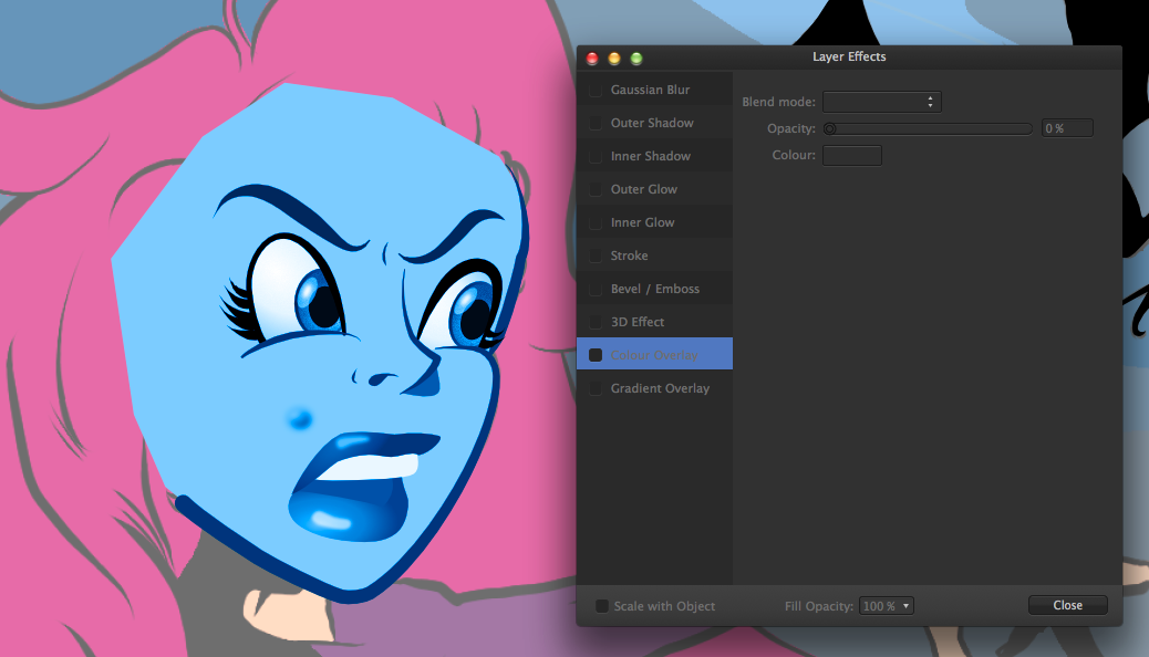
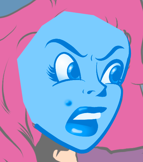
That's one of the settings I tried. Still doesn't affect black strokes and fills. In the attached image, the eyelashes and lines for the eyelid are black and the pupils are a black fill. The Eyebrows are a very dark purple. The other stroke colors are browns and lighter colors. The other image (layer-color-fx-MS.png) is the same face (lines are black and fills are various colors) with the layer color effect added, just for comparison. With the FX still active, I tried some of the adjustment options and when I tried the Curves option, I got something that's close by using the setting in Curves.png. Until actions/scripting is added, I'll carry on without attempting to use these options for a "layer tinting". It's too many steps and interrupts my workflow. I appreciate your help and it did get me to find a solution. Of sorts. :) Still feel that a one-option/ button feature that does this would be great to have in AD, in any case. EDIT: Added a screen cap of the face with the Colour Overlay FX and Curves Adjustment added.