
.jpeg.1b727463d44a0d52bc3499597e28d11c.jpeg)
James Ritson
-
Posts
855 -
Joined
-
Last visited
Posts posted by James Ritson
-
-
Interestingly, it looks like the default option for you is not to apply the tone curve - it is usually the other way round whereby the tone curve is applied by default.
Not applying the tone curve would achieve the washed-out look you have described: raw files use a linear tone curve, whereas processed jpegs have a logarithmic curve, which is perceptually more pleasing for us to look at. Therefore we typically add a tone curve to the raw image to make it easier for us to view.
If you were to load the raw file into another program that lets you define/disable the tone curve, you would see a similar result (FastRawViewer from LibRaw enables you to do this).
There's actually a tutorial video called Maximising Raw Latitude that explores removing the tone curve, so rest assured all the detail and latitude you would want is still retained even if the image looks washed out. It's actually a great way of starting with the "flattest" image possible and having more control over how it looks tonally. The first thing I do whenever I load a raw file into Photo is disable the tone curve and bring the highlights down; this gives me more flexibility to carve out the look I want using adjustment layers and retouching tools.
Also, could I ask why you're determined to change the DPI of your images? Only because I suspect you may be creating more work for yourself than is necessary!
Thanks,
James
-
Hey again, I was intrigued to see the difference so I downloaded the Olympus Raw Viewer software and opened some E-M1 files, but I'm not seeing a huge difference. I've attached one comparison so you can see how they compare. I use the Natural picture mode as well.
Is it a consistent difference with all your images, or are there certain types of shots that look muddier and darker? It would be interesting to see the results you're getting as I can't reproduce them here.
Thanks,
James

-
Hi dotlyc,
I shoot with an E-M1 and I can't say I've noticed a quality issue. Do bear in mind that the Olympus viewer will probably mimic the picture mode settings that you shot with, whereas most RAW converters will not. It might be worth checking that your picture settings are not influencing how you expose your images, as it could be throwing the brightness/contrast off.
Regarding DPI, if you simply change the value without resampling then you are not physically altering the image, so no worries there. Try not to get too hung up on DPI, changing it in camera will not influence the resolution, it's more for printing purposes. Your RAW files are going to be 16 megapixels regardless of the DPI setting. You would probably find that a JPEG from the camera will store the DPI value you have set.
Hope that helps!
[Edit] Just to clarify further - the DPI value does not affect the decoded resolution of your RAW files. You will find different RAW converters use various DPI values by default (for example 240, or in Photo's case, 96). What you should be concerned with are the pixel dimensions, which can be found in the top left of the Develop persona when you load a RAW file into Photo (near the Develop and Cancel buttons).
-
Hi Wayne,
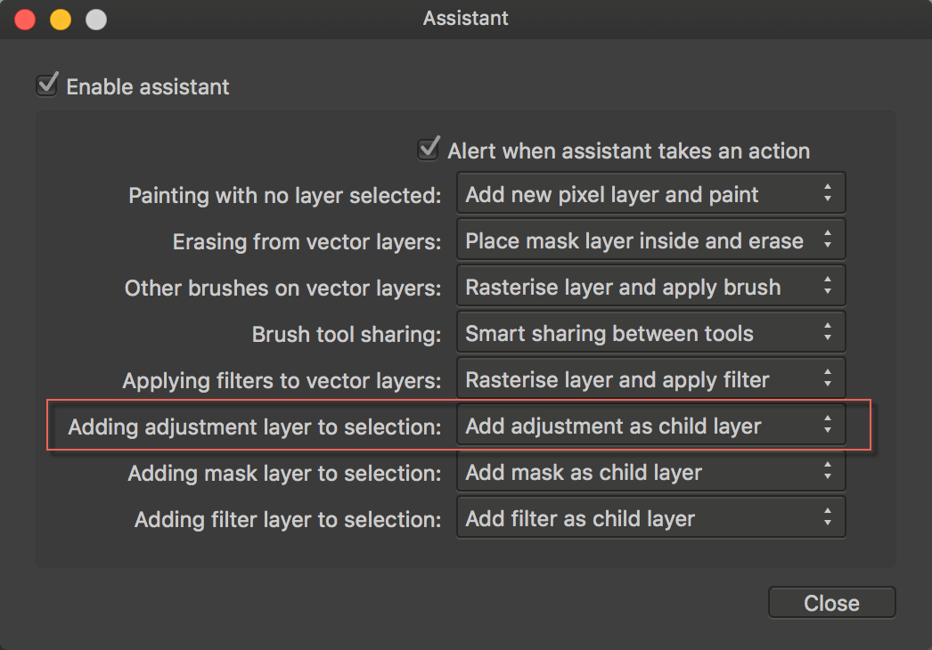
I think the closest you'll get to completely destructive is to add your adjustment (eg your CMD+U) above the layer you want to effect, then click the Merge button on the adjustment's dialog box. That will merge the effect down into the layer beneath it.
Although MBd's suggestion of choosing to have new adjustments nested as child layers means you'll get your desired result instantly and stay non-destructive!
[Edit] Here's the assistant dialog option:
-
Hi Digbydo, as Dale said, the videos will give you the tools to be able to achieve this, but there is a video that I think would suit your needs very well: Enhancing Landscapes/Architecture
It's a straightforward approach using a couple of brush tools to both brighten areas and bring out their colour - sounds like that would work for you?
-
[Edit] Beaten! You're too quick MEB! :)
Hi, have you seen the in-house tutorials topic in the Tutorials forum? https://forum.affinity.serif.com/index.php?/topic/10119-in-house-affinity-photo-video-tutorials/
There are a couple of categories that would cover what you're after. Transforming contains videos on image resizing, cropping and straightening. There is no topic that outright covers deleting sections of an image as the tutorials use a non-destructive approach, but the Selections and Masking category will show you how to make selections and use layer masks to show and hide content.
Deleting sections of an image would just be a case of making a selection (see the videos to find out how) and pressing the delete key, or using the eraser brush.
Hope that helps!
-
Thanks for this. It helps. But you mention, for example, layers. In Photoshop you click Ctrl+J to duplicate a layer and it is easy to see and manipulate layers and their masks. I've no idea how to do that in Affinity. The "Layers" tutorial assumes that you already have a set of layers to work on. Not helpful.
I'm really floundering without a simple set of "how to"s.
There seems to be no more logic behind the current sequence of videos than there is in my attic. It starts with Maximum Stacking, followed by Global Cloning, then Subtle Toning and Multiple Colour Formats, and continues with Panoramas and Stacking: Noise Reduction. This is such a jumble, with no key to explain what's in them, and they assume so much familiarity when what is lacking is a really basic map of how to use the software, that I've got completely frustrated with them - and worse, with Affinity Photo.
In short, I find everything so much easier in Photoshop (which is expected, since Affinity is new to me) but so little in the way of structured guidance that I'm rapidly losing my patience with Affinity. I'm coming up to the end of my 10 day trial, and so far there is nothing pulling me from your side to convince me not to continue to pay the hateful monthly license to Adobe.
Hi Kalense, thank you for your comments, I'll try and address some of them:
Regarding the video order, if you are looking on Vimeo then these are unfortunately organised in chronological order (newest first) which we have no control over. What you can do however is look at the separate Affinity Photo channel which has an ordered structure here: https://vimeo.com/channels/875980
Also, if I could point you to the "In-house Affinity Photo Video Tutorials" thread at the top of this forum, that also presents a structured list of all the tutorial videos available.
You will also find a large amount of information in Photo's Help, including an entire section on Layers, and you can also find topics on every tool under Workspace - Tools. This video demonstrates how you can hide the table of contents and have a help topic open whilst you work alongside your document/image.
We are constantly working on the documentation of the software, and a handbook tailored more to basic principles and functionality is being worked on. There will also be more videos appearing, some of which will address the functionality that users are struggling with in more detail.
Hope that helps,
James
-
-
[Edit] One more video added [/Edit]
Hello all,
As a present for 2016 here are four more videos for you all:
Global Cloning - http://vimeo.com/149628411
Subtle Toning - http://vimeo.com/149269746
Multiple Colour Formats - http://vimeo.com/149265352
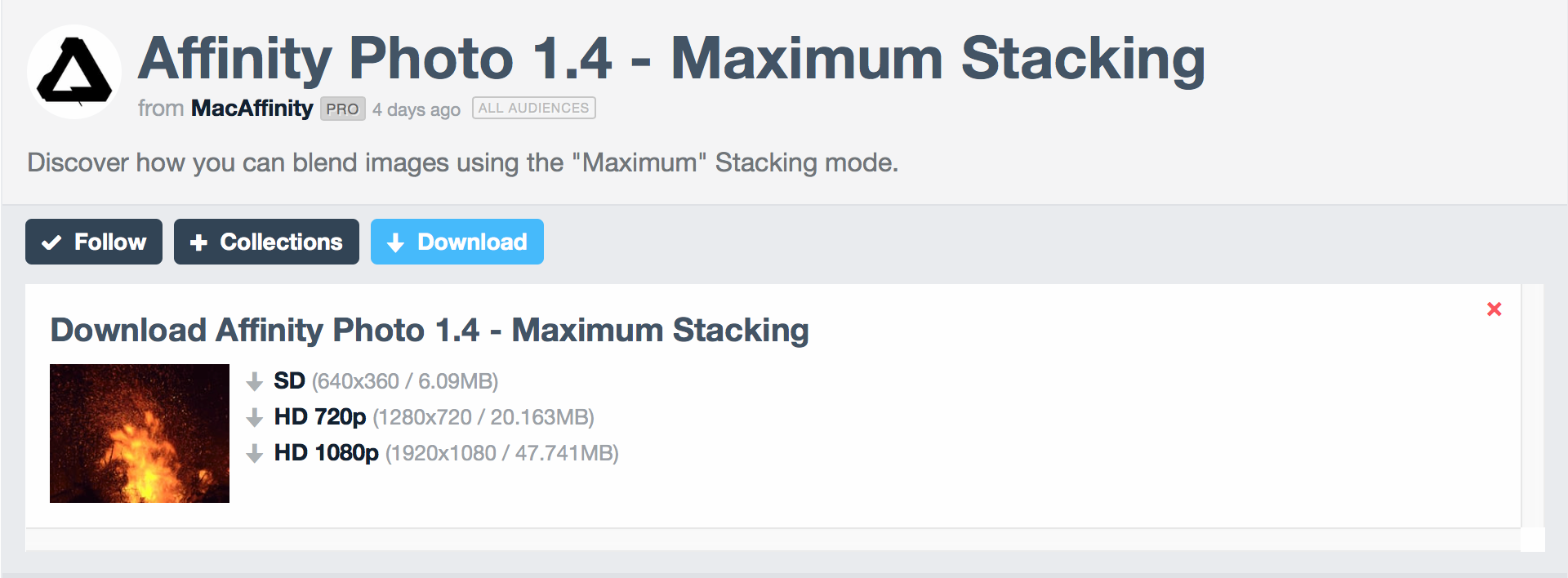
Maximum Stacking - http://vimeo.com/150416756
Multiple Colour Formats highlights how, as an example, you can work in LAB with adjustments whilst your document remains in RGB. A useful little feature!
More videos on the way soon - hope you all have a good New Year!
James
-
Hi Dave,
You're halfway there! By painting with the selection brush you've actually made the selection. It's then up to you as to what you do with the selection - you can select a different tool, eg the paint brush tool, and paint into that selection, or you can add an adjustment or filter, and it will mask the effect to that selection.
The extra keys might be referring to the modifier keys - Ctrl and Alt. They're used to add to or subtract from the selection on the fly (as opposed to having to click between Add/Subtract on the context menu at the top).
I can also point you to some video tutorials that might help:
- Creating Selections gives you an idea of the different selection tools available. However, it does not cover what you would then do with your selections.- Cutting Out uses the selection brush to select an object then create a layer mask to isolate it.- Sky Replacement uses the selection brush to isolate and replace the sky in an image.Hope that helps.
-
Hi MrKahuna, thank you for the feedback, you make a good point and it's been noted for future videos. I have gone back to the video you linked to and added a shortcut overlay to clarify that I'm deselecting the marquee selection. Hope that helps!
-
Hello T_Y,
Thanks for your feedback - it would help greatly if you could indicate how you came to discover only six tutorial videos, as we've produced well in excess of a hundred between Designer and Photo. Any way that we can further highlight this to ensure people discover them is worth considering.
As Callum mentioned, both apps also ship with a built-in Help system that is searchable. It covers all the tools, major and minor features, and I think it would be a good reference point for you being that you're familiar with similar software.
Hope that helps,
James
- anon1, Callum, MacGueurle and 1 other
-
 4
4
-
Sorry, I only see a page with six, not the mass of tuts you find on the tutorial link????
Cheers......
Hi tonyt, that's the front page of the Affinity Vimeo page - there should be a link near the top that allows you to access more videos (at this point in time it should say "178 videos").
You should also be able to download each video via a link near the bottom of its individual page.
Hope that helps,
James
-
Hello all,
Off the back of the new customer beta we've got two new videos! You'll need to grab the latest beta from here http://forum.affinity.serif.com/index.php?/topic/12638-affinity-photo-customer-beta
- Affinity Photo - Haze Removal (Customer Beta 1.3.5.1)
- Affinity Photo - Accessing Help (Customer Beta 1.3.5.1)
The Help video covers how to produce printable versions of topics, so if you've been wanting paper copies to refer to, give the video a watch!
- manu schwendener, MacGueurle, Dale and 1 other
-
4
-
Hi, we have a tutorial video that covers basic exposure merging here: Affinity Photo - Exposure Merging
You can use the techniques shown in this video to achieve what you're after:
- Copy & paste your multiple images into one document
- Use blend ranges to blend the exposures into one another
- Use masking to "mix and match" the areas you want from each image
The above video uses two exposures and focuses on blending through highlight detail, but the techniques are still applicable for your requirements. Hope that helps!
-
Hello all, here's a new video for you this week that covers exporting 3D LUTs from Photo and using them for colour management in other software:
Enjoy! More videos coming soon...
-
Hi, have you tried using the Shadows and Highlights filter? (Not the Adjustment or the Shadows/Highlights in Develop, those behave differently). Using the filter will give you more powerful shadow and highlight recovery; it's available as a live filter as well so you can do it non-destructively.
Here's a video that demonstrates using the filter:
[Edit]
You should try what Callum has suggested first - make sure you're not throwing away the highlight information in Develop (the histogram would be "running into" the right hand side of the graph). Turning the assistant off will disable some tone processing that may be doing this. Also experiment with the Highlights, Blackpoint and Brightness sliders.
-
Hi Joe,
You are correct, having pure black doesn't blend at all with Screen mode: in the video I added the displace filter first (then the blur), which negates this.
However, the same technique does not work on a rasterised layer (e.g. if you use the perspective tool on text which rasterises it), so in this case you would actually need to change the colour of the text before or after rasterising.
Thank you for pointing this out, I'll add a note to the video description.
-
Hello all,
Three new videos for you this week (I'm clearly slacking), the master list has been updated with these:
-
This is exactly what I'm trying to do.
I have to images, one on top of the other and am trying to remove only a small portion of one of the images and have that blend in with the other.
I click on the mask layer at the bottom and then I try to fill it with black.
That's where I get stuck, and can't figure out how to fill that mask with the color black. If I could I would then select the mask and paint in with white gradually building up the effect. As mentioned above.
If anyone could offer any suggestions I'd be eternally grateful.
Once you've added the mask, select it in the Layers panel then go to Layer - Invert. This will invert the mask and allow you to build it up.
Hope that helps!
-
Hi, it is simply that the composition has been merged into a single pixel layer for the tutorial, and it is selected so it appears blue. It does not affect the adding of a live filter layer which is what happens in the video. You will be able to add a live filter to your Background layer and achieve the same result in the video.
Hope that helps!
-
Another quick video update!
Four more videos have been added to the master list including a beginner's walk through that aims to help people who are new to image editing software and its basic concepts.
Here are the new videos added:
Look out for more videos soon..
-
I've been the last week trying to find a workaround with no luck.
If right now we cannot blend any two channels, or a layer with a channel, maybe it is possible to substitute a channel with a grayscale image.
It seems that we can get grayscale layers from the channels, and we can blend them as we wish and produce a new grayscale layer exactly as we want. Unfortunately, I was not able to substitute a channel with this layer, it's like channels are "read-only". If we could edit a channel and substitute it with an ad-hoc grayscale layer, we might have a good workaround until the Apply Image functionality is implemented.
Any idea or suggestion?
Hi Asparria,
This is a blind suggestion as I don't have Photo in front of me, but have you tried right clicking a channel and choosing Create Spare Channel? You can then right click the newly created spare channel and choose "Load to..." to apply it to a specific channel. Is this what you're referring to?
-
Hi Anstellos,
Regarding the functionality of Apply Image, have you tried experimenting with the Channels panel?
For example:
1) Duplicate or import your pixel layer that you want to "apply"
2) With that pixel layer selected, go to the Channels panel
3) Right click a channel belonging to your layer (e.g. the Background layer will be called Background Red, Background Green etc)
4) You have a number of options:
Create Greyscale Layer will create a new pixel layer containing greyscale information for that colour channel. You can then use blend modes/blend ranges and opacity to blend it.
Alternatively, if you want to just blend the red channel, right click both the Green and Blue channels and select "Clear" for both of them. You will then be left with only the red channel information, which you can blend using blend modes/ranges.
Does that process achieve similar results to what you are used to getting with Apply Image?
I am investigating doing a tutorial video on channels since there is a lot of unexplored functionality there.

RAW ORF import - files dark & muddy & resolution is wrong
in [ARCHIVE] Photo beta on macOS threads
Posted
I think the main message regarding DPI is... don't worry about it!
Let's take a typical E-M1 image. Once decoded in the Develop persona, it has a pixel resolution of 4640x3472 pixels.
Now, even if the initial DPI was an extremely low value (let's say 1!) your pixel resolution would still be 4640x3472 pixels.
Unless you specifically "resample" your image, which means changing the pixel resolution, you will not compromise its quality.
Where DPI comes into practical use is for specific measurements and sizes.
For example, if you wanted to create a new document that was exactly 5x7 at a DPI of 300, we would calculate:
5x300 = 1500
7x300 = 2100
So we would end up with a document that would be 1500x2100 pixels. Those are the dimensions that your document/image will want to be to print at 300DPI and be exactly 5x7" in size.
If you wanted to print the same 5x7" size at 600DPI, the resolution requirement would increase to 3000x4200 pixels.
So, if you want to send your work to a printers or editorial and they request specific dimensions and a DPI, you could create a new document following those requirements, then insert/paste your image into it and reposition/scale as necessary.
For personal use and general web delivery, however, don't worry too much about DPI. Leave it at the default of 96 or 72 and instead focus on your pixel resolution, as that's what counts.
[side note] If you start printing A3 or larger sizes, you may find yourself struggling to match the required resolution at 300DPI, which is optimal for print. Don't be afraid to drop the DPI down (to 200 for example). As long as your source material is of high quality and you're sensible with the resolution, you should get good results (provided you have a good printer, but that's another story!).