firstdefence
-
Posts
11,711 -
Joined
-
Last visited
Everything posted by firstdefence
-

curves with arrows
firstdefence replied to AlyceG's topic in Pre-V2 Archive of Desktop Questions (macOS and Windows)
I think simply creating a path with an appropriate width and a triangle shape on the end should accommodate most arrow eventualities. -
custom
firstdefence replied to debbru's topic in Pre-V2 Archive of Desktop Questions (macOS and Windows)
The kick in the mutts is you cannot save your customised document as a preset! Why! why for the love of (whatever deity you believe in) but I have no idea why a basic function should be omitted. There are workarounds like saving the newly created document as a blank document and using File > Save as... to save as an differently named document, or, converting the document to an Artboard if you have Affinity Designer and saving that Artboard as an Asset. -
Help with a label
firstdefence replied to Phil_rose's topic in Pre-V2 Archive of Desktop Questions (macOS and Windows)
A follow on from Wosvens micro lesson, is to create the label (flat) print it off and stick it to a Clear straight beaker/cup, position it as you wish and photograph it, use that image as a trace image. This gives you something to work from, it gives you a feel for how things should actually look and helps you get a feel for perspectives, reflections, shadows etc. You'd be surprised how good you can get something to look when basing it on a real world subject. If I'm drawing blind; no reference image, I will draw some basic lines, that might include ellipses, or perspective lines.
-
In Affinity Designer You can create Assets, so create any number of Lines with the required dimensions, group them and save them as an Asset, you can then just drag and drop them to the workspace
-
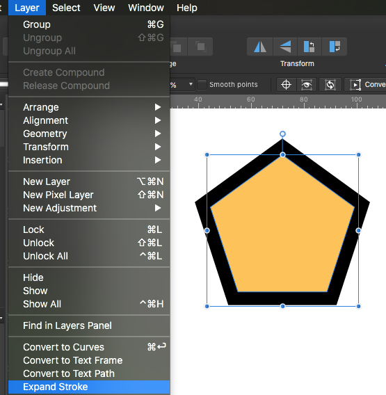
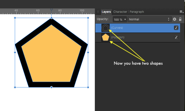
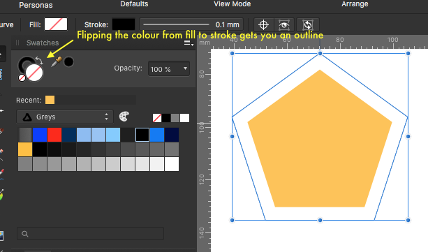
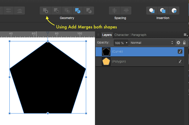
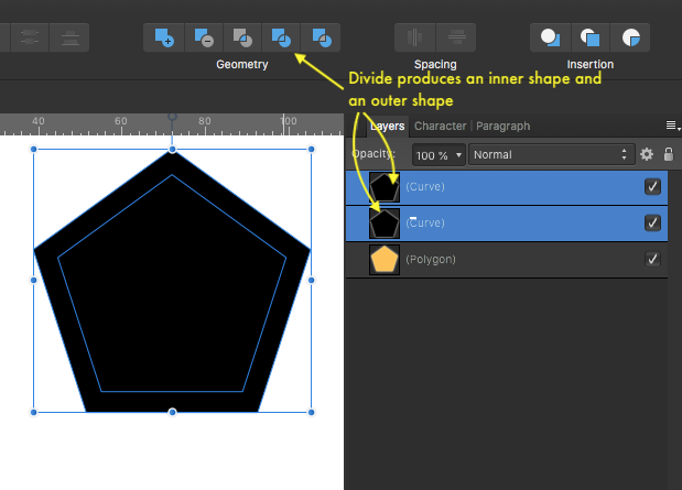
Are you talking about an Offset path? If yes, Affinity haven't added that feature yet, but a workaround in Affinity Designer is to add stroke align it to the outside then go to Layer > Expand Stroke 1. Add a Stroke to the Shape 2. Go to Layer > Expand Stroke 3.You should now have two shapes, the original shape and a new shape that looks like a Stroke but is actually a filled shape. 4. If you want to make the new shape a solid shape, select the new shapes layer and use Layer > Geometry > Divide and then Layer > Geometry > Add 5. To get an outline just flip the colour from fill to stroke
-
Go to Windows > Separated Mode and click on it.
-
Create the Artboard sizes you want then add them as Assets. To show the Assets Panel: View > Studio > Assets. From the Assets Panel create a new Category or Sub Category Rename the Category to Artboards or a name of your choosing Create Artboards in the sizes you wish to have. ( I would suggest you add an Artboard sized rectangle with a colour fill else the Artboard will not be seen in the Assets Panel) Rename your Artboards to indicate the sizes Select the Artboards in the Layers Panel and go to the Assets Panel and use Add from Selection to add the Artboards to the Assets Panel's category or Sub Category. You can now drag your New Artboards to the workspace.
- 1 reply
-
- 1
-

-
- preset sizes
- designer
- (and 1 more)
-
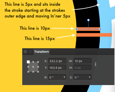
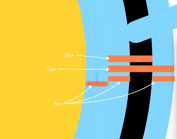
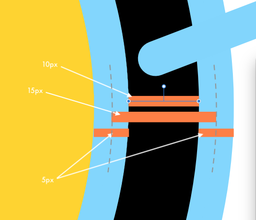
The Outline when set to "Inner" is being placed inside the stroke width, it starts at the outer (external) edge of the stroke and moves in 5px, this is true whether the stroke is set to inner or centre lined. The unexpected behaviour starts when you set the Stroke to Outer Align. When this is set and Outline fx is set to Inner and applied, the Outline is applied to both edges of the stroke and moved 5px inwards from the outer edges of the stroke and it is also applied to the Fill. Setting the Outline fx to Outer applies the Outline correctly and setting the Outline fx to Centre applies an Outline to both edges of the stroke and aligns them centrally to the edge of the stroke.
-
Copy Paste Nodes
firstdefence replied to evtonic3's topic in Pre-V2 Archive of Desktop Questions (macOS and Windows)
I see what you mean now, it will not let you pick out a group of nodes to copy and paste -
The Outline is Inside the stroke by 5px, if you increase the size of the outline it will reduce the width of the stroke until you get to 15px and then the outline will overrun the stroke and obliterate it. I suppose the assumption is that the outline starts at the fill edge not the stroke outer edge, but it is correct as far as I can see. Also removing the Stroke moves the Outline to the edge of the fill and overlaps it by 5px so again that is correct.
-
Need help choosing logo
firstdefence replied to Nic727's topic in Pre-V2 Archive of Desktop Questions (macOS and Windows)
Be care with your Name as "ND Photography" people might think of Neutral Density Photography. Don't get too held up on having everything be in a logo. You could have the blue swirl and your name for certain things like a letterhead or the website but it's your name that is important. You might want to work on a stylish signature you could write this out and scan it in, obviously write it in black on white plain paper, if you can't scan it take a picture with your phone then import it into Affinity to work on it, There is nothing more unique than your signature. -
Copy Paste Nodes
firstdefence replied to evtonic3's topic in Pre-V2 Archive of Desktop Questions (macOS and Windows)
What are you trying to achieve? give us a screenshot Can you not duplicate the layer with the text on it and move it out of the compound -
Need help choosing logo
firstdefence replied to Nic727's topic in Pre-V2 Archive of Desktop Questions (macOS and Windows)
What you are trying to create is Identity branding. It's all well and good to have fancy writing but if people can't read the words very well it becomes a waste of time. You have to consider usability so things like, will the design work in black & White, Greyscale and Colour, will look look ok in a square as well as a rectangle, Can people read the text within the logo, does the logo work for photography, do you specialise in a particular type of photography, do you want to be seen as fun, classy, stylistic, modern, retro? I prefer the blue water coloured one but that font has to go, it might work if it has lowercase letters -
Same color on two builings
firstdefence replied to Jon1's topic in Pre-V2 Archive of Desktop Questions (macOS and Windows)
@Jon1 Theres multiple ways to do this so just use the one that suits you best. -
PS Trim Equivalent
firstdefence replied to sector7g's topic in Pre-V2 Archive of Desktop Questions (macOS and Windows)
Using Erase White Paper will make the image transparent, try it. -
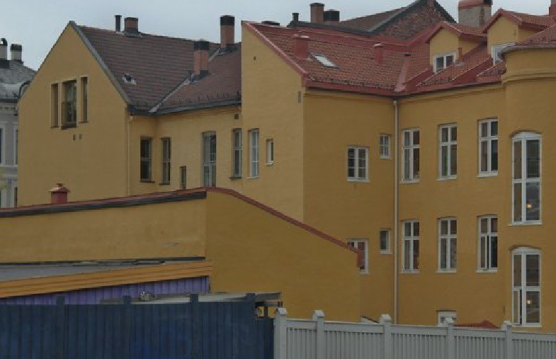
Same color on two builings
firstdefence replied to Jon1's topic in Pre-V2 Archive of Desktop Questions (macOS and Windows)
Make a selection of the lighter building at the back using the Brush Selection Tool (W) use a smallish size Now select the Picker Tool (I) and use Radius: 129x129 Click on the large gable end wall to select sample colour Create a new Pixel Layer and change the blend mode to Soft Light and adjust the Opacity to about 70% Now switch to the Flood Fill Tool (G) and click anywhere in the selection you made in step one. You should have a very close match to the colour of the rest of the buildings.
-
Yes, in New document Affinity has Metres as a document unit
-
Is there a reason why stroke and dashes info isn't in Affinity Photo help? No wonder I couldn't find it, I notice you reference Affinity Designer help for that info!
-
I thought they were using em as a measurement, do you have any other info on Dashed Lines R C-R? scrub the above, I get it now.
-
Because you are referencing Photoshop I will assume you are using Affinity Photo. There is no Expand Stroke in Affinity Photo, Expand Stroke is in Affinity Designer and is under Layer > Expand Stroke. Q2. This may be set to show as points, there is the option to turn this off and have it show in whichever units you have the document set to This option is under Preferences > User Interface: Show lines as points, unchecking this option will allow Affinity Photo to show lines as the document units.
-
PS Trim Equivalent
firstdefence replied to sector7g's topic in Pre-V2 Archive of Desktop Questions (macOS and Windows)
Try Filters > Colours > Erase White Paper, this will crop the bounding box tight to the graphic, while the graphic is still selected you can then use Merde's suggestion to get a neat clip. -
The shadow is too much at the base of the phone, Shadows are generally darker and sharper near the object, so less blurred, and they are softer away from the phone, so at the base the shadow should be finer and darker so you can only just see the shadow cast but it has that almost no light look. Making a shadow like this would connect the phone to the worktop. If there was something underneath the phone like a box or book that it was leaning against it would help with perspective and also give a more realistic physicality. Having said all that, you are steam-rollering the learning curve.
-
Thanks for the video Bones, always learning will be using Krita for this type of work from now on.
-
@exurbanite7 An example goes a long way to helping you get what you want.
-
Tools & Assets Missing
firstdefence replied to pwfp-2018's topic in Pre-V2 Archive of Desktop Questions (macOS and Windows)
Welcome to the forum, Pressing Tab hides and shows the panels. if the Assets panel isn't shown, go to View > Studio > Assets to show the Assets Panel